
AI Data Analyst Tools: What They Can and Cannot Answer
Revenue for the month came in below plan, and someone types the question straight into an AI data analyst tool: "why did revenue drop last month." Within seconds there is a clean paragraph, a named channel, a couple of numbers, and a confident recommendation. It goes straight into the board update because it sounds finished, and the room moves on to the next problem.
The trouble is that these tools only know what is sitting in your existing data — they read rows, they cannot ask around the office. When the real answer lives outside that data, such as a payment provider having a bad day or one invoice landing in the wrong month, the tool has no way to know that. It still writes a fluent, certain-sounding paragraph anyway, because generating confident sentences is what it is built to do, not because it actually found the cause.
This piece will walk you through where these tools genuinely save time, where their confident tone hides a wrong answer, and how to phrase questions so you can check the answer before repeating it. By the end, you will know which questions are safe to ask an AI data analyst tool directly, and which ones still need a human to walk the floor and confirm what actually happened.
What Does an AI Data Analyst Tool Actually Do?
An AI data analyst tool turns a plain-language question into a query over your connected data, runs it, and writes the result back as a sentence or a chart. It reliably answers what happened, to whom, when and how much. It cannot verify why anything happened, because causes are not stored in your tables — only outcomes are.
Underneath the chat box, almost every one of these products does the same four things in the same order, and knowing the order tells you where the failures come from.
First it reads your question and guesses your intent — which metric you meant, which time range, which grouping. Second it looks up a description of your data: table names, column names, data types, sometimes a semantic layer where a human has written down what "revenue" means here. Third it writes a query and executes it against the real data. Fourth it takes the rows that came back and narrates them in prose.
Three of those four steps can be wrong in ways that produce a perfectly formed answer. If step one guesses the wrong metric, the query is valid and the number is real and the answer is about something you did not ask. If step two hits a warehouse where two columns are both plausibly "revenue", it picks one, usually without telling you which. If step three writes a join that quietly multiplies rows, the total inflates and nothing in the output looks broken.
Step four is where the trouble compounds. The narration step is a language model doing what language models do well: writing a confident, tidy sentence. It has no channel through which to express doubt about steps one to three, because it did not observe them failing. Fluency is generated independently of correctness. This is the single most important thing to understand about the category, and it is not a bug anyone is going to fix — it is what the architecture does.
So the practical question is never "is this tool accurate". It is "which class of question am I asking, and does the answer to that class live in my data at all".
The Four Question Shapes These Tools Handle Well
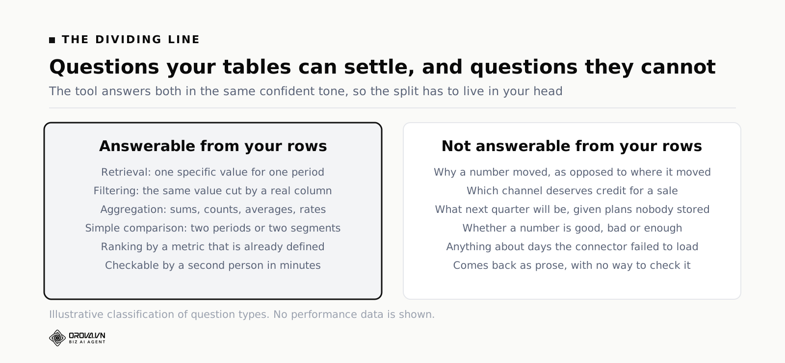
There is a clean line between questions whose answer is a property of your rows and questions whose answer is a property of the world. The first group is where these tools are genuinely excellent, and there are four shapes in it.
Retrieval: pulling a specific value
"What was total revenue in June?" "How many orders shipped yesterday?" "What is the current spend on campaign X?" These are lookups. There is exactly one correct answer, it is in the data, and a competent tool gets it right nearly every time. The only real risk is definitional — whether "revenue" means gross, net of refunds, or net of tax — and that risk lives in your warehouse, not in the model.
Retrieval is also where these tools deliver most of their day-to-day value, which is easy to underrate. In most teams the actual bottleneck is not sophisticated analysis. It is that eleven people per week need one number each, and every one of those requests interrupts the one person who knows where the number is. Removing that queue is worth real money even if the tool never answers a hard question in its life.
Filtering and slicing: the same number, cut differently
"Revenue in June, but only for new customers." "Orders yesterday, excluding wholesale." "Spend this month by country." Filtering is retrieval with a where-clause, and the tools are strong here as long as the filter maps onto a field that actually exists. Ask for "new customers" when no column defines new versus returning, and the tool will either invent a definition or silently pick a proxy. It rarely says "that field does not exist".
The test to run before you trust a filtered answer: could you point at the column that implements the filter? If you cannot, neither could the tool, and it filtered on something else.
Aggregation: sums, counts, averages, rates
"Average order value by month." "Count of distinct customers who bought twice." "Conversion rate by landing page." Aggregation is the workhorse, and modern tools do it well. The failure mode here is the denominator, not the numerator. A conversion rate needs a definition of both the conversion and the population, and there are usually three defensible populations — sessions, users, or qualified visitors. Ask "what is our conversion rate" and you will get one of them without being told which.
Averages carry their own trap. An average with a long tail hides more than it shows, and a tool asked for an average will give you an average rather than volunteering that the median is half of it. If the shape of the distribution matters to your decision, ask for the distribution.
Simple comparison: two periods, two segments, two campaigns
"Compare June to May." "Which country grew fastest?" "Rank campaigns by cost per order." Comparison is where the value curve starts bending upward, because a comparison is closer to a decision than a raw number is. Tools handle the arithmetic reliably. What they cannot do is tell you whether the comparison is fair — whether June had one more weekend, whether May contained a promotion, whether a tracking tag broke in the middle of one of the two periods.
Comparison is therefore the last safe shape and the first dangerous one. The arithmetic is trustworthy. The interpretation stapled onto the end of it is not.
Where AI Data Analyst Tools Fail While Sounding Certain
Everything past comparison requires information that is not in the warehouse. The tool does not know that, because from inside the query engine, "this data does not contain the answer" and "this data contains the answer" look identical. Here are the five failure classes in the order you will meet them.
"Why did it change?" — decomposition is not causation
Ask why and you will get a decomposition: which segment, channel or product moved the most in absolute or relative terms. That is a real and useful piece of arithmetic. It is also not an answer to why. Decomposition tells you where the change is concentrated. Causation requires ruling out every other explanation, and the tool cannot enumerate explanations it has no data about.
A worked illustration, with invented numbers used only to show the shape of the problem. Suppose revenue falls and the tool reports that paid social revenue fell by an amount roughly equal to the total drop. That sentence is arithmetically true and it points at paid social. Now list the things that would produce exactly the same pattern: a competitor running a heavy promotion that week, a pixel that stopped firing so conversions were logged but not attributed, a creative refresh that landed badly, a payment failure that hit checkout traffic from that channel harder because it skews mobile, or a public holiday in the country where that channel over-indexes. Five candidate causes, one observed pattern, and only one of the five leaves any trace in the marketing warehouse.
The honest phrasing of what the tool found is: "the drop is concentrated in paid social". Everything after that is your job.
Attribution: several sources claiming the same sale
Attribution is not a hard question for an AI tool. It is an impossible one, because the answer depends on a modelling choice that a human has to make and write down. Ask "which channel drove the most revenue" against a warehouse holding both platform-reported conversions and your own order table and the tool will answer from whichever table it decided you meant. Platform numbers double-count across platforms by design — each network claims a conversion it touched. Your order table has one row per order and no idea who deserves credit.
Neither answer is wrong on its own terms. Presented as "which channel drove the most revenue", both are misleading, and the tool will not flag the conflict because it queried one table and the other table was never in the conversation. If you are pulling paid and organic performance into the same view, decide the credit rule first and encode it, the same discipline that combined SEO and ads reporting demands before anything gets compared.
Forecasting: extrapolation wearing a forecast costume
"What will revenue be next quarter?" produces a number. That number is almost always a trend line extended forward, sometimes with a seasonality adjustment learned from your own history. What it cannot contain: the promotional calendar nobody put in a table, the price increase shipping next month, the two enterprise deals in the pipeline, the warehouse capacity ceiling, the campaign that is about to be switched off because the contract ends.
A forecast is a statement about the future that incorporates plans. An extrapolation is a statement about the past pointed forwards. AI analyst tools produce the second and label it the first. They are useful as a sanity check on a human forecast — if your plan is triple the extrapolation, something needs explaining — and dangerous as a replacement for one.
Business context: "is this good?"
"Is a 3.1 percent conversion rate good?" has no answer in your data. Good depends on your margin, your price point, your traffic mix, your sales cycle and what you were getting last year. The tool has your history, so it can tell you whether 3.1 is above or below your own average — that part is fine and worth asking. It cannot tell you whether 3.1 clears the bar, because the bar is a business decision.
The same applies to any question containing an evaluative word: good, bad, healthy, concerning, enough, worth it. Rewrite those into a comparison against a number you chose in advance and the tool becomes useful again. "Is our CAC good" is unanswerable. "Show CAC by month against a target of X" is a chart.
Absent data: the silence that reads as a zero
This one is the most under-discussed and it has bitten every team that has run a warehouse for more than a year. If a connector fails for three days, those days do not appear as errors. They appear as low numbers, or as nothing. An AI tool asked "how did last week go" against a week with a broken sync will report a decline with total composure.
Systems get this wrong in subtle ways too. We once shipped a rule engine that treated a threshold of zero as "nothing entered here", so any rule with a zero threshold was quietly skipped — the value was real, the system read it as absence. That class of bug is everywhere in data plumbing, and an AI layer sitting on top of it inherits every one of them without knowing they exist. A missing row and a zero row are different facts, and only one of them is usually visible.
How to Phrase a Question So the Answer Is Checkable
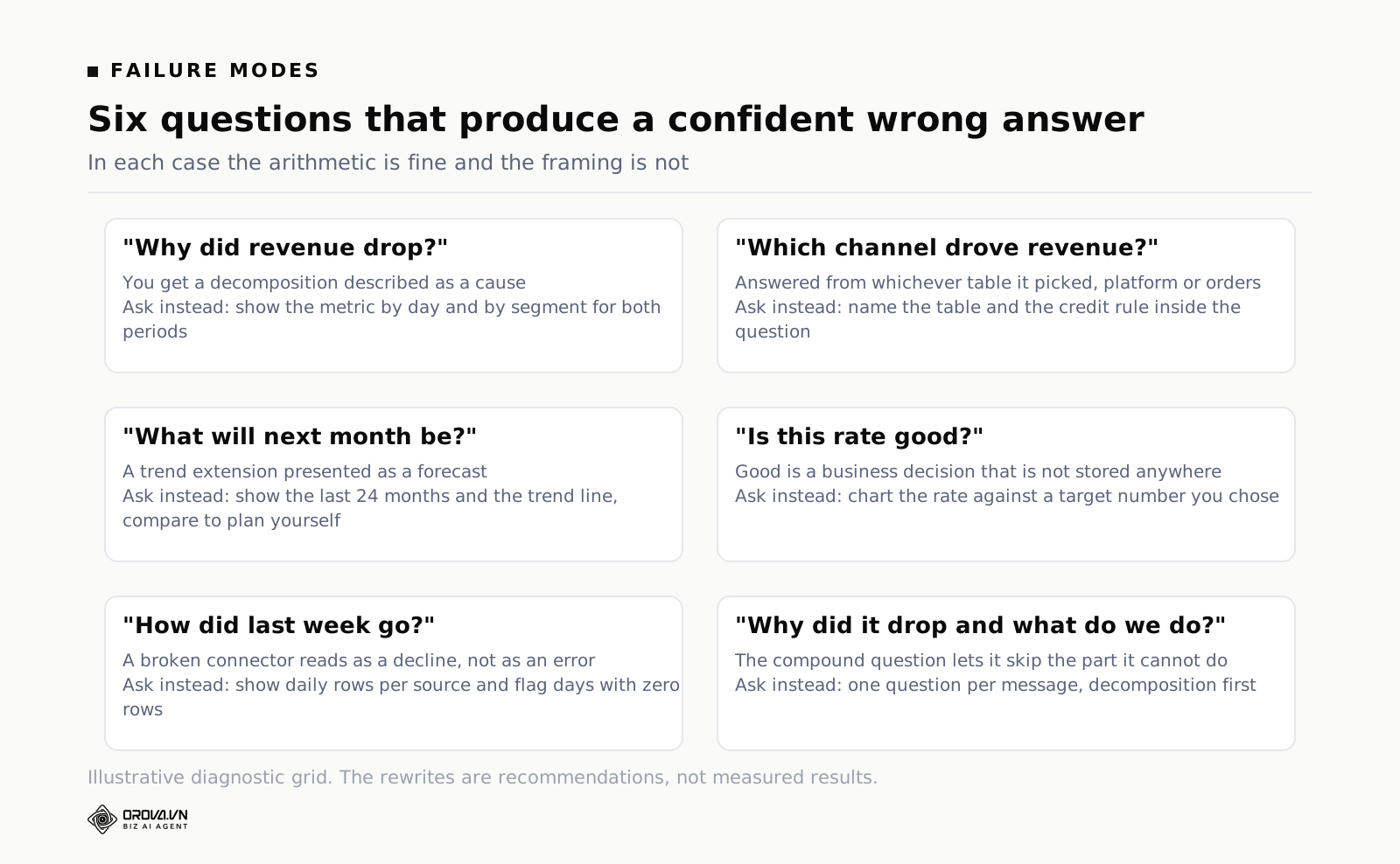
The single highest-leverage skill with these tools is not prompt cleverness. It is writing questions that a second person could independently verify. A checkable question pins down five things, and if any of the five is missing, the tool fills it in for you and does not mention which choice it made.
- The metric, defined. Not "revenue" but "net revenue after refunds, from the orders table". If your warehouse has a semantic layer with that written down, name the metric as it appears there.
- The date range, as explicit dates. Not "last month" but "1 to 31 July". Relative words depend on what the tool thinks today is and which timezone it thinks in.
- The population. Who is included and who is excluded. Test orders, internal staff, wholesale, cancelled, one country or all of them.
- The grouping. By day, by channel, by product category — and say whether you want a total row as well.
- The receipt. Ask for the row count and, where the tool allows it, the query or the chart it built. An answer you cannot inspect is an answer you cannot defend.
That fifth item does more work than the other four combined. A number by itself is a claim. A number plus the query that produced it plus the row count is evidence, and evidence is what survives being questioned in a meeting.
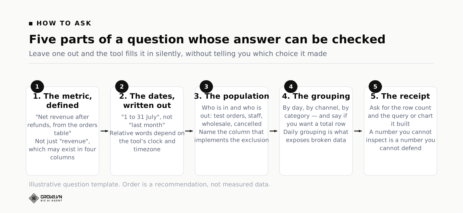
Here is the same principle applied to five questions people actually type. The rewrites are longer, which feels like a loss until the first time someone challenges a number in front of a client.
| What people type | What to type instead | What the rewrite prevents |
|---|---|---|
| Why did revenue drop last month? | Show net revenue by day and by channel for 1 to 31 July against 1 to 30 June, same channels, and give me the row count for each period. | Turns an unanswerable causal question into a decomposition you can read yourself. |
| Which channel performs best? | Rank channels by cost per completed order from the orders table for July, excluding cancelled and test orders, and show spend and orders alongside. | Stops the tool choosing both the metric and the credit rule on your behalf. |
| Is our conversion rate good? | Show conversion rate defined as completed orders divided by sessions, by week for the last thirteen weeks, with a line at 3 percent. | Replaces a judgement the data cannot make with a comparison it can. |
| How are we doing this quarter? | Show net revenue, orders and average order value by month for this quarter and the same quarter last year, and note any days with zero rows. | Forces the missing-data check that a vague question hides. |
| What will next month look like? | Show net revenue by month for the last twenty-four months and the trend line, so I can compare it against our plan number. | Keeps the extrapolation visible instead of dressing it as a forecast. |
One more rule that sounds trivial and is not: ask one question at a time. Compound questions — "why did revenue drop and what should we do about it" — invite the model to skate past the part it cannot do in order to reach the part it can write fluently about. Split them. Get the decomposition. Then think.
Data Hygiene Decides Answer Quality More Than the Model Does
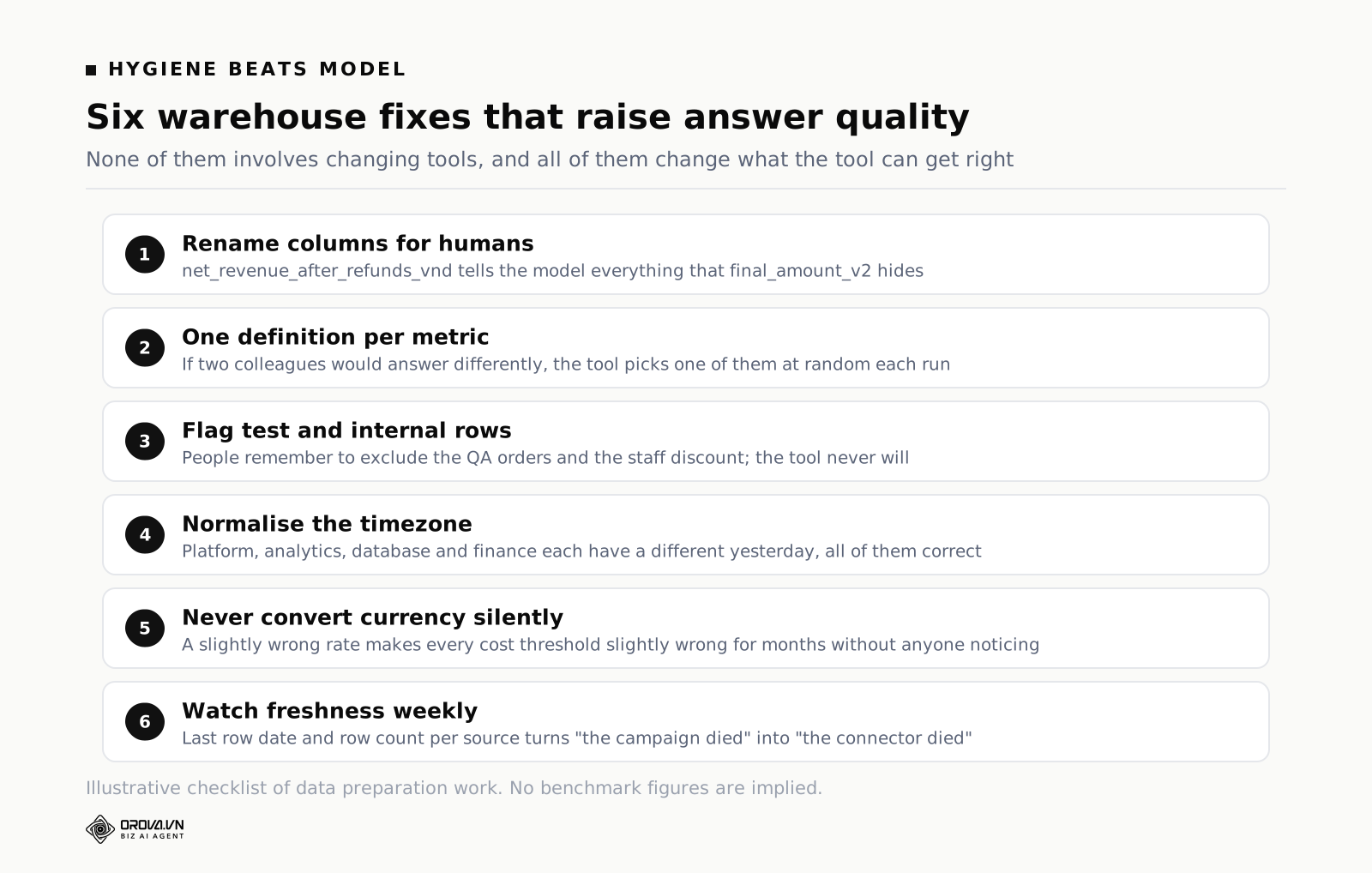
Teams shopping for these tools spend their evaluation time on the model and almost none on the warehouse underneath. That ratio is backwards. Point two different products at a clean, well-named, single-definition dataset and their answers will mostly agree. Point the best product on the market at a warehouse with four revenue columns and no descriptions and it will be confidently wrong on a schedule.
Column names are the prompt
The tool reads your schema to decide what you meant. A column called final_amount_v2 gives it nothing. A column called net_revenue_after_refunds_vnd gives it everything. Renaming columns is the cheapest accuracy improvement available to you and no vendor will tell you that, because it is work you do rather than software you buy.
If renaming production tables is off the table, use a semantic layer or a description field. Most warehouses and most analytics tools let you attach a human sentence to each table and column. Write those sentences the way you would explain the field to a new hire on their first day. That text is what the model actually consults.
One definition per metric, written down
If two people in your company would answer "how many active customers do we have" differently, the tool will pick one of their definitions at random each time it is asked. Pick one. Write it down. Kill or clearly quarantine the other columns. This is unglamorous and it does more for answer quality than any model upgrade.
It also protects against a subtler problem: metrics that are easy to compute drifting into reports because they are easy, rather than because anyone decides on them. That is the same failure that makes dashboards fill up with numbers nobody acts on, and it is worth reading the case against those best SEO Keyword Research Tools (Free and Paid Compared) before you let an AI make them even easier to produce.
Duplicates, test rows and the staff discount
Every warehouse contains rows that should not be counted: test orders from QA, internal purchases, the developer who ran the checkout thirty times in one afternoon, records duplicated by a retried sync. Humans know to exclude them because they remember. The tool does not remember. Either exclude them at the source, or add a boolean column that flags them and mention it in the column description.
Timezone and where the day starts
This one produces disagreements that take a full afternoon to unpick. Your ad platform reports in the account timezone. Your analytics property reports in the property timezone. Your database stores UTC. Your finance team closes the month on local business days. Ask any tool for "yesterday" across those four sources and you get four different yesterdays, all correct, none comparable.
Fix it once by normalising to a single reporting timezone in the warehouse and stating it in the column description. Then when someone asks why the AI's number is different from the platform's number, you have an answer that takes ten seconds rather than an afternoon.
Mixed currencies
An account holding several currencies cannot be totalled without an exchange rate, and an exchange rate has a date, a source and a spread. Automatic conversion is the wrong default, because a slightly wrong rate makes every cost threshold slightly wrong in a way nobody will notice for months. Some platforms refuse to total a mixed-currency account at all rather than guess, and that refusal is a feature, not a limitation. If your stack converts silently, at minimum find out which rate it uses and on what date.
Gaps you can see
Add a freshness or completeness check that a human looks at weekly: last row date per source, row count per day per source, and an alert when a day comes in at a fraction of its usual volume. This is fifteen minutes of setup and it is the difference between "the campaign died" and "the connector died". Without it, every AI answer about a recent period is a coin flip on whether the data arrived.
Who Gets to See What: The Consent and Access Question
An AI analyst inherits the permissions of whatever connection it was given. That sentence is worth reading twice, because the natural-language interface makes broad access feel narrower than it is. A person with read access to a warehouse still has to know a table exists, know its schema and write a query. A person with a chat box just has to ask, and the tool will happily go and look.
Three practical consequences.
Least privilege matters more, not less. Connect the AI through a service account that can read exactly the tables it needs. If salary data, supplier cost, or customer contact details live in the same warehouse, they need to be out of scope at the connection level, not out of scope by hoping nobody asks.
Per-source consent should be explicit. The pattern worth insisting on is that a source is only readable by the AI when a human has switched it on for that purpose. Connecting a data source for dashboards and connecting it for an AI to read are two different decisions, and a tool that treats them as one decision is making it for you.
Questions are logs. Every question asked and every answer given should be recorded, with who asked. This is not surveillance; it is how you reconstruct where a wrong number in a board deck came from, and it is usually what your auditor asks for first.
There is a fourth, quieter issue: what leaves your environment. Some products send your schema, sample rows or full result sets to a model provider. Read the data-handling terms and specifically look for whether query results are used for training and whether they are retained. If you handle personal data, that answer determines whether the tool is usable at all, regardless of how good it is.
The Verification Habit to Run Before You Quote an AI Answer
Verification is not a personality trait, it is a checklist, and it needs to be short enough to actually run. Five steps, two to five minutes, before any AI-generated number enters a document that someone else will act on.
- Check the window and the population. Ask the tool to restate the exact date range and the filters it applied. Half of all wrong answers are right answers to a slightly different question, and this step catches most of them.
- Check the row count. Does it look like the volume you expect? An unexpectedly small count means a filter you did not intend. An unexpectedly large one usually means a join that duplicated rows.
- Reproduce it a second way. Pull the same number from the source platform, an existing dashboard tile, or a different phrasing of the question. Agreement is not proof, but disagreement is always worth an hour.
- Look for a data break. Chart the metric by day across the period rather than accepting a single total. Flat zeroes, a step change on a suspiciously round date, or a sudden variance shift are plumbing signals, not business signals.
- Write down what would make this wrong. One sentence. "This assumes the pixel fired all month" or "this counts platform-reported conversions, which overlap across networks." If you cannot write that sentence, you do not understand the number well enough to present it.
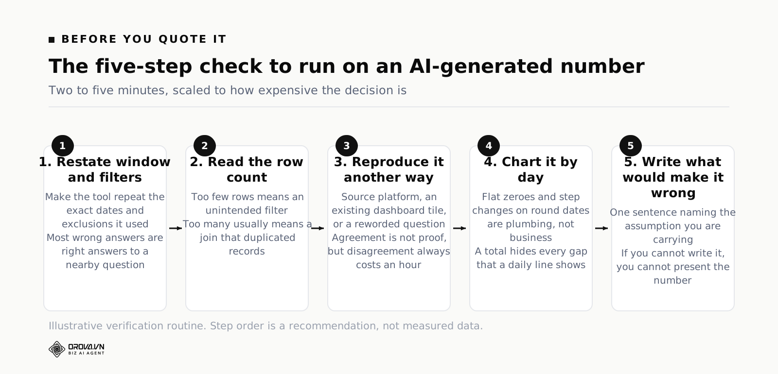
Scale the checklist to the stakes. A number in a Monday status message needs steps one and two. A number that will move budget, end a contract or go to a client needs all five, and probably a second pair of eyes. The mistake teams make is not skipping verification — it is applying the same low effort to both cases, because the chat box made both feel equally cheap.
One habit worth adopting alongside it: keep the question, not just the answer. Paste the exact wording you used into the doc footnote. When the number is challenged in six weeks, the question is what lets you reproduce it. An orphaned number with no provenance is worse than no number, because it cannot be defended and cannot be corrected.
When an AI Data Analyst Tool Earns Its Place, and Where Manual Work Still Wins
The honest way to decide is to count. For one week, write down every data question anyone in the team asks, and mark each one as retrieval, filter, aggregation, comparison, or something else. Most teams find that the first four categories account for the overwhelming majority of requests, and that those requests are the ones currently queued behind one busy person. That is the case for the tool, and it is a strong case: not because AI is clever, but because the queue is expensive.
Manual analysis still wins in four situations, and no tool is close to changing that. When the question needs a join nobody has built yet, across sources that were never designed to meet. When the answer depends on knowing what the business did — the promotion, the outage, the contract — rather than on what the data recorded. When you need to be right rather than fast, because the decision is expensive and irreversible. And when the question is genuinely novel, meaning nobody has ever asked it before, so there is no established definition to reach for.
There is also a middle ground worth naming: the tool as a first pass. Use it to get the shape of the situation in thirty seconds — which segment, which week, how big — then do the careful work yourself with a much better starting point than a blank query editor. Used that way it is a speed multiplier on human analysis rather than a substitute for it, which is also the honest way to think about best AI Marketing Automation Tools That Actually Take Action in general: the machine narrows the search space, the human closes it.
If you want to see how that feels on your own numbers, the AI Analyst inside Orova Insight answers in plain language from the sources you have explicitly switched on for AI, and shows you the chart it built from the real rows rather than a paragraph you have to take on faith. Registration is free with 1,000 quota and no card, which is enough to test it against numbers you already know the answer to — which is exactly how you should test any tool in this category.
That last point deserves emphasis regardless of which product you pick. Never evaluate an AI analyst tool on questions you cannot check. Feed it five questions whose answers you already know cold, including at least one where the correct answer is "your data cannot tell you that". How it handles the fifth question tells you more than how it handles the other four.
Frequently Asked Questions
Can an AI data analyst tool replace a data analyst?
No, but it can replace the least valuable half of an analyst's week. The ad-hoc number requests, the "can you just pull" messages, the same three charts rebuilt for four audiences — those go. What stays is defining metrics, designing the warehouse, judging whether a comparison is fair, and knowing which business events explain which movements. Teams that fire the analyst and keep the tool end up with fast answers and nobody who can tell which of them are wrong.
Why does it give different answers to the same question?
Usually because your question was ambiguous and it resolved the ambiguity differently on each run — a different revenue column, a different date boundary, a different treatment of cancelled orders. Sometimes because the data itself changed between runs, as late-arriving rows landed. Occasionally because of model non-determinism. The fix for the first two, which cover almost every real case, is a tighter question and a single metric definition. If a fully specified question gives different answers twice in a row, that is a product defect worth raising with the vendor.
Should I let it write and run SQL against production?
Against a read-only replica or warehouse, yes. Against production with write permissions, no, and no reasonable product asks for that. Read-only is the entire requirement here: an analyst tool has no business being able to modify a row. Also cap query cost if your warehouse bills by scan, because a badly formed question can scan a lot of data and nobody notices until the invoice.
How do I know whether the answer used all my data?
You do not, unless you ask. That is why the row count is on the checklist. Ask the tool which tables it queried and how many rows it returned, then sanity-check that against what you know about volume. Missing days from a broken connector are invisible in a total and obvious in a daily chart, so charting by day is the fastest structural check available.
What single thing improves answer quality the most?
Naming and defining your metrics — one definition per metric, written into the column description or semantic layer, with the ambiguous duplicates removed. It beats changing tools, beats model upgrades, and costs an afternoon. Every team that reports these tools working well has done this, usually before they realised it was the reason.
Is it safe to give natural-language analytics to the whole company?
Safe from a data-access perspective if you configure it per source and per role rather than granting one broad connection. Safe from a decision-quality perspective only if the verification habit spreads with the tool. The specific risk of company-wide rollout is not leakage; it is twelve people quoting twelve unverified numbers in twelve documents, all slightly different, all sounding authoritative. Roll out the checklist at the same time as the access.
What to Do This Week
Take the last AI-generated number that made it into one of your documents and run the five-step check on it. Restate the window and filters, get the row count, reproduce it a second way, chart it by day, and write the one sentence about what would make it wrong. Whatever you find — and something will turn up — you now know what the tool does on your data rather than what the demo did on somebody else's.
Then spend one afternoon on the boring half. Open the three tables people ask about most and write a plain sentence describing every column that anyone would plausibly call revenue, orders or customers. Pick one definition per metric and note which duplicates to ignore. Add a weekly freshness check so a dead connector announces itself instead of showing up as a decline.
Do those two things and the same tool gets measurably better without anyone shipping a new model. That is the part of the category nobody sells you, and it is the part that decides whether the answers are worth reading.
Where the Real Time Goes, and Where It Doesn't Need To
Doing this work manually means someone has to pull the numbers, cross-check them against what actually happened in the business, and write up an explanation that holds up when finance or the board asks a follow-up question. That checking step is exactly where the hours disappear, long after the first paragraph looked finished.
Orova Insight is built to sit on top of that gap: it handles the pulling and organizing of your data automatically, so your team's time goes into verifying the explanation instead of assembling it from scratch. If that sounds useful for how your team currently works, it is worth a quick look.
Ask your own numbers a question
The Orova Insight AI Analyst answers from the sources you have switched on, and shows the chart it built.
Start for free