
Marketing Analytics Tools: Which Questions They Answer
Marketing analytics tools are usually bought in the belief that better analysis will settle an argument the team keeps having — which channel is working, whether the last campaign paid for itself, where the next unit of budget should go. Analysis rarely settles those arguments, because they are not usually analytical disagreements. They are disagreements about what counts as evidence.
This article is about the part of the category that does deliver: which questions analytics tools genuinely answer, which ones no tool can answer regardless of price, and how to tell the difference before you spend a quarter on the wrong one.
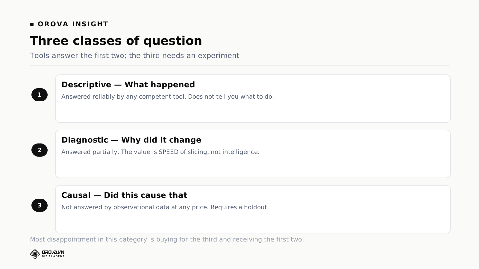
What do marketing analytics tools actually answer?
Three classes of question, answered very differently. Descriptive — what happened — reliably, by any competent tool. Diagnostic — why did it change — partially, by letting you slice fast enough to form a hypothesis. Causal — did this cause that — not at all from observational data, at any price. That needs an experiment.
Most disappointment in this category comes from buying for the third class and receiving the first two.
The three classes, and what each is worth
Descriptive: what happened
Spend, clicks, conversions, revenue, by channel and period. Every tool does this, and doing it in one place with your own metric definitions is genuinely valuable — mostly because it ends the arguments that are really about arithmetic rather than about strategy.
Its limit is that description does not tell you what to do. A channel with a poor cost per customer might be underfunded, badly executed, or fundamentally unsuited to your product, and the description looks identical in all three cases.
Diagnostic: why did it change
This is where a good tool earns its subscription, and the mechanism is speed rather than intelligence. Cost per acquisition rose; you need to know whether that is one campaign, one device, one region, one landing page, or a competitor entering the auction. Answering that means slicing the same number six ways in ten minutes.
A tool that makes slicing fast turns a half-day investigation into a coffee-length one, which changes how often investigation happens at all. Most teams do not fail to diagnose because they lack the skill; they fail because the investigation costs more time than the question seems to justify, so it gets deferred until the trend is undeniable.
The limit is that diagnosis produces a plausible story, not a verified one. Six slices that all point the same way build confidence; they do not establish cause.
Causal: did it work
The question everyone actually wants answered, and the one observational data cannot deliver. If you spend more on a channel during a period when demand rises, the channel's numbers improve. Nothing in the data separates your effect from the season's.
Three approaches exist, and it is worth knowing their real shape. A holdout test — turning something off for a defined period or region — is the most reliable and the least popular, because it requires deliberately forgoing revenue. Geographic experiments approximate this with less pain and more assumptions. Modelling approaches infer contribution statistically, need substantial history, and produce answers whose confidence intervals are usually wider than the decisions being made with them.
What matters for a purchase: none of these come from buying an analytics tool. They come from running an experiment, which is a decision rather than a product.
Attribution: what it is and is not
Every analytics purchase eventually collides with attribution, and it is worth stating plainly what the concept can and cannot do.
Attribution assigns credit for an outcome across the touchpoints that preceded it. It is a bookkeeping convention, not a measurement. Different conventions produce different answers from identical data, and none of them is more true than the others — they encode different assumptions about how influence works.
Three practical positions follow, and they matter more than which model you choose.
Pick one convention and keep it. Whether it is last click, a platform's own view, or something custom matters far less than consistency over time. Trends inside a consistent convention are informative even when the absolute numbers are wrong. Trends across a changed convention are noise, and every convention change resets your ability to compare with last year.
Never sum platform-reported conversions. Each platform is incentivised to claim credit and their claims overlap. The sum overstates, sometimes substantially, because the same sale is counted more than once. If a total is needed, take it from a single source that sees everything — your own analytics or your order system — and use platform numbers only for comparisons within a channel.
Hold one figure that cannot be gamed. Total spend against total new customers, from the business's own records, monthly. It attributes nothing and it is the thing that tells you when the channel-level story has drifted from reality. Every channel can look healthy while this deteriorates.
The last point is the most useful and the least glamorous. Teams who watch only attributed numbers discover the drift late; teams who keep the blended figure beside the detail notice within a month.
What a small team actually needs
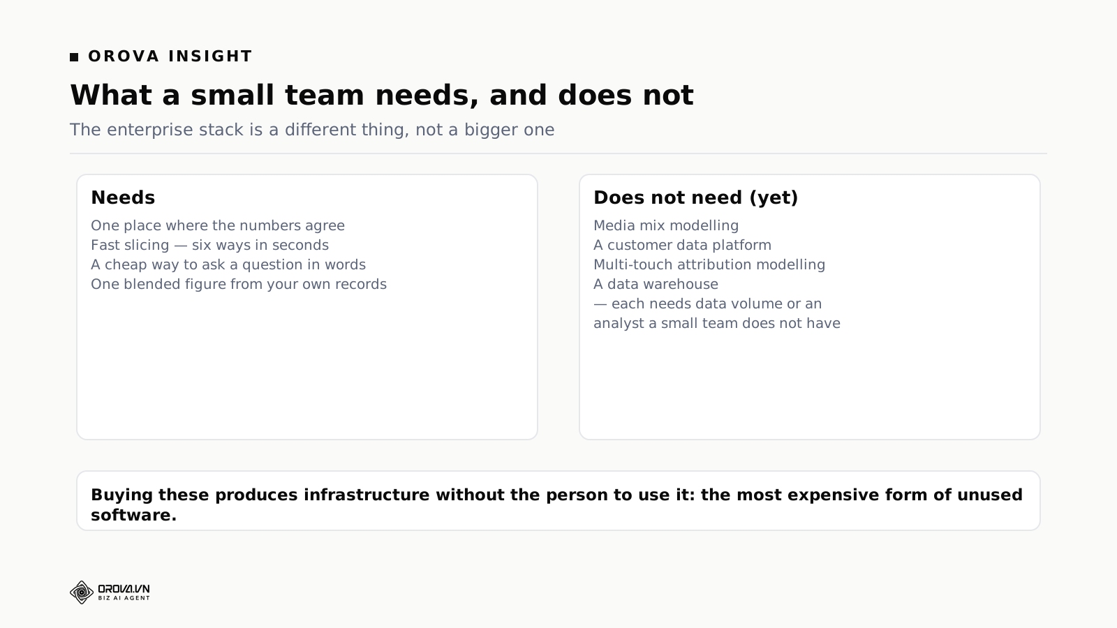
The analytics stack sold to enterprises is not a smaller version of what a small team needs; it is a different thing. Four capabilities cover most of it.
One place where the numbers agree. Not sophisticated — consistent. Most disagreements inside marketing teams are definitional, and a single source with central definitions removes them without any analysis at all.
Fast slicing. The ability to break a number down by campaign, device, region, landing page or period in seconds. This is the diagnostic capability, and it is where a subscription pays back most reliably.
A way to ask a question in words. Not because natural language is magical, but because the barrier to investigation is usually the effort of building a new view. Lowering that barrier increases how often anyone investigates, which matters more than the sophistication of any individual answer.
One blended figure from your own records. As above. Cheap, ungameable, and the anchor for everything else.
What a small team does not need: media mix modelling, a customer data platform, multi-touch attribution modelling, or a warehouse — not because these are bad, but because each requires either data volume or an analyst that a small team does not have. Buying them produces infrastructure without the person to use it, which is the most expensive form of unused software.
How Orova Insight fits
Insight is the analytics and reporting module inside Orova, and it sits squarely in the descriptive-and-diagnostic space rather than the causal one.
Twelve sources connect directly: GA4, Search Console, Google Ads, Meta pages, Meta Ads, Instagram, Threads, TikTok, TikTok channels, YouTube, LinkedIn and LinkedIn Ads — plus Zalo, which matters in Vietnam and is missing from most Western products.
Google Sheets syncs in as a first-class source, including merged tabs and multi-level headers, because a meaningful share of the numbers that belong in a marketing analysis live in a spreadsheet somebody maintains: offline sales, agency invoices, targets, a manual pipeline. Files upload directly too, and you can declare your own API source when a number lives somewhere nobody has built a connector for.
Metrics are defined centrally, so two views cannot quietly disagree about what a lead is — which removes the class of argument that is really about definitions.
There is an analyst you can ask questions of, in words, which answers with charts as well as text, plus AI widgets that live on a dashboard. This is the diagnostic capability described above: the value is that asking is cheap, so investigation happens more often.
Dashboards are versioned with restore, snapshots, sharing and a live view for people without accounts, and reports send themselves on a schedule.
What it does not do
It is not a business intelligence platform in the warehouse-plus-modelling sense: no data warehouse, no SQL modelling layer, no semantic layer for an analyst to build against. If the requirement is joining marketing to finance and product data across years, a warehouse is the right answer and this is not it.
It does not run incrementality experiments or media mix modelling, and it will not tell you what would have happened if you had not advertised. It does not validate your data either — a conversion event firing twice produces a clean chart of the wrong number.
The questions worth asking of your data, in order
Analysis without a question produces a tour of the data and no decisions. Five questions cover most of what a small marketing team needs, and they are worth asking in this order because each depends on the last.
Is the total working? Blended spend against new customers, against margin. If this is failing, channel-level optimisation is rearranging deck chairs. If it is comfortable, most channel-level worries are not urgent.
Where is the money going that produces nothing? Not the worst-performing channel — the specific campaigns, search terms, audiences, and placements with meaningful spend and no outcomes. This is almost always the largest recoverable sum in an account that has run without close supervision, and it requires no sophistication to find.
What changed, and when exactly? When a number moves, the date matters more than the magnitude, because the date lets you match it against things you did. Half of unexplained performance changes turn out to coincide with a deploy, a price change, a competitor's campaign, or a tracking edit.
Where do people leave? The step-by-step drop between arriving and buying. This is the analysis that points at work outside the ad account, which is why it gets skipped — the fix belongs to someone else.
What would we stop if we had to cut a fifth? A hypothetical that clarifies priorities faster than any ranking. Teams who can answer it immediately have a real view of what is working; teams who cannot are usually maintaining spend by inertia.
Notice that four of the five are answerable with descriptive and diagnostic capability alone. Only the first brushes against causality, and it does so crudely and usefully.
Five ways analytics goes wrong
Precision mistaken for accuracy
A tool reporting cost per acquisition to two decimal places implies a confidence the underlying data does not support. Conversion tracking loses events, platforms revise figures for days, and attribution is a convention. The number is an estimate with a range, and treating it as exact leads to decisions based on differences that are inside the noise.
A practical habit: before acting on a change, ask whether it is larger than the variation you see week to week when nothing happened. Most are not.
Slicing until something looks significant
Break any dataset enough ways and some segment will look dramatic. Mobile users in one region on Tuesdays convert at half the rate — and it is eleven conversions, which is noise wearing a pattern's clothes. The discipline is to decide the segments you care about before looking, and to require a minimum volume before any slice earns a decision.
Analysing instead of testing
The most common substitution in marketing. A question that would take two weeks to answer with an experiment gets answered in an afternoon with a chart, and everyone prefers the afternoon. The chart cannot answer it, so what gets produced is a confident hypothesis presented as a finding. If the decision is large, run the test.
Reporting on things nobody can change
Every dashboard accumulates metrics that are interesting and inert. The test for a metric is not whether it is meaningful but whether anyone can do anything about it. Brand search volume, industry benchmarks, competitor estimates — real numbers, no lever.
Waiting for the data to be clean
The opposite failure, and it delays decisions indefinitely. Data is never clean. The question is whether it is clean enough for the decision in front of you, and for most decisions — stop this, spend more there — approximate numbers are sufficient. Reserve the reconciliation effort for numbers that will be quoted outside the team.
Running an experiment without a platform
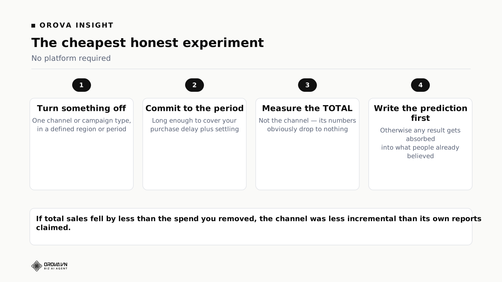
Since the causal question is the one people want answered and no tool answers it, it is worth describing the cheapest honest version.
Pick something you believe is working and turn it off. One channel, or one campaign type, in a defined region or for a defined period. This is uncomfortable, which is why it is rarely done and why it produces information nothing else does.
Choose the period before you start, and commit. Long enough to cover your typical purchase delay plus a settling period. Stopping early because the numbers look bad is the most common way these tests get abandoned, and abandoning halfway produces no information at all.
Measure the total, not the channel. The channel's own numbers will obviously drop to nothing; that is not the finding. The finding is what happened to total sales. If total sales fell by less than the spend you removed, the channel was less incremental than its reports claimed.
Write down what you expect first. A prediction, in writing, before the test. Without it, any result gets absorbed into whatever people already believed, and the test teaches nobody anything.
One test of this kind, run properly, is worth more than a year of attribution modelling for a small business — and it costs nothing except nerve and some foregone revenue during the period.
Build, buy, or use what the platforms give you
Three routes, and the third gets dismissed too quickly.
Platform-native reporting plus a spreadsheet. Free, already available, and adequate for a team running two channels. Its cost is the assembly time and the definitional drift between two people's versions of the same metric. For a team of one or two, that cost is small.
Buying a tool. You get connections you do not maintain, central definitions, and fast slicing. The failure mode is a subscription for capability nobody uses, which happens when the purchase was aimed at the causal question.
Building a pipeline into a warehouse. Right when requirements are genuinely unusual and someone owns it as part of their job. The build is quick and the maintenance is permanent — platform APIs deprecate on their own schedule, tokens expire, fields get renamed, and all of it lands without warning on whoever built it. The worst outcome is silent partial data: six of seven sources returning, a report that looks complete and is wrong.
For most companies under fifty people the honest ranking is: fix the definitional drift first, which is free; then buy if slicing speed is the constraint; and build only if there is a named owner whose job includes it.
Eight questions for a demo
- Connect one of my accounts now. Mine, with its permissions, not the sample workspace.
- Slice this number six ways in front of me. Campaign, device, region, landing page, period, and something I name on the spot. Time it.
- How do you handle conversions from two platforms in one total? Listen for whether overlap is mentioned unprompted.
- Define a custom metric and show it appearing in two views.
- Import the spreadsheet my colleague actually maintains. Merged cells, two header rows, the real file.
- What happens when a source fails? Blank, stale, or a warning?
- Ask the built-in analyst something I care about, in words, and judge the answer rather than the interface.
- Export everything. If leaving is hard, that is part of the price.
Notice that none of these ask about attribution models, forecasting, or predictive scoring. Those demo well and they are not what the tool will be used for on a Tuesday.
What changes with scale
The right analytics setup shifts at two predictable points.
When one person can no longer hold the account in their head. Up to that point, a knowledgeable person plus platform reporting outperforms most tooling, because they carry context no metric captures. Past it, consistency starts beating expertise, and central definitions become the highest-value thing you can buy.
When someone's job is analysis. An analyst changes the calculation entirely: they can work with a warehouse, they need flexibility more than prebuilt views, and prebuilt tools start to feel constraining. Buying warehouse infrastructure before that person exists produces rows nobody models.
Between those two points — which is where most companies of ten to eighty people live — the answer is a tool with reliable connections, central definitions, fast slicing, and a low barrier to asking questions. That is a narrower requirement than the category's marketing implies, and it is worth resisting the upgrade path until one of the two transitions actually arrives.
The definitional work that comes before any analysis
Most arguments a marketing team has about numbers are not analytical. They are two people using the same word for different things, confidently, in the same meeting. Four definitions are worth writing down before buying any tool, because no tool resolves them and every tool will happily compute both versions.
What counts as a lead. A form submission is not a lead if half of them are unqualified. Pick the point in the process where the business would agree something real happened, and define the metric there. Teams reporting form fills as leads systematically overstate performance and then wonder why the sales team disputes the numbers.
What goes into acquisition cost. Media spend obviously. Agency fees, tool subscriptions, and the time of the person running it — less obviously, and the answer changes the figure substantially. There is no correct answer, only a consistent one. Write down which version you use and stop switching.
What "new" means. A new customer, a new account, or a first purchase in twelve months? Businesses with returning customers get very different numbers from each, and the choice determines whether your acquisition cost looks healthy.
What period a number belongs to. The day of the click or the day of the sale. Platforms use the click; your accounts use the sale. Comparing one to the other produces a monthly discrepancy that recurs forever and gets rediscovered by each new person who joins.
Half a day on those four definitions removes more confusion than any analytics purchase, and it makes the purchase more valuable when it happens, because a tool with central definitions can only enforce definitions you have actually made.
Reading a number that moved
A small procedure, worth having as a habit, for the most common analytical task in marketing: a metric changed and someone wants to know why.
First, check whether it actually moved. Compare against the variation of the last eight comparable periods, not against last period alone. A large share of investigations end here, and ending here is a win — you have saved an afternoon and avoided a decision made on noise.
Second, check the data before the world. Did a tracking change ship? Did a source stop reporting? Is the period complete? Data explanations are more common than behavioural ones and much faster to rule out, and skipping this step is how teams construct elaborate market narratives to explain a broken tag.
Third, decompose rather than hypothesise. A cost per acquisition change is arithmetic: cost per click times clicks divided by conversions. Establish which of the three components moved before theorising about why. This single discipline eliminates most wrong diagnoses, because the intuitive explanation frequently belongs to a component that did not change.
Fourth, find the smallest unit responsible. Usually one campaign, one search term, or one landing page carries most of the movement. Aggregate changes are almost never uniform, and acting on the aggregate means acting on things that were fine.
Fifth, write one sentence. What moved, which component, which unit, and what is being done. If you cannot write the sentence, the investigation is not finished — and stopping without the sentence is how the same question gets asked again next month.
What analysis is worth on a small budget
An honest question worth asking before subscribing to anything: how much money is actually at stake in being right?
If monthly marketing spend is modest, the range of outcomes between a well-analysed and a badly-analysed month is smaller than it feels. Recovering a fifth of wasted spend on a small budget is a real saving and it may be less than the tool costs, and less than the hours spent using the tool are worth.
This is not an argument against analysis; it is an argument for proportion. On a small budget, the highest-return analytical activity is finding spend that produces nothing, which requires no sophistication — a search term report and an afternoon covers most of it. The sophisticated capabilities earn their price when the sums are large enough that a percentage point matters.
The corollary is worth stating too. On a small budget the largest available gains are usually not analytical at all. They are in the offer, the landing page, and the follow-up speed — three things that change conversion rate, which is the multiplier on everything else. A team spending a lot of attention on attribution while the enquiry response time is two days has the priorities inverted, and the analysis will keep confirming that the channels are mediocre without ever pointing at the reason.
The report nobody asked for that changes the most
One artefact is worth producing even though no stakeholder will request it: a monthly page listing what you stopped doing and why.
Marketing reporting is almost entirely additive. It records what was launched, what was spent, what was produced. The decisions to stop — a campaign closed, an audience dropped, a channel paused — leave no trace, which means the reasoning behind them evaporates and the same things get restarted eighteen months later by someone who was not in the room.
Four lines a month covers it. What was stopped, what it was costing, what result triggered the decision, and what would have to change for it to be worth revisiting. It takes five minutes and it is the only part of your reporting that gets more valuable with age.
Where AI helps in analytics, and where it does not
Every product in this category now advertises AI, and it is worth separating the two things the phrase covers, because they have different value.
Lowering the cost of asking. This is the genuinely useful one. Building a new view to answer a passing question costs enough effort that most passing questions go unasked. Being able to type the question in words and get a chart back changes the frequency of investigation, and frequency is what turns a reporting setup into a diagnostic one. The answer does not need to be brilliant; it needs to arrive before the curiosity fades.
Generating conclusions. This is the one to be careful with. A summary that says cost per acquisition rose because competition increased is a plausible sentence generated from a pattern, not a finding. It reads exactly like an insight, and it is frequently the wrong one — because the actual cause was a tracking change, an incomplete period, or a single campaign that a decomposition would have identified in a minute.
The practical rule: treat generated observations as hypotheses to check rather than as answers. Specifically, check them against the decomposition — which arithmetic component moved — because that is a fact rather than a narrative, and the narrative is where these systems go wrong.
There is also a quieter benefit worth naming. Explaining a number in words to a colleague who lacks context is real work, and a system that drafts that explanation saves genuine time even when you rewrite it. The draft is the tedious part; the judgement about what matters is not, and that part stays yours.
What none of it does is remove the need to have decided what you are measuring, why, and against what threshold. Those three decisions determine whether any analysis — automated or otherwise — produces a decision or a document. A team with clear definitions and a modest tool consistently outperforms a team with excellent tooling and four versions of what a lead is.
Two habits that outperform most tooling
Both are free, both take under an hour a month, and in small teams they reliably produce more value than the difference between two analytics products.
The waste review. Once a month, list every campaign, search term, audience and placement with meaningful spend and no outcomes over a defined window. Then act on the list — exclude, pause, or consolidate. That is it. In accounts that have run without close supervision, this single hour typically recovers between a fifth and a third of spend, and it requires no model, no attribution convention, and no sophistication whatsoever.
The reason it works is unglamorous: waste accumulates continuously and nobody is assigned to remove it. Every account drifts toward spending on things that were once reasonable, and the drift is invisible in aggregate metrics because the good spend hides it.
The written decision log. One line per significant change: what was changed, on what date, and what was expected. Ten seconds each, kept anywhere.
Its value appears six weeks later, when a metric moves and someone asks why. Instead of reconstructing history from memory — which reliably produces a narrative shaped by the current mood — you have dates to match against. Half of unexplained performance changes turn out to coincide with something the team did and forgot, and the log is what turns "the market got harder" into "we changed the landing page on the fourth".
The log also does something subtler: writing down what you expected forces the expectation to exist. A change made without a prediction cannot teach you anything, because any outcome is consistent with it. Teams who keep the log get better at forecasting their own account within a couple of quarters, and that improvement transfers to every future decision in a way no dashboard does.
Neither habit is a substitute for tooling — the waste review is much faster with fast slicing, and the log is more useful when you can pull up the numbers around a date. But both work without any purchase, and a team that will not sustain them will not be rescued by software that makes them slightly easier.
What good looks like after six months
Four signs, and none of them is a more sophisticated model.
Arguments about numbers have stopped. Not arguments about strategy — those should continue. Arguments about whether a figure is right, which are definitional and are the ones central definitions eliminate.
Investigation happens without being scheduled. Someone notices something odd and looks into it in ten minutes rather than adding it to a list. This is the diagnostic capability actually being used, and it is the return on the subscription.
At least one experiment has been run. A holdout, a geographic split, something with a written prediction. Teams who never run one keep having the same unresolvable argument about incrementality for years.
Somebody deleted a metric. Contraction is a sign of ownership. A reporting setup that only grows is one nobody is responsible for, and by month twelve it will contain figures whose definitions nobody remembers.
If none of those four are true after six months, the usual cause is that nobody owns the fifteen minutes a month it takes to keep definitions and dashboards honest — and without that owner, the most capable analytics tool available becomes an expensive way to produce numbers that nobody quite trusts.
The short version
Marketing analytics tools answer descriptive questions reliably, diagnostic questions partially and usefully, and causal questions not at all. Most disappointment comes from buying for the third and receiving the first two. The causal question needs an experiment, which is a decision rather than a purchase.
Attribution is a bookkeeping convention, not a measurement. Pick one and keep it, never sum platform-reported conversions, and hold one blended figure from your own records that no platform can influence — it is the thing that tells you when the channel story has drifted from reality.
What a small team needs is narrow: one place where the numbers agree, fast slicing, a cheap way to ask a question, and that blended anchor. What it does not need is media mix modelling, a customer data platform, or a warehouse, because each requires data volume or an analyst that a small team does not have.
Ask the five questions in order, require a minimum volume before any slice earns a decision, and when the decision is large enough to matter, turn something off for a defined period and measure the total instead of modelling it.
None of which requires the most sophisticated product on the market. It requires four definitions written down, one place where the numbers agree, the ability to slice quickly, and the nerve to turn something off once a year to find out whether it was doing anything. That is a short list, and it is most of what analytics can honestly offer a company that is not yet employing someone to do analysis full time.
Whatever you buy, keep the four definitions on one page where new joiners can read them. Most of the confusion this article describes gets reintroduced by the next person to arrive, simply because nobody wrote down what a lead was.
Related reading: blended CAC explained, the vanity metrics quietly wasting your time, and from dashboards to decisions. The definitional work above is worth doing on paper regardless of what you buy — it is the input that decides whether any tool produces decisions or documents. If you want to see central metric definitions, twelve connected sources including Zalo, and an analyst you can question in words, that is at orova.vn.
Ask in words, get a chart
Orova Insight defines metrics centrally, connects twelve sources including Zalo, syncs real spreadsheets, and has an analyst you can question in words instead of building a new view.
Try the analyst