
What is lead generation content marketing? A practical playbook

Lead generation content marketing is the practice of creating genuinely useful assets, such as checklists, templates, reports and calculators, and offering them in exchange for a visitor's contact details so your sales team can follow up. If your blog gets traffic but your pipeline stays empty, this is usually the missing piece: visitors come, read, and leave without a trace. Traffic alone does not pay the bills; you need a mechanism to capture that interest. This guide shows how to build that system step by step: choosing a lead magnet you can make on a small budget, speeding up production with AI, a 15-point landing page checklist, the 20/80 rule for distribution, five copy-paste prompts for your nurture emails, and a spreadsheet model for calculating ROI. By shifting your focus from views to captured subscribers, your website can feed your sales team with qualified prospects week after week.
What is lead generation content marketing?
Lead generation content marketing is a strategic approach that involves creating valuable, relevant information assets and offering them to a target audience in exchange for their contact details. It serves to transition anonymous website visitors into identifiable prospects, distinct from general content marketing which focuses primarily on broad brand awareness.
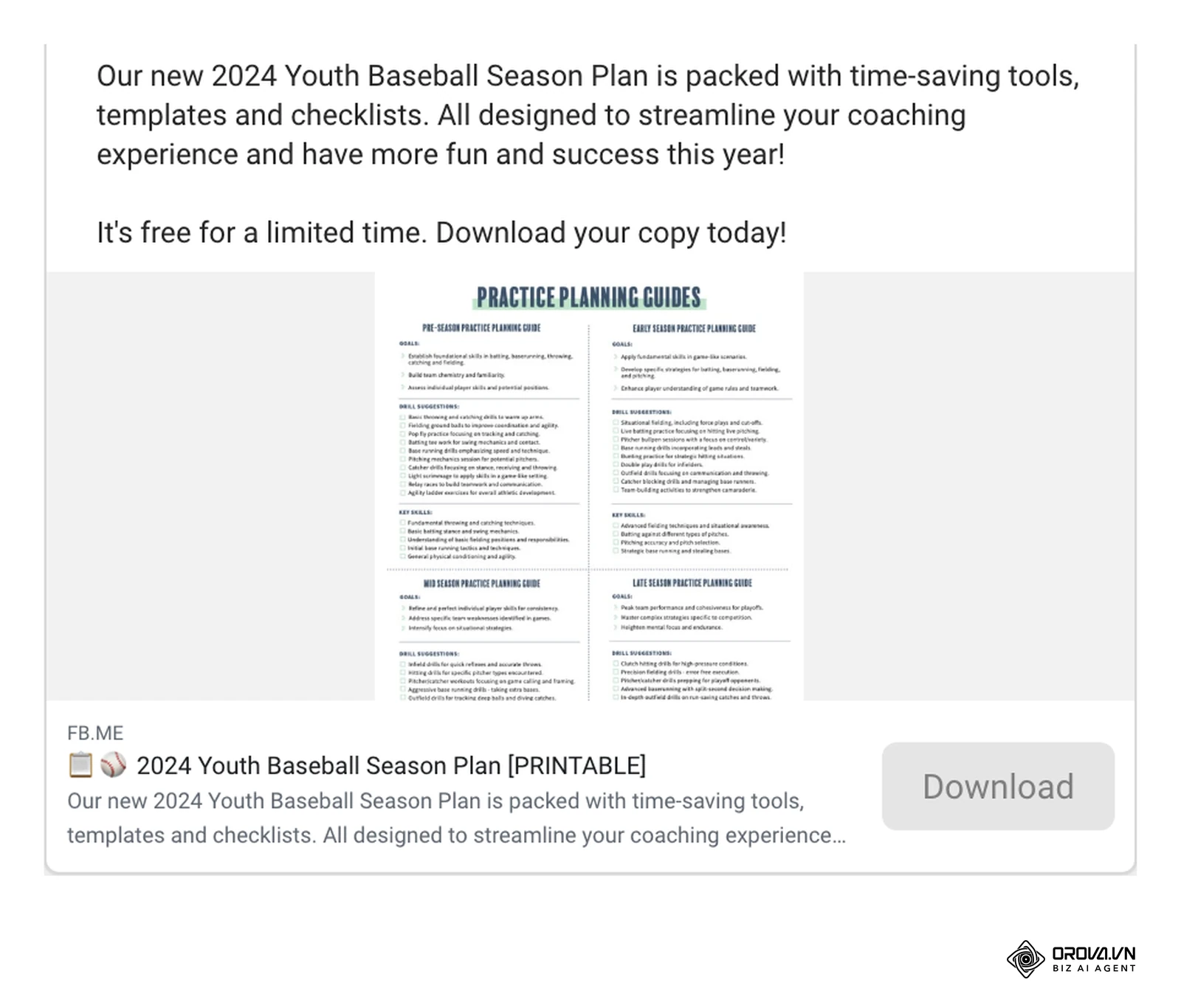
The concept originated from direct mail marketing, where companies would offer free informational booklets via magazine tear-outs to collect physical mailing addresses. Today, this exchange happens digitally. A business offers a premium digital asset, and the user pays for it not with a credit card, but with their email address and professional details.
To fully understand this concept, we need to distinguish it from related industry terms that are often used interchangeably but serve different operational purposes.
| Concept | Key Difference | Practical Example |
|---|---|---|
| Content Marketing | Broad focus on building brand trust and driving general website traffic. Open access. | A public blog post about industry trends that anyone can read without logging in. |
| Lead Generation Content Marketing | Narrow focus on acquiring contact data to build a sales pipeline. Gated access. | An exclusive industry report that requires filling out a form to download. |
| Inbound Marketing | The overarching philosophy of pulling customers in, which encompasses both of the above. | Using SEO to rank the blog post, which then links to the gated report. |
Imagine you are walking through a crowded grocery store. A vendor handing out free cheese samples on toothpicks is doing general content marketing. Anyone can take a sample and walk away. But if that vendor says they will give you a complete, beautifully printed recipe book for free, provided you join their loyalty program and give them your phone number, that is lead generation content marketing. They have traded high-value information for a direct line of communication.
The strategic role of lead generation content marketing
Lead generation content marketing exists to solve a very specific problem for growing companies: the anonymous traffic leak. When a company invests heavily in building an audience, but has no system to capture who those people are, they are essentially renting attention rather than owning an audience. This strategy exists to capture the contact information of potential buyers who are interested in a topic but are not yet ready to speak to a sales representative or make an immediate purchase.
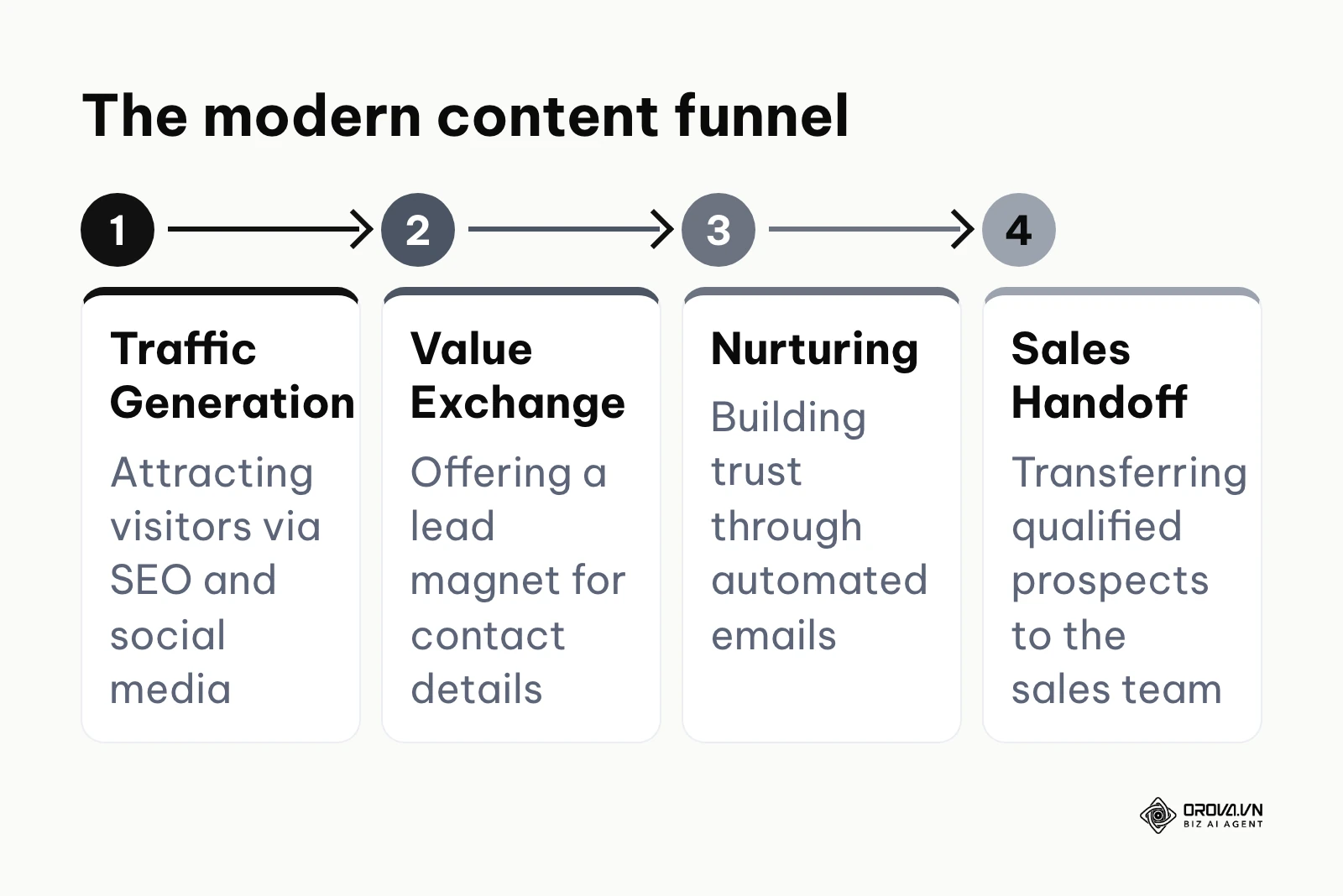
In the big picture of a company's growth engine, this strategy sits squarely in the middle of the marketing funnel. At the top of the funnel, you have broad activities like public relations, social media broadcasting, and foundational SEO designed to generate initial awareness. At the bottom of the funnel, you have sales calls, product demonstrations, and pricing negotiations. Lead generation content is the crucial bridge that connects these two extremes. It takes the casual browser generated by top-of-funnel activities and qualifies them into a tangible record that the bottom-of-funnel sales team can pursue.
If you choose to ignore this strategy, you will suffer a severe loss of marketing efficiency. You will be forced to treat every website visitor as a cold prospect, meaning you have to constantly pay for advertising to reach the exact same people over and over again. Your sales team will waste countless hours trying to find people who are actually interested in your solutions, rather than focusing their energy on people who have already raised their hands by engaging with your premium materials.
When you don't need lead generation content marketing: If you are selling low-cost consumer goods, introducing a form to download a document before purchase creates unnecessary friction and hurts sales. In these scenarios, direct response advertising leading straight to a checkout page is far more effective. Additionally, if your business is completely overwhelmed with current demand and you have zero sales capacity to follow up with new prospects, capturing more emails will only waste resources and frustrate potential customers who expect a timely response.
Tangible value and benefits of content lead generation
The benefits of implementing this strategy can be divided into two distinct layers: the macro value it brings to the business organization, and the micro benefits it provides to the operators performing the daily work.
Business value: Predictable revenue and lower acquisition costs
For a business, the most critical value is financial predictability. When you rely solely on referrals or outbound cold calling, revenue fluctuates wildly. By building a digital asset library that consistently converts a steady percentage of website traffic into leads, a business can forecast future sales with much higher accuracy. Furthermore, once an asset is created, it can generate leads for years with minimal additional investment, drastically lowering the overall customer acquisition cost compared to continuously running expensive direct response advertisements.
Illustrative example:
- Context: A mid-sized financial consulting firm struggling with unpredictable monthly revenue from traditional networking.
- Actions taken: They developed a comprehensive tax planning checklist for small businesses and promoted it across their website. They set a modest monthly advertising budget to drive traffic specifically to this checklist.
- Hurdles and solutions: Initially, the leads generated were not qualified because the checklist was too generic. They updated the asset to focus exclusively on tax planning for companies with over one million dollars in revenue, which filtered out unqualified startups.
- Results: By the end of the year, this single asset generated a predictable stream of forty qualified leads per month, stabilizing their sales pipeline and reducing their reliance on expensive offline networking events.
Business value: Mitigating platform risks with owned audiences
Every company that builds an audience on social media platforms or search engines is essentially building a house on rented land. Algorithm changes can wipe out your visibility overnight. By using content to capture email addresses, you transition your audience from a rented platform to an owned database. You secure the ability to contact your prospects directly, at any time, without having to pay a platform for the privilege of reaching them.
| Factor | Rented attention (social, search) | Owned audience (email list) |
|---|---|---|
| Who controls reach | The platform's algorithm | You |
| Cost to contact again | Pay per impression or click each time | Close to zero per send |
| Risk if rules change | Visibility can drop overnight | The list stays yours |
Operator benefit: Shifting from cold pitching to inbound consulting
For the sales representatives and marketers doing the daily work, the biggest benefit is a shift in dynamic. Cold pitching is exhausting and often faces immediate rejection. When a prospect has downloaded an in-depth guide written by your company, they already recognize you as an authority. The sales conversation changes from an aggressive pitch to a consultative discussion based on the specific topics the prospect was reading about.
Illustrative example:
- Context: A sales representative at a B2B software company who previously spent eight hours a day cold calling lists of generic industry contacts.
- Actions taken: The marketing team launched an ebook about optimizing supply chain logistics. The sales representative was instructed to only call people who had downloaded this specific ebook.
- Hurdles and solutions: The sales rep initially struggled to transition from a hard sell script to a consultative approach. The marketing team provided a modified script that opened the conversation by asking for the prospect's feedback on chapter three of the ebook.
- Results: The representative found that prospects were significantly more receptive to the calls. Their meeting booking rate increased sharply, and they experienced far less daily rejection, vastly improving their job satisfaction.
Operator benefit: Automating the initial qualification process
Marketers often spend hours manually reviewing lists to see who is worth contacting. A well-designed lead generation system automates this. By observing which specific assets a prospect downloads and what information they provide in the form, the system can automatically assign a score. High-scoring prospects are sent instantly to sales, while low-scoring ones are kept in automated email loops.
| Primary Benefit | Measured By | Time to See Results |
|---|---|---|
| Predictable Pipeline | Number of net new leads generated per month | 2 to 4 weeks |
| Lower Acquisition Cost | Cost Per Lead (CPL) and Customer Acquisition Cost (CAC) | 3 to 6 months |
| Platform Independence | Total size of the active email subscriber database | 1 to 3 months |
| Improved Sales Efficiency | Lead-to-meeting conversion rate | 4 to 8 weeks |
Discover Orova.vn – a Biz AI Agent platform with OROVA SEO, a complete solution for every website. The system supports search engine optimization from A to Z with features including keyword research, writing new SEO-ready articles, optimizing existing content, rank tracking, plus competitor analysis and in-depth technical analysis. Sign up today to experience OROVA SEO completely free (offer valid through July 7, 2027).
How a high-converting lead generation content engine works
Building a successful system is not just about writing a document and putting it online. It requires a synchronized engine of creation, conversion optimization, distribution, and automated nurturing. We will break down this anatomy step by step, addressing the most critical gaps that cause typical campaigns to fail.
The zero-budget lead magnet strategy for small businesses
Many companies delay their campaigns because they believe they need a massive budget to hire graphic designers and researchers to create a hundred-page industry report. This is a misconception. If you are operating with zero budget, the most effective strategy is to create highly functional, micro-assets.
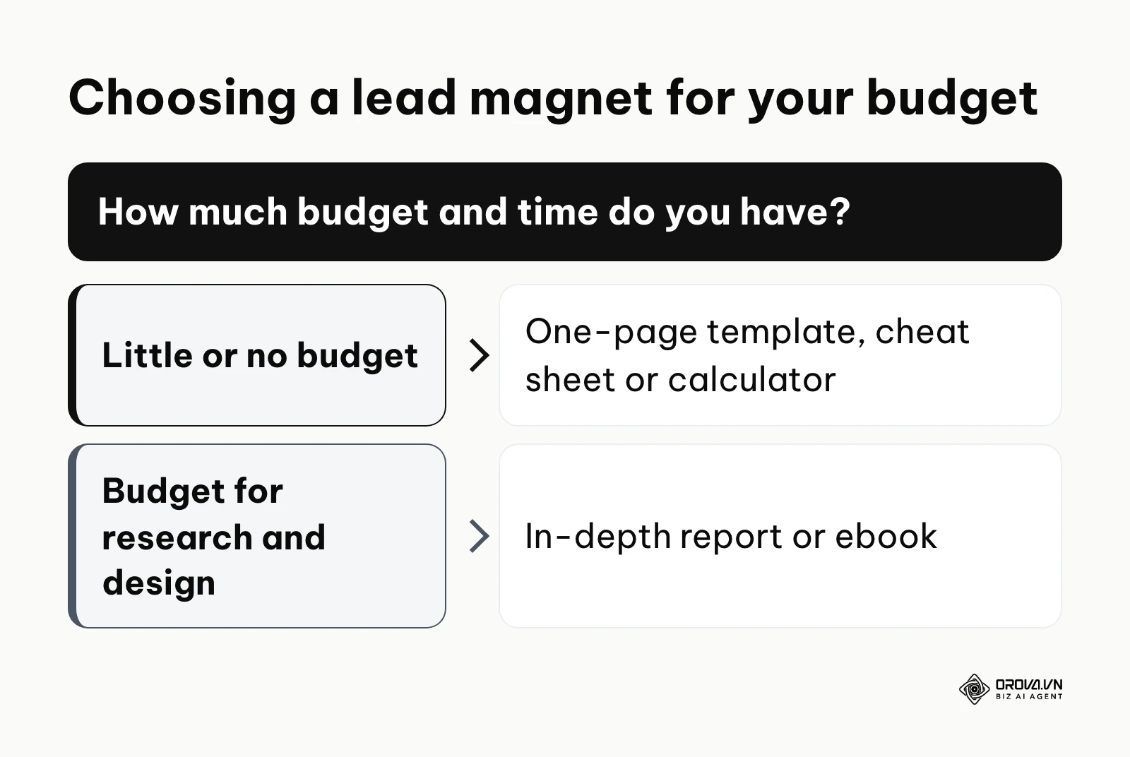
Instead of an ebook, create a one-page template, a cheat sheet, or a calculator. For example, if you are an accounting firm, do not write a book about tax theory; offer a simple spreadsheet template that helps businesses calculate their quarterly estimated taxes. These micro-assets take only a few hours to build, cost nothing, and often convert at higher rates because they promise an immediate solution to a very specific problem. The key is to stop thinking about volume and start thinking about utility.
Accelerating lead magnet creation with AI
The traditional process of creating a comprehensive lead magnet could take weeks. Today, using AI tools can compress this into a single afternoon, solving the massive bottleneck of content production. However, simply asking an AI to "write an ebook" will result in generic, unhelpful content. You must use AI as a structured assistant.
First, use an AI model to generate a comprehensive outline based on the specific pain points of your target audience. Second, feed the AI your proprietary data, past blog posts, or transcripts of your sales calls, and instruct it to draft individual sections using your unique insights. This ensures the content is original and valuable. Finally, paste the refined text into a design tool such as Canva to format it into a clean, professional PDF document. By mastering these AI workflows, your team can test multiple different asset concepts in the time it used to take to build just one.
Landing page conversion rate optimization and the 15-point checklist
The most common point of failure in b2b content marketing lead generation is the landing page. You can create the best asset in the world and drive thousands of visitors to it, but if the page is poorly designed, no one will fill out the form. You must apply rigorous conversion rate optimization principles.
A common recommendation among landing page specialists is to remove external navigation links from a dedicated download page so nothing pulls attention away from the form. When visitors arrive, they should have only two options: fill out the form or close the browser tab.
Here is the definitive 15-point checklist to review before you launch any download page:
- Remove all navigation menus: Hide your main website header and footer links to prevent distraction.
- Clear headline proposition: The main text must state exactly what the user is getting and the primary benefit.
- Action-oriented subheadline: Support the main headline with a brief sentence explaining the value exchange.
- Professional hero image: Show a tangible, high-quality visual representation of the digital asset (e.g., a 3D book mockup).
- Bullet point benefits: Do not write long paragraphs. Use three to five concise bullet points detailing what the reader will learn.
- Minimize form fields: Only ask for the information you absolutely need to take the next step. Every extra field reduces conversions.
- Use progressive profiling: If you have advanced software, set the form to ask different questions if the user has already downloaded something previously.
- Clear field labels: Ensure users know exactly what format of information is expected in each box.
- Prominent privacy statement: Place a small, reassuring line of text below the form ensuring you will not spam them.
- High-contrast CTA button: The submit button must visually stand out from the rest of the page design.
- Actionable button text: Never use the word "Submit." Use phrases like "Send Me the Guide" or "Download Now."
- Include social proof: Add one or two short quotes from people who have found the asset useful.
- Display trust badges: If applicable, show logos of companies that use your services or industry security badges.
- Test mobile responsiveness: Physically check the page on a smartphone to ensure the form is easy to tap and type into.
- Verify the thank you page: Ensure that after submitting, the user is redirected to a clear page that delivers the promised asset immediately.
The 20/80 rule of content distribution and ad integration
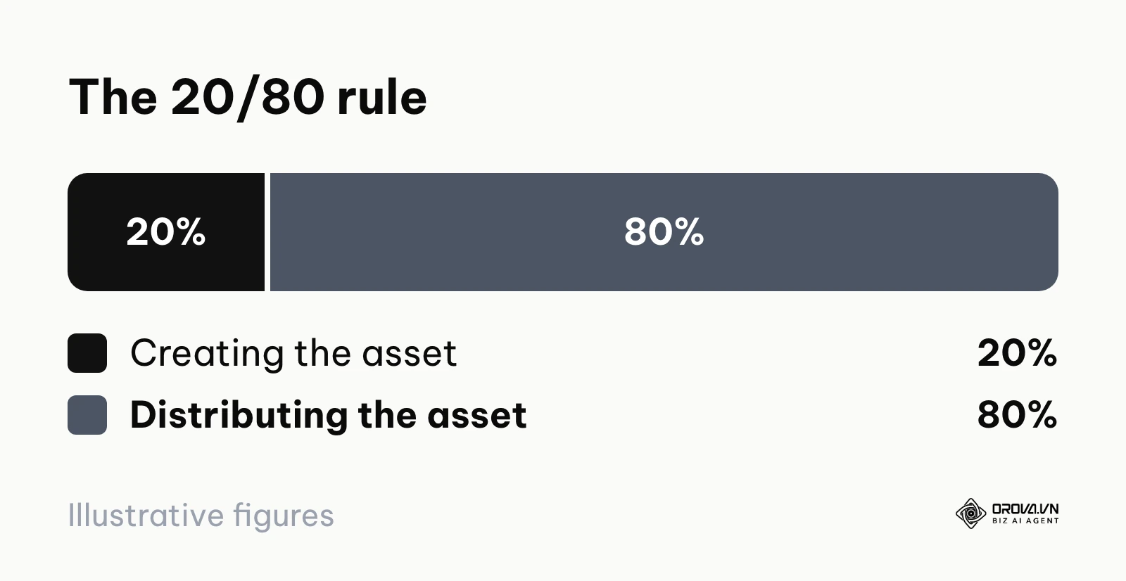
A tragic mistake marketers make is spending eighty percent of their resources creating the perfect asset, and only twenty percent distributing it. The reality of how to create a lead magnet that actually works dictates that this ratio must be flipped. You must adhere to the 20/80 rule: spend twenty percent of your time and budget on creation, and eighty percent on aggressive distribution.
If you have a budget, integrate search and social media advertisements immediately. Run targeted ads specifically designed to drive traffic directly to your optimized landing page. Do not rely solely on organic traffic, as it can take months to build. Use ads as the primary engine to validate if people actually want your asset. Once you find a message that works, scale the budget.
Designing the automated email nurture sequence
Once a user downloads your asset, the job is not done; it has just begun. You must have an automated email sequence ready to build trust and move them closer to a purchase decision. Segmented, behavior-based nurture sequences tend to earn more engagement than one-size-fits-all broadcast emails.

You can use AI to rapidly draft this sequence. Here is a framework of 5 essential prompts to copy and paste into your AI assistant to generate your email series:
- The Welcome Prompt: "Write a short, warm email delivering a digital guide titled [Title]. Thank the reader, provide a clear download link, and set the expectation that I will send them a few more helpful tips over the next week. Keep the tone professional but approachable."
- The Problem Agitation Prompt: "Write an email focusing on the common pain point of [Insert Problem]. Explain why this problem is costing businesses money, and reference how the concepts in our recently downloaded guide help address this. End with an open-ended question asking if they are currently facing this issue."
- The Value Add Prompt: "Write an email that provides a brand new, actionable tip related to [Topic] that was not included in the original guide. The goal is to prove we offer ongoing value, not just a one-time transaction. Keep it under 200 words."
- The Objection Handling Prompt: "Draft an email addressing the most common objection our prospects have: [Insert Objection]. Provide logical reassurance and a brief, anonymized example of how a client successfully overcame this concern by working with us."
- The Soft Pitch Prompt: "Write a concise email transitioning from education to a sales proposition. Briefly summarize the value we've discussed over the past few emails, and offer a no-pressure, 15-minute consultation call to discuss how these strategies apply to their specific situation. Include a clear calendar link."
Filtering junk leads and balancing gated vs. ungated content
A major debate in the industry is whether to gate content (require a form) or leave it ungated (open access). The answer depends on your primary goal. If you desperately need broad brand awareness and SEO rankings, leaving content ungated is superior. However, if your sales team is starving for qualified contacts, you must gate your premium assets.
The challenge with gated content is the influx of junk leads—people who enter fake emails or have no purchasing power just to get the free document. To filter these out, you must implement strategic friction. Do not just ask for an email; ask for their company name and their biggest current challenge. A student doing research will abandon a long form, but a serious buyer experiencing a real problem will take the time to fill it out. Furthermore, ensure your email system only delivers the asset to their inbox, rather than displaying it immediately on the screen, which forces users to provide a legitimate, working email address.
A worked campaign example and ROI calculation
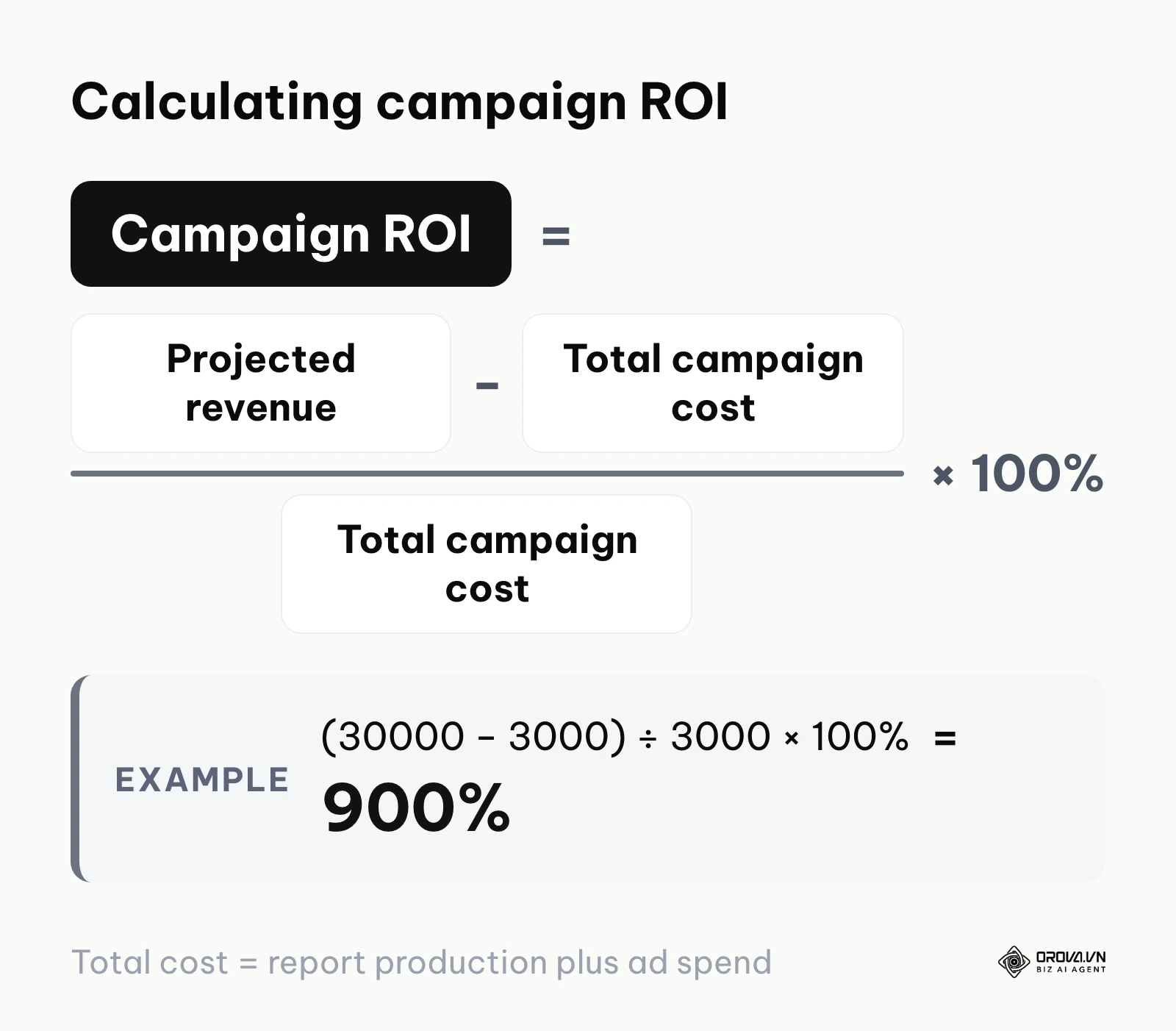
To understand the financial mechanics, we must look at a complete mathematical model. Let's build a conceptual Google Sheets layout to calculate the Return on Investment (ROI) of a lead generation campaign.
Illustrative example:
- Context: A B2B consultancy launched an industry benchmarking report, aiming to acquire new clients with an average lifetime value (LTV) of 10,000 dollars.
- Actions taken: They spent 1,000 dollars producing the report and allocated 2,000 dollars to LinkedIn advertisements. They tracked the entire funnel meticulously.
- Hurdles and solutions: In the second week, they noticed the cost per click was too high. They refined their ad targeting to exclude junior titles, which lowered the click volume but doubled the form completion rate.
- Results: The campaign generated highly profitable returns, proving the model to the executive board.
If you were building this in a spreadsheet, your rows would look exactly like this:
| Row | Line item | Value | Formula |
|---|---|---|---|
| 1 | Total ad spend | 2,000 dollars | Input |
| 2 | Cost per click (CPC) | 2 dollars | Input |
| 3 | Total traffic generated | 1,000 visitors | Row 1 ÷ Row 2 |
| 4 | Landing page conversion rate | 10% | Input |
| 5 | Total leads generated | 100 leads | Row 3 × Row 4 |
| 6 | Cost per lead (CPL) | 20 dollars | Row 1 ÷ Row 5 |
| 7 | Lead-to-customer conversion rate | 3% | Input |
| 8 | Total new customers | 3 customers | Row 5 × Row 7 |
| 9 | Average lifetime value (LTV) | 10,000 dollars | Input |
| 10 | Total projected revenue | 30,000 dollars | Row 8 × Row 9 |
| 11 | Total campaign cost | 3,000 dollars | 1,000 production + Row 1 |
| 12 | Campaign ROI | 900% | (Row 10 − Row 11) ÷ Row 11 |
This mathematical framework is the ultimate asset you need to secure ongoing marketing budgets.
| Types of Lead Magnets | Defining Characteristics | Best Suited For |
|---|---|---|
| Ebooks & Whitepapers | Deep, comprehensive text exploring a single topic in detail. | Complex B2B industries requiring extensive education before a purchase. |
| Checklists & Cheat Sheets | Short, highly actionable summaries designed for immediate use. | Busy professionals looking for quick operational improvements. |
| Webinars & Video Courses | Scheduled live events or recorded video series. | High-ticket services where building a personal connection with the presenter is vital. |
| Calculators & Toolkits | Interactive spreadsheets or software snippets that process user data. | Financial, logistical, or technical fields where prospects need custom numbers. |
With OROVA.VN and the OROVA SEO module, you put an end to the exhausting days of manual work for good. Instead of struggling for hours to write articles and compile reports, the entire process is now optimized and completed in just 5 minutes.
How to adapt and build your lead generation content system
Different organizations must approach this transition with different operational priorities. You cannot apply a massive enterprise strategy to a tiny startup. Here is a tailored action plan based on your role.
For small business owners
As a small business owner, your primary constraints are time and capital. You cannot afford to build complex funnels that take months to launch.
- Identify the single most common question your best customers ask before buying.
- Create a simple, two-page PDF checklist answering that specific question.
- Build a basic landing page using a free or low-cost software provider.
- Promote this asset heavily on your personal social media profiles and organically in relevant community groups. This is a task you can launch before the end of this week.
- Manually email every person who downloads it with a personalized message offering a quick introductory call.
For in-house marketing managers
In-house managers face the challenge of aligning marketing metrics with actual sales results. Your goal is to build an automated, scalable engine.
- Interview three top-performing sales representatives to discover the exact friction points they encounter during early conversations.
- Develop a comprehensive digital asset that directly addresses and resolves those specific friction points.
- Implement a marketing automation platform to establish a strict lead scoring system based on engagement.
- Set up an automated email nurture sequence that runs continuously in the background.
- Create a reporting dashboard that tracks the cost per qualified lead, not just overall traffic, to prove financial viability to your executives.
For specialized content agencies
Agencies and freelancers must demonstrate clear ROI to retain clients. You need to move beyond just delivering words and start delivering systems.
- Shift your service offering from "writing blog posts" to "building complete lead generation funnels."
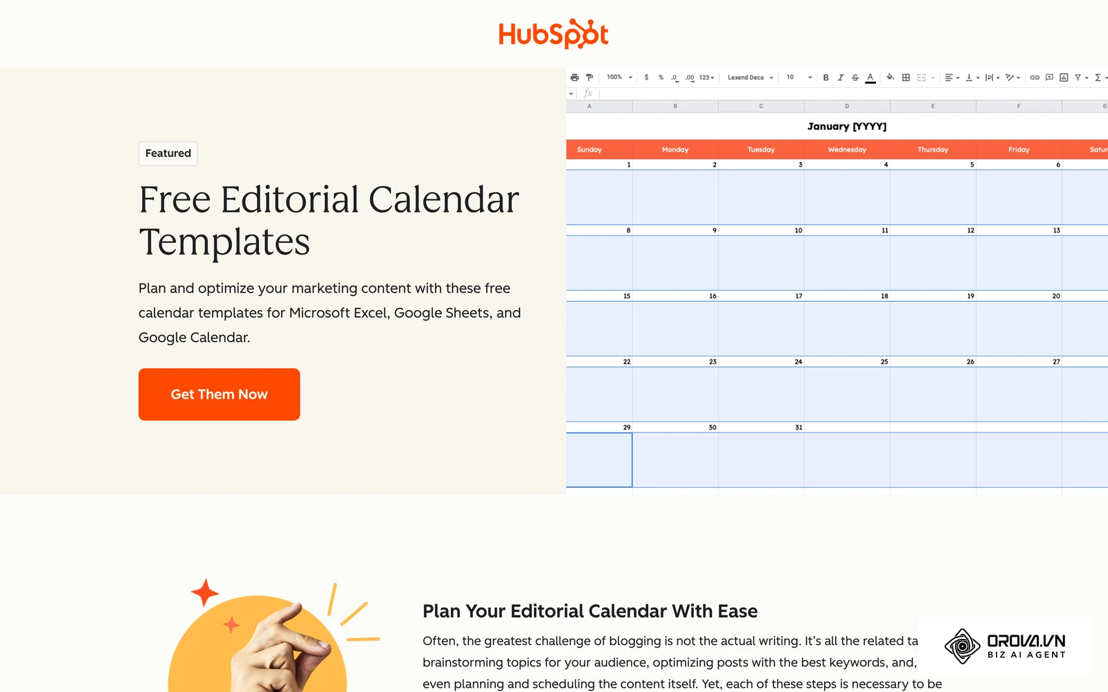
- Utilize a shared content calendar with your clients to coordinate when premium assets will launch alongside supporting blog content.
- Take responsibility for designing the landing page and writing the follow-up email sequences, ensuring a cohesive brand voice throughout the entire journey.
- Integrate your forms directly into the client's CRM software so leads appear instantly on their sales dashboard.
Illustrative example:
- Context: A freelance marketing consultant working with a local real estate agency that relied entirely on expensive billboard advertising.
- Actions taken: The consultant created a "First-Time Homebuyer's Neighborhood Guide" specific to their city. They set up localized search ads pointing to a simple download form.
- Hurdles and solutions: The real estate agents were too busy to call leads immediately. The consultant solved this by building a five-day automated text message and email sequence that prompted the leads to book their own viewings via a calendar link.
- Results: The agency acquired four new buying clients in the first month, proving that digital lead generation was far more cost-effective and trackable than their traditional billboard spend.
| Common Mistakes | Severe Consequences | How to Avoid and Fix |
|---|---|---|
| Asking for too much information upfront (e.g., phone numbers when not necessary). | Plunging conversion rates as users abandon the long, intrusive form. | Stick to name and email initially. Use progressive profiling later. |
| Creating assets about topics you care about, rather than what the audience needs. | High traffic but zero downloads because the value proposition is irrelevant. | Base asset topics strictly on sales team feedback and customer interviews. |
| Failing to test the technical delivery mechanism before launch. | Leads submit their information but never receive the promised file, destroying trust instantly. | Always perform a live test using an external email address before spending ad money. |
Where lead generation content marketing is heading in the next few years: the author's take
This section is opinion, not forecast data. Here are three shifts I think are worth preparing for.
Interactive micro-tools will take share from long static ebooks
I think the long static PDF is losing its pull as the default lead magnet. The signal today is that busy readers respond better to assets that give them a personalized answer, such as a calculator, a short diagnostic quiz or a simple assessment, than to fifty pages of theory. Over the next two to three years, my read is that these small interactive tools will become a far more common offer, especially as no-code and AI builders make them cheaper to produce. To prepare, audit your existing guides and list the ones that could become a tool where readers enter their own numbers. If building simple web tools stays expensive for small teams, checklists and templates will remain a sensible choice for longer.
Nurture emails will become more personalized
Most nurture sequences today are a fixed path: everyone gets the same five emails in the same order. My read is that AI writing tools will push marketers toward sequences that adapt to what each lead shared in the form and which assets they downloaded. I would not expect this to replace human judgment on tone and offers, but the gap between generic and tailored follow-up will become more visible to buyers. To prepare, collect clean, consistent data in your forms now, because personalization is only as good as the fields behind it.
Community channels will matter more for distribution
I think search will stay important but become less predictable as a single traffic source, because AI-generated answers now resolve many basic questions directly on the results page. Getting visitors to a landing page will take more than solid on-page SEO. My view is that more qualified leads will come from niche communities, private groups and industry forums where peers share and recommend useful assets. Start taking part in one or two of these communities as a helpful member now, so you have earned trust before you share your own resources.
Frequently asked questions about lead generation content marketing
Is lead generation content marketing still needed with AI?
Yes, it is absolutely still needed. While AI makes it drastically easier to generate text, it does not magically build a pipeline of qualified sales contacts for your business. AI tools change the speed of production, but the fundamental human psychology of exchanging contact information for proprietary, highly valuable insights remains the bedrock of business growth.
Should I gate all my high-value content?
You should not gate everything. You must strike a balance. Keep your educational blog posts, foundational guides, and high-level industry perspectives ungated to ensure maximum search engine visibility and brand awareness. You should only gate your most actionable, deeply researched, and practically useful assets—the materials that a prospect would realistically pay money to access.
How do I prevent competitors from downloading my resources?
It is nearly impossible to completely block a determined competitor. However, you can mitigate this by requiring a verified corporate email address (blocking free providers like Gmail or Yahoo) to access the download. Additionally, your marketing automation software can be configured to immediately flag and suppress leads originating from competitor domains, keeping them out of your sales team's active pipeline.
What is a good conversion rate for a lead magnet landing page?
Conversion rates vary widely by traffic source, industry and offer, so there is no single benchmark worth chasing. Cold traffic from ads usually converts noticeably lower than warm traffic from your email list or a closely related blog post. The most useful benchmark is your own: record your current rate, then test one change at a time (headline, form length, button text) and keep what moves the number. If a page converts far below your other pages with similar traffic, the offer probably does not match what visitors expected.
How long should an email nurture sequence be?
A standard initial sequence should last between five and ten days, consisting of three to five carefully spaced emails. The goal is to stay top-of-mind without becoming annoying. After the initial sequence concludes, leads who have not booked a meeting should be moved to a longer-term, less frequent newsletter list where they receive updates once or twice a month until they are ready to buy.
Where to start with lead generation content marketing?
Knowing where to begin depends entirely on the current maturity of your marketing operations. Choose the scenario below that best describes your situation and execute the single recommended step.
If you are starting completely from scratch with zero assets: Your first step is to interview your top sales representative for thirty minutes. Ask them to identify the one specific task that prospects struggle with the most before they decide to buy your product. Take their answer and spend one afternoon creating a simple, one-page PDF template that helps solve that exact problem. Do not worry about design perfection; focus entirely on practical utility.
If you already have scattered assets but no cohesive system: Your immediate task is to consolidate your traffic flow. Choose your single highest-performing blog post and insert a prominent, unmissable call-to-action right in the middle of the text, offering your best existing digital asset in exchange for an email. You likely already have the traffic and the asset; you simply need to connect them directly to stop the audience from leaving empty-handed.
If you are executing campaigns but not measuring financial results: You must establish your baseline metrics immediately. Spend an afternoon setting up a basic spreadsheet utilizing the ROI calculation framework discussed earlier. Gather your total ad spend for the last thirty days, count the exact number of leads generated, and track how many of those leads turned into paying customers. You cannot optimize a machine if you do not know its current operating speed.
About the author

Builder of Orova
Nguyễn Đỗ Trọng Ân has 8 years of experience in marketing, including 6 years managing market development across Asia. He builds Orova, a Biz AI Agent that never sleeps: it plans, runs and optimizes work for businesses.
Run your business with AI Agents
Orova is the always-on Biz AI Agent — it plans, runs, and optimizes the work for you.
Save time, unlock productivity.