
How to Use a Free Certificate Maker People Can Verify
Thirty-eight people sat through your two-day safety course in March. You made their certificates the same evening in a free certificate maker: pick a template, type a name, download the PDF, attach it to an email. Twenty minutes of work, and everybody was pleased with the gold border. Then in July an employer writes to you about one of those thirty-eight. She has a PDF in front of her with your company logo on it and a line saying the holder completed a course, and she wants to know one thing: is this real, and how would she check without taking your word for it.
You open your laptop and discover what you actually kept. There is a folder of thirty-eight PDFs named after whoever they were sent to. There is the spreadsheet you typed the names from, which has since been edited by two other people. There is no record of which version of the course anybody took, no record of the date each file was generated, and nothing at all connecting the file in the employer's inbox to anything you own. Anyone with a graphics editor could have produced the same file in ten minutes. You cannot prove the one she is holding came from you, and she cannot check it herself.
Here is the short answer to the question you are now asking. A certificate is not a design problem, it is an evidence problem wearing a design costume. The layout takes an afternoon and never changes again. What determines whether the certificate means anything four months later is whether it carries a unique serial, whether a stranger can look that serial up without an account, and whether it was issued by a rule rather than by somebody's memory. Most tools that call themselves a certificate maker solve the afternoon and ignore the four months.
This article covers both halves. What belongs on the certificate and what quietly weakens it, how to choose between landscape, portrait and square, designs that survive real names in real fonts, unique IDs and public verification, automatic issue at a pass mark against manual issue, where free tools stop, the mistakes that make a year of certificates worthless, and what to do this week.
What should a free certificate maker actually do?
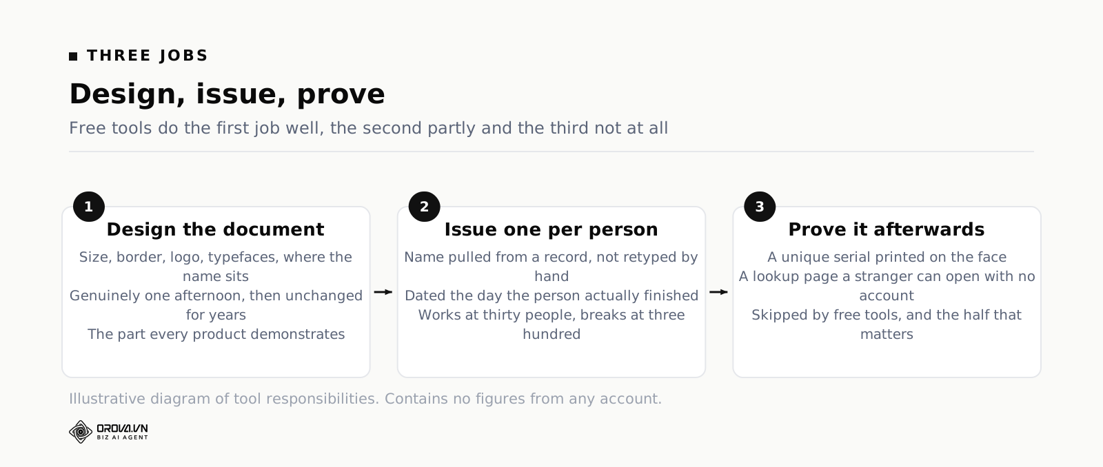
Three jobs. It has to lay out a certificate that reads well at final size, generate one per person without you retyping anything, and leave behind proof that survives the file being forwarded. Most free tools do the first job well, the second partly, and the third not at all. The third is the one that matters later.
Design, issue, prove
Split the work into three jobs and the shopping decision becomes obvious.
Design is the visual: size, border, logo, typefaces, where the name sits, how the signature block reads. It is genuinely one afternoon of work, it is the part every tool demonstrates, and it is where almost all the marketing effort goes. It is also the part with the least long-term consequence, because once you have settled a template you will use it unchanged for years.
Issue is turning one template into many certificates. Somebody finished, so a file exists with their name on it, spelled the way they spell it, dated the day they finished. If this happens by a person opening a design file and typing, it works for thirty people and quietly falls apart at three hundred, because the failure mode is not effort, it is typos and missed people.
Prove is everything after the file leaves your hands. A serial printed on the face, a page somebody else can open to check that serial, a record on your side saying who holds it and for what. This is the half that free tools skip, and skipping it is not a small compromise. Without it you have made a picture of a certificate.
Where "free" usually stops
Free tiers are generous in predictable places and thin in predictable places. You will usually get the full template library, all the fonts, and unlimited editing, because those cost the vendor nothing per certificate. What gets rationed is anything that runs per issued document: bulk generation from a list, exports above a certain count per month, removal of a watermark, and storage of what you issued.
That shape tells you something useful. Almost every certificate maker online is optimised for the moment of creation, because that is the moment it is being evaluated. Nobody picks a tool based on what it will be like to answer an employer's email in four months, so nothing is built for that moment. Judge it by the second moment, not the first.
A certificate and a receipt are different documents
Be honest about which one you are making, because it changes how much machinery you need.
A receipt says somebody turned up. Attendance at a talk, participation in a workshop, a thank-you for running a session. Nobody will ever verify it, nobody will put it on a professional profile, and a nicely designed PDF is entirely adequate. Use the free tool, enjoy the border, move on.
A certificate asserts a capability: this person passed an assessment at a stated standard on a stated date. Somebody may act on that assertion — put the holder on a rota, sign off a compliance requirement, hire them. That is when the assertion needs to be checkable, and that is when a picture stops being enough. If you are not sure which you are making, ask whether you would be uncomfortable if the document were forged. If yes, it is a certificate.
What belongs on a certificate, and what quietly weakens it
Certificate design goes wrong in one direction almost every time: too much decoration, too little information. The seal, the ribbon and the second gold border are free to add, so people add them, and the document ends up looking like a school prize while omitting the four facts that would let anybody act on it.
The elements that carry weight
Eight things earn their space. Everything else is optional.
- The holder's full name, spelled the way they spell it, in the largest type on the page after the heading.
- What they did, stated as a capability or a completed course with its real title — not "Excellence" and not "Achievement".
- The standard met, if there is one: passed at a stated mark, completed a stated number of hours, met a named internal requirement.
- The date of issue, and separately an expiry date if the thing being certified goes stale.
- The issuing organisation, named in text as well as shown as a logo, because logos get cropped and screenshotted.
- A unique serial, printed where somebody can read it aloud over the phone.
- A verification route: the address of the lookup page, and a QR code that opens it directly.
- A signature block with a real role attached — a name and a job title, not a decorative squiggle.
Read that list against the last certificate you received. Most templates supply the heading, the name, a date and a squiggle, and leave out the standard, the serial and the verification route. Those three are precisely the ones that make it evidence.
The decorations that cost you credibility
Some additions actively make a certificate look less trustworthy, which is a strange thing to have to say about decoration.
Fake seals are the worst offender. A gold foil circle that says nothing, or says "Certified" in a made-up crest, reads as costume jewellery to anyone who handles documents for a living. If you have no accrediting body, do not draw one. Latin mottoes and heraldic borders have the same effect. So does the word "Diploma" on something that took two hours.
Overclaiming in the achievement line is the subtler version. "Master of Customer Service" for a half-day module is not flattering to the holder, it is embarrassing for them, because they have to decide whether to put it on a profile where somebody might ask what it involved. Understated claims survive contact with strangers. Inflated ones do not.
Wording the achievement line
The line under the name is the sentence people read. Write it as a fact, in this shape: has successfully completed [exact course title] [duration or credit, if you have one], and passed the final assessment with a score of [threshold] per cent or above.
Three rules keep it honest. Use the exact course title, so the certificate matches whatever else you publish about the course. Say what "passed" means, because a certificate that does not state the bar cannot be compared to anything. And avoid superlatives entirely — no "outstanding", no "with distinction" unless distinction is a defined band with a defined mark and you can say what it is.
Landscape, portrait or square: choosing the size on purpose
Most certificate tools offer three shapes, and most people pick the one the template happened to be in. The shape should follow where the certificate will actually be looked at, which for the overwhelming majority of internal training is a phone screen and an email attachment, not a wall.
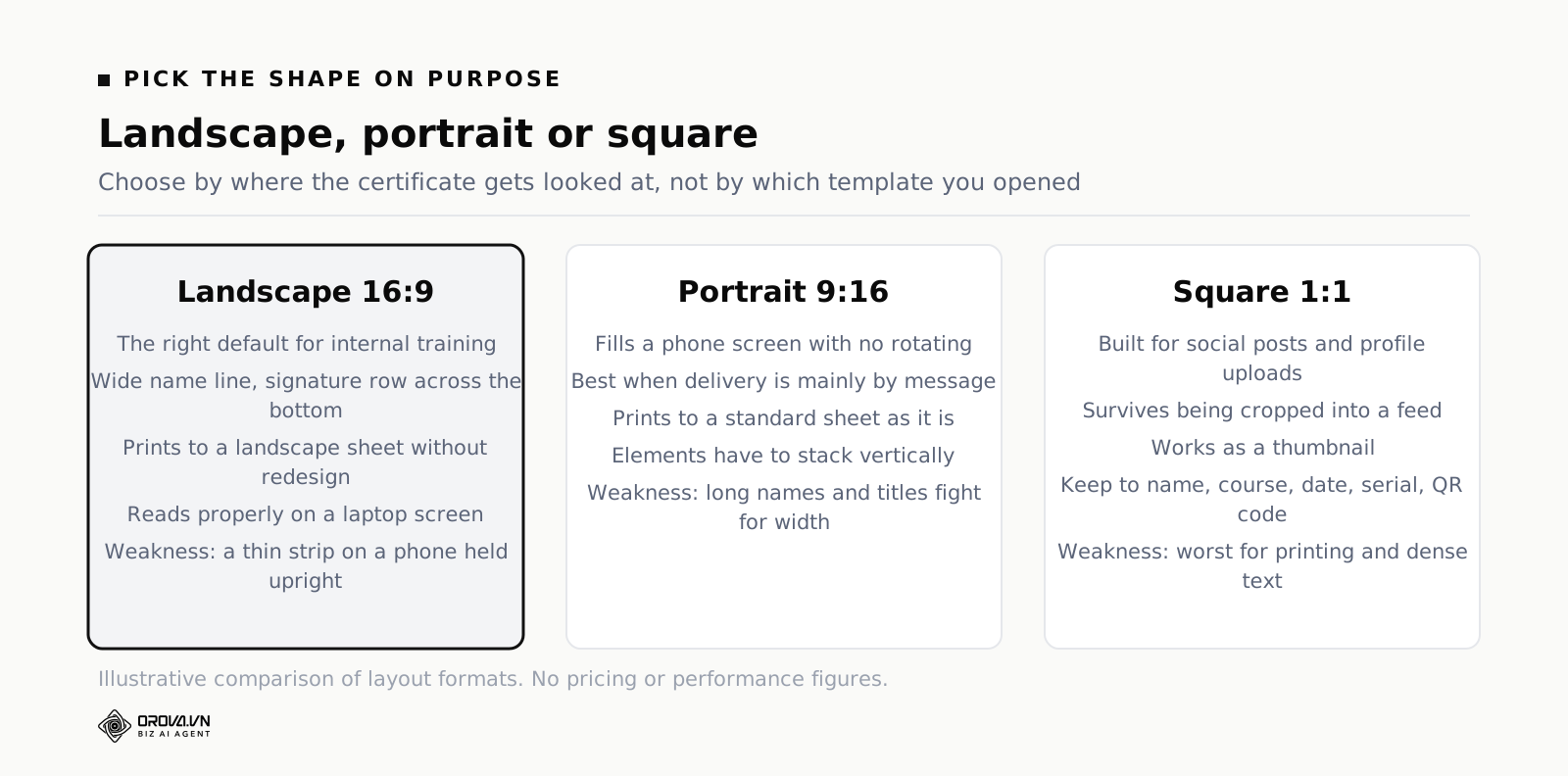
Landscape, sixteen by nine
The default, and the right default. Landscape suits a wide name line and a signature row across the bottom, it prints onto A4 in landscape without redesign, it fits the shape of a laptop screen when opened as a PDF, and it is what people expect a certificate to look like. If you make only one version, make this one.
Its weakness is the phone. A sixteen-by-nine document opened on a phone in portrait orientation shows as a thin strip; the recipient has to rotate or pinch to read their own name. That is survivable for something people open once, and annoying for something you want them to share.
Portrait, nine by sixteen
Portrait fills a phone screen and reads without rotating, which makes it the better choice when the certificate is mainly delivered by message and viewed on a handset. It also prints to a standard sheet without rotation, which matters if somebody in an office is going to file paper copies.
The constraint is horizontal room. Long names, long course titles and two signature blocks all fight for width that is not there. Portrait forces you to stack elements vertically, and stacking makes the design taller and thinner than most templates assume. Test portrait with your longest course title before committing to it.
Square, one by one
Square exists for social posts and profile uploads. It survives being cropped into a feed, it works as a thumbnail, and it is the shape to reach for if part of the point of the certificate is that the holder will post it. It is the worst shape for printing and the worst for dense text, so keep the wording short: name, course, date, serial, QR code, nothing else.
One design, three sizes — how to do it without three designs
Reflowing a single layout into three aspect ratios by dragging things around inside a certificate builder produces three subtly different documents, and eventually three inconsistent ones. A better method takes twenty minutes.
Fix the elements that must not change: logo, colours, typefaces, the wording of the achievement line, the position of the serial. Then decide one rule per shape for what moves. In landscape, signatures sit side by side along the bottom. In portrait, signatures stack and the QR code moves under them. In square, the standard line merges into the achievement line and the duration disappears. Write those rules down once, and every future certificate in all three shapes stays recognisably the same document.
Designs that survive real names
Every certificate template in the world looks perfect with "John Smith" in the name field. The design work is finding out what happens with the other names, and this is where a surprising share of certificate runs fall over — not in the tool, but in the twenty minutes after somebody notices that one name has been silently truncated.
Fonts break on names before they break on anything else
Decorative and script typefaces are frequently incomplete. They were drawn for English display text, they contain the basic Latin alphabet, and they do not contain the accented and stacked characters used across Vietnamese, Czech, Turkish, Polish or Spanish. What happens next depends on the renderer and none of the outcomes are good: the character falls back to a completely different typeface mid-name, the accent is dropped, or you get an empty box.
The check takes two minutes and you should do it before you fall in love with a font. Type a name from each language group your organisation actually employs into the name field at final size and look at it. If any character changes shape, weight or baseline relative to its neighbours, the font is incomplete — pick another one. Reserve decorative faces for the heading, which you control, and set names in a text face with proper coverage.
Leave room for the longest name on your list
Sort your learner list by name length and take the longest one. That is your design constraint, not the average. A name field laid out for fifteen characters will do one of three things with a thirty-five-character name: overflow the border, shrink to the point of illegibility, or wrap onto a second line that collides with whatever sits underneath.
Two habits prevent all of it. Give the name line its own horizontal band with empty space above and below, so a wrap has somewhere to go. And set a sensible auto-shrink floor — the name may reduce in size to fit, but never below the size of the achievement line beneath it, because a name smaller than the body text looks like a mistake.
Margins, contrast and what printing eats
Certificates get printed more often than you expect, usually by the holder on whatever printer is nearest. Design for that. Keep everything meaningful at least fifteen millimetres from the edge, because home printers clip. Avoid pale grey text on white, which looks refined on screen and disappears on paper. Avoid full-bleed dark backgrounds, which drink ink and come out banded.
The QR code has its own rules: it needs a quiet margin of clear space around it, it needs strong contrast, and it should be at least two centimetres square at print size. A QR code laid over a patterned border is a QR code that will not scan, and an unscannable verification route is worse than none because it implies verification exists.
Unique IDs and public verification: why a lookup code beats a pretty PDF
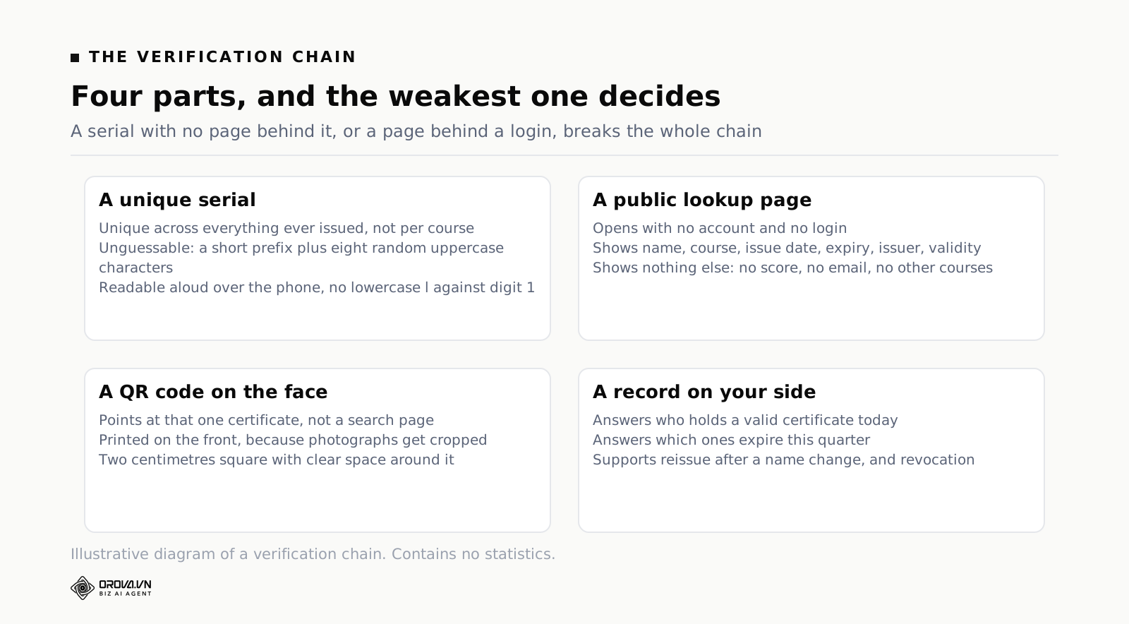
This is the section that separates a certificate from a picture, so it is worth being precise about what a verification chain is made of and what each part does.
What a serial has to guarantee
A serial is a short string printed on the face of the certificate that identifies that one issued document and nothing else. Three properties make it useful.
It has to be unique across everything you have ever issued, not unique within a course. Per-course numbering produces two certificates numbered 014 within a year, and the moment that happens the number stops identifying anything.
It has to be unguessable. Sequential numbers tell the world how many you have issued and let anyone construct a plausible neighbouring serial. A random string of eight characters does not. The practical format is a short fixed prefix so people recognise what they are holding, then eight random uppercase characters — long enough that guessing is pointless, short enough to read over the phone.
It has to be readable by a human. Somebody will retype it from a photograph. Uppercase only, no lowercase l against digit 1, grouped so the eye can hold it.
Public lookup with no account
A serial does nothing on its own. The serial has to resolve to a page, and the single most important property of that page is that a stranger can open it without logging in.
Think about who verifies. It is a hiring manager at another company, a client's compliance officer, an auditor, a site supervisor at a customer's premises. None of them have an account with you, none of them will create one, and every additional step between them and the answer converts a verification into a phone call to you. A lookup page that demands a login is not verification, it is a contact form.
What the page needs to show is small: the holder's name, the course title, the issue date, the expiry date if there is one, the issuing organisation, and a clear statement that this serial is valid. What it should not show is anything else about the person — no score, no email address, no other courses. Verification answers one question, and volunteering more data about your learners to anonymous visitors is a problem you do not need.
The QR code is not decoration
Printing the lookup address as text is necessary; adding a QR code that opens it directly is what makes verification actually happen. The difference is friction. A supervisor holding a printed certificate on a site will scan a code with the phone already in their hand. They will not retype a URL and an eight-character serial, and if that is the only route, they will simply assume the document is fine.
Point the code at the specific certificate, not at a general search page. One scan, one answer. And put it on the face of the certificate rather than the back or a footer, because certificates get photographed, and a photograph crops.
What verification proves, and what it does not
Be clear-eyed about the limits, because overstating them is its own credibility problem.
Verification proves that a document with this serial was issued by you, to this person, on this date, for this course. That is genuinely valuable: it defeats a forged PDF, a name swapped in a graphics editor, an altered date, and a certificate for a course that never existed.
It does not prove that the person presenting the certificate is the person named on it. It does not prove the course was any good, or that the assessment was hard, or that the holder can still do the thing today. Those are questions about your programme, not about the document, and no amount of cryptography answers them. What a lookup code buys you is the ability to stop arguing about the document and start talking about the programme.
Automatic issue at a pass mark, or issuing by hand
The other structural decision is what triggers a certificate. Somebody deciding, or a rule firing. This sounds like an efficiency question and it is really a consistency question.
Decide the threshold before you design anything
A certificate is a claim about a standard, so the standard has to exist before the certificate does. Write down two numbers and one sentence: the pass mark, the number of attempts allowed, and what the certificate asserts about the holder. Do it before you open any design tool, because the design has to state the standard and you cannot state a number you have not chosen.
Pick the mark from the consequence of being wrong. Content where a mistake is recoverable — a process refresher, a product overview — sits comfortably in the seventy per cent region. Content where a mistake hurts somebody, or breaches a rule you are audited against, belongs higher, and for a small number of topics the honest answer is a hundred per cent on the questions that matter with unlimited attempts, because the goal is that everybody eventually knows it rather than that some people are filtered out.
What automatic issue removes from your week
When the rule fires on its own, four recurring chores disappear at once.
- The typing. The name comes from the learner record, so it is spelled the way that person spelled it when they registered, every time, in every language.
- The lag. The certificate exists at the moment of passing rather than whenever an administrator next runs a batch, which matters because the moment of passing is the only moment the learner cares.
- The omissions. Nobody is skipped because they finished late, changed department, or was on the second page of the spreadsheet.
- The reconciliation. There is no separate list of who was issued a certificate to keep in step with the list of who passed, because they are the same list.
That last one is the quiet win. Manual issue always creates two records that diverge, and the divergence is invisible until an auditor lines them up in front of you.
When issuing by hand is still right
Automation is not always the answer. Keep manual issue for anything assessed by a human: a practical demonstration, a portfolio review, a supervisor sign-off, a presentation. In those cases the pass is a judgement, and dressing a judgement up as a threshold does not make it more objective.
Also keep it manual for one-off recognition — the certificate you make for a guest speaker or a long-service award. Those are receipts in the sense described earlier and they do not need the machinery.
Revoking, reissuing and expiry
Three things happen to certificates after issue, and a tool that has no answer for them will make you handle each one by email.
Reissue is the common one. Somebody's name was misspelled at registration, or they changed their name. You need a way to correct the record and produce a fresh document. The clean approach is to correct the holder's details and reissue against the same serial, so the old copy in circulation still verifies and shows the corrected name.
Revocation is rarer and more sensitive: a certificate issued in error, or issued on the basis of an assessment later found to be compromised. What matters is that the lookup page can say "this serial is no longer valid" rather than simply going blank, because a dead link reads as a broken system, not as a revoked certificate.
Expiry applies to anything that goes stale — safety, first aid, product knowledge on a product that changes, and most regulatory topics. Put the expiry date on the face of the certificate and on the lookup page. An expired certificate that still verifies as valid is worse than no verification, because it launders an out-of-date claim.
Building your first certificate, start to finish
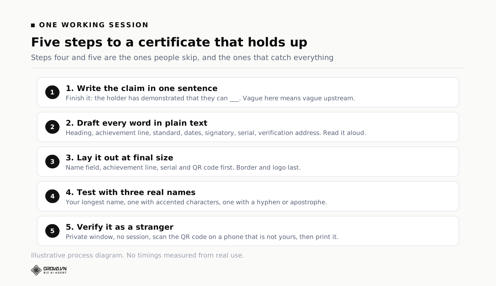
Assume the course and the assessment already exist. Here is the whole job in five steps, and it is genuinely one working session.
Step 1: write the claim in one sentence
Before any design: finish the sentence "the holder of this document has demonstrated that they can ___". If you cannot finish it without vagueness, the problem is upstream in the course, not in the certificate. Fix it there. This sentence becomes the achievement line, and it decides whether the standard, the duration and the expiry date need to appear.
Step 2: draft the full text in plain text first
Type every word that will appear on the certificate into a plain document: heading, name placeholder, achievement line, standard, dates, organisation, signatory name and title, serial placeholder, verification address. Read it aloud. Text problems are invisible once they are set in a script face at forty points, and obvious in a plain list.
Step 3: lay it out at final size
Build the layout in the shape you chose, at the size it will be exported, not scaled down to fit your screen. Set the name field, the achievement line, the serial and the QR code in that order — those four carry the meaning; the border and the logo can be dropped in last.
Step 4: test with three real names
Not placeholders. Take the longest name on your learner list, one name with accented characters, and one name with a hyphen or an apostrophe. Generate all three. Look at them at one hundred per cent. This single step catches almost every problem that would otherwise surface in front of an audience.
Step 5: issue one to yourself and verify it as a stranger
Complete your own assessment, let the certificate issue, then open the verification page in a private browser window with no session — the way an outside employer would. Scan the QR code with a phone that is not signed in to anything of yours. Print it. If any of those three fails, you have found the failure now instead of in four months.
Where a free certificate maker stops being enough
None of what follows is a criticism of free design tools. They are good at the job they were built for. The trouble starts when a design tool is used as an issuing system, because those are different products with different jobs.
A file, and nothing behind it
The core gap. A design tool produces a file. It holds no notion of a holder, an issue date, a course, or a serial, so there is nothing to look anything up in. You can print a serial onto the design by hand, and it will resolve to nothing.
The workaround people invent is a public spreadsheet of serials. It half works and it leaks: the sheet exposes everybody's name to anyone with the link, it is editable by whoever has edit access, and it proves nothing about who created any given row. If verification matters at all, this is the point where the design tool has run out.
One row at a time
Certificates by hand cost a couple of minutes each. Thirty of them is an afternoon and forty of them is an afternoon with three typos in it, because the work is repetitive enough that attention drifts. Some tools offer bulk generation from a spreadsheet, which helps a great deal, but the spreadsheet is still assembled by a person from the assessment results, which means it inherits every mistake in the copying step and adds a lag between passing and receiving.
Watermarks, export limits and fonts you cannot keep
Three practical traps in free tiers, all discoverable before you commit. Watermarks on export, which are fine for a draft and fatal for a document somebody shows an employer. Monthly export caps, which surface the week you run your biggest cohort. And fonts licensed to the platform rather than to you, which is how a template stops rendering correctly after a redesign and your certificates from last year no longer match the ones from this year.
Nothing left on your side
The subtlest gap and the one that hurts on the day of the audit. After you send the files, your organisation's memory of the event is an email folder. You cannot answer "who holds a valid first-aid certificate today", "which ones expire this quarter", or "did this person pass on the first attempt", because the tool never knew any of it. A corporate learning system exists largely to answer exactly those three questions, and the certificate is the visible tip of the record it keeps.
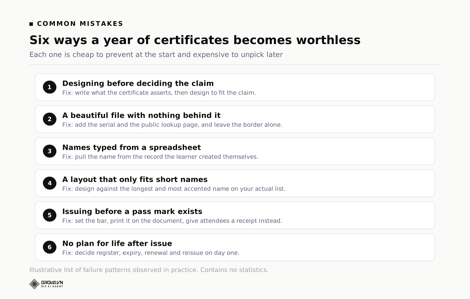
Common mistakes
Mistake 1: designing before deciding what the certificate claims
Opening a template gallery is the fun part, so it happens first. Then the achievement line gets written to fit the space that happens to be left, the standard never appears because there was no room for it, and the finished certificate asserts something nobody chose. Write the claim, then design to the claim.
Mistake 2: a beautiful PDF with nothing behind it
The one this whole article is about. Hours on the border, no serial, no lookup, no register. The document looks its best on the day it is sent and is worth nothing the first time somebody asks a question about it. If you have time for exactly one improvement to your certificates, add the serial and the lookup page and leave the border alone.
Mistake 3: typing names from a spreadsheet
Manual data entry is not just slow, it is the source of the errors that embarrass you publicly. A misspelled name on a certificate is noticed by exactly one person, and that person is the holder. Pull names from the record the learner created themselves.
Mistake 4: a layout that only fits short names
The template looked right with the sample name, so nobody checked. Then it ships and one person's certificate has their surname clipped by the border, or set two sizes smaller than everyone else's, or rendered in a different font because the script face had no accented characters. Test with the longest and the most accented names on your actual list before the first run.
Mistake 5: issuing before the pass mark exists
Certificates handed out for attendance, then quietly upgraded to imply competence when somebody asks what they mean. This is the fastest way to make your own certificates worthless internally, because everybody knows how they were earned. Decide the bar first, state it on the document, and give receipts to the people who only attended.
Mistake 6: no plan for the certificate after it is sent
No register, no expiry dates, no renewal reminder, no route to reissue a misspelled name. A year later you have an unknown number of certificates in circulation making claims you can neither confirm nor withdraw. Decide the lifecycle on day one; it is ten minutes of decisions and it saves the whole mess.
Frequently asked questions
Is a free certificate maker good enough for internal training?
For receipts, yes, and there is no reason to pay for anything. For certificates that assert a standard, the design part is fine and the issuing and verification parts are not there. The practical test is whether anybody outside your team will ever act on the document. If the answer is no, use the free tool. If somebody outside might, you need the serial and the lookup page, and that is not a design feature.
Does a certificate need a signature to be valid?
A handwritten signature carries very little weight on a digital document — it is an image, and images are copyable. What carries weight is a named signatory with a real job title, so the reader knows which human is standing behind the claim, plus a verification route they can check independently. Keep the signature for the look of the thing, but do not mistake it for security.
What size should a certificate be?
Landscape sixteen by nine is the right default: it prints, it reads on a laptop, and it looks like what people expect. Add portrait if your learners receive things mainly by phone message, and add square only if part of the point is that the certificate gets posted publicly. Keep the wording identical across all three so they remain the same document.
Can somebody tell if a certificate has been edited?
Not by looking. A PDF or an image can be altered convincingly in minutes by anyone with basic tools, and there is no visual cue that survives. That is exactly why the answer has to sit outside the file: a serial that resolves to a page you control, so the reader compares the document in front of them against the record rather than inspecting the document itself.
How long should a certificate stay verifiable?
Longer than you expect it to be needed. People present training records years after leaving a job, and a lookup page that has been retired makes an honest certificate look fabricated. Treat the verification record as permanent, and use an explicit expiry date on the certificate to say the qualification has lapsed, rather than deleting the record to achieve the same thing.
Do certificates actually change anything, or are they decoration?
They do two useful things and one useless one. They mark completion in a way people can show, which raises finishing rates on optional courses. They give you a durable artefact for audits and customer questions. What they do not do is make anybody more capable — the assessment does that, and a certificate for a weak assessment is decoration with a serial on it. Fix the assessment behind the certificate first.
When a design tool stops being enough
What you can genuinely run by hand
More than tool vendors like to admit. One or two courses, one cohort a quarter, thirty or forty people, no expiry, nobody outside ever asking questions: a certificate creator with a good template, a careful person and a folder of PDFs will carry that for a long time. You will also learn the design constraints yourself, which is worth something.
The symptoms that say you have outgrown it
Four, and they arrive in roughly this order. Somebody outside asks you to confirm a certificate and you cannot do it without opening a folder. You catch a misspelled name after issue and there is no clean way to correct it. Renewals start colliding, so people's expiry dates are scattered through a calendar nobody maintains. And the run itself gets big enough that the afternoon of typing becomes a job you postpone, which means people wait days for a document they earned on Tuesday.
What issuing inside a training platform changes
The certificate stops being a file and becomes the visible end of a record. That is the point where an integrated tool earns its place. Orova Training designs the certificate with AI from a description or takes a template you upload, in landscape 16:9, portrait 9:16 or square 1:1, and awards it automatically the moment a learner passes the threshold set on the course — no approval queue, no batch run. Every certificate carries a system-wide unique serial in the form OROVA-XXXXXXXX printed on the face, plus a QR code that opens a public lookup page needing no account, so an outside employer can check it in one scan; certificates export to PDF. Because it sits alongside courses, documents, quizzes and learners in the same workspace, the name comes from the learner's own record, the pass comes from a server-graded assessment, and per-person progress — real study time, opens, score per assessment — sits behind the document rather than in a spreadsheet. New accounts get 1,000 quota, which is enough to build a course, run an assessment and issue a verifiable certificate to yourself before deciding anything.
What to do this week
Five things, in order, and none of them takes an afternoon.
- Open the last certificate you issued and check it for the four elements most templates omit: the standard met, a unique serial, a verification route, and a named signatory with a job title. Whatever is missing is your work list.
- Write the claim sentence for your main course — "the holder has demonstrated that they can ___" — and fix the achievement line to match it. Ten minutes, and it usually exposes a vague course objective as a bonus.
- Decide the pass mark and the attempt limit, write both on the certificate, and decide today whether the topic expires and after how long.
- Run the three-name test: your longest name, one with accented characters, one with a hyphen or apostrophe. Generate all three at final size and look at them properly.
- Issue one certificate to yourself and verify it as an outsider — private window, no session, phone scan of the QR code, then print it. If any step fails, you have found your real problem, and it is almost certainly not the border.
Do those five and your next cohort receives something that still means something in July, when somebody who has never heard of you opens it and wants to know whether it is real.
Issue certificates people outside your company can check
Orova Training awards a certificate automatically the moment a learner passes the threshold, in landscape, portrait or square, each with a unique serial, a QR code and a public lookup page that needs no account.
Try it free