
Looker Studio Reports: Speed, Sharing and the Limits You Will Hit
The client email says the dashboard is broken. It is not broken. You open the link yourself, watch the spinner sit on the first scorecard for a slow count, and by the time the channel table paints you have already lost the argument. A year ago it opened fast. Since then the Looker Studio reports on that page picked up more platforms, a spreadsheet of offline sales, and a handful of blends, and now the whole thing takes far too long to show a number that has not changed since yesterday.
Naming note before we start: Google has renamed Looker Studio back to Data Studio. It is the same product and nothing in this article changes because of it — we keep saying Looker Studio because that is still the name most people search for and still see on their own reports.
The usual fix is to keep adding more charts, more filters, more "just in case" data, hoping the report catches up on its own. It does not, because the real issue is not the tool — it is the report asking for far more data than the page needs, sending out one request per chart, live, every single time somebody opens it. Rebuilding the same report somewhere else, or nagging the client to be patient, does not fix that; it just moves the problem around.
This article walks through what is actually slowing your report down, what you can safely change without breaking anything, and how to stop the second, quieter problem: sharing that does not work the way you think, where who sees which numbers depends on a setting you probably never touched. By the end you will know which fixes actually save time, and which ceilings you will hit as the report keeps growing.
What actually makes Looker Studio reports slow?
Looker Studio reports are slow because every chart fires its own live query to the data source when the page loads. Slowness comes from the number of charts, the number of separate sources, blends that join large tables, calculated fields evaluated at query time, long date ranges, and third-party connectors that are slower than Google's own.
Hold that sentence in your head, because every fix in this article is a consequence of it. Looker Studio does not store your data. It is a reporting layer sitting on top of other people's databases and APIs. When someone opens your page, the tool looks at what is on that page, works out which questions it needs to ask, and asks them.
That design is why you could build something useful in twenty minutes. It is also why the thing crawls once you get ambitious. A dashboard tool that holds the data in memory answers a new chart instantly, because the data is already there. Looker Studio has to go and ask again.
So the mental model to use when a report is slow is not "which chart is heavy". It is "how many questions is this page asking, how big is each answer, and who is being asked".
The path from click to chart, one step at a time
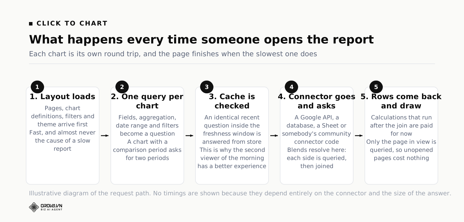
When a viewer opens your report, roughly this happens. Understanding the order matters, because each step is a place you can intervene.
- The browser loads the report layout: pages, chart definitions, filters, the theme. This part is fast and is almost never your problem.
- For each chart on the current page, Looker Studio builds a query — the fields, the aggregation, the date range, the filters that apply to it.
- It checks the cache. If an identical query was answered recently and the data is still considered fresh, it serves the stored answer and the chart appears immediately.
- If not, the query goes to the connector, which talks to the underlying source — a Google API, a database, a Sheet, or somebody's community connector code.
- The source computes and returns rows. Blends are resolved here too: the sources are queried, then joined.
- Looker Studio applies anything that has to happen after the data arrives, then draws.
Two consequences fall straight out of that list. First, charts on pages the viewer never opens do not slow down the first page — Looker Studio queries the page you are on. Second, a page with twenty charts on five different sources is not one request, it is a pile of them, and the page is only as fast as the slowest one.
That last point is worth dwelling on. People optimise the wrong thing constantly. They simplify the pretty chart at the top of the page because it feels heavy, when the actual delay is a small, innocent-looking scorecard in the corner pulling from a partner connector that takes twenty-five seconds to wake up. The page waits for it. Everything else finished eighteen seconds ago.
The six things that add the most seconds
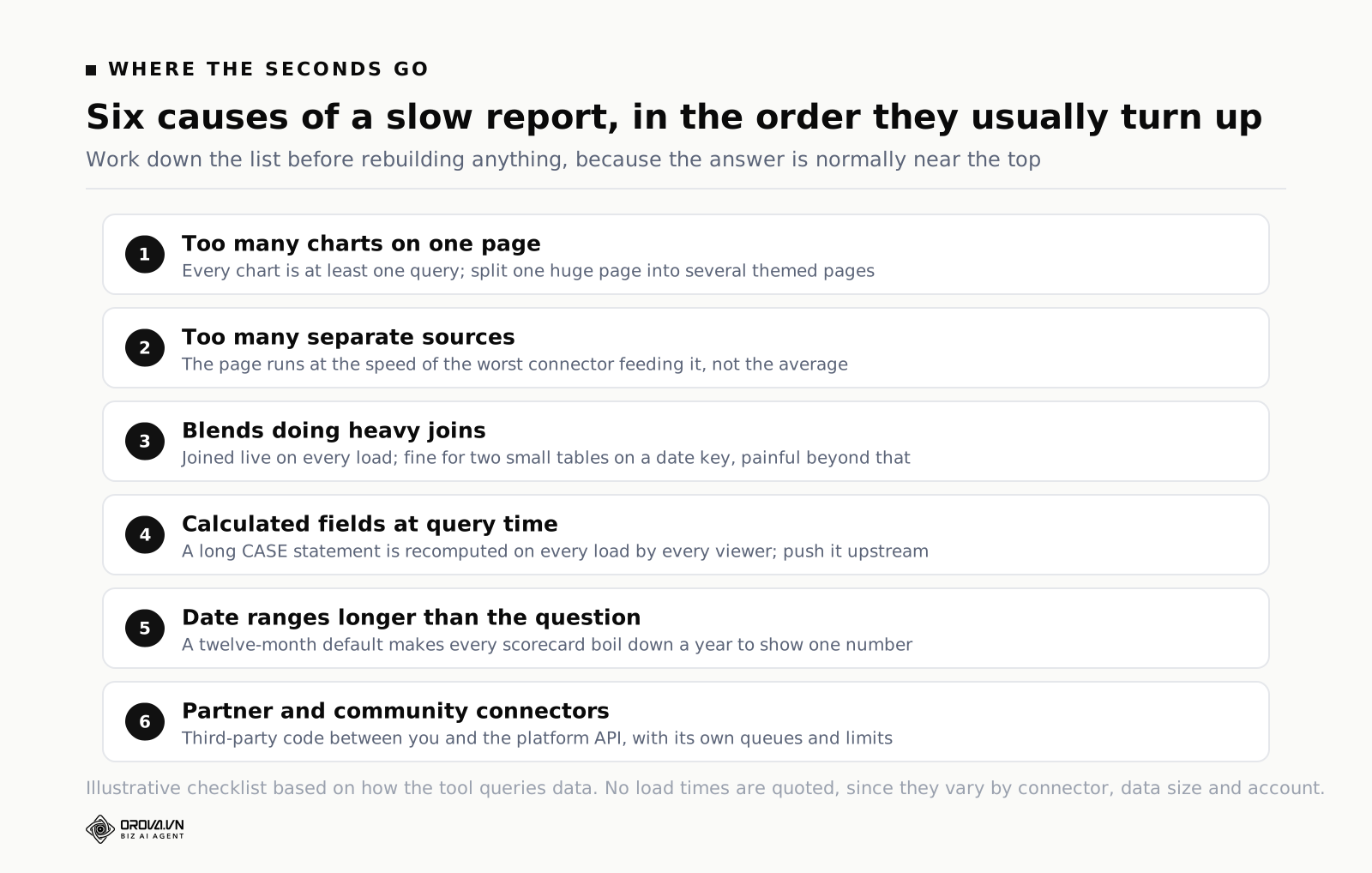
In rough order of how often each one turns out to be the culprit.
Too many charts on one page
Each chart is at least one query. Some are more — a chart with a comparison date range asks for both periods. A page with thirty-five charts is asking thirty-five-plus questions at once, and connectors have their own limits on how many simultaneous requests they will accept, so some of yours end up queuing behind others.
The fix is unglamorous: fewer charts per page, more pages. A viewer cannot read thirty-five charts at once anyway. Splitting one enormous page into four themed pages usually cuts the perceived load time by more than any technical change, because Looker Studio only queries the page in view.
Too many separate data sources
Five sources on one page means five different systems have to respond before the page settles. If four are instant and one is a rate-limited third-party API, your report runs at the speed of that one.
Look at a slow report and count the distinct sources feeding the first page. If it is more than three, ask whether some of those numbers could be consolidated upstream — into a single table, a warehouse, or even a scheduled Sheet — before they reach the report.
Blends
A blend joins sources at query time. Every time. Looker Studio has to fetch from each side, then join. Blends of two small tables on a date key are fine. Blends with several tables, joined on high-cardinality keys, over a long date range, are the single most reliable way to make a report unusable.
There is a documented cap on how many tables one blend can contain, and it is smaller than people expect. Check the current figure in Google's help before you design a report around a big blend, because it has changed across releases and any number you read in a blog post — including this one — may be stale by the time you read it.
Calculated fields evaluated at query time
A calculated field is convenient and it is not free. Fields defined on the data source or on the chart are computed as part of the query, on every load. A long CASE statement bucketing campaign names into channels, evaluated over a hundred thousand rows, costs real time.
Where you can, push the calculation upstream. A channel column that exists in the source table is free to read. The same logic written as a CASE in Looker Studio is paid for on every page load, by every viewer, forever.
The nastier version of this is a calculated field on a blend. Now the join happens, and then the calculation runs on the joined result. Two expensive operations stacked.
Date ranges longer than the question needs
A default date range of "last 12 months" on a daily table means every chart pulls roughly 365 rows per dimension combination before aggregating. Most of your charts answer a question about the last month. They are being handed a year of data to boil down.
Set report-level and chart-level date ranges deliberately. Trend charts that genuinely need twelve months can have twelve months. The scorecards at the top do not.
Community and partner connectors
Google's own connectors — GA4, Google Ads, Search Console, Sheets, BigQuery — are built and maintained by Google and are generally the fastest route in. Everything else goes through a partner connector or a community connector, and those run somebody else's code between you and the platform's API.
Community connectors run on Apps Script, which has its own execution limits and its own queueing. Partner connectors usually pull data into their own storage on a schedule and serve you from there, which is often faster, and adds a second freshness lag you now have to explain to people. Neither is a criticism. It is just where the seconds go.
Caching and refresh: what the tool remembers, and for how long
Caching is the part people misunderstand most, and misunderstanding it produces two opposite complaints from the same team in the same week: "the report is slow" and "the report is showing yesterday's numbers".
Both are the cache doing exactly what you configured it to do.
Looker Studio keeps answers to queries it has already run. If a new query matches one it has stored and the stored answer is still within the freshness window you set on that data source, it hands back the stored answer without touching the source at all. That is why the second person to open the report in the morning has a much better experience than the first.
Data freshness is a per-source setting, and the available options depend on the connector. Some sources let you choose a short window, some only offer longer ones, and the defaults are not the same across connectors. Open each data source in your report, look at the freshness setting, and write down what it says. Most teams have never looked, then argue about "real time" data based on an assumption.
Some important behaviours to know:
- Freshness is set on the data source, not on the report. One report can contain sources with wildly different freshness windows, which is exactly how you end up with two charts on one page that disagree.
- The Refresh Data button clears the cache for that report's sources. It is the honest way to answer "is this current". It also guarantees the slowest possible load, because nothing is cached any more.
- Changing anything about a chart's query invalidates the cache for it. Add a dimension, change a filter, change the date range — new question, new query, no stored answer.
- Interactive filters can defeat the cache. A drop-down that lets viewers pick any of two hundred campaigns means two hundred possible queries per chart. The first person to pick an unusual value waits the full round trip.
- Viewer credentials reduce what can be cached and pre-fetched, because the answer depends on who is asking. More on credentials in the sharing section, because this setting has consequences in both halves of the article.
The practical takeaway: a report that is slow only for the first viewer each morning has a caching pattern, not a performance problem. A report that is slow for everybody, every time, is asking questions that cannot be cached — usually because of viewer credentials, heavy interactive filters, or a date range that shifts on every load.
Extracts: the fix that works, and what it costs you
If you have done the tidying above and the report is still slow, the next lever is an extract.
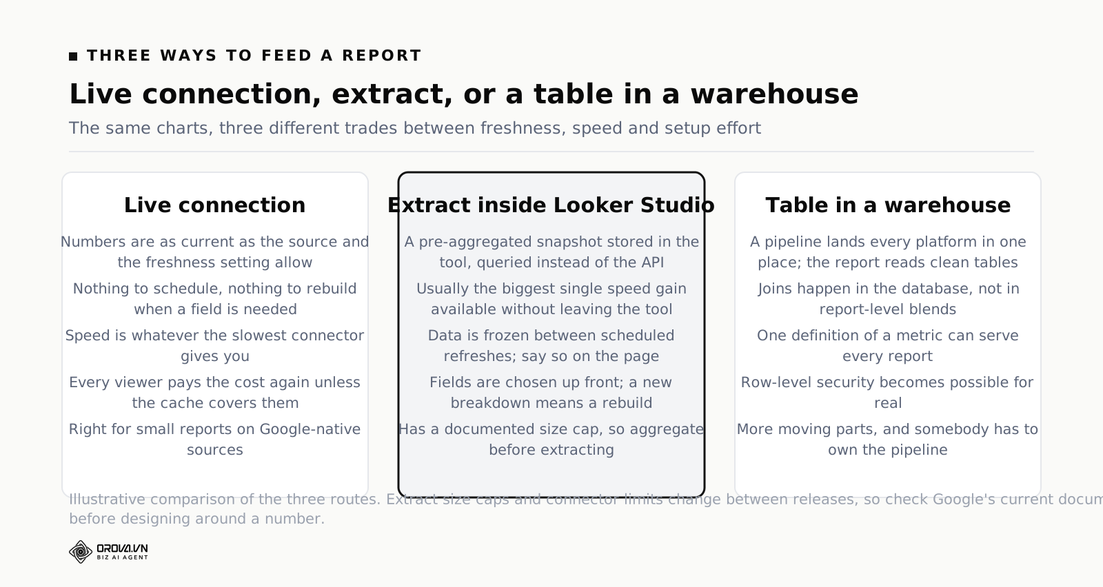
The Extract Data connector takes a snapshot of a source — the fields you pick, the date range you pick, aggregated the way you pick — and stores it inside Looker Studio. Your charts then query the snapshot instead of the live source. It is fast, sometimes dramatically so, because a small pre-aggregated table in the tool's own storage beats an API call to an ad platform every time.
It is the single most effective speed fix available inside Looker Studio, and it is also a set of trade-offs you have to accept knowingly.
- The data is as old as the last extract run. You schedule the refresh. Between runs, the numbers are frozen. For a weekly report this is fine and arguably better, because the numbers stop shifting under people mid-meeting. For anything anyone calls "live", it is not.
- You choose the fields up front. An extract contains what you told it to contain. The moment someone asks for a breakdown by a dimension you did not include, you edit the extract and wait for it to rebuild.
- There is a size cap. Google documents a maximum extract size, and large daily tables with high-cardinality dimensions hit it faster than you would think. Aggregating before extracting — daily by campaign rather than hourly by ad — is usually how you stay under it.
- It is another thing that can silently fail. An extract whose scheduled refresh breaks does not shout. The report keeps working, showing older and older data, until someone notices the trend line ends on a Tuesday three weeks ago.
That last risk is real enough that any report built on extracts should carry a visible last-refreshed indicator on the page. A scorecard showing the maximum date present in the data is enough. It costs one chart and it saves the conversation where a client makes a decision on stale numbers.
There is a third option beyond live and extract, which is to move the data into a warehouse — BigQuery being the obvious one because the connector is native — and have Looker Studio read clean, pre-aggregated tables. That is more setup, more moving parts, and someone has to own the pipeline. It is also the only option that scales past the point where extracts start creaking, and it solves the joining problem properly instead of asking blends to do it.
A worked example, with made-up but realistic numbers so the shape is clear. Say a report has one page, fourteen charts, three sources, and a twelve-month default date range, and it takes about forty seconds to settle. Splitting it into three pages of four to five charts takes the first page down to whatever the slowest source on that page costs. Cutting the default range to ninety days with one twelve-month trend chart on its own page cuts the rows every other chart handles by roughly three quarters. Replacing the one partner-connector source with a nightly extract removes the slowest respondent from the critical path. None of those three changes is clever. Together they usually turn a forty-second report into a few seconds, and you have not rebuilt anything.
Sharing: what viewers can and cannot see
Now the half that carries actual risk.
Looker Studio sharing looks like Google Drive sharing because it is built on it. You add people or you turn on link access, and you pick viewer or editor. That part behaves how you expect.
What does not behave how you expect is that the report and the data source are two different objects with two different permission sets, and the one that decides what data a viewer sees is the data source.
Owner credentials versus viewer credentials
Every data source has a credentials setting with two options.
Owner credentials means the source authenticates as you. Anyone who can open the report sees the data, whether or not they have any access to the underlying account. This is how a client with no Google Ads access can read a Google Ads report. It is the default in most workflows and it is why sharing feels so easy.
Viewer credentials means the source authenticates as whoever is looking. Each viewer needs their own access to the underlying data, and they see only what their own permissions allow. If they have no access, they get a prompt asking them to authorise, and if they cannot, they see nothing.
Both are correct in the right situation. The failure is using owner credentials without noticing, on a source that contains more than the audience should see. An account-level Google Ads source with owner credentials, shared by link, hands anyone with that link a window into that whole account — every campaign, every spend figure. Nothing warned you. The sharing dialog said "viewer", and it meant viewer of the report, not viewer of a filtered slice.
Filters do not save you here either. A filter on a chart limits what that chart displays. A viewer who can edit — or who copies the report, if copying is allowed — can change the filter. Filters are presentation, not security.
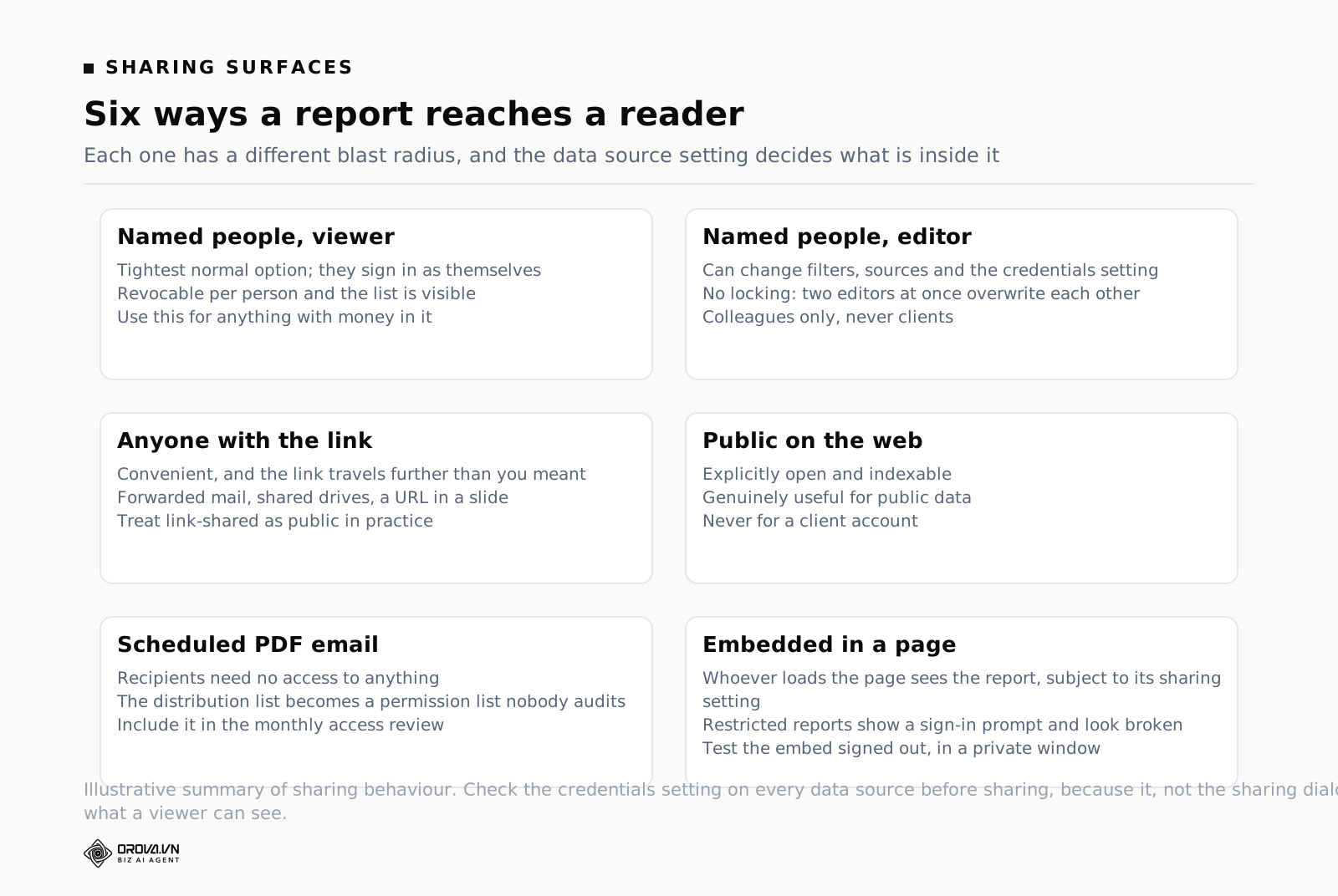
The sharing levels, and what each one actually opens
- Named people, viewer. The tightest normal option. They must sign in as themselves. Access is revocable per person and you can see the list.
- Named people, editor. They can change anything, including filters, data sources and the credentials setting. Give this to colleagues, not clients.
- Anyone with the link. Convenient, and the link travels. Forwarded emails, shared drives, a screenshot of the URL in a deck. Treat any link-shared report as public in practice.
- Public on the web. Explicitly indexable and open. Genuinely useful for public data. Never for a client account.
- Scheduled email delivery. A PDF sent on a schedule to a list of addresses. The recipients need no access to anything, which is a feature and a leak vector at the same time, because the list is easy to add to and easy to forget about.
- Embedded in a page. The report renders inside an iframe on your site or an intranet. Whoever can load that page can see the report, subject to the report's own sharing setting.
There is also a setting that stops viewers downloading, printing and copying the report. It is not a security control — anyone can screenshot — but it does stop a viewer taking a copy of your report structure along with the data source configuration, which is the more meaningful part.
The thing Looker Studio does not do: per-viewer row filtering
The question every agency asks eventually: can I build one report and have each client see only their own rows?
Not natively, not in a way you should trust. Looker Studio does not have a proper row-level security layer of its own. The two workarounds are:
- Push it down to the source. If the data lives in BigQuery, use BigQuery's own row-level security so the database itself refuses to return other people's rows. This is the only version of the idea that is actually secure, and it requires viewer credentials, which means every client needs a Google identity with access.
- Filter by the viewer's email inside the report. Some sources expose the current viewer's email address as a parameter you can filter on. It works, and it is a presentation-layer control on a source that would still return everything if the filter were removed. Fine for internal convenience. Not fine as the thing standing between two clients' revenue figures.
For most agencies the honest answer is one report per client, built from a template and copied. Copying is quick, and the version you copy carries the chart layout while asking you to map sources. Tedious at ten clients. Painful at fifty. That pain is a real ceiling, and it arrives sooner than teams plan for.
Embedding, and the thing that breaks it
Embedding is a URL in an iframe. The report has to be shared in a way that the person loading your page satisfies. If the report is restricted to named viewers, the embed shows a sign-in prompt to anyone else, which looks broken even though it is correct. If the report is link-shared or public, the embed works for everybody, including everybody you did not intend.
People discover this in production. The embed worked for the person who built it, because they were signed in as the owner. It failed for the first real visitor. Test embeds in a private browsing window, signed out, always.
Versioning: what gets saved and what does not
Looker Studio keeps a version history of a report, and you can restore an earlier version from edit mode. It has saved plenty of afternoons. It is not, however, a source control system, and treating it like one leads to a specific kind of disaster.
What version history handles well: someone deleted a page, someone reorganised a layout badly, someone broke a chart and does not remember what it looked like on Friday.
What it does not handle:
- Two editors at once. There is no locking and no merge. Two people editing the same report at the same time will overwrite each other's changes, and the version history will show the result rather than warn you it happened.
- Changes outside the report. If someone edits a shared data source, adds a calculated field, or changes the freshness setting, that change lives on the source. Restoring an old report version does not undo it. Data sources are shared objects with their own blast radius.
- A draft and a live copy. There is no staging. You edit the thing your audience is reading. Larger changes should happen on a copy, tested, and then the copy becomes the shared link — which means the link changes, which means everyone's bookmark breaks. Every team solves this badly.
- Any record of why. Versions have timestamps, not reasons. Six weeks later nobody remembers whether the definition change was a fix or a mistake.
The workaround that costs nothing: keep a text box on the last page of every report with a short change log and the name of the person who owns the report. It is not clever and it works. When a number moves and everyone panics, the first question is always "did something change on the report", and answering it in five seconds is worth a lot.
Looker Studio reports: the limits you will hit as the work grows
Every tool has a size beyond which it stops being the right shape for the job. Looker Studio's ceilings are rarely hard numbers in a documentation table. They are moments where the effort curve turns upward.
| What grows | Where it starts hurting | What it looks like |
|---|---|---|
| Charts on a page | Past roughly a screen and a half of content | Load time climbs, nobody scrolls that far anyway |
| Sources on a page | Around four or five | Page runs at the speed of the worst connector |
| Blends | Beyond simple date joins on two tables | Slow loads, and numbers that quietly double-count |
| Reports in the team | Somewhere past a dozen | Nobody knows which one is current; duplicates multiply |
| People editing | Three or more editors on one report | Overwrites, and changes nobody can explain |
| Client copies | Ten-plus identical reports | A definition change means editing every copy by hand |
| Metric definitions | The first time two reports disagree | Meetings about whose number is right, not what to do |
Look down that table and notice that only the top three are about performance. The rest are about maintenance, and maintenance is what actually kills reporting setups. A slow report annoys people. A report nobody trusts gets ignored, and then the work that went into it was wasted.
The metric definition problem deserves its own paragraph, because it is the one that scales worst. In Looker Studio, a calculated field lives on a data source or on a chart. There is no shared layer where "qualified lead" is defined once for the whole company. Build the same metric in nine reports and you have nine chances to build it slightly differently. Six months later two of them disagree and there is no way to diff them. This is the structural reason larger organisations move to tools with a modelling layer, and it has nothing to do with speed.
If you want the counterweight to all this, it is worth reading how to SEO Checker: Free Tools and What They Miss — because half the limits above disappear when the report is small on purpose. Most reporting problems are the result of adding, never removing.
A monthly speed and safety check that takes thirty minutes
Do this once a month per report that matters, or after any change that adds a source. It catches both halves of the problem before somebody else does.
- Open the report signed out, in a private window. Time it with your phone. This is the number your audience experiences, not the warm-cache version you see. If it fails to load entirely, you just found a sharing problem.
- Count the queries. Charts on the first page, plus one for each chart with a comparison period. Write the number down. If it is more than ten or twelve, the fix is more pages, not more cleverness.
- List the sources feeding page one. For each, note the connector type and the freshness setting. Any source you cannot explain is a source to remove.
- Check every data source's credentials setting. Owner or viewer, on every one. Ask out loud whether that is what you want given who has the link. This is the two minutes that prevents the bad kind of incident.
- Review who has access. Named people, link setting, scheduled email recipients, and any embed. Remove anyone who left, and anyone who never opens it.
- Confirm the data is current. Check the last-refreshed indicator, or the maximum date in the data. If any extract or scheduled refresh has quietly stopped, this is where you find out.
- Cut something. One chart nobody has mentioned in three months. Every audit should end with the report slightly smaller than it started.
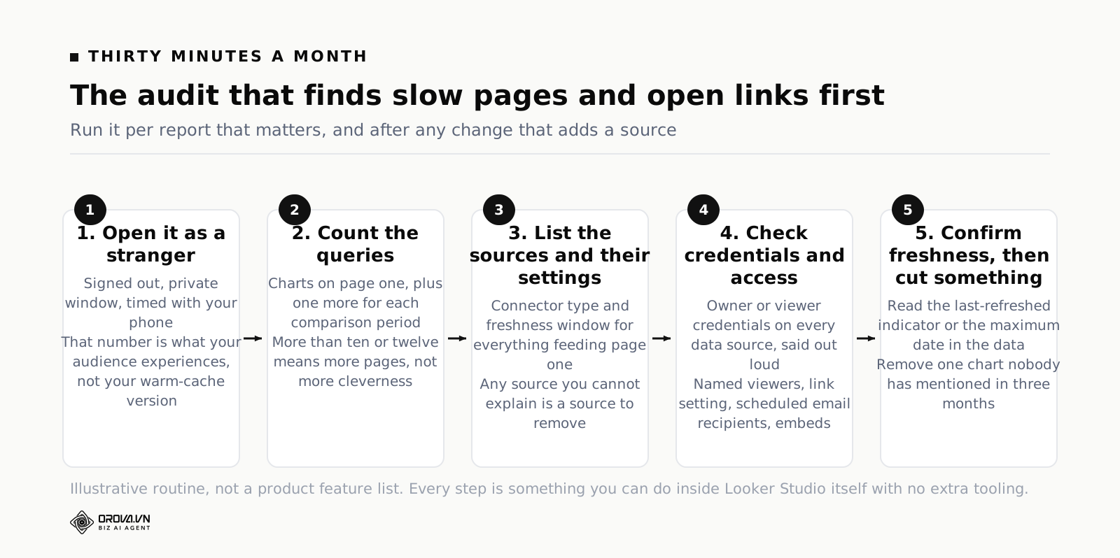
Step one deserves emphasis because almost nobody does it. The person who built the report has the warmest possible cache and the strongest possible permissions. Their experience of the report is the best experience anyone will ever have of it. Everything you learn about the real state of a report comes from opening it as a stranger.
When to fix the report, and when the tool has run out
Most slow reports are fixable in an afternoon with the list above. Do that first. Rebuilding reporting is expensive, disruptive, and usually gets blamed for whatever else goes wrong that quarter.
The signals that the report itself is the problem, not the tool:
- It has more than about fifteen charts on the page people open
- The default date range is longer than the question being asked
- There are blends doing work that a properly prepared table should do
- Nobody has looked at the freshness settings, ever
- It is slow for the first viewer of the day and fine afterwards
The signals that you have reached the edge of what the tool wants to do:
- You maintain more than about ten near-identical copies for different clients or brands, by hand
- You need each viewer to see a different slice, and pushing it down to a database is not available to you
- Metric definitions have drifted across reports and there is no place to fix them once
- The blends are trying to be a data model, and losing
- Editors overwrite each other regularly and nobody trusts the current state
- You have partner connector subscriptions costing real money whose only job is to move ad data into the report
At that point you have three honest routes. Put a warehouse underneath and keep Looker Studio as the presentation layer, which fixes joins, speed and definitions in one move and needs someone to own the pipeline. Move to a tool built around a data model, accepting the cost in licences and learning. Or use a platform where the connectors, the storage and the sharing are one product rather than three you are gluing together — which is what Orova Insight does: sixteen source types syncing to a shared store, a drag-and-drop canvas, custom metrics defined by formula, ten recovery versions kept per report, and sharing that covers workspace permissions, per-person access, public links, iframe embeds and scheduled PDFs from the same place.
Whichever route you take, the decision should be made on the maintenance signals, not the speed ones. Speed problems get fixed. Maintenance problems compound.
Questions people ask about Looker Studio report performance
Why is my report slow for the client but fast for me?
Three usual causes. You have a warm cache from working on it and they do not. Your permissions on the underlying sources are complete and theirs trigger a slower authentication path. Or the source uses viewer credentials, so their queries cannot use the same cached answers as yours. Test signed out, in a private window, before assuming it is their connection.
Does adding more pages make a report slower?
No, in the way that matters. Looker Studio queries the page in view, so charts on other pages do not delay the first load. Moving charts off page one is one of the cheapest speed wins available. It does add a navigation cost for the reader, so group pages by the question they answer rather than by data source.
Is an extract always faster than a live connection?
Usually, sometimes dramatically, but not always. An extract that still contains millions of rows at a fine grain will not feel fast. The speed comes from the aggregation you do when creating it, as much as from the storage. An extract of daily figures by campaign is fast. An extract of hourly figures by ad and placement is a smaller version of the same problem.
Can a viewer see data they do not have access to?
Yes, and this is the single most important thing to understand about Looker Studio sharing. If the data source uses owner credentials, viewers see whatever your account can see, filtered only by what the report displays. That is the intended design and it is why client reporting works so smoothly. It is also why you check the credentials setting on every data source before sharing a link.
Is Looker Studio the same as Google Data Studio?
Yes. Google renamed Data Studio to Looker Studio in 2022. Anything you built as a google data studio dashboard still works, and older tutorials still apply with different screenshots. Search results mix both names, so when you find advice about performance or limits, check the publication date before trusting any specific number in it.
How many charts is too many on one page?
There is no hard limit that stops you, which is the problem. As a working rule, a page should answer one question and fit on roughly one screen. If a reader has to scroll twice to reach the chart they came for, the page is doing two jobs and should be two pages. That rule improves speed and readability at the same time.
Do scheduled PDF emails slow the report down?
They generate a full render on a schedule, which is a load on your sources, but it happens without a human waiting. The practical risk is different: recipients of a scheduled PDF need no access to the report, so the distribution list becomes a permission list nobody audits. Include it in the monthly access review.
What to do this week
Pick the one report that gets complained about and spend half an hour on it, in this order.
Open it signed out and time it, so you know the real number. Count the charts on the first page and move everything that is not part of the headline question onto a second page. Set the default date range to the shortest window that answers the question, and give the one genuine long-range trend chart its own page and its own range. Then open every data source in the report and read two settings: freshness, and credentials. Write both down.
That is the whole first pass, and for most reports it is enough. If it is still slow afterwards, you now know which source is responsible, and you can decide whether an extract fixes it or whether the data needs to live somewhere else before it reaches the report.
Do the access review the same day, while you are in there. Named viewers, link setting, scheduled email recipients, embeds. It takes five minutes and it is the only part of this list where the downside of skipping it is not merely a slow page. And if the report exists to tell leadership whether the money is working, check it against the business Analytics Dashboards: What to Put on One before you spend another hour making it faster — a fast report of the wrong numbers is still the wrong report.
When the report is too big to fix by hand
Everything above can be done manually: trimming charts, checking cache settings, testing what each client can and cannot see, rebuilding data sources so they load faster. The catch is time — every new client, every new data source, every new blend means doing this audit again, and most teams only notice when someone complains.
Orova Insight is built to take that repeated checking off your plate, watching how your reports and data connections behave so you are not the one clicking through every chart to find what broke. If that sounds like something worth trying on your own reports, it is worth a look.
When the report outgrows the tool
Orova Insight keeps sources synced, versions saved and sharing controlled from one link.
Start for free