
Building an SEO Report in Looker Studio: Fields, Filters, Pitfalls

You spend a Friday afternoon wiring up your first Search Console report, and the totals are wrong. The Search Console interface shows one number for clicks, your new report shows another, and the average position tile is off by enough that nobody trusts it. You did not misconfigure anything. A google data studio seo report reads the same data as the interface, but it asks a different question by default, and that quiet difference is what makes the whole report look broken.
The usual fix is to keep tweaking settings and hope the numbers line up, which wastes hours and rarely works because the mismatch is not a settings bug — it comes from choices baked into how the report is built: which connector you picked, how dates are windowed, how position gets averaged. Nobody explains this up front, so people rebuild the same report three or four times before giving up or quietly ignoring the discrepancy.
This article walks through the build order that avoids that trap: the connector choice that decides what the report can ever show, which fields are safe to chart and which quietly mislead, how dates and reporting delays distort recent numbers, the filters that actually carry the value, where blending with GA4 breaks, and the aggregation traps that make position and click-through rate lie. Read it once and you can build a report that either matches the interface or clearly explains why it does not — before anyone senior asks.
Why does a Google Data Studio SEO report never match the Search Console UI?
Because the two use different defaults. The Search Console interface filters to Web search by default and shows the last three months; the Looker Studio connector pulls every search type over whatever date range the chart requests, and it aggregates average position differently once you change the dimensions. Same API, different questions.
There are five causes, and in my experience they show up in roughly this order of frequency.
Search type. The Performance report in Search Console opens filtered to Web. Image, Video, News and Discover data sit behind separate filters. The Looker Studio connector does not apply that filter for you. If your site earns image traffic, your report's impressions will be higher than the screen your boss knows, and the average position will be worse, because image results sit further down. Add a Search Type filter set to Web and the two converge immediately.
Property type. A domain property and a URL-prefix property for the same site return different totals, because the domain property includes every subdomain and both protocols. If your Search Console account has both — and many do, because someone verified the URL prefix years ago and the domain property later — you can pick the wrong one in the connector without noticing. The data source name in Looker Studio shows which one you picked. Check it before you debug anything else.
Date range and completeness. Search Console data is not real time. The most recent days are incomplete and get filled in afterwards. If your report's default range ends today and the interface's range ends two days ago, you are comparing a partial period against a complete one.
Aggregation. Average position and CTR are not additive. Sum them or average them across rows and you get a number with no meaning. This one is worth its own section below, because it is the trap that survives every other fix.
Anonymised queries. Search Console does not show every query. Rare queries, and queries that might identify a person, are excluded from the query dimension. So the sum of your query table will always be lower than your site total. That is documented behaviour, not a bug in your report, and you should write it on the page rather than explain it in a meeting every month.
Site Impression or URL Impression: the choice that decides everything
When you add the Search Console connector, Looker Studio asks for the site, the search type, and then a table type: Site Impression or URL Impression. People click past this in two seconds. It is the most consequential decision in the whole build, because it determines which dimensions exist for the rest of the report.
Site Impression aggregates at the property level. Its dimensions are query, country, device, date and search type. Impressions are counted once per query per site, even when several of your URLs appear in the same result page. This is the table you want for anything query-shaped: brand versus non-brand, question keywords, country splits, ranking distribution.
URL Impression aggregates per landing page. Its dimensions include landing page, country, device, date, search type, and a set of rich-result and appearance dimensions. Impressions are counted per URL, so a search page showing two of your URLs counts twice here and once in the other table. This is the table for page-level work: which URLs are decaying, which templates earn clicks, which section of the site grew.
Here is the part that surprises everyone: the URL Impression table has no query dimension. You cannot build a chart that shows queries for a specific page from the native connector. In the Search Console interface you can filter to a page and then look at queries, and even there the numbers do not reconcile to the page total because of anonymisation. In the connector, the combination simply does not exist.
So if the report you have been asked for is "which queries drive traffic to this page", the native connector will not deliver it, and no amount of blending will conjure the missing dimension. Your honest options are: use the interface for that one question, pull the API directly with a script or a third-party connector that supports the query-plus-page combination, or reframe the report around what the tables can actually answer.
One more practical detail. The metric names differ between the two tables — you will see impressions, clicks and CTR in one and URL-flavoured equivalents in the other. If you build calculated fields against one table and later swap the data source on a chart to the other, the fields break and the chart shows an error rather than a warning. Decide the table type first, then build.
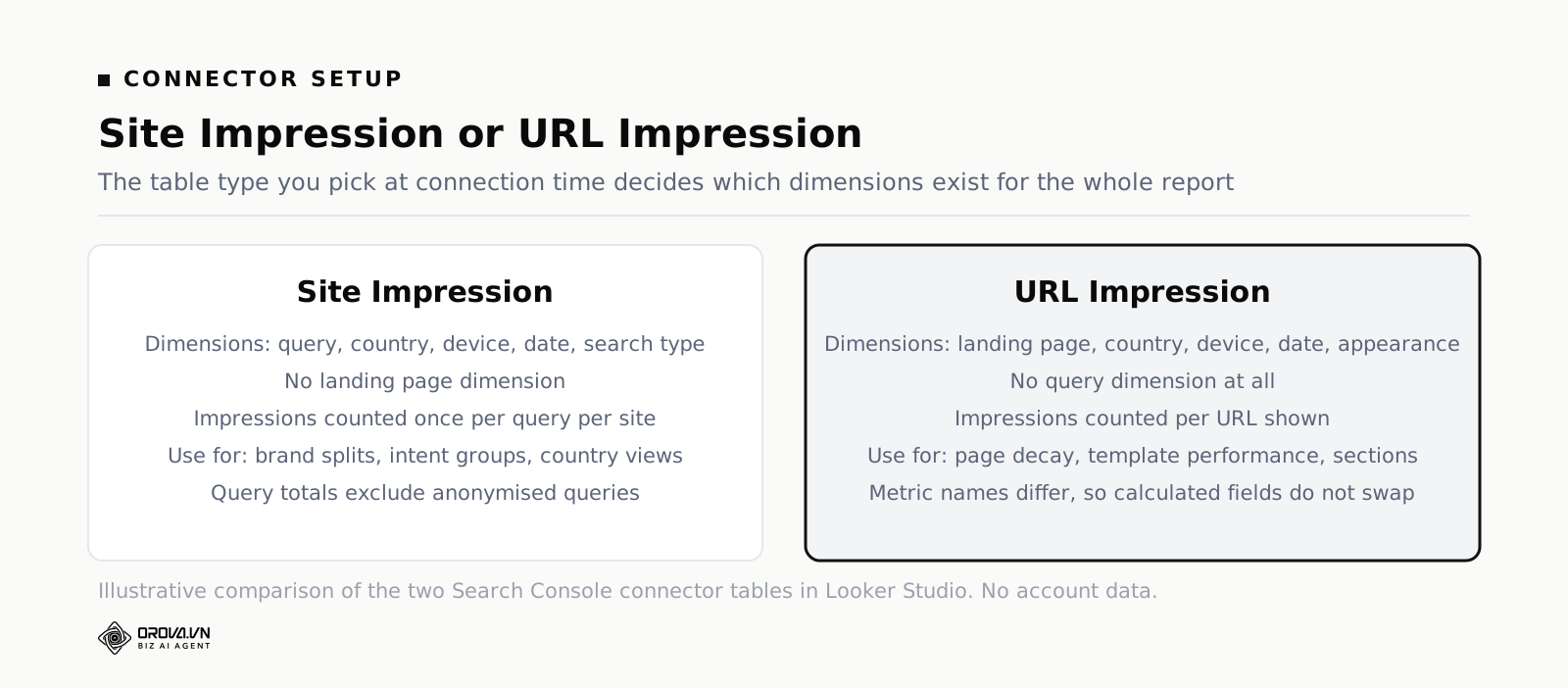
In practice most teams need both. Create two data sources from the same property — one Site Impression, one URL Impression — name them clearly, and put query charts on one page and page charts on another. Do not try to serve both from one source. You will spend an hour discovering why the landing page field is missing from a chart you already built.
The fields worth using, and the ones that mislead
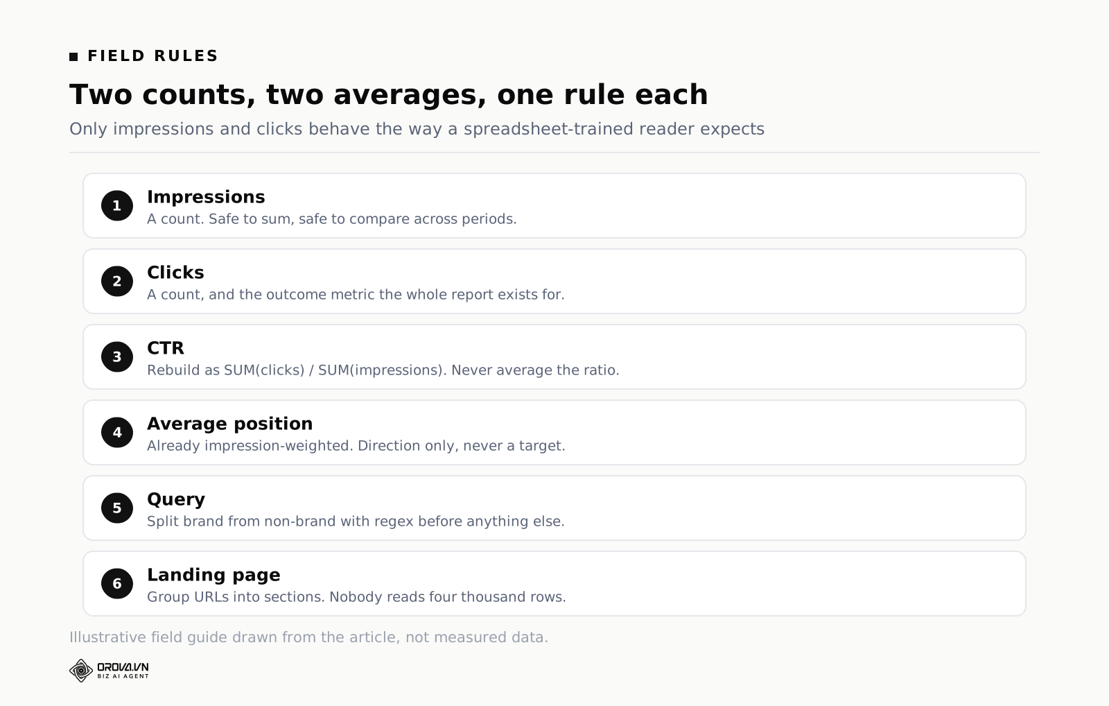
The field list looks generous until you separate what you can chart from what you can chart honestly. Four metrics come from Search Console, and only two of them are real counts.
| Field | What it is | Safe to sum? | Use it for |
|---|---|---|---|
| Impressions | Times a result was shown, counted per the table type you chose | Yes | Demand and visibility trend |
| Clicks | Clicks through to your site | Yes | The outcome metric of the whole report |
| CTR | Clicks divided by impressions | No — recompute | Snippet and intent diagnosis |
| Average position | Impression-weighted mean rank of your best result | No — never average | Directional movement only |
| Query | The search term, minus anonymised ones | — | Brand splits, intent grouping |
| Landing page | The full URL that received the impression | — | Page and template analysis |
| Country / device | Segmentation dimensions | — | Filters and controls, not standalone charts |
| Search type | Web, image, video, news | — | A filter you set once and forget |
Impressions and clicks are counts. They add up, they compare cleanly across periods, they behave the way a spreadsheet-trained reader expects. Everything else needs a rule.
CTR should be a calculated field, always. Create it as the sum of clicks divided by the sum of impressions. Do not use the connector's CTR field inside a table that groups rows, because you will end up showing the average of a set of ratios, which is a different and wrong number. A row with three impressions and one click has a CTR of 33 per cent; averaging that against a row with 30,000 impressions at 4 per cent gives you 18.5 per cent, which describes nothing that happened.
Average position deserves suspicion in every chart it appears in. It is already an average when it arrives, weighted by impressions, and the value is the position of your best-ranking result for that query. It moves when a page that never ranked starts ranking on page five, which looks like a decline and is actually expansion. Put it on a line chart to watch direction. Never put it in a scorecard next to a target, and never let anyone build a KPI on it. If leadership wants a rank number, the honest version is a distribution: how many queries sit in positions one to three, four to ten, and beyond. Building that argument for a non-technical audience is the subject of Business Analytics Dashboards: What to Put on One.
Three calculated fields earn their place in almost every build:
- Brand flag. A CASE statement on the query field using REGEXP_MATCH against your brand terms and common misspellings, returning "Brand" or "Non-brand". Almost every meaningful SEO conclusion depends on this split, and reports without it overstate performance every single month.
- Page group. A CASE statement on landing page turning URLs into sections — blog, product, category, docs, home. Nobody wants to read 4,000 URLs. They want to know whether the blog grew and the category pages shrank.
- Position bucket. A CASE statement turning average position into bands. Bands survive the volatility that a decimal average does not.
A note on regex in these fields: test the pattern in a table before you rely on it. Build a temporary table of query, your new brand flag, and clicks, sort by clicks, and read the top fifty rows with your own eyes. Brand patterns that look obviously right catch things you did not intend — a two-letter brand name inside longer words is the classic — and once a wrong flag is buried in a scorecard nobody ever audits it again.
Dates, freshness and the hole at the end of the range
Three separate date problems hide in a Search Console report, and they compound.
The reporting delay. Search Console data is not available immediately. The most recent days are incomplete when you look at them and get topped up over the following days. Practically, this means a report whose range ends "today" always shows a cliff at the right edge of every line chart. Someone will screenshot that cliff and send it to you as a crisis. Fix it structurally: set your default date range to end a couple of days before today, and put a text box on the page that says the last complete day is not today.
Time zone. Search Console reports days in Pacific Time. GA4 reports days in whatever time zone the property was configured with. If you are in Europe or Asia, your Search Console "Monday" and your GA4 "Monday" cover different hours. On a monthly total the difference is small enough to ignore. On a daily chart of a launch day, it is the entire story. This matters most the moment you blend the two, which is why it comes up again below.
The 16-month window. Search Console retains roughly 16 months of performance data. Year-on-year comparison works — barely — but two-year trends do not exist and never will unless you have been storing exports. If your report needs history beyond that, you have to warehouse the data yourself, and you needed to start last year. The cheap version is a scheduled monthly export into a sheet, appending rather than overwriting. It is not elegant and it works.
On refresh: Looker Studio caches results, and each data source has a freshness setting you can change. Faster refresh is not free — it costs API quota and load time — and Search Console data does not update quickly enough to justify aggressive settings. Daily is plenty for a report about search. Anyone asking for real time in an SEO report is asking for a feeling of control, not information, and the honest answer is that the underlying data does not move that fast.
Give every date-based chart a fixed default range rather than leaving it on Auto, and add a date-range control at the top of the page so readers can change it without editing anything. Then decide whether the comparison period is the previous period or the same period last year, and write the choice on the page. Search behaviour is seasonal in most categories, and a month-on-month comparison in a seasonal business generates panic every autumn.
Filters that matter: page, query, country, device
Looker Studio gives you three ways to reduce data, and mixing them up produces reports that disagree with themselves from one page to the next.
Data source filters apply everywhere the source is used. Search type set to Web belongs here, and so does excluding a staging subdomain. Set it once, never think about it again.
Chart and page filters apply to one chart or one page. Brand-only tables, single-section page groups, and country-specific pages live here. The rule is to name them for what they do, because a filter called "Filter 7" will be a mystery in three months, including to you.
Controls are the dropdowns and boxes readers touch. They are the difference between a report people use and a report people request changes to. Four are worth the space in almost every SEO report: date range, device, country, and a page-group or brand toggle. Add a search box on the query field if the report has a technical audience — people who know their own product will type a term and get an answer in two seconds, which is the highest-value interaction a report can offer.
The trap: a control only affects charts built on data sources it is bound to. Add a second data source for GA4, forget to widen the control's scope, and your date picker silently moves half the page. Readers will not report this. They will just quietly conclude the numbers do not agree, and stop trusting the report. Test every control by setting it to an extreme value and confirming that every tile on the page moves.
Two filter details specific to Search Console. First, the landing page dimension holds full URLs including protocol and any trailing slash, so a filter using "contains /blog/" is safer than one using an exact match. Second, filtering on query in the Site Impression table hides anonymised queries entirely, so a brand-versus-non-brand split will never sum to your site totals. Show the site total separately, label the query table as "queries Search Console discloses", and the question stops being asked.
Blending Search Console with GA4, and where blends break
The request arrives within a week of the first report shipping: "can we see which pages get organic traffic and what those visitors did?" It is a reasonable question, and a blend is the obvious tool. Looker Studio blends up to five tables with the join types you would expect — left, right, inner, full outer, cross — on join keys you choose.
It breaks in three places, reliably.
The join key does not match. Search Console's landing page is a full URL: https://example.com/blog/post/. GA4's page path is /blog/post/, and its page location may or may not include query strings. Join those two raw and you get a table of nulls. The fix is a calculated field on the Search Console side that strips the protocol and domain, plus one on the GA4 side that strips query parameters, so both produce the same shape. Trailing slashes and uppercase characters need normalising too. This is fifteen minutes of work and it is the single most common reason a blend "does not work".
The dates do not line up. Pacific Time versus your property time zone, plus the Search Console delay, means the two sources have different last-complete-days. In a left join from Search Console, the most recent rows come back with organic sessions of zero, which looks like a catastrophic traffic drop. Ending your default range before the incomplete window solves it.
Row multiplication. If either side has more granularity than the other — GA4 with a device dimension, Search Console without it — the join fans out and metrics get counted more than once. Totals inflate, nobody notices until a total is quoted in a meeting, and then the whole report is suspect. The defence is discipline: reduce both sides to exactly the dimensions in the join key plus the metrics you need, and check a blended total against the same total in each source separately before you publish.
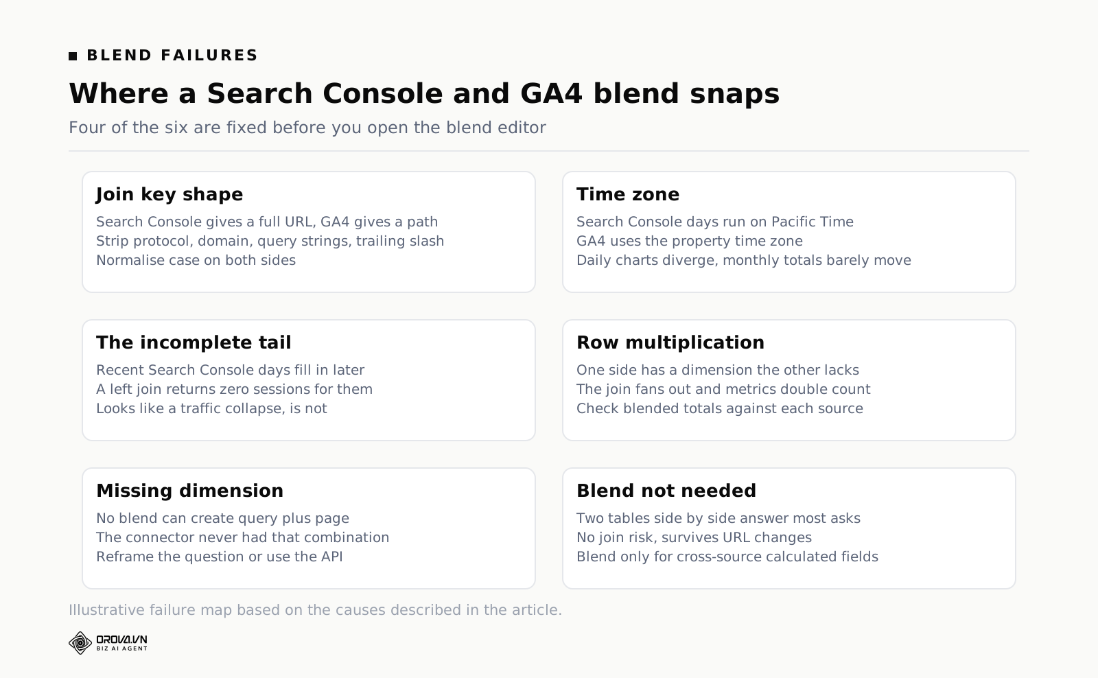
There is also a strategic question worth asking before you build the blend at all: does the reader need the two datasets on one row, or side by side on one page? Nine times out of ten, side by side is enough. Two tables — top pages by clicks, top landing pages by conversions — answer the same question with none of the join risk, and they keep working when a URL structure changes. Reserve blends for cases where you genuinely need a calculated field spanning both sources, such as clicks-to-conversion rate per page.
If the ask is broader than search — combining organic and paid performance in one view — the join and definition problems multiply, and it is worth reading combined SEO and Ads reporting before you start dragging fields around.
Aggregation traps: average position, CTR, and the sum that is not a sum
This is the section to read twice, because every other error in this article produces a number that is obviously odd, and this one produces a number that looks completely plausible.
Average position arrives from the API already averaged and already weighted by impressions. When you put it in a table grouped by query, each row is correct. When you then ask for a total, or a scorecard, or a trend line without the query dimension, something has to combine those rows — and an unweighted average of averages is not the same number as the weighted one.
Take a worked example with three queries. Query A: 10,000 impressions at position 3.0. Query B: 500 impressions at position 12.0. Query C: 200 impressions at position 40.0.
The unweighted average of the three positions is 18.3. The impression-weighted average — which is what Search Console reports — is 4.1. Same three rows, same data, two numbers that would lead to opposite conclusions about whether the site is healthy. The unweighted version says you are stuck on page two. The weighted version says almost all of your visibility sits near the top of page one, with a long tail of terms you barely rank for.
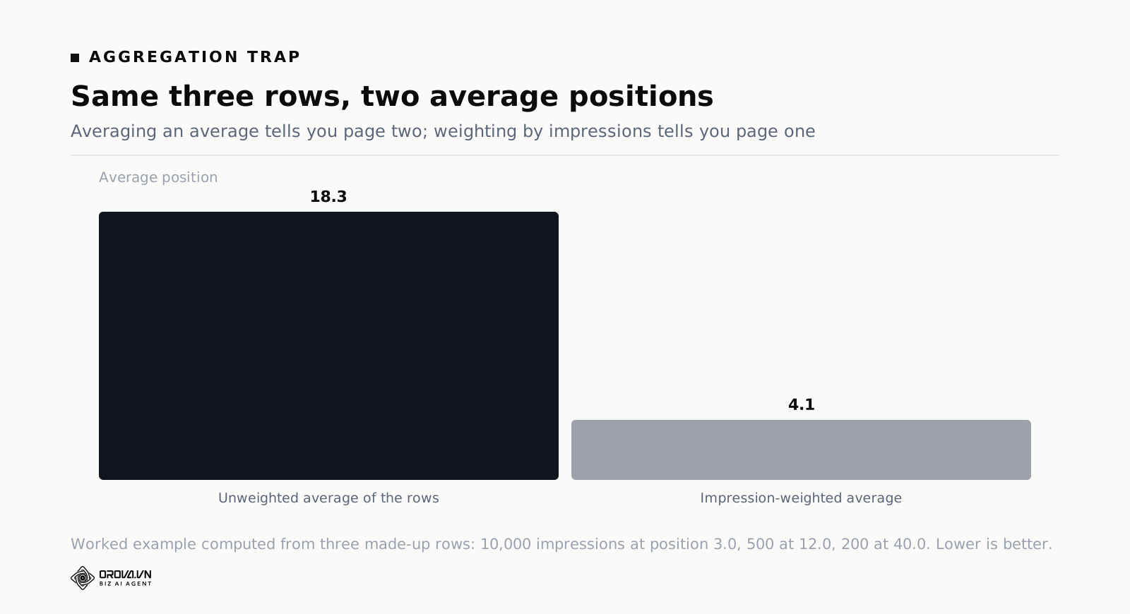
The rule that keeps you out of trouble: if a metric is a ratio or an average, recompute it from the underlying counts at whatever grouping the chart uses. For CTR that means SUM(clicks) / SUM(impressions) as a calculated field. For average position, Looker Studio's built-in weighted average aggregation is the correct choice where it is available, and where it is not, you either accept a directional line chart or you drop the metric.
The same principle bites elsewhere. Percentages from any source — bounce rate, conversion rate, engagement rate — must be rebuilt from counts when you change the grouping. So must anything already labelled "per" something: cost per click, revenue per session, clicks per page. A useful habit is to keep the raw counts on the report even when nobody asked for them, in small text under the ratio, so the ratio can always be checked. It costs one line of space and it ends arguments.
One more subtle case. When you add a second dimension to a table, existing rows split, and any ratio in the table recalculates at the new grain. That is correct behaviour and it still surprises people, because the top-line number they memorised last week is no longer on screen. Warn readers before you change the grain of a table they use, or leave the old view on the page for a month.
Sampling, row limits and the rows you never see
Reports lose data quietly in three ways, and none of them throw an error.
Anonymised queries. Search Console withholds rare and potentially identifying queries from the query dimension. Your query table's total will always be less than your site total, and the gap is larger for small sites and for long-tail-heavy sites. This is not sampling, it is deliberate exclusion, and it cannot be recovered.
Chart row limits. Tables in Looker Studio return a limited number of rows, and the limit is a setting you can raise but not remove. A table sorted by clicks descending is fine — the rows you lose are the ones with the smallest numbers. A table sorted by average position ascending is a disaster, because the top of the table fills with queries that had two impressions and no clicks, and the rows that matter never render. Always sort tables by a volume metric, and apply a minimum-impressions filter before you sort by anything ratio-shaped.
High-cardinality aggregation in GA4. When a GA4 report exceeds its cardinality limits, values collapse into an "(other)" row. If you have ever seen an "(other)" line dominating a page-path table, that is what happened. Reduce cardinality before it happens: filter to the section you care about, group pages with a calculated field, and shorten the date range for detailed views.
If a report is slow as well as truncated, Looker Studio's extract feature snapshots a data source into a static, faster table on a schedule, with a documented size cap. It is a good fit for a stable historical layer — last 16 months of Search Console at page-group grain — and a bad fit for anything a reader expects to be current. Use extracts for history, live connectors for the current period, and label which is which on the page.
A build order that avoids rework
Almost everyone builds a Search Console report in the wrong order: connect, drag charts, discover the missing dimension, rebuild. This sequence avoids that, and takes about half a day the first time.
- Write the question first. One sentence, and a named reader. "Is organic traffic to our commercial pages growing, and which pages moved?" Every field decision below is settled by that sentence.
- Pick the property and the table type. Domain property or URL prefix, Site Impression or URL Impression. Create both sources if you need both, and name them so a colleague can tell them apart without opening them.
- Set data-source filters immediately. Search type Web, staging subdomains excluded. Before any chart exists.
- Build the calculated fields before the charts. Brand flag, page group, CTR, position bucket. Fields built at the data-source level are reusable everywhere; fields built on a chart are not.
- Validate against Search Console. One table, one month, no filters beyond search type. Compare clicks and impressions with the interface. Do not proceed until they agree or until you can state in one sentence why they do not.
- Build the top-line row, then one chart per question. Clicks, impressions, CTR, position, each against the same declared comparison period. Then charts, adding one at a time, and deleting any chart you cannot describe a decision for.
- Add controls last, then test them. Date range, device, country, page group. Set each to an extreme value and check that every tile on the page responds.
- Write the footnotes on the page. Last complete day, comparison period, search type filter, and the anonymised-query caveat. Four lines that prevent four recurring conversations.
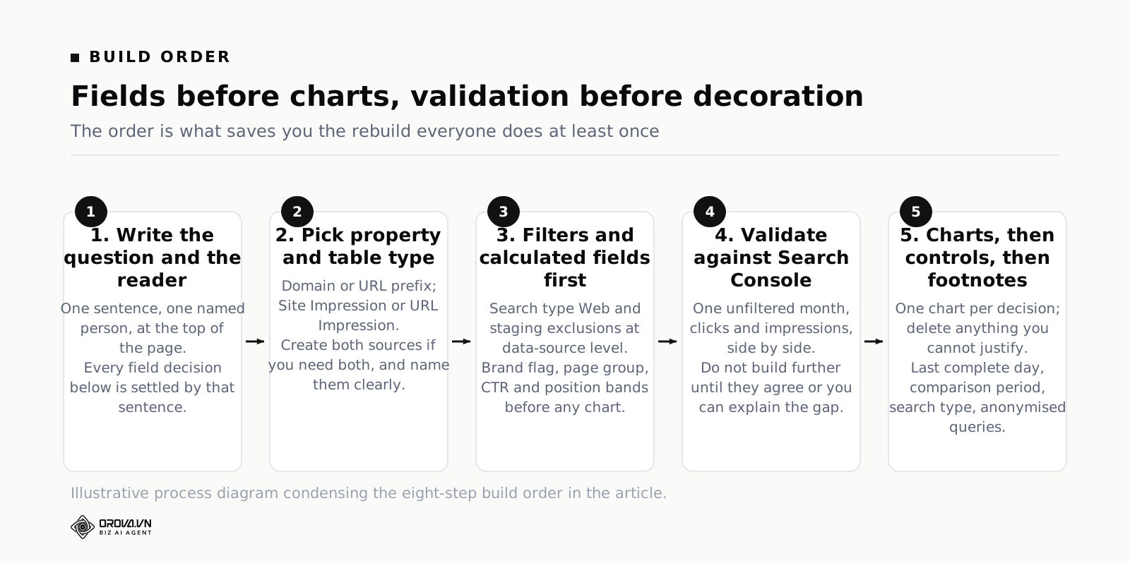
Step five is the one people skip, and it is the one that determines whether the report survives. Reconciling a single unfiltered month against the interface takes ten minutes and buys you the right to be believed for a year.
Mistakes that force a rebuild
Building on the wrong table type
You build six charts on Site Impression, then get asked for landing-page performance, and discover the dimension does not exist. Rebuilding is not just re-dragging fields; every calculated field, filter and control has to be reattached. Decide the table type from the question, in step one.
Leaving the date range on Auto
Auto is convenient and it means different things on different charts. One tile shows this month, another shows the last 28 days, both look reasonable, and the numbers do not reconcile. Set an explicit default on every chart, or set it once at page level and let charts inherit.
Treating average position as a KPI
Somebody puts average position in a scorecard with a target, and from then on any expansion into new keyword territory reads as failure. Report distribution bands, or report it as a line with no target attached and a sentence explaining what moves it.
Reporting brand and non-brand together
Brand search is largely a function of what marketing did elsewhere. Mixed into an SEO report, it either flatters bad months or hides good ones. Split it in the first build, not after someone challenges a number.
One page for every audience
An executive page and a practitioner page share almost no charts. Trying to serve both produces a page that is too dense for one reader and too shallow for the other. Two pages in the same report costs nothing.
No owner and no cadence
Reports rot. Connectors lose authorisation when someone leaves, a URL structure changes and a page-group regex stops matching, GA4 gets a new property. Put a name against the report and a fifteen-minute check in a calendar, monthly. Without that, the failure mode is not an error message — it is a chart that has quietly been wrong for two months.
When to keep building it yourself, and when a tool is cheaper
Do it yourself when the scope is small and stable: one property, one or two sources, a handful of pages, a reader who is technical enough to interpret a caveat. Looker Studio is free for that, the connectors are official, and the skills transfer. If you are learning, build it by hand at least once — you cannot judge a reporting tool until you have felt where the joins break.
The economics change on three specific pressures. First, source count: once you are past three or four connectors and every one has its own join key and time zone, maintenance stops being occasional and becomes a standing task. Second, history: when you need more than 16 months of Search Console, or any history at all from a source that does not retain it, you need a warehouse rather than a live connector. Third, headcount: when the only person who understands the calculated fields goes on holiday and the monthly report does not go out.
That is the point where a managed reporting layer is genuinely cheaper than an afternoon a week. Orova Insight sits in that slot — it connects Search Console, GA4, the ad platforms and Google Sheets among 16 source types, stores the daily numbers so history keeps accumulating past the retention windows of the sources, and lets you build calculated metrics and 31 chart types on a canvas with 11 kinds of filter control. Whether that is worth it depends entirely on the three pressures above. If none of them apply to you, keep building it by hand.
Frequently asked questions
Is Looker Studio still free?
The standard product is free, including the Search Console and GA4 connectors and unlimited reports. There is a paid tier aimed at organisations that need team content management and support commitments. Nothing in this article requires the paid tier. Some third-party connectors charge separately, which is worth checking before you build a report that depends on one.
How far back can a Search Console report go?
Roughly 16 months, which is the retention window on the source. Year-on-year comparison just fits; two-year trends do not exist. If long history matters, start appending monthly exports to a sheet or a warehouse today, because the data you did not store is gone permanently and no tool can retrieve it.
Why can I not see queries for one specific page?
Because the URL Impression table in the connector has no query dimension, and the Site Impression table has no landing page dimension. The native connector cannot cross them. The interface can, imperfectly, because of anonymised queries. For a proper page-plus-query report you need the API directly or a connector built on it.
Should I blend Search Console with GA4?
Only when you need a calculated field that spans both — clicks-to-conversion rate per page, for example. If the reader just needs both sets of numbers, put two tables side by side. That answers the same question, survives URL changes, and cannot inflate totals through row multiplication.
How often should the report refresh?
Daily. The source data updates with a delay of days, so a faster refresh consumes quota to show you the same numbers. Set data freshness on each data source rather than leaving defaults, and put the last complete day on the page so nobody mistakes the incomplete right-hand edge of a chart for a collapse in traffic.
Why did last week's numbers change after I looked at them?
Search Console fills in recent days after the fact, so a partial day you screenshotted on Tuesday is a fuller day by Friday. This is normal and it is why a fixed range ending a few days before today makes a report far more stable. If you circulate screenshots, put the date range and the export date on every one.
What to do this week
If you already have a report and it is disputed, do not rebuild it. Do these four things in order and most disputes disappear: check the property type in the data source, add a Search Type filter set to Web, end the default date range a couple of days before today, and reconcile one unfiltered month of clicks and impressions against the Search Console interface. That is an hour of work.
If you are starting from an empty canvas, write the question and the reader's name at the top of the page before you connect anything. Then pick the table type deliberately — queries or pages, because the connector will not give you both together — build your brand flag and page group as data-source fields, validate one month against the interface, and only then start dragging charts onto the canvas.
And write the four footnotes. Last complete day, comparison period, search type, anonymised queries. They look like small print. They are the difference between a report that gets trusted and a report that gets argued with every month until someone quietly stops opening it.
Skip the rebuild-it-three-times cycle
Getting a Search Console report to actually match reality means checking connector settings, date windows, filters, and aggregation rules by hand, every single time you add a new page or metric. Done manually, that is hours of quiet, repetitive checking that most business owners do not have spare on a Friday afternoon, let alone every month.
Orova Insight is built to handle that checking automatically, so the report you look at is already set up the sane way instead of the default way. If you are tired of explaining away numbers that do not match, it is worth a look.
Skip the connector plumbing
Orova Insight connects Search Console and GA4 for you and keeps the report refreshed.
Start for free