
Looker Studio vs Power BI for Marketing Teams
The message from IT lands on a Tuesday. The company is standardising on Power BI, reporting moves there by the end of the quarter, and there is already a training session on the calendar with your name on it. Meanwhile you have a browser tab pinned for a year: three Looker Studio reports, one weekly channel mix, one client-facing dashboard, one page the sales director opens every Monday morning. Now you have to weigh looker studio vs power bi for a marketing team, not a finance department, and do it without becoming the person who blocks progress.
The problem is that most comparisons written about this decision come from an IT point of view: security, governance, data warehouses. None of that tells you whether your weekly channel report will still open in two clicks, whether your client will still see their dashboard without a login wall, or whether someone on your team can fix a broken number without calling in a specialist. Marketing reporting has its own set of headaches, ad platform connectors, refresh timing, sharing with people outside the company, and those rarely show up in the feature list either vendor publishes.
This piece is written from the marketing side of the table, not the IT side. By the end, you will know where each tool actually helps a marketing team versus where it just adds friction, what breaks first as your reports grow, and enough to walk into that training session with a real opinion instead of just going along with the decision.
What are Looker Studio and Power BI, and is Google Data Studio the same thing?
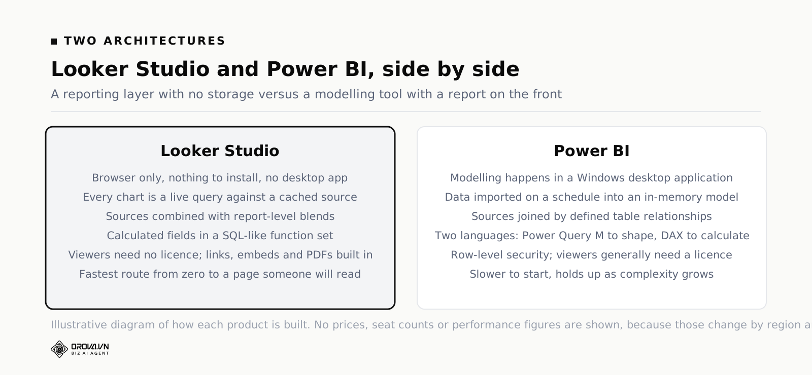
Looker Studio is Google's free, browser-based reporting tool, renamed from Google Data Studio in 2022. Power BI is Microsoft's business intelligence suite, built around a Windows desktop modelling tool and a paid cloud service. Both build dashboards; Looker Studio starts faster on marketing data, Power BI models bigger data more strictly.
Yes, Google Data Studio and Looker Studio are the same product. Google renamed it in 2022 when it folded the tool into the Looker family. Everything you built under the old name still works, old tutorials still apply with different screenshots, and a fair number of people in your company will keep calling it Data Studio for another three years. If you search for power bi vs google data studio you will find comparisons written before the rename that are still broadly accurate about the shape of each tool, and completely out of date about pricing tiers and connectors. Check the date on anything you read, including this.
The deeper difference is architectural, and it explains almost every practical difference further down.
Looker Studio is a reporting layer with no storage of its own. Every chart is a query. When someone opens your page, Looker Studio asks the connector for numbers, subject to a cache. There is no dataset sitting inside the tool, no separate modelling step, no file. That is why you can build something useful in twenty minutes and why the thing occasionally crawls.
Power BI is a modelling tool with a reporting layer bolted on the front. The usual flow is: pull data in with Power Query, shape it, load it into an in-memory model with defined relationships between tables, write measures in DAX, then build visuals on top. The report is the last step, not the first. That is why it takes longer to get anything on screen and why the result holds up when the data gets complicated.
Neither approach is wrong. They are answers to different questions. Looker Studio answers "can I see this and send it to someone." Power BI answers "can the whole company agree on what this number means."
Looker Studio vs Power BI: the nine things a marketing team actually hits
Feature comparisons age badly because both products ship every month. What does not change is the list of places a marketing team gets stuck. In roughly the order you hit them:
- Getting ad platform data in at all
- Making it refresh on time, and understanding why it did not
- Putting two sources side by side without lying with the numbers
- Writing the calculation your boss asked for
- Sharing it with someone outside the company
- Paying for it, per person, every month, forever
- Keeping it fast once it has forty charts
- Teaching someone else to change it
- Deciding whose job it is when it breaks
Take them one at a time. Where a difference is genuinely close, this article says so rather than manufacturing a winner.
Connectors: where your ad data actually comes from
This is the first collision and it decides more migrations than anything else on the list.
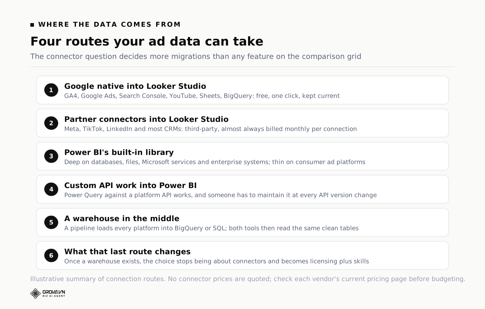
Looker Studio has native connectors, built and maintained by Google, for the Google stack: GA4, Google Ads, Search Console, YouTube, Google Sheets, BigQuery, Campaign Manager, Display & Video 360. They are free, they are one click, and they are kept current when the underlying APIs change. If your reporting is Google Analytics plus Google Ads plus a Sheet of manual data, you can have a first draft on screen before your coffee goes cold.
For anything outside Google — Meta Ads, TikTok Ads, LinkedIn Ads, Shopify, HubSpot, Klaviyo, most CRMs — Looker Studio uses partner connectors. These are built by third parties, listed in the connector gallery, and almost all of them are paid, monthly, per connection or per account. The tool is free. Your Meta data is not. This is the single most common surprise for teams who "just use the free one" and then discover the connector line item on the credit card statement.
Power BI ships an enormous connector library, in the hundreds. Read the list carefully and the shape becomes clear: it is deep on databases, warehouses, files, Microsoft services, and enterprise systems like SAP, Dynamics and Salesforce. It is thin on consumer ad platforms. Marketing teams routinely end up in one of three places:
- A paid third-party connector or data pipeline service, which is the same economics as the Looker Studio partner connector, sometimes cheaper at volume
- A custom Power Query connection against the platform API, which works and which someone has to maintain every time the API version moves
- A warehouse in the middle — a pipeline tool loads Meta, TikTok and Google Ads into BigQuery, Snowflake or a SQL database, and Power BI reads from there
That third option is the grown-up answer, and it is worth saying plainly: once you put a warehouse in the middle, the Looker Studio versus Power BI question gets much less interesting. Both read from a warehouse happily. The argument stops being about connectors and starts being about licensing and skills.
One practical note on power bi for marketing specifically. If a colleague tells you Power BI has a built-in Facebook connector, check its current status in Microsoft's connector documentation before you plan around it. Several social and ad platform connectors have been deprecated over the years as the underlying APIs changed, and a deprecated connector will keep working right up until it does not. Verify, do not assume — that applies to both tools.
Refresh and caching: why yesterday is missing
Every marketing dashboard eventually generates the same message: "this doesn't match the platform." Nine times out of ten it is not a bug. It is refresh behaviour, and the two tools get there differently.
Looker Studio queries live, then caches. When a report loads, it serves what is in cache if the cache is still considered fresh; otherwise it re-queries the source. You control the freshness interval per data source, and the available intervals depend on the connector — Google documents the options in the Looker Studio help centre, and they differ between, say, a BigQuery source and a Sheets source. There is a manual refresh button. There is no build step and nothing to schedule.
The consequence: your Looker Studio report is usually close to live, and the failure mode is slowness rather than staleness. The other consequence, less obvious, is that a report open on ten screens is ten sets of queries against the API, subject to the platform's own quotas. Teams who hit Google Ads API limits usually hit them because a shared report is being refreshed all day by people who leave tabs open.
Power BI, in the standard import mode, does the opposite. Data is pulled into the model on a schedule, compressed, and stored. Reports then read from that stored copy, which is why they are fast. The trade is that the report is exactly as current as the last successful refresh. If the refresh failed at 6am because a token expired, everyone reads yesterday's numbers all day and nothing on screen says so unless you built a "last refreshed" text box, which you should.
Refresh frequency is a licensing question in Power BI, not a technical one. Microsoft's documentation on scheduled refresh sets the ceiling at eight scheduled refreshes per day for datasets in shared capacity with Pro, and forty-eight per day on Premium capacity. Check the current figures on Microsoft's documentation before you quote them internally, because capacity SKUs have been reorganised under Fabric and the details move. The point stands regardless: with Power BI you buy your way to fresher data, and with Looker Studio you get freshness by default and pay in query load.
Power BI also offers DirectQuery, which leaves data in the source and queries it live, more like Looker Studio's model. It solves staleness and creates the performance problem Looker Studio has. There is no free lunch anywhere in this comparison.
What this means for a weekly report
If your Monday meeting needs numbers through Sunday midnight, both tools handle it. If someone wants to check spend at 3pm and act on it, Looker Studio on a live connector is the more natural fit, and Power BI needs either a mid-day refresh slot or DirectQuery. If your numbers must be reconciled and never move once published — the finance-adjacent case — Power BI's stored snapshot is the feature, not the bug.
Blending versus a data model
Here is where the two tools differ most, and where most bad marketing dashboards are born.
Looker Studio has blends. You pick two or more sources, choose join keys, choose a join type, and get a combined table you can chart. It is genuinely useful and it is genuinely easy to get wrong. The classic failure: you blend Google Ads and Meta Ads on date, put spend and conversions in one table, and the conversion column double-counts because the join fanned out rows. It looks fine. The total is wrong by a factor you will not notice until someone in finance does.
Looker Studio caps how many sources one blend can hold, and the cap has moved over the product's life — check the current limit in Google's help centre rather than trusting a blog post. More importantly, blends are defined inside the report. They are not a shared model. Build the same blend in three reports and you have three chances to define it differently, which is how two dashboards in the same company end up disagreeing about cost per lead.
Power BI does not blend, it models. You load each table, then draw relationships between them: this campaign table relates to that date table on the date column, one-to-many, single direction. Once the model is right, every visual in the report obeys it. Filters propagate along the relationships you defined. Ambiguous relationships are refused rather than silently guessed.
Modelling is more work and it is more work every time. You need a proper date table. You need to think about grain — is one row a day, a campaign-day, or an ad-day? You need to know what a many-to-many relationship does to your totals. The payoff is that when the model is right, the numbers are right everywhere, and adding the fourth data source does not break the first three.
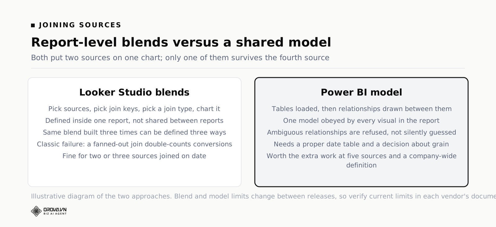
The honest summary: for two or three sources joined on date, blending is fine and faster. For five sources, overlapping dimensions and a definition of "lead" that has to hold across the company, a model is worth the pain. Most marketing teams sit in the first case for two years and then wake up in the second one without noticing the transition. If you want a longer treatment of how to keep a multi-source report honest, the piece on combining SEO and ads reporting works through the join problems in detail.
Calculated fields and the formula language
Every marketing report needs calculations the platform does not give you: blended CPA, contribution margin per channel, a bucket that maps thirty campaign names into four business lines.
Looker Studio calculated fields use a function set that reads like SQL with the sharp edges filed off. CASE WHEN for conditionals, REGEXP_MATCH and REGEXP_EXTRACT for campaign naming conventions, standard arithmetic and date functions. A marketer who has written a nested IF in a spreadsheet can write a Looker Studio calculated field the same afternoon. Aggregation-aware calculations exist but are limited, and this is where people run into the wall: some things you want simply cannot be expressed at the row level.
Power BI has two languages, and this catches people out. Power Query M is for shaping data on the way in — splitting columns, unpivoting, cleaning. DAX is for calculations in the report — measures, ratios, time intelligence. They are different languages with different syntax, used at different stages, and both are needed for a real report.
DAX is more powerful than anything in Looker Studio and it is also the steepest part of the climb. Filter context is not intuitive. The gap between a calculated column and a measure trips up almost everyone at first. Time intelligence — same period last year, rolling 28 days, year to date — is a solved problem in DAX and a manual grind in Looker Studio. If your reports lean on period-over-period comparison, that alone is a real argument for Power BI.
A concrete example
Say you want "rolling 28-day blended CPA, compared with the previous 28 days, split by business line, where business line is derived from a campaign naming convention."
In Power BI: derive business line in Power Query with a conditional column or a lookup table, write two DAX measures using DATESINPERIOD, done. It will take an afternoon the first time and ten minutes every time after.
In Looker Studio: derive business line with a REGEXP_EXTRACT calculated field, easy. Rolling 28 days you get from the date range control. The comparison is available through the built-in comparison date range. Splitting a blended CPA correctly across two blended sources while a comparison period is active is where it gets fragile, and you may end up pre-computing the number in BigQuery or a Sheet. Which is a perfectly good answer, and also an admission that the calculation left the reporting tool.
Sharing with clients and permissions
For agencies this section outranks everything above it.
Looker Studio shares like a Google Doc. Add an email address with view or edit rights, or turn on link sharing, or publish a public link, or embed the report in an iframe on a page you control, or schedule an emailed PDF. Viewers do not need a licence. They do not need an account for public links. Your client opens the link on their phone and it works.
The credential model is the part to understand. A Looker Studio data source has an owner credential, and you choose whether the report queries the data using the owner's credentials or the viewer's. Owner credentials are what make client sharing painless — the client sees the data without having access to the ad account. It is also how people accidentally expose more than they meant to. Set this deliberately, per data source, and re-check it before you send a link outside the company.
Power BI sharing is built for employees. A viewer generally needs a Power BI licence to open a report in shared capacity, which means either everyone who reads your dashboard has a paid seat, or the content sits on a capacity that permits free viewers. There is a Publish to Web feature that produces a genuinely public link, and many organisations disable it by policy because genuinely public means genuinely public, indexable and all.
What Power BI has and Looker Studio does not, in any comparable form, is row-level security: a rule in the model that says this user sees only these rows. For an agency serving twenty clients from one report, or a company where regional managers must see only their region, that is the feature that ends the argument. Doing the same in Looker Studio means either separate reports per client or filtering by viewer email, which works and is fiddly.
The rule of thumb on sharing
External audience, low friction, no licences: Looker Studio, comfortably. Internal audience with rules about who sees what: Power BI, comfortably. Mixed — internal governance plus a client-facing page — expect to run both, which is a legitimate outcome and not a failure to decide.
Licensing: what you pay for, per seat
No prices here, because they change by region and by month, and a number in a blog post is worse than no number. What does not change is the shape of each model, and the shape is what you budget against.
Looker Studio's shape: the core product is free, with no seat cost for builders or viewers. There is a paid tier, Looker Studio Pro, sold per user through Google Cloud, which adds team content ownership, access management at the project level, support and an SLA. Your real spend, if you have non-Google sources, is partner connectors — usually billed per connection or per account per month — and BigQuery if you use it, which is billed on storage and query volume rather than seats. Looker studio pricing questions almost always turn out to be connector pricing questions in disguise.
Power BI's shape: there is a free tier for personal use in Power BI Desktop, but sharing effectively requires paid seats. Power BI Pro is a per-user monthly subscription. Premium Per User is a higher per-user tier with larger models and more refreshes. Above that sit capacity-based purchases — now organised under Microsoft Fabric — where you buy compute for the tenant rather than seats, and free users can view content hosted on it. Which tier you need is driven by how many people read the report and how fresh it must be, not by how clever the report is.
Three budgeting notes that catch marketing teams out:
- Viewers cost money in Power BI and do not in Looker Studio. A report read by forty people is a very different bill in each tool. Count readers, not builders.
- Connectors cost money in Looker Studio and are bundled or custom in Power BI. A team pulling six ad platforms may find the partner connector total exceeds a handful of Power BI seats.
- Power BI Desktop is Windows-only. If your marketing team is on Macs, building reports means a virtual machine, a remote desktop, or working in the browser service with reduced modelling capability. For a design-heavy agency running entirely on Apple hardware this is not a detail, it is the decision.
And the piece everyone forgets: if the company already pays for Microsoft 365 at a tier that includes Power BI seats, the marginal cost of Power BI for your team may be zero, while the marginal cost of Looker Studio partner connectors is real money on a card. That is often what IT means by "we've already bought it," and it is a fair point.
Performance as reports grow
Both tools are fast on a demo and both get slow in production. They get slow for different reasons, which means the fixes are different.
Looker Studio slows because every chart is a query. Twenty-five charts on one page, three of them on blends, two on a slow partner connector, and your page takes fifteen seconds to settle while the client watches. The fixes are all about reducing queries: fewer charts per page, more pages, longer cache windows, pre-aggregate upstream in BigQuery or a Sheet so the tool is reading a small summarised table instead of computing over raw rows. A Looker Studio report on a well-built BigQuery table is fast. A Looker Studio report doing heavy blending over live ad APIs is not, and no amount of layout tidying saves it.
Power BI in import mode is fast at read time because the model is already in memory and compressed. It slows in three other places: the refresh window, which grows with data volume; model size against licence limits; and badly written DAX, where a measure that iterates row by row will crawl over a large table regardless of the hardware. The fixes are engineering fixes — better model design, incremental refresh, rewriting measures — and they need someone who knows the tool properly.
The comparison in one line: Looker Studio degrades gradually and visibly to everyone; Power BI stays fast until it hits a wall, and then needs a specialist. Which failure mode you prefer is a real question, and the answer depends on whether you have the specialist.
The learning curve, and who ends up maintaining it
Time to first useful dashboard is not close. A marketer with no training can connect GA4 to Looker Studio and produce something a manager will read in an afternoon. The same marketer in Power BI will spend that afternoon on Power Query and a date table and have nothing to show.
Time to a report you would stake a budget decision on is much closer than the first paragraph suggests. Looker Studio's easy start is real, and so is the ceiling. People hit blend limits, aggregation limits, page-speed problems, and the absence of a shared definition, and the workarounds pile up. Power BI's slow start buys a foundation that does not need to be rebuilt at the next level of complexity.
Now the question that decides the whole thing, and that almost never gets asked in the kickoff meeting: who maintains this in month seven?
Three futures, and you should pick yours honestly:
- Marketing maintains it. Then optimise for what marketers can edit without asking. That is Looker Studio, or Power BI with a hard commitment to training two people properly rather than sending eight to a one-day course.
- A data team maintains it. Then defer to them, genuinely. A report you cannot change is annoying; a report nobody can fix is worse. If the data team lives in Power BI, your marketing dashboard should live in Power BI.
- Nobody maintains it. This is the most common answer and the least spoken. The person who built it changes jobs, the tokens expire, the refresh fails silently, and six months later a dashboard nobody trusts is still on the wall. In this future, the tool matters far less than the number of moving parts. Fewer sources, fewer blends, fewer scheduled jobs. Whichever tool you pick, build the version that survives its author leaving.
The maintenance question also drives what you put on the page. A dashboard with forty metrics needs a caretaker; a dashboard with eight needs a glance. There is a full walkthrough of that reduction in the piece on SEO Checker: Free Tools and What They Miss, and the same discipline applies to a paid media page.
Which should your team pick? A decision table
Situation beats feature list. Find the row that matches you.
| Your situation | Lean towards | Because | The catch to plan for |
|---|---|---|---|
| Solo marketer or two-person team | Looker Studio | No seat cost, no desktop app, first report in an afternoon, sharing is a link | Partner connector fees for Meta and TikTok; keep the number of sources small |
| In-house team of about five, Google-heavy stack | Looker Studio, with a plan | Everyone can edit; native GA4, Ads and Search Console connectors carry most of the load | Agree metric definitions in writing, or three reports will disagree within a quarter |
| In-house team of five, data already in a warehouse | Genuinely either | Both read a warehouse well; the connector argument disappears | Decide on skills and viewer count, not on the tools; whoever maintains it should choose |
| Agency with external clients | Looker Studio | Viewers need no licence; public links, embeds and scheduled PDFs are built in | Owner versus viewer credentials on every data source; templating twenty near-identical reports |
| Agency needing one report, many clients, strict separation | Power BI | Row-level security does properly what per-client copies do badly | Client viewer licensing, or hosting on a capacity that allows free viewers |
| Company with a BI team and a Microsoft stack | Power BI | Governance, shared models, existing licences, someone else fixes the refresh | Get marketing sources into the model early or you will be reporting on last quarter's schema |
| Marketing inside a Power BI company, but needs a client-facing page | Both, deliberately | Governed internal reporting plus a lightweight external page is a normal split | One source of truth for definitions; the external page reads from the same numbers |
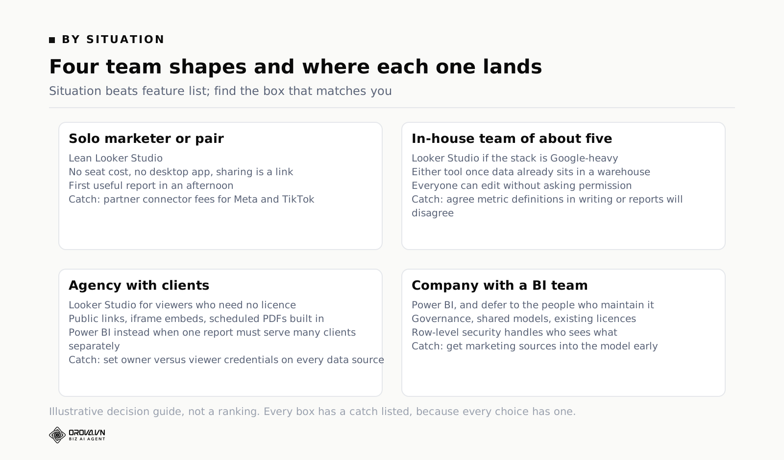
Notice how often the answer is "it depends who maintains it" and how rarely it is "because of feature X." That is not fence-sitting. It is the actual pattern across teams who have done this.
Mistakes teams make when IT says migrate
Rebuilding every report before questioning whether it is read
A migration is the cheapest opportunity you will ever get to delete things. Before rebuilding, check who opened each report in the last ninety days. Looker Studio reporting on report usage is limited, so ask people directly; Power BI has usage metrics per report. You will usually find one report carrying the weight and several that exist because someone requested them once. Rebuild the one. Archive the rest and see if anyone notices.
Treating the new tool as a screenshot of the old one
Copying a Looker Studio layout chart-for-chart into Power BI produces a report that is worse than both. Looker Studio pages are designed around scorecards and a date range control at the top. Power BI is designed around cross-filtering — click a bar, everything else filters. Rebuild for the interaction model you now have, or you will pay for a tool and use none of what you paid for.
Migrating the reports and not the definitions
The value in your existing reports is not the charts. It is the accumulated agreements: what counts as a lead, which campaigns belong to which business line, which conversion action is the real one. Write those down as text before touching the new tool. If they only exist inside calculated fields, the migration will quietly change your numbers and nobody will be able to say when.
Assuming the deadline is real
"By end of quarter" usually means the licence renewal is in that quarter. Ask what specifically has to be true by the deadline. Often it is one executive report, not everything you own. Migrating one report well and keeping the rest running is a far better outcome than migrating eight badly.
Losing the client-facing page in the process
If a client currently opens a link with no login, and after migration they need an account and a licence, you have not standardised. You have created a support ticket that repeats monthly. Raise this before the decision, not after, because it is the one point IT usually has not considered and usually accepts.
A migration plan that does not eat the quarter
If the decision is made and the answer is Power BI, this sequence keeps you sane. It also works in reverse if you are consolidating into Looker Studio.
- Inventory, one page. Every report, its audience, its sources, its refresh need, and when it was last opened. Half an hour of work that reshapes the whole project.
- Write the definitions down. Every metric that has an argument attached to it, in plain sentences, with the filters spelled out. This document outlives both tools.
- Pick one report to move first. The one with the most readers and the fewest sources. Not the hardest one, and not the one nobody reads.
- Solve the connector problem before building anything. Get Meta, TikTok and whatever else landing somewhere reliably. If that means a pipeline into a warehouse, find out now, because it changes the timeline more than the report build does.
- Build the model, not the visuals. Date table, relationships, three or four core measures. Get one number to match the platform exactly before adding a second chart.
- Run both in parallel for one full cycle. A month, or four weekly meetings. Compare numbers each time. Do not switch off the old report until the new one has matched it in front of witnesses.
- Hand over deliberately. Name the maintainer. Show them the refresh schedule, the credentials, and what a failure looks like. Put a "last refreshed" indicator on every page.
- Delete the old reports. Actually delete them, on a date you write down. Two live versions of the truth is the worst outcome of any migration.
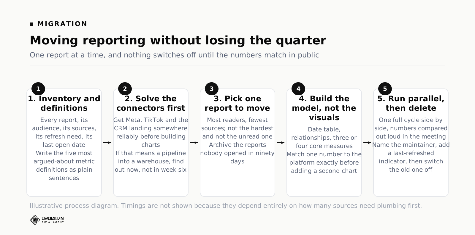
Step six is the one people skip and the one that decides whether anyone trusts the new report. Numbers that appear without a reconciliation period get quietly disbelieved, and a disbelieved dashboard is dead even if it is correct. If your audience is the leadership team, the framing in the piece on Business Analytics Dashboards: What to Put on One is worth reading before you decide what goes on page one of the new version.
When the real problem is upstream of both tools
Sometimes the honest diagnosis is that neither tool is the bottleneck. If the work is 20% building charts and 80% getting Meta, TikTok, GA4, Search Console and a CRM export into one place with matching date grains, then choosing a visualisation layer is choosing the wrong thing. The chart tool is not what is costing you Thursday afternoons.
That is the gap platforms built for marketing data try to close, by owning the connection and the report together rather than assuming someone else solved the pipeline. Orova Insight works this way: 16 source types including GA4, Search Console, Google Ads, Meta Ads, Fanpage, Instagram, Threads, TikTok Ads, TikTok channel and Google Sheets, with 10 connectors live and LinkedIn awaiting approval, plus a per-project webhook so a CRM or an in-house system can post JSON and become an ordinary drag-and-drop source. Data syncs to the store daily. On top of that sit a multi-page canvas at a size you set (1920×1080 by default), 31 chart types, 11 kinds of filter control, calculated metrics by formula, and text columns aggregated into numbers — distinct count, count all, most frequent, newest, oldest. Sharing covers a single link, workspace-wide permission, per-person permission, a public link, an iframe embed and PDF download, with scheduled report delivery and 10 restore versions kept. There is an AI Analyst that answers in plain language and builds charts from real data, and it reads only the sources you have explicitly enabled for AI. Signing up is free and gives 1,000 quota with no card, and everything is charged by usage rather than by feature-locked plans.
That is not a reason to abandon a working Power BI deployment or a Looker Studio report your clients like. It is a reason to check where your hours actually go before you spend a quarter migrating between two tools that both sit downstream of the real problem.
Frequently asked questions
Can I use Looker Studio and Power BI at the same time?
Yes, and plenty of teams do. The common split is Power BI for governed internal reporting where the data team owns the model, and Looker Studio for client-facing or fast-turnaround pages. The rule that makes it work: one agreed definition of each metric, written down, used in both. Two tools is manageable. Two definitions is not.
Is Looker Studio really free?
The tool is free with no seat cost for building or viewing. The costs sit around it: partner connectors for non-Google sources, usually monthly per connection; BigQuery storage and query charges if you use it; and Looker Studio Pro if you want team content ownership and support. A team with only Google sources can genuinely run at no software cost. A team with six ad platforms cannot.
Does Power BI work on a Mac?
Power BI Desktop, where the modelling happens, is a Windows application. Mac users work through a virtual machine, a remote desktop, or the browser-based service, which can edit reports but does not offer the full desktop modelling experience. For a team entirely on Apple hardware this is a genuine cost in friction, and it deserves to be raised early rather than discovered in week two.
Which one handles Meta and TikTok ads data better?
Neither handles it natively. Looker Studio reaches them through paid partner connectors listed in its gallery; Power BI reaches them through third-party connectors, custom API work, or a pipeline into a warehouse. If those platforms are a large share of your spend, price the data plumbing before you compare the reporting tools, because that is where the money and the maintenance actually go.
My IT department has already decided. What is worth arguing?
Not the tool. Argue three specifics: how client-facing sharing will work without licences, who owns refresh failures on marketing sources, and what the timeline is for getting Meta and TikTok data into the model. If those three have answers, Power BI will be fine. If they do not, you have identified the actual project rather than lost the argument.
Will Looker Studio be discontinued like Data Studio was?
Data Studio was not discontinued, it was renamed to Looker Studio in 2022 and continues as the same product inside Google's Looker family. Any tool carries platform risk, and the sensible hedge is the same in both directions: keep your metric definitions and, where possible, your transformed data outside the reporting layer, so a change of tool is a rebuild of charts rather than a rebuild of logic.
What to do this week
Do not open either tool yet. Take an hour and write the one-page inventory: every report, who reads it, which sources feed it, how fresh it must be, and when it was last opened. Then write down the definitions of your five most argued-about metrics in plain sentences.
Take that page into the conversation with IT. Ask the three questions from the FAQ above — external sharing, refresh ownership, timeline for ad platform sources. You will usually find the mandate is narrower than the email implied, and that the parts you care about are negotiable.
Then pick one report, the most-read one, and rebuild it properly in whichever tool won. Run both for a month. Compare the numbers out loud in a meeting. When they match, switch the old one off and put the date in the calendar. That is a migration. Everything else is a tool preference, and tool preferences are not worth a quarter of your team's time.
Before you switch tools, fix the reporting itself
Whichever tool wins the debate in your company, the real time sink was never picking looker studio vs power bi. It is the hours spent rebuilding the same weekly report, chasing a broken connector, or explaining to a client why yesterday's numbers are missing. That work happens no matter which platform you land on, and it happens every single week.
Orova Insight handles that recurring reporting work for you, so your dashboards stay current and readable without someone manually patching them each week. If that sounds like the part of your job you would rather not keep doing by hand, it is worth a look.
A third option built for marketing data
Orova Insight connects ad platforms, analytics and sheets out of the box, then answers questions in plain language.
Start for free