
Marketing Report Template: A One-Page Format Executives Read
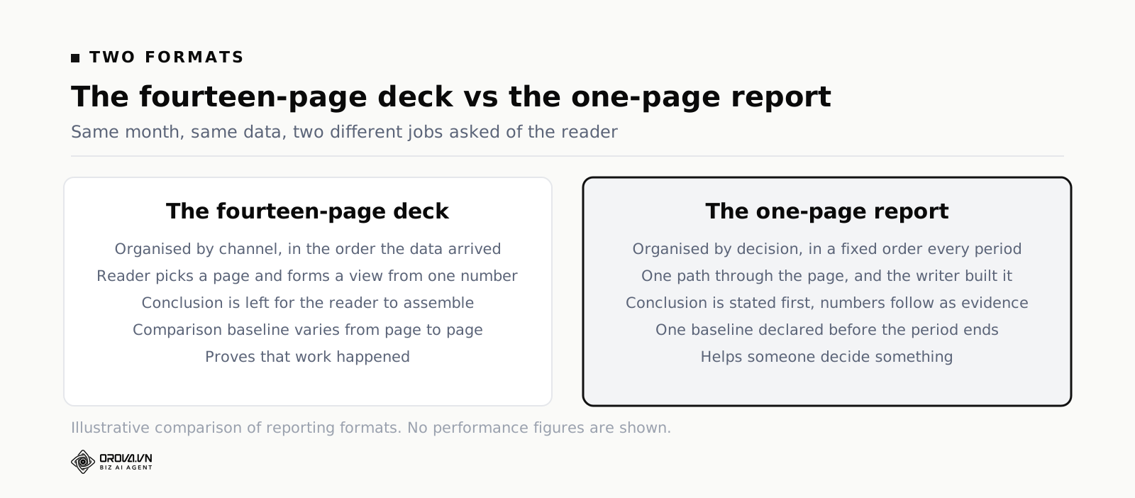
The deck goes out at 08:40 on Tuesday. Fourteen pages, every channel covered, a chart on each one, brand colours, the works. By 08:52 the CMO has replied. She has read page one. Her question is six words long: "Are we going to hit plan?" Nothing in those fourteen pages answers it, and the answer was the only thing she needed.
This is the problem with the average marketing report template: it is built to prove that work happened, not to help someone decide anything. It walks through the month channel by channel, metric by metric, in the order the data happened to arrive, and leaves the reader to piece together a conclusion from raw material. Executives do not do that work. They read the top of page one, form an impression, and ask the question that impression provokes — and if the report has not already answered it, the report failed, no matter how thorough the other pages were.
This article gives you a better way to build the report itself: a one-page format organised around decisions instead of channels, so the answer sits right at the top instead of buried on page nine. You will get the section-by-section template, the reasoning behind the order, rules for choosing a fair comparison baseline, how much commentary each number deserves, what to cut, how to write it honestly in a bad month, and a filled-in example you can copy.
What Goes On a One-Page Marketing Report?
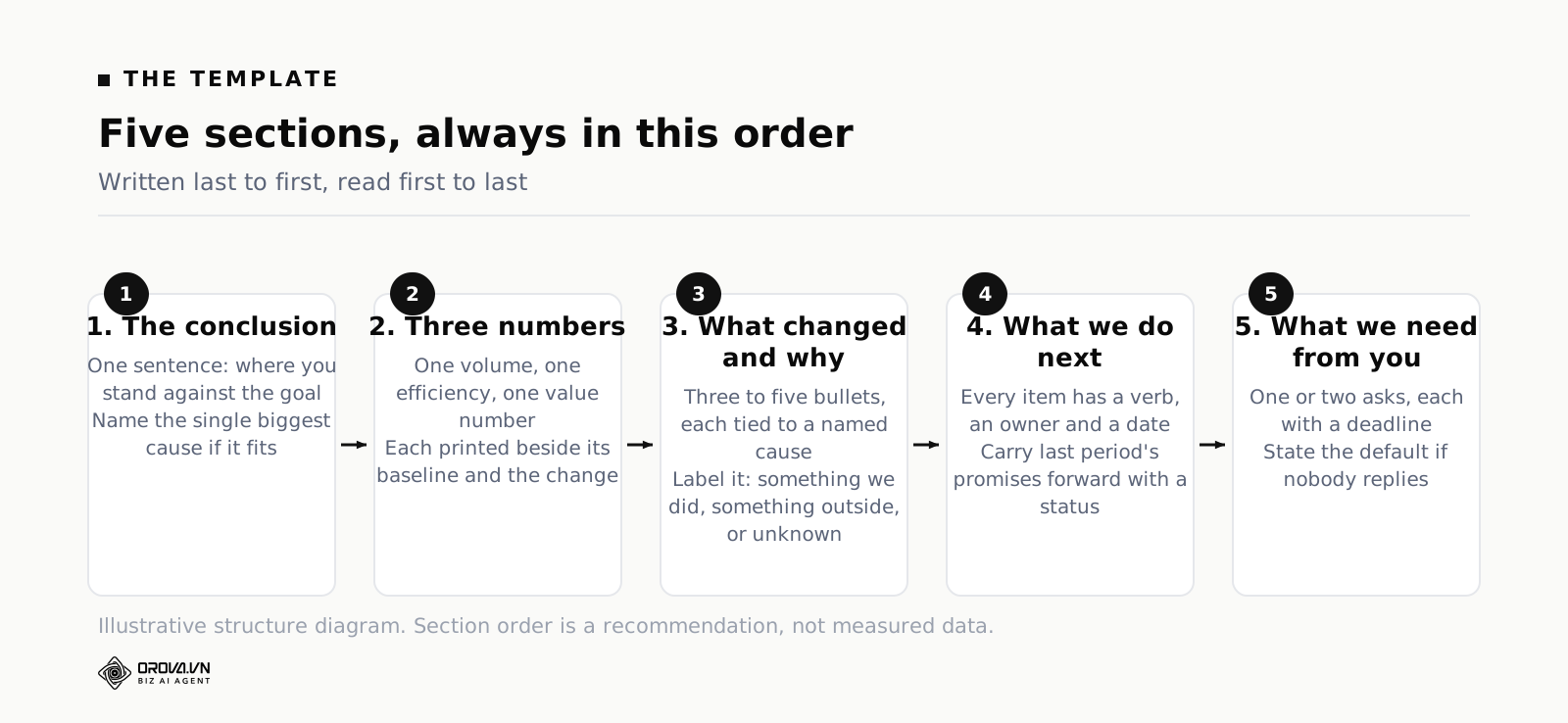
A one-page marketing report holds five things in a fixed order: a one-sentence conclusion, three headline numbers each shown against one baseline, a short explanation of what changed and why, the specific actions you will take next with owners and dates, and the decisions or resources you need from the reader.
Notice what is not on the list. There is no channel breakdown, no month-by-month trend gallery, no screenshot of a platform dashboard, no slide titled "Overview" that overviews nothing. Those are not banned from existence. They are banned from page one, because page one has a different job.
The job of page one is to move a reader from "I do not know how marketing is doing" to "I know how marketing is doing, I know why, and I know what is being done about it" inside ninety seconds. That is the entire specification. Any element that does not contribute to that transition is competing with the elements that do.
This is a different instinct from the one most marketers are trained on. Reporting usually gets treated as an accountability exercise: here is the budget you gave me, here is everything I did with it, please note the volume of activity. That framing produces the fourteen-page deck. It is defensive. It answers "was I busy?" when the reader asked "are we winning, and what happens next?"
Why the One-Page Marketing Report Format Beats a Fourteen-Page Deck
The obvious argument for one page is that people are busy. That is true and it is the weakest argument. The strong argument is that length changes what the reader does with the document.
A long deck invites grazing. The reader jumps to the page about the channel they already have an opinion on, finds a number that supports or contradicts that opinion, and forms a judgement from that single data point. You lose control of the narrative completely. Worse, you lose control of the comparison: they will compare the number they landed on against whatever is in their memory, which is usually a figure from a good month eighteen months ago.
A one-page report removes the choice. There is one path through it and you built the path. The reader sees your conclusion before they see any number, which means every number afterwards is read as evidence for or against a stated claim rather than as free-floating trivia. That is not manipulation; it is the difference between an argument and a pile of facts.
There is a second effect, and it works on you rather than the reader. Fitting a month onto one page forces you to decide what mattered. When you have fourteen pages you never have to choose, so you never have to think. When you have five sections and three number slots you have to rank things, and the ranking is where the analysis actually lives. Plenty of marketers discover, the first time they try this, that they cannot name the three numbers that matter for their business. That discovery is worth more than the report.
One caution before you delete anything. Going to one page does not mean doing less analysis. It means doing more analysis and publishing less of it. The appendix still exists, the working files still exist, and you should still be able to defend every claim three levels deep if someone pushes. What changes is that the depth is available on request rather than pushed at everyone by default.
The Marketing Report Template, Section by Section
Here is the structure. Five sections, in this order, every month, without variation. The consistency matters as much as the content, and I will come back to why.
Section one: the headline conclusion, in one sentence
One sentence. Not a paragraph, not a bulleted summary. One sentence that states where you stand relative to the goal and, if you can fit it, the single largest cause.
Good: "We finished July 8% under the qualified-lead plan because paid search costs rose faster than we replaced the volume organically, and the September pipeline is still on track."
Bad: "July saw mixed performance across channels with strong results in some areas and challenges in others." That sentence has been written ten million times and has never once told anybody anything. If your headline would survive being copied into any other company's report in any other month, it is not a headline.
Write this sentence last and put it first. Almost nobody does this and it is the single highest-leverage habit in the whole template. You cannot know your conclusion until you have looked at everything, but the reader needs it before anything else.
A test that works: if your CMO read only this one sentence and nothing else, would she be correctly informed or misled? If the sentence is technically true but leaves out the thing she would be annoyed to discover later, rewrite it. Reports lose credibility through omission far more often than through error.
Section two: three numbers, each against one baseline
Three. Not five, not eight, not "the seven we always show". Three numbers, each printed next to the baseline you are comparing against and the change between them.
Why three? Because a reader can hold three numbers in their head and carry them out of the room. Beyond three, they remember an impression instead of figures, and impressions are exactly what you were trying to replace. Three also forces the ranking work I mentioned above.
Which three depends on your business, but the shape is usually the same: one volume number, one efficiency number, one value number. Volume tells you the machine is running. Efficiency tells you what it costs. Value tells you whether the output is worth anything. For a lead-generation business that might be qualified leads, cost per qualified lead, and pipeline value created. For ecommerce it might be orders, blended cost of acquisition, and contribution profit after ad costs.
The one rule with no exceptions: every number gets a baseline printed beside it. A number on its own is not information. "412 qualified leads" means nothing to a reader who does not carry your history in their head, and nobody carries your history in their head. "412 qualified leads against a plan of 450" is information. Getting this wrong is the most common failure I see, and it is closely related to the broader habit of reporting figures that feel meaningful but drive no decision — the same trap covered in our piece on best SEO Keyword Research Tools (Free and Paid Compared).
Section three: what changed and why
Three to five short bullets. Each one links a movement in the numbers above to a cause you can name. Not "performance was affected by market conditions" — an actual cause, ideally one you could have observed and, better still, one you can act on.
Causes come in three flavours and it helps to label which one you are claiming:
- Something we did. We launched the pricing page test, we cut the underperforming campaign, we ran the webinar.
- Something outside changed. A competitor entered the auction, a platform changed its attribution window, seasonality landed a week earlier than last year.
- We do not know yet. This is allowed. It is far better than a confident fiction. Say what you are doing to find out and by when.
The third flavour is the one that builds trust. A report that explains every movement with total confidence every month is not a report, it is a horoscope. Executives who have been around a while know this, and a single honest "we cannot yet explain the drop in direct traffic, we are checking the tracking change from the 14th" buys you more credibility than a page of smooth narrative.
Section four: what we are doing next
Three to five items. Each one needs a verb, an owner and a date. "Improve landing page conversion" is not an action, it is a wish. "Ship the shortened demo form on the two highest-traffic landing pages — Mai — 19 August" is an action.
These should follow logically from section three. If your causes section says paid search costs rose, and your next-steps section talks about a rebrand of the email newsletter, the reader will notice the disconnect even if they do not say so. The two sections are a matched pair: here is what happened, here is the response.
Keep last month's actions visible. The simplest way is a one-line status against each item you promised last time: shipped, slipped, dropped. This is uncomfortable the first two or three months and then it becomes the most valuable line on the page, because it turns the report into a running record instead of a fresh set of promises every thirty days.
Section five: what we need from you
The section almost everybody omits, and the reason executives find marketing reports frustrating.
Every report should end with a specific ask, or an explicit "nothing needed this month". An ask is a decision, a budget, a person, a piece of access, or a removal of a blocker. It has a deadline. "We need a decision by 15 August on whether to hold the paid search budget flat or fund the extra spend from the events line — without it we will default to holding flat."
Notice the last clause. Always state the default. It converts silence into a decision, which is enormously useful because silence is what you will usually get. An ask with a stated default gets resolved either way; an ask without one sits in an inbox for six weeks.
Limit yourself to one or two asks. A list of nine requests is a list of zero requests. If everything is blocked, the honest headline is that everything is blocked, and that belongs in section one.
Choosing the Comparison Baseline: Previous Period, Same Period Last Year, or Plan
This is the decision that changes the story most, and it is usually made by accident — whatever the dashboard defaulted to.
Take an illustrative example. A B2B software company records 412 qualified leads in July. Their June figure was 366, their July figure last year was 344, and the July plan was 450. All four numbers describe the same reality. Look at what each comparison lets you say honestly:
- Against last month: up 12.6%. A good month.
- Against the same month last year: up 19.8%. A very good month, real growth.
- Against plan: down 8.4%. A miss.
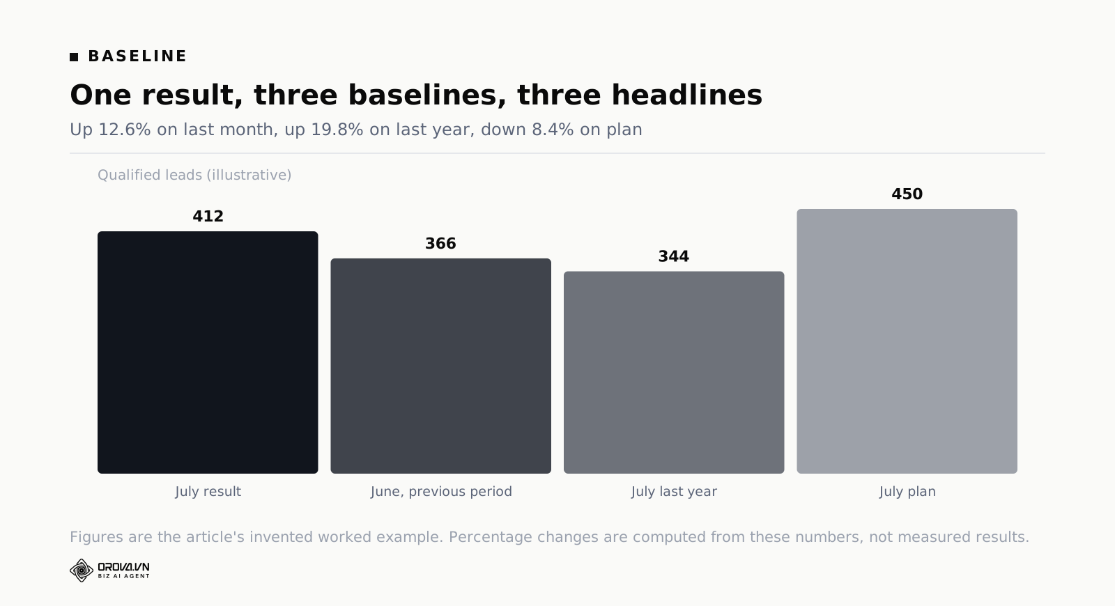
Nobody in that story is lying. Every one of those three sentences is arithmetically correct. Which is exactly why the choice of baseline has to be made in advance and written down, because otherwise it will be made after the fact by whoever wants the nicest headline, including you, including subconsciously.
When each baseline is the right one
Previous period answers "is the machine getting better or worse right now?" It is the most sensitive to recent action, which makes it good for weekly operating reviews and bad for monthly executive reports in any business with seasonality. If August is always quiet in your market, a month-on-month comparison in September will hand you a triumph you did not earn.
Same period last year answers "are we actually growing?" It cancels out seasonality, which is its whole reason to exist. Its weakness is that it compares you against a company that may no longer be recognisable — different pricing, different product, different budget, possibly a different market. Twelve months is a long time. Use it, but stop using it as the only lens once the business has changed materially.
Plan answers "will we hit the commitment we made?" This is the baseline executives actually care about, because it is the one connected to hiring, cash and board expectations. It is also the one marketers avoid, because it is the only one where you can be plainly wrong. That avoidance is exactly why using it builds so much trust.
My recommendation for a monthly marketing report: lead with plan, because that is the question in the reader's head, and use the other two in the commentary to explain the shape of the miss or the beat. In the example above, the honest headline is "8% under plan", and the useful commentary is "though up 19.8% year on year, so the gap is a plan that was set aggressively rather than a business going backwards". That sentence is far more informative than any of the three raw comparisons on its own.
Rules that keep baselines honest
- One primary baseline for the whole page. Do not compare leads against plan, cost against last month, and pipeline against last year. Mixed baselines make the three numbers uncomparable and readers cannot tell that it happened.
- Decide the baseline before the period ends. Write it in the template, not in the report.
- Never change baseline silently. If you have to change it, say so on the page and show the old comparison once alongside the new one.
- Do not compare against a re-baselined plan without flagging it. If the plan was cut in May, "on plan" in June means something quite different, and pretending otherwise is the fastest way to lose a reader permanently.
- Handle partial months explicitly. A month with 21 working days against one with 23 is not a like-for-like comparison in a B2B business. Either normalise it or say so.
How Much Commentary Does Each Number Get?
Two sentences maximum per number. That is the working rule and it is more useful than it sounds.
The first sentence says what moved and by how much against the baseline. The second says why, or says you do not know. That is it. If a number genuinely needs a third sentence, it is not a headline number — it is the subject of its own analysis, and that analysis belongs in the appendix with a one-line pointer from page one.
The reason for the cap is not aesthetic. Commentary length is how readers judge importance, whether or not you intend it. Give one number six sentences and two numbers one sentence each, and you have told the reader that the first number is six times as important. Often that is not what you meant; you just happened to have more to say about it, usually because it was the one you spent the week investigating. Equal space keeps the emphasis where you decided it should be rather than where your week went.
There is a related discipline about what the commentary is allowed to contain. Two sentences of explanation, not two sentences of hedging. Compare these:
"Cost per qualified lead increased slightly, which may be attributable to a range of factors including seasonal auction dynamics and potential shifts in competitor activity, though further analysis is required to confirm."
"Cost per qualified lead rose 7% above plan. Two competitors started bidding on our brand terms in the second week; we are checking whether the increase is confined to those campaigns."
The first is longer and says nothing. The second is shorter, names a cause, and states an open question. Readers trust the second writer, and they trust them more the next month, and eventually they stop asking for the fourteen pages.
What to Cut From Page One
Cutting is the hard part. Everything on the current report is there because somebody once asked for it, and removing it feels like disobedience. Here is the test: would this element change what anybody does? If the answer is no, it is appendix material at best.
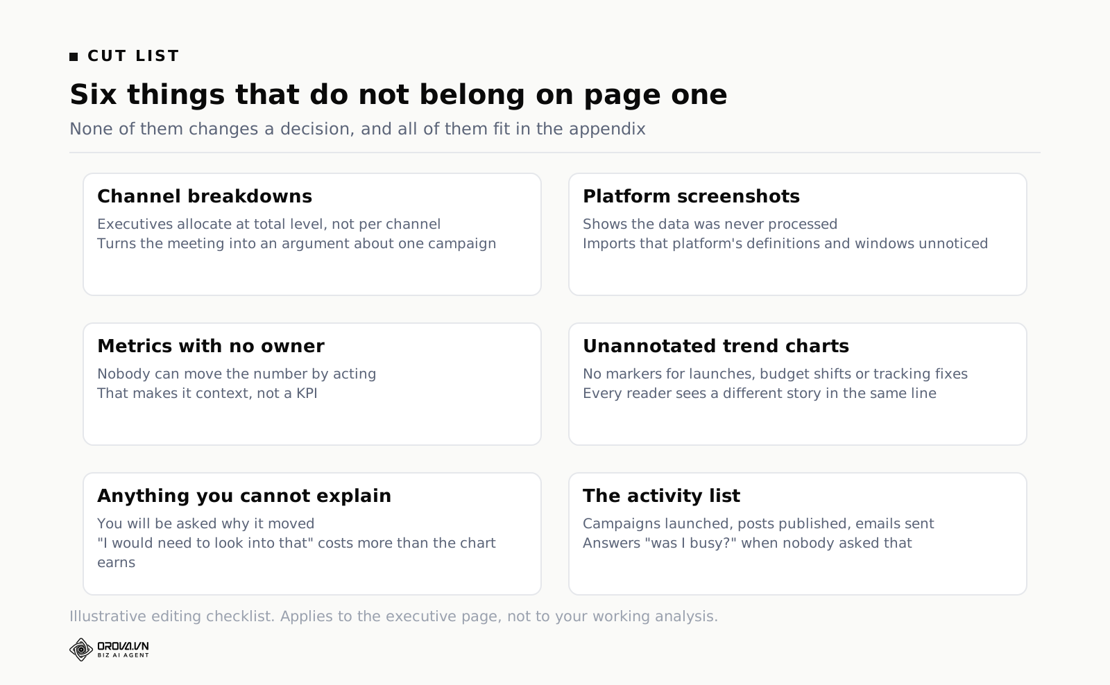
Some specifics worth naming.
Channel-by-channel breakdowns. These belong in the appendix almost without exception. Executives do not allocate at channel level; they allocate at total level and expect you to handle the split. The moment channel detail appears on page one, the conversation becomes an argument about a single campaign and never returns to the question of whether the quarter is safe. If you do need a combined view across paid and organic, build it properly as its own artefact — we walk through that in the guide to combined SEO and ads reporting.
Platform screenshots. A screenshot of an ad platform tells the reader you did not process the data. It also imports that platform's definitions, currency formatting and attribution window into your report without you noticing.
Metrics with no owner. If nobody in the company can change a number by acting, it is context, not a KPI. Context goes in the appendix.
Trend charts with no annotation. A twelve-month line with no markers for the launches, budget changes and tracking fixes is a Rorschach test. Either annotate it or move it.
Anything you cannot explain. If a chart is on page one and you cannot answer "why did it do that?", you will be asked, and the answer "I would need to look into that" in front of the leadership team costs you more credibility than the chart earned.
The activity list. Nine campaigns launched, four blog posts published, two emails sent. This is the defensive reflex I mentioned at the start. Activity belongs in your team's own operating review, not in a document whose purpose is to inform a decision.
A Marketing Report Example, Filled In
Below is a complete worked example. Every figure here is invented for illustration. They are internally consistent so you can follow the arithmetic, but they are not measured results from any real company and should not be read as benchmarks. The business is a fictional B2B software company selling to mid-market operations teams; the currency is US dollars.
Monthly marketing report — July 2026 — Northwind Tools
1. Conclusion. We finished July 8% under the qualified-lead plan because paid search costs rose faster than we replaced volume through the webinar programme, but year-on-year growth of 20% and a full September webinar calendar mean the quarter is still reachable if we resolve the brand-bidding issue in the next three weeks.
2. The three numbers. Baseline for all three is the July plan.
| Number | July actual | July plan | Change |
|---|---|---|---|
| Qualified leads accepted by sales | 412 | 450 | −8.4% |
| Cost per qualified lead | $214 | $200 | +7.0% |
| Pipeline value created | $1.84M | $2.00M | −8.0% |
3. What changed and why.
- Two competitors began bidding on our brand terms from 8 July. Brand campaign cost per click rose and pulled the blended cost per qualified lead up 7% against plan. Outside change.
- The 16 July webinar produced 90 of the month's 412 qualified leads, our best single source this year, which is why the volume miss is 8% rather than closer to 20%. Something we did.
- Pipeline value fell almost exactly in line with lead volume, so average deal size held. The shortfall is a volume problem, not a quality problem.
- Direct traffic dropped 11% from June with no obvious cause. We suspect the analytics tag change on 14 July. Checking by 12 August. We do not know yet.
- Year on year, qualified leads are up 19.8% (412 against 344 in July last year). The plan for this year was set at a steeper slope than that growth rate.
4. What we are doing next.
- Split brand and non-brand search into separate campaigns so the cost increase stops contaminating the blended figure — Linh — 14 August.
- Add a second August webinar on the same topic as the 16 July session — Mai — invite out by 18 August.
- Audit the analytics tag change and report back on direct traffic — Duc — 12 August.
- From last month: shortened demo form — shipped 3 July. Pricing page test — slipped to 20 August, blocked on design review.
5. What we need from you. One decision by 15 August: fund $18,000 of additional brand-defence spend from the events line, or hold the paid budget flat and accept a likely second month under plan. Default if we do not hear back: hold flat.
That is the whole report. Read it back and notice how quickly you know where you stand, what caused it, what happens next and what is being asked of you. Then notice something else: the fourteen-page version of this month would have contained every one of these facts, scattered, and the reader would have had to assemble the argument themselves.
Notice too what is deliberately absent. There is no total-traffic figure, no impressions, no follower count, no list of blog posts. Not because those numbers do not exist, but because none of them would have changed the decision on the table.
How to Write the Report in a Bad Month
The template is easy in a good month. The month it earns its keep is the one where you missed badly, and that is where most reporting habits break down.
The instinct is to bury the miss: open with something positive, work down to the bad news on page nine, surround it with mitigating context. Everyone who has sat on the receiving end of reports can spot this from the first sentence, and the moment they spot it they stop reading for information and start reading for what you are hiding. You lose more from the appearance of spin than you ever lose from the miss itself.
Four rules for a bad month.
Lead with the number. Section one still states where you stand against plan, in the first clause, without a warm-up. "We finished July 8% under the qualified-lead plan" comes before anything else. If it is 30% under, say 30%.
Separate the diagnosis from the excuse. A cause explains a result; an excuse asks to be released from responsibility. "Two competitors entered the brand auction" is a cause. "Market conditions were challenging" is an excuse wearing a cause's clothes. The test: can you act on it? If yes, it is a diagnosis, and the action goes in section four.
Say what it means for the forward number. The reader's real question after a miss is not "what happened?" but "does this change the quarter?" Answer it explicitly, including when the answer is bad. "If August repeats July we will end the quarter roughly 12% under, and the recovery plan below assumes the brand issue is resolved by mid-August."
Do not change the baseline. The temptation to switch from plan to last year in the exact month you miss plan is enormous, and it is the fastest way to permanently destroy trust in your reporting. Someone will notice. They always notice.
One more thing that helps: report a miss the moment you can see it coming, not at month end. If you know on the 14th that the month is in trouble, a three-line note on the 14th converts the month-end report from bad news into confirmation of known news. The emotional difference is enormous and the effort is five minutes.
The Appendix Rule
Everything you cut has to go somewhere, and where it goes matters.
The rule is simple: the appendix exists to answer the questions page one provokes, and nothing else. It is not a dumping ground for everything you used to report. It is not a second report. It is a reference document, structured so that a specific question can be answered in under a minute by someone who is not you.
Practically, that means:
- It is a separate link, not more pages. If the appendix is attached below page one, it is not an appendix, it is a fourteen-page deck with a summary slide, and readers will scroll into it and get lost exactly as before.
- It is organised by question, not by channel. "Why did cost per lead rise?" beats "Paid search detail" as a heading. Channel-organised appendices only work for readers who already know which channel to blame.
- Page one links into it, specifically. If the direct-traffic anomaly is mentioned in section three, the appendix section on it should be one click away, not something to hunt for.
- It can be a live dashboard. This is often the best version, because it never goes stale and readers can slice it themselves. Building one that people genuinely use is a skill of its own — the principles are the same ones in our guide to SEO Checker: Free Tools and What They Miss.
- Nobody is required to open it. If a decision depends on something in the appendix, that thing is on page one and you made a mistake.
Track which appendix sections get opened. After three or four months you will find that most of them never are, and you can delete them with a clear conscience. The ones that do get opened tell you what your leadership actually cares about, which is useful information you can only get by publishing less and watching what gets requested.
Cadence and Ownership
A template only works if the same thing arrives at the same time from the same person. Irregular reporting trains readers to ignore reports, because they cannot build a habit around something that shows up whenever it is ready.
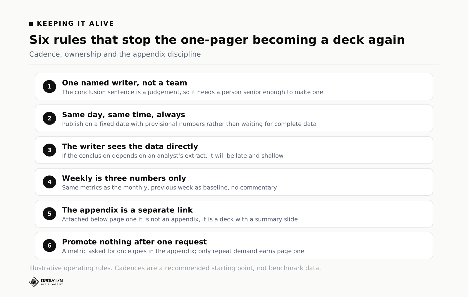
A workable rhythm for most teams:
| Cadence | Audience | Format | Owner |
|---|---|---|---|
| Weekly | Marketing team | Three numbers, no commentary, against previous week | Channel leads |
| Monthly | Executive team | The full one page, against plan | One named marketer |
| Quarterly | Board or leadership | One page plus the plan for next quarter | Head of marketing |
| Ad hoc | Whoever asked | Answer the question, link the appendix | Analyst |
Three rules about ownership.
One name, not a team. "Marketing" cannot be accountable for a report. A person can. That person writes the conclusion sentence, and they should be senior enough that their judgement is worth reading, because the conclusion is a judgement, not a calculation.
Same day, same time, always. The third working day of the month at 09:00 is better than "when the data is complete", because data is never complete and the reader's calendar is. If a number is not final, publish with the number marked provisional and correct it in the next report.
The writer must be able to see the data themselves. If the person writing the conclusion has to request a pull from an analyst three days before the deadline, the report will always be late and the conclusion will always be shallow. The writer needs direct access, or they will write what the extract happened to contain.
One last note on ownership: the person who writes the report should also be the person who has to live with the decisions it triggers. Reporting written by someone with no stake in the outcome drifts towards description. Reporting written by the person who will be asked about August in September stays sharp.
Doing This By Hand, and When a Tool Starts to Pay
You do not need software to run this template. A one-page document in whatever you already write in, filled in from a spreadsheet, is a completely legitimate implementation and I would rather you start there this month than spend three weeks selecting a tool.
Hand-assembly stops working for predictable reasons. It breaks when the number of sources grows past what one person can pull in a morning — ads platforms, analytics, search console, social, plus a CRM that holds the only figures leadership actually cares about. It breaks when someone rebuilds the spreadsheet and the definitions quietly change. It breaks hardest when the report is late every month because it depends on a single person having a free Tuesday, which is how reporting quietly dies in most companies.
The point at which a tool pays is not "we have a lot of data". It is "the same numbers need to arrive on the same day without a person assembling them". A connected reporting layer that syncs sources daily, holds your custom metric definitions in one place, and sends the same page on a schedule removes the two failure modes that kill recurring reports: lateness and definitional drift. That is the job Orova Insight is built for — it pulls from 16 source types including GA4, Search Console, the ads platforms and Google Sheets, lets external systems such as a CRM post JSON into a webhook so they behave like any other source, supports custom metrics defined by formula, and can send the finished report on a schedule as a link or a PDF.
Whatever you use, the tool is not the template. A dashboard with 31 chart types available will still produce a fourteen-page deck if the person driving it has not decided what the three numbers are. Decide first, automate second.
Frequently Asked Questions
Can a one-page marketing report really cover a multi-channel programme?
Yes, because page one is not covering the channels — it is covering the outcome the channels exist to produce. Qualified leads, cost per qualified lead and pipeline value are the same three numbers whether you run two channels or twelve. The channel detail moves to the appendix, where anyone who wants it can find it in a minute. If a specific channel is the cause of a movement, it earns a line in section three by name.
What if my executive asks for a metric I cut?
Add it to the appendix and link to it from page one, then watch. If they ask again next month, it may genuinely belong in the three. Usually they asked because they were curious once, not because they need it monthly. Resist the reflex to promote anything requested once to permanent page-one status, because that reflex is exactly how a one-page report grows back into fourteen.
Should the same marketing report format be used weekly and monthly?
Same structure, different depth and different baseline. The weekly version is three numbers against the previous week with no commentary — it is an operating check, not an argument. The monthly version is the full five sections against plan. Keeping the numbers identical across both means the weekly is a genuine early warning for the monthly rather than a separate universe of metrics.
How long should it take to write?
Ninety minutes once the data assembly is handled, and most of that goes on the conclusion sentence and the causes. If it is taking a day, the time is going into data collection rather than analysis, and that is the part to fix. If it is taking twenty minutes, you are probably transcribing numbers rather than forming a view.
Do I need charts on page one?
Usually not. Three numbers with baselines and change figures read faster as text or a small table than as charts, and a chart on a single page tends to eat the space that commentary needs. The exception is one annotated trend line when the shape of the trend is itself the point — a recovery, a step change after a launch. One chart, annotated, or none.
What if the plan was unrealistic to begin with?
Report against it anyway, and say plainly in the commentary that the gap comes from an aggressive plan rather than declining performance — the year-on-year figure is your evidence for that claim. Then raise re-planning as an ask in section five, with a date. What you cannot do is quietly switch baselines. Argue for a different plan out loud; do not change the measuring stick in the middle of the quarter.
What to Do This Week
Three tasks, in order.
Monday. Open your last monthly report and ask one question of every element on the first two pages: did this change what anyone did? Mark each one keep, appendix or delete. Most teams find that under a quarter of the content survives, and the survivors are almost always the ones with a baseline attached.
Wednesday. Choose your three numbers and write the definitions down in one sentence each, including which system is the source of record. Then choose your primary baseline and write down why. Send both to whoever reads your reports and get them to disagree now rather than in a leadership meeting six weeks from now.
Friday. Write last month again, in the five-section format, on one page. Do not send it. Put it beside the deck you actually sent and see which one answers the CMO's six-word question. That comparison is what will convince you, and it is what will convince them when you send the new format next month.
Stop rebuilding this report from scratch every month
Even with a clear template, someone still has to pull the numbers from every channel, line them up against the right baseline, and write the commentary by hand — every single reporting period, on a deadline, usually the morning it's due. That part rarely gets faster just because the format improved; it still eats an afternoon someone could have spent on the work the report is describing.
Orova Insight is built to take that pulling-and-formatting step off your plate, assembling the numbers and drafting the one-page report automatically so a person only needs to check it and add judgment, not build it from zero. If Tuesday mornings keep starting with a scramble, it's worth a look.
Send this report on a schedule
Orova Insight keeps the numbers fresh and mails the report out on the rhythm you choose.
Start for free