
PPC Reporting Template: What to Include for Each Audience
The same PDF went to three inboxes on Friday. The client who pays the invoice, the CFO who approves the budget, and the two people who sit in the accounts every day. Twenty-two pages, exported straight from the ad managers and tidied into a deck. By Monday there were three replies, and none of them said "thanks, all clear."
The problem is that one ppc report template (the standard layout you fill in every month) was built around whatever the ad platform exports, not around who's actually reading it. The client wanted to know if the money worked. The CFO wanted to know what a customer costs now versus a few months back. The person running the campaigns wanted to know why a nine-day problem got buried inside a monthly total. One document tried to answer all three questions and answered none of them, and it still took a full day to put together.
This article gives you three working versions of the same report — one for the client, one for the executive, one for the practitioner — built on a structure that stays fixed while the details, the metrics, and the commentary change per audience. Read it and you'll know exactly what to keep, what to leave out, and how to explain a bad month without losing the account.
What Should a PPC Report Template Include?
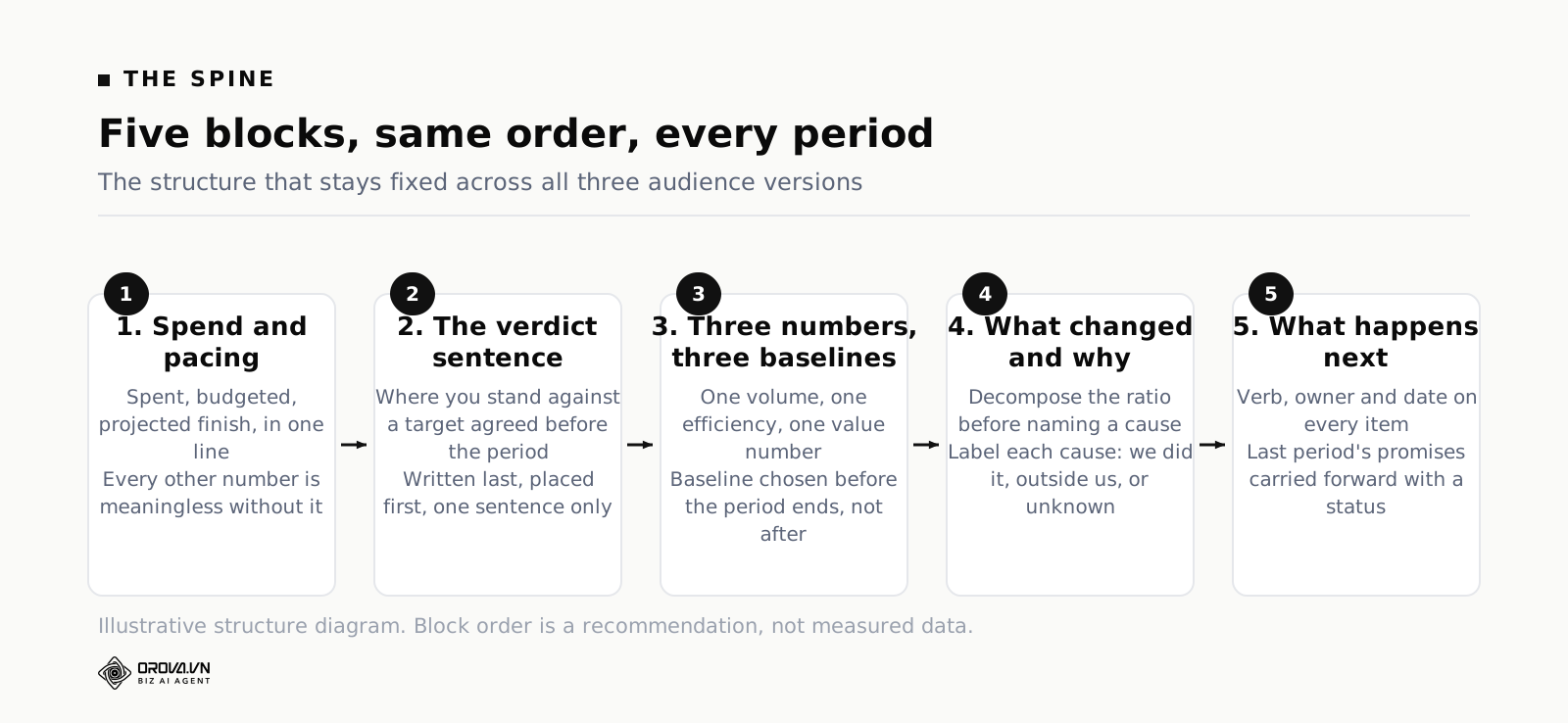
A PPC report template should include five fixed blocks: the period and spend against budget, a one-line verdict against a stated target, three headline numbers each shown with a baseline, what changed and why, and what happens next with owners and dates. The metric set and the depth change by audience. The five blocks never do.
That is the whole spine. Everything else in this article is a variation on it. Before we get to the variations, it is worth being precise about why those five blocks and not others, because the temptation to add a sixth is constant and it is always a mistake.
Period and spend against budget exists because every other number in the report is meaningless without it. A cost per lead of 45 dollars is a different story at 6,000 dollars of spend than at 60,000. Putting spend and pacing at the top also prevents the single most common argument in agency reporting, which is a client discovering three weeks later that the account underspent by a fifth and nobody flagged it.
The one-line verdict is a sentence you write last and put first. It states where the account stands relative to a target that was agreed before the period started. Not "performance was mixed with strong results in some areas." A verdict. "We finished June 12 per cent over the cost-per-lead target because the landing page conversion rate dropped after the site release, and the fix ships on the 9th."
Three headline numbers with baselines is the hardest constraint and the most valuable. Three, because a reader carries three numbers out of the room and remembers a vague impression of anything beyond that. A baseline beside each one, because a number without a comparison is not information. Which three depends entirely on the audience, and that is where the three versions diverge.
What changed and why is the section that separates a report from a data dump. It is also the section most people skip or fill with hedging. There is a method for writing it and it has a whole section below.
What happens next closes the loop. Every item gets a verb, an owner and a date, and last period's items get carried forward with a status so nothing quietly disappears. A report with no forward commitments trains the reader to treat reporting as ceremony.
Why One PPC Report Cannot Serve Three Audiences
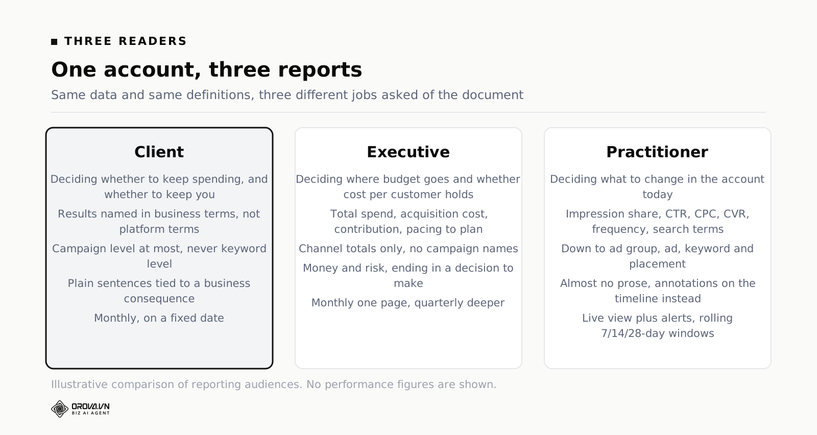
The instinct to send one document to everyone is not laziness. It comes from a reasonable-sounding principle: everyone should be looking at the same numbers. That principle is correct and it does not imply one document. Three reports can be built from the same source data with the same definitions and still be three reports. What breaks trust is different numbers, not different pages.
The three audiences differ on four axes, and each axis pulls the document in an incompatible direction.
They differ on the decision they are about to make. A client is deciding whether to keep spending and whether to keep you. A finance executive is deciding whether to move budget between lines and whether the acquisition cost trend is sustainable. A practitioner is deciding which ad group to pause before lunch. A metric that informs one of those decisions is noise to the other two.
They differ on vocabulary. A media buyer reads "IS lost to rank 31 per cent" instantly. A client reads it as a foreign language and either asks, which costs you a meeting, or does not ask, which costs you credibility later. Meanwhile, writing "we improved visibility in the auction" for a practitioner is useless — they need the number to act on.
They differ on tolerance for uncertainty. Practitioners live comfortably with platform-attributed conversions because they only need relative signal to pick between two ad groups. A CFO cannot use platform attribution at all without a health warning, because the platforms grade their own homework and the totals overlap. Handing a finance team a number that sums to more revenue than the company booked is how a reporting relationship dies.
They differ on time window. Executives think in months and quarters because that is how budgets and boards work. Practitioners need rolling 7, 14 and 28-day windows because that is the timescale on which auction dynamics and creative fatigue actually move. A monthly-only report hides a two-week collapse inside an average.
One more thing before the templates. Producing three reports is not three times the work if the underlying data layer is shared. The expensive part of PPC reporting is never the layout — it is pulling, joining and reconciling the data. Once that is done once, generating three views costs you the writing time and nothing else. Teams that resist splitting the report are almost always teams still exporting CSVs by hand, and their real problem is upstream.
The Standing Structure That Never Changes
Consistency is a feature that people underrate because its benefit is invisible. When the report has the same shape every month, the reader stops spending attention on navigation and spends it on content. They know the verdict is in the top left, they know the asks are at the bottom, and they develop a habit of reading it. Change the layout and you reset that habit to zero.
Here is the spine, written out as an order of operations. It applies to all three versions.
- Header line. Account or client name, the period, the date the data was pulled, and who wrote it. The data-pull date matters more than people expect — conversions keep arriving after the period closes, and a report dated three days after month end will not match one rebuilt a month later. Say which one the reader is holding.
- Spend and pacing. Spent, budgeted, percentage of the way through the period, and projected finish. One line.
- The verdict sentence. Where you stand against the agreed target, and the single largest cause.
- Three numbers with baselines. One volume number, one efficiency number, one value number, each printed beside the baseline you are comparing to.
- What changed and why. Three to five bullets, each attributing the change to a named cause and labelling that cause as something you did, something outside your control, or unknown.
- What happens next. Actions with verbs, owners and dates, plus the status of last period's actions.
- What you need from the reader. One or two asks with deadlines, and the default if nobody replies.
- Appendix, as a separate link. Everything else. If it is stapled underneath, it is not an appendix, it is a deck with a summary page.
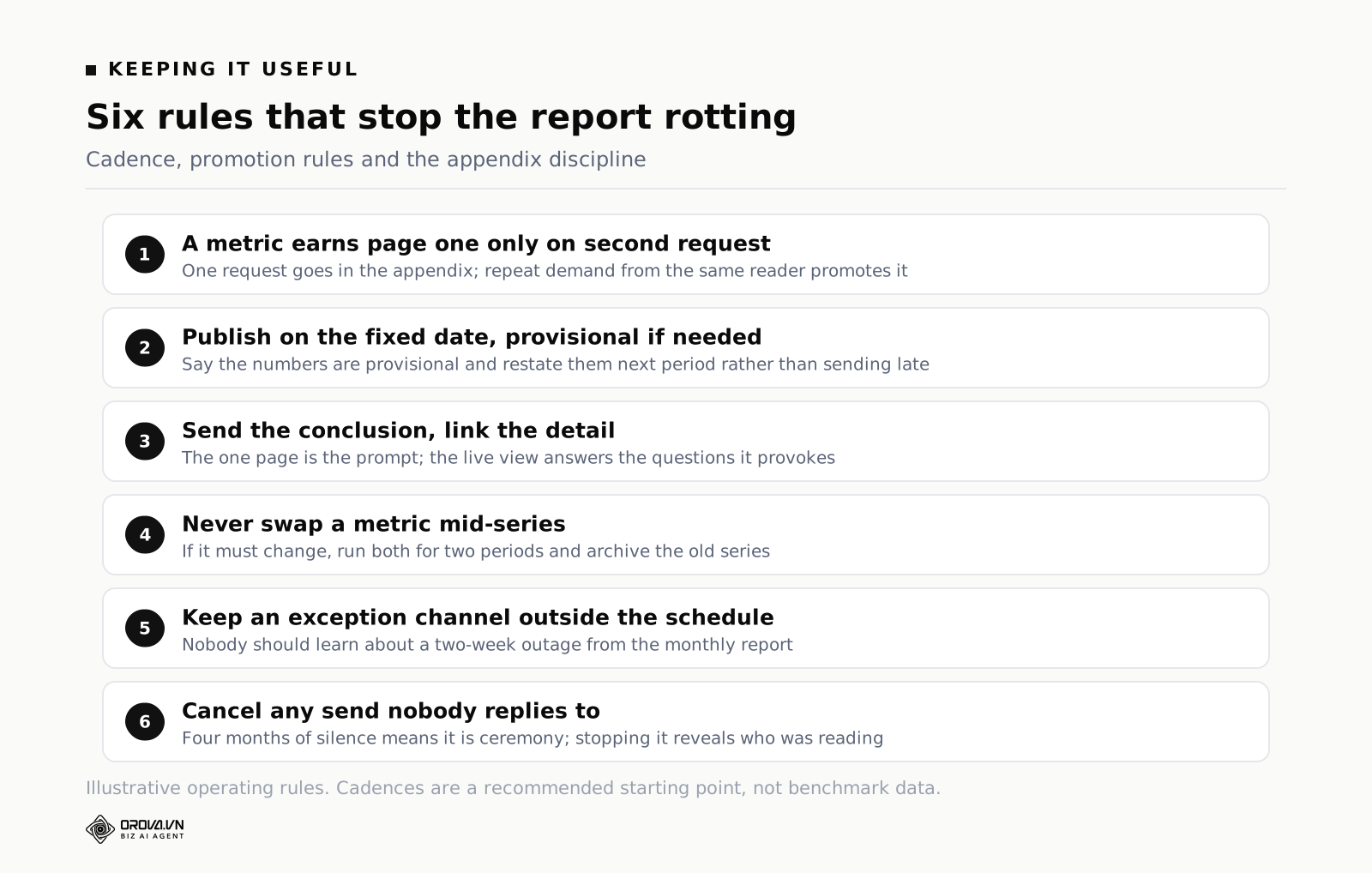
The rule that makes this work: a metric earns a place in the standing structure only after it has been asked for twice by the same person. One request goes in the appendix. Repeat demand promotes it. Without that rule, the report accretes a new permanent row every time somebody is curious once, and in eighteen months you are back to twenty-two pages.
Version One: The Client PPC Report
The client report is the hardest of the three to write well, because you are writing for someone who is paying for a service they cannot evaluate directly. Every choice you make is also a trust signal.
Sections
Verdict. Spend against budget. Results and cost per result. What we did this period. What we are doing next. What we need from you. That is it — six blocks, one page, an appendix behind a link.
The metric set
Spend. Conversions in the client's own language, not the platform's — "booked demos", "orders", "enquiries", not "conversions (all)". Cost per one of those. Revenue and return if the account has revenue tracking that you trust. Then one quality signal, because volume without quality is how a client PPC report starts feeling dishonest three months in: qualified rate from the CRM, or average order value, or the share of leads that reached a second call.
Five numbers is the ceiling for a client report and three is better. If you cannot get quality data because the client's CRM is not connected, say so in the report, every month, in the same place. A visible gap you name is fine. A gap you hide until it is discovered is not.
Level of detail
Campaign level, maximum. Never ad group, never keyword, never placement. Clients who ask for keyword-level detail are usually asking for something else — they want reassurance that you are working, or they suspect waste. Give them the reassurance directly in the "what we did" section and the waste answer in "what changed", and the keyword table request usually stops.
Commentary style
Plain sentences, no platform jargon, and every claim tied to a business consequence. "We cut the display placements that were spending without converting, which moved about a fifth of the budget back into search." Not "implemented placement exclusions to improve efficiency."
Write the causes honestly, including the ones that are your fault. The counterintuitive part of client reporting is that admitting a mistake early buys more credit than a clean run, because it tells the client that the good months are also being reported honestly.
What to leave out
- Impressions, reach and CTR as headline figures. They belong in the appendix. A client who sees impressions at the top learns to judge the account by impressions, and then you will spend a year explaining why a campaign with fewer impressions is better.
- The list of forty optimisations completed. It answers "was I busy?", a question nobody asked. Three sentences of what you did and why beats a table of tasks.
- Quality Score, learning status, bid strategy names. Internal machinery. Explain the consequence, not the mechanism.
- Screenshots of the ad platform interface. They import the platform's definitions, attribution windows and default date ranges into your report without you noticing, and they signal that no analysis happened between the export and the send.
- Metrics that flatter without informing. Engagement rates, video views past three seconds, follower growth on an ads report. This is the whole category we pulled apart in the piece on best SEO Keyword Research Tools (Free and Paid Compared), and the client report is where they do the most damage, because the client cannot tell which numbers are load-bearing.
Version Two: The Executive Report
The executive version goes to a CFO, a founder, or a board pack. Its reader controls whether the budget exists at all. They are not evaluating your craft. They are evaluating whether the money buys customers at a price the business can afford and whether that price is moving in the right direction.
Sections
Verdict against plan. Spend pacing against the annual or quarterly budget. Acquisition cost and its trend. Contribution or payback. Forecast for the rest of the period. Risks. Decisions needed. Seven blocks, still one page.
The metric set
Total paid spend across all platforms, not per-platform. New customers or qualified pipeline, taken from the business system rather than the ad platforms. Blended acquisition cost — total marketing spend divided by total new customers — alongside paid-only acquisition cost, because the gap between the two is the most informative number in the whole report. Revenue or margin contribution. Pacing against budget for the year to date.
Notice what dominates: money in, customers out, and the ratio. There is no CTR, no CPM, no impression share. A finance reader cannot act on any of them.
Two warnings on the numbers themselves. First, never present platform-attributed revenue to a finance audience without labelling it. If Google, Meta and TikTok each claim the same order, adding the three columns gives you a revenue figure larger than what the company banked, and a CFO will find that within one meeting. Report the business system's number as the truth and the platform numbers as directional signal. Second, if you show a return figure, state the attribution window and model beside it, every time, in the same words.
Level of detail
Channel totals only. Paid search, paid social, everything else. No campaign names. If an executive wants to know why paid social moved, the answer belongs in one sentence of commentary, not in a breakdown they then have to interpret.
The one exception worth making is a split between prospecting and retargeting spend, because that ratio is a strategy question a finance reader legitimately has opinions about. It also protects you from the classic executive misreading where retargeting's flattering return figure is taken as proof that the whole account is efficient.
Commentary style
Money and risk. Every paragraph should end at a business consequence: cash, growth rate, or a decision. Keep it to three or four short paragraphs and name the decision you want made.
If you also report on organic performance to the same reader, resist building a second document with a different structure and different baselines — the two get compared, the definitions do not match, and the meeting becomes an argument about method. The approach that holds up is a single leadership view where paid and organic sit under one set of definitions, which is the structure we work through in Business Analytics Dashboards: What to Put on One and in more depth for the combined case in combined SEO and ads reporting.
What to leave out
- Weekly noise. Executives who see weekly fluctuation start managing it, and paid media managed weekly by people who are not in the account produces expensive whiplash.
- Campaign names and creative. They invite opinions on execution from someone whose job is allocation.
- Platform ROAS as a headline. Covered above. It is the single fastest way to lose a finance team's trust permanently.
- Anything you cannot explain in one sentence. You will be asked. "Let me look into that" costs more than the chart earns.
Version Three: The Practitioner Report
The practitioner version is not really a report. It is a working instrument, and treating it like a document is why so many teams end up doing their real analysis in the platform interface and then writing a report nobody uses.
Sections
Pacing and anomalies at the top, in exception form — only what is off. Then diagnostics by campaign and ad group. Search terms and waste. Creative performance and fatigue signals. Experiments currently live and their status. The action queue.
The metric set
Everything the other two versions excluded, and this is the correct place for it. Impressions and impression share, share lost to rank and to budget, CTR, CPC, conversion rate, cost per conversion, CPM, frequency, unique reach, landing page conversion rate, search term spend with no conversions, asset-level performance, and the learning status of any bid strategy that was touched.
The critical difference is the time window. A practitioner view needs rolling 7, 14 and 28-day figures side by side, not a calendar month. Auction pressure, creative fatigue and seasonality all move on timescales that a monthly average erases. Half the value of the practitioner report comes from seeing that the last seven days look nothing like the previous twenty-one.
Level of detail
All the way down: campaign, ad group, ad, keyword, search term, placement, audience, device, hour of day where volume supports it. The constraint is not depth, it is triage. A practitioner view with three hundred rows and no ordering is as useless as a one-page summary. Sort by wasted spend, or by absolute change, so the top of every table is the thing worth looking at.
Commentary style
Almost none. Practitioners do not need prose; they need annotations. What they do need is context markers on the timeline: the date the budget changed, the date the landing page shipped, the date the bid strategy switched, the date tracking broke and the date it was fixed. Without those, everyone on the team reconstructs a different story from the same chart, and the arguments are unwinnable because nobody has the facts.
What to leave out
- Narrative summaries. Time spent writing them is time not spent in the account.
- Aggregated-only views. A total with no ability to click down is a dead end.
- Anything on a monthly-only window. By the time a monthly report shows a problem, it has been running for up to five weeks.
Choosing the Metric Set for Each Audience
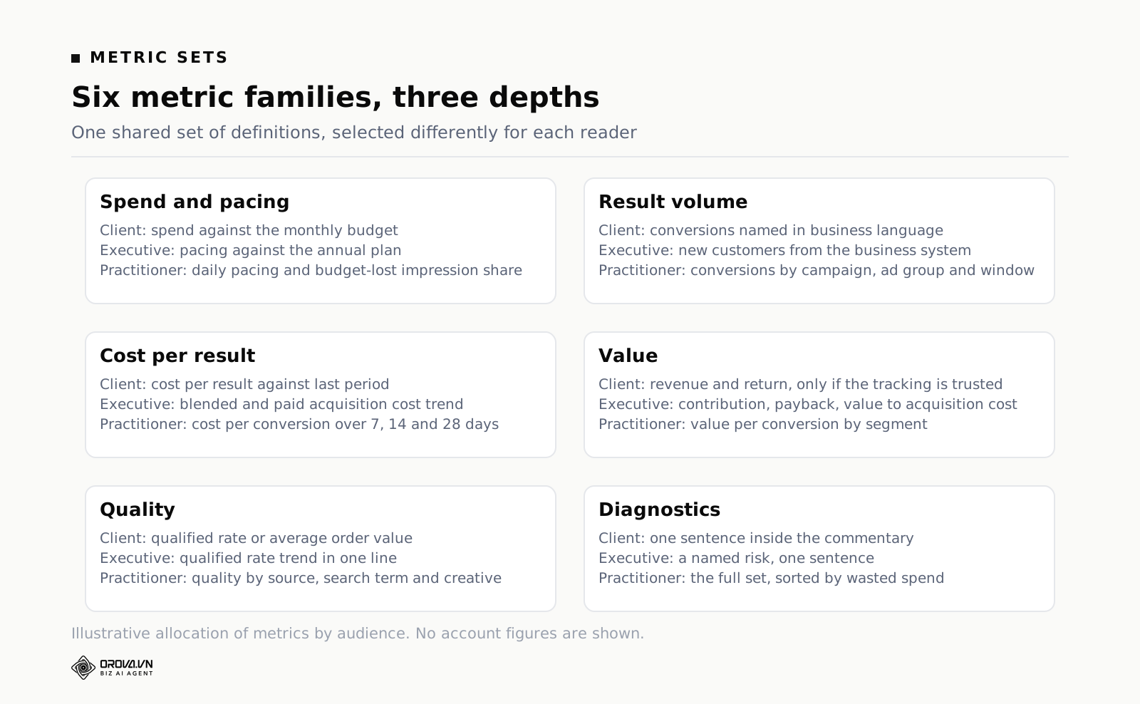
Here is the same account expressed three ways. The definitions are identical across all three columns — the same conversion action, the same date logic, the same source of truth. Only the selection and the depth change.
| Question the reader is asking | Client | Executive | Practitioner |
|---|---|---|---|
| Are we spending what we agreed? | Spend vs budget, monthly | Spend vs annual plan, pacing | Daily pacing, budget-lost impression share |
| Are we getting results? | Conversions named in business terms | New customers from the business system | Conversions by campaign, ad group and window |
| What does a result cost? | Cost per result vs last period | Blended and paid acquisition cost vs trend | Cost per conversion by ad group, 7/14/28 days |
| Is it worth it? | Revenue and return, if trusted | Contribution, payback, LTV to CAC | Value per conversion by segment |
| Is quality holding? | Qualified rate or average order value | Qualified rate trend, one line | Lead quality by source, term and creative |
| What is breaking? | One sentence in commentary | Named risk, one sentence | Full diagnostics, sorted by wasted spend |
One discipline holds the whole thing together: write the definitions down once, in a place all three reports read from, and never redefine a metric inside a single report. "Conversion" must mean the same event in the client report and the practitioner view. The moment two versions disagree, every future conversation starts with reconciliation instead of decisions, and you lose an hour a week forever.
How to Write the "What Changed" Paragraph
This is the part of PPC reporting that cannot be automated, and it is the part most people write badly. The failure mode is describing the movement instead of explaining it: "cost per lead increased month on month." The reader can see that. They are asking why.
A "what changed" bullet that works has four parts: the number and its size, the mechanism, the attribution of cause, and the confidence level.
Take a worked example. These figures are invented to make the arithmetic clear, not measured results from a real account. A lead-generation account spends 18,000 dollars in April and produces 450 leads, which is 40 dollars per lead. May holds spend at 18,000 and produces 400 leads, so 45 dollars each — exactly the agreed target. June spends 21,000 and produces 350 leads, which is 60 dollars per lead, a third above target.
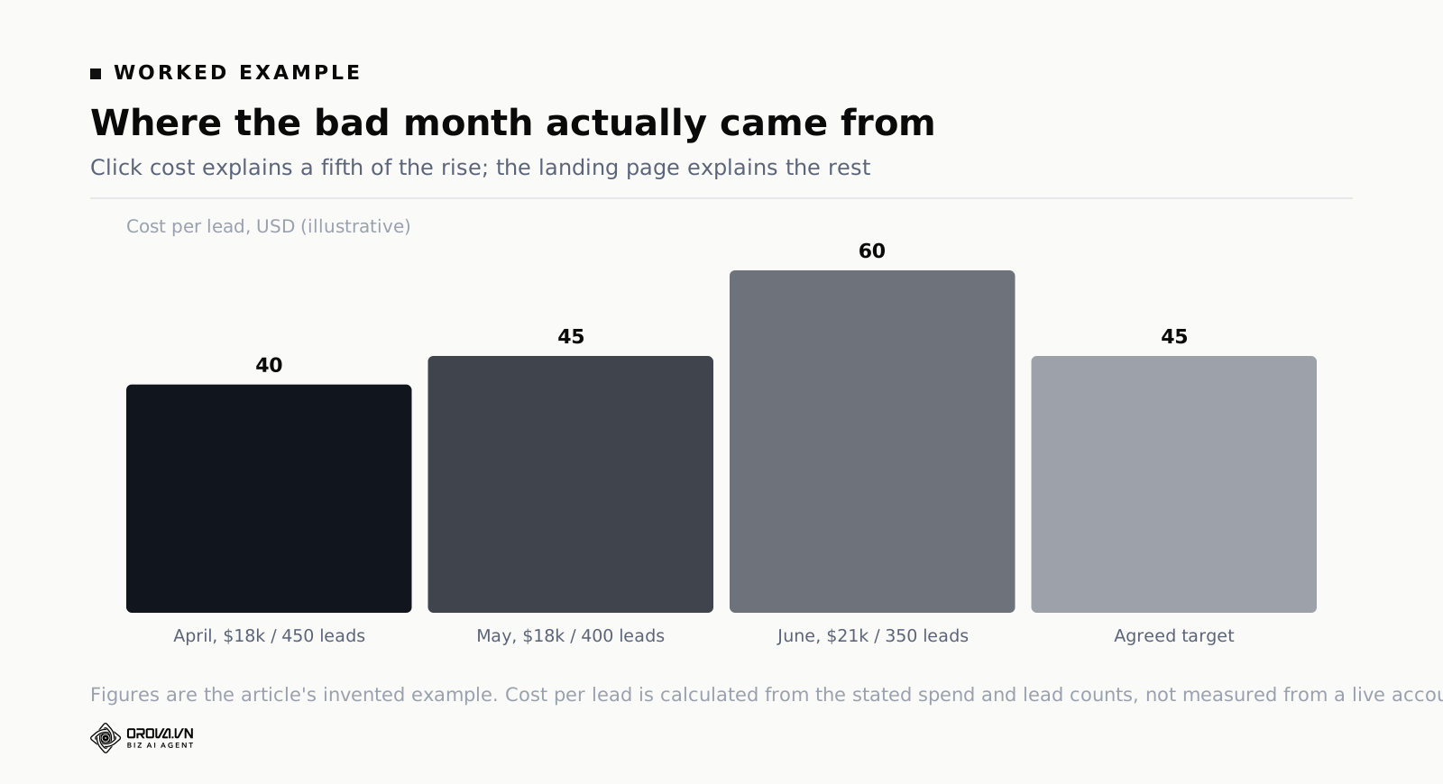
The lazy version of the paragraph: "June cost per lead rose to 60 dollars due to increased competition and lower conversion rates." True, useless, and it will not survive one follow-up question.
The version that works decomposes the number. Cost per lead is cost per click divided by conversion rate, so any move has to come from one or the other. In this example, average cost per click went from 2.25 in May to 2.40 in June, and the landing page conversion rate went from 5.0 per cent to 4.0 per cent. Hold conversion rate constant and the higher click cost alone would have taken cost per lead from 45 to 48. The remaining move, 48 to 60, is entirely the landing page. So four-fifths of the damage is the site, one-fifth is the auction.
Now the paragraph writes itself: "Cost per lead rose from 45 to 60 dollars. About four-fifths of that is the landing page — conversion rate fell from 5.0 to 4.0 per cent from the 3 June site release, and the drop starts on that exact date. The remaining fifth is auction cost; average click cost rose 7 per cent, consistent with two new advertisers appearing in auction insights. The site fix is in test and ships on the 9th. We expect cost per lead back under 48 within a week of the fix, and back to target only if click costs settle."
Four rules make this repeatable.
- Decompose before you explain. Every headline PPC metric is a ratio of two others. Cost per acquisition is click cost over conversion rate. Return is value per conversion over cost per conversion. Find which input moved before you write a word of cause.
- Attribute to one of three buckets. Something we did, something outside us, or unknown. Say "unknown" out loud when it is true. A report that has an explanation for everything is a report that is inventing explanations, and experienced readers can smell it.
- Anchor causes to dates. "After the 3 June release" is checkable. "Recently" is not. If your claimed cause happened on the 20th and the metric moved on the 5th, writing the date forces you to notice that before the reader does.
- State what you expect next and by when. This is the single biggest credibility multiplier available in reporting. Publishing an expectation you can be wrong about, and then reporting honestly next period on whether you were right, is what turns a monthly send into a track record.
How to Report a Bad Month
A bad month is the only time anyone reads the report closely, so it is worth having a method rather than an instinct.
Lead with it. The verdict sentence says the result was bad, in the first line, before any context. Burying it in paragraph four and hoping the reader stops early is a strategy that works exactly once. Readers who find bad news late stop trusting the good news too.
Separate the causes properly. There are only three kinds and they need different responses. Something you did — own it plainly, say what you learned, say what stops it recurring. Something structural outside your control, such as a seasonal collapse or a competitor entering — evidence it, do not just assert it, and say how you are adapting. Something unknown — say it is unknown, say what you are doing to find out, and give a date by which you will know.
Do not stack qualifiers. "Whilst overall performance declined, we did see encouraging signals in several areas" is the sentence of somebody hoping not to be asked a question. Say the number, say the cause, move on.
Show the scoreboard, not just the period. One bad month against a good year reads very differently when the year is on the page. That is not spin as long as the annual view is always there, in good months and bad. It becomes spin the moment you only include it when it helps, which readers notice within two periods.
Bring a decision, not just an apology. The reader's actual anxiety in a bad month is not the number, it is whether anyone is in control. A specific plan with dates settles that. A vague promise to "continue optimising" confirms the fear.
Do not change the metrics. The strongest temptation in a bad month is to introduce a new metric that happens to be up. Everyone sees it. Whatever credibility the report had is gone, and the new metric is now a permanent obligation.
Platform Sections: The Google Ads and Facebook Report Templates
The three-audience split covers structure. Each platform then adds a small number of sections that only make sense for that platform, and these belong in the practitioner version with at most one line surfacing upward.
The Google Ads report template
Four things are specific enough to earn their own space in a google ads report template. Impression share, split by share lost to rank and share lost to budget — these point at two completely different fixes, and the combined figure hides which one you have. Search terms, sorted by spend with no conversion — this is where waste actually lives, and it is the section that most often pays for the reporting time by itself. Auction insights, for evidencing the "competitor entered" claim rather than asserting it. Network split — search, display, video and partners reported separately, because a blended number across networks is close to meaningless.
Performance Max needs its own handling. Asset group level is the deepest reporting the platform gives you, placement transparency is limited, and shopping and search traffic mix inside one campaign. Report what you have, and say explicitly in the appendix which questions the campaign type cannot answer. Writing "not available at campaign level" is far better than quietly leaving a gap the reader assumes you overlooked.
Also report conversion actions individually rather than only as a total, and state which ones are counted in the primary figure. Accounts that count newsletter sign-ups and purchases in one column produce cost-per-conversion figures that mean nothing and bid strategies that optimise toward the wrong thing.
The Facebook advertising report template
A facebook advertising report template needs a header line most people omit: the attribution setting the numbers were pulled with. Meta's default click and view windows attribute differently to Google's, and the same sale can appear in both. If that line is not on the report, every cross-platform comparison in it is unsound and nobody can tell.
Beyond that, four sections earn their place. Frequency alongside unique reach, because impressions divided by people is the leading indicator of creative fatigue and it moves before cost does. Results defined by the optimisation event, spelled out — a "result" is whatever the ad set optimised for, and two ad sets in one report can be counting different things. Placement and platform breakdown, because Facebook feed, Reels, Stories and Audience Network behave differently enough that a blended cost figure conceals more than it shows. Event match quality and the server-side conversion setup, which sits in the appendix but needs a status line, because a degraded signal explains a lot of otherwise mysterious performance decline.
Finally, always put a reconciliation line at the bottom of the Facebook section: platform-reported conversions versus what the business system recorded for the same period. Not to prove one wrong, but so that the size of the gap is known and stable. A gap that has been the same for six months is a measurement quirk. A gap that doubled last month is a tracking problem.
Self-Serve Access or a Sent File?
The modern version of this argument is dashboard link versus PDF, and both camps are half right.
Sent files get read. A document that lands in an inbox at a known time is a prompt; a dashboard link is an invitation, and invitations are declined. Most people who build a beautiful live dashboard for a client discover within two months that the client opened it twice.
Live access answers follow-ups. The value of self-serve is not the first read, it is the fourth question — the one that comes at 4pm on a Wednesday, that would otherwise cost you forty minutes of pulling data, and that the reader could answer themselves in ten seconds if the view existed.
So the rule is: send the conclusion, link the detail. The one-page report goes out as a file or as the body of an email at a fixed time. Underneath it sits a link to the live view with the depth. The report is the prompt; the dashboard is the answer to the questions the prompt provokes.
If you give live access, it needs guardrails, or it generates more questions than it resolves.
- Fix the default date range so everyone lands on the same period. Otherwise two people quote different numbers from the same dashboard in the same meeting.
- Publish metric definitions on the page itself, not in a separate document nobody opens.
- Annotate the timeline with launches, budget changes and tracking fixes. An unannotated line chart is a Rorschach test.
- Remove editing rights. A viewer who accidentally changes a filter and then reports a number is a problem you will spend a week unpicking.
- Give each audience its own page or view. The same guardrail as the report: an executive who lands on a keyword-level table will draw conclusions from it.
Cadence: How Often Each Audience Hears From You
Cadence errors do as much damage as content errors. Too frequent and readers manage noise. Too infrequent and problems run for weeks.
| Audience | Regular cadence | What it contains | Exception trigger |
|---|---|---|---|
| Client | Monthly, fixed date | Full one-page report plus appendix link | Same-day note if spend, tracking or results break materially |
| Client, high spend | Weekly note added | Three numbers and one line, no commentary | As above |
| Executive | Monthly one page, quarterly deeper | Acquisition cost, pacing, forecast, decisions | Immediately if the quarterly budget outcome changes |
| Practitioner | Live view, weekly working review | Full diagnostics, rolling windows, action queue | Automated alerts on anomalies, daily |
Three rules keep the cadence honest. Publish on the fixed date with provisional numbers rather than waiting for complete data — say the numbers are provisional and restate them next period. Nothing gets a schedule unless somebody acts on it; a recurring send that nobody has replied to in four months should be cancelled to see who notices. And build an exception channel separate from the schedule, because the worst reporting failure is a client learning about a two-week outage from the monthly report.
Mistakes That Make PPC Reporting Worthless
Reporting platform numbers as if they were business numbers
Ad platforms report on their own performance using their own attribution. That is not dishonest, it is their design. It becomes dishonest when you pass those numbers up as company results without a label. The tell is when channel-level revenue adds up to more than the business booked. Fix it by nominating one source of truth — usually the CRM or the order system — reporting that as the result, and using platform figures for relative decisions only.
Changing the metric set
Every substitution resets the reader's ability to compare. If a metric must change, run both for two periods, explain why, and archive the old series rather than deleting it.
Numbers without baselines
"412 leads" is not information. "412 leads against a plan of 450" is. And pick the baseline before the period ends, not after you have seen the result — choosing between last month, last year and plan once you know which flatters you is a habit readers eventually detect.
The activity list
Forty optimisations completed, twelve campaigns launched, sixty ads written. It reads as work, not results, and it invites the reply nobody wants: "and what did that achieve?"
Reporting during a learning period
A bid strategy that changed six days ago is not producing evaluable data. Reporting on it anyway generates a decision to reverse the change, which resets learning, which produces worse data. Mark those campaigns as in learning and report nothing else about them.
A report with no ask
If the reader has nothing to decide, approve or respond to, the report is decoration. Even in a stable month, an ask exists: confirm next month's budget, approve the creative brief, tell us whether the qualified-lead definition still holds.
When Manual PPC Reporting Stops Paying
Everything above works with spreadsheets. Plenty of good reporting is done that way, and for one account on one platform, exports and a template document are entirely reasonable.
The economics change on three specific triggers. The first is multiple platforms, because reconciling Google, Meta and TikTok by hand is where most of the hours go and where most of the errors enter. The second is multiple audiences, this article's whole subject — building three views by hand each month is the moment people quietly abandon the split and go back to one bad report for everyone. The third is any metric defined by a formula across sources, such as blended acquisition cost, because a hand-calculated definition drifts the first month somebody else builds the file.
What actually fixes this is not a nicer chart tool. It is a layer that syncs the sources on a schedule, holds the metric definitions in one place, and produces the audience views from that shared set. That is the job Orova Insight is built for: it connects 16 source types including GA4, Search Console, Google Ads, Meta Ads, TikTok Ads and Google Sheets, lets an external system such as a CRM post JSON into its own webhook so your source of truth behaves like any other connected source, supports custom metrics defined by formula so blended acquisition cost is written once and read everywhere, builds multi-page canvases with 31 chart types and 11 filter control types so each audience gets its own page, and shares the result as a link, a workspace-wide permission, a per-person permission, a public link, an embedded frame or a PDF — on a schedule, so the fixed send date stops depending on somebody remembering.
Whether you use a tool or not, the test is the same: if producing the report takes long enough that you skip it in a busy month, the reporting system has failed regardless of how good the template is.
PPC Report Template FAQs
How long should a PPC report be?
One page for the client and the executive, plus an appendix behind a link. The practitioner view is not measured in pages because it is a live instrument. If your one page does not fit, the problem is usually that the verdict has not been decided — length is what fills the space where a conclusion should be.
Should a client PPC report include impressions and CTR?
In the appendix, yes. On page one, no. They tell a client nothing about whether the money worked, and putting them at the top teaches the client to evaluate the account on them, which creates a year of arguments about why fewer impressions can be better.
Do I report platform conversions or CRM numbers?
CRM numbers for the client and executive versions, platform conversions for the practitioner version. Then include one reconciliation line showing the gap between them. The gap itself is a metric — a stable gap is a measurement quirk, a sudden change in the gap is a tracking problem worth investigating immediately.
What goes in a monthly report when almost nothing changed?
Say so in the verdict, in one line, and use the space for something forward-looking: the test you are about to run, the structural issue that will bite next quarter, or the budget decision that needs making. A quiet month is the only time you have room to raise something that is not urgent yet. Never fill it by adding metrics.
Should PPC reports be weekly or monthly?
Monthly for clients and executives, because those readers make monthly decisions. Weekly only for accounts where weekly spend is large enough that a bad week matters, and then only three numbers with no commentary. Practitioners work on rolling 7 and 28-day windows continuously and need alerts rather than a cadence.
How do I stop a client asking for more and more metrics?
Answer the underlying question directly instead of adding the metric. Most requests for extra data are requests for reassurance, or a suspicion that something specific is wrong. Ask which decision the metric would inform. If there is one, add it. If there is not, address the worry in the commentary and it usually stops.
Can one template work across Google Ads, Meta and TikTok?
The five-block spine works everywhere. The metric set has to be per-platform in the practitioner view because the platforms genuinely count different things, and the cross-platform roll-up must be built on the business system's conversions rather than by adding platform-reported figures together.
What to Do This Week
Do not rebuild everything. Do these four things in order.
- Open the last report you sent and mark every line with the audience it serves. Client, executive, practitioner, or nobody. The "nobody" pile is usually a third of the document and it can go today.
- Write the verdict sentence for last month, retrospectively. One sentence, with a target and a cause. If you cannot write it, you do not yet know how last month went, and no amount of charts will fix that.
- Pick the three numbers and their baselines for each audience, and write the definitions down. One shared definitions list, referenced by all three versions. This is the step that prevents the drift that eventually kills the whole system.
- Send next month's report in the new structure with a short note explaining the change. Say the detail moved to an appendix link and is still available. Readers accept a format change once, told in advance, and resist it if it appears without warning.
The month after that, add the second version. Then the third. Three focused reports built from one set of definitions will take you less time than the one document that currently satisfies nobody, and the first person to notice will be the reader who stops asking you what the report means.
Stop Rebuilding the Same Report Three Times
Doing this properly by hand means keeping three separate templates straight, pulling the same numbers into different shapes, and writing a fresh "what changed" paragraph for each audience every single month. That's the part that eats the day — not the writing, the reformatting and re-explaining.
Orova Insight is built to take that repetitive part off your plate: it pulls the numbers automatically and helps generate the different report versions so you're not starting from a blank export every time. If Friday reports are currently costing you a full day, it's worth a look.
One report, three permission levels
Orova Insight shares a report with workspace, per-member and public permissions from a single link.
Start for free