
Marketing Dashboard Examples: 6 Layouts by Reader Type
You built the dashboard, you shared the link, and almost nobody looks at it more than once. Someone opens it Monday morning, scrolls past a wall of tiles, and closes the tab without changing a single decision. That is the real problem with most marketing dashboard examples people copy from templates: they were built to show off available data, not to answer the one question a real person actually has when they open it.
The usual approach is to connect every source you have and drag every "interesting" metric onto one screen — sessions, clicks, reach, three donut charts, a map, a line chart with so many series it turns into spaghetti after a few weeks. It looks thorough. It is technically accurate. But nobody can tell at a glance whether things are going well or badly, so nobody acts on it, and the person who built it spends hours maintaining a screen that gets ignored.
This article skips the generic template gallery and gives you six specific dashboard layouts, each built around one person and one question they actually ask — the leadership view, the paid-channel view, the funnel view, and others. For each one, you get who reads it, what question it answers, which tiles belong on it, and the one trap that quietly turns it back into a data museum nobody opens twice.
What makes marketing dashboard examples worth copying?
A marketing dashboard is worth copying when it names one reader, answers one question they ask on a schedule, and shows every number against a baseline. If you cannot say who opens it, what they decide, and what each number is compared to, the layout is decoration no matter how good it looks.
Three tests, and they are quick. Run them on any board you already own before you build a new one.
Test one: name the reader. Not "the marketing team". A person, or one role with one job. The board a CFO reads and the board a paid media buyer reads share almost no tiles, because the CFO is deciding whether the channel deserves more money and the buyer is deciding which ad set to pause before lunch. When two audiences share a board, both get a compromise that serves neither.
Test two: write the question on the board. Literally, as a text tile at the top. "Are we on pace to hit the quarter's pipeline target, and which channel is dragging?" If you cannot write that sentence, you do not have a dashboard, you have a data export with rounded corners. Writing it also kills scope creep: every request to add a tile gets checked against the sentence, and most requests fail.
Test three: every number has a baseline. A tile that says "1,240 leads" is worthless. A tile that says "1,240 leads, up 8% versus the previous 30 days, 12% behind plan" is a decision. Raw values without comparison force the reader to remember last month's number, and nobody does. This is the single most common difference between a sample marketing dashboard that looks good and one that gets used.
Everything below applies those three tests. If a layout here does not fit your business, keep the structure and swap the metrics — the structure is the part that transfers.
The six layouts, and who each one is for
Marketing reporting fails in a predictable way: one board tries to serve everyone. The fix is boring. Build several small boards, each aimed at one reader and one rhythm, and let people open only the one that matches their job. Six covers almost every team I have seen.
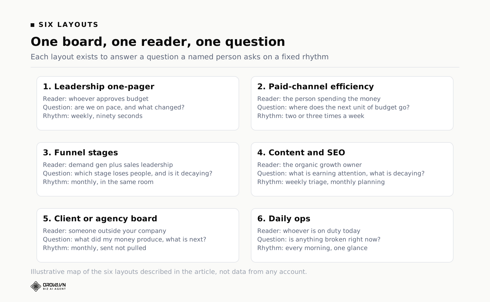
- The weekly leadership one-pager — for whoever signs off on budget. Answers: are we on track, and what changed?
- The paid-channel efficiency board — for the person spending the money. Answers: which channel and campaign deserves the next unit of budget?
- The funnel-stage board — for demand gen and sales leadership together. Answers: where do people fall out, and is that stage getting better or worse?
- The content and SEO board — for the content owner. Answers: which pages are earning attention, and which ones are decaying?
- The client or agency board — for someone outside your company. Answers: what did you do with my money, and what happens next?
- The daily ops board — for whoever is on the tools today. Answers: is anything broken right now?
Notice that four of the six are read by people who do not build dashboards. That is the point. The builder's instinct is to add detail; the reader's need is to remove it. Every layout below is written from the reader's side. Treat each one as a marketing dashboard template you refill with your own metrics, not a screenshot to imitate pixel for pixel.
Example 1: the weekly leadership one-pager
Who reads it: the founder, the CMO, the CFO, or whoever approves spend. They read it on a phone, between meetings, and they will give it ninety seconds.
The question it answers: are we on pace against the target we agreed, and what is the one thing that changed this week?
Tiles and charts, in reading order:
- Four number tiles across the top, no more: the outcome metric (pipeline, revenue, qualified leads — pick one), cost per that outcome, total spend, and pace against target expressed as a percentage. Each with a delta against the baseline.
- One line chart of the outcome metric by week, with the plan line drawn on the same axes. Two series. That is the whole chart.
- One horizontal bar chart: outcome contribution by channel, this period. Horizontal because channel names are words and words are easier to read across than rotated forty-five degrees.
- One small table: the top three movers, up or down, with the change and a one-line human explanation typed by a person. Not generated. Typed.
- One text tile at the bottom: "what we are doing about it", three bullets, rewritten weekly.
The comparison baseline: plan first, previous period second. Leadership thinks in commitments, so "12% behind the quarterly plan" lands harder than "down 4% week over week". If you have no plan number, use a rolling four-week average as the baseline and say so on the board, because comparing a single week to a single week amplifies noise into drama.
The trap: adding channel detail. The moment you put ad-set-level data on the leadership board, two things happen. Leadership starts asking about individual ad sets in meetings, which is a bad use of everyone's hour, and the person who owns paid stops maintaining their own board because "it's already on the exec one". Keep the one-pager at the altitude of decisions its reader can actually make: move budget between channels, change the target, or hire.
A second, quieter trap: no written commentary. A number that dropped 18% with no sentence next to it generates a Slack thread, a meeting, and an apology. One typed line — "spend paused three days while the payment method was re-verified" — ends it. The commentary tile is the highest-value square centimetre on the whole board and it is the one people skip because it cannot be automated.
Example 2: the paid-channel efficiency board
Who reads it: the person or agency actually spending the money, two or three times a week.
The question it answers: where should the next unit of budget go, and what should I turn off?
This is where most marketing KPI dashboard builds go wrong, because paid platforms hand you a hundred columns and it feels wasteful not to use them. Resist. A budget decision needs efficiency, volume, and a stability signal. Everything else is diagnosis you do after the board tells you where to look.
Tiles and charts:
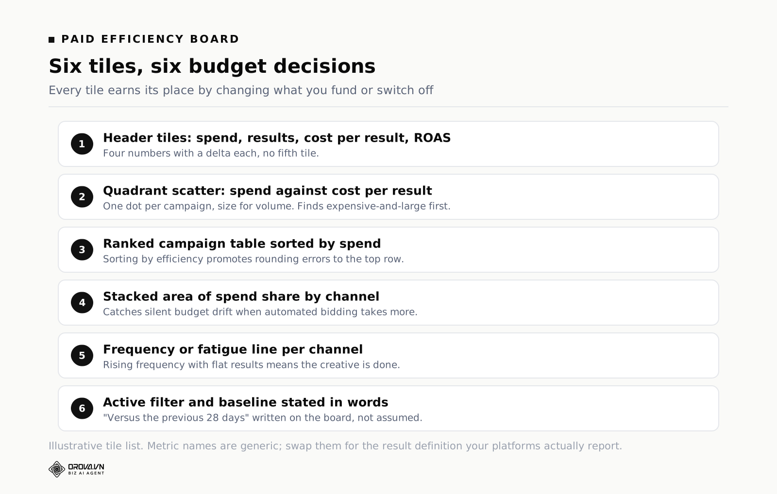
- Header tiles: total spend, results, cost per result, and return on ad spend if you have reliable revenue. Four tiles, each with a delta.
- A scatter or quadrant view: spend on one axis, cost per result on the other, one dot per campaign, dot size for volume. This is the single most useful paid chart and almost nobody builds it. It shows you the expensive-and-large campaigns — your biggest savings — in one glance.
- A ranked table of campaigns: spend, results, cost per result, delta versus the previous equal period, and the share of total spend. Sorted by spend descending, not by cost per result, because a beautiful cost per result on 2% of budget is a rounding error.
- A stacked area chart of spend share by channel over time. This answers "did we drift?" — budget drifts silently when one platform's automated bidding takes more than it used to.
- A frequency or fatigue signal per channel where the platform provides it, plotted as a simple line. Rising frequency with flat results is the earliest warning you get that creative is done.
The comparison baseline: previous equal period, always equal length and aligned to the same weekdays. Seven days versus the previous seven days. Twenty-eight versus the previous twenty-eight. Comparing "this month so far" to "all of last month" is the most common self-inflicted reporting wound in paid media, because on the eighth of the month everything looks catastrophic. Where seasonality is real — retail, travel, education — add a second baseline of the same period last year and put it in a lighter shade.
The trap: mixing currencies and mixing conversion definitions. If one account reports in dollars and another in dong and the board silently converts at yesterday's rate, every cost threshold on the board is wrong, and you will not notice because the numbers still look plausible. The same applies to conversions: platform A counts a form view, platform B counts a purchase, and your "cost per conversion by channel" chart compares two different things stacked next to each other. Before you build this board, write down the definition of one result and enforce it per platform. If you cannot, split the board by platform rather than blending — an honest split beats a dishonest total.
If you have not settled on which efficiency metric leads this board, that decision is worth making before you place a single tile. We wrote about picking one in ad Performance Metrics That Actually Matter, and the short version is: pick the metric closest to money that you can measure without guessing.
Example 3: the funnel-stage board
Who reads it: demand generation and sales leadership, in the same room, monthly.
The question it answers: at which stage are we losing people, and is that stage improving or decaying?
A funnel board is not a funnel picture. The classic tapering funnel graphic is one of the worst charts in marketing: it encodes volume as area, which humans read badly, and it shows a single snapshot with no trend. Build it as stage counts plus stage conversion rates plus time-in-stage.
Tiles and charts:
- A row of stage tiles: visitors, leads, qualified, opportunity, won. Each with count and delta.
- A row of conversion tiles directly underneath, each one being the rate between two adjacent stages. Visitor to lead. Lead to qualified. Qualified to opportunity. These rates are the actual content of the board — counts move with spend, rates move with quality.
- A small-multiple line chart: one mini chart per conversion rate, six months of history, same y-axis scale within each. Six small charts beat one chart with six lines every single time.
- A bar chart of median days in stage. Slow stages are invisible in conversion rates and they are where deals quietly die.
- A breakdown table of stage conversion by source. This is the tile that ends the "marketing sends junk leads" argument, in either direction, because it shows which source actually converts past the qualified stage.
The comparison baseline: cohort, not calendar. A lead created in March that closes in June should be counted in March's cohort, otherwise your conversion rates lie in both directions — this month looks terrible because its leads have not had time to convert, and last quarter keeps improving retroactively. If your data cannot support cohorts, at minimum label the board clearly with the lag and compare only periods old enough to have matured.
The trap: counting the same person at multiple stages and calling the sum a funnel. Stages must be defined by a single field with one value per record — a status column, not five boolean flags. When five flags exist, someone will be "qualified" and "unqualified" at once and your conversion rate exceeds 100% in a way that takes an afternoon to debug. Fix the definition upstream in the CRM before you build the board. A dashboard is a mirror, not a laundry.
Example 4: the content and SEO board
Who reads it: the person responsible for organic growth, weekly for triage and monthly for planning.
The question it answers: which pages are earning attention, which are decaying, and what should I write or fix next?
Tiles and charts:
- Header tiles: clicks, impressions, average position, and conversions from organic. Four, with deltas against the previous equal period.
- A page-level table with clicks, impressions, average position, and click-through rate — sorted by impressions descending, filtered to positions five through twenty. That filter is the whole point: it isolates pages that Google already trusts but that nobody clicks, which is the cheapest work available to you.
- A decay list: pages whose clicks fell more than a set threshold versus the previous ninety days, with the drop shown in absolute clicks, not percent. A page falling from 4 clicks to 1 is a 75% drop and does not matter.
- A query-cluster chart: grouped queries by topic with clicks over time, so you see whether a topic is rising or being eaten by someone else.
- A new-content tracker: pages published in the last ninety days with days since publish and clicks to date. Organic content has a maturation curve, and judging a three-week-old post is how good content gets killed early.
The comparison baseline: previous ninety days, plus same period last year if the site has that much history. Search data is noisy week to week and seasonal at the year level, so short baselines produce false alarms and long ones produce false calm. Use both.
The trap: ranking every keyword and reporting the average position of everything. Average position across a thousand queries is a number that moves when Google discovers you for a new irrelevant query, and it moves in the wrong direction when things go well. Track position for a named set of queries you care about, and treat the rest as impressions. We went deeper on this layout in SEO Checker: Free Tools and What They Miss, including which tiles to cut when the board gets crowded.
One more trap specific to content boards: reporting pageviews as the headline. Pageviews reward whichever page is linked in the navigation and tell you nothing about whether the content worked. Lead the board with clicks from search, then entrances, then whatever conversion event exists. If nothing on the page converts, say so and put a task on the roadmap instead of dressing up a traffic number.
Example 5: the client or agency board
Who reads it: a client, a stakeholder in another department, or an investor. Someone who did not build it, does not have a login to your platforms, and is quietly deciding whether to keep paying.
The question it answers: what did you do with my money, what did it produce, and what happens next month?
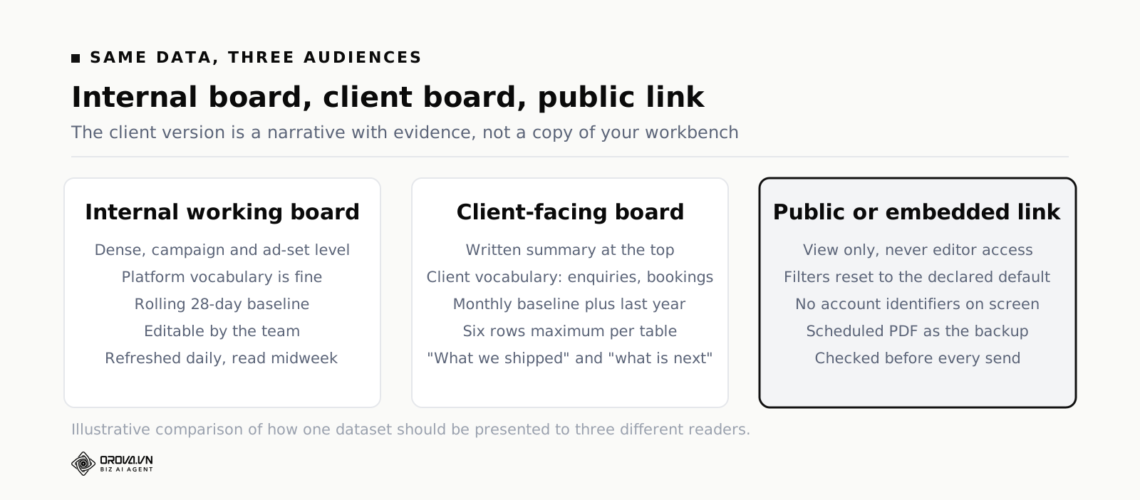
This is the layout that most needs to be different from your internal one, and the one most agencies ship as a copy of their internal board with a logo swapped. The client does not want your working surface. They want a narrative with evidence attached.
Tiles and charts:
- A written summary at the top. Three to five sentences. What we set out to do, what happened, what we are changing. If your client-facing board has no writing on it, you are asking a non-specialist to interpret your data for you, and they will interpret it badly.
- Outcome tiles in the client's language: "enquiries", "bookings", "qualified calls" — not "conversions" and definitely not "events".
- One trend chart of the outcome over the last six to twelve months, so a single bad month sits inside a visible pattern instead of standing alone.
- A spend-and-result table by channel, no more than six rows. Roll the long tail into "other".
- A "what we shipped" list: campaigns launched, creatives tested, pages published. Clients pay for work as well as results, and in slow months this list is the difference between renewal and a cancelled contract.
- A "next period" list, three bullets, written as commitments.
The comparison baseline: the period the client remembers. That is usually the previous month and the same month last year. Do not introduce rolling twenty-eight-day windows to an external reader; they will compare it to the invoice, which is monthly, and the mismatch costs you a meeting.
The trap: sharing the live editable board. Give a view-only link, a public link, an embed, or a scheduled PDF — never editor access, and never a link whose filters are set to something you did not check. The second trap is metric inflation: adding impressions and reach to make a slow month look busy. Every experienced client has learned what "we reached 2.4 million people" means, and it means the outcome number was bad. If it was bad, say it was bad, put the reason next to it, and put the fix in the commitments list. That conversation renews contracts. Impressions do not.
Example 6: the daily ops board
Who reads it: whoever is on duty. Opened once in the morning, glanced at, closed.
The question it answers: is anything broken right now?
This board is not analysis. It is a smoke detector, and it should be built like one: few tiles, obvious states, no interpretation required. If someone has to think to read it, it will not be read.
Tiles and charts:
- Yesterday's spend versus the daily budget cap, per platform. Underspend is as much a fault as overspend; a campaign spending 40% of its cap is usually broken, not thrifty.
- Yesterday's conversions versus a floor you set by hand. Zero conversions on a channel that normally produces some is the number one signal of a broken tracking tag, and you want to catch that on day one, not on the seventh of next month.
- Data freshness per source: when did each connection last update? A stale source silently turns every other tile on every other board into a lie.
- Disapproved or paused assets, if your platforms expose it. A rejected ad set can sit dead for a week before anyone notices.
- Site health: yesterday's sessions and error rate, if you have it. Marketing gets blamed for traffic drops caused by a broken deploy roughly as often as by anything else.
The comparison baseline: yesterday versus the same weekday last week, plus a hand-set floor. Weekday matters enormously — comparing Sunday to Saturday generates a false alarm every single week, and after three false alarms nobody looks at the board again.
The trap: thresholds set to zero, or not set at all. There is a specific failure worth knowing about here, because we hit it in our own product: a rule engine treated the value 0 as "no value entered", so any threshold set to zero was skipped entirely — exactly the threshold you most want to fire on, since "conversions equals zero" is the alarm that matters. Whatever tool you use, test your alert conditions by deliberately triggering them once. An untested alarm is a decoration.
How to choose a chart type from the question
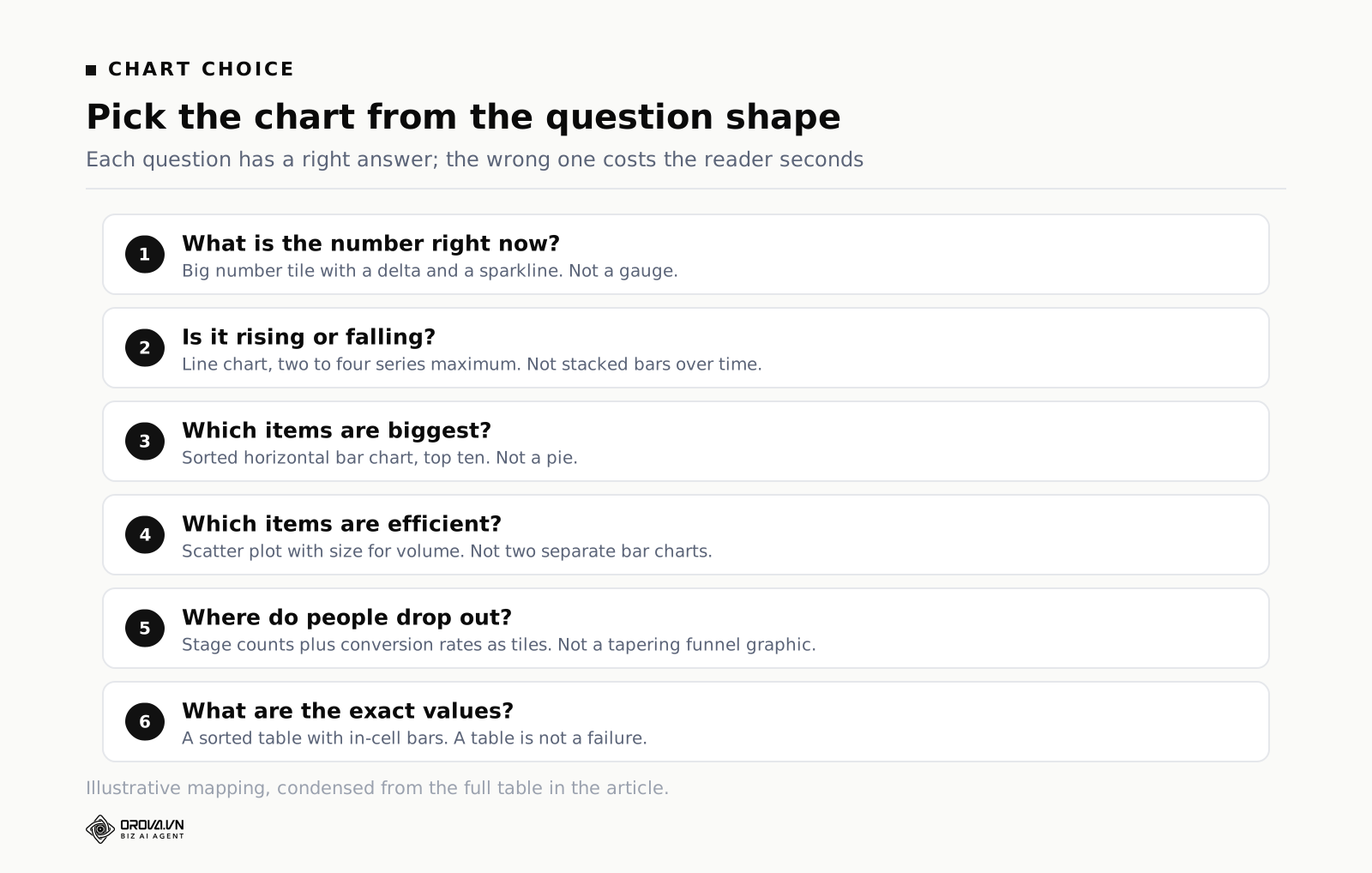
Chart choice is not taste. Each question shape has a right answer, and the wrong answer costs the reader seconds they will not spend. Here is the mapping I use, and it covers the overwhelming majority of marketing dashboard examples you will ever build.
| The question in the reader's head | Chart that answers it | What not to use |
|---|---|---|
| What is the single number right now? | Big number tile with a delta and a sparkline | A gauge or speedometer |
| Is it going up or down over time? | Line chart, two to four series maximum | Stacked bars over time |
| Which items are biggest? | Horizontal bar chart, sorted, top ten | Pie or donut |
| How is the total split? | Stacked bar for two or three parts, or a sorted table | Pie with eight slices |
| Did the mix change over time? | 100% stacked area chart | Multiple pies side by side |
| Which items are efficient and which are expensive? | Scatter plot with size for volume | Two separate bar charts |
| Where do people drop out? | Stage counts plus conversion rates as tiles | Tapering funnel graphic |
| What are the exact values? | A sorted table with in-cell bars | Any chart at all |
| How do many segments trend at once? | Small multiples, one mini chart per segment | One chart with twelve lines |
Three rules underneath that table. First, tables are not a failure. When a reader wants exact numbers to copy into a deck, a table is the correct visualization and a chart is an obstacle. Second, sort everything. An unsorted bar chart makes the reader do the ranking with their eyes, which is work you could have done for them. Third, cap the series count. The moment a line chart passes four series it becomes a texture, and the reader's takeaway is "it's complicated" rather than any specific fact.
One more thing about colour, since it decides readability more than chart type does. Use one accent colour for the metric in focus and grey for everything else. Reserve red and green for good and bad, and remember that for cost metrics down is good — a red arrow on falling cost per acquisition has caused more panicked meetings than any dashboard bug I know of. Set the direction convention explicitly per metric, and if the tool will not let you, write it in the tile label.
Comparison baselines: the part sample marketing dashboards get wrong
You can build every layout above perfectly and still ship something useless if the baseline is careless. Four baselines exist and each answers a different question.
- Previous equal period. Answers "did anything change recently?" Best for operational boards. Must be equal length and weekday-aligned. Never compare a partial period to a complete one.
- Same period last year. Answers "is this normal for this time of year?" Essential for anything seasonal. Useless if the business changed shape in between, so drop it after a pivot rather than reporting a comparison you know is meaningless.
- Plan or target. Answers "are we going to make it?" The only baseline leadership truly cares about. Requires a plan number, which is why so many boards skip it, and skipping it is why so many boards get ignored by leadership.
- Rolling average. Answers "is this a real move or noise?" A four-week rolling line under a weekly bar chart kills most false alarms. Use it whenever daily volume is small enough that single events swing the number.
Pick one primary baseline per board and state it on the board itself, in words, near the top: "all comparisons versus the previous 28 days unless labelled". Readers who know the rule stop asking, and readers who do not know it stop guessing wrong. Mixing baselines silently across tiles — one tile versus last month, another versus last year — is how a board loses trust permanently, and trust is very hard to rebuild once someone has been embarrassed in a meeting by a number they read off your screen.
A note on percentages. A 200% increase on a base of two is a base of six, and it will dominate every "top movers" list you build. Set a minimum-volume filter on any list sorted by percentage change, or sort by absolute change instead. This one filter removes most of the noise from most reporting.
Refresh cadence and ownership
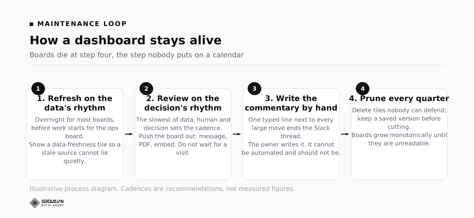
Dashboards do not rot because the data breaks. They rot because nobody owns them and the cadence does not match the decision. A board refreshed hourly that is read monthly wastes cost and attention; a board refreshed monthly that drives daily decisions gets replaced by someone's private spreadsheet within a fortnight.
Match three things: how often data updates, how often a human looks, and how often a decision is actually made. The slowest of the three sets the cadence. If budget decisions happen weekly, a daily-refresh paid board is fine but a daily-review ritual is theatre.
| Board | Data refresh | Human review | Owner |
|---|---|---|---|
| Leadership one-pager | Daily overnight | Weekly, before the leadership meeting | Marketing lead — writes the commentary |
| Paid efficiency | Daily overnight | Two or three times a week | Whoever holds the budget |
| Funnel stages | Daily | Monthly, with sales in the room | Demand gen, co-signed by sales ops |
| Content and SEO | Daily, accepting search data lag | Weekly triage, monthly planning | Content owner |
| Client board | Daily | Monthly, sent not pulled | Account manager |
| Daily ops | Every morning before work starts | Daily, ninety seconds | Rotating duty person |
Ownership means three duties, and they should be written down where the board lives. The owner writes the commentary. The owner approves or rejects requests to add tiles. The owner reviews the board quarterly and deletes what nobody used. That third duty is the one everybody skips, and it is why boards grow monotonically until they are unreadable. Put a recurring quarterly reminder on the calendar titled "delete tiles", and treat any tile nobody can defend as gone.
One practical detail on delivery: push beats pull. A board someone has to remember to open gets opened in week one and forgotten by week five. Schedule it — a link in the Monday message, a PDF in the inbox before the meeting, an embed on the page people already look at. The reading habit is part of the design, not an afterthought.
Traps that turn a good layout into a dead one
Building from the data you have instead of the question you have
The connector list is a menu, and menus are seductive. You connect analytics, ads, and your CRM, and suddenly there are eight hundred fields available. The instinct is to survey them. Do not. Write the question first on paper, list the four to eight numbers that answer it, then go looking. Anything you find that is interesting but not on the list goes in a note for later, not on the board.
Reporting activity as if it were outcome
Impressions, reach, followers, sessions, email opens, and video views all move reliably upward with effort and tell you almost nothing about whether the effort worked. They belong on a diagnostic board where you use them to explain a change in an outcome number, not at the top of any board where a decision gets made. We took this apart in detail in best SEO Keyword Research Tools (Free and Paid Compared), including how to tell a diagnostic metric from a decorative one.
One board for two audiences
When leadership and the paid buyer share a board, the buyer's detail confuses leadership and leadership's targets clutter the buyer's workspace. The compromise board gets maintained by nobody. Duplicating a board and stripping it down for a second audience takes twenty minutes and saves months of misreading.
Filters that lie
A date filter left on "last 7 days" when someone shares a screenshot, a channel filter someone applied and did not clear, a currency toggle nobody noticed — these produce confidently wrong decisions. Show the active filter state as visible text on the board, default filters to the board's declared baseline on every load, and check the filter state before you share any link outside your team.
No definition layer
If "lead" means something different on the paid board and the funnel board, the two boards will disagree and both will lose credibility. Write a one-page definitions note — what counts as a lead, which conversion action each platform reports, what timezone the day boundary uses, whether spend includes agency fees — and link it from every board. Timezone alone accounts for a surprising share of "why don't these two numbers match" investigations, because platforms often report in the account's timezone while your warehouse stores UTC.
Never deleting anything
Every board accumulates. Someone asks for a tile before a meeting, it gets added, the meeting passes, the tile stays for two years. Prune quarterly. If you are nervous about deleting, keep a copy of the old version before you cut — most serious tools keep a version history you can roll back to, so the risk of cutting is lower than the cost of clutter.
A repeatable process for building any of these
- Write the question and the reader on one line. If two people are named, split into two boards now, before any work happens.
- List the numbers that answer it. Four to eight. If your list has fifteen, you have more than one question.
- Pick the baseline and write it on the board. One primary baseline, stated in words.
- Sketch the layout on paper. Number tiles at the top, one trend chart, one ranked comparison, one detail table. Paper is faster than any tool and it stops you designing around what the tool makes easy.
- Check definitions before connecting anything. What is a lead, which conversion counts, which timezone, which currency. Fix conflicts at the source.
- Build it, then delete a third of it. You will over-build. Everyone does. The cut is the design step.
- Show it to the reader without explaining it. Watch them read. Every question they ask out loud is a labelling failure on the board, not a comprehension failure in the reader.
- Schedule the delivery and name the owner. Put both in writing on the board itself.
- Review in ninety days. Did any decision change because of this board? If not, either the question was wrong or the reader was wrong. Fix one and try again.
Step seven is the one that separates a board people use from a board people tolerate. Sit next to the reader, open it cold, say nothing. The first three seconds tell you whether the layout works. If their eyes go to the bottom-right chart first, your top-left tile is not doing its job.
When manual building stops paying and a tool earns its place
Everything above works in a spreadsheet. If you run one channel and one website and you have twenty minutes a week, a spreadsheet with a pivot table and a chart beats any platform, because the maintenance cost is zero and you already know how to use it.
The break point comes from three directions. First, source count: once you are pulling from search, analytics, two or three ad platforms, your CRM, and a couple of social channels, manual export becomes a part-time job and the numbers go stale between exports. Second, audience count: six boards for six readers, each needing a different slice and a different share permission, is where copy-paste reporting collapses. Third, question latency: when someone asks "why did cost per lead jump on Tuesday" and the answer takes two days to assemble, the answer arrives after the decision.
At that point a dashboard platform stops being overhead and starts saving hours. For what it is worth, this is the problem Orova Insight was built for: 16 source types including GA4, Search Console, Google Ads, Meta Ads, Fanpage, Instagram, Threads, TikTok Ads and Google Sheets, plus a webhook any in-house system can post JSON into so it behaves like any other drag-and-drop source. Boards are multi-page canvases with 49 chart types and 11 kinds of filter control, custom metrics defined by formula, sharing by workspace permission or per-person or public link or embed or scheduled PDF, and 100 recovery versions if a cut goes wrong. There is an AI Analyst that answers questions in plain language and builds charts from your real data, and it only reads sources you have explicitly enabled for it. Signing up is free and comes with 1,000 quota, no card required.
Whatever you choose, choose it after you have written the questions down. A tool applied to a vague question produces a faster museum, and if your reporting problem is that nobody trusts the numbers, no platform fixes that — a definitions page does. If you also run paid media and want the search and ads picture in one place, the mechanics of combining them without double-counting are worth reading up on separately, because a blended board built carelessly is worse than two honest ones.
Frequently asked questions
How many tiles should a marketing dashboard have?
For a board read on a schedule by a busy person, four to eight number tiles and three to five charts. If it does not fit one screen without scrolling on the device the reader actually uses, it is too big. Working boards for analysts can be denser, because analysts are hunting rather than glancing, but even there small-multiple layouts beat crowded single charts. The same cap holds for any KPI marketing dashboard, whatever the channel mix behind it.
Should I build one dashboard or several?
Several. One board per reader per rhythm. The instinct to consolidate comes from the builder's convenience, not the reader's need. Boards are cheap to duplicate and expensive to misread. Consolidate the data model, never the boards.
What is the difference between a marketing dashboard and a report?
A dashboard is a standing surface you return to on a rhythm to check state; a report is a one-time argument with a beginning and an end. Dashboards answer "where are we"; reports answer "here is what happened and what I recommend". The client board above is a hybrid, which is exactly why it needs written commentary that a pure dashboard would not.
How do I stop stakeholders adding tiles?
Put the board's question in writing at the top and make every request answer it. "Does this tile change what you decide when you read this board?" is a question most requests fail politely. Offer the requester their own board instead — it is usually twenty minutes of work and it protects the original.
What should I do when two sources disagree?
Assume they always will, and decide in advance which one is the source of truth for each metric. Platform-reported conversions and your CRM will never match, because attribution windows, timezones, and deduplication rules differ. Pick one for the board, name it on the tile, and use the other for diagnosis only. Chasing a perfect reconciliation is a project with no end.
How often should the layout itself change?
Rarely. Readers build muscle memory for tile positions, and moving things resets it. Change the layout when the question changes, not when you learn a new chart type. Quarterly pruning should remove tiles, not rearrange them.
What to do this week
Open the dashboard your team looks at most and try to write, in one sentence at the top, who reads it and what they decide. If you cannot finish the sentence in thirty seconds, that board is the problem, not the data behind it.
Then pick one of the six layouts above — most teams should start with the leadership one-pager, because it is the one whose absence causes the most meetings — and build it small. Four number tiles, one trend chart with the plan line, one ranked bar chart, one commentary box you type yourself. Declare the baseline on the board. Name an owner. Send it once, and watch what the reader asks about.
The questions they ask are your next iteration. That loop, run three or four times, produces a board people open on purpose, which is the only measure of a dashboard that has ever mattered.
Building this yourself takes more time than it looks
Picking the right layout is only half the job. Someone still has to pull the numbers from every channel, keep the comparisons consistent, update it before every Monday meeting, and rebuild parts of it whenever a channel or a goal changes — and that upkeep is where most dashboards quietly rot back into a pile of disconnected tiles.
Orova Insight is built to take that ongoing work off your plate: it pulls your marketing data together and keeps a dashboard like the ones described here current automatically, so you are not the one manually refreshing charts every week. If that sounds like the part you would rather not do by hand, it is worth a look.
Build these layouts by dragging, not coding
Orova Insight pulls your ad, web and spreadsheet data into one place so you can assemble a report and ask AI for the chart.
Start for free