
Marketing Dashboard Software: Eight Decisions Before You Buy
Marketing dashboard software gets bought to end a specific irritation — the half-day every month spent assembling numbers from six places — and then, in a large share of cases, the dashboard that results goes unopened by week five. The tool worked. The artefact failed.
This article is about the artefact rather than the category: what a dashboard is for, why most of them die, the layout that survives contact with a real team, and the maintenance nobody budgets for. The software matters, and it matters less than the eight decisions you make while building the thing.
What is marketing dashboard software for?
It connects to the platforms you spend and publish on, holds your own metric definitions, and presents the current state on one screen without anyone assembling it. Its purpose is to answer a small set of recurring questions faster than opening six platforms would — not to display everything available. A dashboard that shows everything answers nothing, because finding the relevant number costs the same as looking it up.
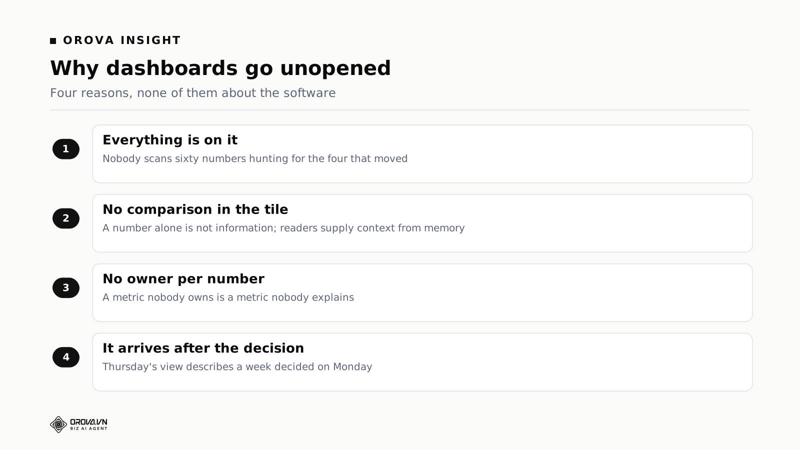
The four reasons dashboards die
Everything is on it
The first version has sixty metrics, because sixty were available and each one felt defensible. Nobody scans sixty numbers weekly hunting for the four that moved; they glance at the two they already worry about and close the tab.
The uncomfortable fix is deleting things people asked for. A weekly dashboard should carry the numbers that could change a decision this week — usually between five and nine. Everything else belongs in a second view that people visit with a question, which is a different artefact with a different job.
No comparison in the tile
A number alone is not information. Cost per acquisition of some figure means nothing until it sits beside last month, the same period last year, or the target. Dashboards showing current values force every reader to supply context from memory, and memory supplies whatever confirms the mood.
The comparison has to be in the same tile, not on a separate chart the reader correlates. A reader who has to look in two places will look in one.
No owner per number
A metric nobody owns is a metric nobody explains. The most useful field on most marketing dashboards is not numeric — it is a name. When the figure moves, somebody is expected to know why, and knowing that in advance changes how carefully it gets watched.
It arrives after the decision
A view refreshed Thursday afternoon describes a week whose spending decisions were made Monday. It is history rather than input. Match the rhythm to the moment decisions get made, which for most teams means Monday morning or nothing.
The layout that survives
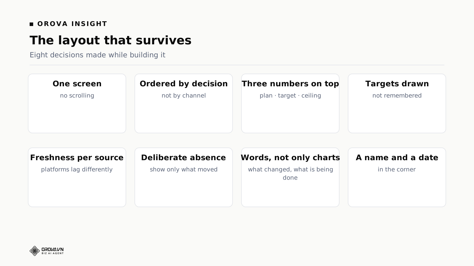
Eight decisions, in the order they matter.
One screen, no scrolling. Anything below the fold is not part of the weekly rhythm. If it does not fit, it is two dashboards rather than one long one.
Ordered by decision, not by channel. The instinct is a section per platform, because that is how data arrives. But nobody decides about a platform in isolation; they decide where the next unit of budget goes. Order the page so that question is answerable from the top, then let channel detail sit underneath.
Three numbers at the very top. Spend against plan, outcomes against target, cost per outcome against the ceiling. A reader who stops there should still know whether to worry.
Targets drawn on the page. If there is a ceiling for cost per customer, draw it. A number beside a threshold reads instantly; the same number alone requires the reader to remember the threshold, and half will remember it wrong.
A freshness stamp per source. Platforms report with different lags, and a page mixing an hourly source with a daily one will show a Monday-morning figure that looks like collapse and is an incomplete day. Nearly every serious dashboard panic traces back to somebody reading a partial period as a real one.
A deliberate absence. Show only metrics that moved beyond a threshold you set. The absence of a metric is itself information: nothing here needs you.
Words, not only charts. One line stating what changed and what is being done. A chart does not tell anyone what you think, and the reader most in need of the dashboard is the one least able to interpret it unaided.
A name and a date in the corner. Who owns this view, and when was it last reviewed. Dashboards outlive their relevance silently, and a date is the cheapest defence.
Connections: the part that quietly breaks
Everything above assumes the numbers arrive. In practice the data layer is where dashboards fail silently, and silent failure is worse than an outage because decisions continue being made.
Depth matters more than breadth. A product advertising sixty connectors, three of which you need and one of which returns only top-line totals, is worse than one with twelve done properly. Check whether each connector returns the dimensions you actually report on — campaign, placement, landing page, whatever your questions are about — rather than only account-level sums.
Partial data is the dangerous failure. A connection that dies loudly gets fixed within a day. One that returns six of seven platforms, or drops the last three days of a month, produces a dashboard that looks complete and is wrong. Ask specifically what the interface does when a source fails: does the tile go blank, show stale values, or display a warning?
Revisions arrive late. Several platforms restate figures for days afterwards. A dashboard read on Tuesday morning and again on Thursday will show different numbers for Monday, and someone will conclude the tool is unreliable. Marking each source's lag prevents most of these arguments.
Spreadsheets are a real source, not a fallback. In most companies a meaningful share of the numbers that belong in a marketing dashboard live in a spreadsheet a person maintains: offline sales, agency invoices, targets, a manually tracked pipeline. Tools that treat spreadsheet import as an afterthought — single header row, no merged cells, tidy rectangles — cannot ingest the file your colleague actually keeps.
How Orova Insight builds dashboards
Insight is the reporting and dashboard module inside Orova. Its shape, stated plainly rather than as a recommendation.
Twelve sources connect directly: GA4, Search Console, Google Ads, Meta pages, Meta Ads, Instagram, Threads, TikTok, TikTok channels, YouTube, LinkedIn and LinkedIn Ads — plus Zalo, which matters for anyone operating in Vietnam and is absent from most Western products.
Google Sheets is a first-class source. Sheets sync in with support for merging tabs and multi-level headers — the shape real spreadsheets have rather than the shape importers wish they had. Files can be uploaded directly as sources too.
You can declare your own API source. If a number lives in a system nobody has written a connector for, it comes in without waiting for a roadmap.
Dashboards are built by dragging, and they are versioned. Version history with restore, snapshots, duplication, renaming, sharing, and a live view for people without accounts. The versioning is what experienced teams appreciate most: a dashboard several people edit will eventually be broken by somebody, and without history the fix is a rebuild from memory.
There is an analyst you can ask questions of, which answers in charts as well as words, plus AI widgets that live on a dashboard. This addresses the gap between a fixed view and a real question — asking in words is a far lower barrier than building a new view.
Metrics are defined centrally rather than per dashboard, so two views cannot quietly disagree about what a lead is. Reports send themselves on a schedule, with a send-now option, and templates exist for starting points.
What Insight is not
It is not a business intelligence platform in the sense that a warehouse plus a modelling layer is. No data warehouse, no SQL modelling, no semantic layer for an analyst to build against. If the requirement is joining marketing, finance and product data across years and modelling it properly, this is the wrong shape of tool and a warehouse is the right answer.
It is also not an attribution product: it presents what platforms report and what your own sources say, and does not run incrementality experiments or media mix modelling. And it does not validate your data — if a conversion event fires twice, the dashboard shows twice as many conversions, cleanly.
The maintenance nobody budgets for
A dashboard is not a deliverable, it is a thing that decays. Four sources of decay, all predictable.
Renaming. A campaign gets renamed, a channel gets restructured, an account is split. Views filtered on names break or, worse, silently exclude the renamed thing and show a number that is right about a smaller world.
Definition drift. The business changes what it means by a lead, and the dashboard keeps computing the old thing. Nobody notices because the number still looks plausible.
Proliferation. Someone builds a view for a campaign, someone copies it and changes two tiles, and within a quarter there are nine views, four of which contradict each other because they predate a definition change. Nobody deletes any of them, because deleting somebody else's work feels rude.
Audience drift. The dashboard was built for a team of three and is now read by a founder and two clients, who need different things from it and get an internal view instead.
The cheap discipline: an owner and a date on every dashboard, a rule that anything unopened in sixty days is archived rather than kept, and fifteen minutes a month from the owner. Archiving rather than deleting is what makes the rule actually enforceable, because it is reversible. Four maintained views beat nineteen of unknown provenance, and the difference is administrative rather than technical.
One dashboard or several?
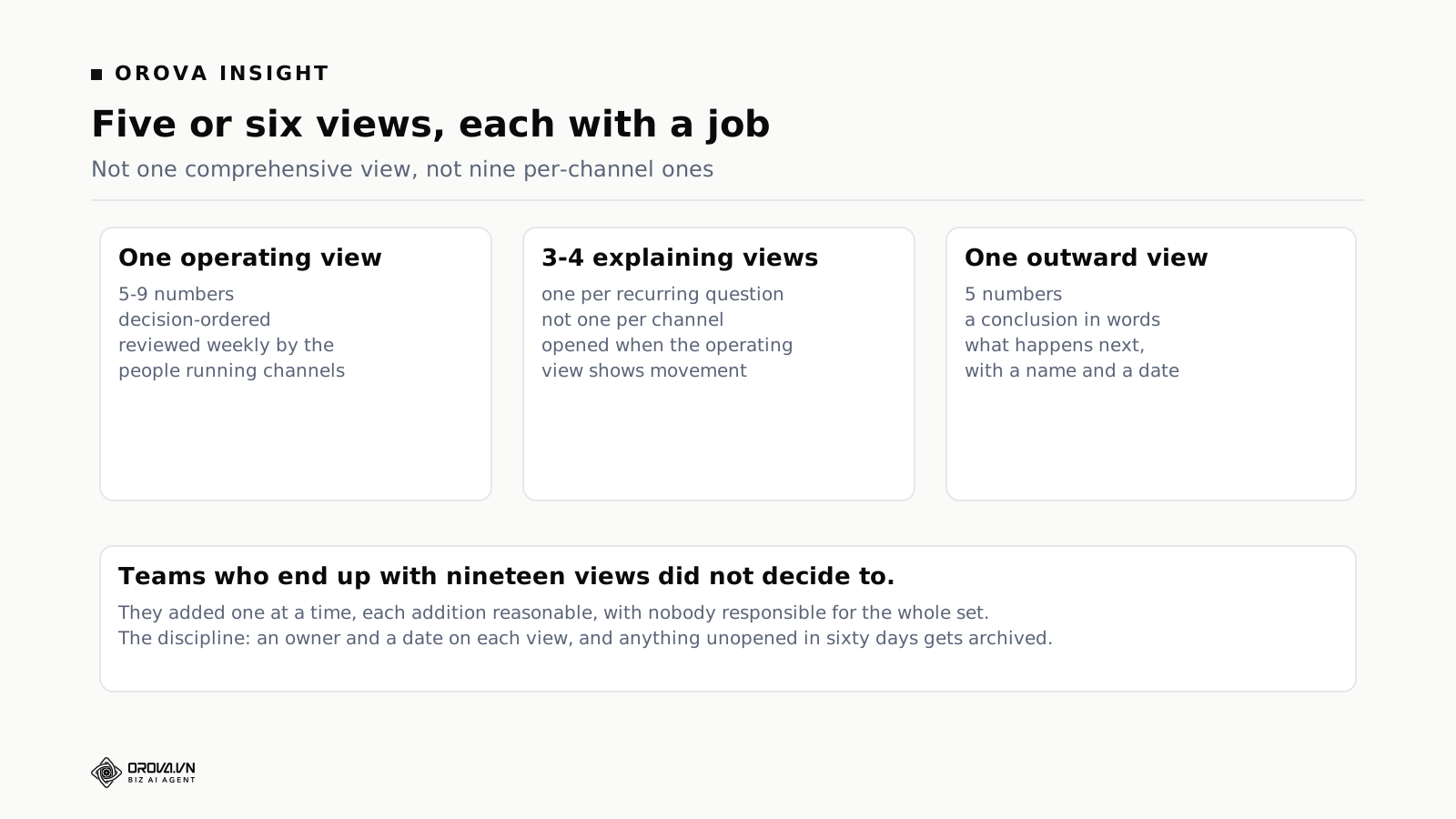
The instinct is one dashboard for everything, and it produces the sixty-metric artefact nobody opens. The alternative — a view per channel — produces nine views that each answer a question nobody asks. A middle structure works better for most teams.
One operating view. Five to nine numbers, decision-ordered, reviewed weekly by the people running channels. This is the artefact that has to survive; everything else is optional.
One explaining view per recurring question. Not per channel — per question. "Why did cost per customer move?" is a question with a stable set of contributing numbers, and a view built for it gets opened when the operating view shows something moved. Three or four of these cover most of what a small marketing team asks.
One outward view. Five numbers, a conclusion in words, and what happens next with a name against it. For a founder, a board, or a client. Never the internal view handed over, because density reads as either impressive or evasive and generates an hour of questions either way.
That is five or six views total, each with a job you can state. Teams who end up with nineteen did not decide to; they added one at a time, each addition reasonable, with nobody responsible for the whole set.
Building the first one, in order
Six steps that avoid the most rework.
Write down the three decisions you make weekly. Where the next budget goes, what to stop, what to test. Everything downstream serves these.
List the numbers each decision needs. You will end with fewer than a dozen, and two or three will turn out not to exist reliably yet — which is itself the most useful output of the exercise.
Connect only the two sources carrying most of the spend. Nothing else, for a week. Twelve connections produce twelve things that can break before anyone knows what normal looks like.
Reconcile one metric completely against the business's own records until every unit of the gap is understood. This is the least enjoyable step and it determines whether anyone trusts the dashboard in month three.
Define the metrics centrally, then build one screen. Apply the eight layout decisions. Resist adding anything that does not serve one of the three weekly decisions.
Schedule it, and add the line no tool can write: what changed and what is being done about it.
Teams who follow that order end with a short view that gets read. Teams who begin by connecting everything and building comprehensively end with something impressive that stops being opened around week five, and a suspicion the category is overrated.
Build it yourself or buy it
Teams with engineering capacity consider building, usually starting from a script that pulls one platform into a spreadsheet. The first version is genuinely quick; the cost arrives later.
The build is not the expense, the maintenance is. Platform APIs deprecate versions on their own schedule, tokens expire, fields get renamed. None of these are hard problems and all of them arrive without warning, usually on the morning a report is due, landing on whoever built it regardless of what else they were doing.
Silent partial failure is the real risk, and it is much likelier in a home-built pipeline because nobody writes the monitoring for a script that started as a favour.
The bus factor is one. The person who built it holds the model in their head. When they move teams, the reporting becomes an artefact nobody can safely change, so it gets frozen — and a frozen dashboard stops reflecting the business within two quarters.
Building is right when requirements are genuinely unusual and someone owns it as part of their job, with that ownership surviving them being busy. Otherwise the comparison is not subscription against zero; it is subscription against a recurring obligation nobody has budgeted.
Ten questions for a demo
- Connect one of my accounts now. Not the sample workspace — mine, with its awkward permissions.
- Show me a connector's depth. Does it return the dimensions I report on?
- Break a connection and show me the dashboard. Blank tile, stale value, or a warning?
- Import the spreadsheet my colleague actually maintains, merged cells and two header rows included.
- Define a custom metric and show it appearing in two different views.
- Break a dashboard, then restore it. Is there version history?
- Show me the freshness of each source on the page.
- Send a view to someone with no account. What do they get?
- Ask the built-in analyst a question I care about, in words. Judge the answer, not the interface.
- Export everything. If leaving is hard, that is part of the price.
What to expect in the first month
Week one: the numbers disagree with what you believed. Almost always, and the gap is usually a definition rather than an error. Reconcile one metric completely before touching others.
Week two: you find a channel that has been reporting badly for months. A connection nobody checked, an event double-counting, a campaign missing from the structure. This is the purchase paying for itself, though it does not feel like it.
Weeks three and four: the dashboard gets shorter. The first version had everything because everything was available. Then people stopped opening it, and version two has nine numbers. That contraction is the sign it is working — not evidence the first attempt failed.
Sharing a dashboard outside the team
An internal view and an outward one are different artefacts, and handing over the first is the most common reason a dashboard generates work instead of saving it.
The internal view is dense, uses shorthand, and assumes the reader knows the account. Given to a founder or a client, that density produces questions that take an hour to answer, because the answer requires context the page does not carry. Worse, it invites interpretation by someone without the context to interpret — and a stakeholder who has drawn their own conclusion from a chart is harder to redirect than one who asked a question.
Three properties make an outward view work. It is short: five numbers rather than fifteen. It states the conclusion in words at the top, because a chart does not say what you think. And it names what happens next, with a person and a date, which converts a report into a commitment.
Access matters as much as content. Stakeholders will not maintain logins, so a live shareable view or scheduled delivery is what decides whether the thing gets seen at all. And scheduled rather than manual delivery matters for a reason that is not convenience: a report you have to remember to send is a report that gets sent when the numbers are good, which teaches the recipient exactly the wrong thing about silence.
The number that keeps a dashboard honest
Whatever you build, keep one figure on it that no platform contributes to: total marketing spend against total new customers, from the business's own records, monthly.
It attributes nothing and explains nothing. Its entire value is that it disagrees with the channel numbers when something has drifted — and channel numbers do drift, because platforms overlap in what they claim, because the mix shifts toward channels that report generously, and because a growing share of customers may be arriving anyway.
Every channel can look healthy while this figure deteriorates. Teams watching only channel metrics discover it late, usually when someone in finance asks a question nobody can answer. Teams who keep it beside the detail notice within a month, and the conversation is about a discrepancy rather than a crisis.
It is also the number that survives a change of tooling, a change of agency, and a change of attribution convention — which makes it the only series in your reporting that will still be comparable in three years.
Five mistakes worth avoiding
Rebuilding the old spreadsheet exactly
Familiar, and it imports every one-off request the spreadsheet accumulated over years. Start from the weekly decisions and work backwards to the numbers they need.
Treating the dashboard as the deliverable
The deliverable is a decision made faster or better. A beautiful view that changes nothing is a cost. The test is uncomfortable and simple: name a decision that went differently because of it in the last month.
Letting definitions live inside each view
If a metric is defined per dashboard, you have recreated the spreadsheet's central flaw with better graphics. Definitions belong in one place, referenced everywhere.
Assuming the tool validates data
It reports what platforms return. A double-firing conversion event produces a professional-looking chart of the wrong number. Reporting tools make data errors more legible, not less likely.
No owner
Fifteen minutes a month from a named person keeps a setup honest. Without it, a dashboard that was accurate in January is quietly misleading by June, and everyone still trusts it — which is worse than having no dashboard, because a wrong number with a chart around it carries authority a guess would not.
When you do not need this
Two channels, one person running them, a monthly review that takes twenty minutes: there is no dashboard problem here. Buying one adds a surface to maintain and the twenty minutes was never the constraint.
If the reason nobody acts on the current numbers is that nobody has authority to change anything, a better view will not help. The reporting is not the bottleneck; the decision rights are. This sounds like an organisational platitude and it is the most common reason dashboard projects disappoint — the numbers arrive faster and the same person still waits for approval to spend differently.
And if you are about to change your channel mix substantially, wait. A view built around the current mix needs rebuilding, and the transition month produces numbers that compare badly against anything.
Charts: choosing the form that says the right thing
Most dashboard software offers a dozen chart types and the default choice is usually wrong in a way that changes what readers conclude.
A single number is the strongest form available and the most underused. If the question is "what is cost per customer this week", the answer is a number with a comparison. A line chart of the same thing invites the reader to interpret a trend from four noisy points, which they will do confidently.
Lines are for time, bars are for comparison between things. Swapping them is common and it makes both harder to read. A bar chart across dates hides the shape of a trend; a line across categories implies a continuity that does not exist.
Pie charts should almost always be a table. They answer "what share" for at most three categories and become unreadable beyond that. Share of spend across seven channels is a sorted table, and the table is faster to read.
Two axes on one chart usually means two charts. Dual-axis plots let a designer imply a relationship by choosing scales, and readers absorb the implication without noticing the choice. If two series genuinely need comparing, index them both to a starting point and use one axis.
Avoid charts of things that only move with spend. Impressions over time is a chart of your budget, drawn expensively. It looks like insight and contains none.
One test covers most of this: state the sentence the chart is supposed to deliver, then check whether a reader would arrive at that sentence in three seconds. If not, either a different form says it faster or the chart is decorative.
Alerts, and why they usually fail
Most dashboard products offer thresholds that notify you. It is a good idea implemented badly almost everywhere, and the failure is predictable.
A rule firing on any twenty per cent movement will fire constantly on small numbers, because small numbers move twenty per cent for no reason. Within three weeks the notifications are muted, and a muted alert is worse than no alert because it created the belief that something is watching.
Two properties make alerting survive. Thresholds that scale with the size of the thing measured, so a small campaign does not generate the same volume of noise as a large one. And a minimum-volume gate: nothing with eleven clicks this week should be able to trigger anything.
A third property is more of a discipline than a feature: every alert should name an action. If there is nothing to do when it fires, it is a notification about weather. Alerts that cannot lead to an action are the ones that train people to ignore the channel, and they take the useful ones down with them.
What good looks like after a quarter
Four signs, none about features.
The Monday meeting starts from the view rather than from someone's screenshots. This is the clearest signal of adoption and it either happens in the first month or does not happen.
Somebody has deleted a metric. Contraction is health. A view that only ever grows is a view nobody is responsible for.
A number moved and the right person explained it without being asked. That is the owner field doing its job, and it is the difference between a dashboard and a dashboard that works.
Nobody talks about the tool. Software that works becomes invisible. Continued discussion about how it should be configured means the artefact is still being negotiated rather than used.
If after a quarter the weekly meeting still opens with someone assembling numbers, the tool is installed rather than adopted — and the fix is almost always the eight layout decisions rather than a different product.
Two failure stories worth recognising
Both are common enough to be patterns rather than anecdotes, and both are recoverable if spotted.
The dashboard that became a compliance exercise. A view is built for a weekly meeting. Over months, each stakeholder asks for one addition, and each request is individually reasonable. By month eight there are thirty-one tiles, the meeting spends its first ten minutes waiting for the page to load, and the discussion has moved back to whoever prepared their own slides. The view is now maintained because it exists rather than because it is used — and someone spends an hour a month keeping it accurate for an audience of nobody.
The recovery is a deletion pass with the people who requested the additions in the room. Most of them will not remember asking, and the ones who do will usually accept a second view instead. What does not work is deleting quietly, because the one person who noticed will treat it as a reason to distrust the whole thing.
The dashboard that was right and got ignored. A well-built view, nine numbers, accurate, delivered Monday morning. And nothing changes, because the team lacks authority to reallocate spend without approval that takes two weeks. The numbers are not the constraint and never were.
The recovery here is not a reporting change at all. It is agreeing a bounded authority — a proportion of budget the team can move without asking — and then the same dashboard suddenly matters, because a number that can change a decision is read differently from one that cannot. Teams in this situation often keep rebuilding the reporting, which is the most expensive way to avoid a conversation about decision rights.
A note on templates
Most products ship dashboard templates, and they are useful in one specific way and misleading in another.
The useful way: a template shows you what is possible and what a source can return, which shortens the learning curve considerably. Starting from a template and deleting is faster than starting from blank and searching.
The misleading way: a template encodes somebody else's three weekly decisions. It is built to demonstrate breadth, because a template with six tiles looks less impressive in a gallery than one with twenty-four. Adopted as-is, it becomes the sixty-metric artefact this article opened with, and the team inherits a set of numbers nobody chose.
The practical approach is to use a template as a parts catalogue rather than as a design. Open it, note which tiles you would actually look at on a Monday, delete everything else, then check what is missing against your three decisions. What remains is usually about a third of what arrived, and it is a dashboard rather than a demonstration.
The same caution applies to anything an AI widget or an automatic layout generates. Generated views optimise for looking complete, because completeness is easy to evaluate and relevance is not. They are a good first draft and a bad final one.
The honest summary of what you are buying
Strip the category down and the purchase is three things: reliable connections you do not maintain, metric definitions that live in one place, and delivery that happens without anyone remembering. Everything else — the drag-and-drop, the chart library, the templates, the sharing — is packaging around those three.
That is a genuinely useful set of things to buy, and it is smaller than the marketing suggests. It also explains why the tool usually works and the artefact often fails: nothing in that list is about deciding what belongs on the screen, and deciding what belongs on the screen is where the value actually gets created or lost.
So the sensible sequence is to spend an hour on the eight layout decisions and the three weekly questions before spending anything at all. Do it on paper. If the result is a page with seven numbers on it that you would genuinely open on a Monday, you know what you are buying and the choice between products becomes a question of connections and definitions rather than of features. If you cannot fill the page, that is worth knowing too — and it is a cheaper discovery on paper than in month three of a subscription.
The short version
Marketing dashboard software solves the assembly problem well. Whether the dashboard gets used depends on eight decisions you make while building it: one screen, ordered by decision rather than by channel, three numbers at the top, targets drawn on the page, a freshness stamp per source, deliberate absence of what has not moved, a line of words, and a name with a date in the corner.
Dashboards die for four reasons — too many numbers, no comparison in the tile, no owner per number, and arriving after the decision was made. None of those are software problems, and all four are cheaper to fix than to buy around.
Keep five or six views with stated jobs rather than one comprehensive one or nine per-channel ones. Connect two sources before twelve, reconcile one metric completely, and expect the first version to get shorter. Keep one blended figure from your own records that no platform can influence, and give every view an owner and a date.
One more thing worth saying about the sixty-metric first draft, because it is nearly universal and it is not a mistake exactly. It is what happens when you can finally see everything at once after years of not being able to. The instinct to put it all on the page is the instinct of someone who has been assembling numbers by hand and is enjoying the relief. Let it happen, then prune in week three — the pruning is easier once you have seen which tiles you never looked at.
Related reading: combined SEO and Ads reporting in one dashboard, from dashboards to decisions, and the vanity metrics quietly wasting your time. If you want to see what versioned dashboards, centrally defined metrics and a Zalo connection look like alongside the eleven other sources, that is at orova.vn. Do the paper exercise above first, though — it will tell you more about what you need than any product tour, including ours.
Dashboards with version history
Orova Insight builds dashboards by dragging, keeps version history with restore and snapshots, shares a live view with people who have no account, and lets you ask questions in words.
Build one