
Search Engine Marketing Report: One Page, Two Feeds
It is the second working day of the month and the same hour is disappearing again. The monthly search engine marketing report is due, one browser tab holds Google Ads, another holds Search Console, a spreadsheet sits between them collecting numbers copied by hand, and a slide deck waits at the end of it all. By the time the file goes out, the person who built it has stopped asking what the numbers mean and started asking whether the cells line up.
The reason this takes so long is not the tools. It is that most teams are producing two reports and calling it one. The paid half comes from the ad account, with its own definitions and its own date picker. The organic half comes from Search Console, with different definitions and a different lag. They get stapled together and handed to somebody who has to reconcile two stories about the same market, in a meeting, without the underlying data. A report that works is not two exports in one document. It is one page where both feeds answer the same question.
This piece is the build. The six numbers that fit on that page and why those six. What Google actually counts behind each one, in Google's own words, because two of the four organic metrics do not mean what their names suggest. The four numbers to take off the page your manager reads, and what to put in their place. The period comparisons that make a bad month look survivable. Who should receive which version, how often, and the question each reader is really asking. And at the end, the parts you can automate and the parts you cannot.
What should a search engine marketing report include?
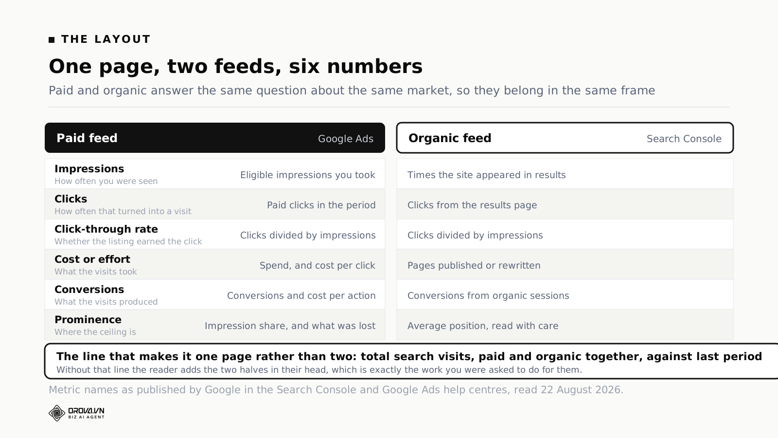
Six numbers, on one page, covering both feeds: impressions, clicks, click-through rate, cost or effort, conversions, and a prominence measure such as impression share for paid and average position for organic. Add one combined line — total search visits, paid and organic together — plus two comparisons and three sentences of narrative. Everything else belongs in an appendix.
That is the shape. The rest of this article is why each of the six is there, what each one hides, and how to keep the page honest when the month was bad.
Why one page beats two decks
Splitting paid and organic into separate reports feels natural because the work is split that way. Different people run them, different tools measure them, often different budgets fund them. So the reporting inherits the org chart.
The problem is that the customer does not inherit the org chart. Somebody types a query. They see a page with ads at the top and results underneath. They pick one. From their side there is a single event, and your two reports are two partial views of it, each blind to the other.
Three specific decisions go wrong when the halves are kept apart.
Cutting spend on terms you already own. The classic case: a term where the organic listing is strong and the ads sit above it. Read from the ad account alone, the campaign looks efficient — the conversions are there, the cost per action is acceptable. Read together with organic, the question becomes whether those conversions would have arrived anyway through the free listing directly beneath. That question cannot even be asked from one tab.
Buying the traffic you cannot earn. The reverse case is more common and more useful. There are terms where the organic listing will not reach the top of the page this year — the competition is entrenched, the page type Google prefers is one you do not have, the intent is transactional and the results are all retailers. Those are exactly the terms worth paying for, and you only find them by putting the organic position beside the paid opportunity.
Explaining a flat month. Total search visits stayed level. In the paid report that looks like stagnation. In the organic report it looks like stagnation. On one page you might see that organic clicks rose by a quarter while paid clicks fell by the same amount because the budget ran out on the twentieth — which is not stagnation at all, it is a budget problem wearing a disguise, and it has an obvious fix.
None of these require sophisticated analysis. They require both halves in one frame, which is the entire argument for the single page. If you are already running a dashboard tool of some kind, the change is a layout decision rather than a project.
The six numbers that earn their place
Six is not an arbitrary limit. It is roughly what a reader holds in working memory while listening to somebody talk. Push to twelve and they stop reading and wait to be told what to think, which defeats the purpose of sending a page at all.
1. Impressions — how often you were there
On the paid side this is straightforward: the number of times your ad was shown. On the organic side, Search Console counts how many times your site appeared in results. Both answer the same question — was the market showing up, and were you in front of it — and both are close to useless in isolation.
Impressions matter as a denominator and as a market signal. If impressions fall across both feeds at once, demand probably moved: seasonality, a news cycle, a competitor's campaign ending. If impressions fall on one feed only, the cause is almost always yours.
2. Clicks — how often that turned into a visit
The number people actually feel. Clicks is the metric that survives contact with a non-specialist reader, which is why it should anchor the page.
Report it three ways: paid clicks, organic clicks, and the sum. The sum is the line that makes the page one page. If you print only the two halves, every reader does the addition in their head, at different moments, and half of them get it wrong.
3. Click-through rate — whether the listing earned the click
Same arithmetic on both sides. Google defines it for Search Console as "the click count divided by the impression count", and the paid platforms compute it the same way.
Click-through rate is the metric that tells you whether the problem is visibility or persuasion. Impressions up, click-through rate down, clicks flat: you got more exposure and it was worse exposure — often a new query group where you are not what people wanted. Impressions flat, click-through rate up: something about the listing improved, or a competitor stopped bidding.
4. Cost, or effort
Paid has a number here and organic does not, which is the honest asymmetry at the heart of this report. Do not fake one. Attempting to price organic per click with an "equivalent ad value" calculation produces a figure nobody believes, including the person who calculated it.
Put spend and cost per click on the paid side. On the organic side put the effort: pages published, pages rewritten, technical fixes shipped. It is not the same unit and it is not supposed to be. It answers the reader's real question — what did we put in this month — in whichever currency each half runs on.
5. Conversions — what the visits produced
The number the meeting is really about, and the one most likely to be wrong. Two rules keep it defensible.
First, say which conversion you mean and keep it fixed. A page that reports demo requests in March and demo requests plus newsletter signups in April has reported a rise that did not happen. Second, say where the number came from. Paid conversions counted by the ad platform and organic conversions counted by your analytics are two different counting systems with different attribution rules, and they will not sum cleanly. That is a fact to state in a footnote, not a flaw to hide.
6. Prominence — where the ceiling is
The sixth slot is the one that tells you how much room is left, and it is the only one where the two feeds use genuinely different measures.
For paid, use impression share. Google defines search top impression share as "impressions you've received among top ads divided by the estimated number of impressions you were eligible to receive among top ads", and it publishes companion metrics for what you lost to budget and what you lost to rank. That split is the single most actionable pair of numbers in a paid report: lost to budget is a money decision, lost to rank is a quality decision, and they land on different desks.
For organic, use average position — with the care described in the next section, because it is the most misread number in the whole report.
What Google actually counts behind each number
Two of the four organic metrics are routinely reported as something they are not. Since the whole report rests on them, it is worth reading the definitions from the source rather than from habit.
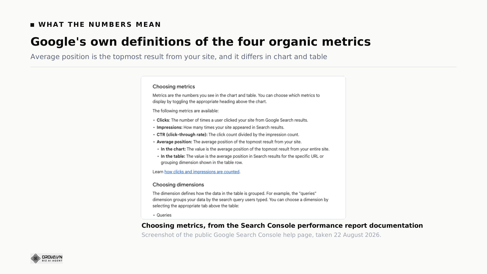
Google's help page for the Search Console performance report gives four, in its own words. Clicks: "the number of times a user clicked your site from Google Search results." Impressions: "how many times your site appeared in Search results." CTR: "the click count divided by the impression count." And average position: "the average position of the topmost result from your site."
Average position is not your ranking
Read that fourth definition again: the topmost result from your site. Not your ranking for a keyword. The average, across every query where you appeared at all, of the best position any of your pages held.
Google then adds a distinction that most reports ignore. In the chart, "the value is the average position of the topmost result from your entire site." In the table, "the value is the average position in Search results for the specific URL or grouping dimension shown in the table row." The chart number and the table numbers are computed over different scopes. They are not supposed to agree, and a reader who compares them will conclude your report is broken.
The practical consequence is that average position moves for reasons that have nothing to do with performance. Publish thirty new pages and they will start appearing, far down, for queries you never ranked for before. Every one of those appearances is an impression at position 40 or 60, and every one drags the average down. Traffic rose, the number fell, and now you are explaining a chart instead of a business.
This is why a search engine ranking report built purely on positions misleads even when every figure in it is accurate. The figures are answers to a question about visibility, presented as answers to a question about performance.
Impressions depend on what Google chose to show
The same help page notes that search results vary by "time, place, device, and recent history of the person searching." Your impression count is therefore partly a record of Google's layout decisions in a given month, not only of your own visibility. A change in how results are laid out for a query family can move impressions substantially without a single change on your site.
The defence is simple: never report impressions without click-through rate beside it, in the same row. Together the pair is interpretable. Alone, an impression number invites a story that fits whatever mood the meeting is in.
The newest data is not final
Google states that the most recent Search Console data can be preliminary — still being collected, and liable to change in the following hours, shown with a dotted line on the graph. Build a month-end report at 9am on the first and you are reporting partly on numbers that have not settled.
Two habits fix this. End the reporting window two or three days before you build the page. And if you ever rebuild a past month, say in the footnote that the figure moved and by how much. A number that silently changes between two versions of the same report destroys more credibility than a bad month ever does.
Prominence metrics are not bidding targets
On the paid side, Google is explicit that impression share and its relatives are prominence metrics showing where ads sat on the page — and it advises against treating them as bidding targets, noting that raising bids can sometimes reduce them. Report them as headroom, which is what they measure. Do not turn them into a goal on a slide, because they are the kind of goal that can be hit while the account gets worse. Our walkthrough of what belongs in a paid search report goes through the rest of the paid-side field list.
Four numbers to take off the page your manager reads
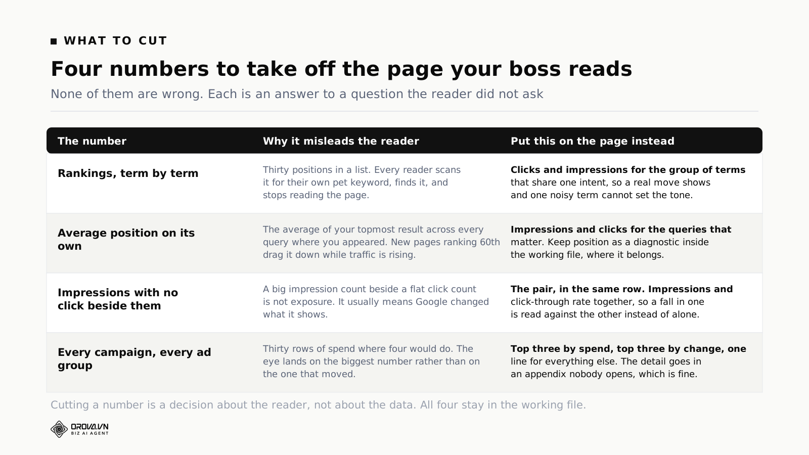
Every number below is legitimate. Every one belongs in the working file. None of them belong on the page a busy person reads in ninety seconds, because each answers a question that reader did not ask.
Rankings, term by term
A list of thirty keyword positions has a predictable effect: every reader scans it for the term they personally care about, finds it, forms an opinion, and stops reading. You have handed the meeting to whichever keyword happened to move.
A search engine position report is a working document. It belongs in the file where somebody decides what to fix. On the summary page, replace it with clicks and impressions for a group of terms that share one intent. Groups are stable; individual terms are noisy, and one term bouncing between position four and position six can make a good month look like a bad one.
Average position, standing alone
Covered above, and worth repeating because it is the single most common self-inflicted wound in search engine optimization report writing. If it appears at all, it appears next to clicks and impressions for the same query group, never as a headline.
Impressions with no click beside them
Impressions rose forty per cent. That sentence has no meaning on its own, and a reader who has been given it will supply a meaning — usually a flattering one. Print the pair or print neither.
Every campaign and every ad group
Thirty rows where four would do. The reader's eye finds the largest number, which is rarely the number that changed. Give the top three by spend, the top three by movement, and one line for the remainder. The full table goes in an appendix that nobody opens, and that is a feature: it exists so that a question can be answered, not so that it can be read.
Layout: before and after, not a wall of numbers
The most common failure of these reports is not the choice of metrics. It is that the numbers are presented as a table, and a table asks the reader to do the comparison themselves.
Every number on the page should arrive already compared. Not "clicks: 12,400" but "clicks: 12,400, up 8% on last month, up 22% on the same month last year." The reader's first question is always "compared to what", and if the page does not answer it in the same glance, they ask it out loud and the meeting goes sideways for five minutes.
Three rules make the layout carry the meaning.
Direction before magnitude. Whether a number went up or down should be legible before the digits are read. In a house style with no colour to spare, that means arrows, position, or a consistent bold — anything that survives being printed in grey. The reader takes the direction from the shape of the page and the magnitude from the numbers, in that order.
Three sentences on top. Above the numbers, in prose: what happened, why we think it happened, what we are doing about it. Three sentences, not a paragraph. This is the part most people skip because it is the hardest, and it is also the only part that most readers will retain a week later.
One decision, asked explicitly. A report that asks for nothing gets filed. If there is a budget decision, a priority decision or an approval waiting, put it at the bottom in one sentence with a date. If there genuinely is nothing to decide, say that too — it is information, and it tells the reader they can stop reading.
If your monthly page needs a starting point, the one-page marketing report layout is the same skeleton with the channel mix widened.
The comparison mistakes that flatter a bad month
These are arithmetic errors, not analytical ones, which is what makes them dangerous. Nobody argues with them in the meeting because nobody notices them.
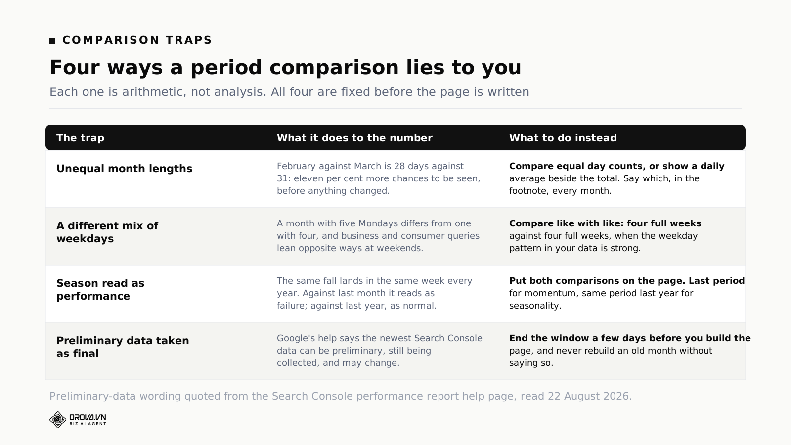
Unequal month lengths
February against March is 28 days against 31 — roughly eleven per cent more days on which to be seen, click and convert. Report the raw totals and March looks like a good month before anything has happened.
Either compare equal day counts, or print a daily average alongside every total. Whichever you pick, say so in the footnote and never change it mid-year. The consistency matters more than the choice.
A different mix of weekdays
A month with five Mondays does not behave like a month with four. Business-hours queries and consumer queries lean opposite ways across a weekend, so this can move a monthly total by several per cent in either direction.
If the weekday pattern in your own data is strong — check once, it takes ten minutes — compare four full weeks against four full weeks rather than calendar months. The calendar is convenient for accounting and arbitrary for search behaviour.
Season read as performance
The same dip lands in the same week every year. Reported against last month it looks like a failure and somebody gets asked to explain it. Reported against the same month last year it looks like the business working normally.
Put both comparisons on the page permanently: against last period for momentum, against the same period last year for seasonality. Two comparisons is the right number. One is misleading and three is a table.
Preliminary data taken as final
Covered above, and it belongs on this list as well because it produces the most damaging version of the error: the same month reported twice with different numbers. End the window early, and disclose any restatement.
Who gets it, how often, and what they are really asking
A report has a reader. Most reports have three readers and are written for none of them, which is why they get longer every quarter — each new section is a scar from a question somebody once asked.
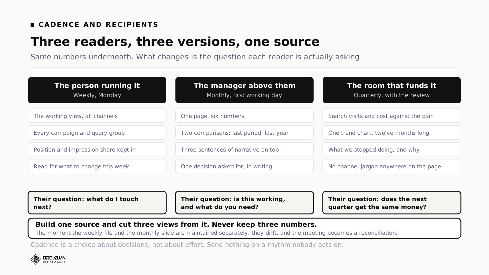
Weekly, for the person running it
The working view. Every campaign, every query group, position and impression share included, and no narrative because the reader is the author. Its only job is to answer what do I change this week.
Weekly is right here because weekly is roughly the cycle on which paid search decisions can be made without acting on noise. It is too fast for organic, which is fine — the organic half of the weekly view is a watchlist, not a scoreboard.
Monthly, for the manager above
The one page this article has been describing. Six numbers, two comparisons, three sentences on top, one decision at the bottom. Sent on the same working day every month, whether or not the month was good, because a report that only arrives after good months is not a report.
Quarterly, for the room that funds it
Different question entirely: does the next quarter get the same money. That page carries search visits and cost against plan, one trend chart running twelve months so the shape of the year is visible, and a line on what you stopped doing and why — which buys more credibility than any success metric.
Strip the jargon completely. Impression share, CTR and average position do not belong in front of a finance audience; they are internal instruments. Translate to visits, cost, and outcomes.
One source, three views
The rule underneath all of this: build one source of numbers and cut three views from it. The moment the weekly file and the monthly slide are maintained separately, they drift, and the first ten minutes of the meeting becomes a reconciliation between two of your own documents. There is no faster way to lose a room.
What to do when the two feeds disagree
They will. Paid clicks and organic clicks are counted by different systems with different definitions of a click, different bot filtering and different time zones, and the analytics package sitting underneath both will disagree with each of them. Every so often somebody notices and the report is declared unreliable.
The answer is not to reconcile the numbers, which cannot be done and has consumed entire quarters at companies that tried. The answer is to fix each metric to one source, name that source on the page, and never switch. Paid clicks come from the ad platform. Organic clicks come from Search Console. Sessions and conversions come from analytics. Write it in the footnote once, and when someone points out that the ad platform reports more clicks than analytics reports sessions, you have a one-sentence answer rather than a two-week project.
Then hold the definitions still for at least a year. A report whose definitions change is not a time series, it is a sequence of unrelated snapshots, and the comparisons on it are decorative. This is worth more than accuracy: a slightly imperfect number measured the same way every month tells you the truth about direction, which is what almost every decision actually needs. Our note on reading GA4 and Search Console side by side goes through where the two disagree and why.
When a channel earns a page of its own
The one-page rule has limits, and pretending otherwise leads to a page so compressed that it hides the thing it was built to show. A channel earns its own page when one of three things is true.
It has a decision cycle of its own. If somebody adjusts paid budgets weekly and organic priorities quarterly, forcing both into one rhythm makes one of them either too slow or too noisy. The summary page still reports both; the working pages diverge.
It is large enough that its detail changes decisions. A paid account spending a small share of the budget does not need a page. One where a single campaign type accounts for most of the spend does, because the summary line hides the only variable that matters.
It is under investigation. Something is wrong and a specific answer is needed. Give it a temporary page, and — this is the part people forget — remove the page when the question is answered. Investigation pages that become permanent are how a two-page report turns into a fourteen-page pack that nobody reads.
What does not earn a page: a channel having its own owner. That is the org chart again, and the org chart is not the reader.
Building it once so it runs without you
Everything above is a layout and a set of definitions. The reason it still takes an hour every month is that the data arrives from separate systems on separate schedules and gets joined by hand — and hand-joined numbers are where the transcription errors live.
The parts that can genuinely be automated are narrow and worth naming precisely: pulling both feeds on a schedule, computing the combined and derived figures the same way every time, keeping the comparison windows consistent, and delivering the result to the same people on the same day. That is the mechanical work, and it is most of the hour.
This is the shape of what Orova Insight does. GA4, Search Console and Google Ads connect as data sources into the same drag-and-drop dashboard, so the two feeds land in one place instead of two exports. Combined figures — total search visits, blended cost per acquisition, whatever your page needs — are defined once as custom metrics rather than recalculated in a spreadsheet each month. Dashboards keep versions, snapshots and restore, so last month's page is still there exactly as it was sent, which is what you need when somebody asks why a number changed. Scheduled reports go out on the day they are due, and recipients open a live page rather than an attachment that was already out of date when it left.
Two limits, stated plainly, because a reporting article that oversells its own tooling has failed at the one thing it was arguing for.
This is dashboarding, not a data warehouse. Insight connects to sources and builds views on them. It does not model data in SQL, and it is not the tool for joining three years of CRM history to ad spend at record level. If your question genuinely needs modelled data, you need a modelling layer, and no dashboard product will substitute for one. We wrote about that boundary in more detail in the piece on self-service BI.
The three sentences on top are still yours. A tool can put the right numbers on the page, keep the comparison windows honest and send it on time. What happened, why, and what we are doing about it is judgement about your business, and it is the only part of the page the reader will still remember next week. If a vendor implies otherwise, they are describing a product that does not exist.
Whatever you build it in, the test is the same: can somebody who was on holiday produce this month's page without asking anyone a question. If the answer is no, the report has a person in it, and people take holidays.
Common questions
How long should a monthly search report be?
One page for the summary, plus an appendix of any length. The appendix exists to answer questions, not to be read. If the summary cannot fit on a page, the problem is usually that it is reporting activity rather than outcomes.
Should paid and organic conversions be added together?
Report both and show the sum, with a footnote saying they come from different counting systems and may overlap. The sum is useful as a direction. Treating it as an exact figure — particularly for anything financial — will eventually embarrass you, because the two systems attribute the same journey differently.
Why does average position fall when traffic rises?
Because it is the average across every query where your site appeared, weighted by how often you appeared at all. Publishing new pages adds appearances far down the results for queries you never ranked for, and each one pulls the average down. Rising clicks with a falling average position is a normal, healthy pattern for a growing site.
What is the difference between a ranking report and a marketing report?
A ranking report answers where do we appear. A marketing report answers what did that produce and what should we do next. The first is an input to the second, and the mistake is sending the input to somebody who asked for the output.
How far back should the comparison go?
Two comparisons: the previous period and the same period one year earlier. Anything more turns the page into a table. If you want the long shape, use one twelve-month trend chart in the quarterly version rather than more columns in the monthly one.
Do we need to include impression share?
Include it if there is a budget conversation to have, because lost impression share to budget is the clearest evidence that money is the constraint. Note that Google itself advises against treating these prominence metrics as bidding targets — they describe headroom, not goals.
What if the month was bad?
Send the page on the same day, with the same six numbers, and use the three sentences honestly. The credibility you build by reporting a bad month plainly is the credibility you spend when you need a budget decision later. Reports that arrive late after bad months teach readers to distrust the good ones.
Should the report include competitor data?
Only if you can measure it consistently and it changes a decision. Auction insights on the paid side is defensible because it comes from the same account and is stable month to month. Third-party estimates of competitor organic traffic are not, and putting an estimate that moves by fifty per cent on its own into a report that otherwise uses measured data lowers the credibility of everything around it.
Can this be automated end to end?
The collection, calculation, comparison windows and delivery can be. The interpretation cannot, and should not be — it is the part that requires knowing what happened in the business that month, which no data source holds. Automate the hour of assembly and spend ten minutes on the three sentences.
What to do before the next one is due
Do not rebuild everything at once. Three changes, in this order, get most of the value.
First, add the combined line. Total search visits, paid and organic together, against last period. One row. It takes ten minutes and it changes what the meeting is about, because for the first time the reader sees the market rather than two departments.
Second, fix the comparison. Pick equal day counts or a daily average, add the year-on-year column, and write the choice into the footnote. Then leave it alone for twelve months. Most of the arguments about whether a month was good are actually arguments about the denominator.
Third, cut four things. Take the keyword list, the bare average position, the naked impression count and the full campaign table off the summary page and move them into the appendix. Nothing is lost, the file is still there, and the page finally fits the ninety seconds it actually gets.
Then check the boring thing that decides whether any of this survives: whether the report can be produced by somebody other than you. Connect both feeds to one place, define the combined metrics once, set the schedule, and let it go out on its own. The version that depends on a person copying cells at month end is the version that stops arriving the first time that person is busy — and a report that arrives irregularly is worse than no report at all, because it teaches everyone to wait for the numbers instead of acting on them.
One page, both feeds, sent on its own
Orova Insight connects GA4, Search Console and Google Ads to the same drag-and-drop dashboard, so the paid and organic halves of the month sit on one page instead of in two exports. Define the combined metrics yourself, keep every version with restore and snapshots, then let the scheduled report go out on the day it is due, as a live page rather than a stale attachment.
See Orova Insight