
Self-Service BI Tools: When You Don't Need a Warehouse
Search for self service bi tools and you get twenty listicles that all contain the same eight logos. Tableau, Power BI, Looker, Qlik, Domo, Zoho Analytics, Metabase, Sigma. Every list is written by a company that sells one of them. None of them starts with the question you actually have, which is whether this category of software is the right thing to buy at all, or whether you are about to spend a year building a data platform in order to answer a question a connected dashboard would have answered on Tuesday.
The confusion is not your fault. "Self-service" got attached to two completely different products about a decade apart, and nobody ever went back and separated them. In one of them, self-service means a data team models your data once and then business users explore inside that model without filing tickets. In the other, it means you click a button, authorise an account, and drag fields onto a canvas. Both are sold with the same phrase and the same screenshot of a smiling marketer pointing at a chart.
This piece separates them. What the two products are, how to tell which one a vendor is selling you, the four signals that mean you genuinely need a data warehouse underneath, the four questions worth answering before you spend anything, what the light tier does well, what it will never do no matter how many features ship, and a plain statement of the case where the heavy tier is the right answer and our own product is not. Every retention limit, row limit and list price below was checked against the vendor's own documentation in August 2026, because several of them have moved recently and most comparison articles have not noticed.
What do self service BI tools actually do?
Self-service BI tools let people who are not analysts build their own reports. In the heavy tier that means exploring a data model a data team has already built and governed. In the light tier it means connecting a platform account directly and dragging fields onto a dashboard. The difference is whether a modelling step exists at all.
Hold on to that last sentence, because it is the whole article. Everything else follows from whether there is a modelling layer in the middle.
A modelling layer is the place where somebody writes down, once, what your business words mean. What counts as an active customer. Whether a refunded order is still revenue. Which of the four date columns on an order is the one that decides the month it lands in. In a governed BI platform that definition lives in a file, it is version controlled, and every chart in the company inherits it. In a connected dashboard tool there is no such file. The definition lives in whichever chart somebody built, and when two charts disagree, the meeting stops while everybody argues about which one is right.
Neither arrangement is wrong. They cost different amounts and they fail in different ways. The mistake is buying the first when your situation calls for the second, which happens far more often than the reverse, because the first is the one with the enterprise sales team.
One name, two products
Here is the practical test. Ask a vendor a single question: who writes the definition of "active customer", and where does that definition physically live?
If the answer involves a semantic model, a repository, a version-controlled file, or the phrase "your data team", you are looking at the heavy tier. If the answer is "whoever builds the chart picks the filter", you are looking at the light tier. The sales deck will not tell you this. That question will, in about fifteen seconds.
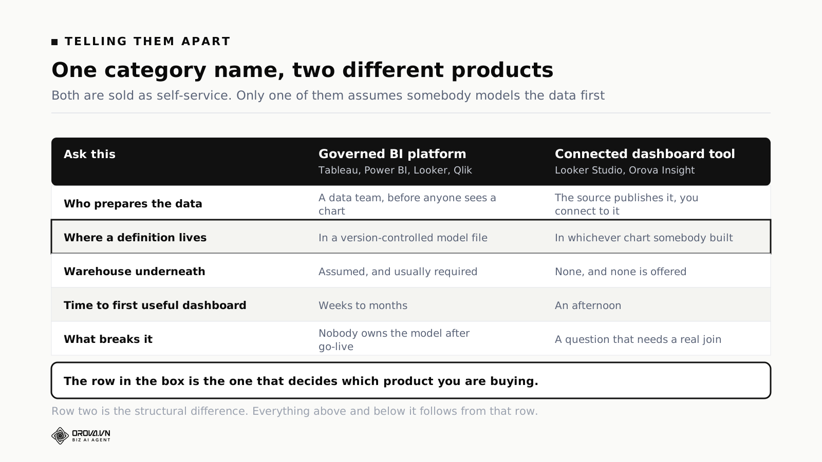
The heavy tier assumes a warehouse. Not always literally, but structurally: it assumes your data has been copied out of the systems that created it, into one place, and reshaped so that the tables join cleanly. That copying and reshaping is a job. It is the job. The dashboard is what happens after the job is finished, and vendors demo the dashboard because the job does not demo well.
The light tier skips the job by refusing to do the things the job enables. It talks to Google Analytics, Search Console, the ad platforms and a spreadsheet, one connector per source, and it accepts each source's data in whatever shape that source publishes it. There is no reshaping because there is nowhere to reshape it to. That constraint is exactly why the light tier is fast to set up and exactly why it hits a wall later.
If your immediate question is which specific product fits a marketing team, we compared the two most common candidates in detail in Looker Studio vs Power BI for marketing teams (Google has renamed Looker Studio back to Data Studio). This article is the layer above that: whether you should be shopping in that aisle at all.
The bill has two halves, and the licence is the small one
Every heavy BI platform has a two-part price. Per-user licences, and a capacity or compute charge for the engine underneath. Comparison articles quote the first and ignore the second, which is how a team budgets for $14 a head and gets a very different invoice.
Microsoft's public pricing page, checked in August 2026, is the clearest illustration because both halves sit on the same screen.
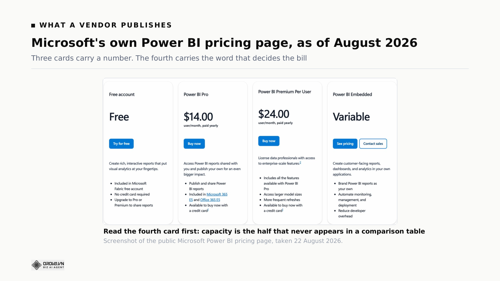
As published there in August 2026: a free account, Power BI Pro at $14.00 user/month paid yearly, Power BI Premium Per User at $24.00 user/month paid yearly, and Power BI Embedded at "Variable". The same page carries a footnote most people skim past, which is that a Power BI Pro licence is required for every Premium and Fabric capacity SKU in order to publish content, and that content consumption without paid per-user licences only starts at P1 and above, or F64 and above on Fabric. Read that twice if you are sizing a deployment where most people only ever look at reports. It is the difference between buying viewers and buying capacity, and it moves the number by an order of magnitude.
For reference, here is where the main list prices sat in August 2026. Treat this as a starting point for your own budget rather than a quote. Vendor pricing moves, and two of these have moved within the last year.
| Product | List price, August 2026 | The part people miss |
|---|---|---|
| Power BI Pro | $14.00 user/month, paid yearly | Required for anyone publishing to a Fabric capacity, on top of the capacity itself |
| Power BI Premium Per User | $24.00 user/month, paid yearly | Per-user Premium, not the same thing as capacity-based Premium |
| Tableau Cloud, Standard edition | Creator $75, Explorer $42, Viewer $15 per user/month, billed annually | Every deployment needs at least one Creator, and Enterprise edition raises all three |
| Metabase | Open source free for unlimited users; Starter $100/mo including 5 users, then $6 per extra user/month; Pro $575/mo including 10 users, then $12 per extra user/month | The free tier is genuinely unlimited on users, but you host it and you still need a database worth querying |
| Looker Studio | Free; Looker Studio Pro at $9 per user per Google Cloud project per month | Per project, not per organisation. An agency with a project per client multiplies that figure by the client count |
Metabase deserves a note because it breaks the pattern in a useful way. Its open source edition is free for unlimited users, which sounds like it removes the cost problem entirely. It does not, because Metabase is a query interface, not a data source. Point it at a production database and you get fast answers and an angry engineer. Point it at a warehouse and you are back to paying for a warehouse. The licence was never the expensive part.
The real cost of heavy BI is a person, not a licence
Somebody has to build the model. Then somebody has to keep building it, because the model is not a project with an end date. Every time marketing adds a channel, every time the CRM gets a new custom field, every time a source renames a column in a quiet release note, the model needs updating or the dashboards quietly start lying.
That person has a job title. Analytics engineer, BI developer, data analyst, depending on the market. They are not cheap and they are not easy to hire, and this is the line item that never appears in the comparison table.
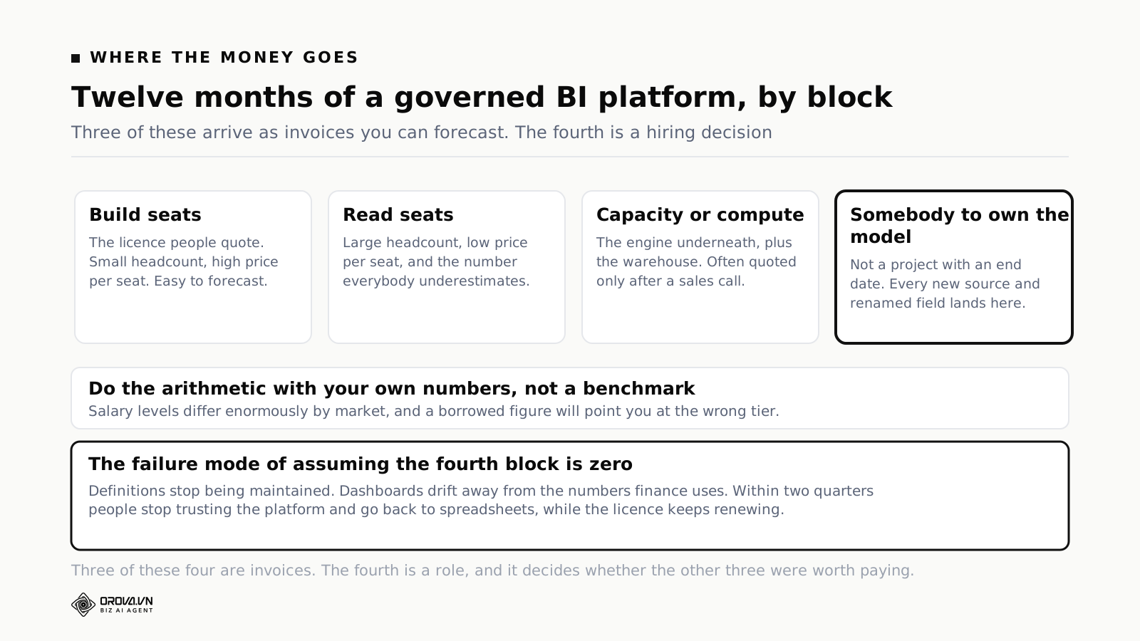
Do this arithmetic yourself rather than trusting anyone's benchmark, including ours, because salary levels differ enormously by market and a borrowed number will mislead you. It takes ten minutes:
- Count how many people will build reports and how many will only read them. Price the build seats and the read seats separately, because the gap between them is large in every heavy platform.
- Add the capacity or compute line. If a vendor will not quote it before a sales call, write down "unknown, at least as much as the licences" and carry that forward. That estimate is usually kind.
- Add implementation. Either an agency statement of work, or the internal weeks, counted honestly at the day rate of the people who will lose those weeks.
- Add the fraction of one salary needed to keep the model alive after go-live. Not a full head necessarily. But not zero, and the failure mode of assuming zero is a platform nobody feeds and everybody stops trusting within two quarters.
Now compare that total against what the light tier costs, which in many cases is nothing at all, or one seat, or a flat monthly fee that does not scale with viewers. If the heavy total is fifteen or twenty times larger, that is not an argument against it. It is an argument for making very sure you are buying it for one of the four reasons below, and not because a listicle put it at the top.
Four signals that you genuinely need a warehouse
Here is the part the listicles skip. There are four real reasons to build a warehouse and a modelling layer. If none of them apply to you, the light tier is not a compromise, it is the correct answer.
Signal one: your history outlives the platform that holds it
This is the most common genuine reason and almost nobody names it, because it does not feel like a data problem until the day it bites.
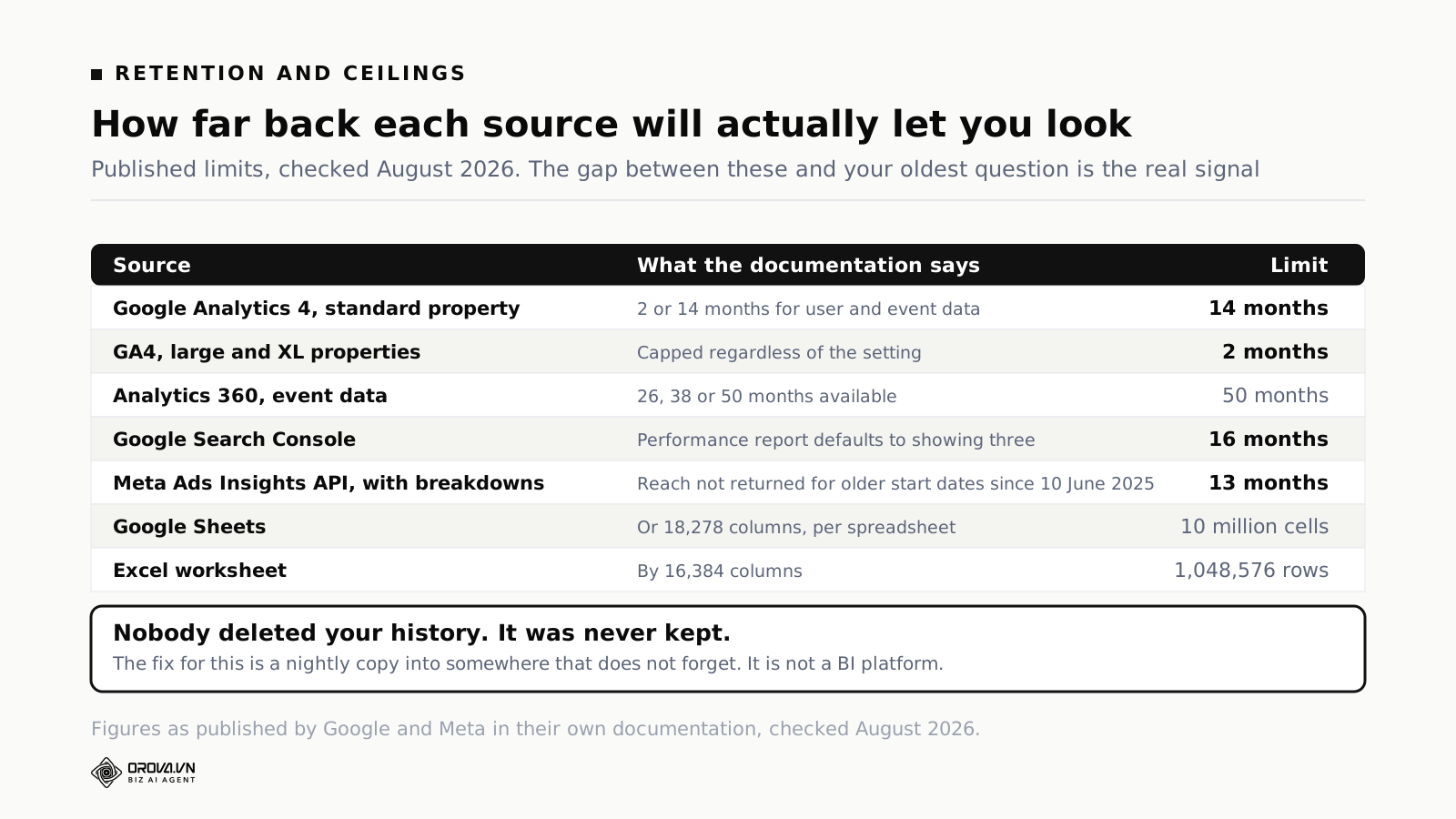
Marketing platforms delete your history. Not as a policy failure, as published design. Some numbers, all checked in August 2026 against the vendors' own documentation:
- Google Analytics 4. A standard property offers exactly two retention settings for user-level and event data: 2 months or 14 months. Large and XL properties are capped at 2 months. Analytics 360 subscribers can extend event data to 26, 38 or 50 months, and even then Google-signals data is capped at 26 months regardless of the setting.
- Google Search Console. Search Console keeps 16 months. The Performance report defaults to showing three.
- Meta's Ads Insights API. Since 10 June 2025, standard queries that apply breakdowns will not return reach for start dates more than 13 months old. You can get some of it back through asynchronous jobs, capped at 10 requests per ad account per day.
Read those together and a specific business question becomes impossible: show me this channel's performance, split by device, for the same quarter two years ago. Nobody deleted your data maliciously. The platform simply never promised to keep it, you never copied it anywhere, and now the answer does not exist.
A warehouse solves this and it is the cheapest problem a warehouse solves. You do not need a modelling layer, a semantic model or a BI platform to fix it. You need a nightly copy into somewhere that does not forget. That distinction matters, and we come back to it in the upgrade path below.
Signal two: the question needs a row-level join across systems
Dashboard tools blend. Blending means: two sources, one shared key such as date or campaign name, results stitched together at the aggregate level. It works, it is genuinely useful, and it is not a join.
A join is what you need when the question is "which specific ad click became which specific opportunity in the CRM, and did that opportunity ever get invoiced". That chain runs across three systems, on identifiers that only exist if somebody deliberately passed them through, at a grain of one row per person. No blend does that. There is nothing to blend on, because the ad platform does not know your opportunity ID and your finance system does not know the click.
If your team is asking questions that end at "by channel, by month", blending covers you and the case for a warehouse has not been made yet. We walked through what that looks like in practice in why the SEO report and the ads report belong in one place. If your team is asking questions that end at "for this customer, on this deal", blending will never get there and you should stop trying to make it.
Worth saying: pushing data back into the ad platforms is a third thing again, neither a blend nor a join, and it has its own set of rules. If that is what you are actually chasing, how Google Customer Match handles first-party lists covers that road instead.
Signal three: the row count has outgrown a spreadsheet
Everyone reaches for volume as the reason, and volume is usually the weakest of the four. Still, there are hard ceilings and they are worth knowing before you plan around them.
- Google Sheets: up to 10 million cells, or 18,278 columns, per spreadsheet.
- Excel: 1,048,576 rows by 16,384 columns per worksheet.
Ten million cells sounds enormous until you export event-level data. Thirty columns of daily campaign detail across a large account will find that ceiling inside a year. But notice what actually breaks first in practice: not the ceiling, but the refresh. A sheet that takes four minutes to open is abandoned long before it hits ten million cells, and nobody files a ticket about it. They just quietly stop opening it.
If your dashboard tool reads from a spreadsheet and that spreadsheet is now the slowest thing in your week, that is the signal. Not the row count itself.
Signal four: one number has to mean one thing across departments
Finance says revenue was X. Marketing's dashboard says Y. Both are defended, both are internally consistent, and both are correct according to the rule the person who built them applied. One counts on order date, the other on invoice date. One subtracts refunds, the other does not.
You can fix this once with a shared document and a lot of discipline. Past roughly thirty or forty regular report readers, discipline stops scaling and you need the definition to live somewhere the tools read from, not somewhere the humans are supposed to remember. That is what a semantic or modelling layer is for, and it is the one thing you genuinely cannot fake with a light tool.
Before you conclude you have this problem, check whether you actually have it or whether you have the cheaper version of it, which is too many metrics rather than inconsistent ones. Those look identical from the inside and have very different fixes. The marketing metrics that matter, and the vanity ones wasting your time is the shorter road if that turns out to be the real issue.
The counter-signal: "we have a lot of data"
Worth stating on its own, because it is the reason most often given and the weakest one on the list.
Volume alone almost never justifies a modelling platform for a marketing or operations team. A mid-sized business generates a startling amount of data and asks approximately eleven questions of it. The relationship between the two is much weaker than the sales process implies. What justifies a platform is the shape of the question, not the size of the pile: history that outlives the source, joins across systems, and definitions that must hold across departments.
If a vendor's discovery call spends its time on your data volume and none of its time on your oldest recurring question, you are being sized rather than diagnosed.
Four questions to answer before you buy anything
Answer these on one page, in writing, before you take a demo. The demo will be more useful and considerably shorter.
1. Who owns the definitions, and do they have the hours? Name a person. If the honest answer is "nobody yet, we will figure it out", you cannot buy the heavy tier, because the heavy tier is a system for publishing definitions and it does nothing at all without someone to write them. A platform with no owner degrades into a slower version of the light tier at fifteen times the cost.
2. How many people build, and how many only read? Every heavy platform charges very differently for the two. Get the split right and the budget is predictable. Get it wrong, usually by underestimating readers, and the invoice doubles at renewal. This is also the question that decides whether capacity-based pricing beats per-user pricing, and it is the only reliable way to compare two vendors whose price pages are not comparable.
3. What is the oldest date anyone will ever ask about? Ask your finance lead and your most senior marketer separately, and take the older answer. Then compare it against the retention limits above. If the oldest question is eighteen months back and your sources keep fourteen, you have a data problem that no amount of dashboard shopping addresses. If the oldest question is ninety days, you have just eliminated the main reason to build anything.
4. What happens the day the person who built it leaves? Ask what exports, what documentation exists, what the metric definitions look like when read by somebody who did not write them. This question sounds pessimistic and it is the single best predictor of whether a reporting setup survives its second year. A dashboard nobody can modify has the same value as no dashboard, on a delay.
Separately, decide who the report is for before you decide what it runs on. A dashboard aimed at the whole company serves nobody in particular. We laid out six layouts by reader type in marketing dashboard examples: six layouts by reader type, and the leadership case specifically in which KPIs the boss actually reads.
What the light tier does well
Having spent this long on the heavy tier's costs, it is worth being precise about what the light tier genuinely delivers, because "it is the cheap option" undersells it.
It connects through APIs, not exports. The meaningful difference between a connected dashboard tool and a spreadsheet is not the charts, it is that nobody has to download anything on the first Monday of the month. An authorised connection to Google Analytics, Search Console, an ad account or a social channel refreshes on a schedule and keeps refreshing after the person who set it up goes on holiday.
It blends on shared keys. Date, campaign, channel, country. That covers the overwhelming majority of marketing reporting, because marketing reporting is mostly comparison across a common time axis.
It builds by dragging. No SQL, which means the person who understands the business question is the same person building the answer. That loop being short matters more than most feature lists admit. A report built by an analyst from a brief is a report built from a misunderstanding roughly a third of the time.
It shares as a link. Clients, executives and colleagues who will never log into a BI platform will open a link. Recurring email delivery covers the ones who will not open a link either.
It versions and restores. The good ones keep a history of the dashboard itself, so an experiment that ruins a layout at 5pm is recoverable at 5.02pm. This is a small feature that changes how boldly people edit.
Put together, that covers the question most teams ask most weeks: what happened, by channel, over the last ninety days, and is that better or worse than the ninety before. That question sits comfortably inside every retention window listed above, needs no join, and needs no semantic layer. Building a data platform to answer it is like buying a lorry to carry a laptop.
If the output you need is a monthly document rather than a live screen, the format matters more than the tool. The one-page marketing report format and what to include in a PPC report for each audience both apply regardless of which tier you end up on.
What the light tier does not do, and will not learn
This list is not a roadmap gap. These are structural, and no future release closes them, because closing them would mean becoming the other product.
- Row-level joins across systems. No shared key means no join. The tool cannot invent an identifier that was never passed through.
- A modelling layer. No place to write down what a word means such that every chart inherits it.
- SQL transformation. No stage between "what the source published" and "what the chart shows" where logic can live.
- History beyond the source's retention. If the platform forgot, the dashboard forgot. A connector reads, it does not archive.
- Row-level security at organisational scale. Sharing controls exist; a permission system that filters the same dashboard by the viewer's region or account is a different mechanism.
- Audit and lineage. Regulated environments need to answer "where did this number come from and who changed the rule". That answer requires the layer that does not exist here.
Any vendor in the light tier who claims otherwise is either redefining the words or selling you a roadmap. Both are worth catching in the demo rather than in month four.
When self-service BI is the thing you need, and where Orova cannot help you
Time to be direct, because this article would be dishonest without it.
Orova Insight is not a business intelligence platform. It has no data warehouse. It has no SQL modelling layer, no semantic model, no dbt-style version-controlled metric definitions, and no query engine you can point at a database of your own. If your situation is one of the following, Insight is not the answer and no amount of framing changes that:
- Finance needs a reporting layer that ties to the ledger and survives an audit.
- You are analysing product event streams at the level of individual user sessions.
- You need multi-year cohort analysis, or any question whose answer starts more than a couple of years ago.
- You have two hundred report readers who must each see only their own region, account or client.
- Operations, supply chain or manufacturing data needs to sit alongside marketing data in one model.
- You already run a warehouse and a transformation layer, and what you are shopping for is the presentation tier on top of it.
In every one of those cases, buy the heavy tier. Power BI, Tableau, Looker, Qlik, Metabase pointed at a warehouse: pick on the criteria above rather than on a ranking, but pick from that shelf. Do not let anyone, us included, sell you a connected dashboard as a substitute for a modelling layer. You will spend six months discovering the gap and you will be angrier than if you had spent the money at the start.
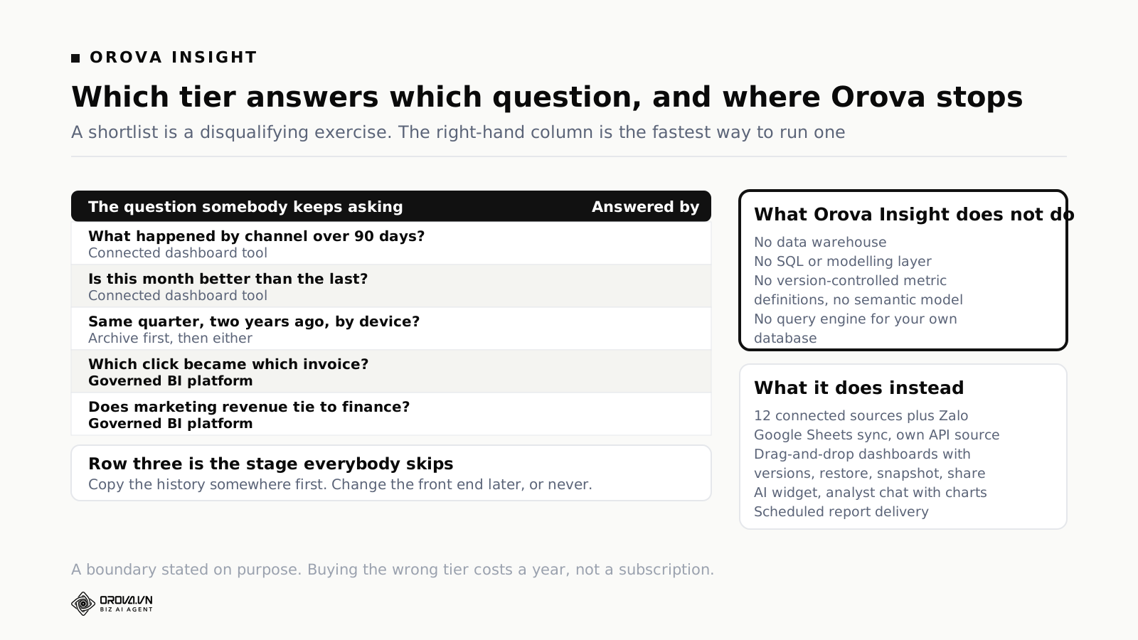
Here is the other half of the honesty, which is where Insight does fit. If your reporting question is "what happened across our marketing channels, recently, and can everyone see it without asking me", that is a different job from business intelligence and it is the job Insight is built for. Twelve sources are connected and ready: GA4, Search Console, Google Ads, Meta, Meta Ads, Instagram, Threads, TikTok, TikTok Channel, YouTube, LinkedIn and LinkedIn Ads, plus Zalo. Google Sheets syncs in, including multi-tab and multi-level sheets. You can declare your own API source if something you use is not on the list. Dashboards are drag-and-drop, with version history and restore, snapshots, sharing and a live view. There is an AI widget and an analyst chat that draws charts. Reports send on a schedule. Metrics can be defined per workspace.
What that adds up to is the light tier done properly, with the connector count and the sharing model that a marketing team actually needs, and none of the warehouse machinery. That is a deliberate boundary, not a missing feature.
The upgrade path, and the stage everybody skips
Teams that outgrow the light tier almost always jump straight to the heavy one, and that jump is where the money gets wasted. There is a stage in between, and it is both cheaper and more useful than either neighbour.
Stage 0: the platform's own reports
Google Analytics reports, Ads Manager, the native dashboard in each tool. Free, accurate, and unbearable past about three platforms because nobody wants to open six tabs to answer one question. Everyone starts here and everyone leaves.
Stage 1: a connected dashboard tool
One canvas, several sources, refreshed on a schedule, shared as a link. Set up in an afternoon. This stage serves most teams under about fifty people indefinitely, and there is no prize for leaving it early.
Stage 2: an archive, without changing your dashboards
This is the skipped one. When you hit signal one, the history problem, the fix is not a BI platform. The fix is a nightly copy of your source data into somewhere that does not delete it. A cloud warehouse used purely as a filing cabinet, with no modelling, no semantic layer and no new front end. Your dashboards stay exactly where they are.
Stage 2 costs a fraction of stage 3, needs no new hire, and solves the single most common reason teams think they need business intelligence. It also buys you something valuable if you do eventually move to stage 3, which is a couple of years of history already sitting there on day one, instead of a platform that knows nothing before the month it was installed.
The cheapest version of this for a marketing team is to switch on whatever native export your sources offer into a warehouse, and then forget about it until you need it. It is unglamorous and it is the highest-return thing on this page.
Stage 3: a modelling layer and a BI platform
Now you build definitions, own them in version control, and let people explore inside them. This is a real project with a real owner and a real ongoing cost. Arrive here because signal two or signal four forced you, ideally with stage 2's history already in place.
The rule is simple: do not skip stage 2. Most of the abandoned BI deployments you can find in any company were teams that went from stage 1 to stage 3, discovered the modelling work was a job nobody had been given, and quietly went back to spreadsheets while continuing to pay the licence.
A word on the AI features in both tiers
Every product in both tiers now ships something AI-shaped. Ask a question in English, get a chart. Surface anomalies automatically. Summarise the dashboard in a paragraph. According to Salesforce's State of Marketing research, 75% of marketers now use AI in at least one stage of their workflow, so the demand is real and the feature is not going away.
It changes the calculation less than the demos suggest, and in a specific direction. Natural-language querying is only as good as the layer it queries. In the heavy tier it is genuinely powerful, because the model has already been told what your words mean, so "show me active customers by region" resolves to a definition somebody agreed on. In the light tier it is a faster way to build a chart from fields that were already there. Useful, sometimes very useful, but it does not create a definition that did not exist, and it cannot join data that has no shared key.
Which means AI does not let you skip the decision in this article. It makes the heavy tier more valuable once you have paid for the modelling work, and it makes the light tier quicker to use. It does not move the line between them.
Common questions
Is Looker Studio a self-service BI tool?
It is the light tier: connectors, blends, drag-and-drop, share a link. It has no modelling layer and no warehouse of its own, though it will happily read from one. Looker, without "Studio", is a different product with a genuine semantic model. The names are similar and the products are not, which causes a fair amount of confusion in procurement.
Can I use a self-service BI tool without a data warehouse?
You can run a heavy platform directly against production databases and cloud sources, and vendors support it. It works badly at any size worth paying for: queries compete with the application for resources, and you still have no place to put the transformation logic. If you find yourself planning a heavy platform with no warehouse behind it, that is usually a sign the light tier was the right shelf.
How many people does it take to run a BI platform?
Not a fixed number, but not zero. The relevant question is not headcount, it is whether one named person has time in their week, every week, to maintain definitions and fix what breaks when a source changes. Teams that answer "we will share it" are describing zero.
What is a semantic layer, in plain terms?
The file where your business words are defined once so every chart uses the same meaning. Active customer, revenue, qualified lead. Without it, each chart carries its own private definition and disagreements between charts are unresolvable. With it, changing a definition changes every report at once. It is the main thing the heavy tier sells and the main thing the light tier lacks.
Is open source cheaper?
The licence is. Metabase's open source edition is free for unlimited users, which is a real saving. You then host it, patch it, and point it at a database that has to be worth querying, and that database is where the cost went. Open source moves the bill, it does not delete it.
We only need reporting for marketing. Do we need any of this?
Probably not the heavy tier. Marketing reporting is mostly comparison over a common time axis, within the retention windows the platforms already provide, across sources that offer connectors. That is the light tier's exact shape. Revisit the decision if the board starts asking multi-year questions, or if marketing numbers have to reconcile with finance numbers in a meeting where both sides brought a laptop.
What to do this week
Three things, in order, none of which requires a demo:
Write down your five recurring questions. The ones somebody asks every month. Not the ones you imagine asking. For each, note the oldest date it reaches back to and how many systems it touches. Five lines, ten minutes.
Check those against the retention limits. Fourteen months for a standard GA4 property, sixteen for Search Console, thirteen for Meta breakdowns with reach. Any question that reaches further back than its source keeps is a stage 2 problem, and no dashboard purchase solves it.
Count your builders and your readers. Two numbers. Price both tiers against them, including the capacity line and a fraction of a salary for whoever maintains the model. If the heavy tier wins on that arithmetic, buy it with confidence. If it does not, you have just saved a year.
The category name promises that anyone can serve themselves. That is true in both tiers. What differs is who had to lay the table first, and whether you are prepared to employ them.
Twelve sources, no warehouse, no SQL
If your question is what happened across the marketing channels lately, and can everyone see it without asking you, Orova Insight is built for exactly that. Twelve sources are connected and ready, from GA4 and Search Console to Google Ads, Meta, TikTok and LinkedIn. There is no data warehouse and no modelling layer, on purpose.
See Orova Insight