
Instagram feed planner: 7 best tools for 2026, with comparison table

Finding the right instagram feed planner determines whether your profile grid converts casual profile visitors into followers or leaves them confused by disorganized visual clutter. When an account publishes posts without previewing how individual tiles look side by side, brand palettes clash, typography clips at the edges, and promotional banners overwhelm the visual hierarchy. Choosing the wrong software costs hours in manual adjustments, broken auto-publishing schedules, and corrupted video thumbnails.
To separate practical tools from surface-level scheduling apps, we evaluate visual planning software across five operational criteria: visual drag-and-drop grid responsiveness, vertical Reels cover safe-zone alignment, multi-format auto-posting, desktop and mobile access, and team workflows.
This comparison reviews seven options as of 2026, details a technical framework for aligning vertical video covers with the 3:4 profile grid, and provides an actionable content matrix to ensure your visual grid drives measurable business outcomes.
Comparison Table: 7 Best Instagram Feed Planner Tools in 2026
An effective Instagram feed planner must balance intuitive visual arrangement on a digital canvas with strict adherence to Meta publishing APIs. The table below summarizes the seven software options by ideal target audience, signature strength, and a short assessment.
| Tool Name | Best For | Top Strength | Short Verdict |
|---|---|---|---|
| Later | Visual-first brands and ecommerce | Desktop drag-and-drop grid with Shopify product tagging | Strong for visual curation and retail storefronts |
| Planoly | Content creators and solo influencers | Grid planner plus multi-channel planning | Clean interface tailored for aesthetic lifestyle grids |
| Plann | Small agencies and aesthetic service brands | Grid preview with strategy and color guidance | Helpful visual theme guidance for design beginners |
| Buffer | Minimalist teams and lean creators | Simple queue-based scheduling | Reliable scheduling with a basic grid check |
| Preview App | Mobile-first solo creators | Phone-based drag-and-drop grid preview | Handy mobile sandbox for testing layouts |
| Hopper HQ | Marketing agencies and boutique consultancies | Desktop grid planner with auto-publishing and bulk upload | Good fit for hands-off publishing with grid preview |
| Orova Social | Multi-channel teams producing video | Cuts long videos into vertical 9:16 clips and schedules to eight channels | Fits multi-network publishing; plans by calendar, not grid canvas |
While summary overviews highlight broad positioning, technical nuances separate everyday utility from workflow bottlenecks. For teams evaluating a dedicated instagram post scheduler, features like auto-publishing Reels or rearranging unposted drafts on desktop decide daily productivity.
The matrix below compares core planning capabilities across all seven platforms (features change often, so confirm the current version on each vendor's site):
| Planner Tool | Visual Grid Preview | Main Workspace | Auto-Publish to Instagram |
|---|---|---|---|
| Later | Yes, drag-and-drop | Desktop web and mobile app | Yes |
| Planoly | Yes, drag-and-drop | Desktop web and mobile app | Yes |
| Plann | Yes, drag-and-drop | Desktop web and mobile app | Yes |
| Buffer | Basic preview | Desktop web and mobile app | Yes |
| Preview App | Yes, drag-and-drop | Mobile app first | Depends on plan and format |
| Hopper HQ | Yes, drag-and-drop | Desktop web and mobile app | Yes |
| Orova Social | No grid canvas (Day, Week, Month calendar) | Web app | Yes, with catch-up posting for missed slots |
Later: Visual Instagram Feed Planner
Later stands out as an established visual-first marketing platform tailored for direct-to-consumer lifestyle brands, boutique retailers, and creative agencies requiring tight synchronization between desktop asset libraries and scheduled publishing queues.
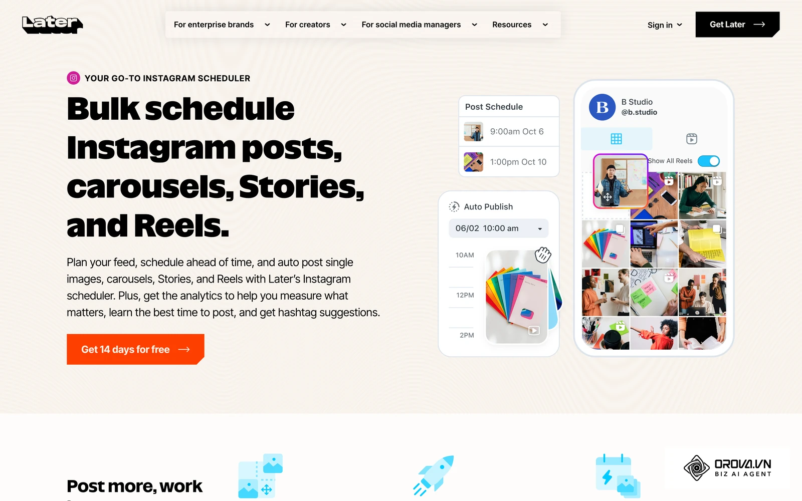
- Best for: Direct-to-consumer ecommerce merchants, digital marketing agencies, and lifestyle brands managing visually intensive Instagram storefronts.
- Key strengths:
- Intuitive visual grid planner on desktop web browsers, enabling marketers to drag media from an unposted side repository directly into future calendar slots while immediately seeing how color palettes interact.
- Native Shopify integration that allows catalog product tagging directly onto grid drafts, ensuring that when an image publishes, product links are already mapped for shopping tags.
- Media library for storing and tagging creative files before scheduling.
- Weaknesses:
- Its richest planning features live in the desktop web app, so phone-only creators may find a mobile-first tool quicker.
- Teams that only need a simple posting queue may not use its media library and commerce features.
- When to choose: Select Later when your primary operational priority is pairing an interactive desktop grid preview with Shopify product tagging and multi-user asset libraries.
Practical example (Ví dụ minh hoạ):
- Context: A boutique apparel brand with a two-person marketing team managing one Instagram profile with 14,000 followers.
- Steps taken: They batched 18 lifestyle flat-lay photos, uploaded them into a visual grid planner, organized the layout into an alternating checkerboard pattern of product close-ups and model shots, and scheduled posts across three weeks.
- Stumbling block & resolution: Two scheduled high-priority flash sale announcements clashed visually with adjacent muted background tones, so the team moved the announcement graphics to Instagram Stories and replaced the feed slots with neutral behind-the-scenes imagery containing the sale text in the caption.
- Tangible visible result: The profile maintained an unbroken neutral color palette when visitors landed on the profile, leading to direct click-throughs to the bio link without visual clutter.
Planoly: Visual Instagram Feed Planner
Planoly was one of the earliest tools built specifically around the visual aesthetics of the Instagram grid, offering a workspace that bridges desktop content organization with mobile publishing convenience for creators and social media managers.
- Best for: Independent creators, beauty and wellness influencers, and boutique service providers who plan aesthetic grids around weekly thematic color stories.
- Key strengths:
- Grid planner that lets you drag drafts around the profile preview before anything goes live.
- Multi-channel workspace that lets users adapt their Instagram plan for networks such as TikTok, Pinterest, and Facebook.
- Calendar and grid views for checking both publishing dates and the resulting profile layout.
- Weaknesses:
- Upload allowances depend on the plan, so creators who batch-test many images should check current limits first.
- Teams that need detailed sales attribution usually pair it with a separate analytics tool.
- When to choose: Select Planoly when you want to sketch out visual grid themes with drafts before your final photo shoots are finished.
Plann: Visual Instagram Feed Planner
Plann focuses on guiding users through visual storytelling strategy, combining its grid preview workspace with built-in color palette prompts, layout recipes, and pre-formatted content pillar frameworks.
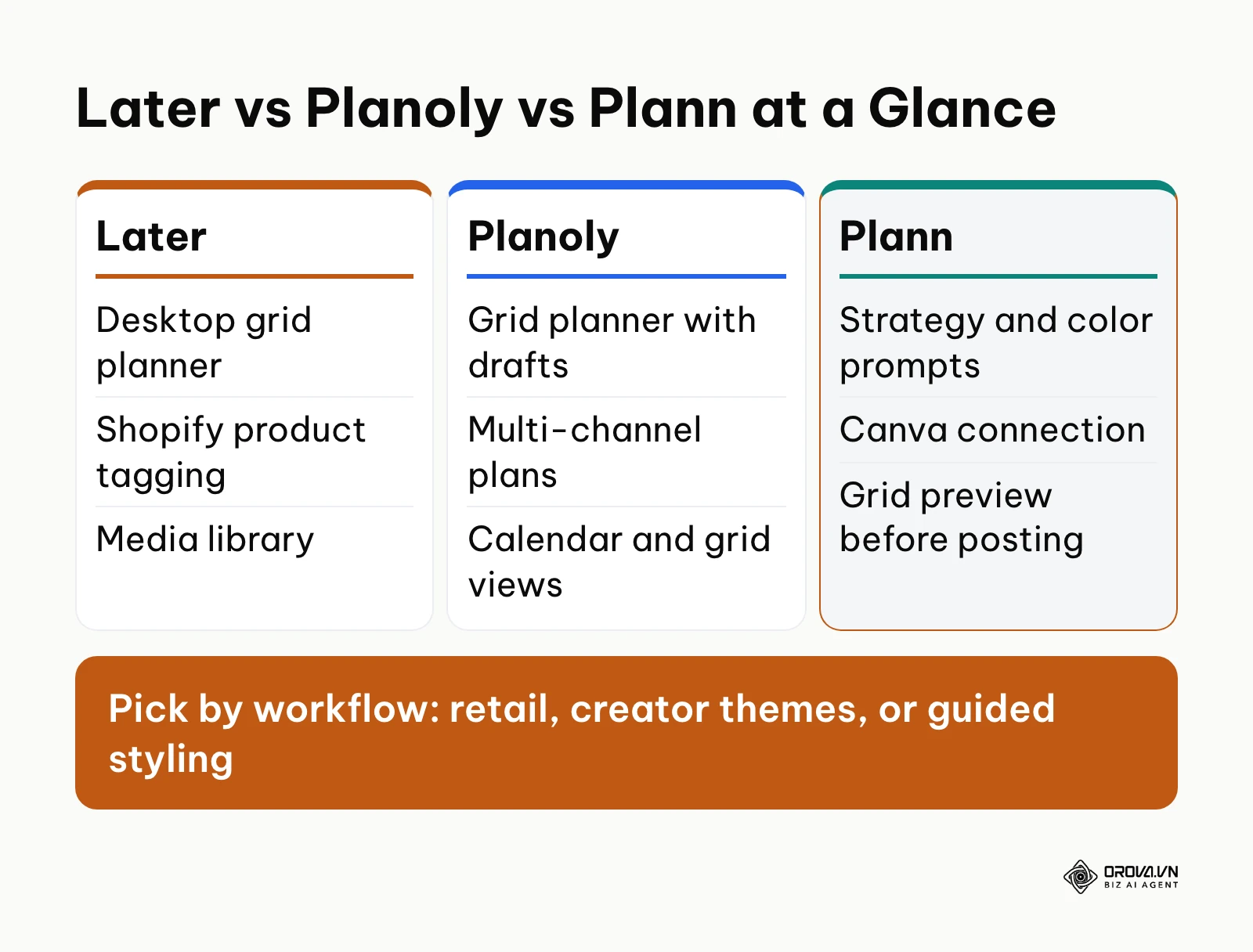
- Best for: Solo entrepreneurs, photography studios, and marketing generalists who want visual styling guidance alongside their scheduling calendar.
- Key strengths:
- Strategy prompts and color guidance that help beginners keep alternating patterns like columns or checkerboards consistent.
- Canva connection, so creators can design an image in Canva and bring it into the Plann grid.
- Grid preview for checking how new posts sit beside published ones before you confirm a posting time.
- Weaknesses:
- The strategy extras can feel like more than you need if you only want a simple scheduler.
- Its guidance is built around Instagram-led brands, so teams publishing mostly elsewhere may get less from it.
- When to choose: Select Plann when you lack a dedicated graphic designer and need structured layout recipes to maintain an alternating color theme across your profile.
Buffer: Simplified Instagram Feed Planner
Buffer approaches social management from a minimalist, queue-driven perspective. While originally engineered as a text and link scheduler, its Instagram channel integration includes a functional visual grid preview for verifying layout harmony.
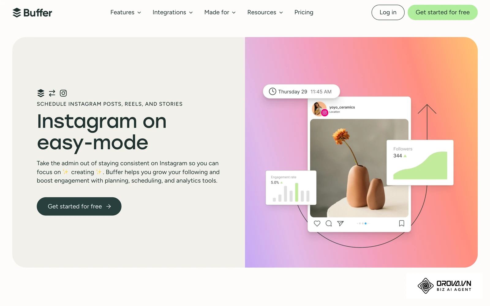
- Best for: Lean marketing teams, non-profit organizations, and indie creators who want reliable post queuing without complex visual design suites.
- Key strengths:
- Focused setup: connect only the channels you need and schedule without learning a large design suite.
- Schedules Instagram feed posts, carousels, and Reels from the same queue.
- Fast, distraction-free queue interface that lets users set recurring publication time slots and drop media directly into predefined queues.
- Weaknesses:
- The visual grid preview is a secondary feature rather than the core canvas, lacking drag-and-drop flexibility for unscheduled, unassigned draft images.
- Does not focus on safe-zone overlay guides for checking whether a 9:16 vertical video thumbnail will crop cleanly into a 3:4 grid tile.
- When to choose: Select Buffer when you prioritize simple, dependable automated publishing across your channels and only need a basic grid check before posts publish.
Preview App: Mobile-First Instagram Feed Planner
Preview App is built for smartphone users who want to experiment with grid arrangements before anything is posted.
- Best for: Solo content creators, micro-influencers, and mobile photographers who curate their Instagram visual feed directly from their iOS or Android devices.
- Key strengths:
- Drag-and-drop grid preview on your phone, so you can import camera-roll photos and rearrange them freely.
- A low-risk testing ground for experimental aesthetic themes and puzzle layouts before they go live.
- Built-in photo filters and caption tools inside the mobile app.
- Weaknesses:
- Being phone-first, it suits solo creators better than agency teams managing assets from shared computers.
- Publishing options vary by plan and format, so check how your post types are handled before relying on it.
- When to choose: Select Preview App when you work exclusively from a smartphone and want to test visual layouts on your phone before posting.
Hopper HQ: Visual Instagram Feed Planner
Hopper HQ is built around visual scheduling automation, providing agencies and digital marketing departments with a desktop-centric planning workspace that prioritizes bulk uploading and fully automated publishing.
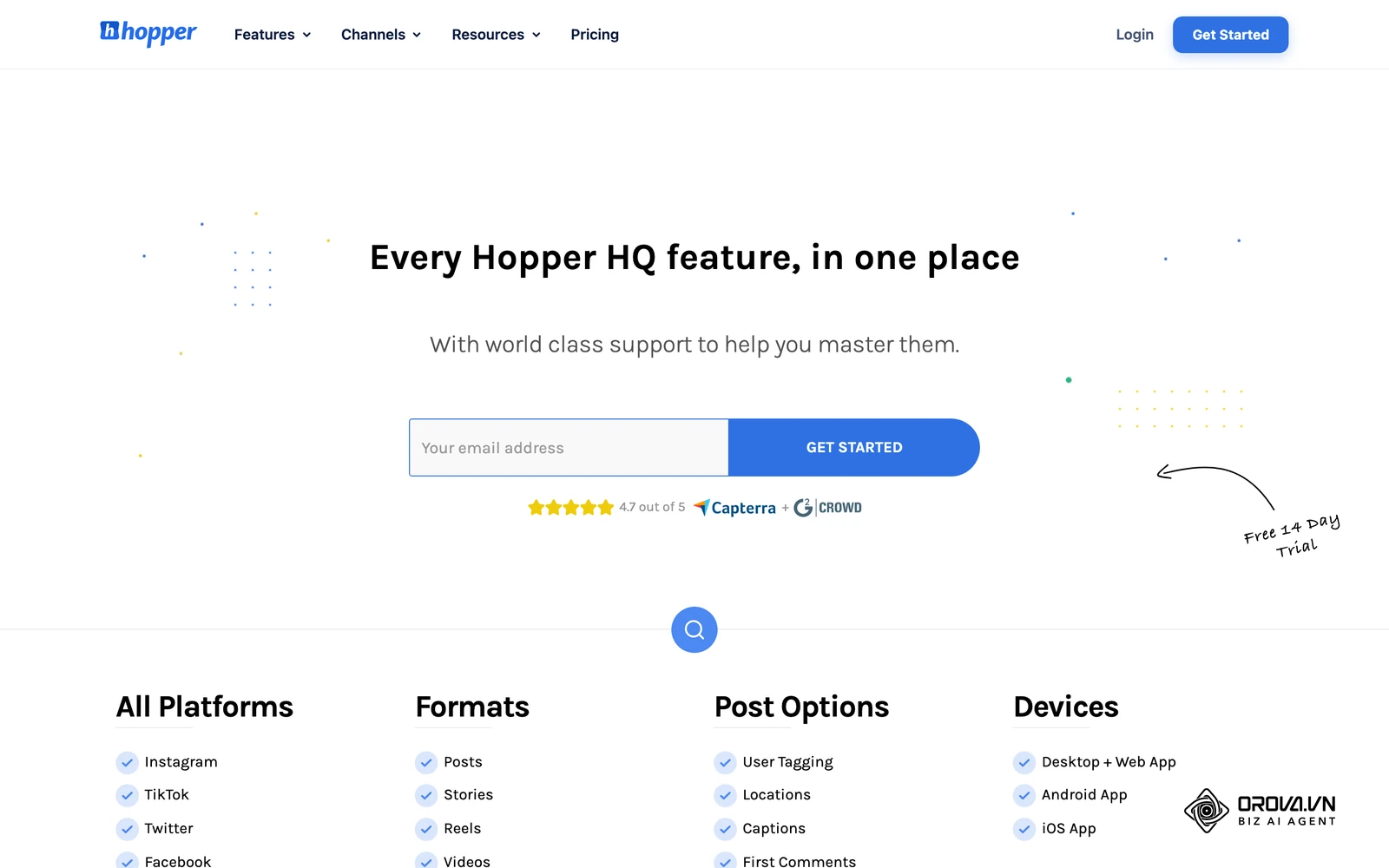
- Best for: Social media agencies and corporate marketing teams managing multiple client profiles that demand hands-off auto-publishing and bulk asset loading.
- Key strengths:
- Auto-publishing for Instagram feed posts, carousels, and Reels from a desktop workspace.
- Bulk uploader that brings in many photos and clips at once so they can be dragged into order on the grid.
- Grid planner that previews how scheduled posts will sit on the profile.
- Weaknesses:
- Built around agency-style desktop work, which can feel heavy for creators who only plan from a phone.
- Focuses on planning and publishing rather than design, so graphics are usually made in another tool.
- When to choose: Select Hopper HQ when your agency requires reliable, hands-off automated publishing for multi-slide carousels and Reels directly from a desktop interface.
Orova Social: Multi-Channel Instagram Feed Planner
Orova Social approaches visual content management as a publishing workflow for business operators, marketers, and agencies posting to several social networks at once.
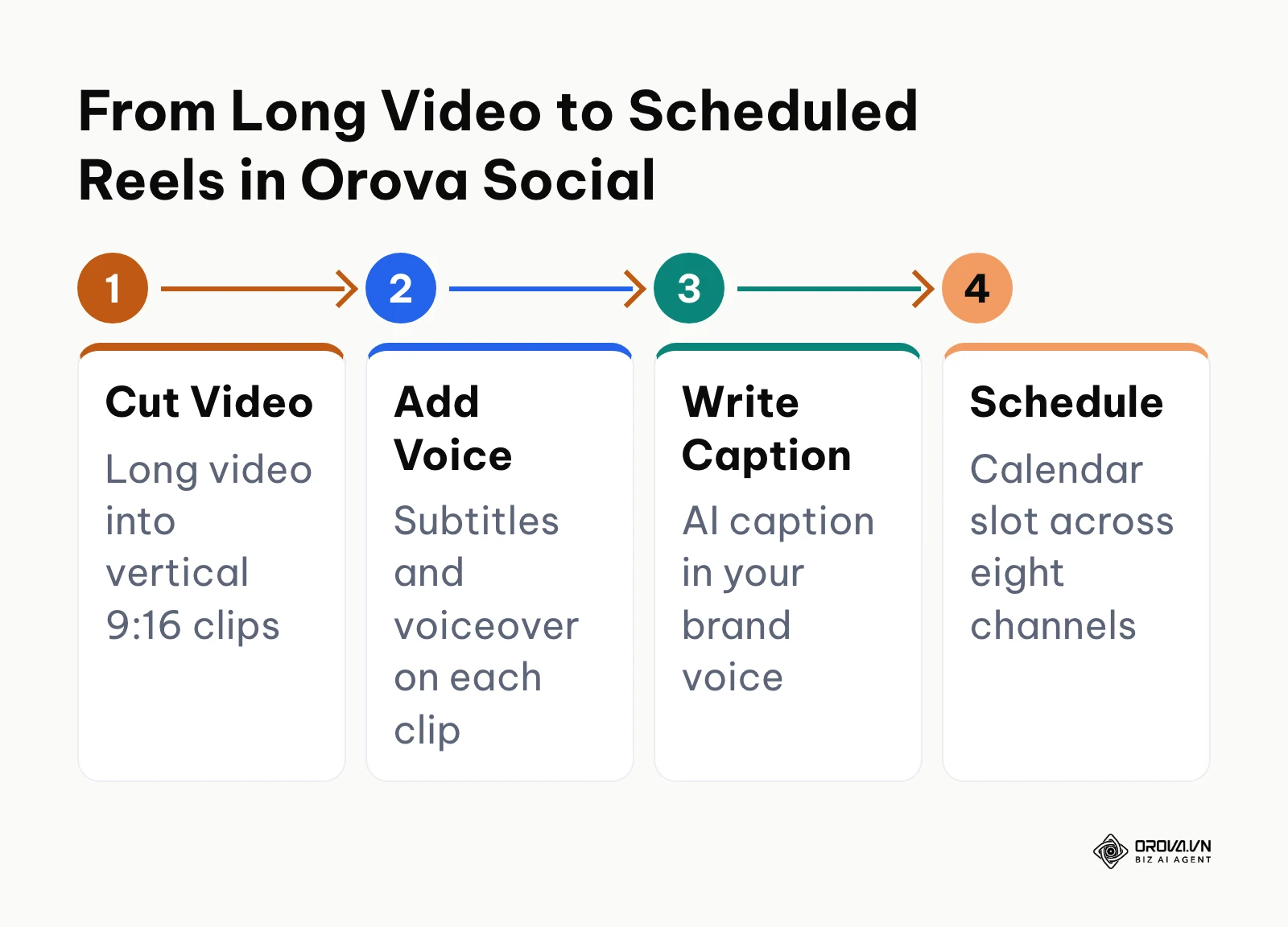
- Best for: Marketing teams that need to schedule Instagram content alongside other networks while repurposing long videos into vertical clips.
- Key strengths:
- Write once and publish to eight channels: Facebook, Instagram, TikTok, YouTube, Threads, LinkedIn, Zalo OA, and Telegram (Zalo and LinkedIn do not accept video).
- Cuts long videos into vertical 9:16 clips with subtitles and voiceover, ready for Reels.
- AI writes captions in your brand voice in several languages (see this ai caption generator guide), and AI images come with your brand frame and identity applied through a brand profile.
- Scheduling with automatic catch-up posting for missed slots, a Day, Week, and Month content calendar, and Excel export of your publishing schedule for reporting.
- Weaknesses:
- Does not provide a drag-and-drop photo grid canvas; publishing is arranged on the Day, Week, and Month calendar.
- Teams that judge every post by how it sits on the profile grid will still want a grid preview tool for that check.
- Access: Free until 7 July 2027 with every feature available.
- When to choose: Select Orova Social when your workflow involves publishing across eight channels and turning long videos into vertical Reels with subtitles, provided your team plans schedules on a calendar rather than an interactive photo grid.
Planning visual posts across several networks often creates disconnected workflows. If you want to plan your Instagram posts while publishing the same draft to Facebook, Threads, and LinkedIn, explore Orova Social. You can create AI images with your brand frame applied, write captions in your brand voice, and organize everything on a Day, Week, and Month content calendar.
Instagram Feed Planner Safe Zone Guide: Aligning 9:16 Reels With 3:4 Profile Grids
One of the most frequent technical mistakes in visual feed management is designing a 9:16 vertical video cover that looks stunning in full-screen view but becomes unreadable once Instagram crops it on your profile tab.
Since early 2025, Instagram's profile grid shows tiles as 3:4 vertical rectangles instead of squares, so a 9:16 Reel cover is cut down to its central 3:4 area (1080x1440 pixels on a 1080x1920 canvas). When the same Reel appears in the home feed, it is often framed at 4:5 (1080x1350 pixels). If your headline typography or core product visuals sit outside the overlap of these frames, viewers see cut-off words and awkward visual amputations. Layouts can change, so check a test post on your own profile before you lock a template.
The diagram below compares the full 9:16 vertical viewing canvas against the cropped 3:4 profile grid tile.
+-----------------------------------------------+
|         1080 x 1920 Full Reels Canvas         |
|  [Top: Y 0-285 - header, cropped on grid]     |
| - - - - - - - - - - - - - - - - - - - - - - - |
|       +-------------------------------+       |
|       |                               |       |
|       |   Safe Text Band Y 285-1440   |       |
|       |                               |       |
|       |   Keep All Typography,        |       |
|       |   Brand Logos & Core Focal    |       |
|       |   Subjects Inside This Band   |       |
|       |                               |       |
|       +-------------------------------+       |
| - - - - - - - - - - - - - - - - - - - - - - - |
|  [Bottom: Y 1440-1920 - caption and buttons]  |
+-----------------------------------------------+
Pixel Guide for Your Reels Cover Template
To prevent broken thumbnails, configure your design templates in Canva, Photoshop, or Figma to the following pixel dimensions:
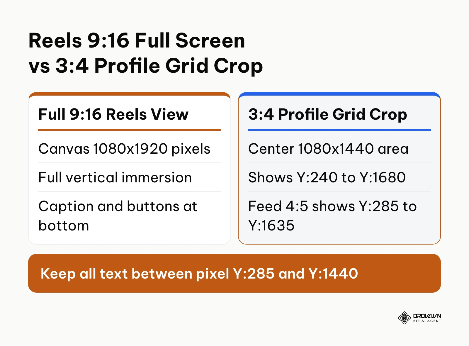
- Master Canvas: Set the base artboard to 1080 pixels wide by 1920 pixels tall (9:16 vertical ratio).
- Profile Grid 3:4 Area: The grid tile shows a 1080x1440 pixel area in the vertical center of the artboard, starting at pixel Y:240 and ending at pixel Y:1680.
- Home Feed 4:5 Boundary: When a Reel appears in the home feed, the visible window spans 1080 pixels wide by 1350 pixels tall, starting at pixel Y:285 and ending at pixel Y:1635.
- Interface Overlay Clearances: In full Reels playback, the lower part of the screen is covered by the creator handle, caption preview, audio ticker, and like/comment buttons. Keeping typography between pixel Y:285 and Y:1440 keeps it clear of all three frames.
According to the World Wide Web Consortium (W3C) in the Web Content Accessibility Guidelines (WCAG) 2.2 (2023), text should maintain a minimum contrast ratio of 4.5:1 against its background to ensure legibility. When placing text over photographic thumbnails, apply a subtle dark gradient or solid backing card behind your lettering to prevent typography from disappearing against light image backgrounds.
Practical example (Ví dụ minh hoạ):
- Context: A solo fitness educator producing three educational Reels and two infographic carousels weekly.
- Steps taken: The creator designed custom 1080x1920 pixel video thumbnails, positioned bold hook headlines within the central 3:4 area, tested the graphic against a mobile grid mockup, and scheduled auto-publishing.
- Stumbling block & resolution: On the first two published Reels, the lower three lines of explanatory text were obscured by the Instagram account username and caption overlay on the Reels feed, so the creator moved all text into the band between pixel Y:285 and Y:1440.
- Tangible visible result: Every video cover displayed full, readable headlines on both the 3:4 profile grid and the 9:16 vertical Reels tab without clipped typography.
Instagram Feed Planner Content Matrix: Balancing Visual Aesthetics With Revenue
A visually polished Instagram grid that generates zero sales is an expensive digital art gallery. Many business owners spend hours arranging harmonious pastel tones or continuous photography bands, only to discover that their audience never clicks their link in bio because direct commercial offers are hidden to avoid spoiling the aesthetic.
Visual cohesion on a business profile shapes how quickly a new visitor decides whether to follow during that first profile check. However, long-term brand retention requires predictable value delivery.
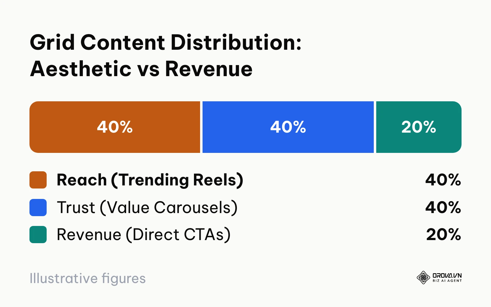
To solve this tension, structure your 9-post grid cycles using a 40/40/20 conversion matrix:
- 40% Reach Engine (Top-of-Funnel Reels): Fast-paced vertical videos, industry commentary, and relatable problems designed for the Reels algorithm to attract non-followers.
- 40% Trust Engine (Middle-of-Funnel Carousels & Infographics): Detailed educational guides, customer case studies, and carousel breakdowns that establish industry authority and generate saves.
- 20% Conversion Engine (Bottom-of-Funnel Offers): Clear product demonstrations, client testimonials with direct calls-to-action, and bottom of funnel content crafted to prompt direct messages or link-in-bio clicks.
The pie distribution below illustrates this strategic allocation across your monthly content cycle:
Balancing Visual Cohesion and Commercial Intent
When scheduling through an Instagram feed planner, distribute these three pillars so that promotional sales posts do not cluster together. Three rows of the profile grid show nine tiles. Applying the 40/40/20 rule to nine tiles yields roughly three to four Reach posts, three to four Trust posts, and one to two Conversion posts.
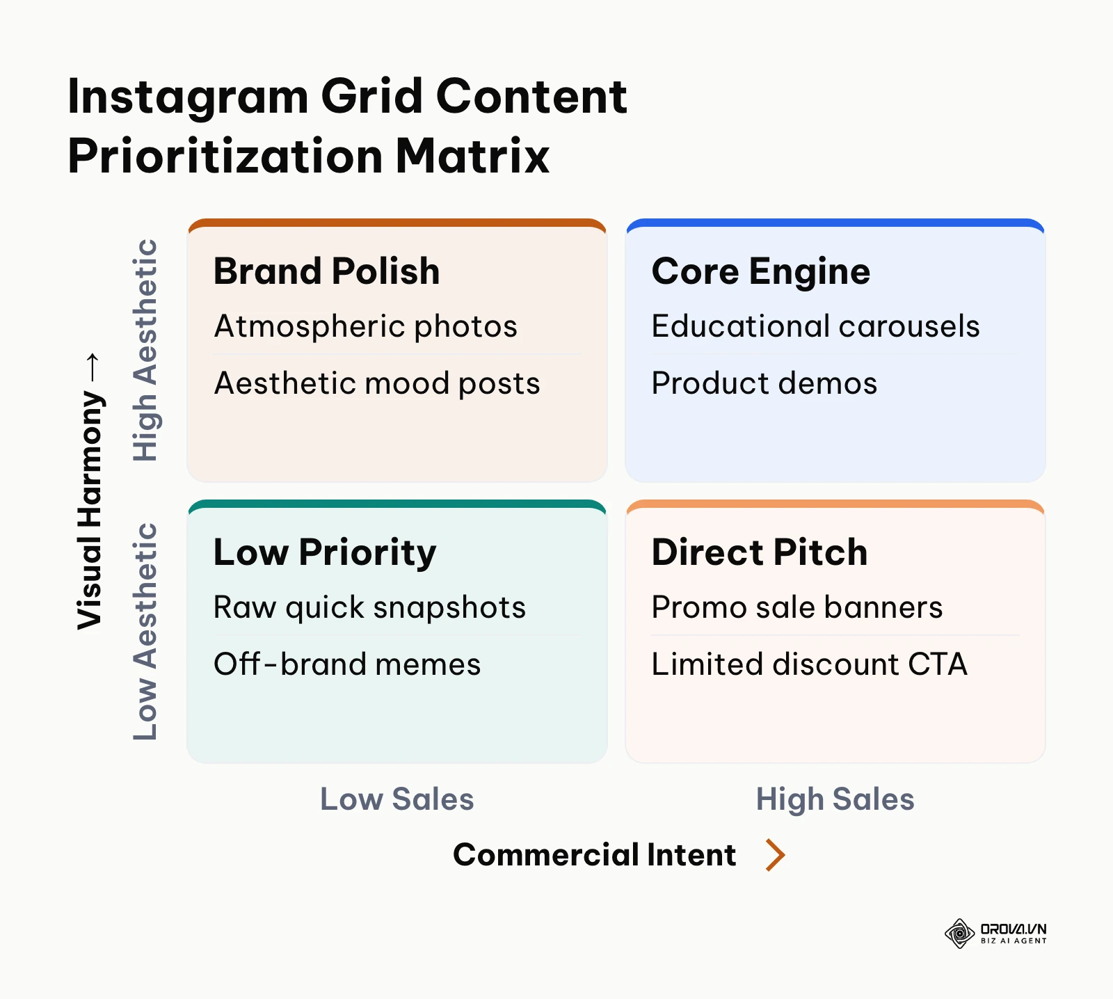
The table below outlines a practical 30-day grid scheduling sequence demonstrating how to balance format, visual mood, and conversion objectives:
| Grid Slot | Content Pillar | Format | Visual Tone / Styling | Conversion Objective |
|---|---|---|---|---|
| Tile 01 | Reach (40%) | 9:16 Reel | Dynamic action video, bold yellow headline box | Profile visits from Explore |
| Tile 02 | Trust (40%) | 10-Slide Carousel | Clean neutral background, dark slate typography | Post saves and shares |
| Tile 03 | Reach (40%) | Single Image | Lifestyle portrait, natural ambient light | Comments and engagement |
| Tile 04 | Conversion (20%) | Product Showcase | High-contrast studio product shot, minimal text | Direct clicks to bio link |
| Tile 05 | Trust (40%) | Infographic Carousel | Step-by-step framework, brand accent borders | Profile follows |
| Tile 06 | Reach (40%) | 9:16 Reel | Screen recording demo, centered title card | Reach to non-followers |
| Tile 07 | Trust (40%) | Customer Case Study | Quote card with client portrait overlay | Brand trust reinforcement |
| Tile 08 | Conversion (20%) | Offer Announcement | Bold typographic banner, warm background card | Inquiries via direct message |
| Tile 09 | Trust (40%) | Educational Carousel | Data chart summary, brand-consistent palette | Bookmarks and saves |
Practical example (Ví dụ minh hoạ):
- Context: A handmade ceramics studio owner managing an Instagram business account with 8,500 followers.
- Steps taken: The owner audited the previous month of 24 posts, categorized them into 10 process Reels for reach, 10 educational pottery-care carousels for trust, and 4 product launch announcements with direct purchase links, mapping them onto a 30-day calendar matrix.
- Stumbling block & resolution: Early commercial posts featured harsh white background graphics that disrupted the warm, earthy aesthetic of the ceramics feed, so the owner reshot product packaging on raw clay workstations to match the visual tone while keeping the call-to-action prominent.
- Tangible visible result: The grid looked cohesive while sales posts blended naturally into the visual sequence, leading to direct inquiries in direct messages without alienating casual profile browsers.
Designing Seamless Puzzle Grids in Your Instagram Feed Planner
A puzzle grid (or continuous panoramic layout) splits a large master artwork across multiple adjacent tiles so that individual posts connect to form a cohesive mural when viewed on your profile tab. When executed correctly, puzzle feeds create an unforgettable first impression. When miscalculated, they produce awkward cut-off edges, unreadable fragments, and ruined scheduling queues.
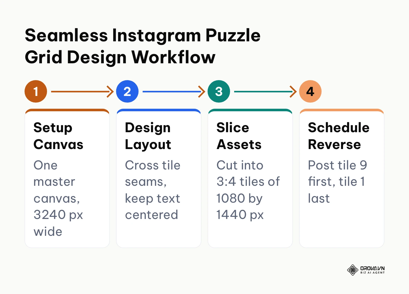
To build a seamless puzzle layout that does not distort on mobile screens, use the following technical setup:
Step 1: Canvas Dimensions in Design Software
Do not design individual tiles in isolation. Instead, open Canva, Photoshop, or Figma and establish a master canvas based on the number of tiles you intend to span:
- 3-Tile Horizontal Panorama: 3240 pixels wide by 1440 pixels tall (3 tiles across one row).
- 9-Tile Full Matrix (3 rows): 3240 pixels wide by 4320 pixels tall (3 rows of 3 tiles).
- 12-Tile Extended Mural (4 rows): 3240 pixels wide by 5760 pixels tall (4 rows of 3 tiles).
These sizes match the 3:4 tiles of the current profile grid. If you upload at 4:5 instead, Instagram trims each tile slightly at the top and bottom on the grid, so keep a margin there.
Step 2: Establish Individual Tile Boundaries
Divide the master canvas into 1080x1440 pixel tiles using software guide lines. Ensure that critical focal points, such as human faces and product logos, sit well inside individual tile boundaries rather than straddling the seam line. When an image splits across a border, small rendering discrepancies between mobile screen resolutions can create a 1-pixel visible gap.
Step 3: Individual Post Value Check
Every single slice of your puzzle grid must function as an interesting, standalone post in the home feed stream. If tile number five is merely a blank patch of beige background texture, followers browsing their main feed will see meaningless filler and scroll past without engaging. Overlay an actionable quote, tip, or mini-caption on every individual segment.
Step 4: Slicing and Reverse Scheduling
Use a lossless image splitter or native Figma slice exports to cut your master artboard into 1080x1440 pixel PNG files.
When loading these slices into your feed planner, schedule them in reverse numerical order. Because new Instagram posts appear in the top-left position and push previous posts to the right, your puzzle will break if published chronologically. For a 9-tile puzzle, schedule Tile 09 first, followed by Tile 08, down to Tile 01.
Turning long videos into Instagram Reels no longer requires bouncing between separate editing and scheduling apps. With Orova Social, you can cut long footage into vertical 9:16 clips with subtitles and voiceover, schedule posts to eight channels, and let missed slots post automatically. Every feature is free until 7 July 2027, no card needed.
How to Choose an Instagram Feed Planner by Real-World Scenario
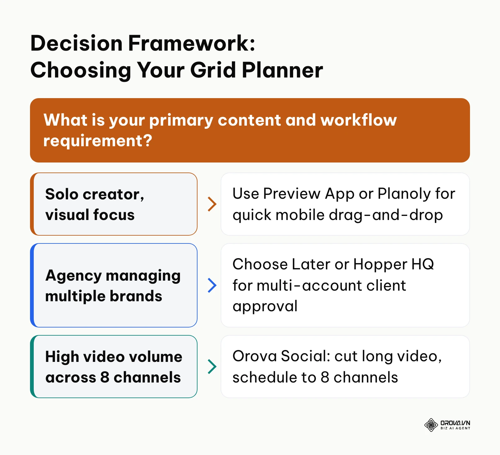
Selecting software depends on your operational bottlenecks rather than a generic feature list. A solo creator needs rapid visual sandbox testing on mobile, while a multi-client agency requires multi-network synchronization, asset tagging, and strict publication timing.
For organizations looking to manage all social media in one place, connecting every profile in one workspace often matters more than niche visual styling features.
The table below outlines which Instagram feed planner best matches common business environments:
| Real-World Scenario | Recommended Planner | Core Operational Reason |
|---|---|---|
| Solo creator focusing entirely on mobile photography | Preview App | Drag-and-drop grid preview right on your phone |
| Boutique lifestyle brand with Shopify storefront | Later | Pairs desktop visual grid planning with product catalog tags |
| Creative service agency managing client aesthetics | Hopper HQ or Later | Combines hands-off auto-publishing with a desktop grid preview |
| Minimalist team scheduling across multiple networks | Buffer | Simple, reliable queue-based publishing |
| Multi-channel business producing high-volume vertical video | Orova Social | Cuts long-form video into vertical Reels and schedules across eight networks |
| Influencer planning thematic color palette transitions | Planoly | Grid planner with drafts and calendar views |
Pre-Publishing Visual Checklist for Your Instagram Feed Planner
Before you confirm publication dates and lock your scheduled content queue, run your planned 9-post layout through this 7-point visual and typographic quality audit:
- Adjacent Color Clashing (Yes/No): Do any two adjacent tiles share identical heavy background saturation that creates an unintended visual blob on the grid?
- Typography Safe-Zone Clearance (Yes/No): Are all headline titles on 9:16 Reels covers strictly contained within the band between pixel Y:285 and Y:1440 to avoid edge clipping?
- Contrast Ratio Compliance (Yes/No): Does text overlay maintain at least a 4.5:1 contrast ratio against background imagery, adhering to WCAG 2.2 accessibility standards?
- Standalone Tile Value (Yes/No): Does every individual image or carousel slide deliver standalone informational value when viewed out of context in the main home feed?
- Format Rhythm (Yes/No): Are video Reels, multi-slide carousels, and single images alternating in an intentional visual rhythm rather than clustering in rows?
- Commercial Distribution (Yes/No): Does the 9-post cycle adhere to the 40/40/20 balance, ensuring promotional offer posts do not exceed two tiles per batch?
- Reverse Chronological Sequencing (Yes/No): If publishing a connected puzzle or multi-tile panorama, are assets queued in reverse order (highest tile number published first)?
Future Trends in Instagram Feed Planner Tools: Author's Perspective
The visual feed planning landscape is undergoing a structural shift driven by changes in consumer browsing habits and algorithmic media distribution. Based on developments observable as of 2026, I anticipate three major transformations over the next two to three years.
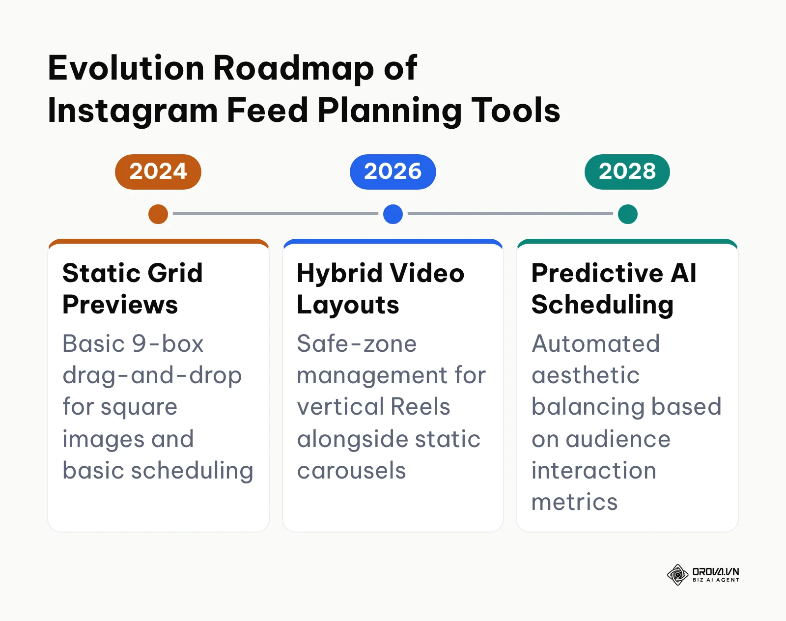
First, I believe traditional static image grids will evolve into dynamic cross-format layout engines. Today, many creators still plan feeds as if every tile were a square, even though vertical video now drives much of what people watch on the app. Over the next two to three years, planning software that fails to provide adaptive preview modes, showing how feeds appear in 9:16 video tabs, 4:5 timeline streams, and 3:4 profile tiles simultaneously, will become obsolete. Readers should prepare today by adopting asset templates designed around safe-zone overlays rather than fixed single-ratio crops.
Second, I project that generative AI will move from writing generic captions to contextual aesthetic balancing. In my view, planners may soon analyze an uploaded batch of images, evaluate the color histogram, lighting temperature, and subject density of previously published posts, and automatically suggest the optimal visual sequence to maximize profile dwell time. However, this prediction could be invalidated if Meta alters the profile layout away from the traditional three-column grid, rendering algorithmic color arrangement unnecessary.
Third, I expect visual planners to merge directly with automated social commerce pipelines. As social platforms shorten the path between discovery and checkout, planning a grid will no longer be about aesthetic beauty alone. Tools may start linking scheduled product images to inventory, flagging posts for items that have sold out. Creators and brands should begin structuring content around clear bottom-of-funnel conversion goals today rather than treating social media profiles as static mood boards.
Frequently Asked Questions About Instagram Feed Planner
How do I design a 9:16 Reels cover that looks right on both the Reels tab and the 3:4 profile grid?
Set your master graphic canvas to 1080x1920 pixels and keep all headline text, logos, and critical focal imagery between pixel Y:285 and Y:1440. That band sits inside the 3:4 grid crop, the 4:5 home feed frame, and above the Reels caption and buttons, so no typography is clipped.
Does an aesthetically organized grid still impact the Instagram algorithm in 2026?
The algorithm does not analyze color harmony to award algorithmic reach in the feed. However, an aesthetically structured grid directly impacts profile conversion rate when an account receives profile visits from Reels or Explore. A cohesive layout communicates clear brand positioning, encouraging visitors to tap the follow button and click bio links.
How do Collab Posts and tagged profile photos affect a pre-planned feed grid?
Accepting a Collab Post inserts that publication into your chronological feed, which can disrupt a meticulously planned checkerboard or puzzle layout. If you run a strict visual pattern, preview the collaborative post in your feed planner draft workspace before accepting the collaboration, or remove yourself as a collaborator afterwards if the post breaks the pattern.
Can you plan and rearrange an Instagram grid directly inside the native app?
The native app offers some controls over published posts, such as pinning, and newer versions have added more grid controls, but it does not let you place unposted drafts on your live grid to preview a whole layout. You can save drafts, yet you cannot see them in position beside your published posts. A dedicated feed planner remains the practical way to test a layout before posting.
How does AI assist with visual Instagram feed planning in 2026?
Modern AI tools assist feed planners by analyzing image color palettes, generating cohesive brand design frames, and writing channel-optimized captions based on post topics. Furthermore, semantic video processing tools can automatically isolate the most engaging segments of long videos, convert them into vertical Reels, and schedule them across publication calendars.
Where to Start With an Instagram Feed Planner
Starting visual feed planning does not require purchasing expensive enterprise software or overhauling your entire social media output overnight. Identify which of the three situations matches your current stage and complete the corresponding initial task.
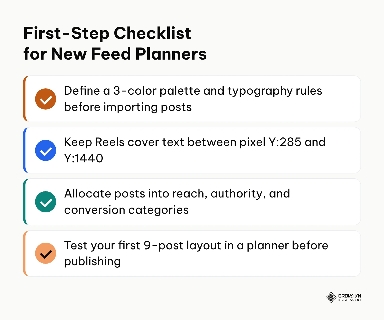
If you are a solo creator with zero budget and an unorganized camera roll, download a mobile-first tool like Preview App. Spend one afternoon importing your last twenty unposted photographs and arrange them into a simple alternating sequence of close-ups, wide landscape shots, and text quotes without committing to automated scheduling.
If you are an established brand owner struggling with mismatched visual branding, open design software and establish a master Reels cover template with a locked Y:285 to Y:1440 text band. Re-export your upcoming five video covers using this template to ensure headline typography remains intact across your profile grid.
If you are a multi-channel marketing team managing content across social networks, audit your monthly content distribution using the 40/40/20 matrix. Allocate your planned posts into reach, authority, and direct conversion categories before loading them into your publishing software to guarantee your aesthetic grid supports business growth.
Consistent grid planning is ultimately about intentional visual storytelling, and testing your workflow with the right instagram feed planner ensures your brand aesthetic supports sustainable business growth.
About the author

Builder of Orova
Nguyễn Đỗ Trọng Ân has 8 years of experience in marketing, including 6 years managing market development across Asia. He builds Orova, a Biz AI Agent that never sleeps: it plans, runs and optimizes work for businesses.
Run your business with AI Agents
Orova is the always-on Biz AI Agent — it plans, runs, and optimizes the work for you.
Save time, unlock productivity.