
What is a BI Excel dashboard? How to build automated reports

You have data scattered across customer relationship management systems, advertising platforms, and local spreadsheet files. Your current approach likely involves manually copying and pasting this raw information into a master workbook, wrestling with complex lookup formulas, and hoping the file does not freeze before your weekly performance review meeting. This chaotic and manual routine leaves you with static charts that are essentially outdated the moment you hit the save button. A robust bi excel dashboard solves this exact problem by transforming your local file into a dynamic, automated reporting engine. However, most professionals still treat this software as a simple grid for basic data entry, completely missing out on the built-in enterprise tools designed to handle millions of rows effortlessly. This comprehensive guide will show you exactly how to move beyond basic reporting, automate your data pipelines, and build a professional-grade visualization system without needing to purchase new software licenses.
What is a BI Excel dashboard?
A bi excel dashboard is an automated reporting interface built within Microsoft Excel that uses built-in business intelligence tools like Power Query and the Data Model to extract, transform, and visualize large datasets. It serves to track key performance indicators dynamically, differing from traditional spreadsheets by handling relational data without manual formula updates.
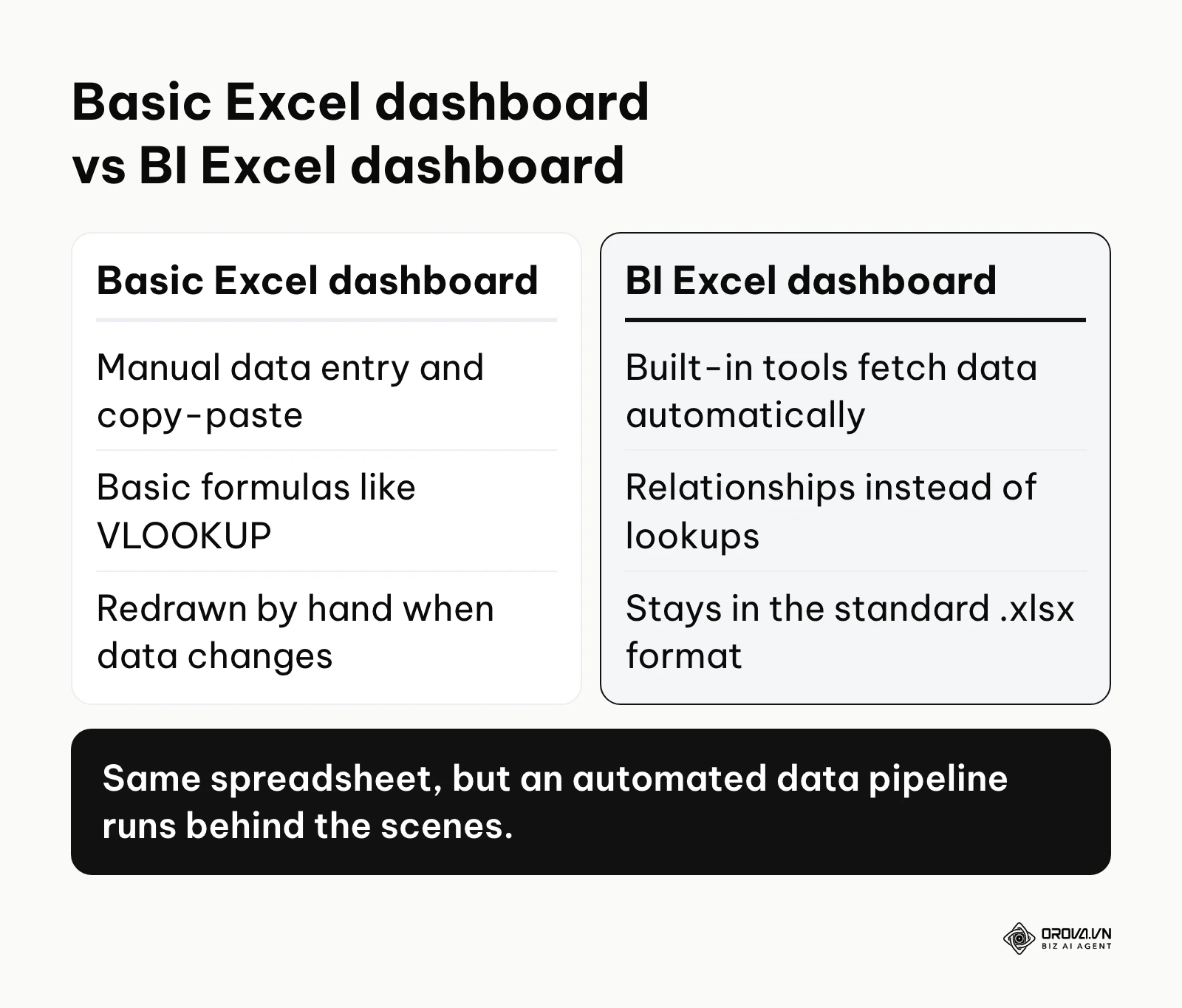
The term originates from the integration of Business Intelligence capabilities directly into the familiar spreadsheet environment. While many people use the word "dashboard" loosely to describe any page with a chart on it, a true business intelligence setup requires an automated data pipeline running behind the scenes.
Here is how it fundamentally differs from concepts that are frequently confused with it:
| Concept | Where it differs | Example |
|---|---|---|
| Basic Excel Dashboard | Relies entirely on manual data entry, copy-pasting, and basic formulas like VLOOKUP that slow down the file. | A monthly budget template where you type in individual expenses row by row. |
| Power BI Dashboard | A standalone, cloud-based application that requires a separate software license and a dedicated online workspace. | A company-wide interactive sales report hosted directly on the app.powerbi.com website. |
| BI Excel Dashboard | Uses built-in tools to automate data fetching and relationship building while staying within the standard .xlsx format. | An inventory tracker that automatically pulls and cleans data from three different local folders upon opening. |
To understand this better, consider a real-world everyday example. Think of a basic spreadsheet as drawing a physical paper map by hand every time you want to travel somewhere. If a road closes, you have to erase and redraw the map yourself. A BI Excel dashboard, on the other hand, is exactly like the GPS navigation application on your smartphone. It automatically pulls live satellite information, calculates the most efficient route, and instantly updates the visual display on your screen as you move, completely without you needing to redraw or calculate anything manually.
Why does a BI Excel dashboard matter?
A business intelligence dashboard built natively in your spreadsheet software exists to solve the critical problem of data fragmentation and human error. In modern business, information rarely lives in just one place. Your sales numbers might be in a database, your marketing spend on a web platform, and your employee hours in a local text file. Bringing these together manually creates a massive bottleneck for data analysts, operations managers, and business owners who need to make rapid decisions.
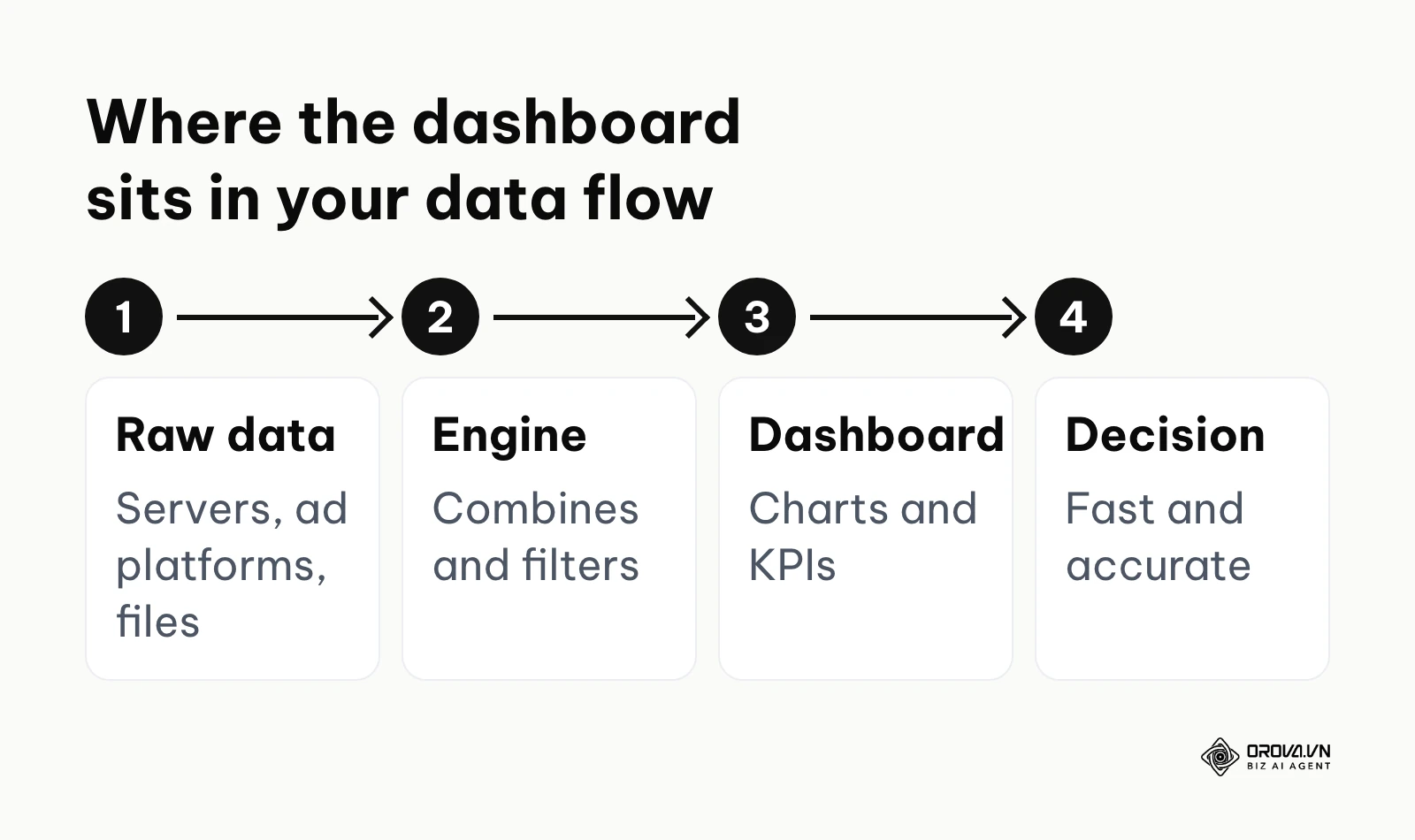
In the larger picture of data architecture, this tool sits precisely between raw data extraction and high-level strategic decision making. The raw data comes first, sitting in various servers and files. The dashboard acts as the processing engine and the presentation layer, filtering out the noise so that the final step, the human decision, can happen quickly and accurately. If you choose to ignore this automated approach, you lose hours every week to repetitive administrative tasks, and you expose your business to significant risks caused by simple copy-paste errors or broken formulas that go unnoticed until it is too late.
Illustrative example: A mid-sized retail chain needed to track daily inventory across five regional warehouses. The operations manager initially spent four hours every Monday downloading CSV files from their point-of-sale system, pasting them into separate tabs, and updating hundreds of lookup references manually. The main hurdle occurred when the master file grew to 500,000 rows, causing the software to freeze repeatedly during saving. To resolve this, they adopted a Data Model approach by connecting the raw CSV folder directly via Power Query, which eliminated the need for manual copy-pasting entirely. The visible result was a stable, interactive report that loaded all new data in under thirty seconds, allowing the manager to instantly identify specific stock shortages before the stores opened, without waiting for the spreadsheet to calculate.
When you do not need a BI Excel dashboard: Using this advanced structure is a complete waste of time if you are only tracking a small, static list of items, such as a one-time event guest list or a personal grocery budget. Additionally, if your organization requires second-by-second data streaming for algorithmic stock trading or live server monitoring, Excel is the wrong choice. In these specific cases, you should either stick to a basic spreadsheet or invest in specialized real-time streaming software.
The business value and individual benefits of a BI Excel dashboard
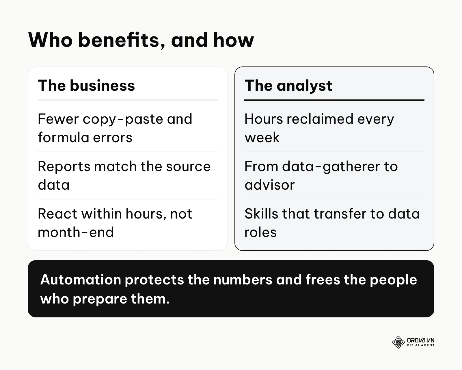
The implementation of an automated reporting structure provides measurable returns on two distinct levels. It protects the company's bottom line while simultaneously elevating the daily working experience of the people responsible for handling the numbers.
Business Value: Protecting the Bottom Line
For the broader enterprise, the primary value lies in risk mitigation and cost reduction. When reports are generated manually, the company pays highly skilled employees to perform basic data entry tasks. More importantly, manual manipulation introduces a high probability of human error. A single misplaced decimal point in a manually updated financial summary can lead to disastrous budget allocations. By automating the data pipeline, the business ensures that the metrics presented to the executive board are mathematically identical to the raw source data, eliminating the risk of human tampering or accidental deletion. Furthermore, because the updates happen instantly, the business can react to market changes within hours rather than waiting for the end-of-month reporting cycle.
Individual Benefits: Elevating the Analyst
For the individual responsible for creating the reports, the benefits are immediate and life-changing. Instead of dreading the end of the week, the analyst reclaims hours of time that can be spent actually analyzing the data rather than simply formatting it. This shift transforms their role from a reactive data-gatherer to a proactive strategic advisor. Furthermore, mastering these built-in intelligence tools significantly upgrades their professional skill set. Learning how to build relationships and write advanced query formulas positions the individual for career advancement, as these concepts are universally applicable across the broader data science industry.
The table below summarizes the core benefits, how to measure them, and when you can expect to see the impact:
| Benefit | Measured by which metric | Time to see result |
|---|---|---|
| Reduced reporting time | Hours spent compiling weekly reports | Immediately after first setup |
| Elimination of formula errors | Number of broken reference warnings per month | Within the first reporting cycle |
| Improved decision speed | Days between data collection and final presentation | After one month of usage |
| Higher file stability | Frequency of software crashes during save operations | Immediately after transitioning |
Turn multi-channel data into instant decisions. OROVA Insight seamlessly connects APIs from Online to Offline, helping you see the full picture of your business through a Real-time chart reporting system.
OROVA Insight: Integrate Online - Offline data, visualize reports in Real-time.
How to build a BI Excel dashboard that actually works
This is the most critical section of your journey. Most users fail because they try to build their visualizations directly on top of raw, flat data tables. To build a system that scales, you must separate your workflow into three distinct layers: the data extraction layer, the modeling layer, and the visual presentation layer. This step-by-step breakdown will show you exactly how to build bi dashboard in excel like a professional data engineer.
Step 1: Establish the data pipeline with Power Query
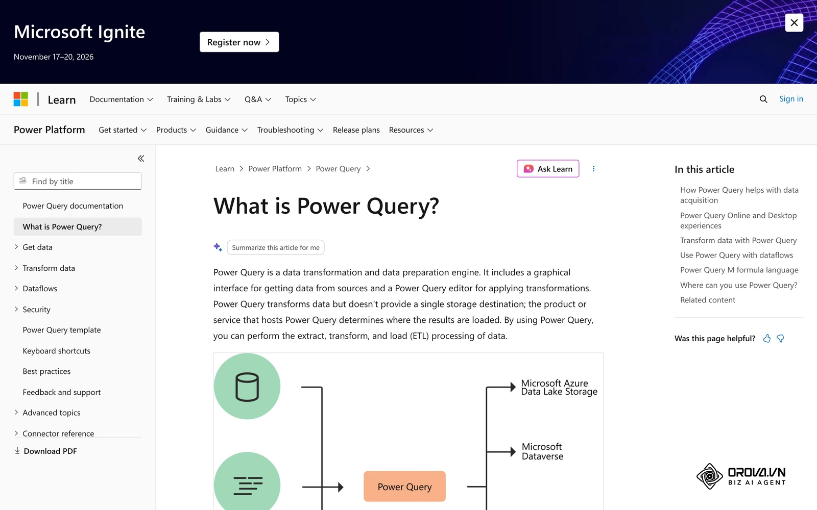
The absolute foundation of any automated spreadsheet is Power Query. This is a built-in data preparation engine that connects to your raw files, cleans the information, and shapes it into a usable format without ever pasting the raw numbers onto a visible worksheet grid. If you have multiple files, such as monthly sales reports exported from a system, you can use the "Get Data from Folder" feature. This allows the system to look at a specific folder on your computer and automatically combine all the files inside it into one massive table.
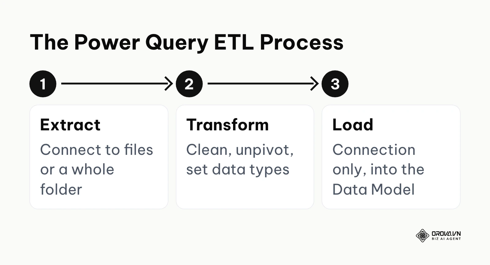
Checklist for normalizing data via Power Query before modeling:
- Connect to the designated data source or folder.
- Remove unnecessary top rows that contain system export information.
- Promote the first valid row to act as your column headers.
- Remove any entirely empty columns or rows.
- Unpivot any crosstab data so that all values sit in a single column.
- Explicitly define the correct data type for every single column (Text, Date, Currency).
- Replace or remove any hard error values.
- Trim text columns to remove invisible leading or trailing spaces.
- Merge related queries to bring necessary lookup descriptions into your main table.
- Select "Close & Load To" and choose "Only Create Connection" and "Add this data to the Data Model".
Step 2: Build relationships with the Excel Data Model
Once your data is cleaned by Power Query, it must be stored efficiently. This is where the Data Model comes in. Instead of using VLOOKUP to smash all your information into one giant, slow table, the Data Model allows you to keep your tables separate and connect them using relationships, much like a professional SQL database. This is known as dimensional modeling, or building a star schema. You will typically have a central "Fact" table containing your daily transactions, connected to smaller "Dimension" tables containing details about your products, customers, and a continuous calendar.
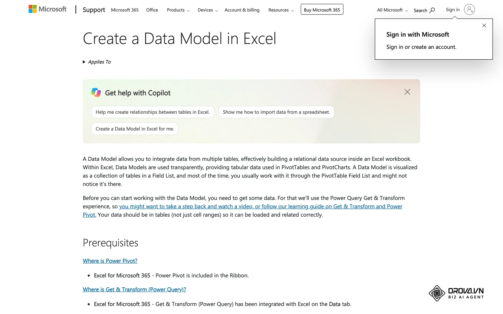
If you are looking for an excel data model dashboard tutorial, the most important concept to grasp is capacity. Microsoft's Excel specifications and limits page lists a ceiling of roughly 2 billion rows per Data Model table, far beyond the 1,048,576-row limit of a regular worksheet. In practice, the real limit is the memory available on your machine, so 64-bit Excel and lean tables (only the columns you need) matter more than the theoretical maximum.
Step 3: Design the visualization layer
Only after your data is modeled should you begin creating visuals. You will use PivotTables and PivotCharts connected directly to your Data Model. When designing the visual interface, clarity is your ultimate priority. Removing unnecessary borders and gridlines makes a dashboard easier to scan, because the eye goes straight to the numbers instead of the cell structure. Use Slicers and Timelines to allow the user to filter the entire page interactively. Arrange your charts on a strict grid, placing high-level summary numbers at the top left, and detailed breakdown charts towards the bottom right, following the natural reading path of the human eye.
Illustrative example: A marketing agency was managing digital advertising campaigns across three different social platforms for twenty active clients. The campaign manager manually exported performance reports from each platform and attempted to combine them into a single presentation sheet. The primary hurdle was that the date formats and column headers rarely matched, leading to constant formatting errors that skewed the total conversion calculations. To fix this structural issue, they utilized Power Query to build a transformation rule set that standardized all date formats to a uniform layout and unpivoted the diverse ad metric columns into a single flat table. The visible result was a unified marketing dashboard KPIs interface where the account director could simply click a drop-down menu to toggle between clients and immediately view cross-channel performance, without needing the analyst to manually compile a new report every week.
Step 4: Automate the refresh process
A dashboard is useless if the numbers are stale. Because you have built your system using Power Query and the Data Model, updating your dashboard requires zero manual copying. When new raw data arrives, you simply drop the new CSV file into your designated source folder. Then, open your dashboard file, navigate to the Data tab, and click the "Refresh All" button. The system will automatically run all your cleaning steps and update the charts in seconds. For further automation, you can right-click your connection properties and set the file to refresh automatically every sixty minutes while open, or trigger a background refresh immediately when the file is launched.
Step 5: Secure and share the dashboard safely
One of the biggest fears when distributing a spreadsheet is that a colleague will accidentally delete a crucial formula or break a chart. Because your logic is hidden in the Data Model, there are no formulas on the presentation sheet to break. However, you should still apply Worksheet Protection. You can lock all cells and objects, explicitly allowing users only to "Use PivotTable & PivotChart" and interact with Slicers. For ultimate safety, upload the file to a secure SharePoint or OneDrive folder. Give stakeholders view-only access so they can open and filter the dashboard in Excel for the web without being able to alter the underlying architecture.
Blueprint 1: Sales performance dashboard
A robust sales dashboard must track revenue generation and highlight bottlenecks in the pipeline. These three blueprints are layouts you rebuild in your own workbook, not files to download. For the sales dashboard, your Data Model needs a Sales Fact table and a Date Dimension table, structured like this:
| Table | Key columns | Example row |
|---|---|---|
| Sales (fact) | Date, Deal ID, Sales rep, Stage, Amount | 2026-03-14, D-1027, Rep A, Closed won, 4,800 |
| Calendar (dimension) | Date, Month, Quarter, Year | 2026-03-14, March, Q1, 2026 |
| Reps (dimension) | Sales rep, Team, Region | Rep A, Enterprise, North |
Relate Sales[Date] to Calendar[Date] and Sales[Sales rep] to Reps[Sales rep]. The core metrics you should write DAX formulas for include:
- Total Revenue: Calculate the sum of all closed deals.
- Year-Over-Year Growth: Use time intelligence functions to compare current revenue to the exact same period in the previous year.
- Win Rate: Divide the number of closed-won opportunities by the total number of opportunities generated.
Place these summary metrics at the very top of your canvas, followed by a bar chart breaking down revenue by sales representative and a line chart showing the monthly revenue trend.
Blueprint 2: HR and employee turnover dashboard
Managing human capital requires precise tracking of employee lifecycles. This blueprint requires an Employee roster table containing hire dates and termination dates. The critical formulas you will need are:
- Active Headcount: A distinct count of employees who were employed during the selected time period.
- Voluntary Turnover Rate: The number of resignations divided by the average active headcount.
- Average Time to Hire: The average number of days between opening a job requisition and the candidate accepting the offer.
Visualizing these metrics accurately is a foundational step before you can perform a meaningful training evaluation to see if your onboarding programs actually improve retention over time.
Blueprint 3: Financial cash flow dashboard
A financial dashboard provides a pulse check on the company's liquidity. This requires connecting to the general ledger exports. The essential calculations include:
- Operating Cash Flow: Total cash received from sales minus total cash paid for operating expenses.
- Monthly Burn Rate: The average amount of money the company loses per month before generating positive cash flow.
- Accounts Receivable Aging: Categorizing outstanding invoices into buckets of 30, 60, and 90 days overdue.
Use a waterfall chart to show exactly how your starting cash balance was affected by various income and expense categories to arrive at the ending balance.
| Type of BI Dashboard | Defining Characteristic | Best suited for |
|---|---|---|
| Strategic Dashboard | High-level overviews comparing long-term goals against current performance. | Executive board members and C-level leaders. |
| Operational Dashboard | Frequently updated metrics focusing on daily or weekly output and efficiency. | Department managers and frontline supervisors. |
| Analytical Dashboard | Highly interactive interfaces allowing deep drill-downs into historical data trends. | Data analysts and specialized strategists. |
What you need to do to adapt and start
Transitioning away from manual spreadsheets requires a shift in workflow habits depending on your specific role within the organization.
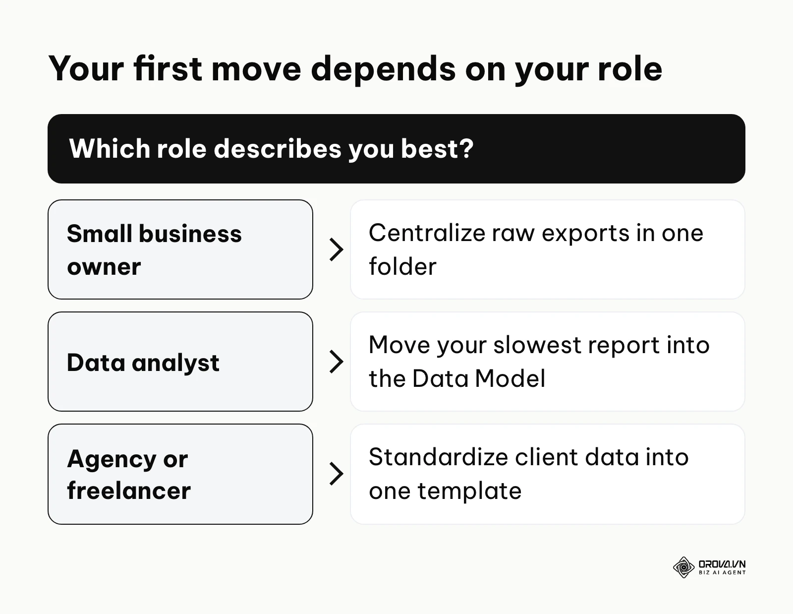
Small business owners: Centralize your files
If you run a small operation, your biggest enemy is scattered data.
- Audit your current files to identify exactly where your numbers live.
- Create a secure, centralized folder on your computer or cloud storage dedicated solely to raw data exports.
- Stop typing numbers directly into your summary sheets.
- Actionable this week: Build one simple Power Query connection from your central folder to a blank workbook just to see how the automated loading works.
Data analysts in companies: Master the Data Model
For analysts, the goal is to stop being a human copy machine.
- Stop using VLOOKUP and XLOOKUP to combine massive tables.
- Study the concept of dimensional modeling and star schemas.
- Learn the basics of DAX (Data Analysis Expressions) to write powerful measures instead of cell-level formulas.
- Actionable this week: Take your heaviest, slowest report and move its underlying data into the Data Model to experience the performance upgrade.
Agencies and freelancers: Standardize client reporting
When managing multiple clients, you need a scalable system.
- Define a strict, standard template for all incoming client data.
- Build a master dashboard that can dynamically switch between different client views using a single Slicer.
- Utilize comprehensive social analytics tools and export their raw data into your standardized folder structure.
- Actionable this week: Create a template that automatically standardizes date formats and currency symbols regardless of which client the data came from.
| Common Mistake | Negative Consequence | How to Avoid |
|---|---|---|
| Loading all data to the grid | The file becomes bloated, slow, and eventually crashes. | Always select "Only Create Connection" and load directly to the Data Model. |
| Hardcoding variables | Formulas break when the new month or new categories are added. | Write dynamic DAX measures that automatically adjust based on Slicer context. |
| Cluttered visual design | Users become overwhelmed and fail to find the important insights. | Remove gridlines, use muted colors, and highlight only the most critical data points. |
Illustrative example: A freelance human resources consultant was hired to present employee retention metrics to the executive board of a manufacturing client. Initially, the consultant relied on static charts pasted into a slide deck, but the board members constantly asked for specific demographic breakdowns during the live meeting. The hurdle was the inability to filter data interactively on the fly, forcing the consultant to repeatedly state that they would follow up later via email. By adapting their workflow to include interactive Slicers connected to a central Data Model, they fundamentally changed their presentation style. The visible result was that during the next quarterly review, the consultant could click a single Slicer button to instantly filter the turnover rates by specific factory floors and age groups, answering the board's complex questions live on the screen and securing a contract extension.
Excel vs Power BI for dashboard: The cost and performance matrix
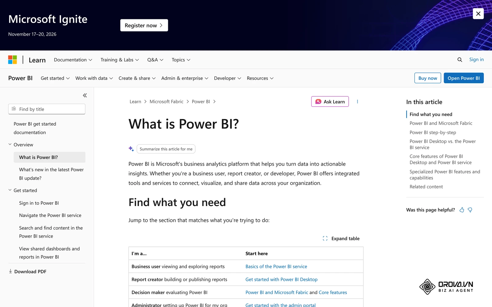
Many users wonder how excel vs power bi for dashboard compares when deciding where to invest their time. While they share the exact same underlying engine, their application and deployment methods differ significantly.
| Feature | BI Excel Dashboard | Dedicated Power BI |
|---|---|---|
| Software Cost | Included in your existing Microsoft Office 365 subscription. | Requires a paid Pro license for cloud sharing and collaboration. |
| Learning Curve | Moderate; builds upon familiar spreadsheet interfaces and logic. | Steep; requires learning a completely new software environment and publishing workflow. |
| Data Limits | Handles millions of rows comfortably depending on your local machine RAM. | Cloud service handles massive enterprise datasets seamlessly. |
| Sharing Method | Sending the physical .xlsx file or hosting on basic SharePoint. | Secure cloud workspaces, mobile apps, and embedded web links. |
If most of your data comes from marketing platforms rather than local files, a connector-based tool can save you the pipeline work. Orova Insight, for example, connects GA4, Search Console, Google Ads, Meta Ads, TikTok, YouTube, LinkedIn and Zalo OA, syncs your own CRM data via API, webhook or Google Sheets, and lets you build a drag-and-drop dashboard or ask the AI in plain language to draw a chart. It does not replace an Excel Data Model for finance or inventory work built on your own files.
No more lag in data management. Unlock the power of the OROVA Insight system to sync O2O (Online-to-Offline) data flows and visualize every report in real time.
OROVA Insight: Integrate Online - Offline data, visualize reports in Real-time.
Future trends for BI Excel dashboards: author's perspective
Here is how I read the direction of spreadsheet-based BI. These are personal views, and changes in software licensing or product roadmaps could easily shift them.
Trend 1: AI-driven natural language queries will replace complex DAX writing
Currently, the biggest barrier to entry for advanced reporting is learning the DAX formula language. I believe users will need to write these complex expressions by hand less and less. Generative AI assistants are likely to let users to simply type a request, such as "calculate year-over-year revenue growth by region," and the software will write the optimized DAX code behind the scenes. To prepare for this, you should focus heavily on understanding data modeling principles, because AI still requires a clean, logically structured database to generate accurate formulas.
Trend 2: The line between Excel and standalone BI tools will blur completely
Excel and Power BI already share much of the same data engine. I expect the spreadsheet interface to become, more and more, another window onto shared data models stored in the cloud, and I expect fewer teams to email heavy local files around. It is worth preparing for a future where the spreadsheet is merely a visualization layer connected to a centralized, governed semantic model that everyone in the company shares simultaneously.
Trend 3: Python integration will become the standard for predictive analytics
While Power Query is excellent for cleaning historical data, I lean towards the idea that Python in Excel will change how forecasting is done inside a spreadsheet. I expect more analysts to run simple predictive scripts next to their grids, for example to flag likely customer churn or plan inventory. Learning basic Python data manipulation libraries now is, in my view, a sensible investment.
Frequently asked questions about BI Excel dashboards
Is a BI Excel dashboard still needed with AI?
Yes, it is absolutely still needed. While AI can quickly generate a chart or write a formula, it cannot build the underlying business logic, govern data security, or ensure the raw data is accurate. AI acts as an accelerator for the analyst, not a complete replacement for structured data pipelines.
Can Excel replace Power BI entirely?
No, they serve different purposes. A spreadsheet is excellent for ad-hoc analysis, financial modeling, and situations where you need to see the underlying grid of numbers. A dedicated platform is better for distributing highly secure, governed, and interactive reports to hundreds of people across a large organization.
How long does it take to learn Power Query?
You can learn the basic interface and connect a simple folder in an afternoon. However, mastering advanced transformations, understanding the M code language, and learning how to optimize queries for maximum speed typically requires several months of consistent practice.
Will my dashboard work on a Mac?
Partly. Power Query on Mac has improved but offers fewer data connectors than on Windows, and Power Pivot, the editor for the Data Model, is a Windows feature. If your team mixes Macs and PCs, build and refresh the model on Windows and check Microsoft's current documentation for what Mac users can view and filter.
How do I prevent the file size from becoming too large?
The most effective way to keep your file size small is to load your cleaned data strictly to the Data Model and never to a visible worksheet grid. Additionally, you should aggressively remove any columns in Power Query that you do not actively need for your final visualizations.
Where should you start?
Knowing where to begin depends entirely on the current state of your data infrastructure. Do not try to implement every advanced feature on day one.
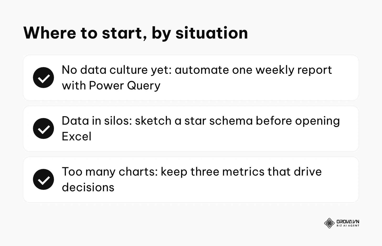
If you are starting from scratch with no established data culture: Your single most important step is to stop typing numbers manually. Choose one small, repetitive weekly report and build a simple Power Query connection to automate its data extraction. Mastering this one step will immediately save you hours.
If you already have data but it is disconnected in silos: Your priority must be learning dimensional modeling. Take an afternoon to map out a star schema on a whiteboard. Identify your central transaction table and figure out exactly which lookup tables you need to connect to it before touching the software.
If you are tracking everything but not measuring results: You likely have too many charts and no clear insights. Your next step is to perform a strict audit of your current visual interface. Select three specific metrics that actually drive business decisions, remove every other chart, and ensure those three numbers are completely accurate by analyzing the underlying click tracking or sales data.
By treating your spreadsheet not as a digital piece of paper, but as a powerful relational database engine, you can build a bi excel dashboard that fundamentally changes how your business operates.
About the author

Builder of Orova
Nguyễn Đỗ Trọng Ân has 8 years of experience in marketing, including 6 years managing market development across Asia. He builds Orova, a Biz AI Agent that never sleeps: it plans, runs and optimizes work for businesses.
Run your business with AI Agents
Orova is the always-on Biz AI Agent — it plans, runs, and optimizes the work for you.
Save time, unlock productivity.