
Automated sales report: setup guide and 3 template blueprints

Without an automated sales report, sales teams struggle to keep up with the massive, continuous stream of data they generate every single day, ranging from individual cold calls logged to high-value deals moved across various pipeline stages. Managing this growing volume of data manually usually means that sales managers are forced to spend their late Friday afternoons painstakingly copying numbers from a Customer Relationship Management (CRM) system into a static spreadsheet, desperately trying to figure out if the team actually hit their weekly quota. This manual routine is incredibly prone to human errors, often results in broken formulas, and ultimately leaves you making critical business decisions based on outdated numbers.
If you are exhausted by this repetitive cycle, an automated sales report is the exact operational solution you need. Instead of relying on manual data entry and constant file exporting, a fully automated system pulls information directly from your original sources, processes the raw numbers, and updates your visual dashboards without any human intervention required. This comprehensive and highly technical guide will walk you through the entire process of setting up these sophisticated workflows, preparing your underlying data, choosing the right software tools for your specific budget, and implementing analytical templates that you can use immediately to regain complete control over your sales operations.
What is an automated sales report and who really needs it?
An automated sales report is a digital dashboard or a dynamically updated document that automatically collects, calculates, and visualizes sales performance data from various connected sources at scheduled intervals, entirely eliminating the need for manual data entry. It is a critical infrastructure piece for sales leaders who require highly accurate, up-to-date numbers to make fast, strategic decisions.
This modern system completely replaces the traditional, error-prone method of exporting heavy CSV files from a CRM and manually pasting them into static spreadsheets. By setting up robust data pipelines, you connect your source systems—such as your CRM, your marketing automation platform, or even a custom internal database—directly to your chosen visualization platform. This architectural shift ensures that every single time you open your dashboard, the numbers reflect the absolute current reality of your sales pipeline. The core difference between a static report and an automated one lies in the data extraction method; automation relies on Application Programming Interfaces (APIs) or webhooks to push and pull data seamlessly behind the scenes.
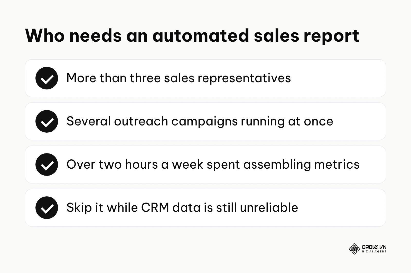
Who should invest the time and resources in building this automated infrastructure? You should absolutely implement an automated sales report if your team has grown to more than three sales representatives, if you are running multiple complex outreach campaigns simultaneously, or if you find yourself spending more than two hours a week simply assembling performance metrics. It is particularly valuable for sales operations managers, revenue operations (RevOps) leaders, and C-level executives who need a bird's-eye view of the organization's financial health without waiting for the end-of-month reconciliation process.
However, you should not attempt to automate your reporting if your underlying data is fundamentally broken or disorganized. If your representatives consistently fail to log their calls, or if deal stages are arbitrarily assigned without strict criteria, automation will only serve to generate incorrect reports at a much faster speed. Furthermore, if you are a solo founder handling a handful of clients manually, a simple manual spreadsheet might still be the most cost-effective and sensible approach. But as your organization begins to scale, transitioning to an automated sales report transitions from being a luxury to becoming a strict, non-negotiable requirement for sustainable business growth.
Data hygiene: The mandatory preparation before your automated sales report
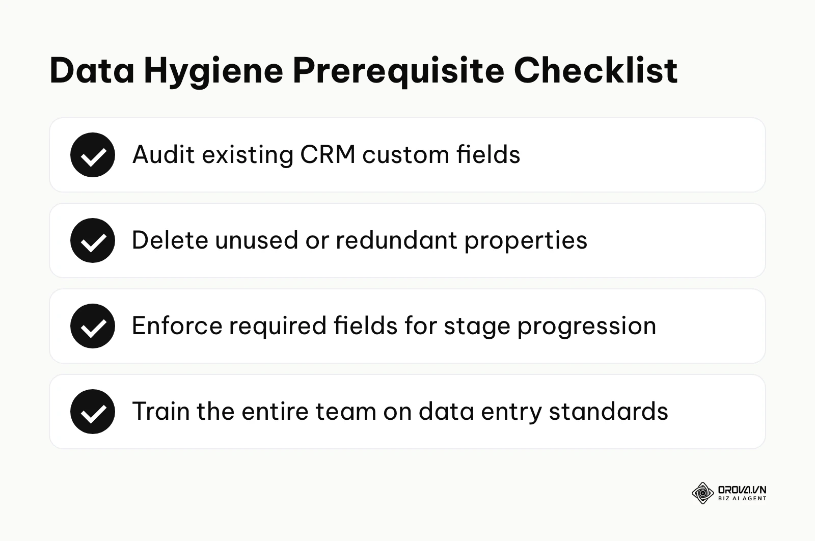
Before you even consider connecting any software platforms or writing any complex calculation formulas, you must ensure your underlying data is clean, structured, and entirely reliable. Establishing rigorous data hygiene means setting up strict, unbreakable rules for how information is entered and maintained within your CRM, which serves as the absolute foundation of any reliable automated sales report.
| Preparation Item | Where to find or build it | Time required to complete |
|---|---|---|
| Standardized deal stages | CRM pipeline settings / Sales playbook | 2 to 3 days |
| Required field validation | CRM object configurations | 1 to 2 days |
| Lead source mapping | Marketing automation platform rules | 3 to 4 days |
| Team data entry policy | Internal company wiki / Training document | 1 week |
| Routine data audit schedule | Calendar / Project management tool | 2 hours |
Standardizing CRM fields and deal stages
The single most common reason an automated sales report fails to deliver value is inconsistent, sloppy data entry. If one sales representative marks a successful deal as "Closed Won" while another types in "Won - Paid" in a custom text field, your automated reporting system will inevitably count them as two entirely separate categories, ruining your revenue totals. You must rigorously configure your CRM to use standardized dropdown menus instead of allowing free-text fields. Teams that enforce strict data validation at the point of entry tend to see far fewer reporting errors. You should conduct a thorough audit of your current pipeline stages and ensure that every single stage maps directly to clear, verifiable, and objective actions, such as "Contract Officially Sent" or "Initial Payment Received". Ambiguous stages like "Thinking About It" must be eliminated from your system entirely.
Building a data-driven culture in your sales team
Even with the most advanced validation rules securely in place, you still need your human team to actively and accurately maintain the system. How do you successfully build a company culture where sales representatives actually log their data without constant nagging? The answer lies fundamentally in aligning their financial incentives with data accuracy and simplifying their daily workflow.
Illustrative example: Building a data culture at a mid-sized B2B software company.
- Context: The sales director of a growing 15-person team noticed a major problem: representatives were only updating the CRM right before the mandatory weekly pipeline review meeting. This behavior caused massive, artificial spikes in the automated dashboard data every Thursday afternoon, while the rest of the week showed flatlines, making daily tracking impossible.
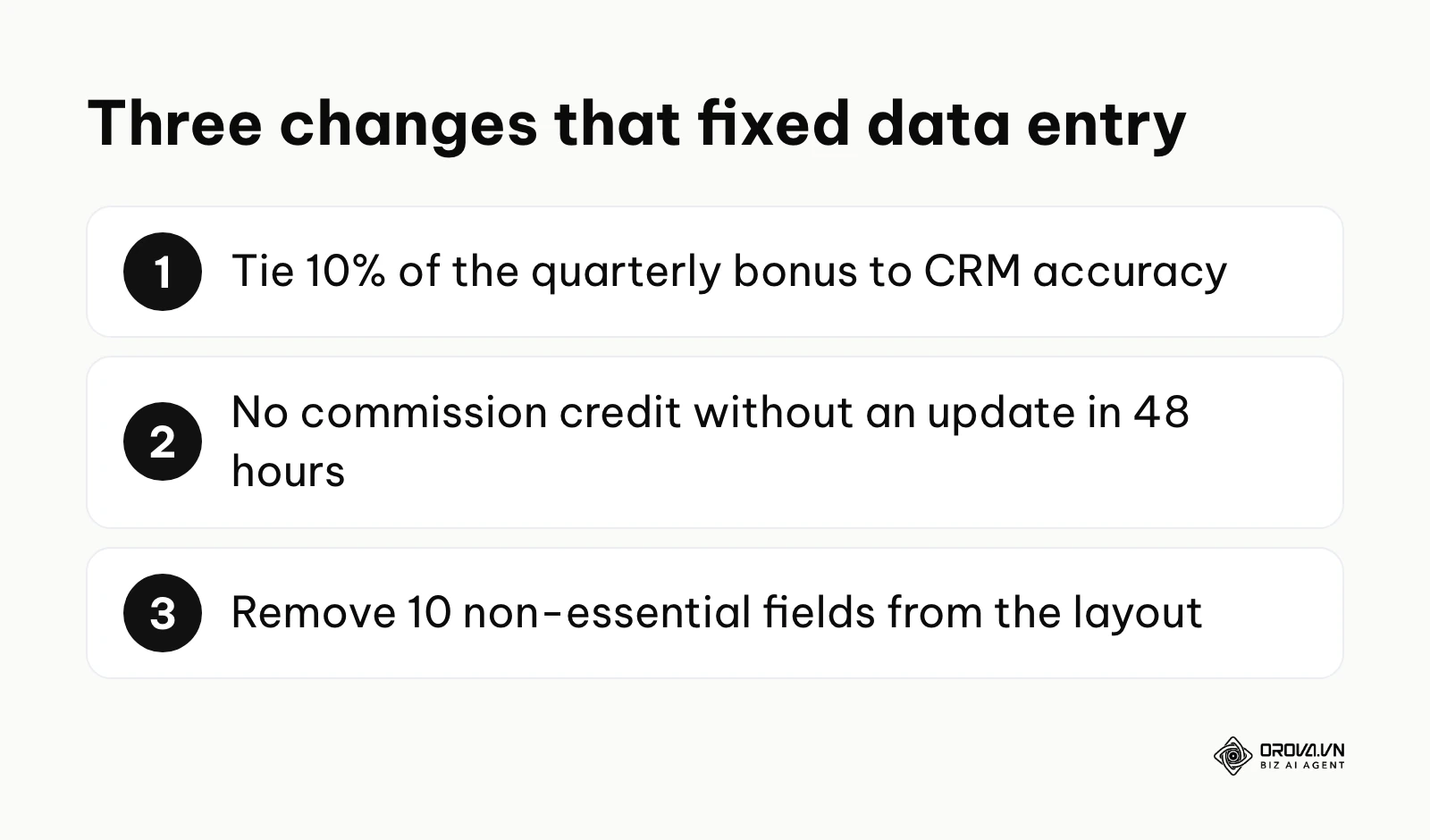
- What they did: First, the director tied a specific 10% portion of the quarterly performance bonus directly to CRM data accuracy scores. Second, they implemented a hard rule that any deal not updated in the CRM within 48 hours of a client interaction would simply not be recognized for commission calculations. Third, they actively simplified the data entry process by removing 10 non-essential, historical fields from the primary opportunity layout.
- Obstacle and fix: Initially, the top-performing representative pushed back aggressively, claiming that administrative data entry was actively wasting their valuable selling time. The director sat down with them individually, demonstrated exactly how the newly automated sales report actually highlighted the representative's exceptionally high conversion rate to the executive board, and adjusted the layout further to require only three absolute critical fields per stage change.
- Result: Within exactly two months, the daily dashboard updates smoothed out perfectly, reflecting genuine day-to-day pipeline movement, and the entire team stopped scrambling to update records on Thursday afternoons.
Addressing legacy systems without APIs
One of the absolute hardest operational questions in modern reporting is dealing with older, proprietary internal software that completely lacks an open API. If you cannot connect your systems directly via standard web protocols, you have to engineer a staging area. This usually involves scheduling an automated email export from the legacy system that contains a CSV file attachment. You then route this email to a specialized parsing tool, which automatically extracts the CSV attachment and pushes the structured row data into a modern cloud database. While this methodology is certainly not as elegant or robust as a direct API integration, it effectively bridges the technological gap and ensures your automated sales report still receives the necessary historical data without requiring a human to manually download and upload files every single day.
How to build an automated sales report: A step-by-step tutorial
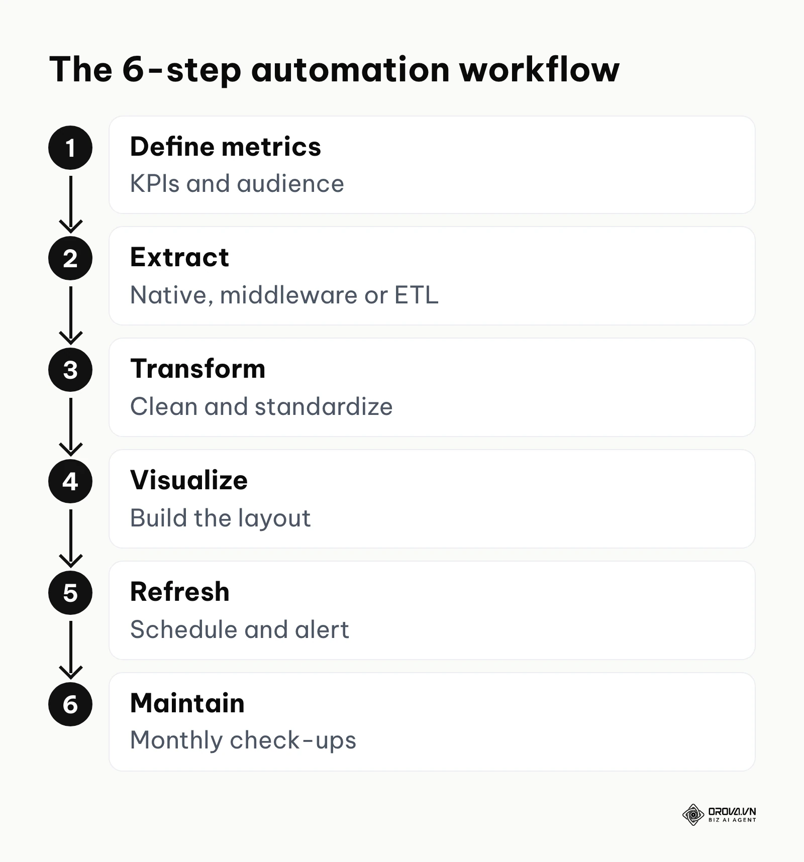
Building a truly reliable automated sales report requires a highly systematic and engineered approach. You are not just creating a pretty chart; you are actively engineering a robust, fault-tolerant data pipeline that must operate flawlessly every single day. If you want to master how to automate sales reports, you must follow these technical steps precisely.
Step 1: Define your metrics and audience
Before touching any software or writing a single line of query code, you must know exactly who will be reading this report and what specific business decisions they need to make based on the data. A C-level executive requires a high-level, aggregated summary of total recognized revenue against quarterly targets, while a front-line sales manager needs highly granular, daily data on individual representative activity metrics, such as call volume and email open rates. List out the exact key performance indicators (KPIs) you need to track. Do you need to measure pipeline velocity, fully loaded customer acquisition cost, or the average deal size broken down by geographic region? Write these requirements down in a document and meticulously map each metric to the specific data fields that currently exist in your source systems. If a metric requires a field that does not exist, you must create it in the CRM before proceeding.
Step 2: Choose the data extraction method
You have to figure out how to get raw data out of your CRM securely and push it into your reporting tool. When engineering this pipeline, you generally have three distinct architectural paths to choose from.
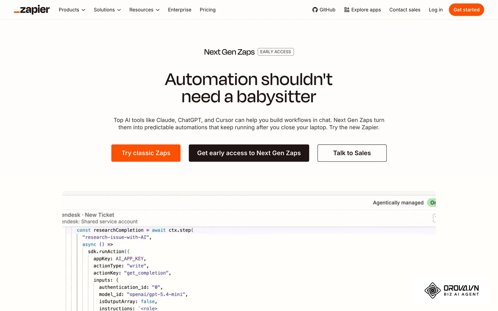
First, native integrations are the absolute easiest route. Major platforms like Salesforce or HubSpot often feature direct, built-in connectors to popular visualization tools, requiring only an OAuth login to authorize the data transfer. Second, if native connectors do not exist, middleware platforms like Zapier allow you to trigger specific data transfers based on precise CRM events, such as a deal officially moving to the "Closed Won" stage. This utilizes webhooks to push data instantly. Third, for highly complex enterprise needs involving millions of rows, you might use a dedicated ETL (Extract, Transform, Load) tool to pull data via REST APIs on a nightly schedule, dumping it into a centralized cloud data warehouse before any visualization occurs.
Step 3: Clean and transform the data
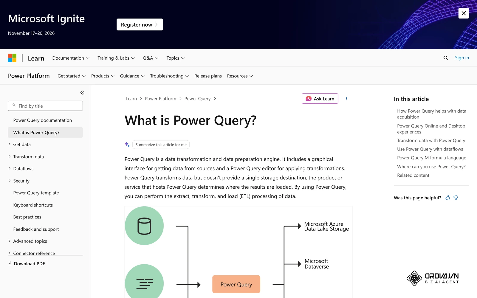
Raw data extracted directly from a source system is rarely ready for immediate visualization. You will almost always encounter data anomalies: duplicate record IDs, empty null fields, or mismatched date formats (e.g., European format versus American format). Transformation involves writing rules to standardize this incoming data automatically. If you are building an automated sales dashboard excel format, this specific step might involve setting up advanced Power Query scripts (using M code) to automatically filter out internal test leads based on email domains, convert every amount to a single base currency using a live exchange rate table, and merge disparate tables from different regional CRMs into one master dataset. You must establish strict programmatic rules that the system applies automatically every single time new data arrives.
Step 4: Build the visualization layout
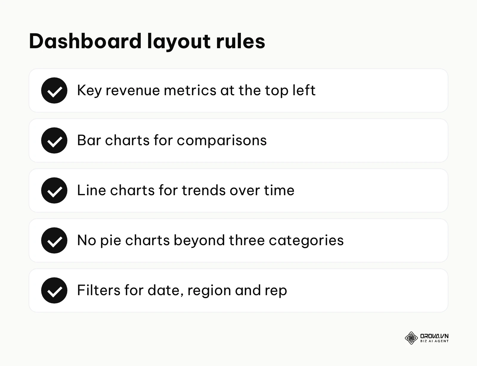
Now you move to designing the actual dashboard interface. The cardinal rule here is absolute clarity over visual complexity. Place your most critical, high-level metrics—usually total recognized revenue and total open pipeline value—at the top left of the screen, as this is where the western human eye naturally goes first. Use simple bar charts for direct comparisons across categories, use line charts strictly for showing trends over time, and fiercely avoid using pie charts if you have more than three categories, as they distort proportional understanding. Ensure your chosen tool allows readers to interactively filter the entire page by date range, geographic region, or specific sales representative. Dashboards that load quickly and keep the number of widgets small are far more likely to be opened regularly by busy business users.
Step 5: Set up the automated refresh trigger
A dashboard is inherently only as good as its most recent successful update. You need to meticulously configure the refresh schedule based strictly on your actual business needs, not just technical capability. Does the automated sales report genuinely need to update every single hour, every day at midnight, or just once a week on Sunday evening? Keep in mind that pulling massive amounts of data too frequently can easily hit your CRM's API rate limits or significantly slow down your source systems during working hours. You must set up a robust alert system that immediately notifies you via an automated email or a Slack webhook if a scheduled data refresh fails. This critical safeguard ensures you never accidentally present a broken or outdated report to your executive team during a board meeting.
Step 6: Maintain and address hidden costs
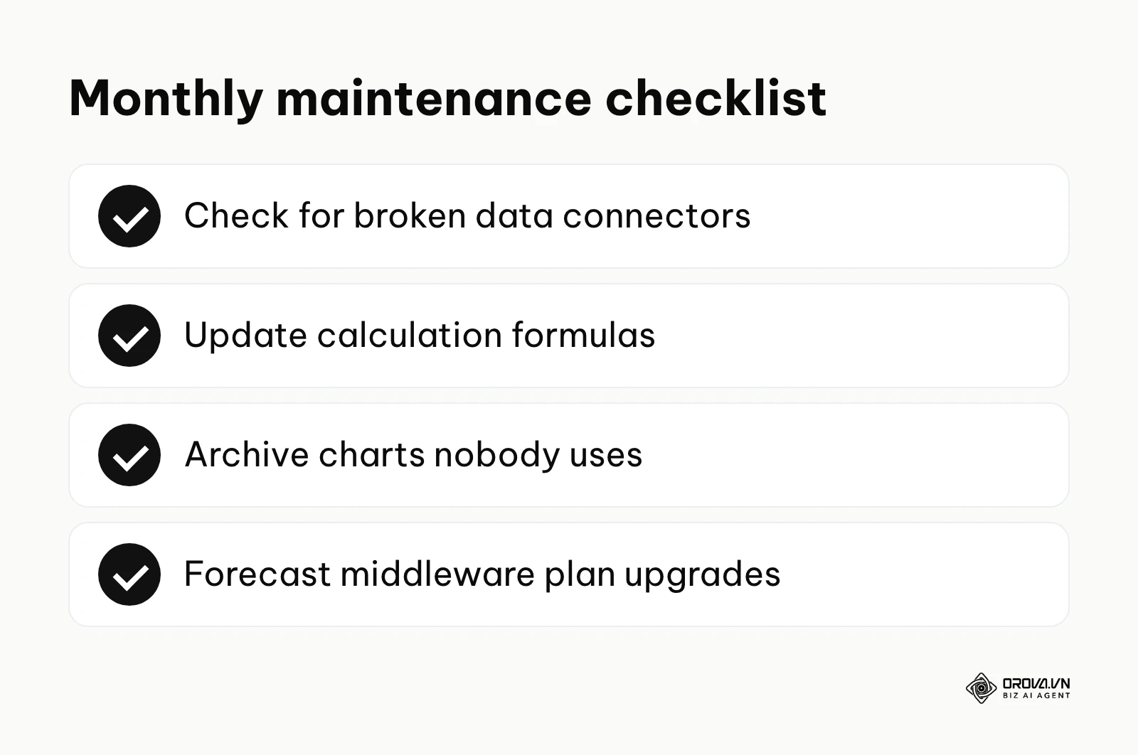
Automation is absolutely not a "set and forget" endeavor. Source APIs are frequently updated or deprecated, custom fields are constantly added to or removed from the CRM by other administrators, and core business definitions inevitably evolve over time. The hidden costs of maintaining an automated sales report include the dedicated hours required to monitor the data pipeline and the recurring monthly subscription costs for API calls or middleware volume tiers. You should schedule a strict monthly maintenance window to actively check for broken data connectors, update complex calculation formulas, and archive obsolete charts that nobody looks at anymore. When your company's data volume grows significantly, you might have to seamlessly upgrade your middleware plan to handle millions of tasks instead of thousands, which is a predictable operational cost you should accurately forecast early in the project.
Turn multi-channel data into instant decisions. OROVA Insight seamlessly connects APIs from Online to Offline, helping you see the full picture of your business through a Real-time chart reporting system.
OROVA Insight: Integrate Online - Offline data, visualize reports in Real-time.
Three automated sales report template blueprints you can use today
To help you completely bypass the blank-page syndrome and start delivering value immediately, below are the logical structures of three essential automated sales report templates. There is no file to download; each one is a blueprint you can replicate in your preferred visualization tool, whether it is a dedicated cloud platform or a highly structured automated sales dashboard excel file.
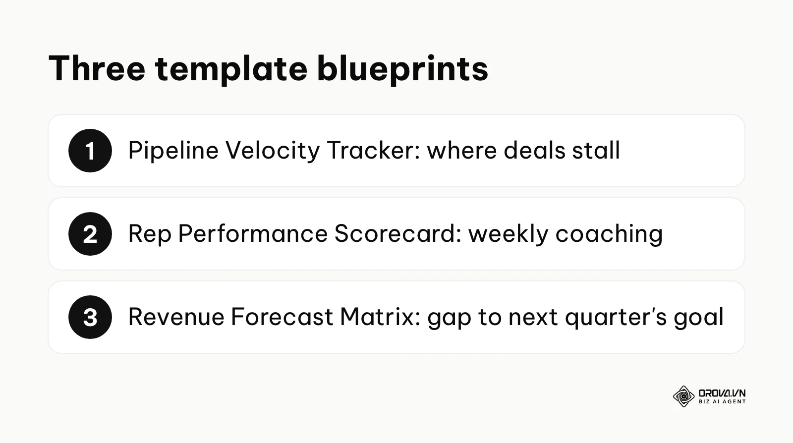
Template 1: The Pipeline Velocity Tracker
This template focuses entirely on the speed of your sales cycle, measuring exactly how fast deals are moving from initial contact to final signature.
- Purpose: To surgically identify operational bottlenecks in your sales process and pinpoint exactly where deals are stalling out and dying.
- Key Elements: A massive summary number showing the average total days to close across all won deals, a horizontal bar chart comparing the average time spent in each individual pipeline stage, and a detailed conditional formatting table listing all stagnant open deals that have not moved stages in over 30 days.
- Implementation Logic: Connect this report to the specific CRM history object that securely logs stage transition timestamps. You must calculate the mathematical difference between the entry date and exit date for each stage, filtering out weekends if necessary to show true business days.
Template 2: The Individual Rep Performance Scorecard
This template aggressively isolates the performance metrics for a single, specific sales professional, removing all team-wide noise.
- Purpose: To guide highly focused weekly one-on-one coaching sessions between a manager and their representative.
- Key Elements: A clear gauge chart showing current quota attainment percentage, a multi-line chart tracking daily leading indicators like outbound calls and personalized emails, and a calculated win/loss ratio metric compared directly against the overall team average.
- Implementation Logic: Use a dynamic, user-level filter based on the viewer's logged-in email address, or provide a simple, prominent dropdown menu at the top of the page to select the representative's name. This selection must dynamically filter the entire underlying dataset to show only their specific assigned records.
Template 3: The Revenue Forecast Matrix
This template shifts the focus from historical data to predictive modeling, predicting future financial performance based on current pipeline coverage and historical conversion rates.
- Purpose: To definitively tell executives if the company is mathematically on track to hit the revenue target next quarter, long before the quarter ends.
- Key Elements: A weighted pipeline calculation (deal value mathematically multiplied by the assigned probability percentage to close), a historical trend comparison against the exact same time period last year, and a prominent gap-to-goal metric showing exactly how much more pipeline needs to be generated.
- Implementation Logic: Ensure your CRM strictly enforces probability percentages at every single stage progression. The report must dynamically multiply the raw deal amount by this specific percentage and sum it up, grouped by the expected close date month, providing a highly realistic view of incoming cash flow.
To make the three blueprints easier to set up side by side, here is how they map to your data:
| Template | Main data source | Core metric | Main chart | Key filter |
|---|---|---|---|---|
| Pipeline Velocity Tracker | CRM stage history (entry and exit dates) | Average days to close | Horizontal bar per stage | Date range, pipeline |
| Rep Performance Scorecard | CRM activities and closed deals | Quota attainment percentage | Gauge plus daily activity lines | Sales representative |
| Revenue Forecast Matrix | Open deals with stage probability | Weighted pipeline vs. target | Monthly bars by expected close date | Quarter, region |
Comparing automated sales reporting tools by business size
Choosing the right software architecture depends heavily on your specific budget, the technical prowess of your operations team, and your overall data complexity. When evaluating automated sales reporting tools, you must carefully consider whether you need a dedicated analytics platform, a simple but effective spreadsheet add-on, or a massive enterprise data solution.
| Tool Category | Primary Function | Core Value for User | Best Fit For |
|---|---|---|---|
| Spreadsheet Add-ons (e.g., Coefficient) | Connect CRM APIs directly to Sheets/Excel | Highly familiar interface with live data | SMBs with tight budgets |
| Middleware (e.g., Zapier) | Push raw data between completely disparate apps | Infinite flexibility without requiring coding | Teams using multiple niche tools |
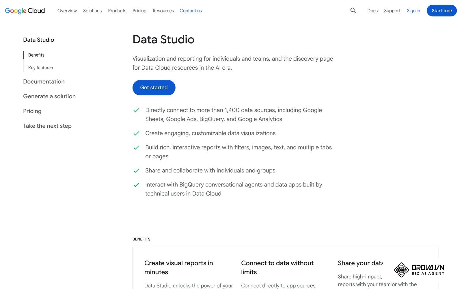
| Dedicated BI Tools (e.g., Looker Studio) | Advanced visualization and complex filtering | Deep customization and secure sharing | Mid-market companies |
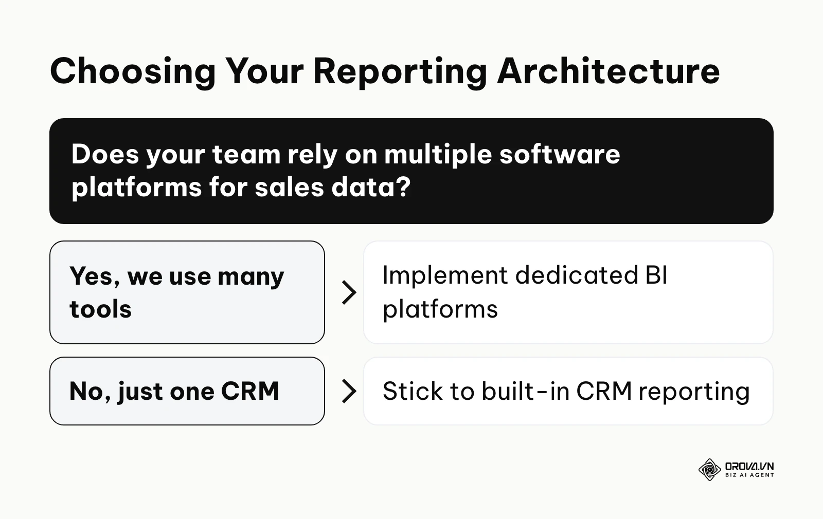
| Built-in CRM Reporting | Native, pre-built dashboards | Absolutely no setup required, instant sync | Companies exclusively using one CRM |
| Enterprise Analytics (e.g., Tableau) | Complex, multi-source data modeling | Handling tens of millions of rows securely | Large corporations |
Spreadsheet Add-ons for the familiar user
If your entire operations team already lives and breathes inside spreadsheets, specialized tools that push live API data directly into specific cells are a fantastic starting point. A well-constructed automated sales dashboard excel setup allows you to continue using highly familiar pivot tables, complex VLOOKUP formulas, and standard conditional formatting. The primary architectural weakness is that traditional spreadsheets can become incredibly slow, unstable, and prone to crashing when handling hundreds of thousands of rows of historical data. However, for a small team, this specific approach provides maximum flexibility with an incredibly minimal learning curve. If you want to truly understand how to structure this underlying data properly without causing the file to crash, reading a comprehensive bi excel dashboard guide is highly recommended to learn about data modeling limits.
Dedicated BI Tools for growing teams
When you inevitably outgrow the row limits and processing power of standard spreadsheets, dedicated Business Intelligence (BI) tools offer a significantly more robust, cloud-based solution. They allow you to build deeply interactive reports where executives can click on a chart and drill down into the specific data points making up that summary. These tools require a bit more technical knowledge to set up the initial OAuth data connections and define the relational models. Their true strength lies in combining data from entirely disparate sources—for instance, seamlessly blending your sales CRM revenue data with your marketing advertising spend to calculate the true, fully loaded customer acquisition cost. If Looker Studio is your pick, our Looker Studio data guide covers connecting and blending sources step by step. Exploring various marketing analytics tools will help you fundamentally understand how BI fits into your broader, company-wide data stack and why separating storage from visualization is crucial.
Built-in CRM Reporting for quick deployment
Most modern, reputable CRMs come equipped with built-in dashboard capabilities right out of the box. If literally all of your sales activities—from emails to contracts—happen strictly within one unified platform, this is often the most reliable and cheapest method. The data stays in sync automatically, there are no external API maintenance costs, and user permissions are already handled. The major operational drawback is a severe lack of flexibility. If you ever need to bring in external financial data from your accounting software or complex marketing metrics, native CRM reports often struggle immensely or require purchasing highly expensive add-on modules. When you evaluate different self service bi tools, you should always carefully compare their external database connection capabilities against your current CRM's rigid native limitations.
Measuring the success of your automated sales report
How do you know if your automated sales report is actually helping your business grow, or if it is just a highly expensive vanity project? You must track specific, measurable usage metrics to ensure the significant technical effort of building the data pipeline actually translates into real operational value. Simply put, if nobody actively looks at the dashboard you built, the automation is completely useless.
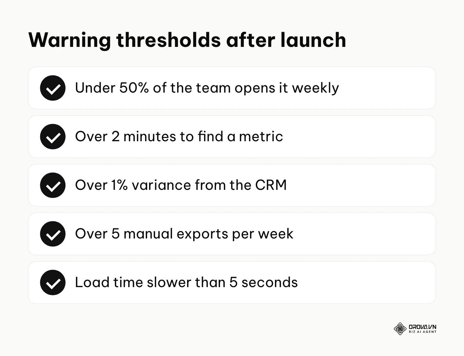
| Success Metric | Meaning and Importance | Warning Threshold |
|---|---|---|
| Weekly Active Users (WAU) | Exactly how many team members open the report weekly | Less than 50% of the sales team |
| Time to Insight | How fast a manager can find a specific required metric | More than 2 minutes of clicking |
| Data Discrepancy Rate | Percentage of records differing from the source CRM | Greater than 1% variance |
| Manual Export Count | Number of times users still export CSVs manually | More than 5 exports per week |
| Dashboard Load Time | How long it takes for all charts to render completely | Slower than 5 seconds |
You should measure these specific metrics obsessively for the first three months directly after your official launch. You can usually check the active user login count and view duration in the administrative backend console of most enterprise reporting platforms. If the manual export count remains stubbornly high week after week, it means your automated sales report is fundamentally failing to provide a critical data field that users still need to calculate their numbers manually. The time to value for these automated systems should be remarkably fast; within four weeks of deployment, your sales managers should officially report a highly noticeable reduction in their administrative workload, allowing them to spend more time actively coaching their representatives.
No more lag in data management. Unlock the power of the OROVA Insight system to sync O2O (Online-to-Offline) data flows and visualize every report in real time.
OROVA Insight: Integrate Online - Offline data, visualize reports in Real-time.
Common mistakes when setting up an automated sales report
Even highly experienced revenue operations managers can make critical, structural errors when deploying these complex systems for the first time. Avoiding these specific operational pitfalls will save you countless hours of frustrating troubleshooting and prevent a catastrophic loss of trust from your executive team.
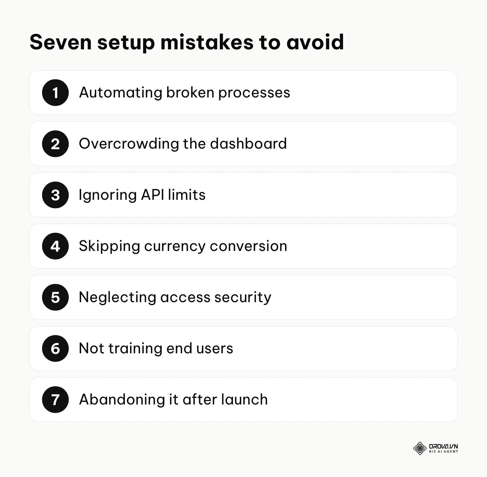
First, automating fundamentally broken processes. If your sales team is currently calculating their manual discounts incorrectly due to a lack of policy, aggressively automating that specific calculation will just produce wrong numbers at a massive scale. You must standardize the underlying business logic entirely before building the data pipeline.
Second, overcrowding the dashboard interface. Putting twenty different, brightly colored charts on a single page makes the automated sales report visually overwhelming and functionally impossible to read. The immediate consequence is that busy executives will simply ignore it. The fix is to strictly separate reports by operational function—build one clean tab for pipeline velocity, one for individual activity, and one for forecasted revenue.
Third, ignoring source system API limits. Most commercial CRMs strictly limit exactly how many times you can pull or push data per day based on your subscription tier. If you aggressively set your dashboard to refresh its data every single minute, you will quickly hit the hard limit, causing the integration to fail entirely and potentially locking your team out of the CRM. The technical fix is to schedule data updates only when genuinely necessary, typically once an hour or overnight via a batch process.
Illustrative example: hitting CRM API limits
Illustrative example: Dealing with API limits in a fast-growing digital agency.
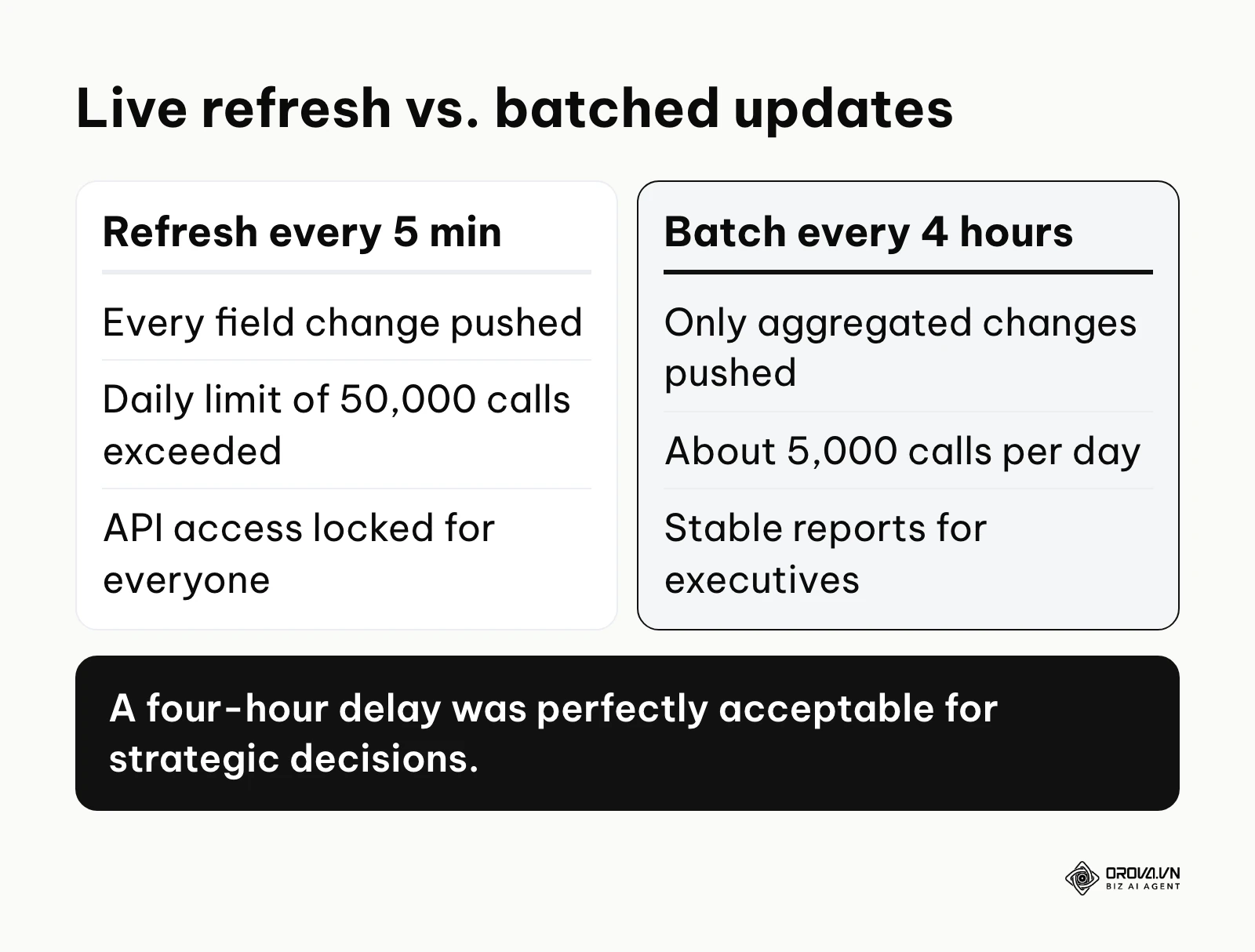
- Context: An ambitious operations manager at a rapidly scaling digital agency connected their enterprise CRM to a new BI tool to track 50 sales representatives. Wanting a "wallboard" experience, they set the automatic refresh rate to every 5 minutes to get a live view of the sales floor.
- What they did: They used a highly popular middleware tool to push every single minute field change directly to the dashboard's cloud database. They built incredibly complex charts tracking minute-by-minute call activity and email opens.
- Obstacle and fix: By noon on the third day of deployment, the CRM automatically locked their API access entirely because they vastly exceeded their strict daily limit of 50,000 calls. The entire company instantly lost access to all automated reports. The manager had to urgently contact CRM support to unlock the account, then completely reconfigured the middleware to batch the updates and only push aggregated changes once every four hours.
- Result: The API calls immediately dropped to a highly manageable 5,000 per day, the system stabilized permanently, and the executive team realized that a four-hour data delay was perfectly acceptable for their strategic decision-making process.
Currency, security, training and upkeep
The remaining four mistakes surface after launch, when the report meets real users and real data.
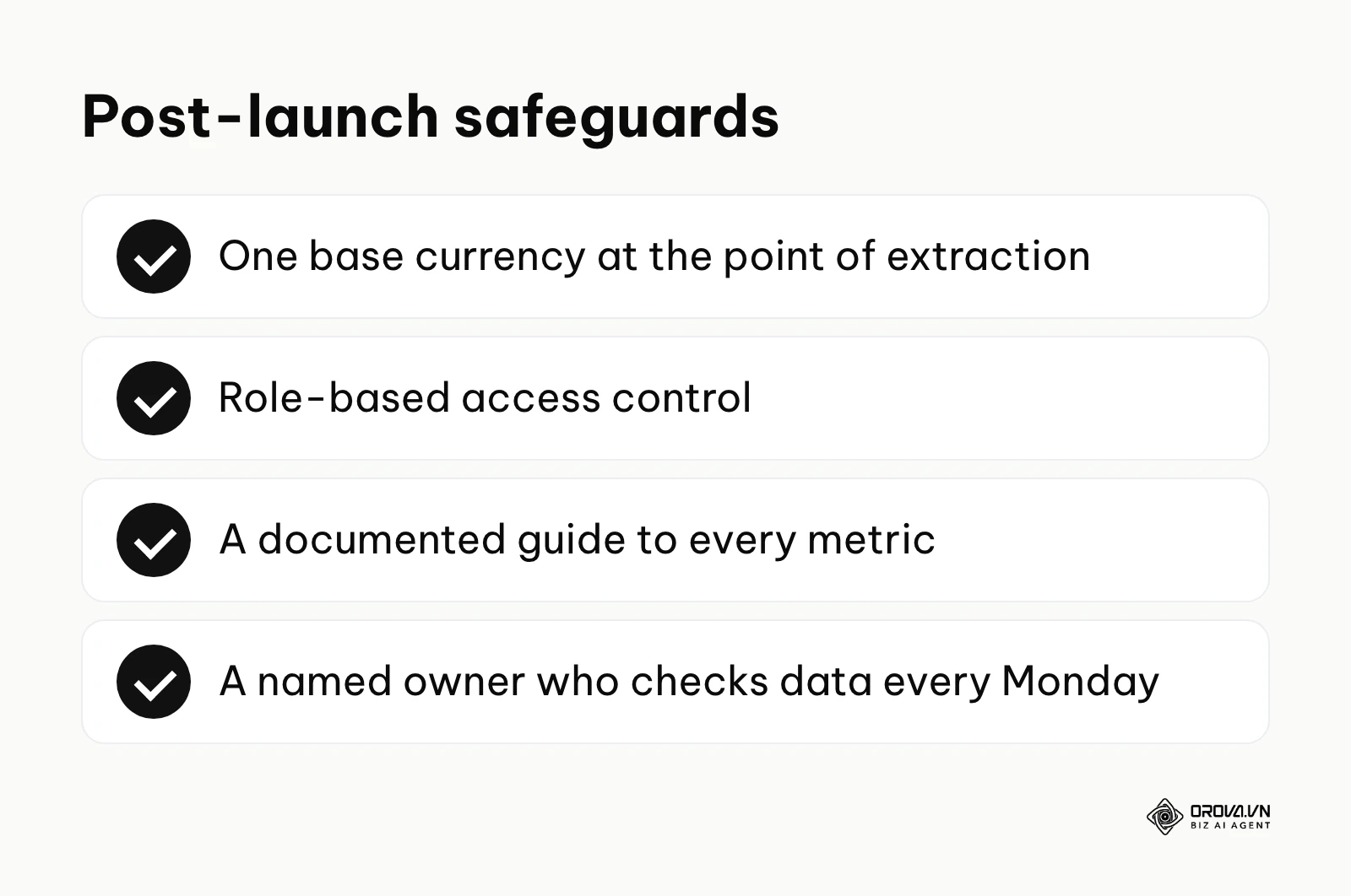
Fourth, failing to account for multi-currency conversions. If you have a global team selling across borders, simply adding up deals in Euros, Yen, and US Dollars without a dynamic conversion table will result in a completely meaningless total revenue number. You must always standardize the financial data to a single base corporate currency precisely at the point of extraction.
Fifth, neglecting data access security protocols. An automated sales report almost always contains highly sensitive financial and revenue data. If you carelessly share a public, unauthenticated link to the dashboard, literally anyone on the internet can see your company's financial health. Always implement strict role-based access control (RBAC) to ensure representatives only see their own data, while only executives see the aggregated totals.
Sixth, forgetting to train the end users. You cannot just send a URL link in an email and expect people to intrinsically understand how to interpret a complex scatter plot. You must provide a comprehensive, documented guide explaining exactly what each specific metric means, how it is calculated, and what specific actions to take when a number turns red. If marketing shares the same dashboard, our marketing report guide shows how to explain campaign metrics so they sit alongside your sales numbers without confusing anyone.
Seventh, abandoning the dashboard immediately after launch. An automated pipeline requires active gardening. If you build it and never check the underlying queries again, minor changes in the CRM (like a renamed custom field) will silently break the charts. Assign a specific owner who is responsible for checking the data integrity every single Monday morning.
Automated sales report trends in the next few years: My perspective
The landscape of business reporting is shifting rapidly as underlying data technology fundamentally evolves. Based on the tools and workflows emerging as of 2026, here is exactly how I view the future of data automation in sales operations.
Generative AI will reduce manual dashboard building
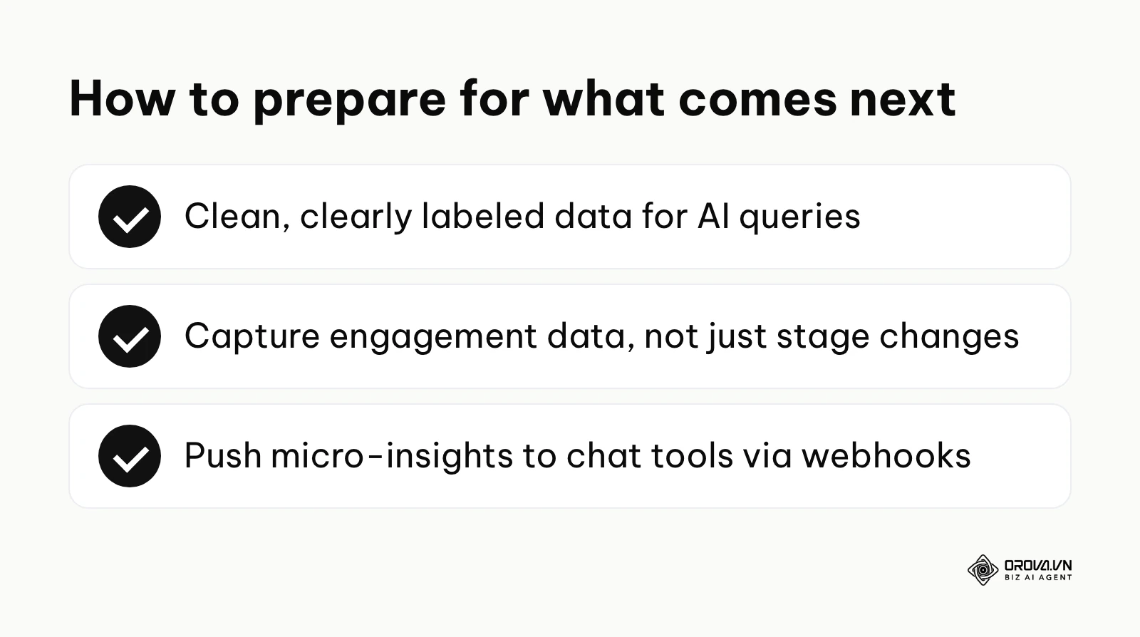
We are already seeing the aggressive integration of natural language processing directly into business intelligence tools. I believe that within the next few years, the traditional, manual process of dragging and dropping fields onto a canvas to build an automated sales report will become far less common. Instead, managers will increasingly type or speak, "Show me the pipeline velocity for the enterprise team in Q3 compared to last year," and the system will generate a suitable visualization for them to review. You should prepare for this massive shift right now by ensuring your raw data is impeccably clean and clearly labeled, as AI models rely heavily on descriptive, standardized column headers to understand context accurately.
Predictive analytics will become standard, not a luxury
Currently, the vast majority of sales reports look strictly backwards, telling you exactly what happened last month. I think the industry focus will shift heavily toward predictive modeling. Automated systems will actively analyze historical win rates, seasonal trends, and current engagement signals to flag which specific deals in the pipeline are mathematically at risk of slipping. This means the automated sales report will transition from a simple historical ledger to a highly prescriptive tool that explicitly tells representatives who they must call next to save a deal. To get ready for this, you must start capturing deep engagement data—like exact email open times and meeting attendance rates—not just basic stage changes.
The rise of embedded analytics in everyday workflows
I expect that large, standalone dashboard portals will gradually lose ground in favor of embedded micro-insights. Modern sales professionals simply do not want to open a separate, heavy browser tab to check their numbers. The automated sales report will be integrated directly into their existing email client, their internal Slack channels, and their video meeting interfaces. The data will actively find the user when they need it, rather than the user seeking the data. If my prediction holds true, operations teams should focus immediately on learning how to push highly specific micro-insights via webhooks directly to communication tools, rather than spending months building massive, centralized dashboard portals that nobody logs into.
Frequently asked questions about automated sales report
How much does it really cost to set up an automated sales report?
The financial cost varies wildly depending on your chosen architectural approach. A simple automated sales dashboard excel setup using native, lightweight add-ons usually involves only modest monthly connector fees. However, deploying an enterprise-grade ETL pipeline, a cloud data warehouse, and a dedicated BI platform for a large team requires a far larger annual budget for software licenses and maintenance hours.
Can AI completely automate my sales reporting process?
As of 2026, AI is incredibly powerful for generating visual charts, summarizing trends, and even writing complex database queries, but it cannot fix fundamentally broken human data entry processes. AI can analyze the data and build the automated sales report quickly, provided the underlying pipeline is structured correctly. It acts as a massive accelerator for analysis, not a complete replacement for strict data hygiene and operational discipline.
What should I do if my CRM does not have an open API?
If you completely lack an API, you cannot build a true, system-to-system automated sales report. You must rely on scheduled email exports containing static CSV files, which are then parsed by a middleware tool and pushed into your database. Alternatively, some older legacy systems require robotic process automation (RPA) tools to physically scrape the screen data, though this methodology is highly fragile, breaks often when the UI changes, and should absolutely only be a last resort.
How often should an automated sales report actually be updated?
Most B2B sales teams genuinely only need their data updated every few hours or once a day overnight. True real-time, second-by-second updates are rarely necessary unless you are running a massive, high-volume consumer call center. Over-refreshing data can also lead to analysis paralysis, where managers overreact to meaningless daily fluctuations instead of focusing on broader, strategic weekly trends.
Where should you start?
Taking the very first step toward complex automation can feel overwhelming, but you absolutely do not have to build an enterprise-grade system on day one. Your ideal starting point depends entirely on the current state of your raw data and your team's technical comfort level.
If your team is currently tracking valuable deals in highly disorganized, manual spreadsheets saved on local hard drives, your very first step is to implement a basic, cloud-based CRM and ruthlessly force adoption. Do not even worry about building an automated sales report yet. Spend one focused afternoon configuring exactly three required deal stages and formally move your existing spreadsheet data into the CRM environment. Until your data is centralized and standardized, automation is literally impossible.
If you already have a functional CRM but still find yourself manually exporting CSV data every Friday afternoon to build pivot tables, your next step is to explore a native integration. Spend two hours this week actively searching your CRM's official app marketplace for a direct, native connector to your preferred spreadsheet tool. Establish a simple automated sales dashboard excel file that automatically syncs just one metric: your total recognized revenue number. Proving that this incredibly simple connection works flawlessly will build the necessary confidence to tackle more complex setups later.
If you already have basic charts working but desperately want to leverage advanced metrics and AI capabilities without wrestling with complex code or managing API tokens, your best move is to evaluate modern platforms explicitly designed for seamless integration. You can connect your various systems, structure your core metrics, and let the software handle the heavy lifting behind the scenes, allowing you to finally focus on high-level revenue strategy rather than spending countless hours maintaining your automated sales report infrastructure.
About the author

Builder of Orova
Nguyễn Đỗ Trọng Ân has 8 years of experience in marketing, including 6 years managing market development across Asia. He builds Orova, a Biz AI Agent that never sleeps: it plans, runs and optimizes work for businesses.
Run your business with AI Agents
Orova is the always-on Biz AI Agent — it plans, runs, and optimizes the work for you.
Save time, unlock productivity.