
Self service BI tools in 2026: the real TCO and implementation guide

The modern business landscape moves incredibly fast, and waiting two full weeks for an overstretched data engineering team to pull a simple performance report is no longer a viable strategy. That is exactly why almost every growing company eventually looks into self service bi tools: platforms that let non-technical people explore data and build their own dashboards without writing SQL or waiting on engineers. The promise is highly attractive: democratize your data, empower your marketing and sales teams, and allow anyone to build a dashboard with a few clicks. However, the reality of implementing these systems is often far more complex than the marketing brochures suggest.
When organizations simply buy a software license and hand it over to their staff without a solid underlying strategy, the result is usually absolute chaos. Teams end up creating hundreds of conflicting reports, measuring the same metrics differently, and ultimately losing trust in the data entirely. This comprehensive guide is designed to walk you through the reality of these platforms. We will break down exactly how to prepare your organization, calculate the true total cost of ownership, avoid the most expensive implementation mistakes, and deploy a framework that actually drives measurable business value.
What are self service bi tools and when should you avoid them?
Self service bi tools are specialized software platforms that allow non-technical business users to access, explore, analyze, and visualize corporate data without needing to write complex SQL queries or rely heavily on dedicated data engineers. They bridge the gap between raw database storage and actionable business insights. You should avoid rolling them out entirely if your company does not yet have centralized data governance, relies entirely on fragmented spreadsheets, or lacks a clear definition of core business metrics.
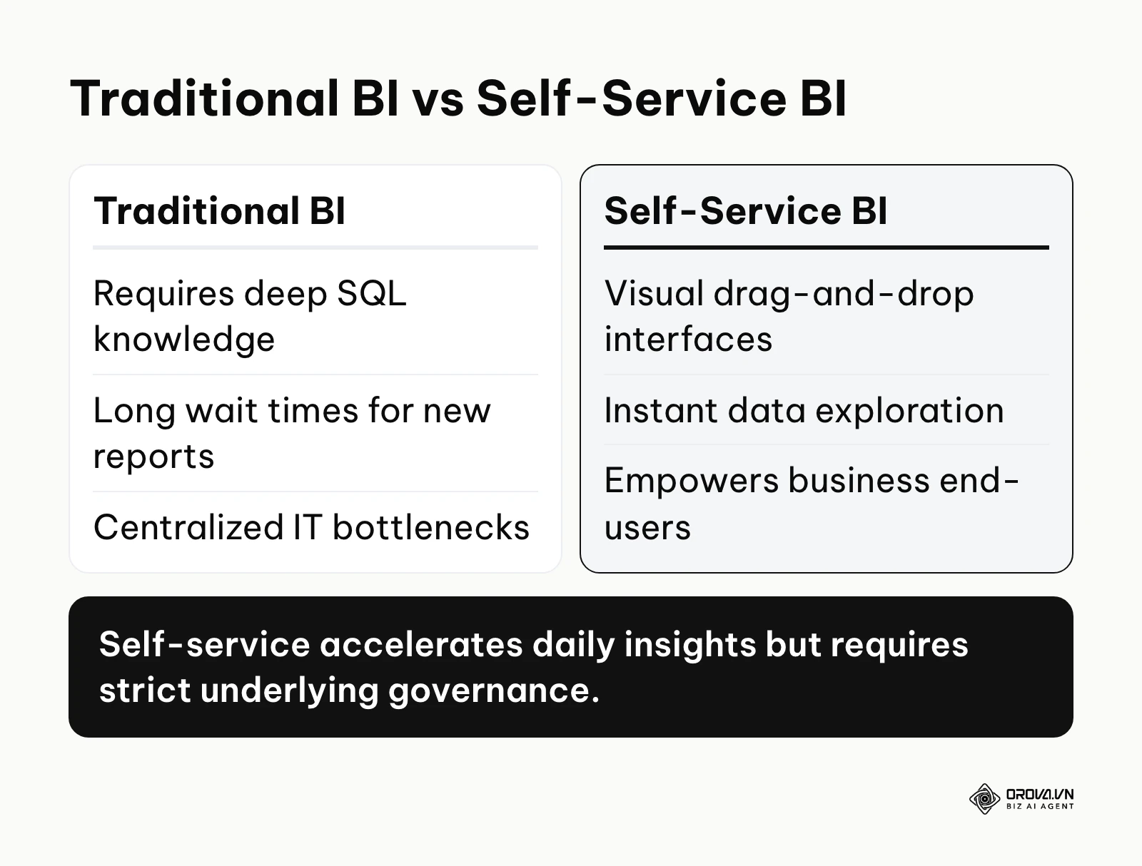
Traditionally, business intelligence required a rigid, linear pipeline. A marketing manager would submit a ticket requesting a specific report. A data analyst or engineer would then write the necessary SQL code to extract the data, transform it, load it into a visualization tool, and finally present it back to the manager. If the manager needed to view the data from a slightly different angle—perhaps filtering by a different region or adjusting the date range—they had to submit a brand new ticket and wait again. Self-service platforms flip this model. The data engineers focus solely on building a clean, secure data foundation in the background. Once that foundation is set, the business users are given intuitive, drag-and-drop interfaces to build their own charts, manipulate variables, and discover insights in real time.
However, the democratization of data is a double-edged sword. If you give a team of fifty people access to raw data without defining strict rules, you will quickly end up with fifty different definitions of "monthly revenue." These tools are powerful engines, but they require a properly paved road to drive on. If your organization is currently struggling with disorganized data silos, implementing a self-service visualization layer will only visualize your underlying mess faster.
Is your data ready? The preparation checklist
Before you even begin evaluating software vendors or requesting product demos, you must take a hard look at your internal data infrastructure. The most sophisticated visualization software in the world cannot generate accurate insights from broken, duplicated, or missing data.
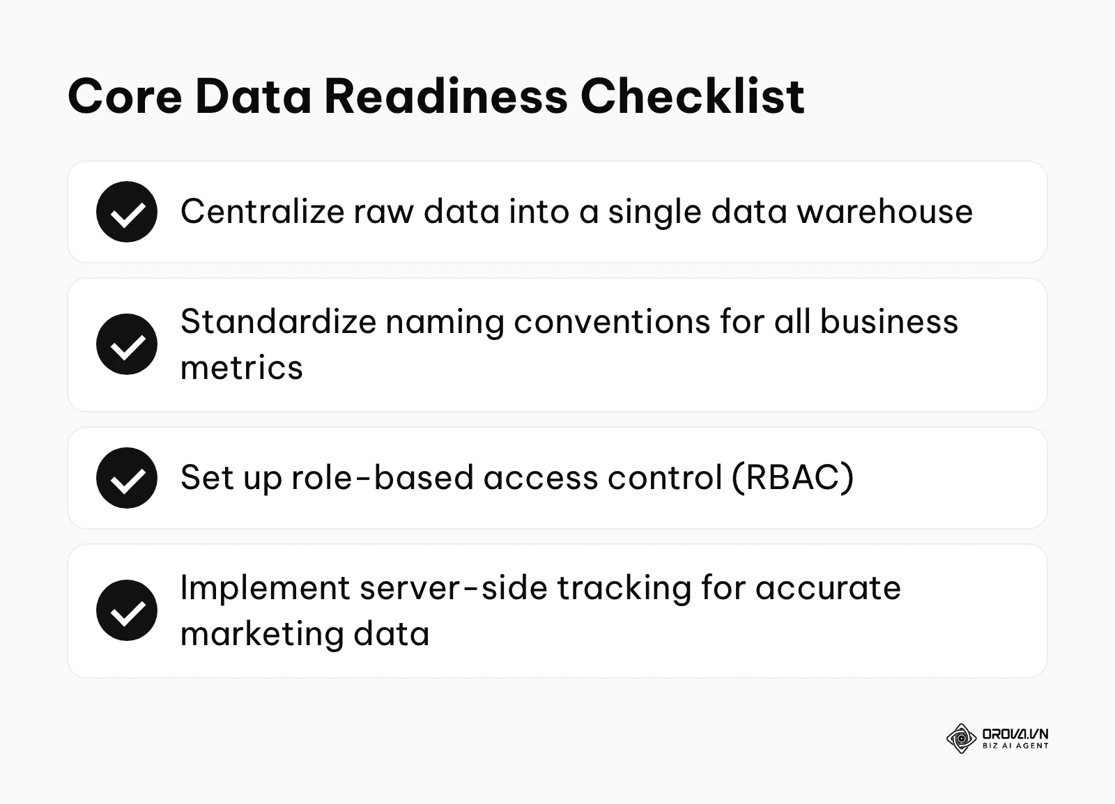
To determine if your organization is truly ready to implement a self-service model, you need to evaluate four critical pillars of data readiness. Skipping this preparation phase is the leading cause of abandoned BI projects, as users will quickly abandon a tool if they find the data inside it to be unreliable or constantly out of date.
| Readiness Component | The Purpose It Serves | Where to Get It / How to Build It | Estimated Prep Time |
|---|---|---|---|
| Centralized Data Warehouse | Acts as the single source of truth for all company data | Cloud platforms like Google BigQuery, Snowflake, or Amazon Redshift | 4 to 8 weeks |
| Standardized Naming Conventions | Ensures everyone speaks the same language (e.g., standardizing "Client" vs "Customer") | Internal documentation created by a cross-functional data committee | 2 to 3 weeks |
| Role-Based Access Control (RBAC) | Prevents unauthorized users from viewing sensitive financial or HR data | Security settings within your data warehouse and identity provider | 1 to 2 weeks |
| Server-Side Tracking | Ensures accurate marketing data collection despite browser privacy restrictions | Implementing solutions like the Conversion API | 2 to 4 weeks |
First, you must assess whether your data is centralized. If your marketing data lives inside Facebook Ads, your sales data lives inside Salesforce, and your financial data lives in QuickBooks, a self-service tool will struggle to provide holistic insights. You need a data pipeline that extracts this information from the source systems and loads it into a centralized warehouse.
Next, you must evaluate the cleanliness of that data. Are there thousands of duplicate contact records? Are date formats completely inconsistent across different regions? Data cleaning is a tedious but absolutely necessary prerequisite. If users generate a report and immediately spot obvious errors, they will lose faith in the system and revert to their old manual spreadsheets. Establishing strict governance protocols and preparing your data infrastructure is not just an IT task; it is a foundational business requirement.
The 90-day self service BI implementation blueprint
Successfully rolling out an analytics platform across a company requires a methodical, phased approach. Trying to launch everything at once inevitably leads to overwhelmed users and system crashes. This 90-day blueprint provides a structured timeline to transition your organization from manual reporting to a fully functioning self-service culture.
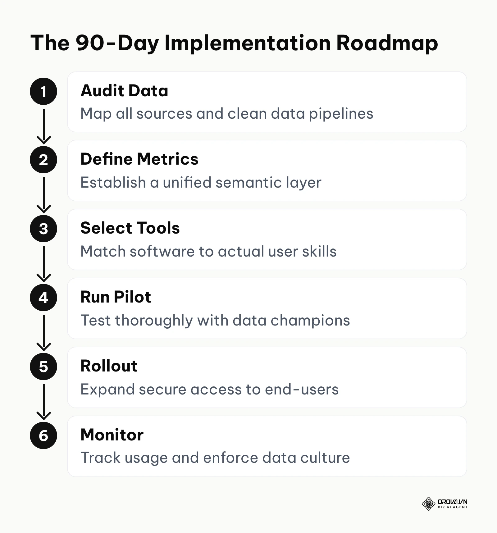
Step 1: Audit and consolidate your data sources (Days 1–15)
The very first action you must take is to conduct a comprehensive audit of every single place your company currently stores valuable data. You need to map out the entire ecosystem.
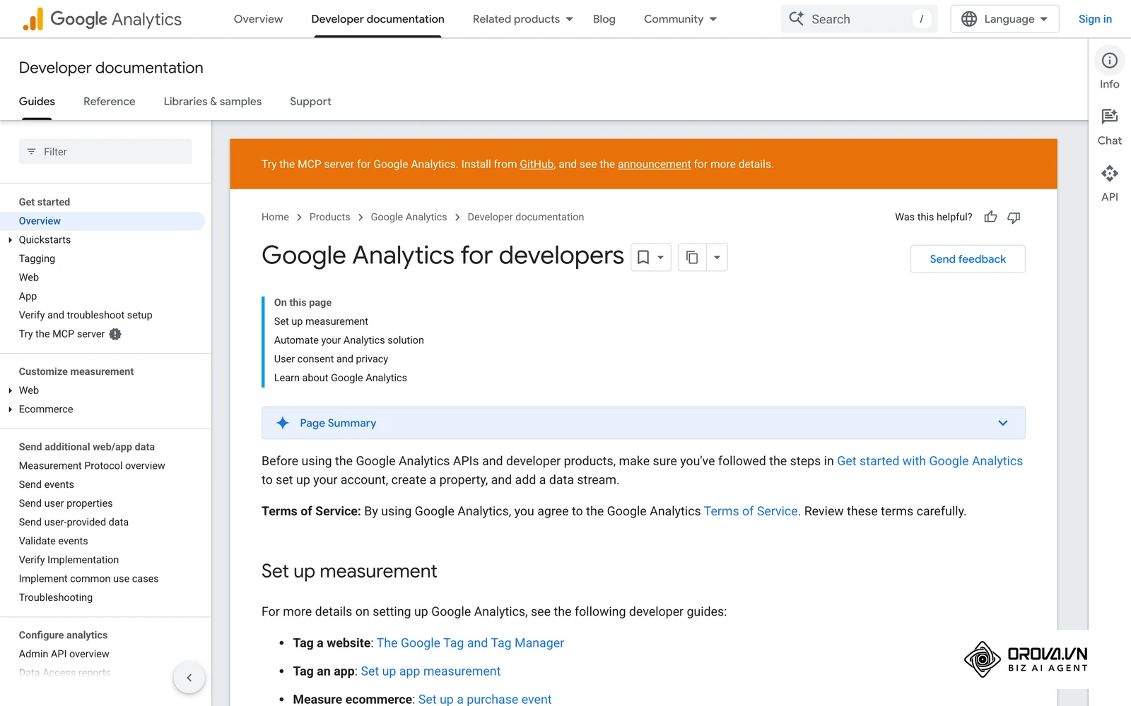
Start by interviewing department heads to understand what platforms they use daily. A marketing team might use Google Analytics 4, HubSpot, and LinkedIn Ads. The customer success team might rely heavily on Zendesk. You must document the exact source, the owner of that platform, and the frequency at which the data is updated. Once the map is complete, your data engineering team must set up automated extraction pipelines to pull this raw data into your central warehouse.
A clear sign that you are executing this step correctly is the creation of a comprehensive "Data Dictionary"—a living document that catalogs every data source, its owner, and how often it refreshes. The most common mistake during this phase is attempting to integrate every single obscure software tool the company owns. Instead, strictly prioritize the top five platforms that drive 80% of your core business decisions.
Step 2: Define core metrics and establish governance (Days 16–30)
Once the raw data is flowing into your warehouse, you must build the semantic layer. The semantic layer is essentially a translation engine that converts complex database jargon into plain business English.
During this phase, leadership from all departments must sit down and agree on absolute definitions for critical metrics. If the marketing team defines a "lead" as anyone who downloads a whitepaper, but the sales team defines a "lead" as someone who has requested a pricing demo, your reporting will always be fundamentally broken. You must clearly establish and document marketing dashboard KPIs that the entire company agrees upon.
You will know this step is successful when you have a locked, centralized glossary of formulas. For example, the formula for Customer Acquisition Cost (CAC) must be coded directly into the semantic layer so that no matter who builds a chart, the underlying math remains identical. A major error here is allowing individual departments to maintain their own separate definitions, which defeats the entire purpose of centralized intelligence.
Step 3: Select the right tools for your specific roles (Days 31–45)
With clean data and clear definitions in place, you can finally evaluate software. The critical objective here is matching the complexity of the software to the actual technical literacy of your end-users.
Create a diverse evaluation committee consisting of a data engineer, a marketing manager, a sales director, and a finance analyst. Ask the vendors to provide a sandbox environment using a small sample of your actual company data, rather than their perfectly polished demo data. Have your marketing manager attempt to build a basic campaign performance chart without any assistance. If they cannot accomplish this within thirty minutes, the tool is likely too complex for general self-service.
Success in this phase is defined by choosing a platform that balances deep analytical power for the data team with an intuitive interface for the business users. The biggest trap organizations fall into is letting the IT department choose the tool in total isolation. IT will almost always select the most technically complex, developer-centric platform, completely alienating the business users who are actually supposed to use it daily.
Step 4: Run a pilot program with data champions (Days 46–60)
Never roll out new software to the entire company simultaneously. You must begin with a carefully controlled pilot program utilizing a small group of "data champions."
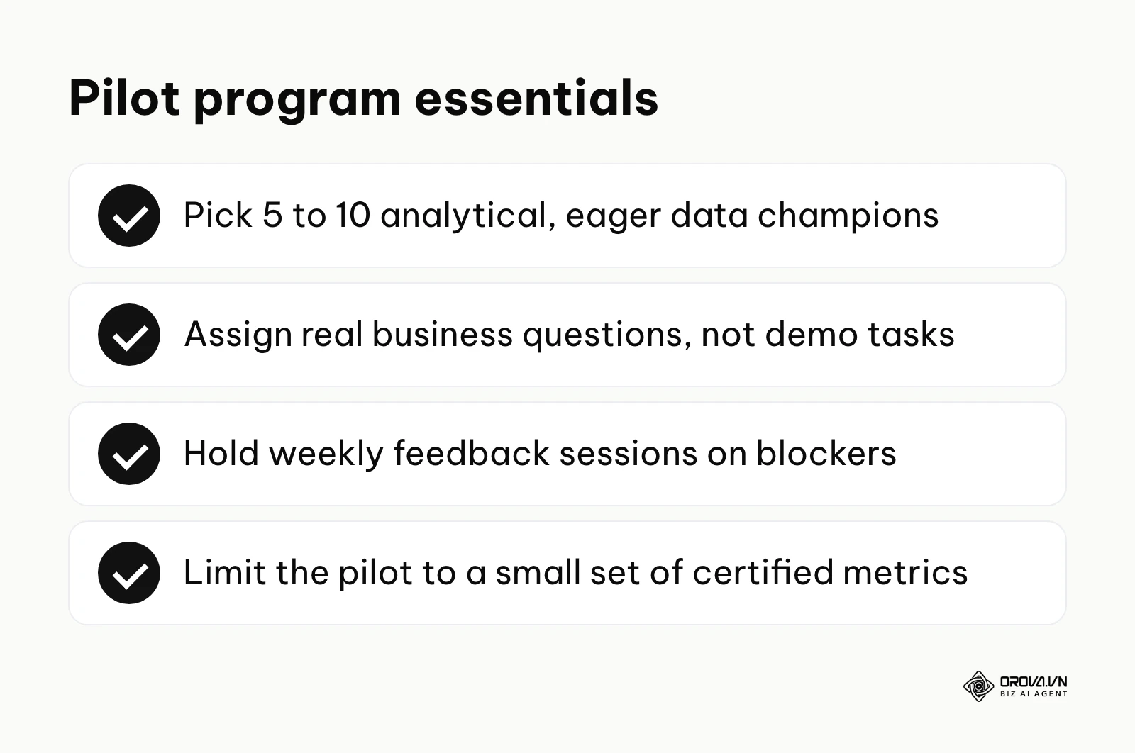
Identify five to ten individuals across different departments who are already highly analytical and eager to improve their workflows. Grant them access to the new self-service environment and assign them specific, real-world business questions to answer using the tool. Hold weekly feedback sessions to observe where they get stuck, which features they find confusing, and whether the data is loading fast enough.
You will recognize a successful pilot when these champions begin voluntarily using the platform for their daily work instead of their old methods, and start eagerly showing their new dashboards to their colleagues. A common mistake is selecting participants who are highly resistant to change for the pilot. The goal of a pilot is to test the system mechanics and build initial momentum, not to fight deep-rooted organizational friction.
Illustrative example: A mid-sized retail company rolling out a new analytics strategy to its marketing team. First, the data engineering team connected their regional sales data and digital ad spend into a central warehouse. Next, they selected five enthusiastic marketing coordinators as data champions to test the new visual interface. The major hurdle they encountered was that the champions were completely overwhelmed by the sheer number of available dimensions and metrics, leading to immediate analysis paralysis. To fix this, the data team temporarily restricted the pilot environment to just 15 core, certified metrics. The result was a highly focused set of initial reports, and the pilot group successfully built three crucial weekly performance trackers that entirely replaced their old manual spreadsheets.
Step 5: Roll out marketing dashboard software and reports to end-users (Days 61–75)
After a successful pilot, it is time for the broader organizational rollout. This phase requires heavy emphasis on structured training and user onboarding.
Do not simply send out a mass email with login credentials. You must host mandatory, role-specific training sessions. A financial analyst needs very different training than a social media manager. To lower the barrier to entry, the data team should pre-build a suite of highly polished, template dashboards covering the most common business questions. End-users can then simply duplicate these templates and modify the filters, rather than staring at a blank, intimidating canvas.
A clear indicator of success is a rapid increase in system logins and the number of distinct users viewing reports each week. The most dangerous mistake during rollout is granting full "edit" and "delete" permissions to every single user. You must implement strict access tiers: the vast majority of users should be "Viewers" or "Explorers," while only a trained subset should have "Creator" rights to publish company-wide dashboards.
Step 6: Establish an ongoing data culture and monitor usage (Days 76–90)
The final step of the blueprint is acknowledging that a BI implementation is never truly finished; it transitions into an ongoing operational lifecycle.
Organizations that pair strict data governance with their analytics rollout tend to sustain adoption far better than those that simply deploy software and walk away. You must actively monitor the metadata of the platform itself. Look at which dashboards are viewed daily and which have not been opened in three months. Set up a dedicated internal communication channel (like a Slack or Teams channel) specifically for users to ask data-related questions and share interesting findings.
Success is achieved when users begin answering each other's questions and proactively suggesting new metrics to add to the semantic layer. The failure point here is treating the platform as a static project. If the data team stops maintaining the pipelines or fails to archive obsolete reports, the system will slowly degrade into a chaotic mess of untrusted numbers.
Turn multi-channel data into instant decisions. OROVA Insight seamlessly connects APIs from Online to Offline, helping you see the full picture of your business through a Real-time chart reporting system.
OROVA Insight: Integrate Online - Offline data, visualize reports in Real-time.
Deep dive: Categorizing self service BI tools by real use cases
The software market is saturated with platforms all claiming to be the ultimate solution for every business. In reality, the architecture and intended audience of these tools vary wildly. Categorizing them accurately by their real-world use cases is critical for making an informed purchasing decision.
| Category of Tool | Target User Profile | Key Strengths | Major Weaknesses |
|---|---|---|---|
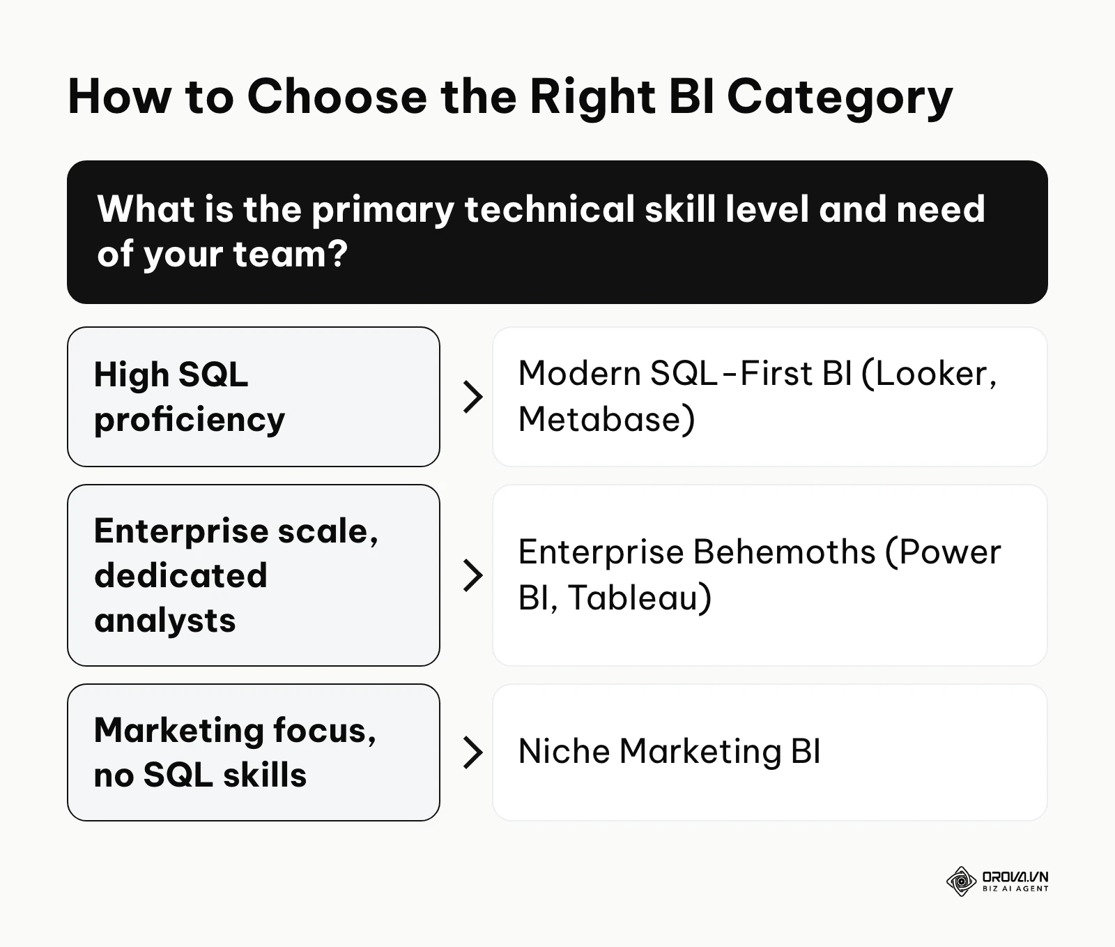
| Enterprise Behemoths (e.g., Power BI, Tableau) | Data analysts, enterprise IT, power users | Incredible depth of visualization, massive scale | Very steep learning curve, requires heavy IT setup |
| Modern SQL-First BI (e.g., Looker, Metabase) | Data teams, SQL-literate product managers | Strong version control, centralized code-based semantic layer | Business users struggle to build complex queries independently |
| Niche Marketing BI (e.g., Orova, Supermetrics) | Marketers, agency account managers | Direct API connections, no SQL required, fast setup | Cannot handle complex data science modeling or deep predictive analytics |
The first category consists of the Enterprise Behemoths. These platforms are incredibly powerful and can handle massive, complex datasets involving millions of rows. They offer pixel-perfect visualization customization. However, they are fundamentally designed for data professionals. If you expect a standard marketing coordinator to jump into these platforms and build a multi-table relational join, you will be deeply disappointed. They require extensive training and are best suited for large corporations with dedicated analytics departments.
The second category is Modern SQL-First BI. These tools revolutionized the industry by introducing the concept of a code-based semantic layer. Data engineers define the metrics centrally using a proprietary modeling language, ensuring total consistency across the company. While they offer a cleaner interface than the enterprise behemoths, their core architecture is still deeply rooted in SQL logic. They are fantastic for tech-savvy organizations and product teams, but purely non-technical staff often find them intimidating when they need to build something from scratch.
The third category encompasses Niche Marketing BI and embedded solutions. These are highly specialized marketing reporting tools built specifically for speed and ease of use. They bypass the need for a heavy data warehouse by connecting directly to APIs (like Facebook Ads or Google Analytics) and pulling the data into pre-built visualization templates. They are a strong fit for marketing agencies or internal marketing teams that need immediate visibility into campaign performance without waiting for IT. While they lack the deep, cross-departmental data modeling capabilities of the larger platforms, they excel at delivering rapid, actionable insights for specific departmental needs.
Illustrative example: A fast-growing B2B software agency struggling with inconsistent client reporting across multiple advertising platforms. They initially tried deploying a complex, SQL-heavy enterprise BI platform for their account managers. They spent three exhausting weeks mapping data schemas and attempting to train the team. The primary hurdle was that the account managers lacked the SQL skills necessary to adjust queries when client requirements suddenly changed, causing a massive backlog of tickets for their sole data engineer. They resolved this bottleneck by abandoning the enterprise tool and switching to a dedicated marketing dashboard software featuring a simple drag-and-drop interface. The result was an 80% reduction in ad-hoc report requests, allowing account managers to generate a comprehensive marketing report independently within minutes before every client meeting.
If your organization relies heavily on tracking sentiment and engagement across platforms like Facebook, X, or LinkedIn, you might also consider integrating specialized social analytics tools alongside your broader BI strategy. The key to categorization is honesty about your team's actual capabilities; buying a Formula 1 car for a team that only knows how to ride bicycles is a guaranteed recipe for failure.
Measuring ROI and the real TCO of self service BI
Executives naturally want to know the return on investment before signing a massive software contract. However, calculating the true financial impact of an analytics platform is notoriously difficult because the benefits are often qualitative—like "better decision making." Furthermore, buyers frequently underestimate the hidden costs involved.
To accurately measure the impact of your deployment, you must track specific, quantifiable adoption metrics rather than just relying on anecdotal feedback.
| Crucial Adoption Metric | Meaning & Business Value | Danger Threshold to Watch |
|---|---|---|
| Monthly Active Users (MAU) | The percentage of licensed users who log in and interact with a dashboard at least once a month. | Drops below 40% of provisioned seats. |
| Time-to-Insight | The average number of hours or days it takes to answer a new business question. | Exceeds 48 hours for a standard query. |
| Dashboard Sprawl Ratio | The ratio of total created dashboards to actively viewed dashboards. | More than 70% of dashboards have zero views in 30 days. |
The Total Cost of Ownership (TCO) for these platforms extends far beyond the monthly subscription fee. Over the first few years of a deployment, the hidden costs of maintenance, pipelines, and training can easily outgrow the licensing line on the invoice.
The true TCO includes the engineering hours required to build and maintain the data pipelines feeding the tool. It includes the cost of cloud computing and warehouse storage (which scales up as your data grows). Crucially, it includes the human cost: the countless hours spent training end-users, writing documentation, and troubleshooting errors. When calculating your ROI, you must offset this massive True TCO against the value gained. The value gained typically comes from two sources: cost avoidance (reducing the number of dedicated analysts needed just to pull routine reports) and revenue generation (identifying a failing ad campaign days earlier than before, or discovering a highly profitable customer segment to target with a data-driven marketing strategy). Only when the value gained significantly outpaces the heavily burdened TCO can the project be considered a financial success.
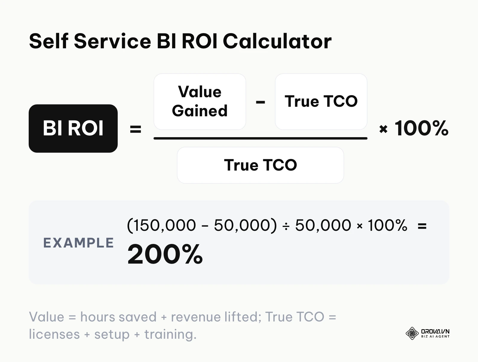
The calculation itself is simple: ROI = (Value Gained − True TCO) ÷ True TCO × 100%. For example, if a rollout delivers 150,000 in value (analyst hours saved plus revenue lifted, in whatever currency you budget in) against a true TCO of 50,000 (licenses, setup, and training), the ROI is (150,000 − 50,000) ÷ 50,000 × 100% = 200%. If you only counted the license fee as the cost, the same project would look far more profitable than it really is.
Why self service BI fails: 5 common mistakes
Despite the massive investments companies make, many analytics initiatives stall or are quietly abandoned. Technology is almost never the root cause of these failures; the real culprits are invariably human behavior, poor organizational design, and a lack of process discipline.
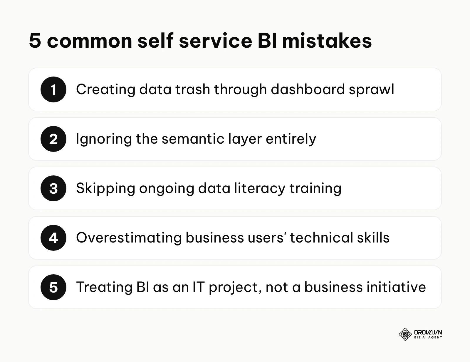
Here are the five most common reasons these deployments fail, the severe consequences they cause, and exactly how you can fix them.
- Creating "Data Trash" through dashboard sprawl
- The Consequence: When everyone has the ability to create and publish reports, the system quickly becomes clogged with hundreds of slightly different variations of the same chart. Users cannot distinguish between an official, verified financial report and a quick scratchpad chart an intern made last week. Trust plummets.
- How to Fix: Implement a strict certification process. The data team should review and apply a visible "Certified by Data Team" watermark to core corporate dashboards. Uncertified dashboards should be automatically archived if they receive zero views for 60 days.
- Ignoring the semantic layer entirely
- The Consequence: Different departments report entirely different numbers to the executive board. Marketing claims 500 new conversions, while Sales claims only 300. The meeting devolves into an argument about whose spreadsheet is correct rather than discussing actual strategy.
- How to Fix: Before deploying the visual interface, you must force cross-departmental agreement on how every single metric is calculated, and lock that logic deep within the centralized data model where end-users cannot alter it.
- Failing to provide ongoing data literacy training
- The Consequence: Users are taught which buttons to click in the software, but they are not taught how to think critically about data. They end up creating beautiful, colorful charts that are statistically meaningless or highly misleading.
- How to Fix: Shift training away from just software mechanics. Teach basic statistical concepts, how to spot anomalies, and how to avoid correlation vs causation fallacies during regular monthly workshops.
- Overestimating the technical skills of business users
- The Consequence: IT purchases a highly complex, developer-centric tool because it has the most features. The marketing and sales teams open it once, feel completely intimidated by the interface, and immediately go back to requesting data dumps into Excel. The expensive licenses sit unused.
- How to Fix: Always run a proof-of-concept prioritizing the user experience of the least technical person who will need to use the platform. If it is too hard for them, it is the wrong tool.
- Treating BI as an IT project instead of a business initiative
- The Consequence: The system is perfectly engineered, highly secure, and incredibly fast, but it doesn't actually answer any of the pressing questions the business leaders care about. IT built what they thought the business needed, without consulting them.
- How to Fix: Every analytics project must have an active executive sponsor from the business side (like a CMO or CRO) who dictates the strategic requirements, while IT focuses strictly on the technical execution.
Illustrative example: dashboard sprawl at a logistics firm
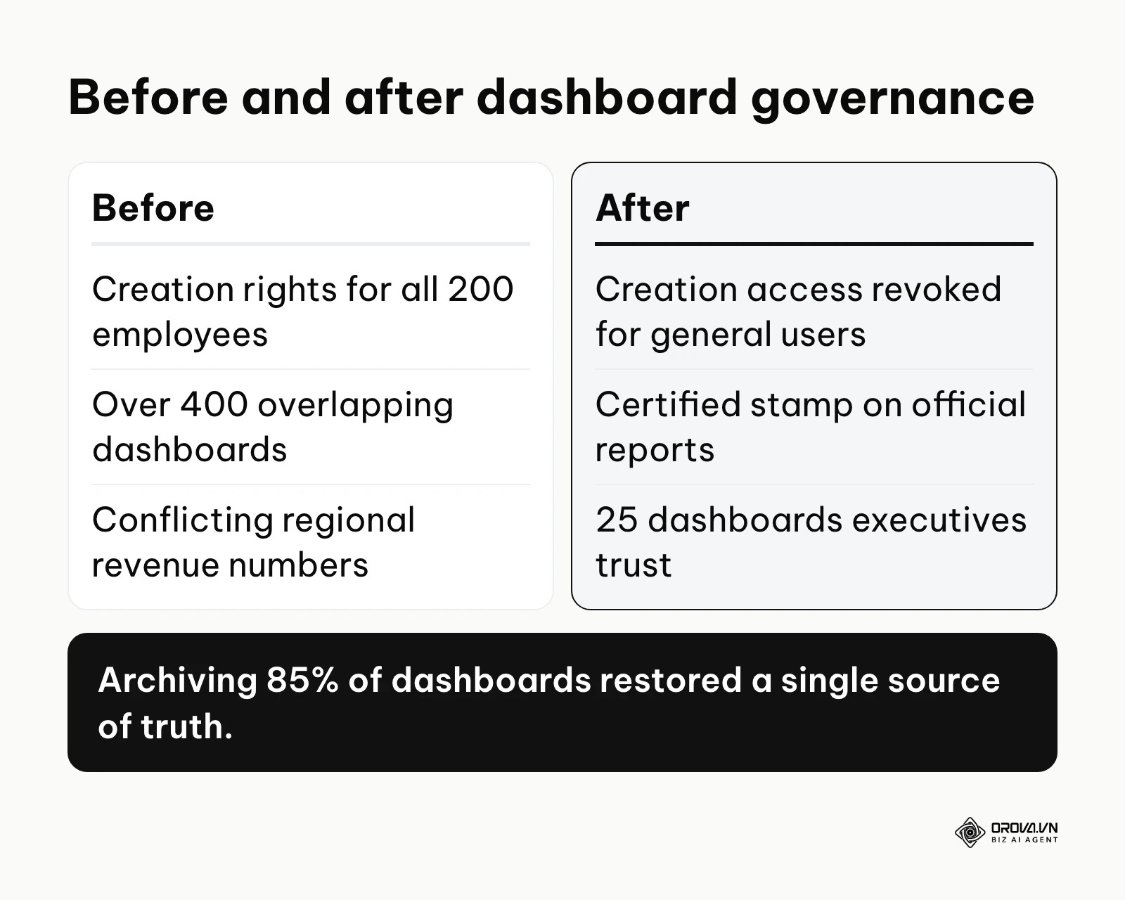
Picture an international logistics firm that granted unrestricted dashboard creation rights to all 200 of its corporate employees. Management actively encouraged everyone to become "data-driven" by building their own visual reports. Within six months, the major hurdle emerged: the system was severely clogged with over 400 overlapping dashboards, and three different regional departments reported completely different quarterly revenue numbers during a critical board meeting. To fix the escalating chaos, the internal governance board forcefully archived 85% of the existing dashboards, established a strict "certified" stamp for official reports, and permanently revoked creation access for general users. The result was a clean, single-source-of-truth portal featuring just 25 highly reliable dashboards that the entire executive team implicitly trusted.
No more lag in data management. Unlock the power of the OROVA Insight system to sync O2O (Online-to-Offline) data flows and visualize every report in real time.
OROVA Insight: Integrate Online - Offline data, visualize reports in Real-time.
Future trends in self service BI tools: Author's perspective
Looking ahead, the landscape of data analytics is poised for dramatic shifts. Based on the rapid evolution of technology and changing organizational demands, here are three distinct trends I observe shaping the future of this industry.
The rise of conversational AI interfaces
According to the Gartner Magic Quadrant for Analytics and Business Intelligence Platforms 2024, the widespread adoption of artificial intelligence within data platforms is shifting the focus from manual report building to automated insight generation. I believe the traditional drag-and-drop dashboard canvas will gradually become a secondary interface for many everyday questions. Instead, more users will type or speak their questions into a search bar and let the AI propose the appropriate visualizations. To prepare for this, organizations must ensure their underlying data is meticulously labeled and structured, as AI models require pristine metadata to function accurately.
Automated insights replacing static monitoring
Currently, managers spend hours staring at static dashboards trying to spot trends or anomalies. I anticipate a shift toward proactive, automated insight delivery. Platforms will learn what metrics a specific user cares about and automatically push contextual alerts—such as "Ad spend in the European region spiked 15% today due to increased CPC"—directly to their phone or messaging app. You should start preparing for this by strictly defining your anomaly thresholds now, so the future systems know exactly what constitutes a meaningful deviation from the norm.
The convergence of BI and operational workflows
Data visualization has historically lived in a separate silo from where the actual work gets done. I expect a steady convergence where analytics are embedded directly into operational software. Instead of leaving a CRM to check a BI dashboard, the relevant insights and predictive scores will be injected directly into the CRM interface. Organizations must begin evaluating their current tech stack's integration capabilities, prioritizing tools that offer robust APIs and seamless embedding options to support this integrated future.
Frequently asked questions about self service BI tools
How do I know if my data is clean enough for self-service?
You can test your data cleanliness by running a simple reconciliation exercise. Ask two different departments to manually calculate a core metric, like total quarterly sales, using your current raw data extracts. If their final numbers differ by more than a small margin, your data is not properly standardized and requires significant cleaning before applying a visualization layer.
What is the exact difference between traditional BI and self-service BI?
The primary difference lies in the workflow and the end-user. Traditional BI requires a highly technical data professional to write code and build reports based on requests. Self-service BI provides a simplified, visual interface that allows non-technical business professionals (like marketers or HR managers) to explore data and build their own reports independently.
Can self-service BI completely replace my data engineers?
Absolutely not. While these tools empower business users to handle their own reporting, the underlying data architecture—extracting data from APIs, transforming complex schemas, maintaining the data warehouse, and ensuring strict security protocols—still requires highly skilled data engineers. Self-service merely shifts the engineers' focus from building charts to building infrastructure.
How do AI advancements impact marketing reporting tools?
As of 2026, AI is fundamentally transforming how marketers interact with their data. Instead of manually adjusting filters and axes, AI algorithms can automatically detect underperforming ad campaigns, suggest optimal budget reallocations, and generate plain-text summaries of complex datasets. This dramatically reduces the time required to translate raw numbers into actionable marketing strategies.
How do I prevent users from making wrong decisions with these tools?
Prevention relies heavily on a robust semantic layer and ongoing data literacy training. You must restrict users from accessing raw, unformatted database tables. Only expose certified, pre-calculated metrics to the general user base. Additionally, mandate that any major strategic decision based on a self-created dashboard must be briefly peer-reviewed by an analyst to ensure the underlying logic is sound.
Where to start?
Knowing how to begin the transition to a modern data culture often depends entirely on your company's current state of maturity. Rather than attempting a massive overhaul, focus on one immediate, actionable step based on your specific situation.
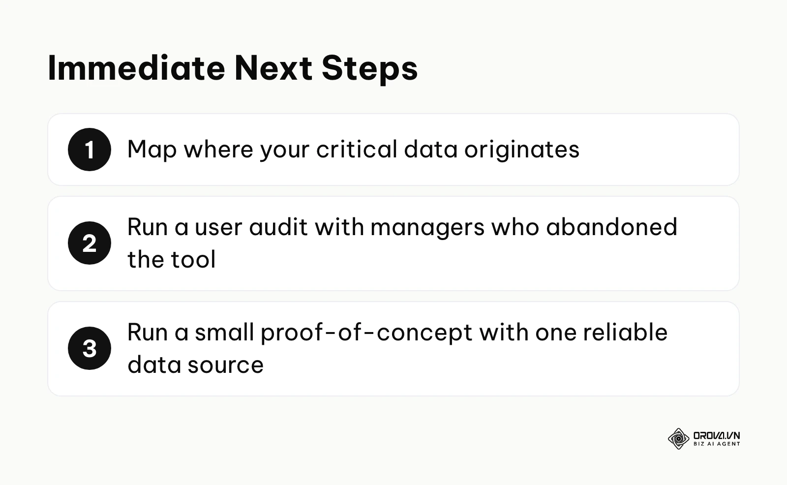
If your company currently relies entirely on hundreds of disconnected Excel spreadsheets scattered across various hard drives, your immediate first step is to map your landscape. Spend one afternoon documenting exactly where your critical data originates (e.g., your CRM, your ad platforms, your e-commerce backend). You cannot build a centralized warehouse until you know exactly what needs to go inside it.
If your company has already purchased an expensive analytics platform but nobody is actually logging in to use it, your immediate step is to conduct a user audit. Sit down with three managers who have abandoned the tool and ask them to show you exactly where they get stuck. You will often find that a single confusing metric definition or a dashboard that takes too long to load is the sole bottleneck killing adoption.
If your company has clean data but a severe bottleneck at the data engineering level, your immediate step is to run a small proof-of-concept with a specialized, user-friendly tool. Connect a single, highly reliable data source—such as your core marketing analytics—and grant access to two tech-savvy marketers. Let them prove the value of independent exploration before committing to a massive organizational rollout of self service bi tools.
About the author

Builder of Orova
Nguyễn Đỗ Trọng Ân has 8 years of experience in marketing, including 6 years managing market development across Asia. He builds Orova, a Biz AI Agent that never sleeps: it plans, runs and optimizes work for businesses.
Run your business with AI Agents
Orova is the always-on Biz AI Agent — it plans, runs, and optimizes the work for you.
Save time, unlock productivity.