
The ultimate marketing report guide: data storytelling, bad numbers and AI prompts

You have spent the entire month running campaigns, optimizing bids, writing copy, and analyzing audiences. But when the end of the month arrives, you face the most dreaded task: building the marketing report. For many marketers, this process means spending a dozen hours manually copying and pasting screenshots from Google Analytics and Meta Ads into a static slide deck, only to have stakeholders glance at it for five seconds before asking a question that isn't on the slides. If your current reporting process feels like a tedious data dump rather than a strategic asset, you are not alone. A good marketing report does one job: it shows how your marketing performed against business goals, explains why, and says what to do next.
This guide is designed to fundamentally transform how you approach data. We will cover exactly how to build a marketing report that people actually want to read, moving far beyond basic vanity metrics. You will learn advanced data storytelling frameworks, how to confidently present failing campaigns without losing stakeholder trust, and how to use AI to automate your analysis. Whether you are an agency owner trying to prove value, an in-house specialist tracking daily spend, or a marketing manager leading a team, mastering this skill is what separates order-takers from strategic business partners.
What is a marketing report and why it matters
A marketing report is a structured document or dynamic dashboard that compiles data from various channels to measure the performance of your marketing efforts against predefined business goals. Its primary purpose is to provide actionable insights that dictate future strategy and budget allocation.
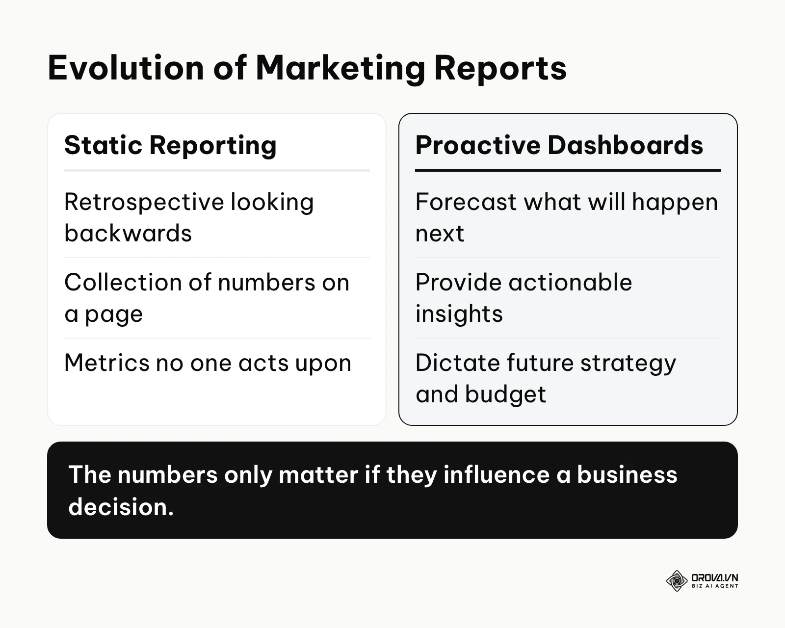
A marketing report is not just a collection of numbers on a page. It is the critical translation layer between daily marketing activities and long-term business outcomes. You should create one to justify your marketing budget, identify exactly what messaging is resonating with your audience, and align your entire team on the immediate next steps. This practice is essential for any business running active campaigns, from solo founders managing a tiny ad budget to large enterprise teams executing global product launches. However, you should not spend excessive time building complex, multi-page reports if you lack baseline historical data, or if the reporting process itself takes longer than the actual marketing execution.
In this guide, we treat reporting primarily as a communication and persuasion tool. The numbers only matter if they influence a decision. If you find yourself consistently reporting on metrics that no one acts upon, you are wasting valuable time. As of 2026, the industry shift is rapidly moving away from static, retrospective reporting looking backwards at what happened, toward proactive, insight-driven dashboards that forecast what will happen next.
Preparation: What you need before building a report
Before you open a single spreadsheet or log into a software tool, you must gather your fundamental business goals, define your target audience for the report, secure historical data access, and have a crystal clear understanding of the questions your report needs to answer.
Diving straight into data extraction without a blueprint inevitably leads to information overload. You will end up pulling hundreds of metrics simply because they are available, not because they are useful. You need a solid foundation to ensure your report is focused and relevant. Here is exactly what you must prepare before you start building your reporting infrastructure.
| What to prepare | Where to find it | Time to complete |
|---|---|---|
| Business Objectives | CEO alignment or Client brief | 1-2 hours |
| Data Source Access | Platform settings (GA4, Meta, CRM, etc.) | 30 minutes |
| Target Audience Personas | Marketing strategy documents | 1 hour |
| Historical Baseline Data | Previous month/year reports | 2 hours |
| Reporting Tool Selection | Internal software stack audit | 2-3 hours |
Without clear business objectives, you cannot determine which metrics actually matter. If the overarching company goal for the quarter is purely brand awareness and market penetration, your report will look drastically different than if the goal is immediate, profitable lead generation.
Furthermore, ensure you have admin or high-level read-only access to all necessary platforms. A common and frustrating roadblock in reporting is waiting weeks for an IT department or a hesitant client to grant access to Google Analytics or the central CRM. Get these administrative hurdles out of the way on day one. Understand that reporting is only as good as the data flowing into it; if your tracking pixels are broken before you start, your final report will be functionally useless.
The 6-step framework to create a marketing report
Creating an effective report involves defining the core objective, selecting the right KPIs, gathering and cleaning the data, visualizing the numbers for quick comprehension, writing analytical insights, and automating the delivery.
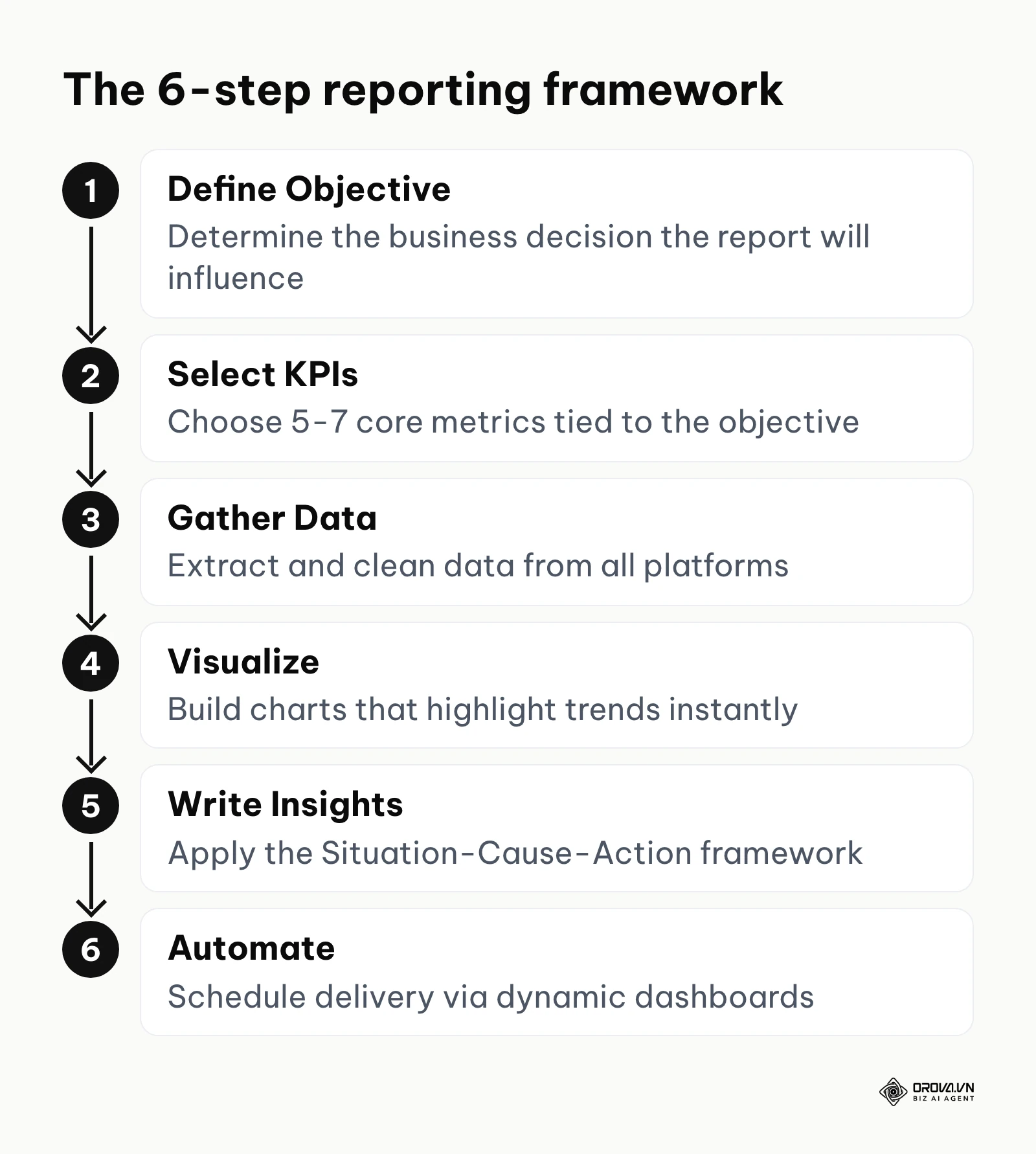
Step 1: Define the primary objective of the report
You must establish exactly what this specific document is meant to achieve and who will be reading it before you pull a single number.
- How to do it: Ask the primary stakeholder one question: "What specific decision will you make based on this data?" If they cannot answer, the report is unnecessary. Document the objective clearly at the very top of your template to serve as a north star. For example, explicitly state: "Objective: Evaluate the ROI of the Q3 Paid Search campaign to determine if we should increase Q4 budget allocation by 20%."
- Signs of success: The objective is highly specific, measurable, and tied to a business outcome rather than a vanity metric.
- Common mistakes: Setting a vague, unmeasurable goal like "Show the team how we did this month." This lack of direction leads to a bloated report containing every possible metric, which ultimately confuses the reader and dilutes your main message.
Step 2: Select your core metrics and KPIs
Choose 5 to 7 Key Performance Indicators (KPIs) that directly and undeniably reflect the objective defined in Step 1.
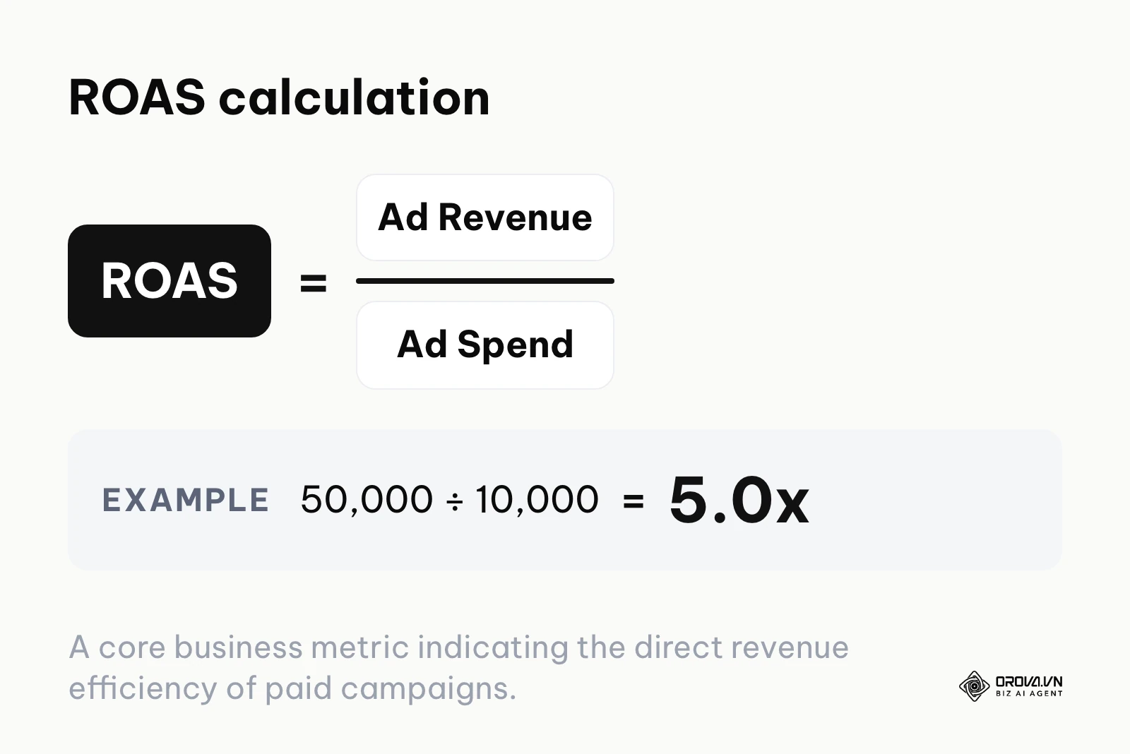
- How to do it: You must distinguish between business metrics (Revenue, Customer Acquisition Cost, Return on Ad Spend) and diagnostic metrics (Click-Through Rate, Cost Per Click, Bounce Rate). If you are building a high-level report for executives, focus exclusively on the business metrics. If you are building a report for your own team to track daily campaign execution, include the diagnostic metrics as well (this marketing campaign guide shows how to set those KPIs before launch). For example, a campaign that brings in 50,000 in ad revenue on 10,000 in ad spend has a ROAS of 5.0x (50,000 ÷ 10,000).
- Signs of success: Every single metric included in the report has a specific historical target or industry benchmark to compare against. A number in isolation means nothing.
- Common mistakes: Including metrics just because the numbers look impressive. A million ad impressions mean absolutely nothing if the goal was enterprise B2B lead generation and you acquired zero qualified leads.
Step 3: Gather and clean your data from all sources
Extract the raw numbers from your various platforms (Google Analytics 4, Meta Ads, CRM, email software) and rigorously ensure they match up.
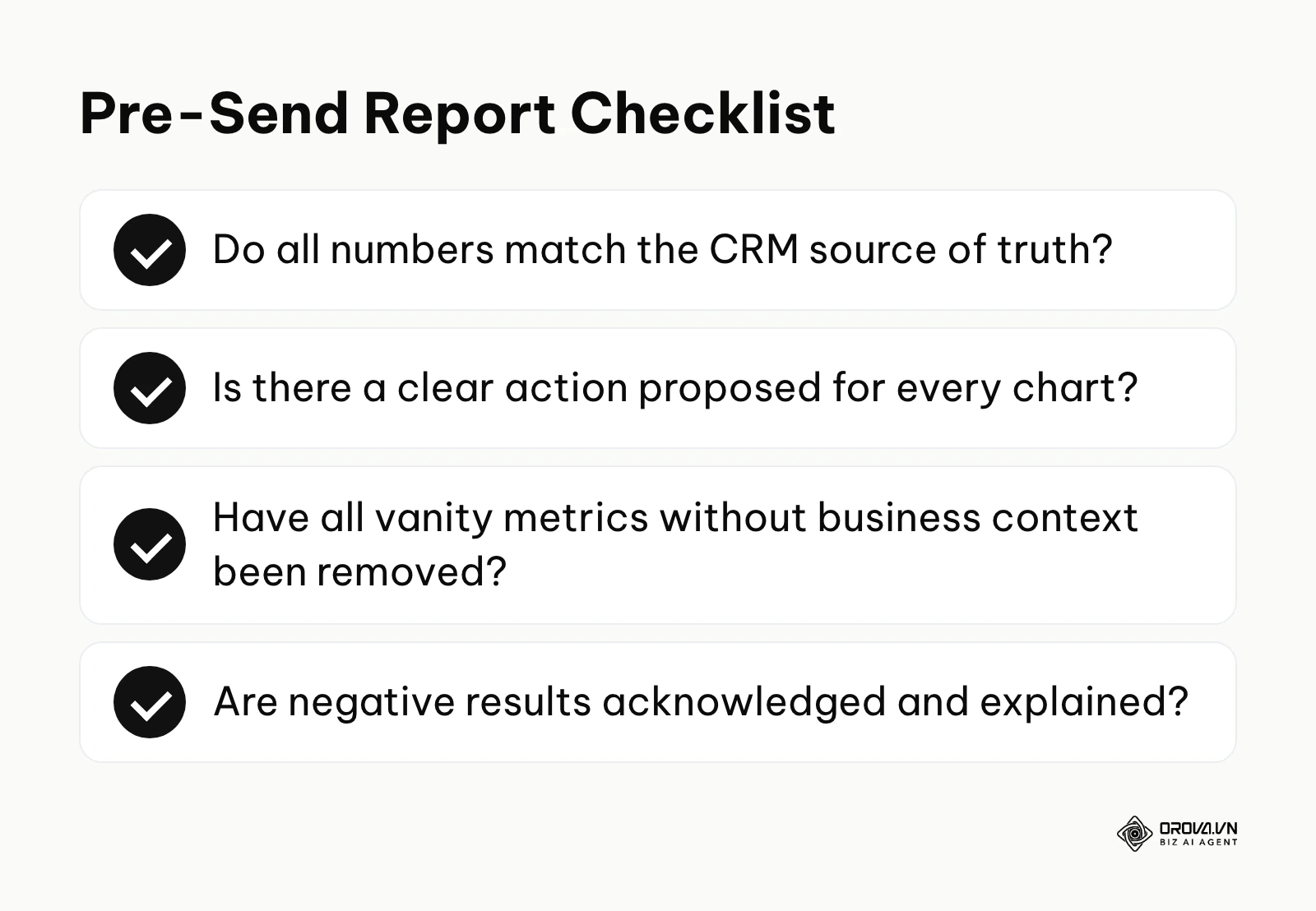
- How to do it: Export your data into a central repository, such as Google Sheets, or connect your sources directly to a visualization tool via API. Be extremely careful with attribution windows and definitions. A conversion tracked in Meta Ads might not perfectly align with a conversion in GA4 due to different tracking logic (e.g., view-through vs. click-through attribution). Choose a single source of truth for your ultimate revenue numbers—this should almost always be your CRM or payment processor.
- Signs of success: The final revenue and lead numbers in your marketing report exactly match the numbers in your sales team's CRM and the finance department's billing software.
- Common mistakes: Willfully ignoring data discrepancies. If your marketing report claims you generated 50 leads but the sales team only received 30 in their system, you will instantly lose credibility with leadership. Always audit your tracking setup before finalizing the numbers.
Step 4: Visualize the data for quick comprehension
Turn raw, intimidating tables of numbers into clean charts and graphs that immediately highlight trends, successes, and outliers.
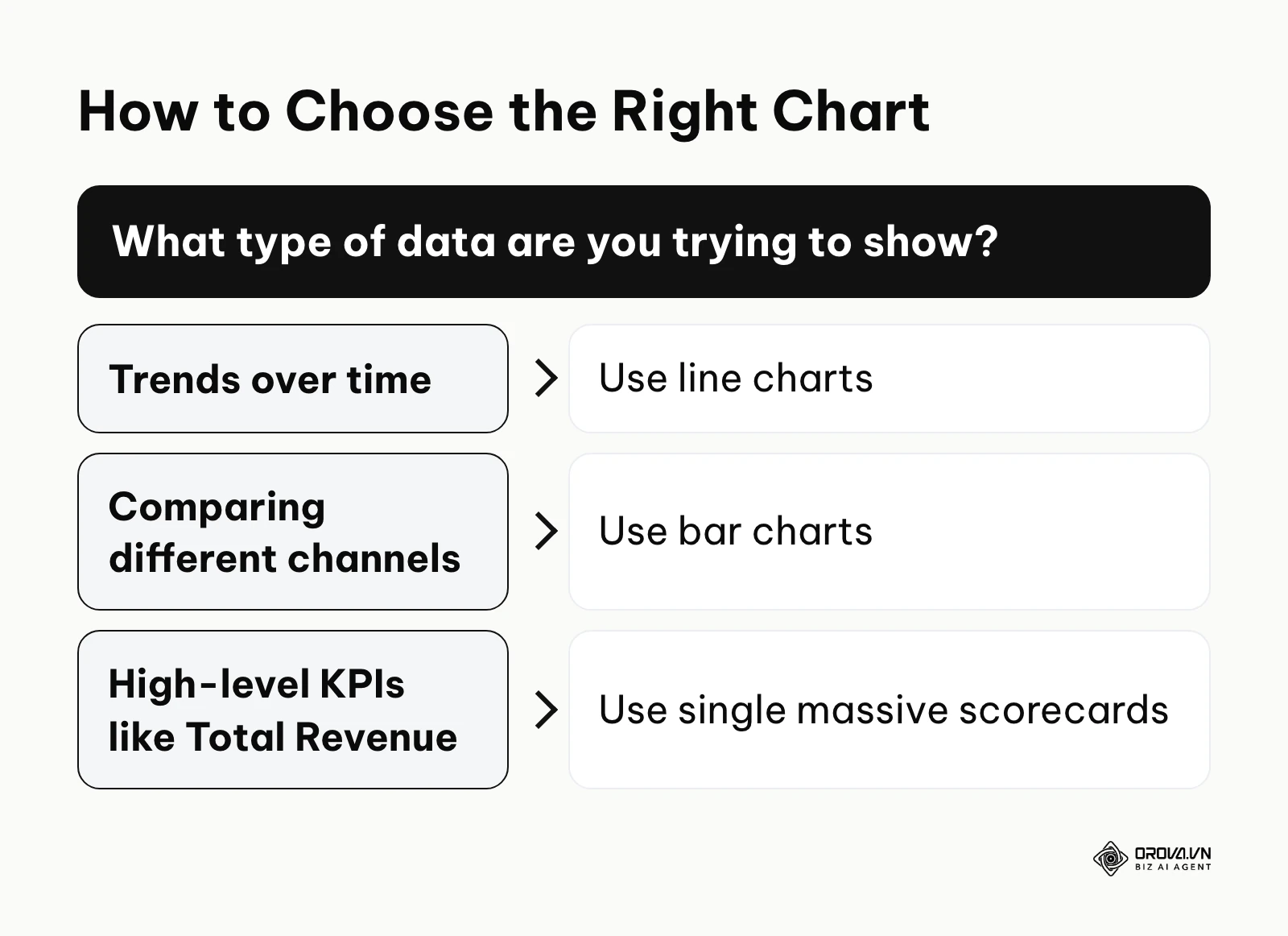
- How to do it: Use line charts to demonstrate trends over time, bar charts for comparing different channels against each other, and single massive scorecards for high-level KPIs like Total Revenue. Avoid pie charts unless you are showing a strict percentage breakdown of a whole (like budget allocation across three channels), and never use 3D charts as they visually distort the data proportions. Keep your color coding consistent across all pages; for instance, always use blue for Facebook data, red for YouTube, and green for overall Revenue.
- Signs of success: A reader with zero marketing background can understand the main takeaway of a chart within five seconds of looking at it.
- Common mistakes: Cluttering the visualization with too many data labels, heavy gridlines, or non-contrasting colors. In data visualization, less is always more. Remove anything that does not help the reader understand the core trend.
Step 5: Write analytical insights and recommendations
Provide the "so what" behind the numbers. Raw data without human context is just noise to an executive.
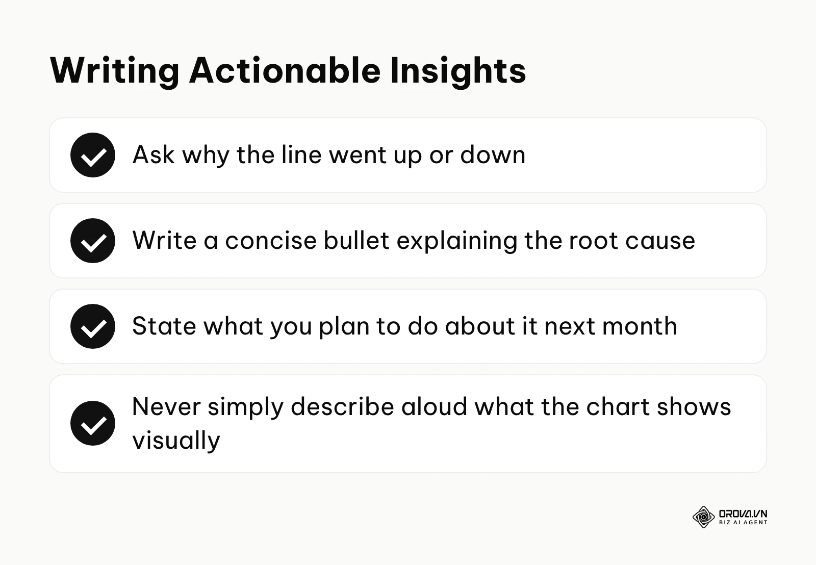
- How to do it: Look at the visual chart and ask yourself why the line went up or down. Did a specific ad creative finally fatigue? Did a major national holiday affect search volume? Write a concise, hard-hitting bullet point explaining the root cause, followed immediately by what you plan to do about it next month.
- Signs of success: The stakeholder reads your written insight and immediately approves your proposed next step without having to ask for clarification or a follow-up meeting.
- Common mistakes: Simply describing aloud what the chart visually shows. Writing "Traffic increased by 20% in October" is useless because the reader can already see the line going up. You must explain why it increased and what that means for the business.
Step 6: Automate the delivery process
Set up a robust system so that the data updates automatically and the report reaches the stakeholders on a predictable, recurring schedule without manual intervention.
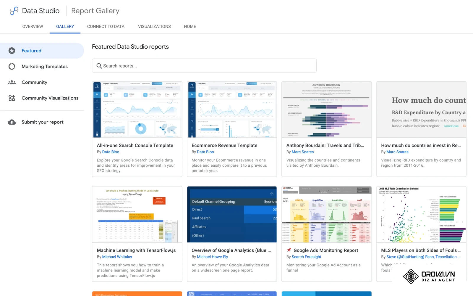
- How to do it: Use dashboarding tools that connect directly to your data sources via APIs; if you are new to them, start with this practical guide to Looker Studio dashboards and reports. Set up scheduled email deliveries—for example, a PDF export sent automatically every Monday at 8:00 AM. This removes the manual labor of copying and pasting screenshots, allowing you to spend your time actually analyzing the data rather than just formatting it.
- Signs of success: You spend absolutely zero hours per week fetching raw data and 100% of your reporting time thinking about strategy and optimization.
- Common mistakes: Relying on manual spreadsheet updates for recurring weekly reports. This is highly prone to human error, constantly breaks when formats change, and quickly burns out your marketing team.
Audience-specific reporting: C-level vs. Specialists
You must heavily tailor your marketing report to the reader's specific role; C-level executives need high-level business impact (ROI, CAC), while marketing specialists need granular, diagnostic data (CTR, CPC) to optimize daily campaigns.
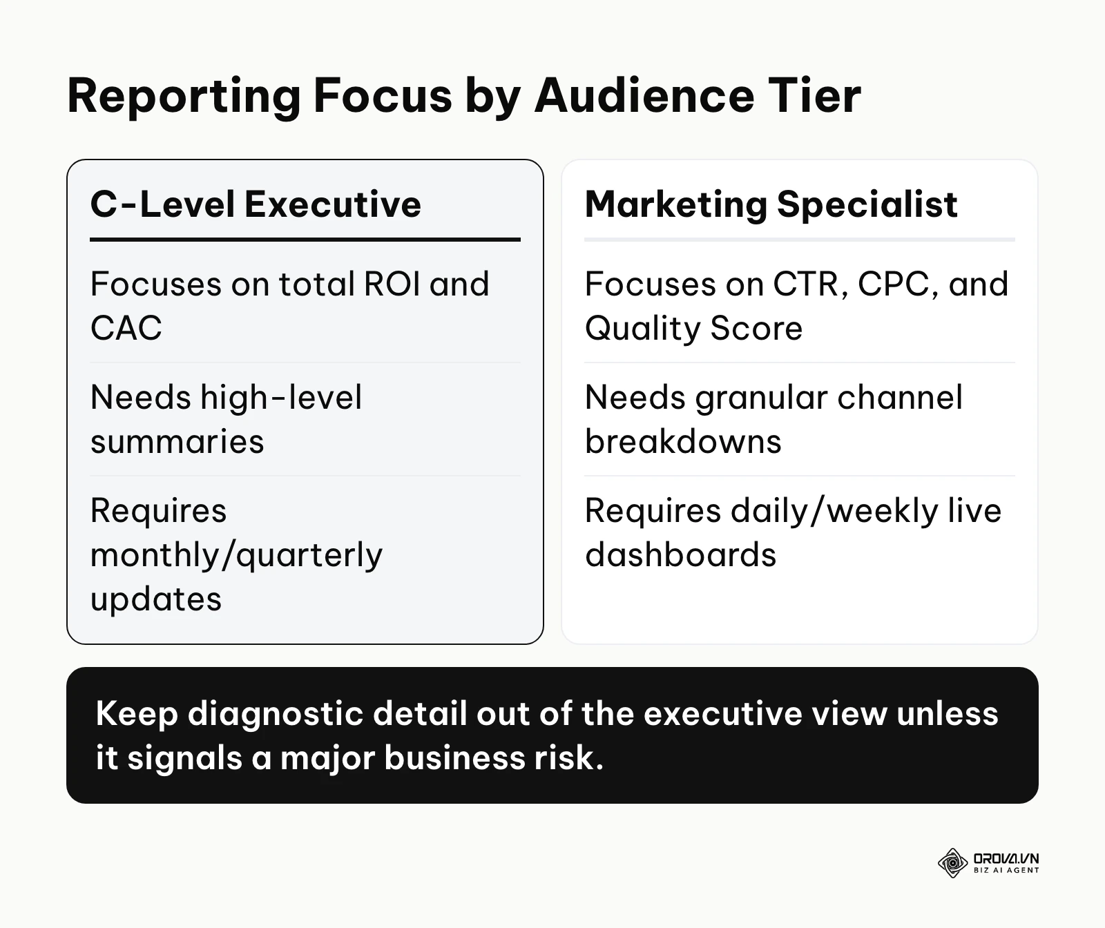
One of the most catastrophic errors in marketing reporting is sending the exact same 30-page document to the CEO, the Sales Director, and the Facebook Ads Specialist. They have entirely different priorities, attention spans, and technical vocabularies. When you force a CEO to wade through slides about Cost Per Click and Impression Share, they perceive the marketing department as tactical, in the weeds, and disconnected from the bottom line. Conversely, if you only give a specialist high-level revenue numbers without channel breakdowns, they lack the diagnostic clues needed to fix a failing campaign.
The Executive Report (C-Level & Board)
Executives care about three things: How much money did we spend? How much money did we make? Are we on track to hit our quarterly financial targets? Your report for this tier should fit on a single page or a single, uncluttered dashboard screen. It should focus exclusively on macro metrics like Return on Ad Spend (ROAS), Customer Acquisition Cost (CAC), total marketing-sourced pipeline, and overall revenue growth. Do not include channel-specific diagnostic metrics unless they highlight a massive, immediate business risk. Use clear, non-jargon language.
The Managerial Report (Directors & VPs)
Marketing Directors need to see how the total budget is performing across different channels to make rapid reallocation decisions. This report goes one level deeper than the executive view. It should break down performance by channel (e.g., SEO vs. Paid Search vs. Social Media) and include metrics like Cost Per Lead (CPL) by channel, conversion rates, and overall traffic quality. This audience wants to know which team members, strategies, or external agencies are delivering the best results so they can shift resources accordingly.
The Specialist Report (Practitioners)
The people actually in the trenches running the campaigns need extreme, unfiltered detail. A specialist report is often a real-time, highly complex dashboard rather than a weekly polished PDF. It includes diagnostic metrics like Click-Through Rate (CTR), Cost Per Click (CPC), Quality Score, bounce rates by device, and individual ad creative performance. This is the only place where vanity metrics might have diagnostic value (e.g., high impressions but low clicks indicate a fundamentally bad ad creative that needs immediate replacement).
| Audience | Primary Focus | Key Metrics | Ideal Format |
|---|---|---|---|
| C-Level | Business Impact | ROI, CAC, Total Revenue | Monthly 1-page executive summary |
| Directors | Resource Allocation | CPL by channel, Conversion Rate | Weekly interactive dashboard |
| Specialists | Tactical Optimization | CTR, CPC, Ad Frequency | Daily real-time dashboard |
Data storytelling: The Situation-Cause-Action framework
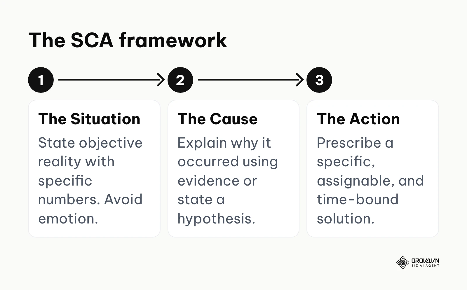
Data storytelling transforms raw metrics into a compelling narrative by clearly stating the current situation, diagnosing the root cause with evidence, and recommending a specific, decisive action.
Numbers alone cannot persuade a stubborn stakeholder to increase your budget or pivot a failing strategy. You must become a translator. Stakeholders approve plans they understand, and a short narrative around a chart is far easier to act on than a raw dashboard.
The most effective way to structure your written analysis within a report is using the Situation-Cause-Action (SCA) framework. This ensures that every chart directly leads to a business decision.
The Situation
Start by stating the objective reality of the data. What is happening right now? Be highly specific and use the actual numbers from the chart. Avoid emotional language, exaggeration, or subjective adjectives like "disastrous" or "amazing." Example (illustrative numbers): "In November, our Cost Per Lead (CPL) on LinkedIn increased by 45% against our usual level, while overall lead volume dropped by 20% compared to October."
The Cause
Next, explain why the situation occurred. This requires you to dig deeper into the diagnostic metrics or investigate external market factors. Do not guess; base your cause on evidence. If you do not know the exact cause, state your best hypothesis and explicitly explain how you will test it. Example: "This spike in CPL correlates directly with our ad frequency reaching 4.5. Our target audience has seen the exact same three ad creatives for six weeks, leading to severe ad fatigue and a 60% drop in Click-Through Rate."
The Action
Finally, prescribe the solution. What exactly are you going to do to fix the problem, or how will you double down on the success? The action must be specific, assignable to a person, and time-bound. Example: "Next Tuesday, we will pause the current LinkedIn creatives and launch three new video variations focusing on customer testimonials to refresh the audience's feed, with the goal of bringing CPL back to within 10% of our usual level."
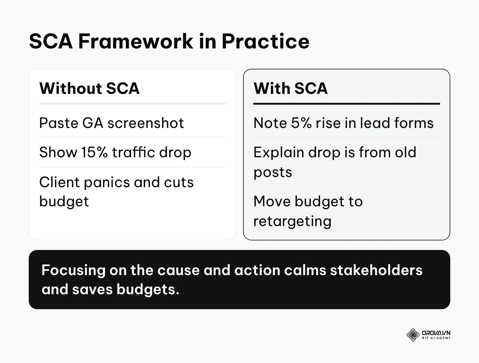
Illustrative example:
- Context: An account manager at an agency is presenting the monthly report to a B2B SaaS client. The client is worried and wants to cut the budget because the chart of total website traffic is pointing sharply down.
- What was done: Instead of pasting a Google Analytics screenshot showing a 15% traffic drop and staying silent, the account manager applies the SCA framework. A closer look shows the drop comes entirely from old blog posts that no longer bring value, while traffic to the core product pages (where conversions happen) has actually grown. The written insight reads: "Situation: Total traffic fell 15%. Cause: A search ranking update pushed down last year's old blog posts, but traffic to the product pages still grew 10%. Action: We will not spend effort rescuing old low-value posts; instead we will move 20% of the budget to retargeting the higher-quality visitors who are growing."
- Where it got stuck and how it was solved: The client still panics at the downward line. The account manager immediately switches to a second chart comparing conversion rate and lead quality.
- Result: The client calms down on seeing that, although traffic fell, trial sign-up forms (leads) actually rose 5%. They approve moving the budget instead of asking the agency to rewrite old posts that bring no revenue.
By using this framework consistently, you position yourself as an expert advisor rather than a mere reporter of facts. To master this, you need a solid foundational understanding of data driven marketing principles to know where to look for the "Cause."
Turn multi-channel data into instant decisions. OROVA Insight seamlessly connects APIs from Online to Offline, helping you see the full picture of your business through a Real-time chart reporting system.
OROVA Insight: Integrate Online - Offline data, visualize reports in Real-time.
Reporting bad numbers: How to present failing campaigns
To report bad numbers professionally, you must own the failure immediately, explain the root cause using data without making excuses, and present a clear mitigation plan to recover the performance.
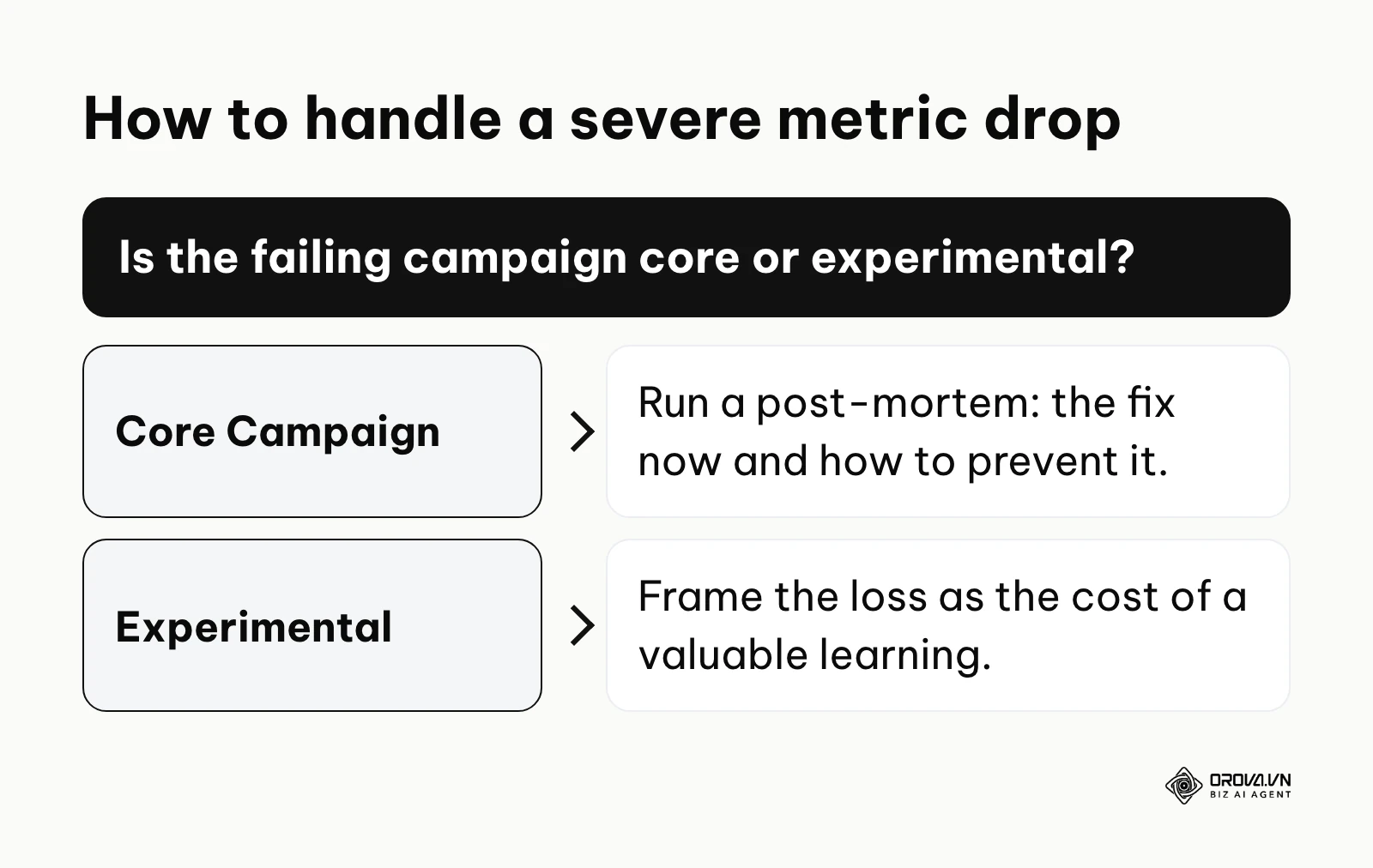
Every marketer, no matter how experienced, will eventually run a campaign that completely bombs. Metrics tank, budgets are wasted, and the ROI is deeply negative. How you handle and report these bad numbers will define your professional career. Trying to hide bad results, manipulating the chart axes to make drops look smaller, or vaguely blaming other departments will instantly destroy your credibility.
Confront the reality early
Do not wait for the end-of-month formal presentation to drop a massive negative surprise on your stakeholders. If a campaign is failing catastrophically halfway through the month, send a brief, factual email update immediately. When it comes time for the official marketing report, put the bad news front and center. Hiding it on slide 45 only makes it look like you are trying to cover your tracks and lack confidence.
Differentiate between tests and core operations
When presenting the numbers, remind the audience of the original context. Was this a highly experimental TikTok campaign with a small test budget, or was this your core Google Search campaign that drives 80% of company revenue? Failures in experimental channels are actually valuable learnings. You paid for data. Frame it as: "We invested a small test budget, about 5% of our quarterly spend, to learn that this specific demographic does not respond to short-form video, which saved us from putting the full Q4 budget into the wrong channel."
The "Post-Mortem" format
When dealing with a significant, painful failure in a core campaign, replace your standard reporting structure for that section with a strict post-mortem format:
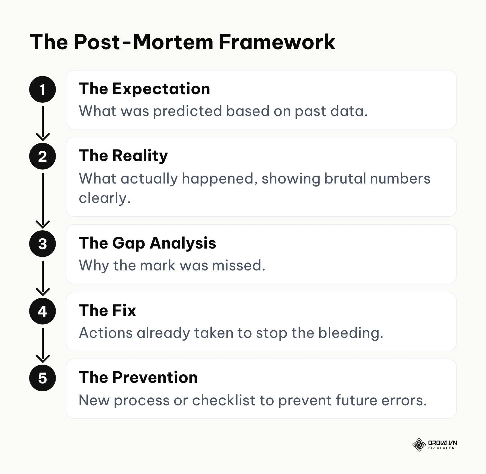
- The Expectation: What did we predict would happen based on past data?
- The Reality: What actually happened? (Show the brutal numbers clearly).
- The Gap Analysis: Why did we miss the mark? (e.g., The landing page broke on mobile devices; a major competitor launched a 50% off sale the exact same day).
- The Fix: What have we already done right now to stop the bleeding?
- The Prevention: What new process or checklist is in place so this specific error never happens again?
Illustrative example:
- Context: An in-house marketing team has just finished its Black Friday campaign, but total revenue reached only 60% of the ambitious target. The marketing lead has to report directly to the CEO and the leadership team.
- What was done: The marketing lead does not hide behind secondary metrics such as "engagement spiked" or "lots of positive comments". One slide at the top of the report states plainly: "Target: 100% of the revenue goal. Actual: 60%. Gap: 40%." The cause is explained with hard data: "Ad costs (CPM) on Meta ran three times higher than planned, so the budget ran out in the first two days, before the core audience was ready to buy." The proposed fix is decisive: "Next year, we will move 40% of the budget to email marketing starting in October to secure customers early, instead of relying entirely on paid ads during peak week."
- Where it got stuck and how it was solved: The CEO pushes hard on why the ads were not paused earlier when bids rose. The marketing lead shows the campaign monitoring history, admits the automated budget alert had been set at the wrong threshold, and presents the corrected threshold review process that was updated that same afternoon.
- Result: Being candid, not blaming the platform, and focusing on the system lesson moves the meeting from tension and finger-pointing to a discussion of prevention for next year. The CEO approves more investment in the CRM setup instead of cutting headcount.
AI prompts for marketing reporting and analysis
You can dramatically speed up your reporting workflow by using AI prompts to analyze raw data sets, identify hidden anomalies, and draft the initial Situation-Cause-Action summaries in seconds.
Writing deep, thoughtful insights manually for a 20-page monthly report is exhausting. As of 2026, AI is exceptionally good at finding patterns in structured data. By feeding your raw metrics into large language models, you can generate the first draft of your insights instantly. However, AI should never replace your strategic judgment. It is an assistant, not an autopilot. Understanding advanced AI generated content workflows is essential to remain competitive.
Here is a cheat-sheet of 5 advanced AI prompts you can use to process your marketing data. Simply paste your data table (copied directly from Excel or Google Sheets) right below the prompt.
Prompt 1: The Anomaly Detector
Prompt: "Act as a Senior Marketing Data Analyst. I am pasting the weekly performance data for our top 5 marketing channels. Analyze this dataset strictly and identify any statistically significant anomalies, sudden drops, or unusual spikes. For each anomaly, suggest 3 highly specific, technical hypotheses for why this might have occurred in the real world."
Prompt 2: The Executive Summarizer
Prompt: "Below is the raw, detailed data from our monthly marketing report. Condense this into a 3-bullet executive summary designed specifically for a busy CEO. Focus strictly on business outcomes: Total Revenue generated, overall ROI, and Blended Customer Acquisition Cost. Do not mention diagnostic metrics like CTR, impressions, or bounce rate. Use a professional, direct, and confident tone."
Prompt 3: The SCA Framework Generator
Prompt: "Review the following campaign performance data. The campaign objective was B2B lead generation. Write an analysis using the Situation-Cause-Action (SCA) framework for the worst-performing channel in the dataset. Detail the current situation with exact numbers, hypothesize the root cause based on the diagnostic metrics provided, and propose a concrete, measurable next step to fix it next week."
Prompt 4: The Cross-Channel Correlation Finder
Prompt: "I have provided data from our Facebook Ads, Google Search Ads, and organic website traffic for the last 90 days. Analyze the relationship between these channels. Is there a mathematical correlation between increased social media spend and spikes in organic branded search traffic? Provide numerical evidence from the data to support your conclusion."
Prompt 5: The A/B Test Interpreter
Prompt: "Here are the results of an A/B test run on our primary landing page. Variant A is the control, Variant B has a new headline. Given the sample size, conversions, and traffic volume provided, calculate if the results are statistically significant. If they are, tell me the exact percentage improvement and whether it is safe to roll out Variant B to 100% of traffic immediately."
Crucial Warning: Never paste sensitive customer personally identifiable information (PII) into public AI models. Always anonymize your data (e.g., removing client names and exact revenue figures, replacing them with percentages if necessary) before prompting.
Deep dive: Choosing the right reporting frequency and format
Your reporting frequency—daily, weekly, monthly, or quarterly—must perfectly match the pace at which decisions can actually be executed; reporting too frequently causes noise and panic, while reporting too rarely causes missed optimization opportunities.
A major point of friction between marketing teams and leadership is the format and cadence of the report. Should you send a weekly PDF? A monthly slide deck? Or just share a link to a live dashboard and never talk about it? The answer depends entirely on the operational speed of your business.
Weekly vs. Monthly vs. Quarterly
- Weekly Reporting: This is best for diagnostic check-ins among practitioners and managers. It allows you to catch runaway budgets, broken tracking links, or rejected ad creatives before they cause massive financial damage. However, you should not make major strategic pivots based on weekly data, as standard statistical variance and weekend slumps can create false signals.
- Monthly Reporting: This is the gold standard for most organizations. A month provides enough data volume and statistical significance to judge whether a new campaign is actually working. This is when you should formally present to directors and clients, focusing on month-over-month (MoM) growth and CPL trends.
- Quarterly Reporting: Essential for C-level executives and board members. Quarterly reports strip away all the tactical noise, ad creative tests, and minor channel fluctuations to focus purely on macro trends, market share, and long-term ROI.
| Reporting Frequency | Best Audience | Ideal Format | Primary Weakness |
|---|---|---|---|
| Daily | Specialists | Live Dashboard | Too volatile for decisions; creates panic over normal daily fluctuations. |
| Weekly | Marketing Managers | Email Summary + Spreadsheet | Can become a massive time-drain if data is compiled manually. |
| Monthly | Directors / Clients | Presentation Deck | May be too late to fix a campaign that failed catastrophically in week one. |
| Quarterly | C-Level / Board | 1-2 Page Memo | Lacks actionable, tactical insights for the team executing the work. |
The shift from Static to Dynamic Formats
Historically, reports were built meticulously in PowerPoint or Keynote. While this is great for telling a highly controlled, linear story, it is entirely static. If a stakeholder asks mid-presentation, "What happens to the ROI if we exclude mobile traffic?", you cannot answer them without ending the meeting and rebuilding the slides.
The modern approach is deploying interactive, dynamic dashboards. You build the data structure once, and stakeholders can filter by date, device, or campaign on their own. This self-serve model drastically reduces the number of ad-hoc data requests the marketing team receives. However, naked dashboards lack the "Action" part of the SCA framework. Therefore, the ideal format is a hybrid: a live, interactive dashboard that stakeholders can explore anytime, accompanied by a short, written monthly memo that provides the human strategic interpretation.
Measurement: Essential metrics and danger thresholds
To effectively measure performance, you must track a strict hierarchy of metrics ranging from overarching ROI down to channel-specific engagement, and establish predefined numerical thresholds that trigger immediate intervention.
If you try to track everything, you track nothing. You need a highly disciplined approach to marketing ROI measurement. The metrics you choose must have a historical baseline and a "danger threshold"—a specific number that, if crossed, means you must pause the campaign immediately to stop bleeding money.
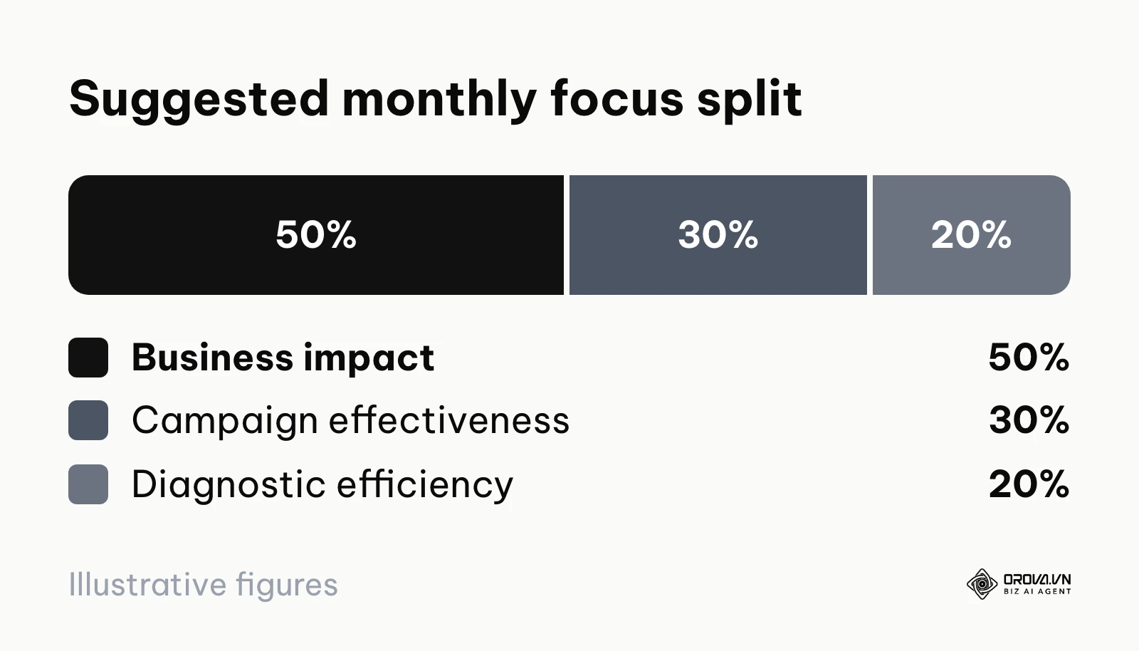
Teams that agree on failure thresholds in advance can stop a weak campaign as soon as the line is crossed, instead of debating it on gut feeling while the budget keeps draining. As a rough starting split for a monthly report (a suggestion, not an industry standard), give about 50% of the space to business impact, 30% to core campaign effectiveness and 20% to diagnostic efficiency.
The Metric Hierarchy
- North Star Metrics (Business Impact):
- Customer Acquisition Cost (CAC): Total marketing and sales spend divided by the number of new customers acquired. This determines if your business model is sustainable.
- Return on Ad Spend (ROAS): Revenue generated by ads divided by ad spend.
- Marketing Originated Pipeline: The total potential revenue value of all leads generated strictly by marketing efforts, proving marketing's value to the sales team.
- Core Campaign Metrics (Effectiveness):
- Cost Per Lead (CPL) / Cost Per Acquisition (CPA): How much you pay for a single prospect's contact info or a specific action.
- Conversion Rate: The percentage of visitors who take the desired action (e.g., filling out a form, making a purchase) after landing on your site.
- Diagnostic Metrics (Efficiency):
- Click-Through Rate (CTR): Indicates if your ad creative and messaging resonate with the target audience.
- Cost Per Click (CPC): Indicates the competitiveness of the ad auction market and the overall quality of your targeting.
| Metric Type | Illustrative healthy range | Illustrative danger threshold | Immediate Action if Breached |
|---|---|---|---|
| Conversion Rate (Landing Page) | 2% - 5% | < 1% | Pause paid traffic immediately; redesign above-the-fold content; test page load speed. |
| Click-Through Rate (Search Ads) | 3% - 6% | < 1.5% | Rewrite ad copy to better match search intent; heavily expand negative keyword lists. |
| Frequency (Social Ads) | 1.5 - 3.0 | > 4.0 | Rotate in completely new ad creatives to combat severe ad fatigue and audience blindness. |
| Cost Per Lead (CPL) | At target CPL | > 150% of target | Halt the campaign; deeply reassess audience targeting and offer viability before restarting. |
Do not treat these benchmarks as absolute universal truths, as they vary wildly by industry. A B2B enterprise software company might be perfectly happy paying for one lead what an e-commerce brand earns from dozens of t-shirt sales, while that same t-shirt brand would go bankrupt if each lead cost half the price of a shirt. You must establish your own historical baselines over time.
No more lag in data management. Unlock the power of the OROVA Insight system to sync O2O (Online-to-Offline) data flows and visualize every report in real time.
OROVA Insight: Integrate Online - Offline data, visualize reports in Real-time.
Common mistakes in marketing reporting and how to fix them
The most frequent reporting errors include cherry-picking good data to hide failures, ignoring complex attribution models, overwhelming the reader with too many charts, and failing to provide actionable next steps.
Even experienced marketing professionals fall into predictable traps when building reports under tight corporate deadlines. Here are the most critical mistakes that silently undermine your credibility with leadership, and how to systematically eliminate them.
- The "Watermelon" Report (Green on the outside, red on the inside)
- The Mistake: Cherry-picking only the positive metrics (like record-high website traffic) while conveniently omitting or hiding the negative ones (like zero actual sales or skyrocketing CAC).
- The Consequence: Stakeholders eventually lose all trust in your reporting when the business as a whole is losing money, but the marketing report claims everything is perfect.
- The Fix: Implement a standardized, locked template. You must report on the exact same core metrics every single month, whether they are historically good or painfully bad.
- Ignoring Attribution Nuances
- The Mistake: Adding up all the conversions claimed by Facebook, Google Ads, and your email platform, and reporting that massive total number to the CEO, not realizing they are all taking credit for the exact same customer.
- The Consequence: You double or triple-count your revenue, making your ROI look artificially massive and completely detaching marketing data from financial reality.
- The Fix: Rely on a single source of truth, typically your CRM, to deduplicate leads and assign final revenue attribution based on a unified model.
- The "Data Puke"
- The Mistake: Cramming 40 different charts into a 50-slide deck simply because you want to show the client or your boss how hard you worked this month.
- The Consequence: The stakeholder suffers from massive cognitive overload, ignores the presentation entirely, and makes decisions based on gut feeling instead.
- The Fix: Force yourself to summarize the entire month's performance in a single executive summary slide before diving into any details. If a chart doesn't support the summary, delete it.
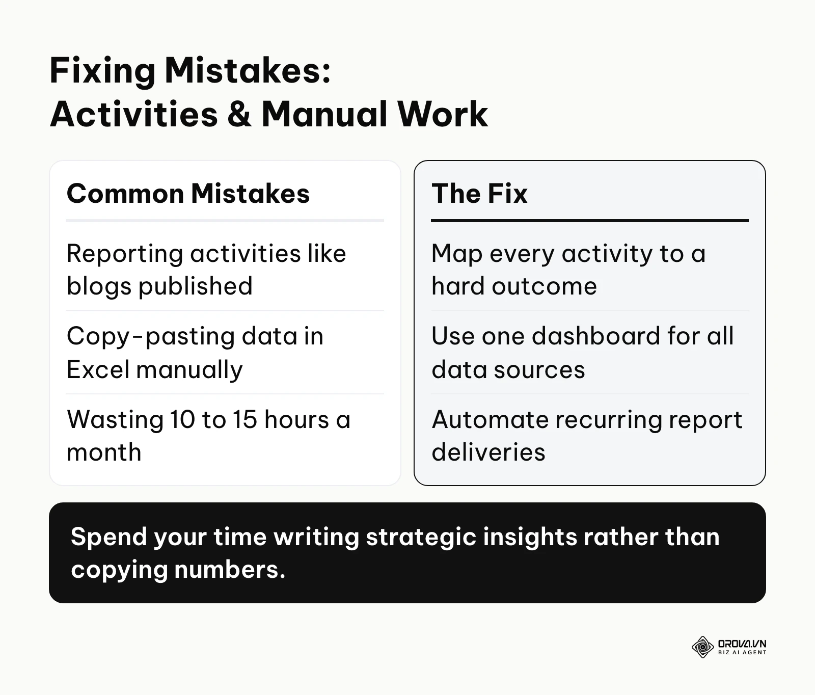
- Reporting Activities instead of Outcomes
- The Mistake: Focusing the bulk of the report on a checklist: "We published 4 blog posts, launched 3 ads, and sent 2 emails."
- The Consequence: You position your marketing team as a cost center doing administrative tasks, rather than a strategic revenue center driving business growth.
- The Fix: Map every activity to a hard outcome. Change "Published 4 blogs" to "Published 4 blogs, which generated 5,000 organic visits and 12 sales-qualified leads."
- Manual Copy-Pasting Hell
- The Mistake: Spending 10 to 15 hours at the end of every single month manually downloading CSVs, cleaning data, and building charts in Excel.
- The Consequence: High risk of human error, burnout, and a massive waste of valuable strategic time that should be spent optimizing campaigns.
- The Fix: Connect your main sources (GA4, Search Console, ad platforms, CRM) to one dashboard tool that syncs data on a schedule, and set up recurring report deliveries. The time you used to spend copying numbers can then go into writing the strategic insights.
Marketing reporting trends in the next few years: My perspective
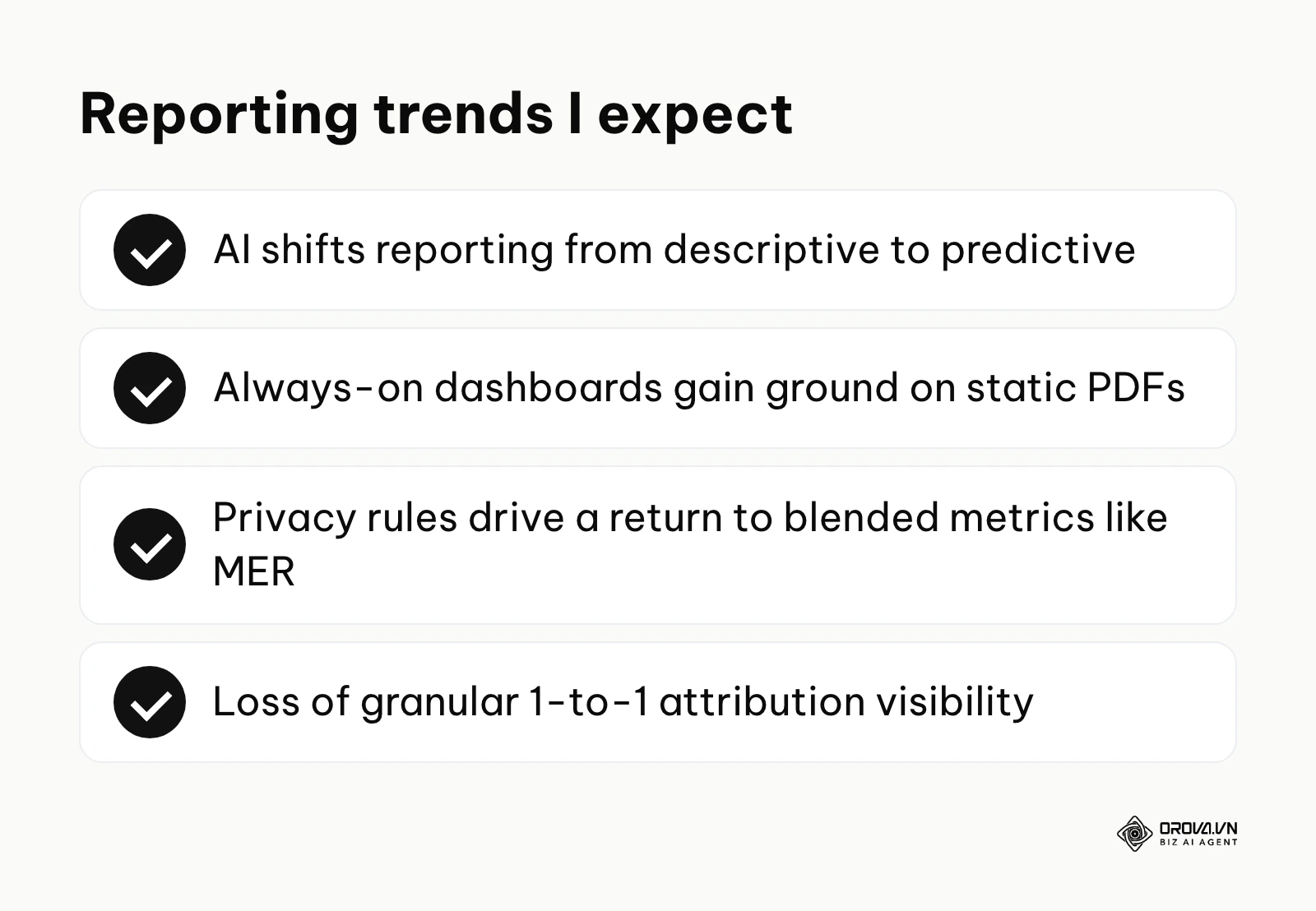
Here is how I see the landscape of marketing reporting evolving over the next few years. These are personal views, not forecasts backed by data.
AI will shift reporting from descriptive to predictive
Currently, most marketing reports are purely descriptive—they tell you exactly what happened last month. I believe AI will gradually push reports toward prediction. Instead of only showing that CPL increased last month, a report could warn that if you keep your current spend pace on Meta, your CPL is likely to cross your profitability threshold within the next few weeks. You should start preparing for this shift right now by ensuring your historical data is immaculately clean and structured, as predictive AI models require high-quality historical training data to make accurate forecasts.
Static monthly PDFs will lose ground
Waiting 30 days for answers about campaign performance feels slower every year. I expect static monthly PDFs to lose ground to always-on dashboards that stakeholders open whenever they need, with a short written memo on top. In my view, the marketer's role will shift from "report builder" toward "system architect." You need to get comfortable building connected dashboards via APIs rather than designing pretty slides in presentation software.
Privacy rules will push teams back to blended metrics
With the ongoing deprecation of third-party cookies and stricter global privacy laws, pixel-perfect, user-level tracking is slowly dying. I believe marketers will find it harder to prove that a specific Facebook ad led to a specific purchase on a 1-to-1 basis. I expect more teams to return to macro, blended metrics—like Marketing Efficiency Ratio (MER), which is total business revenue divided by total marketing spend. As of 2026, it is worth preparing your stakeholders for this loss of granular visibility, so they don't panic if platform attribution numbers drop. Of course, this prediction could be delayed if new server-side tracking technologies manage to bypass current browser restrictions more effectively than anticipated.
Frequently asked questions about marketing reports
How often should I send a marketing report to my client?
It depends entirely on the scope of work and budget, but a monthly cadence is the industry standard for formal reporting and strategy reviews. However, you should always provide a live dashboard link so they can check pacing anytime on their own. If you are launching a massive, high-budget, short-term campaign (like a 3-day flash sale or an event), daily end-of-day updates are absolutely necessary to manage risk.
What is the difference between a dashboard and a report?
A dashboard is a live, interactive visualization of data that updates automatically. It tells you what is happening right now. A report is a static snapshot in time that includes human analysis, business context, and strategic recommendations. It tells you why it happened and what to do next. You need both: the dashboard gathers the data efficiently, and the report delivers the strategy.
Will AI completely replace the need for data analysts in marketing?
No, but it will drastically change their day-to-day workflow. AI is incredible at processing large datasets and identifying hidden anomalies faster than a human ever could. However, AI lacks critical business context. It doesn't know that your competitor just slashed their prices by 50% or that your supply chain is delayed. AI will replace the manual task of charting data and finding correlations, but humans will always be needed to provide strategic context and make the final business decisions based on those AI-generated insights.
How do I report on brand awareness campaigns?
Brand awareness is notoriously difficult to measure with direct, immediate ROI. Instead, you must report on proxy metrics that indicate a growing brand footprint over time. Look at the increase in "Direct" traffic in Google Analytics, the growth in Branded Search Volume (how many people are googling your exact company name), and your Share of Voice on social media compared to direct competitors.
Where should you start?
Reading about data storytelling and predictive analytics is easy; actually changing your team's entrenched reporting habits is incredibly hard. Do not try to overhaul your entire analytics infrastructure overnight, as this usually leads to project failure. Pick the single next step based on your current reality.
If you currently have no reporting system in place: Start by defining your single North Star metric—usually Total Revenue or Total Qualified Leads. Create a simple, one-page Google Sheet. Every Friday afternoon, manually input the total marketing spend for the week and the number of leads generated. Do not worry about advanced attribution models, automated APIs, or pretty charts yet. Your only goal right now is to build the operational habit of looking at the relationship between money spent and results gained.
If you are drowning in too much data and 50-page reports: Your immediate next step is to perform a ruthless metric audit. Take your current reporting deck and delete any chart or metric that has not directly led to a business decision in the last 90 days. If nobody acts on the "Traffic by Device Type" pie chart, remove it entirely. Condense your report down to a maximum of two pages. Force yourself to focus only on what truly matters to the bottom line.
If your reporting is manual and takes days to compile: Your next step is to connect your two or three biggest data sources to a dashboard tool and automate one simple view first, before trying to rebuild everything.
Illustrative example:
- Context: The marketing manager of a five-person team is exhausted because the end of every month costs three scattered days just to collect numbers from seven different ad channels.
- What was done: The manager decides to stop copy-pasting, spends one afternoon setting up a dashboard tool, connects Google Analytics and Meta Ads to it, and builds the simplest possible chart set that tracks only ROI and cost per lead.
- Where it got stuck and how it was solved: A few old campaigns do not sync cleanly because a previous team member named them inconsistently, so the dashboard shows messy breakdowns. The manager solves this by using account-level totals only and skipping the campaign-level split during the first month.
- Result: The team gets one dashboard that refreshes on its own every day, and the manager wins back those three days each month for planning new campaigns instead of typing numbers into Excel.
Stop treating your marketing report as a chore. Treat it as the most important communication tool you have to prove your value and secure your budget.
About the author

Builder of Orova
Nguyễn Đỗ Trọng Ân has 8 years of experience in marketing, including 6 years managing market development across Asia. He builds Orova, a Biz AI Agent that never sleeps: it plans, runs and optimizes work for businesses.
Run your business with AI Agents
Orova is the always-on Biz AI Agent — it plans, runs, and optimizes the work for you.
Save time, unlock productivity.