
What are marketing dashboard KPIs? How to choose them by funnel stage

Marketing dashboard KPIs are the small set of metrics you pin to a shared dashboard because each one triggers a decision: keep spending, cut a channel, fix a landing page, or brief the sales team. Choosing them well means picking a few numbers per funnel stage, checking that the data behind them is clean, and matching each view to the person who reads it.
It is the end of the month, and your team is rushing to compile performance numbers. You have tabs open for Google Analytics, Facebook Ads, your email platform, and a CRM system. Copying and pasting these numbers into a static slide deck takes hours, and by the time you present it, the data is already outdated. This fragmented approach leaves leaders guessing about what actually drove revenue.
You need a centralized system to translate raw numbers into clear business signals, and the KPIs you choose are its foundation. Instead of drowning in endless tables, a well-structured interface highlights exactly where you are winning and where you are bleeding budget. This guide breaks down which metrics belong on the screen at every stage of the customer journey, how to filter out the ones that only add noise, how to make sure your numbers are accurate, and how to wire a simple dashboard from free tools.
What are marketing dashboard KPIs?
Marketing dashboard KPIs are selected, measurable metrics displayed on a centralized visual interface to evaluate campaign performance. They are used to track progress against strategic goals, differing from raw data by providing immediate context. Without them, teams view disconnected numbers instead of actionable insights.
The idea comes from business intelligence practice, where executives used scorecards to monitor company health at a glance. As digital channels multiplied, marketers adopted the same visual approach to consolidate metrics from various advertising networks into single screens.
To understand this concept clearly, we must distinguish it from related terms:
| Concept | How it differs | Example |
|---|---|---|
| Dashboard KPIs | Highly visual, curated for strategic decisions, updated frequently. | Customer Acquisition Cost (CAC) chart. |
| Static reports | Text-heavy, historical snapshots, usually created monthly. | A PDF summarizing last month's blog traffic. |
| Vanity metrics | Numbers that look good but do not correlate to revenue. | Total Facebook page likes. |
Consider a real-life example: driving a car. The dashboard in front of your steering wheel does not show you the temperature of every individual engine bolt. Instead, it shows your speed, fuel level, and engine warnings. These are the critical indicators (KPIs) you need to reach your destination safely. A marketing dashboard does exactly the same thing for your budget and strategy.
The meaning of marketing dashboard KPIs in business
Marketing metrics exist to bridge the communication gap between creative actions and financial outcomes. Historically, marketing departments were viewed as cost centers because their results were difficult to quantify. A centralized reporting interface solves this problem by showing how creative output translates into pipeline growth.
In the broader operational picture, this system sits right in the middle. First, you have the execution phase where ads are launched and content is published. Then, you have the data collection phase where platforms record clicks and views. The dashboard sits immediately after data collection. It processes these raw inputs and turns them into visual outputs. Finally, these outputs lead to the strategic phase, where leaders decide to scale up a campaign or shut it down.
If you ignore this structured measurement approach, you lose accountability. You will continue to spend money on underperforming channels simply because you lack the visibility to identify the waste. Furthermore, you will struggle to secure future budgets because you cannot defend your past investments with numbers.
When you do not need it yet: You do not need a complex dashboard if you are running a single campaign on one platform, like a lone Facebook ad for a local event. In this case, native platform insights are sufficient. Building an external dashboard here wastes time on setup without adding new perspectives. You should instead focus purely on creative testing and direct platform adjustments until you expand to multiple channels.
Core benefits and values
Implementing a structured measurement interface delivers distinct advantages split across two layers: the overall business entity and the individuals doing the daily work.
For the business: financial alignment and risk mitigation
At the executive level, visibility is everything. Teams that tie their dashboard metrics to financial outcomes have a far easier time defending and growing their budgets, because every request comes with numbers the finance team already trusts. A centralized view allows leadership to monitor the health of the sales pipeline in relation to marketing spend. It mitigates risk by highlighting failing campaigns early, allowing the company to pause spending before significant losses occur. This alignment ensures that marketing operates as a revenue generator rather than an unpredictable expense.
For the practitioner: efficiency and trust
For the people running the campaigns, the primary benefit is time recovery. Extracting data manually is tedious and error-prone. Automation restores hours of productive time every week. Furthermore, presenting clean, visual data builds trust with stakeholders. When a marketer can confidently point to a rising trend line on a verified dashboard, their strategic recommendations carry much more weight.
| Benefit | Measured by which metric | When you usually see it |
|---|---|---|
| Reduced reporting time | Hours spent on data compilation | Within the first reporting cycle |
| Faster budget reallocation | Budget shifted to winning campaigns | Within a few weeks |
| Increased stakeholder trust | Approval rate for new campaign budgets | Over several quarters |
Illustrative example: A mid-sized B2B software company struggled to justify their content marketing budget to the board. They decided to implement a unified reporting system. First, they mapped out their core metrics, focusing on lead velocity and acquisition cost. Next, they connected their CRM data to a visualization tool to track the journey from blog read to demo request. The hurdle was duplicate entries inflating their numbers, which they fixed by setting up a unique email identifier rule in their database. As a result, they presented a clear view of customer acquisition and won approval for a larger budget the following quarter.
Turn multi-channel data into instant decisions. OROVA Insight seamlessly connects APIs from Online to Offline, helping you see the full picture of your business through a Real-time chart reporting system.
OROVA Insight: Integrate Online - Offline data, visualize reports in Real-time.
How it works: a complete framework by funnel stage
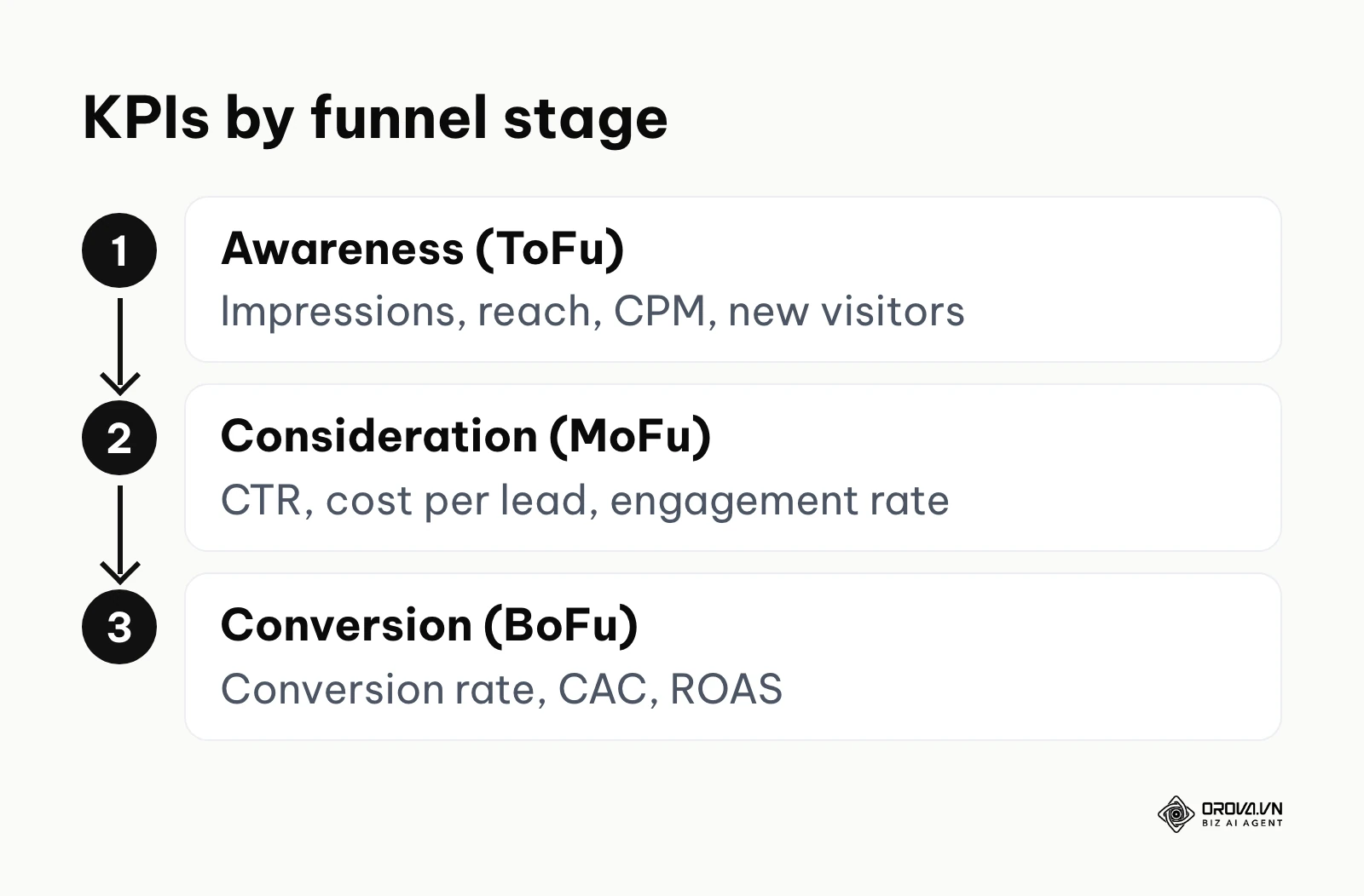
Understanding which metrics to track is the most complex part of building your interface. The most effective method is categorizing your metrics by the customer journey. Throwing everything onto one screen creates chaos. Instead, segment your data into Top of Funnel (Awareness), Middle of Funnel (Consideration), and Bottom of Funnel (Conversion).
Top of funnel (ToFu): awareness and reach
At this stage, you are measuring how effectively you are capturing attention from net-new audiences. You want to know if your brand is visible.
- Impressions and Reach: Impressions count how many times your content was displayed. Reach counts the number of unique individuals who saw it. If impressions are high but reach is low, you are showing the same ad to the same people repeatedly.
- Cost Per Mille (CPM): The cost to achieve one thousand impressions. This tells you how expensive a specific platform or audience is. CPM swings with platform, season, and targeting, so compare it against your own history for the same audience rather than against a generic industry figure.
- New Website Visitors: The volume of first-time traffic landing on your site. If this metric is stagnant, your top-of-funnel campaigns are failing to generate interest.
Middle of funnel (MoFu): consideration and engagement
Once you have their attention, you must measure their intent. Are they interacting with your assets?
- Click-Through Rate (CTR): The percentage of people who clicked your link after seeing it. A strong CTR indicates high relevance. CTR varies widely by format: search ads usually earn a much higher rate than display ads, so never judge both channels against the same line.
- Cost Per Lead (CPL): How much money you spend to acquire one contact's information. This is critical for data driven marketing strategies. If your CPL exceeds the gross margin of your product, your model is broken.
- Engagement Rate: A combination of likes, comments, shares, and time spent on page. It measures content quality. High traffic with low engagement usually signals a misleading headline or poor landing page experience.
Bottom of funnel (BoFu): conversion and revenue
This is where marketing proves its financial worth. These metrics dictate the survival of the business.
- Conversion Rate (CVR): The percentage of visitors who complete the desired action, such as a purchase. Conversion rates differ sharply by industry, price point, and traffic source, so the most useful benchmark is your own average over the last three months.
- Customer Acquisition Cost (CAC): The total cost to win a paying customer, factoring in both ad spend and operational overhead.
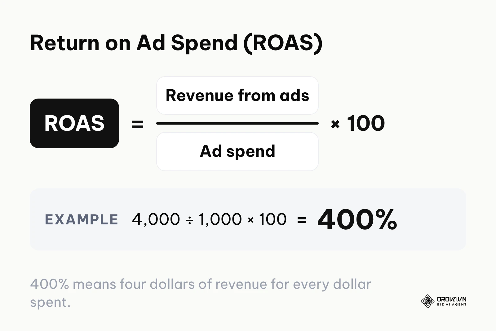
- Return on Ad Spend (ROAS): Revenue generated divided by ad spend. If your ROAS is 400%, you earn four dollars for every one dollar spent: 4,000 in ad revenue on 1,000 of spend gives 4,000 ÷ 1,000 × 100 = 400%. ROAS is one input to your overall marketing ROI, which also counts product costs and overhead.
A simple filter for choosing your KPIs
A long list of candidate metrics is easy to build; the hard part is deciding which ones earn a place on the main screen. Run every candidate through three questions. First, would a change in this number change a decision this month? Second, can you measure it reliably with the data you already collect? Third, who reads it, and does that person have the power to act on it?
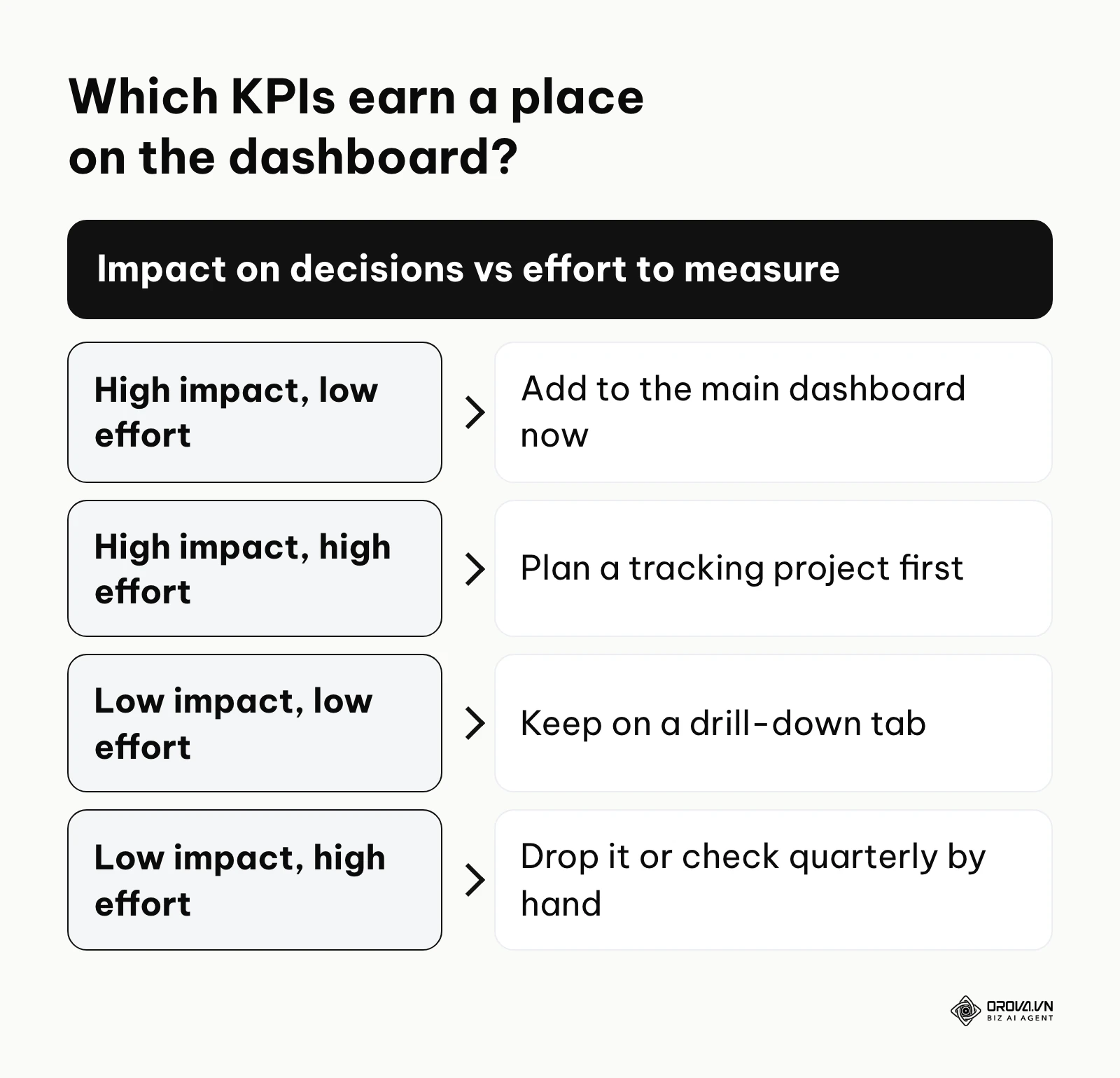
Then place each metric on a simple impact-versus-effort grid:
- High impact, low effort: Add it to the main dashboard now. These are usually spend, leads, CPL, revenue, and ROAS.
- High impact, high effort: Plan a tracking project before you show it, for example connecting CRM deal stages so you can report pipeline by channel.
- Low impact, low effort: Keep it on a secondary tab for specialists who need to drill down.
- Low impact, high effort: Drop it, or check it once a quarter by hand.
A good rule of thumb is to keep each view to five to seven core metrics. Anything beyond that belongs on a drill-down page, not on the screen your leaders open first.
The data quality verification process
Data quality problems are among the most common reasons a dashboard loses the trust of the people who read it. Before you build any charts, you must clean your inputs. Follow this ten-step validation checklist:
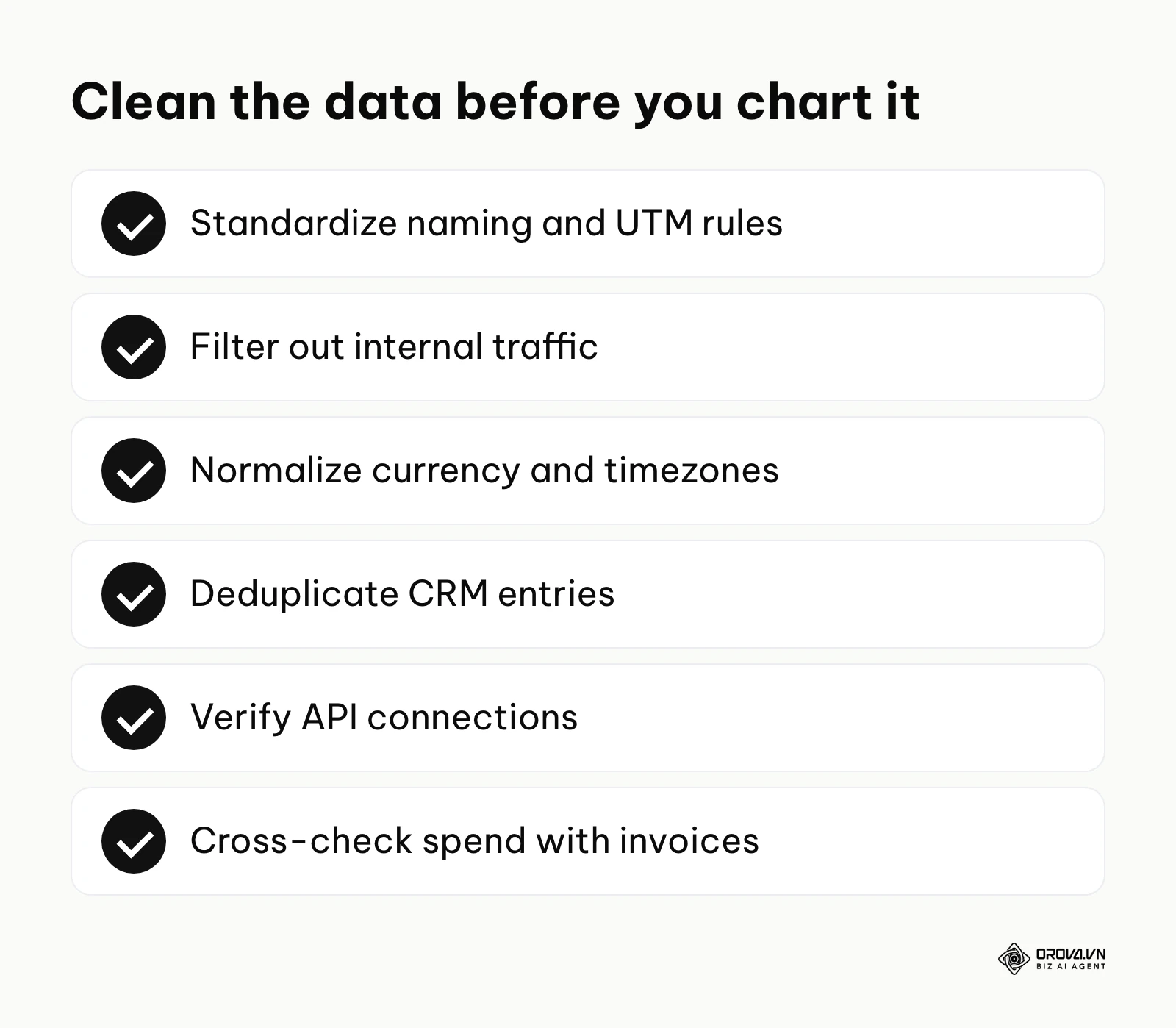
- Standardize Naming Conventions: Ensure every campaign uses the same format (e.g., Year_Month_Platform_Objective). This prevents fragmented tracking.
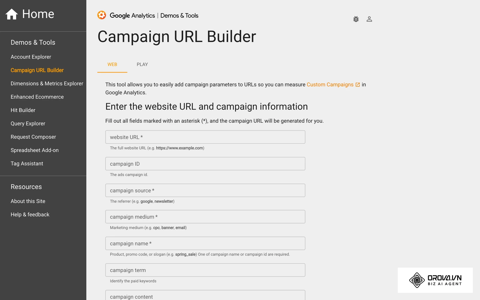
- Enforce UTM Rules: Use tracking parameters on every single link you control to identify exact traffic sources.
- Filter Internal Traffic: Block your office IP addresses so your employees testing the website do not artificially inflate visitor counts.
- Normalize Currency: If you sell globally, ensure all platforms report in one base currency to avoid mathematical errors.
- Align Timezones: Set all ad accounts and analytics properties to the same reporting timezone to prevent daily discrepancies.
- Deduplicate Entries: Implement rules in your CRM to merge duplicate contacts based on email addresses.
- Handle Null Values: Define how your system treats blank fields. A blank should register as a zero in financial calculations, not an error.
- Verify Integrations: Check that API connections are pulling complete datasets without dropping specific days.
- Cross-Reference Billing: Compare the spend shown on your dashboard against the actual invoices from the ad platforms.
- Stakeholder Sign-Off: Have the finance team review and approve your calculation formulas before launching the dashboard company-wide.
Depending on your organizational needs, you will likely construct different views.
| Dashboard type | Key characteristics | Best suited for |
|---|---|---|
| Executive summary | High-level financial metrics, monthly trends, ROI focus. | C-suite and board members. |
| Operational view | Daily performance, granular channel breakdowns, CPL tracking. | Marketing managers. |
| Tactical view | Hourly data, specific ad creative performance, granular CTR. | Specialists running campaigns. |
Illustrative example: An e-commerce retail brand noticed discrepancies between their ad spend reports and actual revenue. They initiated a project to audit their measurement framework. They started by exporting three months of historical data from all social platforms. Then, they compared these figures against their payment gateway settlements. They hit a roadblock when timezone differences caused daily revenue mismatches; they resolved this by standardizing all data pulls to Coordinated Universal Time (UTC) before importing. The outcome was a unified, accurate view of daily profitability, allowing them to shift spend toward high-performing days confidently.
How to build and adapt your system
Transitioning from messy spreadsheets to a streamlined interface requires a structured approach. The execution changes slightly depending on your role, but the foundational steps remain consistent.
Connecting free tools: a practical 3-step guide
You do not need expensive software to start. You can build a robust system using free applications.
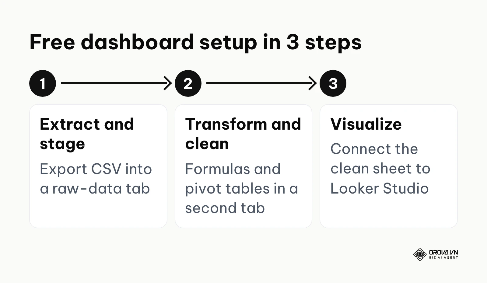
- Extract and Stage: Export your raw data from platforms like Google Analytics or your paid ad platforms into CSV files. Import these into a Google Sheet. Dedicate one tab purely to raw data drops, completely untouched by formatting.
- Transform and Clean: Create a second tab in your Google Sheet. Use formulas like VLOOKUP or pivot tables to pull data from the raw tab. This is where you calculate your metrics and standardize naming conventions.
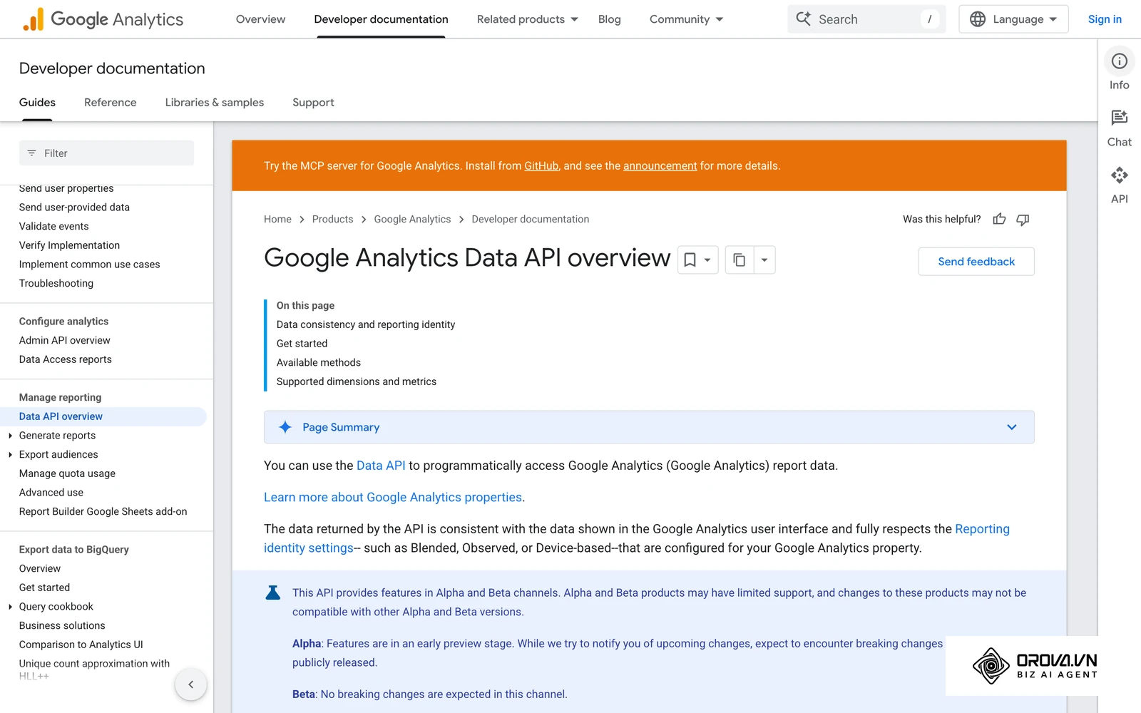
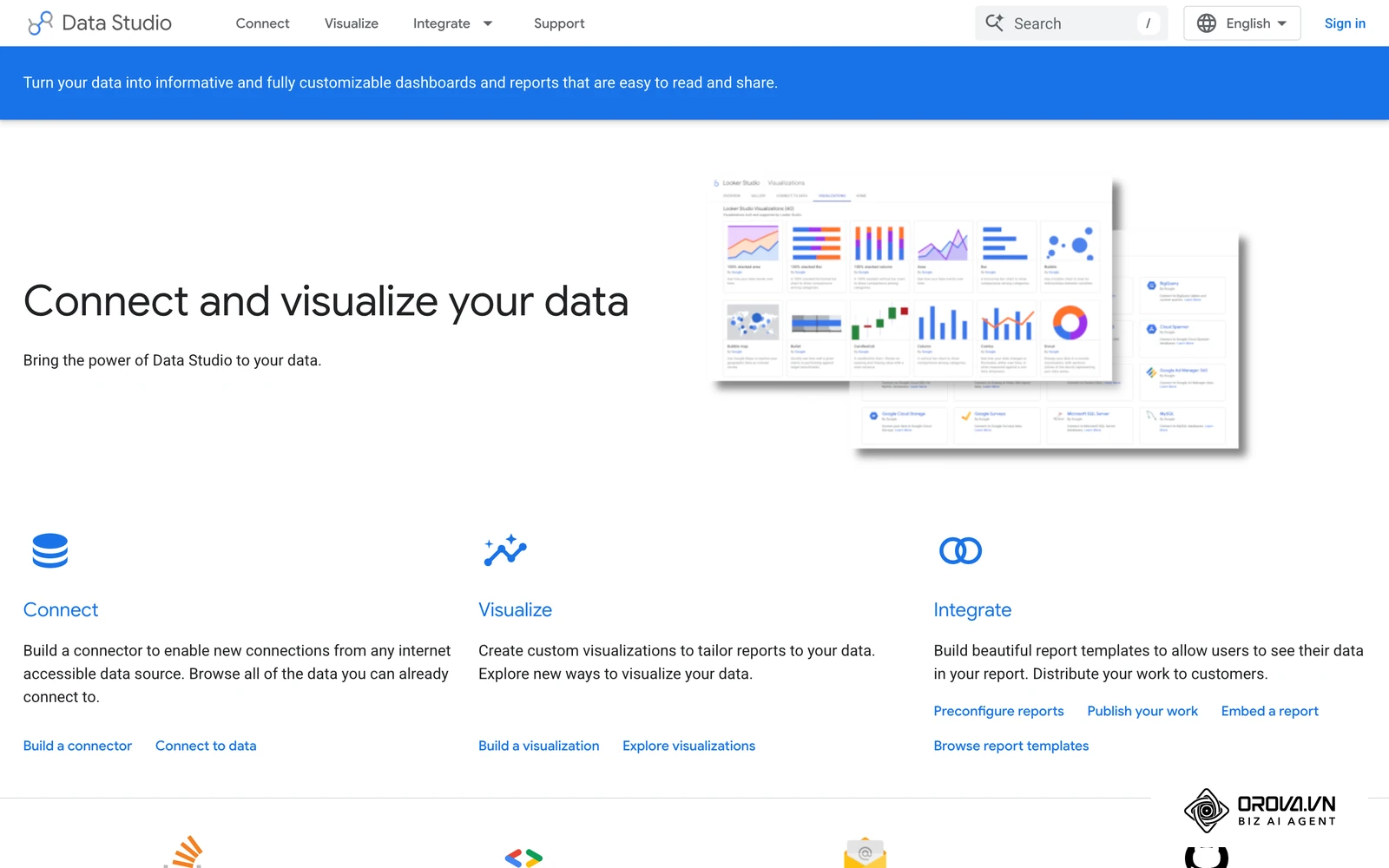
- Visualize the Output: Connect your clean Google Sheet to Looker Studio, which Google now also presents under the Data Studio name. Add your sheet as a data source, drag in your metrics, and build your charts. When you paste new rows into the sheet, the dashboard picks them up on its next data refresh.
For small business owners
As an owner, you need clarity without complexity.
- Identify the three numbers that keep your business alive (e.g., total leads, cost per lead, sales).
- Start with a simple spreadsheet before buying any software.
- Schedule a strict 30-minute block every Monday morning to review these numbers.
For marketing managers
You need to manage both your team's daily output and executive expectations.
- Define clear KPIs for every team member before launching any marketing campaign.
- Separate your reporting: build a detailed operational view for yourself and a simplified ROI view for your boss.
- Establish a routine to audit your data quality at the end of every month.
For agency owners
Agencies must scale reporting across multiple varied client accounts.
- Create a master dashboard template that fits most of your clients.
- Automate data extraction using API connectors to save billable hours.
- Use the dashboard during client calls to shift the conversation from defensive explaining to proactive strategy.
| Common mistake | Consequence | How to avoid |
|---|---|---|
| Tracking too many KPIs | Dashboard becomes noisy and impossible to read. | Limit to 5-7 core metrics per view. |
| Ignoring data cleaning | Decisions are made based on false information. | Follow the 10-step verification checklist. |
| Setting it and forgetting it | The dashboard becomes irrelevant as business goals change. | Review and adjust metrics quarterly. |
If you would rather not maintain the spreadsheet layer yourself, a tool such as Orova Insight connects sources like GA4, Google Ads, Meta Ads, TikTok, and Zalo OA, syncs CRM data through API, Webhook, or Google Sheets, and lets you build a drag-and-drop dashboard and schedule periodic reports.
Illustrative example: A performance marketing agency spent several days every month manually compiling reports for clients. They needed an automated approach to maintain profitability. They began by defining standard metrics applicable across all client accounts. Subsequently, they built a master template using Google Sheets to pull data via API connections. A major challenge arose when APIs changed, breaking the automated pulls. They mitigated this by implementing error-alert scripts that notified the team before client meetings. The final result was a much shorter reporting cycle, freeing up staff for strategic campaign optimization.
No more lag in data management. Unlock the power of the OROVA Insight system to sync O2O (Online-to-Offline) data flows and visualize every report in real time.
OROVA Insight: Integrate Online - Offline data, visualize reports in Real-time.
Future trends of marketing dashboard KPIs: my perspective
Looking ahead, the landscape of data visualization is shifting quickly. Based on the technological developments visible today, I anticipate meaningful changes in how we interact with marketing data over the next few years.
AI-driven narrative generation
Currently, dashboards display charts, and humans must interpret what those charts mean. I believe that over the next few years AI will increasingly flip this dynamic. Dashboards will not just show a declining bar chart; they will draft a plain-text paragraph suggesting why the metric dropped and what to check next. People will still need to verify those explanations, but they may spend less time hunting for the cause and more time deciding what to do.
The shift to predictive tracking
Most marketing dashboard KPIs today are historical—they tell you what happened yesterday or last month. I lean toward a future where forward-looking metrics sit next to them. Forecasting models can already estimate where a quarter is heading from current funnel velocity, and I expect them to become a normal part of the dashboard. People should start preparing for this by keeping their historical data clean today, because a forecast is only as good as the dataset it learns from.
Unified cross-platform identity
Right now, tracking a single user who clicks a Facebook ad on their phone and later buys via a Google search on their laptop is difficult. I think we will see better identity resolution methods that merge these fragmented journeys into a single view. However, privacy rules and browser restrictions could disrupt this prediction. If third-party cookies keep losing ground without a viable replacement, we might see more modeled, estimated data rather than precise individual tracking.
Frequently asked questions about marketing dashboard KPIs
Are marketing dashboards still needed when we have AI?
Yes, they are still necessary. AI is good at processing data and finding anomalies, but human leaders still need a visual interface to verify the AI's findings and understand the broader context. AI will enhance dashboards by making them easier to build and interpret, but it will not replace the need for a centralized "scorecard" that aligns the entire team on core objectives.
How often should a dashboard be updated and reviewed?
This depends entirely on the viewer's role. Tactical specialists running ad campaigns should review operational dashboards daily. Marketing managers overseeing strategy should review performance weekly to adjust budgets. Executives and founders generally only need to review a high-level financial dashboard monthly or quarterly to ensure overall business alignment.
How do you link marketing KPIs to overall financial company metrics?
You must establish a mathematical relationship between marketing activities and revenue. Stop reporting on clicks and start reporting on Pipeline Contribution. To do this, calculate your average order value and your lead-to-close conversion rate. Once you have these numbers, you can show the finance team that generating 100 marketing qualified leads translates to a specific amount of projected company revenue.
What should you do when data is missing or broken?
Never guess or fabricate numbers to make a chart look complete. If an API breaks or a tracking pixel fails, clearly annotate the dashboard to indicate the data outage for that specific date range. Pause any automated reporting emails until the issue is fixed, and communicate the problem transparently to stakeholders so they do not make decisions based on incomplete information.
Where should you start?
If you are overwhelmed by data, the worst thing you can do is try to build a massive, complex system on day one. Your approach must match your current state of readiness.
If you have nothing set up yet: Do not buy software. Your first step is to sit down with a blank piece of paper and write down the three specific actions you want your customers to take (for example, sign up for a newsletter, request a quote, make a purchase). Once you have defined these actions, your only job is to figure out how to count them accurately using free native platform tools.
If you have data but it is scattered everywhere: Stop trying to analyze it across five different screens. Your first step is consolidation. Choose one primary metric from each platform—like ad spend from Facebook and total revenue from your website—and manually type them into a simple spreadsheet once a week. Get comfortable with the habit of viewing your core numbers in one single location before attempting to automate the process.
If you are tracking everything but nobody looks at it: Your dashboard is likely too complicated. Your first step is to ruthlessly delete charts. Audit your current setup and remove any metric that has not directly influenced a business decision in the last thirty days. Simplify the view until it only highlights the numbers that trigger immediate action.
About the author

Builder of Orova
Nguyễn Đỗ Trọng Ân has 8 years of experience in marketing, including 6 years managing market development across Asia. He builds Orova, a Biz AI Agent that never sleeps: it plans, runs and optimizes work for businesses.
Run your business with AI Agents
Orova is the always-on Biz AI Agent — it plans, runs, and optimizes the work for you.
Save time, unlock productivity.