
What are CTA mistakes? An audit guide with a 50-example swipe file
You have spent weeks crafting the perfect landing page, driving targeted traffic, and writing compelling copy, yet your conversion rate remains stagnant. This frustrating scenario often points directly to a single, overlooked element. Understanding and fixing cta mistakes is the fastest way to unblock your marketing funnel. Historically, marketers treated call-to-action buttons as an afterthought, simply slapping a "Submit" button at the bottom of a form. However, modern user behavior demands a sophisticated approach blending psychology, design, and data tracking. This guide will dismantle the most common errors that are secretly draining your revenue, showing you exactly how to transform passive readers into active buyers. We will explore deep psychological triggers, technical tracking setups, and share a swipe file of 50 example CTAs you can adapt for your next campaign.
What are CTA mistakes?
CTA mistakes are design, copy, or strategic errors in a call-to-action that prevent users from taking a desired step. They are used to identify friction points in a conversion funnel. Unlike general design flaws, CTA mistakes directly impact measurable actions, making them critical for immediate revenue and lead generation.
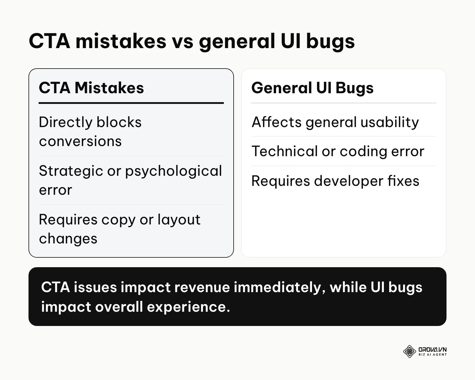
The term "Call to Action" originated in direct response copywriting in the mid-20th century, where mail-order catalogs explicitly instructed readers on how to order. Today, "CTA mistakes" refers to the digital equivalent of these failures, where pixels replace paper but human psychology remains the same. Understanding these errors requires distinguishing them from other common website issues.
| Concept | Difference | Example |
|---|---|---|
| CTA Mistakes | Directly impacts the final decision point. | A button saying "Submit" instead of "Get My Free Ebook". |
| General UI Bugs | Affects usability anywhere on the site. | A navigation menu that doesn't drop down on mobile. |
| Poor Copywriting | Fails to build desire throughout the page. | A headline that doesn't explain the product's core value. |
An everyday example of a CTA mistake is a physical door with a handle that has a sign reading "Push". The visual design (a handle meant for grabbing) tells your brain to pull, but the text says push. This cognitive dissonance creates friction, exactly like a poorly designed button on a website.
The significance of fixing CTA mistakes in the marketing funnel
Call-to-action mistakes exist as roadblocks at the most vulnerable stage of your user journey. You spend significant budget on advertising, SEO, and content creation to drive awareness and interest. The user navigates through your content strategy framework, becoming increasingly educated about their problem and your solution. The CTA is the culmination of all that effort. It is the bridge between marketing and sales.
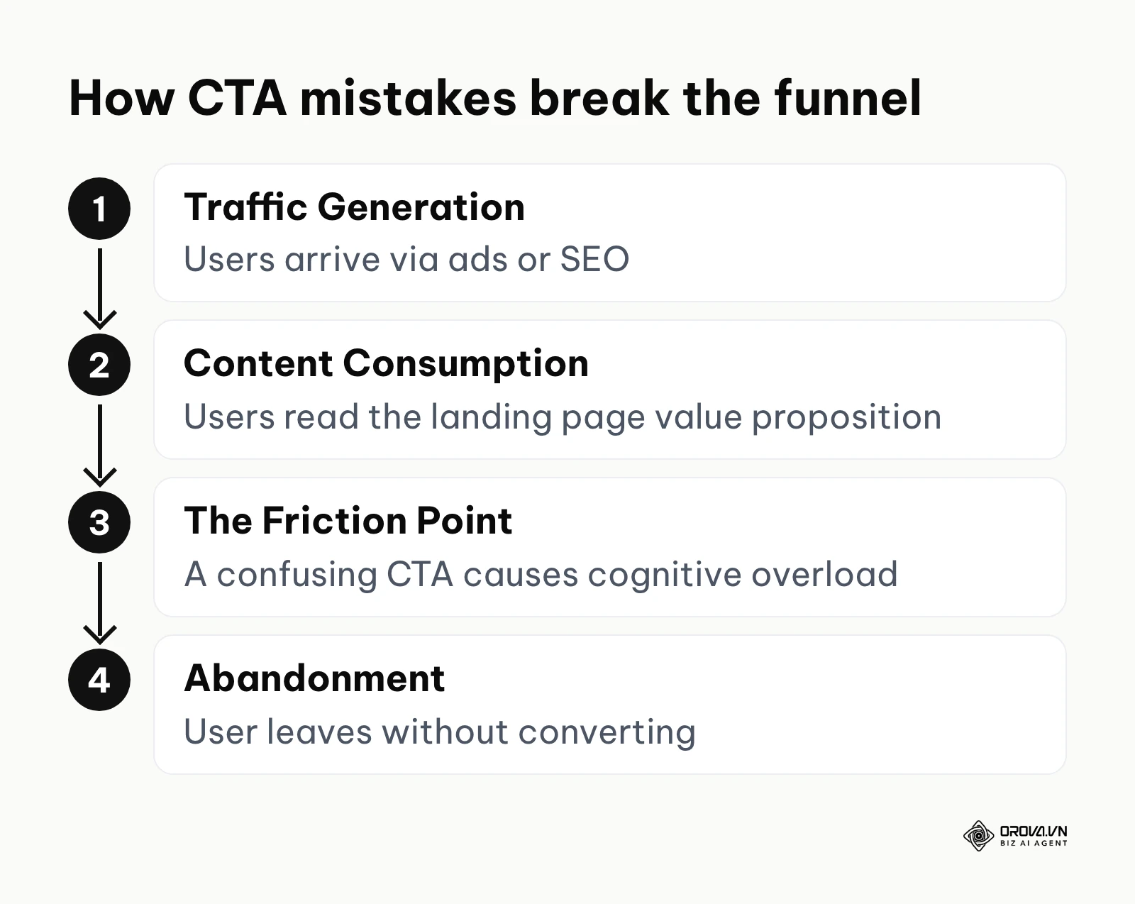
When you ignore these errors, you are effectively pouring water into a leaky bucket. You might have excellent traffic and highly engaging content, but if the user reaches the end of the page and is confused about what to do next, they will simply leave. This inflates your customer acquisition costs and skews your data, making it seem like your product or overall offer is failing when, in reality, only the final prompt was flawed. Fixing these mistakes ensures that the intent you built up is successfully captured.
When you don't need to fix CTA mistakes: If you are publishing internal corporate memos where employees are mandated to read the content without taking external action, or if you are running a purely informational digital archive designed solely for historical preservation, optimizing call-to-action buttons is a waste of time. In these specific scenarios, your primary focus should be entirely on readability and searchability rather than driving a conversion metric.
The business value and benefits of correcting CTA mistakes
Correcting these errors provides immense value divided into two layers: macroeconomic benefits for the business as a whole, and micro-level workflow benefits for the marketing professionals executing the daily tasks.
Immediate revenue recovery for the business
For a business, every percentage point increase in conversion rate drops straight to the bottom line. By removing friction at the decision stage, you instantly capture revenue that was previously bouncing off the page. This requires no additional ad spend or traffic generation; it simply maximizes the efficiency of the traffic you already possess.
Reduced customer acquisition costs (CAC)
When your CTAs convert effectively, the cost to acquire each customer decreases. If a landing page previously converted at 2% and now converts at 4% due to better button design and copy, your effective cost per lead is cut in half. This allows businesses to scale their advertising campaigns more aggressively.
Clearer campaign data for marketers
For the professional marketer, accurate tracking of optimized CTAs provides clarity. When buttons are clear and distinct, click data becomes a reliable indicator of user intent. You no longer have to guess whether a campaign failed due to bad targeting or a confusing user interface.
Faster iteration cycles
When you understand the exact anatomy of a good CTA, you can deploy new pages faster. Marketers spend less time debating colors in meetings and more time relying on proven frameworks and swipe files to launch campaigns rapidly.
Illustrative example: Context: A mid-sized SaaS company with a marketing manager role struggling with high bounce rates on their pricing page. Steps taken: First, they audited the page and found three competing primary buttons. Second, they changed the secondary buttons to ghost buttons (transparent background with a solid border). Third, they rewrote the main button from "Buy Now" to "Start Your Free Trial". Stumbling block: Initially, the ghost buttons blended into the background too much, leading to confusion, so they added a subtle darker border. Result: The pricing page now had one obvious next step, and the team could measure trial sign-ups against a clean baseline without changing ad spend.
| Benefit | Measured by | Seen after how long |
|---|---|---|
| Revenue Recovery | Total Sales / Conversions | 1 - 2 weeks |
| Reduced CAC | Cost Per Acquisition (CPA) | 1 month |
| Clearer Data | Event Click Accuracy | Immediately |
Discover Orova.vn – a Biz AI Agent platform with OROVA SEO, a complete solution for every website. The system supports search engine optimization from A to Z with features including keyword research, writing new SEO-ready articles, optimizing existing content, rank tracking, plus competitor analysis and in-depth technical analysis. Sign up today to experience OROVA SEO completely free (offer valid through July 7, 2027).
The anatomy of CTA mistakes: How to identify and fix them
To truly master conversion optimization, you must dissect the CTA into its core components: visual design, copywriting, contextual placement, and the technical tracking required to measure it. Understanding how to drive traffic to your website is only half the battle; capturing it is the other.
Visual and design CTA mistakes
The most common visual failure is a lack of contrast. Usability research consistently notes that buttons lacking high contrast are easy to miss for users who scan the page. If your brand colors are blue and white, and your CTA button is a slightly different shade of blue, it will suffer from the "chameleon effect"—blending into the layout and becoming invisible.
A critical tool here is the "squint test". If you step back from your monitor, squint your eyes until the page becomes blurry, your primary CTA should be the only element that clearly stands out as a distinct block of color.
Another major issue is whitespace (padding and margin). A button crowded by surrounding text or images creates visual anxiety and increases the chance of accidental clicks on the wrong element. Furthermore, there is no single winning button color: red does not universally outperform green, and what matters is how strongly the color stands out from the brand palette. This psychological concept is known as the Von Restorff effect, or the isolation effect.
The mobile length question: The ideal maximum length for a mobile CTA is 2 to 4 words, keeping the character count under 25. Anything longer risks truncation or crowding the button, making it difficult for users to tap accurately with their thumbs. On mobile screens, real estate is premium, and long sentences force the text size to shrink, harming legibility.
Copywriting and psychological CTA mistakes
The words on your button dictate the perceived risk and reward in the user's mind. The deadliest mistake is using friction words. Words like "Submit", "Buy", "Order", or "Sign Up" imply that the user must give up something (money, data, or time). Instead, high-converting copy uses value-oriented language that highlights what the user gets.
Switching from "Submit" to "Get My Free Ebook" shifts the psychological framing from a chore to a reward. Many teams also test first-person pronouns ("My" instead of "Your") to increase the sense of ownership; treat this as a hypothesis to test on your own page, not a guaranteed win.
The micro-copy question: How to use Micro-copy effectively without clutter? Micro-copy refers to the tiny text placed immediately adjacent to or below the main button. To use it effectively, keep it under 10 words, place it directly below the button in a lighter, smaller font, and use it exclusively to handle the single biggest user objection. For example, if you are asking for a trial signup, the micro-copy should read "No credit card required." If asking for an email, write "We respect your privacy; unsubscribe anytime." This reduces anxiety without distracting from the main action. Micro-copy can also carry social proof, such as a short note about who already uses the product, as long as every claim is true.
The urgency vs clickbait question: How to balance urgency vs clickbait spam? True urgency relies on real scarcity, such as "Sale ends at midnight" when the software will physically reject discounts after 12:00 AM. Clickbait relies on manufactured anxiety or withholding information, such as "Click here before it's too late!" without context. Always deliver exactly what the button text promises to maintain trust. If a button says "Download PDF", it must instantly download the file, not redirect to a 20-minute sales video.
Contextual and strategic CTA mistakes
A perfectly designed, brilliantly written button will still fail if placed in the wrong context. This is known as intent mismatch. If a user is reading a top-of-funnel educational blog post about "what is seo", hitting them with a massive "Buy Our Enterprise Software" button is jarring. They are in an educational mindset, not a purchasing mindset.
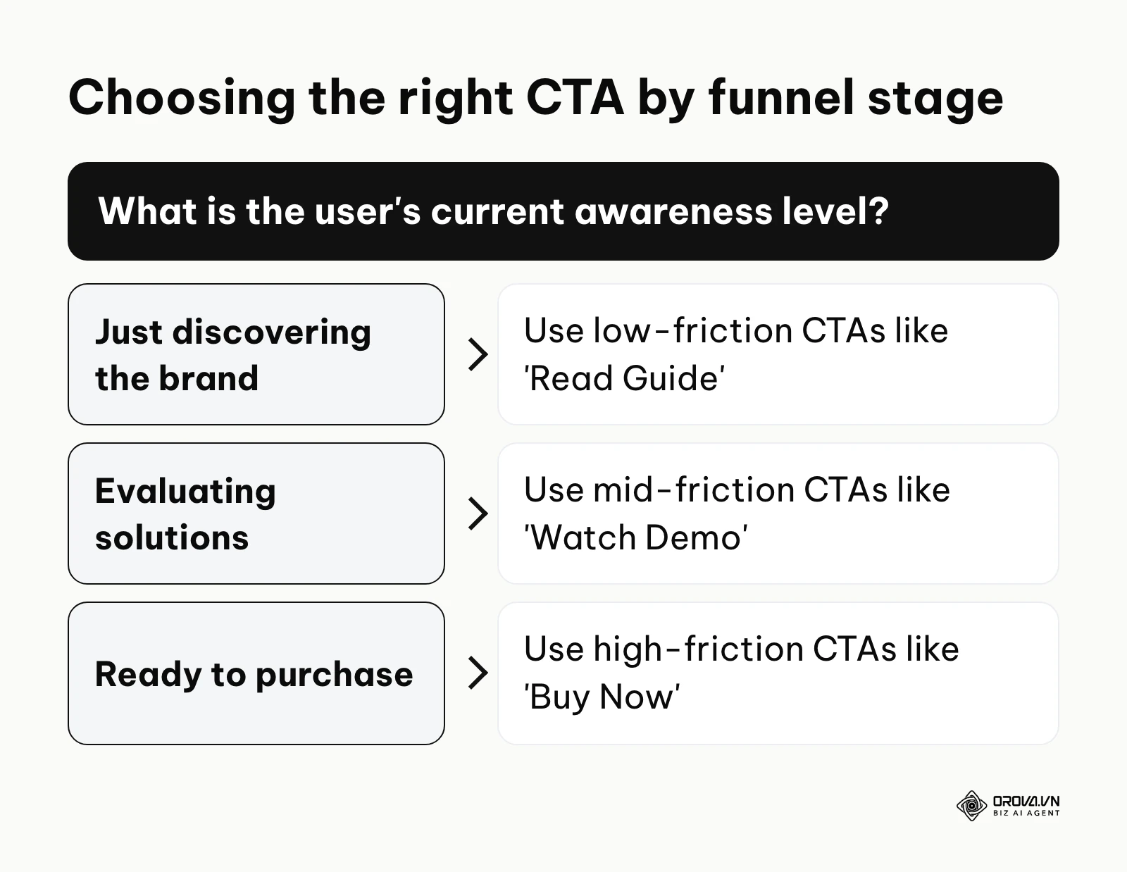
You must map the CTA to the user's journey. Early in the journey, use low-friction CTAs (e.g., "Read the Guide", "Download Checklist"). In the middle of the funnel, offer mid-friction actions (e.g., "Watch a Demo", "Calculate ROI"). Only at the bottom of the funnel, on dedicated landing pages, should you deploy high-friction actions (e.g., "Start Free Trial", "Buy Now"). Where the button sits inside the page matters too; see this breakdown of a high-converting landing page structure for placement around headline, proof, and offer.
Additionally, suffering from "choice paralysis" (Hick's Law) is a strategic error. If a page presents five equal-weighted buttons (Share on Facebook, Read More, Buy Now, Subscribe, Contact Us), the user's brain gets overloaded evaluating the options, and they often choose to do nothing. Every page should have one primary goal, visually dominant, with secondary actions severely minimized.
B2B vs B2C CTA mistakes comparison
A frequent strategic error is applying B2C (Business to Consumer) tactics to B2B (Business to Business) environments, or vice versa.
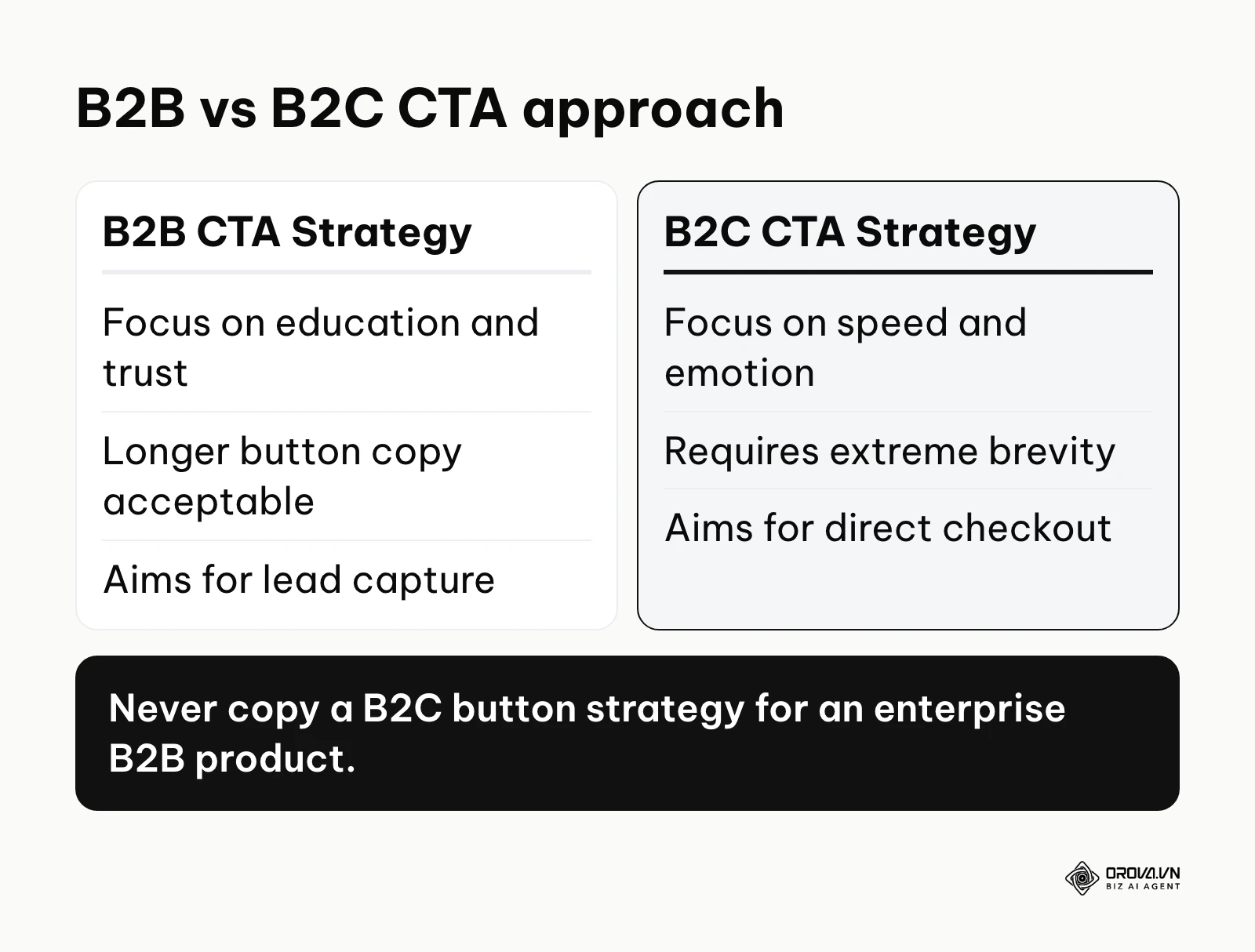
In B2C, purchases are often impulsive, emotional, and involve a single decision-maker spending their own money. The CTAs here need to be sharp, immediate, and heavily rely on scarcity and instant gratification. Buttons like "Add to Cart", "Buy Now", or "Claim 50% Off Today" work exceptionally well.
In B2B, the sales cycle is long, logical, and involves multiple stakeholders spending company money. A B2B buyer is rarely going to impulsively click "Buy Now" on an expensive enterprise software package. The CTAs must reflect education, risk mitigation, and consensus-building. Effective B2B CTAs include "Request a Custom Demo", "Download the Case Study", or "Talk to an Expert". Using a B2C "Buy Now" approach in a complex B2B funnel creates immediate distrust.
How to set up GA4 event tracking to detect CTA mistakes
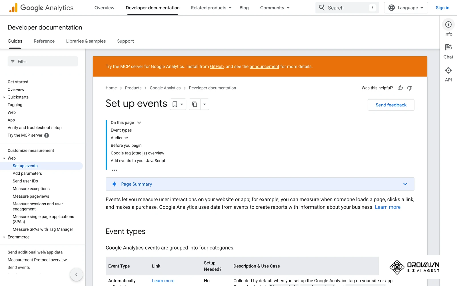
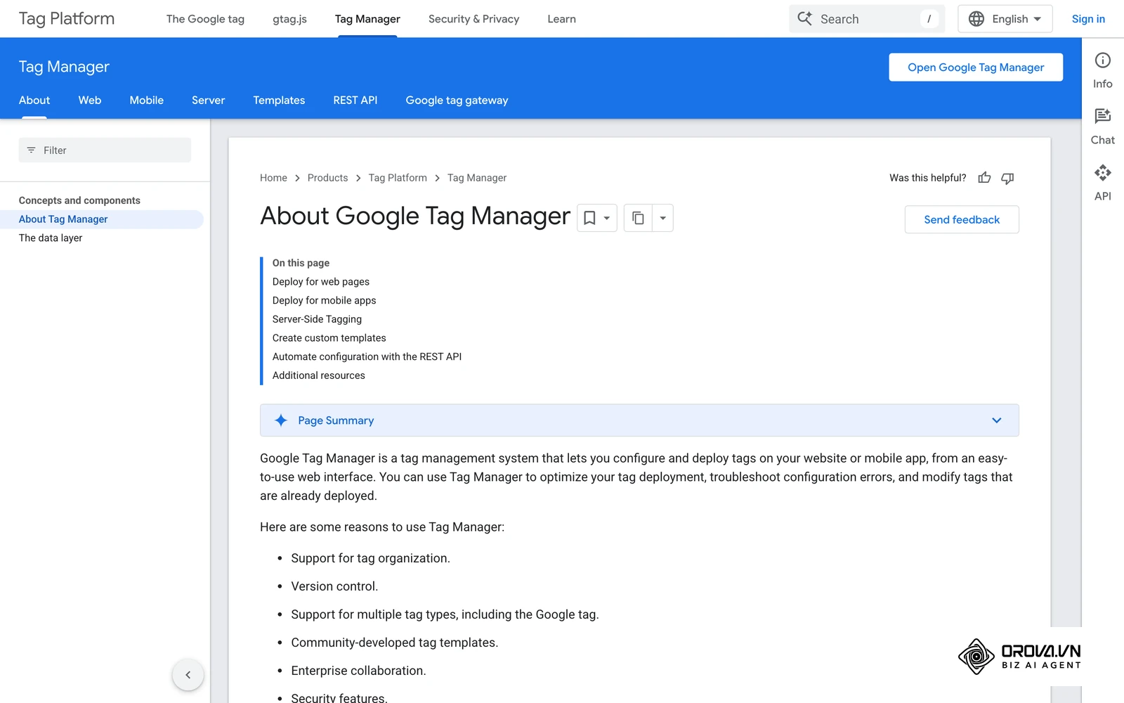
You cannot fix what you cannot measure. If you are wondering why your page isn't converting, you need technical data to pinpoint the exact drop-off location. Google's GA4 documentation on events explains how to send custom events and parameters, which is what you need to track specific button clicks accurately. This click data then feeds the wider conversion rate optimization process, so you test changes against real behavior instead of opinions.
Here is the process to track your buttons using Google Tag Manager (GTM):
- Identify the Button Class: Right-click your CTA on the live website and select "Inspect". Find the CSS class associated with the button (e.g., class="btn-primary-cta").
- Create a GTM Trigger: Open Google Tag Manager, go to Triggers, and create a new one. Choose "Click - All Elements" or "Click - Just Links". Set it to fire on "Some Clicks" where the "Click Classes" contains your button's specific class name.
- Configure the GA4 Event Tag: Go to Tags, create a new "Google Analytics: GA4 Event". Select your GA4 configuration tag.
- Name the Event: Give the event a clear, snake_case name, such as generate_lead or add_to_cart.
- Publish and Test: Save the tag, submit the GTM workspace, and open the GA4 DebugView to verify that clicking the button successfully fires the event.
Illustrative example: Context: An e-commerce store owner experiencing low add-to-cart rates despite running profitable social media ads. Steps taken: First, they implemented Google Analytics 4 event tracking specifically on the "Add to Cart" button using GTM. Second, they segmented the click data by device type in the GA4 dashboard. Third, they discovered that mobile users were missing the button entirely because it was pushed below the fold by unusually large product images. Stumbling block: The initial GA4 setup failed to capture dynamic button IDs on product variations, requiring them to use CSS class tracking instead for consistency. Result: After making the button sticky at the bottom of mobile screens, the owner could compare mobile add-to-cart clicks before and after the change in the same GA4 report, instead of guessing why ads were not paying off.
The 10-point CTA audit checklist
Before launching any landing page, use this checklist to prevent basic errors.
- Is the button color the most contrasting element on the entire page?
- Does the button copy start with a strong, value-driven action verb?
- Is the maximum text length under 25 characters to ensure mobile legibility?
- Is there clear micro-copy handling the user's biggest immediate objection?
- Is the primary CTA placed above the fold AND repeated at the bottom of the page?
- Are secondary CTAs visually deprioritized (e.g., using ghost buttons or plain text links)?
- Does the link actually work, and does the destination page load under 2 seconds?
- Is GA4 event tracking actively firing and verified on the button click?
- Does the landing page headline promise match the CTA text exactly?
- Is there enough whitespace padding surrounding the button to prevent accidental misclicks on touchscreens?
A swipe file of 50 example CTAs
Stop guessing what words to use. Below is a swipe file of 50 example CTAs, grouped into five categories of 10, with a weak version and a stronger rewrite for each. Use them as starting points and test them on your own pages; none of them is guaranteed to win everywhere.
| Category | Funnel Stage | Bad CTA Example | Stronger CTA (Swipe This) | Why It Works |
|---|---|---|---|---|
| E-commerce | Top of Funnel | Buy Now | Shop the Spring Collection | Less aggressive, clear context. |
| E-commerce | Mid Funnel | View Products | Discover Your Perfect Fit | Adds a layer of personalization. |
| E-commerce | Bottom Funnel | Submit Order | Complete My Secure Purchase | Uses ownership ("My") and trust ("Secure"). |
| E-commerce | Cart | Cart | View My Bag & Checkout | Clear indication of the next step. |
| E-commerce | Promo | Get Discount | Claim My 20% Off Code | Value-driven and action-oriented. |
| E-commerce | Out of Stock | Notify Me | Email Me When It's Back | Sets a specific expectation for communication. |
| E-commerce | Wishlist | Add | Save for Later | Low friction, implies no immediate commitment. |
| E-commerce | Upsell | Add More | Upgrade My Order | Highlights perceived value over cost. |
| E-commerce | Subscription | Subscribe | Get Monthly Deliveries | Absolute clarity of the resulting action. |
| E-commerce | Review | Review | Share My Feedback | Sounds less like homework and more like a conversation. |
| SaaS & Software | Top of Funnel | Sign Up | Start My Free Trial | Removes financial risk explicitly. |
| SaaS & Software | Mid Funnel | Demo | See How It Works | Provokes curiosity with low commitment. |
| SaaS & Software | Bottom Funnel | Buy | Upgrade to Pro | Aspirational framing of a purchase. |
| SaaS & Software | Freemium | Register | Create My Free Account | Highlights the word "Free" as a primary hook. |
| SaaS & Software | Feature | Read More | Explore All Features | Action-oriented exploration. |
| SaaS & Software | Pricing | Prices | View Pricing Plans | Direct and sets correct expectations. |
| SaaS & Software | Integration | Connect | Sync With Slack | Mentions the specific, tangible outcome. |
| SaaS & Software | Onboarding | Next | Complete My Profile | Encourages ownership of the account. |
| SaaS & Software | Support | Help | Talk to a Human | Demonstrates empathy and accessibility. |
| SaaS & Software | Cancellation | Cancel | Pause My Account | Offers a less severe alternative to churning. |
| Lead Gen & Services | Agency | Contact Us | Get My Free Audit | Offers tangible, immediate value. |
| Lead Gen & Services | Consultant | Hire Me | Book a Strategy Call | Professional framing of an inquiry. |
| Lead Gen & Services | Real Estate | View Homes | See Available Listings | Direct and expectation-matching. |
| Lead Gen & Services | Legal | Submit | Request My Free Consultation | Provides reassurance for high-stress services. |
| Lead Gen & Services | Medical | Book | Schedule My Appointment | Formal, clear, and reassuring. |
| Lead Gen & Services | Plumber | Call | Get an Emergency Quote | Matches urgency with the user's immediate need. |
| Lead Gen & Services | B2B | Download | Access the Industry Report | Implies exclusivity and high value. |
| Lead Gen & Services | Insurance | Quote | See My Estimated Rate | Personalization and expectation setting. |
| Lead Gen & Services | Finance | Apply | See If I Qualify | Piques curiosity and shifts the dynamic. |
| Lead Gen & Services | Education | Enroll | Start My Learning Journey | Highly aspirational and emotional. |
| Newsletters & Content | Blog | Subscribe | Join [Number] Fellow Readers | Uses social proof; only insert a real, current subscriber count. |
| Newsletters & Content | Ebook | Download | Get the Free Blueprint | Specificity makes the offer feel concrete. |
| Newsletters & Content | Podcast | Listen | Play the Latest Episode | Action-oriented for media consumption. |
| Newsletters & Content | Video | Watch | See the Full Interview | Clarity on the content format. |
| Newsletters & Content | Community | Join | Become a Member | Fosters a sense of belonging. |
| Newsletters & Content | Quiz | Start | Find My Score | Triggers innate human curiosity. |
| Newsletters & Content | Survey | Submit | Share My Opinion | Empowers the user rather than demanding work. |
| Newsletters & Content | Article | Next | Read the Next Chapter | Creates a sense of narrative continuity. |
| Newsletters & Content | Resource | Get | Unlock the Templates | The word "Unlock" implies hidden, premium value. |
| Newsletters & Content | Course | Buy | Start Learning Today | Focuses on immediate gratification. |
| Webinars & Events | Live | Register | Save My Seat | Implies scarcity and physical presence. |
| Webinars & Events | Replay | Watch | Access the Replay | Direct and clear outcome. |
| Webinars & Events | Conference | Buy Tickets | Secure My Early Bird Ticket | Combines urgency with financial savings. |
| Webinars & Events | Meetup | RSVP | Confirm My Attendance | Formal and sets a clear commitment. |
| Webinars & Events | Workshop | Join | Build My First Funnel | Focuses entirely on the end outcome. |
| Webinars & Events | Reminder | Remind Me | Add to Calendar | Purely utilitarian and helpful. |
| Webinars & Events | Agenda | View | See the Full Schedule | Clarity for event planners. |
| Webinars & Events | Speaker | Read | Meet the Speakers | Humanizes the event and builds authority. |
| Webinars & Events | Sponsor | Sponsor | View Sponsorship Packages | Professional language for B2B transactions. |
| Webinars & Events | Networking | Join | Meet Other Attendees | Benefit-driven for community events. |
With OROVA.VN and the OROVA SEO module, you put an end to the exhausting days of manual work for good. Instead of struggling for hours to write articles and compile reports, the entire process is now optimized and completed in just 5 minutes.
How different roles should adapt and avoid CTA mistakes
Different professionals interact with conversion elements in unique ways. A failure to align responsibilities often leads to broken funnels, regardless of how much traffic your campaigns bring in.
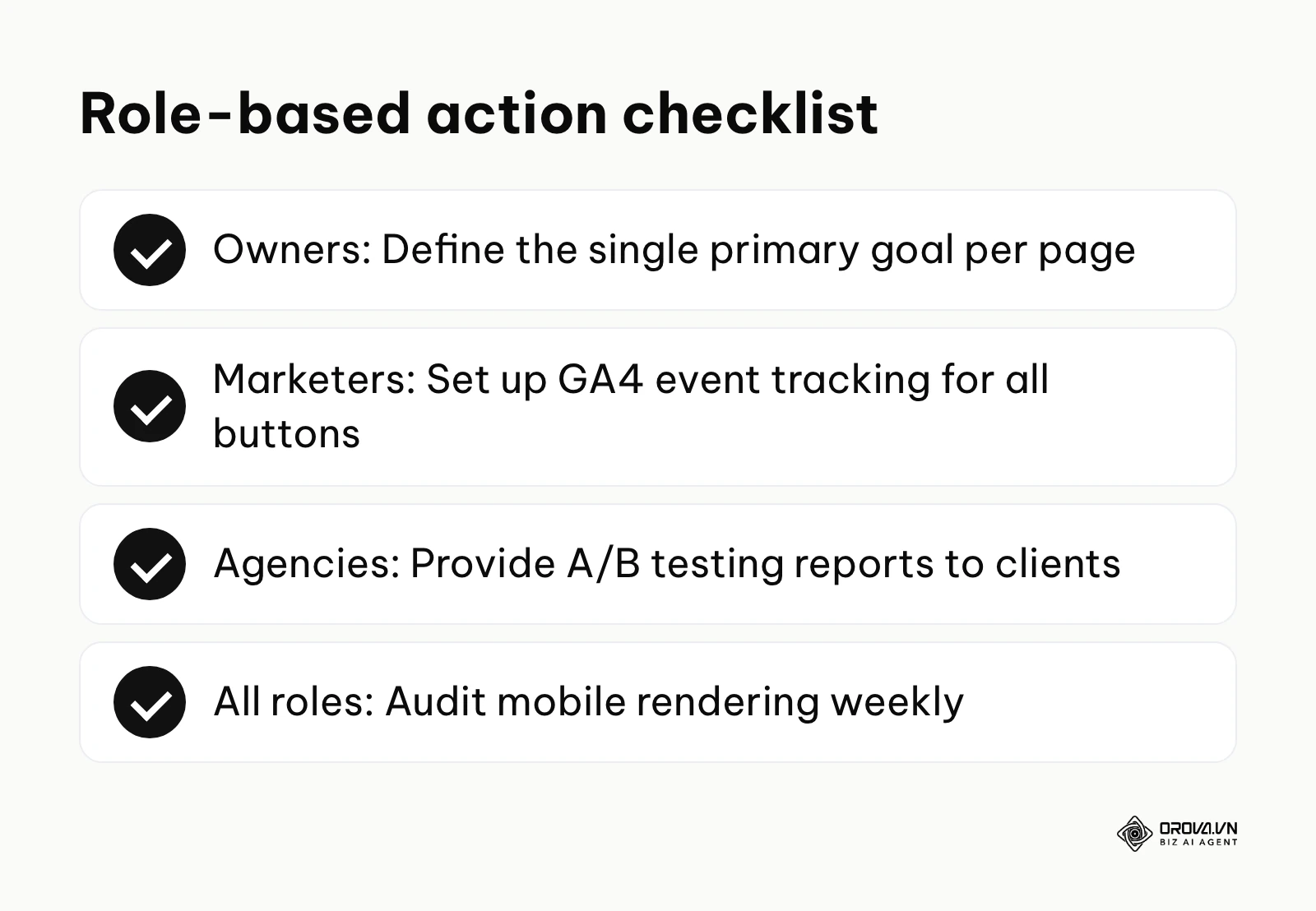
Small business owners
As an owner, your primary job is strategic alignment, not pixel-pushing. You must ensure that the overarching goal of your website matches the buttons you deploy.
- Define the single most important action you want a visitor to take this quarter (e.g., phone calls, email signups).
- Audit your homepage to ensure that primary goal is the only high-contrast button available.
- Remove secondary, conflicting buttons that distract from your main revenue driver.
In-house marketing managers
Marketers are responsible for the execution, testing, and data tracking of the funnels.
- Implement GA4 event tracking on every primary conversion button across the site.
- Run A/B tests specifically on button copy, changing only one word at a time to isolate variables.
- Standardize the micro-copy used across different landing pages to maintain brand consistency.
- Establish a weekly review of button performance metrics to catch technical drop-offs early.
Agency professionals and freelancers
For those serving clients, proving ROI is paramount. You must educate clients who often demand bad practices (like "make the logo bigger" or "add more buttons").
- Present clients with wireframes that clearly justify the visual hierarchy and isolation of the CTA.
- Set up shared tracking dashboards so clients can see button clicks for themselves.
- Refuse requests to clutter landing pages with unnecessary navigation links that bleed traffic away from the CTA.
| Common Mistake | Consequence | How to Avoid |
|---|---|---|
| Too many buttons | Choice paralysis, lower overall conversions | Enforce a strict "one primary goal per page" rule. |
| Vague copy ("Submit") | High anxiety, user abandonment | Use value-driven verbs (e.g., "Get My Report"). |
| Broken tracking | Inability to optimize or prove ROI | Mandate GTM/GA4 testing before any campaign goes live. |
CTA mistakes trends in the next few years: Author's perspective
As we look toward the future of digital marketing, the static nature of buttons is fundamentally changing. Based on current technological trajectories, here is how I see call-to-action optimization evolving.
AI-driven dynamic CTAs will become standard
As of 2026, we are already seeing the early stages of dynamic content generation. I believe that within the next two to three years, hardcoding a single button for all users will likely look dated. AI systems will analyze a visitor's referral source, past browsing behavior, and even current scroll speed to dynamically rewrite the CTA copy on the fly. If a user arrived from a highly technical article, the button might read "View API Docs"; if they came from a pricing comparison site, it will instantly change to "Start Free Trial". You should prepare by ensuring your website architecture supports dynamic parameter insertion.
Voice and conversational CTAs will replace traditional buttons
I lean towards the idea that as smart devices proliferate, the visual button will become less central for certain demographics. Conversational AI interfaces will act as the ultimate CTA. Instead of clicking "Add to Cart", users will simply say, "Buy the organic coffee I looked at yesterday". The mistake will no longer be a bad color choice, but a failure to design an intuitive conversational flow. Marketers need to start optimizing their copy for spoken natural language, rather than just visual scanning.
Hyper-personalization will blur the line between content and CTA
In my view, the rigid separation between "educational content" and the "sales button" will dissolve. AI will weave the call-to-action naturally into the narrative of the content itself, making it feel less like a transaction and more like a logical continuation of the learning experience. Prepare for this by training your teams to write deeply empathetic, context-aware copy, as aggressive, stand-alone "Buy Now" blocks will increasingly trigger user ad-blindness.
Frequently asked questions about CTA mistakes
Why is my CTA not converting despite high traffic?
High traffic with zero conversions usually indicates an intent mismatch. Users might be arriving expecting educational information but are met with an aggressive sales button. Alternatively, it could be a technical failure where the button is invisible on mobile devices or the tracking is broken. Always check your mobile rendering first.
How to improve CTA click through rate quickly?
The fastest way to improve CTA click through rate is to change the button color to the highest contrasting color on your palette, increase the whitespace around it, and change the text from a generic "Submit" to a value-driven phrase like "Get My Free Guide". These three tweaks take minutes, so they are a sensible first test before bigger redesigns.
Are CTA mistakes still relevant when AI can auto-optimize pages?
Yes, absolutely. While AI can test variations rapidly, it still requires a human to define the strategic goal, set the brand voice parameters, and determine the ethical boundaries of urgency and scarcity. AI is a tool for execution; the foundational strategy of understanding what the user actually wants remains a human responsibility.
Can a page have more than one primary CTA?
Generally, no. A dedicated landing page should have exactly one primary goal to prevent choice paralysis. However, you can repeat that same primary button multiple times down a long scrolling page. If you must have secondary actions, design them as low-contrast ghost buttons or simple text links so they do not compete visually.
What is the best color for a CTA button?
There is no universally "best" color like red or green. The best color is the one that stands out the most against your specific website's background and brand colors. If your site is mostly blue, an orange or yellow button will usually stand out more, thanks to the isolation effect.
Where should you start auditing your CTAs?
Knowing before starting is crucial. Just like understanding a seo content outline before writing, you must know your baseline before tweaking buttons. Depending on your current situation, your first step will vary. Do not try to fix everything in one afternoon.
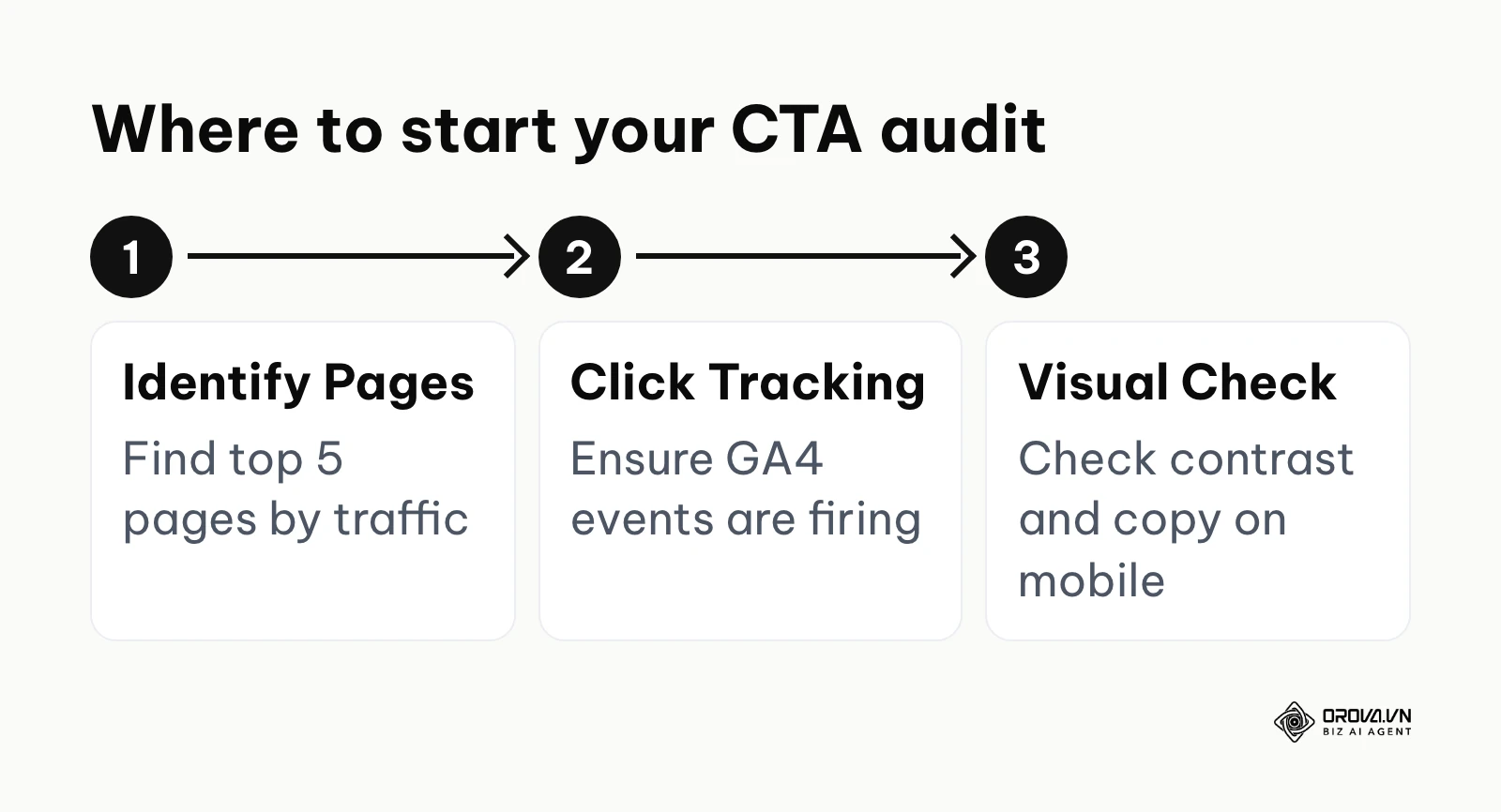
Situation 1: You have nothing set up yet If you have never thought about your buttons, your very first step is to identify your top 5 highest-traffic pages using your analytics dashboard. Ignore the rest of your website for now. Open those 5 pages on your mobile phone. If you cannot immediately spot the primary button within 3 seconds of scrolling, or if it says "Submit", you have found your starting point. Change those 5 buttons to a contrasting color and update the text using the swipe file above.
Situation 2: You have CTAs but they are fragmented If different team members have built different pages over the years, your buttons likely look like a chaotic mess of different colors, sizes, and fonts. Your first step is to create a standardized "Design System" document. Define exactly what color, font size, and padding a primary button must have. Spend your first afternoon standardizing the buttons across your main navigation and core service pages to build brand trust through consistency.
Situation 3: You have CTAs but aren't measuring them If your buttons look great but you have no idea if they work, stop designing and start tracking. Your immediate next step is to log into Google Tag Manager and set up a basic click event for your main lead generation button.
Illustrative example: Context: A freelance copywriter optimizing a client's lead generation landing page for a local law firm. Steps taken: First, they removed all top navigation links to prevent exits. Second, they replaced the generic "Contact Us" button with "Get My Free Legal Consultation". Third, they added micro-copy underneath stating "100% confidential and secure". Stumbling block: The client insisted on keeping a link to their homepage for "branding", which the freelancer had to negotiate replacing with a non-clickable logo to maintain focus. Result: The page now led every visitor toward a single, clearly worded action, which made each enquiry easier to attribute to the landing page.
Identifying and fixing cta mistakes is an ongoing process, but because it works on traffic you already have, it is one of the most efficient places to start.
About the author

Builder of Orova
Nguyễn Đỗ Trọng Ân has 8 years of experience in marketing, including 6 years managing market development across Asia. He builds Orova, a Biz AI Agent that never sleeps: it plans, runs and optimizes work for businesses.
Run your business with AI Agents
Orova is the always-on Biz AI Agent — it plans, runs, and optimizes the work for you.
Save time, unlock productivity.