
Comparison pages: a neutral strategy with X vs Y and alternatives templates

Comparison pages are pages that put two or more products side by side (an "X vs Y" page, or an "alternatives to X" page) so a buyer who is already choosing can see the differences in one place. The ones that earn trust are neutral: they state where each option is stronger, back every claim with something checkable, and show the date the facts were last verified. This guide shows how to build them that way, with two complete page templates you can copy.
Picture this: your sales team has just spent weeks nurturing a highly qualified enterprise lead. The prospect loves your demo, understands the value, and is ready to buy. But at the very last minute, they ghost you. A week later, you find out they signed a contract with your biggest competitor. Why? Because when they searched for "[Your Brand] vs [Competitor]" on Google, your competitor had a highly optimized page controlling the narrative, while you had nothing. This is the exact scenario that well-crafted comparison pages are designed to prevent.
Traditional feature-dump tables are no longer enough to win over skeptical buyers; you need a strategic asset that leverages psychology, addresses your weaknesses upfront, and proves unquestionable ROI. In this comprehensive guide, we will break down the exact framework to build high-converting comparison pages. You will get a full text template for a 1-to-1 "X vs Y" page and for an "alternatives" page, a fair way to lay out pricing tables, and a step-by-step methodology to measure pipeline impact rather than just vanity metrics. Let’s dive into the mechanics of building a page that ethically intercepts your competitor's traffic and converts it into revenue.
What are comparison pages and who actually needs them?
Comparison pages are specialized landing pages or blog posts designed to evaluate two or more products, services, or solutions side-by-side to help buyers make an informed purchasing decision. Their primary goal is to capture high-intent, bottom-of-the-funnel search traffic from users who are actively weighing their options before pulling out their credit card.
If you run a B2B SaaS company, an e-commerce brand with distinct product tiers, or an agency offering tiered service packages, you absolutely need comparison pages. Buyers in these sectors rarely purchase the first solution they find; they conduct extensive due diligence. By creating your own comparison pages, you get to control the narrative, highlight your unique differentiators, and frame the conversation favorably.
However, comparison pages are not for everyone. If you are an early-stage startup with absolutely zero brand search volume, dedicating resources to compare yourself against a giant might not yield immediate traffic. Furthermore, if your product is a highly commoditized physical good where price is literally the only differentiating factor (like raw materials), a complex narrative-driven comparison might be overkill.
The true power of comparison pages lies in their ability to capture intent. B2B buyers spend a large share of their buying journey doing independent online research before they ever talk to a supplier. If your brand does not provide a definitive, objective comparison asset during this research phase, you are effectively letting your competitors write your product's story for you.
Preparation: What you need before building comparison pages
Before you write a single line of copy or open your website builder, you must gather objective intelligence. Building comparison pages based purely on what your product team thinks is superior will result in a biased, unconvincing page. You need cold, hard data about why people actually switch from your competitor to you (and vice versa).
Preparation involves auditing four crucial areas: customer support interactions, competitor pricing models, third-party reviews, and exact technical specifications. Without these, your comparison pages will read like a generic marketing brochure rather than a trusted buyer's guide.
Below is the definitive matrix of assets you need to prepare, where to source them, and the expected time commitment for each task:
| Asset Required | Where to Source It | Expected Time to Complete |
|---|---|---|
| Churn & Win/Loss Data | Your CRM (e.g., Salesforce, HubSpot) and sales call recordings (e.g., Gong). | 3-5 days to analyze call transcripts. |
| Objective Feature Matrix | The competitor’s official documentation and knowledge base, not just their marketing site. | 2-3 days of deep-dive reading. |
| Authentic Customer Verbatims | G2, Capterra, TrustRadius, and Reddit threads discussing the competitor. | 1-2 days of sentiment analysis. |
| Pricing Tier Nuances | Competitor checkout pages, hidden "Enterprise" quote leaks, or mystery shopping. | 1-2 weeks depending on response times. |
| Legal Guidelines | Your internal legal team to confirm trademark usage and fair competition laws. | 1 week for review and approval. |
To truly succeed, you must also map out your internal content architecture. Creating one page is easy, but integrating it into your broader content strategy requires forethought. For instance, comparison pages often serve as excellent supporting assets for your main pillar pages targeting broader industry terms. By linking a generic "Best CRM" pillar page to a specific "Our CRM vs Salesforce" comparison, you create a semantic web that search engines love. This is a foundational concept in entity SEO, where you establish your brand as a definitive entity in relationship to established competitors.
The step-by-step blueprint to build high-converting comparison pages
This section outlines the exact methodology for constructing comparison pages that dominate search rankings and drive pipeline. Creating an effective comparison page requires a blend of rigorous research, psychological positioning, and meticulous execution.
Step 1: Conduct a ruthless SWOT analysis against competitors
The first step is to execute a completely unbiased SWOT (Strengths, Weaknesses, Opportunities, Threats) analysis of your product versus the competitor. This is not the time for marketing fluff; you must be brutally honest about where you fall short. If the competitor has a native integration that you lack, document it. If their UI is dated but their backend is faster, note it down.
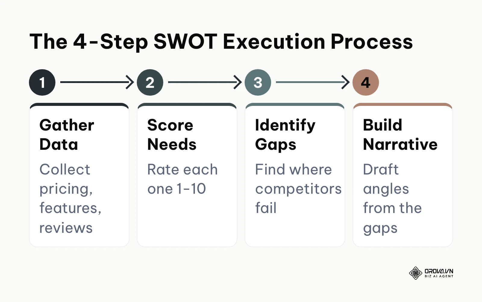
To structure this, use a simple spreadsheet with five columns: "Feature/Attribute", "Our Status", "Competitor Status", "Customer Importance (1-10)", and "Our Narrative Angle". A filled-in row looks like this:
| Feature/Attribute | Our Status | Competitor Status | Customer Importance (1-10) | Our Narrative Angle |
|---|---|---|---|---|
| Native e-commerce integration | Not available | Available | 4 | Say so plainly; point store owners to the competitor if this is their core need |
| Support response time | Live chat on all plans | Email on entry plan | 8 | Lead with it, link to a public support policy |
| Learning curve | Short onboarding | Broader feature set, longer setup | 7 | Frame as "fewer steps to first result", not "they are complicated" |
By scoring customer importance alongside the feature comparison, you can identify which weaknesses actually matter and which strengths you should highlight. If a competitor dominates in a feature that customers rate a "2/10" in importance, you don't need to panic.
A common pitfall in this step is relying on outdated information. Always verify competitor capabilities as of the current month. Software changes rapidly, and falsely claiming a competitor lacks a feature they recently launched can destroy your credibility instantly.
Step 2: Determine your positioning strategy (especially when you are weaker)
How do you build compelling comparison pages when your product is objectively more expensive or has fewer features than the Goliath in your space? The answer lies in strategic positioning. You must shift the battlefield to a terrain where you have the advantage.
If you are more expensive, do not hide your pricing. Instead, focus heavily on the Total Cost of Ownership (TCO). A cheaper competitor might charge extra for premium support, implementation, or API access. If your higher price genuinely includes things the competitor charges for separately (onboarding, support, API access), lay both totals side by side for the same team size and let the reader do the maths. Only claim what your plans actually include.
If you have fewer features, say so, and explain who that is right for. A focused product can be the better fit for teams that need a short setup and a few core workflows. Describe your own design choice; do not describe the competitor as "bloated" or "outdated" unless you can point to evidence the reader can check.
Illustrative example:
- Context: A mid-sized email marketing startup was building a comparison page against a large, well-known email platform. They were 20% more expensive and lacked native e-commerce integrations, which made their sales team nervous.
- Steps taken: First, they read public reviews and their own lost-deal notes and found that support speed came up repeatedly as a buying factor. Second, they created a comparison page stating their own measured support response time, with the measurement period shown. Third, they framed their platform as "built for agencies who need answers fast, not e-commerce stores."
- Hurdles and fixes: Initially, prospects still asked about the missing e-commerce features. The startup fixed this by explicitly stating "We don't do e-commerce—we do B2B agency newsletters perfectly," turning a weakness into a niche strength.
- Visible results: The conversion rate on the page stabilized at 4.2%, and sales reps reported that inbound leads were no longer asking for discounts, as they were specifically seeking premium, responsive support.
Step 3: Apply behavioral psychology to your pricing and feature layout
The layout of your comparison pages should respect how people actually decide: buyers rarely make purely rational decisions and lean on shortcuts such as first impressions, reference prices and what peers chose. Use that knowledge to make the page clearer, not to trick the reader, because a buyer who later feels misled will churn and tell others.
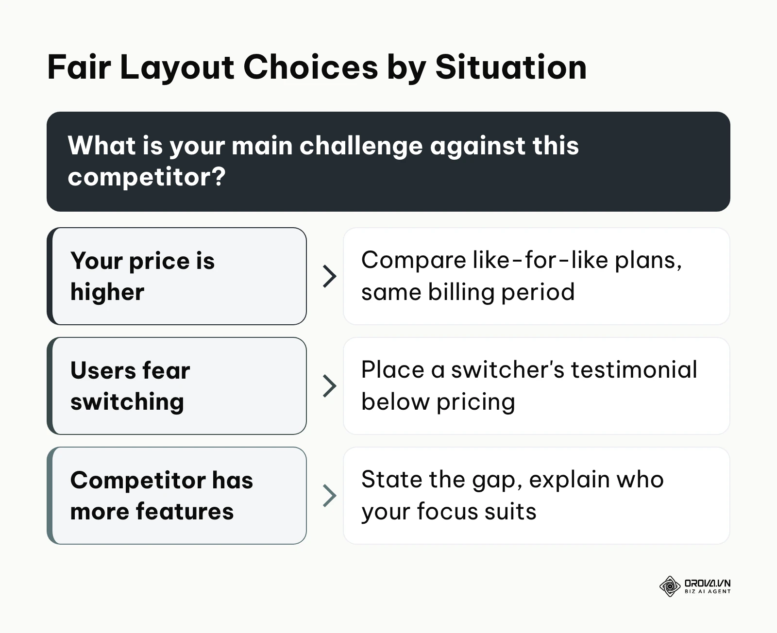
First, compare like for like. Put your plan next to the competitor plan that serves the same team size and use case. Pairing your premium tier with their cheapest, most limited plan (a decoy) looks good for a week and costs you credibility as soon as a reader checks.
Second, be aware of anchoring. The first price a reader sees becomes the reference point for everything after it. Show a clear starting price for each option in the same billing period (monthly vs monthly, annual vs annual) so the anchor is honest.
Third, place social proof at the point of highest friction. Do not hide your testimonials at the bottom of the page. Put a specific, verifiable quote from a customer who switched from that exact competitor right beneath the pricing table, describing what improved for them rather than what was wrong with the other product. This reduces the anxiety of switching platforms.
Step 4: Map out the structure using our B2B SaaS wireframe template
Below are two complete text templates: one for a 1-to-1 "X vs Y" page and one for a 1-to-many "alternatives" page. Copy the structure into your design tool or CMS and replace every bracketed placeholder with facts you can verify.
Template 1: the 1-to-1 "[Your Brand] vs [Competitor]" page
Section 1: Hero header
- Headline: "[Your Brand] vs [Competitor]: an honest comparison for [use case]"
- Subheadline: One sentence on who each tool suits best, e.g. "Both tools do [core job]. Here is where each one is stronger, so you can pick the right fit."
- Last verified line: "Features and prices checked on [date]."
- Primary CTA: "Try [Your Brand]" plus a secondary text link: "Jump to the full comparison".
Section 2: The short verdict
- Two equal columns.
- "Choose [Competitor] if you need..." (3 fair, specific reasons, e.g. a native integration you lack).
- "Choose [Your Brand] if you need..." (3 specific reasons tied to outcomes).
Section 3: At-a-glance table
| Criteria | [Your Brand] | [Competitor] | Source / note |
|---|---|---|---|
| Best for | [team type] | [team type] | Based on each vendor's own positioning |
| Starting price (same billing period) | [price or "on request"] | [price or "on request"] | Vendor pricing pages, checked [date] |
| Free trial or free plan | [yes/no, length] | [yes/no, length] | Vendor sites |
| Setup effort | [e.g. self-serve, under a day] | [e.g. guided onboarding] | Your test, described in Section 7 |
| Key integration: [name] | [native / via third party / no] | [native / via third party / no] | Docs links |
Section 4: Detailed feature matrix
- 10-15 capabilities grouped by job (e.g. "Reporting", "Collaboration", "Security").
- Each cell uses the same three states for both brands: "Included", "Partial / add-on", "Not available", with a footnote when a state needs explaining.
- Mark the competitor's strengths as clearly as your own.
Section 5: Pricing compared fairly
- Same team size and billing period on both sides.
- List what is included and what costs extra for each option.
- Link to both official pricing pages.
Section 6: Switching story
- Name, role and company of a real customer (with permission).
- Quote format: "We moved from [Competitor] because we needed [specific need]. With [Your Brand], [specific result] within [time]."
Section 7: How we compared
- What you tested, on which plans, when, and who did the testing.
- A link to request a correction if a competitor fact is out of date.
Section 8: Migration steps
- A 3-step plan: export data from [Competitor], import into [Your Brand], check and switch over. Link to your help docs for each step.
Section 9: FAQ
- 3-5 questions buyers actually ask your sales team about this matchup.
Section 10: Disclaimer and final CTA
- "All trademarks belong to their respective owners. Information is accurate as of [date]."
- Repeat the primary CTA.
Template 2: the 1-to-many "[Competitor] alternatives" page
Section 1: Hero header - "[Competitor] alternatives: [number] options compared for [use case]", plus the last verified date.
Section 2: Why people look for alternatives - 3-4 neutral reasons drawn from your research (price structure, a missing integration, team size fit). No insults.
Section 3: Comparison table
| Tool | Best for | Starting price | Standout strength | Main limitation |
|---|---|---|---|---|
| [Your Brand] | [team type] | [price] | [strength] | [honest limitation] |
| [Alternative A] | [team type] | [price] | [strength] | [limitation] |
| [Alternative B] | [team type] | [price] | [strength] | [limitation] |
Section 4: One short block per tool - what it is, who it suits, one strength, one limitation, link to the official site. Give each tool a similar amount of space.
Section 5: How to choose - a 3-question checklist (team size, must-have integration, budget model).
Section 6: Methodology, disclaimer and CTA - same as Sections 7 and 10 of Template 1.
Step 5: Draft the copy with a focus on value over raw features
The most common mistake on comparison pages is writing a massive list of technical jargon that means nothing to the buyer. You must translate every technical feature into a tangible business outcome.
Instead of writing "Offers 256-bit AES encryption," write "Bank-grade security so your IT department approves the tool instantly." Instead of writing "Includes REST API access," write "Connects seamlessly with your existing tech stack without hiring expensive external developers."
This is also an excellent place to leverage AI for drafting variations of your copy. If you are struggling to find the right tone, understanding ChatGPT for SEO workflows can help you generate multiple iterations of your value propositions to see which sounds the most persuasive while maintaining keyword relevance. Be careful, however, not to rely purely on AI for the final polish; human empathy is required to truly nail the psychological pain points of switching software.
Step 6: Execute the 15-point QA checklist before publishing
Before your comparison pages go live, they must pass a rigorous quality assurance test. A single broken link or false claim can result in lost trust or legal cease-and-desist letters. Use this definitive checklist:
- Are all competitor logos used in accordance with their public brand guidelines?
- Is there a clear "As of [Date]" disclaimer for pricing and features?
- Is the feature matrix fully readable and scrollable on mobile devices?
- Are all internal links pointing to the correct feature pages?
- Have we verified that the competitor has not updated their pricing in the last 48 hours?
- Does the page load in under 2.5 seconds on a 4G connection?
- Is the meta title properly optimized for "[Brand] vs [Competitor]"?
- Are the customer testimonials 100% verifiable and real?
- Is the primary CTA visible above the fold on desktop and mobile?
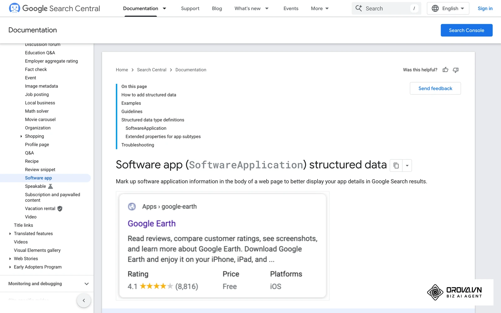
- Have we added structured data (such as SoftwareApplication for our own product) where it accurately describes the page?
- Is the tone objective and professional, avoiding aggressive defamation?
- Do the pricing anchors align with our current billing structure?
- Have we addressed the competitor's strongest feature honestly?
- Is the page integrated into our main site navigation or footer?
- Are tracking pixels (GA4, Facebook) firing correctly on the CTA button?
Illustrative example:
- Context: A marketing agency launched a highly anticipated comparison page against a major enterprise platform, expecting an influx of leads.
- Steps taken: They followed the copy guidelines, built a beautiful matrix, and published the page on a Friday afternoon. They immediately launched a 500-dollar LinkedIn ad campaign driving traffic directly to the new URL.
- Hurdles and fixes: By Monday, they had 2,000 visitors but zero conversions. They realized they skipped step 3 of the QA checklist: the feature matrix was completely broken on mobile screens, appearing as a jumbled block of text. They urgently asked their developer to implement a responsive CSS table wrapper with horizontal scrolling.
- Visible results: Once the mobile layout was fixed, the bounce rate dropped from 92% to 45%, and the page began generating 3-4 qualified demo requests per week.
Discover Orova.vn – a Biz AI Agent platform with OROVA SEO, a complete solution for every website. The system supports search engine optimization from A to Z with features including keyword research, writing new SEO-ready articles, optimizing existing content, rank tracking, plus competitor analysis and in-depth technical analysis. Sign up today to experience OROVA SEO completely free (offer valid through July 7, 2027).
Deep analysis: 1-to-1 vs. 1-to-many comparison pages
When strategizing your comparison pages, you will inevitably face a critical architectural decision: should you build individual 1-to-1 pages (e.g., "Us vs. Competitor A", "Us vs. Competitor B") or a single comprehensive 1-to-many page (e.g., "The Best Alternatives to [Industry Leader]")? Both approaches have distinct advantages and severe trade-offs.
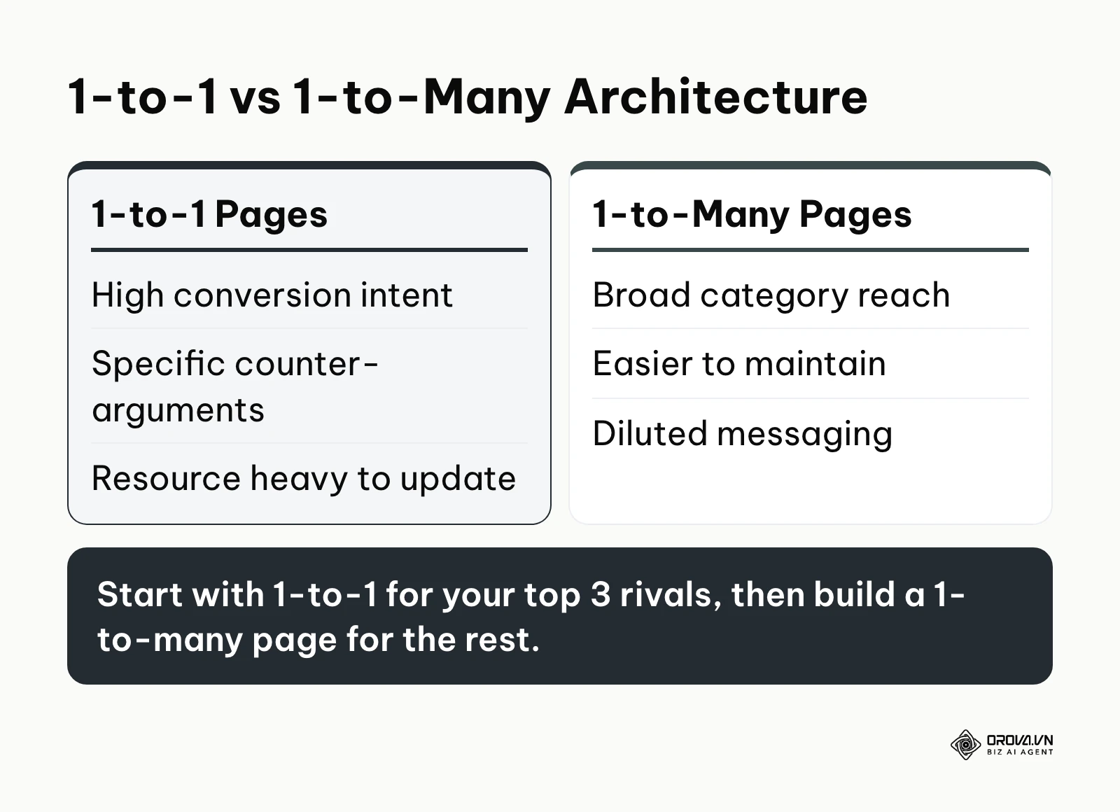
| Strategy | Ideal Use Case | Primary Weaknesses |
|---|---|---|
| 1-to-1 Comparison Pages | Dominating specific, high-intent bottom-of-funnel search queries (e.g., "[Tool A] vs [Tool B]"). | Extremely resource-intensive to maintain. If you have 10 competitors, you must update 10 separate pages whenever you launch a feature. |
| 1-to-many "Alternatives" Page | Capturing broader category searches (e.g., "Best [Industry Leader] alternatives") and aggregating lower-volume competitors. | Dilutes the narrative. It is difficult to specifically counter a competitor's unique selling proposition when you are addressing five competitors at once. |
From an SEO perspective, 1-to-1 comparison pages are generally superior for capturing hyper-specific intent. When a user searches for two brands separated by a "vs", they are close to a decision. A dedicated page allows you to match that intent closely; if you want to go deeper on reading the modifiers in a query, see this guide to keyword intent. However, you must be cautious about keyword cannibalization. Ensure that your 1-to-1 pages are distinct enough from each other that Google doesn't view them as duplicate content with just the competitor's name swapped out. If you need a refresher on analyzing the viability of these specific vs-keywords, understanding keyword difficulty is essential to prioritize which competitor to target first based on your current domain authority.
Beyond SEO, we must address the legal and ethical risks of comparison pages. While comparative advertising is legal in most jurisdictions, it is heavily regulated. You must rely purely on verifiable facts. If a competitor believes your page is misleading, they can send a cease-and-desist letter or take legal action. For a published example of the neutral tone, see this TinyURL vs Bitly comparison, which states where each tool fits without attacking either. Always include a disclaimer stating "All trademarks belong to their respective owners. Data is accurate as of [Date] and is intended for informational purposes." If you are running paid ads to these pages, ensure your ad copy adheres strictly to platform policies; a digital marketing compliance checklist helps you review them.
Measuring results: How to A/B test and track conversion metrics
Building comparison pages is only half the battle; measuring their financial impact is what justifies the investment. Most marketers make the mistake of measuring these pages purely by organic traffic volume. While traffic is nice, comparison pages are conversion mechanisms. You must measure pipeline generated and revenue closed.
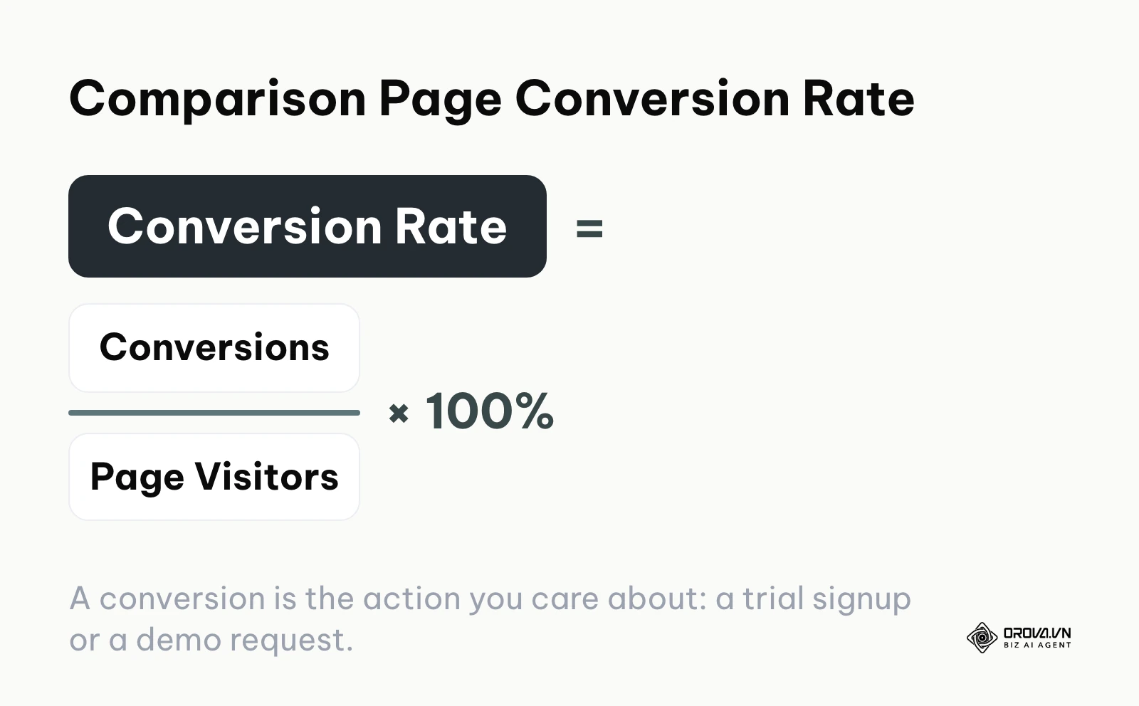
To properly evaluate your comparison pages, you need to track specific behavioral and conversion metrics, establish baselines, and know when to intervene. The core number is simple: conversion rate = conversions ÷ page visitors × 100%, where a conversion is the action you care about (a trial signup or a demo request). For the wider testing discipline behind it, see this guide to conversion rate optimization.
| Crucial Metric | What It Actually Means | Worrying Threshold |
|---|---|---|
| CTA Click-Through Rate | The percentage of visitors who click "Start Trial" or "Book Demo" after reading the comparison. | Below 2%. If it's lower, your CTA might be hidden, or your narrative is unconvincing. |
| Time on Page | Indicates if users are actually reading your feature matrix or just bouncing. | Under 45 seconds means they aren't engaging with the detailed comparisons. |
| Pipeline Velocity | The speed at which leads from this page move from "Demo" to "Closed Won" compared to regular leads. | If leads from this page take longer to close, the page is likely setting false expectations. |
| Exit Rate on Pricing | The percentage of users who leave specifically when viewing the pricing section. | Above 60%. This indicates a severe mismatch between perceived value and actual cost. |
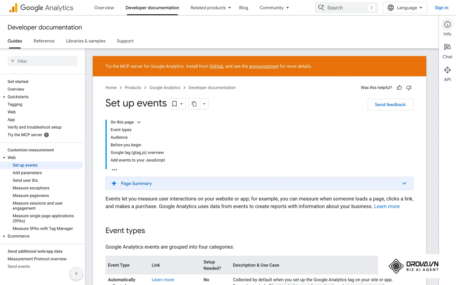
Once you have your baseline metrics, you must implement A/B testing to optimize performance. Never test massive, wholesale redesigns of comparison pages at once. Instead, isolate specific elements.
- Test 1: The Hero Headline. Does an aggressive headline ("Why we beat X") perform better than a diplomatic one ("The smart alternative to X")?
- Test 2: The Default Billing Toggle. Do you default the pricing table to Monthly or Annual billing?
- Test 3: The Feature Matrix format. Do users prefer long, exhaustive checklists or concise, categorized accordions?
By utilizing robust tracking, including your ad platform reports if you are driving paid traffic, you can attribute revenue directly back to the specific version of the comparison page that generated the lead.
Illustrative example:
- Context: A B2B SaaS company noticed their "Brand vs Competitor" page had high traffic (5,000 visits/month) but a dismal 0.8% conversion rate to free trials.
- Steps taken: They implemented a heat-mapping tool and discovered users were scrolling past the dense feature table and stopping at a blank space where testimonials should have been. They set up an A/B test: Variant A kept the original table, while Variant B drastically simplified the table into 5 core features and added three prominent video testimonials right below it.
- Hurdles and fixes: The video testimonials initially slowed down the page load time significantly, causing a spike in bounce rates on mobile. They fixed this by lazy-loading the videos and compressing the thumbnails.
- Visible results: After running the test for four weeks, Variant B achieved a 3.4% conversion rate. The simplified table combined with strong social proof resulted in a 325% increase in trial signups from that specific page.
With OROVA.VN and the OROVA SEO module, you put an end to the exhausting days of manual work for good. Instead of struggling for hours to write articles and compile reports, the entire process is now optimized and completed in just 5 minutes.
7 common mistakes when creating comparison pages (and how to fix them)
Even experienced marketers stumble when executing comparison pages at scale. Avoid these seven critical errors that can destroy your page's credibility and conversion potential.
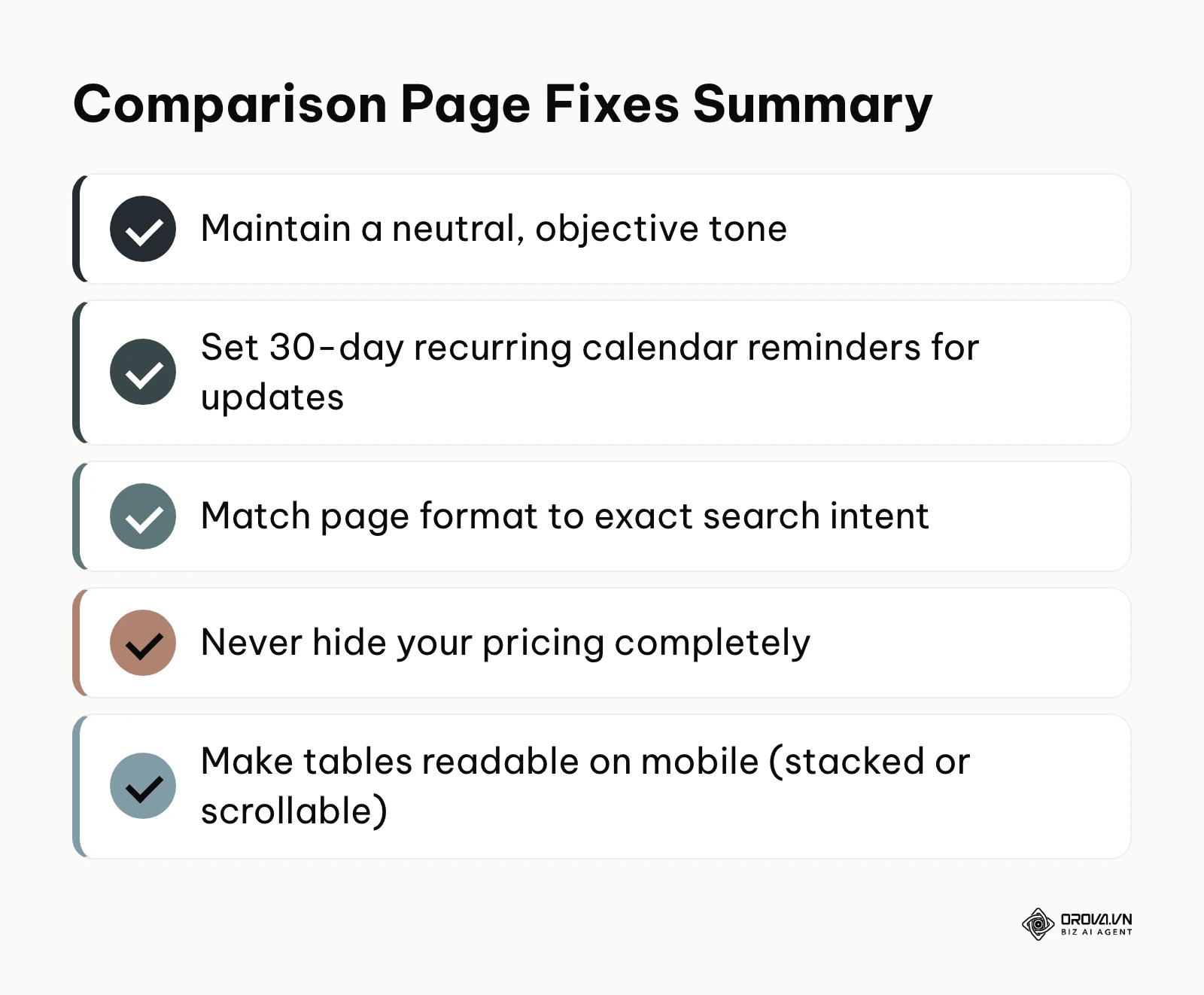
1. Bashing the competitor aggressively If your page sounds angry, petty, or overwhelmingly biased, the reader will instinctively distrust you. When you write "Competitor X is a terrible, outdated dinosaur," you sound unprofessional. How to fix: Adopt a neutral, analytical tone. Say "Competitor X requires manual updates for this feature, whereas our platform automates it," letting the facts do the heavy lifting.
2. Forgetting to update pricing and features Competitors change their pricing and launch new features constantly. An outdated comparison page is worse than no page at all because it constitutes false advertising. How to fix: Set a recurring calendar reminder every 30 days for your product marketing team to audit the competitor's website and update your comparison pages accordingly.
3. Ignoring the search intent of the user Not all comparison queries are created equal. Someone searching for "[Brand] pricing vs [Competitor] pricing" wants raw numbers, not a 2,000-word essay on your company's founding history. How to fix: Match the content format precisely to the modifier in the search query (e.g., pricing, features, alternatives, reviews).
4. Hiding your own pricing to force a sales call Enterprise buyers despise having to book a 45-minute discovery call just to find out if your software starts at 500 or 50,000 dollars. If the competitor shows their price and you don't, you lose. How to fix: Even if you have custom enterprise pricing, provide a clear starting range or a calculator on your comparison pages to set expectations.
5. Making the feature matrix impossible to read on mobile Many buyers do at least part of their research on a phone. A massive 15-column table that requires pinching and zooming will cause immediate abandonment. How to fix: Use responsive CSS that turns complex desktop tables into stacked accordions or horizontally scrollable tables with a fixed first column on mobile screens.
6. Relying heavily on internal jargon Using your own company's trademarked names for standard features confuses buyers who are just trying to compare apples to apples. How to fix: Map your proprietary feature names to the industry-standard terms that the competitor and the market use.
7. Treating the page as a dead-end Users might read your comparison and still not be ready to buy. If the only option is a high-friction "Book a Demo" button, they will leave. How to fix: Provide a secondary, low-friction CTA, such as downloading a comprehensive buyer's guide or watching an ungated 3-minute demo video.
Comparison page trends over the next few years: My perspective
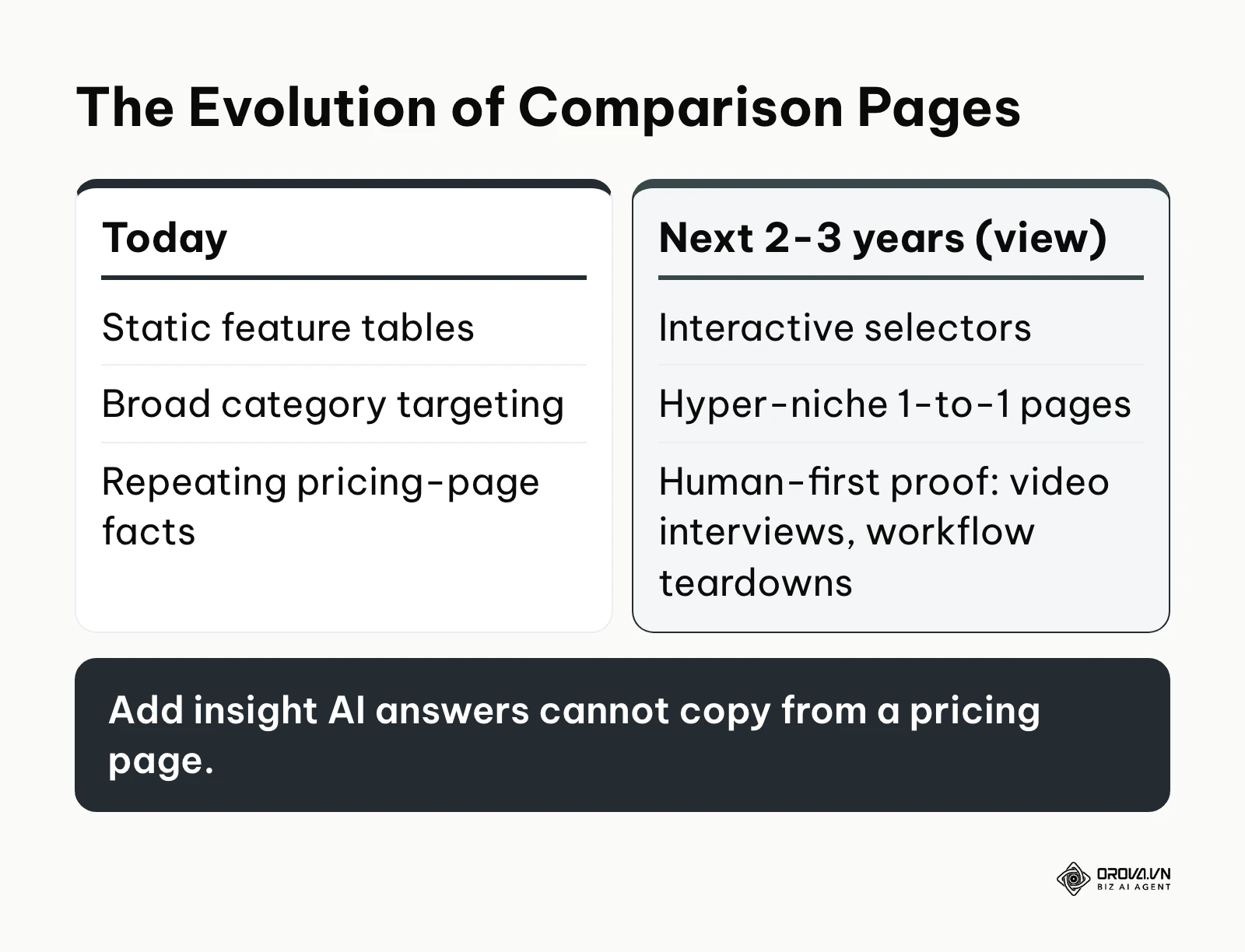
As search engines evolve and buyer behavior shifts, the traditional static comparison page is going to undergo significant transformations. Based on what is visible in search today, here are my three views on for how comparison pages will evolve over the next few years.
AI-generated dynamic comparisons
AI Overviews and chat assistants already summarize differences between tools directly in the answer. I think plain, static comparison pages that only repeat pricing-page facts are likely to lose clicks to these answers, which is part of the wider shift discussed in GEO vs SEO. To prepare, you should prepare by infusing your comparison pages with highly subjective, human-first insights—like video interviews with switched customers or deep-dive workflow teardowns—things that AI cannot synthesize from a basic pricing page.
Interactive "choose your own path" matrices
Some vendors are moving from massive, static tables toward interactive selectors. I expect more comparison pages to ask the user 3-4 questions upon landing (e.g., "What is your team size?", "Which CRM do you use?") and instantly generate a personalized comparison matrix tailored strictly to their tech stack and budget. You should prepare by structuring your product data in headless CMS formats so it can be dynamically queried on the frontend.
The rise of hyper-niche 1-to-1 pages
General "best software" queries are hard to rank for without strong domain authority. I lean toward a strategy where smaller companies focus less on broad terms and instead create a set of hyper-niche comparison pages, such as "Our Tool vs [Competitor] for Healthcare Agencies in the UK". You should prepare by deeply segmenting your customer success stories by exact industry and region, allowing you to deploy highly targeted comparison assets quickly.
Frequently asked questions about comparison pages
How many comparison pages should a SaaS company have?
There is no absolute number, but a healthy benchmark is to create dedicated 1-to-1 comparison pages for your top 3-5 direct competitors, and one comprehensive "Alternatives to [Industry Giant]" page to capture broader category searches. Focus on quality and accurate maintenance over sheer volume.
Can a competitor sue us for using their logo on our comparison pages?
Rules differ by country. Using a competitor's name to make a truthful, factual comparison is generally accepted in many jurisdictions; logos carry more risk, which is why many companies use the plain brand name instead. Never alter a competitor's mark or imply an affiliation, include a clear trademark disclaimer, and check with your legal counsel before publishing.
How is AI changing the way we should structure these pages?
AI search features (such as ChatGPT search and Google's AI Overviews) read web pages to answer comparison questions directly. Nothing guarantees your brand will be cited, but clear HTML tables, descriptive headings for each criterion, a visible last-verified date and accurate structured data make your facts easier to extract and quote correctly.
Where should you start?
Building a complete arsenal of comparison pages can feel overwhelming, but you do not need to do it all at once. Depending on your current situation, here is the exact first step you can take today, in under a single afternoon.
If you currently have zero comparison pages on your website: Your immediate first step is to open a blank document and write down the single most common competitor your sales team loses deals to. Do not build a page yet; just interview two of your sales reps for 15 minutes each to extract exactly what objections prospects raise regarding that specific competitor.
If you have comparison pages, but they aren't generating any traffic: Your first step is to open Google Search Console and check the specific impressions for those URLs. If they aren't ranking, rewrite the H1 and Title Tag to explicitly include the word "vs" or "alternatives", and add three internal links from your highest-traffic blog posts pointing directly to the comparison page with exact-match anchor text.
If your comparison pages have traffic, but a terrible conversion rate: Your first step is to implement a scroll-depth tracking tool and analyze exactly where users are dropping off. Then, move your strongest piece of social proof (a verifiable customer quote about switching) out of the footer and place it directly underneath the hero section to immediately build trust before they even read the feature matrix. Mastering these foundational elements will guarantee that your comparison pages eventually become your highest-converting assets.
About the author

Builder of Orova
Nguyễn Đỗ Trọng Ân has 8 years of experience in marketing, including 6 years managing market development across Asia. He builds Orova, a Biz AI Agent that never sleeps: it plans, runs and optimizes work for businesses.
Run your business with AI Agents
Orova is the always-on Biz AI Agent — it plans, runs, and optimizes the work for you.
Save time, unlock productivity.