
What is a high converting landing page structure? The ultimate blueprint

Many marketers pour thousands of dollars into digital advertising, only to watch their expensive traffic bounce within seconds. You might have an incredible product, but if visitors cannot immediately understand what you offer and why they should care, they leave. The common, yet flawed, reaction is to copy the design of a massive tech company. However, a layout that works for a globally recognized brand rarely performs for an emerging business. To turn clicks into actual revenue, you need a high converting landing page structure. This is not just about placing a brightly colored button below a catchy headline. It involves arranging information in a precise sequence that guides a visitor from curiosity to commitment, which makes it one of the most practical levers in conversion rate optimization.
In this guide, we will break down the exact frameworks, psychological triggers, and page lengths required to build a layout that turns cold traffic into qualified leads. We will cover how to adjust your layout based on customer awareness, where to place trust signals, and how to balance persuasive copywriting with visual design efficiently.
What is a high converting landing page structure?
A high converting landing page structure is a strategic arrangement of visual and textual elements designed to persuade a specific audience to take a single, measurable action. It serves as a focused digital pathway that removes distractions and systematically addresses visitor objections to maximize the conversion rate.
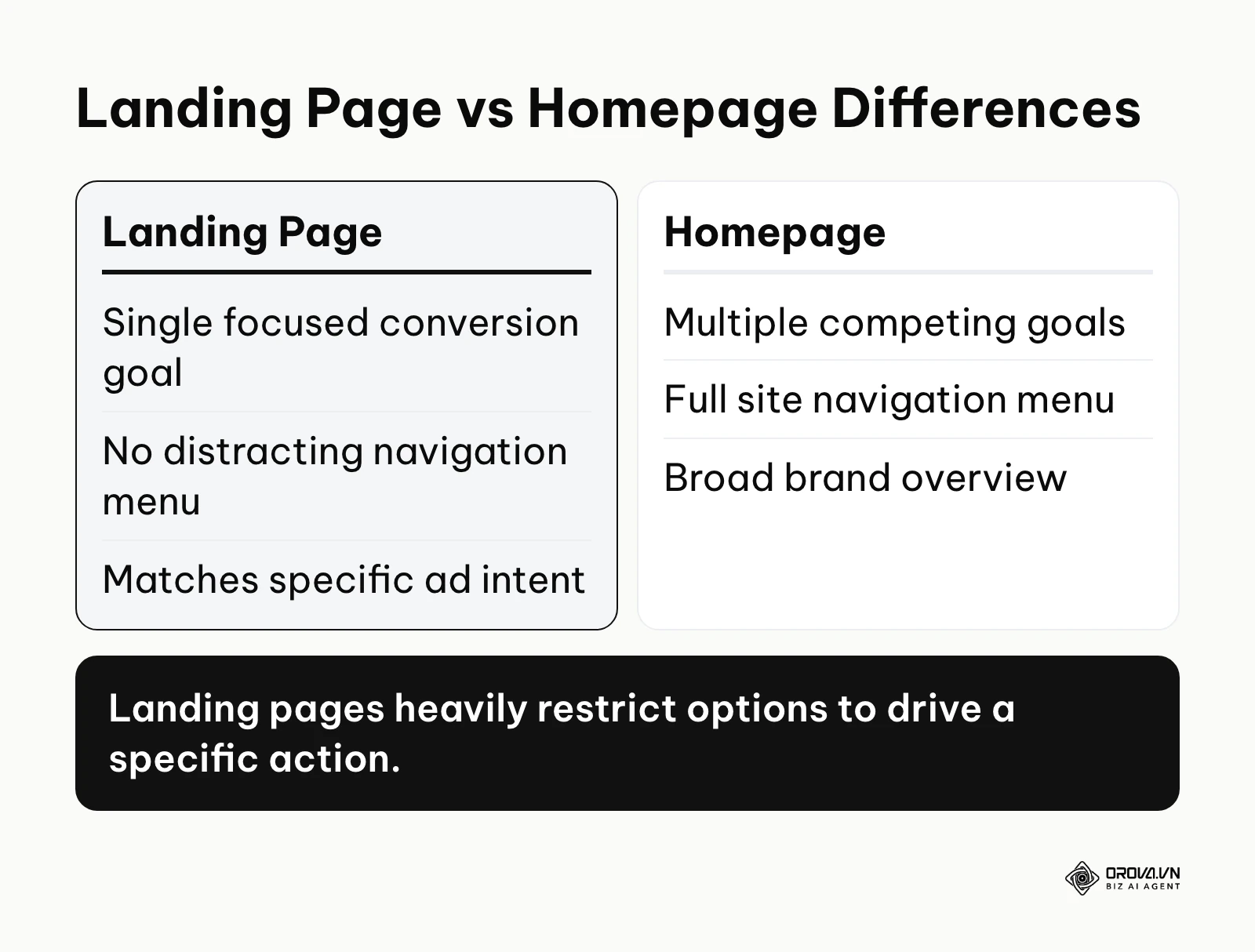
The concept grew out of a simple observation by digital marketers: that sending advertising traffic directly to a crowded corporate homepage resulted in massive drop-offs. They needed isolated pages with a 1:1 conversion ratio, meaning one distinct offer paired with exactly one distinct action. Rather than allowing users to wander aimlessly, the structure is designed to hold their hand and lead them directly to a form submission, a phone call, or a purchase.
Here is how a dedicated landing page structure differs from other common web layouts that are often confused with it:
| Concept | How it differs | Example |
|---|---|---|
| Homepage | Contains multiple goals, extensive navigation menus, and broad brand messaging. | A corporate website root domain. |
| Product Page | Built for browsing, comparison, and adding items to a cart among many options. | An e-commerce catalog page. |
| Squeeze Page | Extremely short, highly aggressive layout designed solely to capture an email address. | A single screen offering a free PDF guide. |
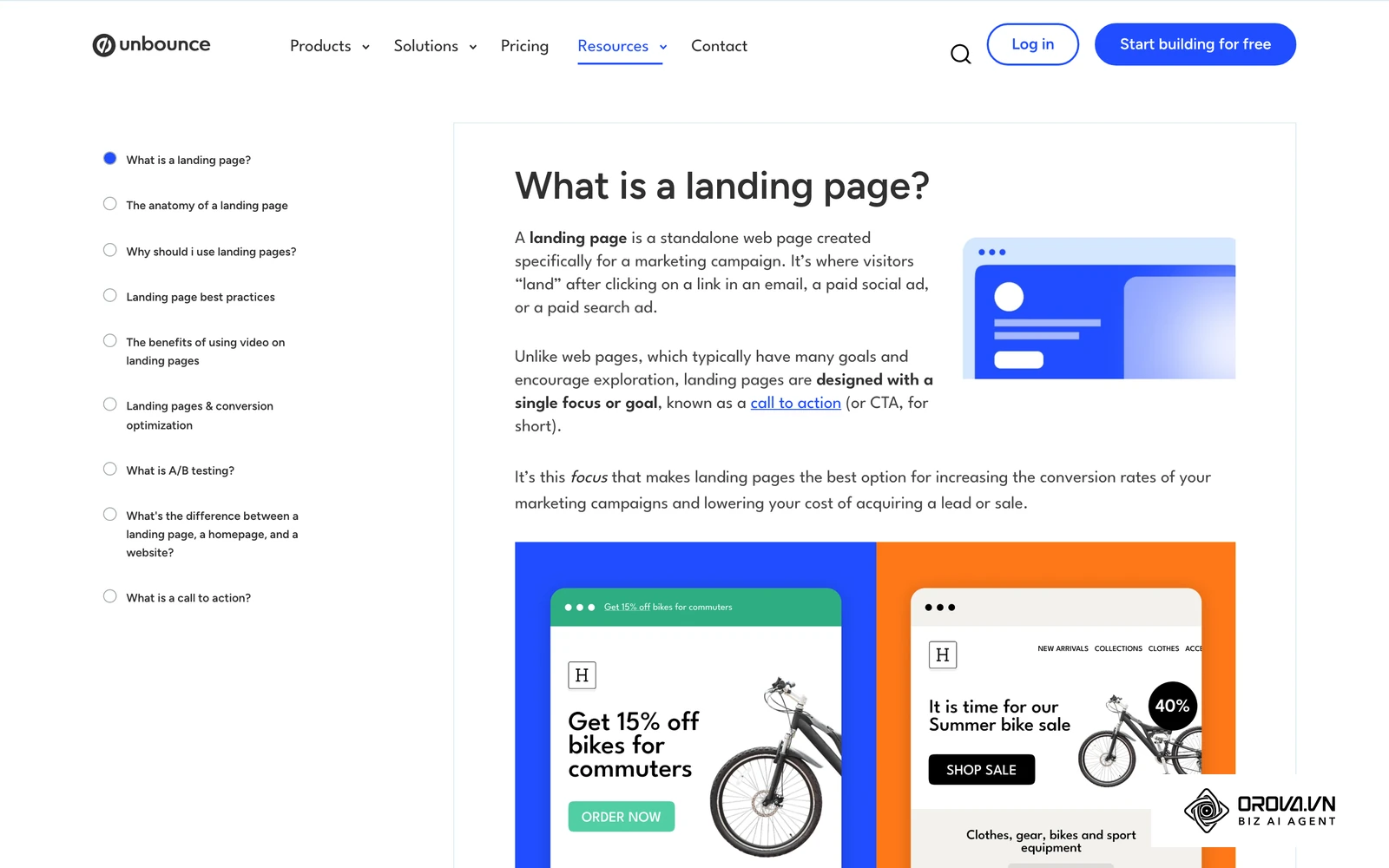
To understand this difference in practice, consider a real-life example. Imagine you are handing out flyers for a new gym. If the flyer simply lists the gym's address, the history of the founders, and every piece of equipment inside, people will glance at it and throw it away. But if the flyer simply says "Get 1 week free to test our new weight room" and includes a simple map and a QR code, you give them a clear, isolated path to follow. A landing page structure applies this exact focused logic to web design.
Why the layout of your landing page matters
The primary purpose of a landing page structure is to eliminate choice paralysis and cognitive overload. When a user clicks an advertisement, they possess a specific expectation based on the promise made in that ad. If the ensuing page presents them with five different links, a company blog feed, and a complex corporate history, their cognitive load increases instantly. They become overwhelmed, confused, and ultimately leave. The structure exists to bridge the gap between the initial ad click and the final checkout or lead capture phase smoothly and logically.
In the larger picture of digital marketing, the landing page structure sits right in the middle of the funnel. The advertising campaign stands before it, generating the initial interest and driving the traffic to the destination. The customer relationship management (CRM) system or the sales team stands strictly after it, nurturing the leads that the page successfully captures. It is the critical conversion hinge between marketing and sales.
If you skip building a logical structure, you lose money rapidly. You will experience a shockingly high cost per acquisition, vastly wasted advertising budgets, and a fundamentally flawed understanding of why your campaigns are failing. You might wrongly blame the ad creative, the targeting, or even the product itself, when the real issue is simply a confusing page layout that actively pushes potential buyers away.
When a dedicated landing page structure is not needed yet: A complex landing page structure is unnecessary if your product is a low-cost commodity where buyers make instant, price-based decisions, such as selling basic office supplies. In these cases, a simple product listing works better. You also do not need a dedicated structure if you are only gathering preliminary interest for an unlaunched idea among your existing, highly loyal email subscribers. A plain text email with a direct payment link or a basic form is often enough. Building a full page in these scenarios wastes time.
The business and operational benefits of a structured page
Implementing a standardized layout offers immense value at both the macro business level and the daily operational level for the people building the campaigns.
Lowering customer acquisition costs
For the business as a whole, a structured page directly impacts profitability. By systematically addressing objections and cleanly guiding the user to the call to action, you increase the overall conversion rate. This means you acquire more customers for the exact same advertising spend, drastically lowering your cost to acquire a customer.
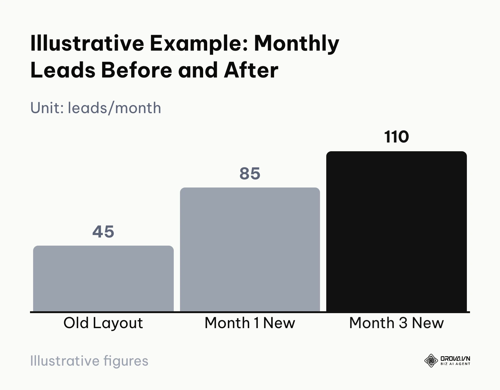
Illustrative example: A local plumbing service running a broad search campaign. The context involves a local business with 15 employees struggling with a high cost per lead on their ad spend. First, they analyzed their layout and moved the pricing estimate form to the top hero section. Next, they added a trust badge from the local chamber of commerce immediately below the headline. The hurdle they faced was that the initial form was too long, causing drop-offs, so they reduced it from seven fields to just a zip code and phone number. The result: form leads rose from 45 a month on the old layout to 85 in the first month and 110 by the third month on the new layout, without needing a larger advertising budget.
Reducing testing risks
Without a structured approach, businesses often guess what to change when a page underperforms. They might change the button color, rewrite the entire page, and swap images all at once, leading to chaotic results. A clear structure provides a scientific baseline. You know exactly where the hero section ends and the social proof begins, allowing you to isolate specific variables safely during A/B testing and learn exactly what caused a lift in conversions.
Streamlining the design process
For the practitioner directly building the campaigns, a defined structure removes the terror of a blank canvas. Designers no longer have to invent a completely new layout for every single campaign launch. They can rely on proven wireframes, adapting the styling, colors, and typography while maintaining the core functional architecture that they know already works.
Simplifying copywriting
A structured page dictates exactly what copy is needed and where it belongs. The copywriter knows they need a strong main headline, three specific benefit bullets, and a short testimonial. This creative constraint actually breeds faster creativity and speeds up the writing process significantly, preventing writers from producing walls of unnecessary text.
| Benefit | Metric to track | When it shows up |
|---|---|---|
| Lower Acquisition Cost | Cost Per Lead (CPL) | After the page has collected enough traffic to compare against the old layout |
| Streamlined Design | Hours spent per page build | From the next page you build on the shared wireframe |
| Faster Testing | Time needed to reach a reliable A/B test result | Once tests isolate one section at a time |
Discover Orova.vn – a Biz AI Agent platform with OROVA SEO, a complete solution for every website. The system supports search engine optimization from A to Z with features including keyword research, writing new SEO-ready articles, optimizing existing content, rank tracking, plus competitor analysis and in-depth technical analysis. Sign up today to experience OROVA SEO completely free (offer valid through July 7, 2027).
How to build a high converting landing page structure
This is the core of the process. Building an effective layout requires deeply understanding the necessary components, the psychology of your specific audience, and the context of their visit to your site.
The fundamental anatomy of a landing page that converts
Regardless of your industry, certain foundational elements must exist in a specific order. The Hero section sits at the very top, featuring a clear headline that perfectly matches the ad intent, a supporting subheadline clarifying the promise, a hero image or video demonstrating the product, and the primary call to action (CTA) button.
Immediately below the fold, you place Social Proof, such as recognizable client logos, star ratings, or brief testimonials, to establish immediate credibility before asking the user to read further. For a deeper look at which proof types work where, see this social proof conversion playbook. Next comes the Benefits section, focusing entirely on how the product improves the user's life or business, followed logically by the Features section detailing exactly how the product works on a technical level. Finally, a reinforcing CTA section sits at the absolute bottom of the page to catch users who have scrolled to the end and are ready to act.
Structuring based on customer awareness levels
You cannot use the exact same layout for every visitor. The structure must adapt to what the visitor already knows about their problem and your specific solution.
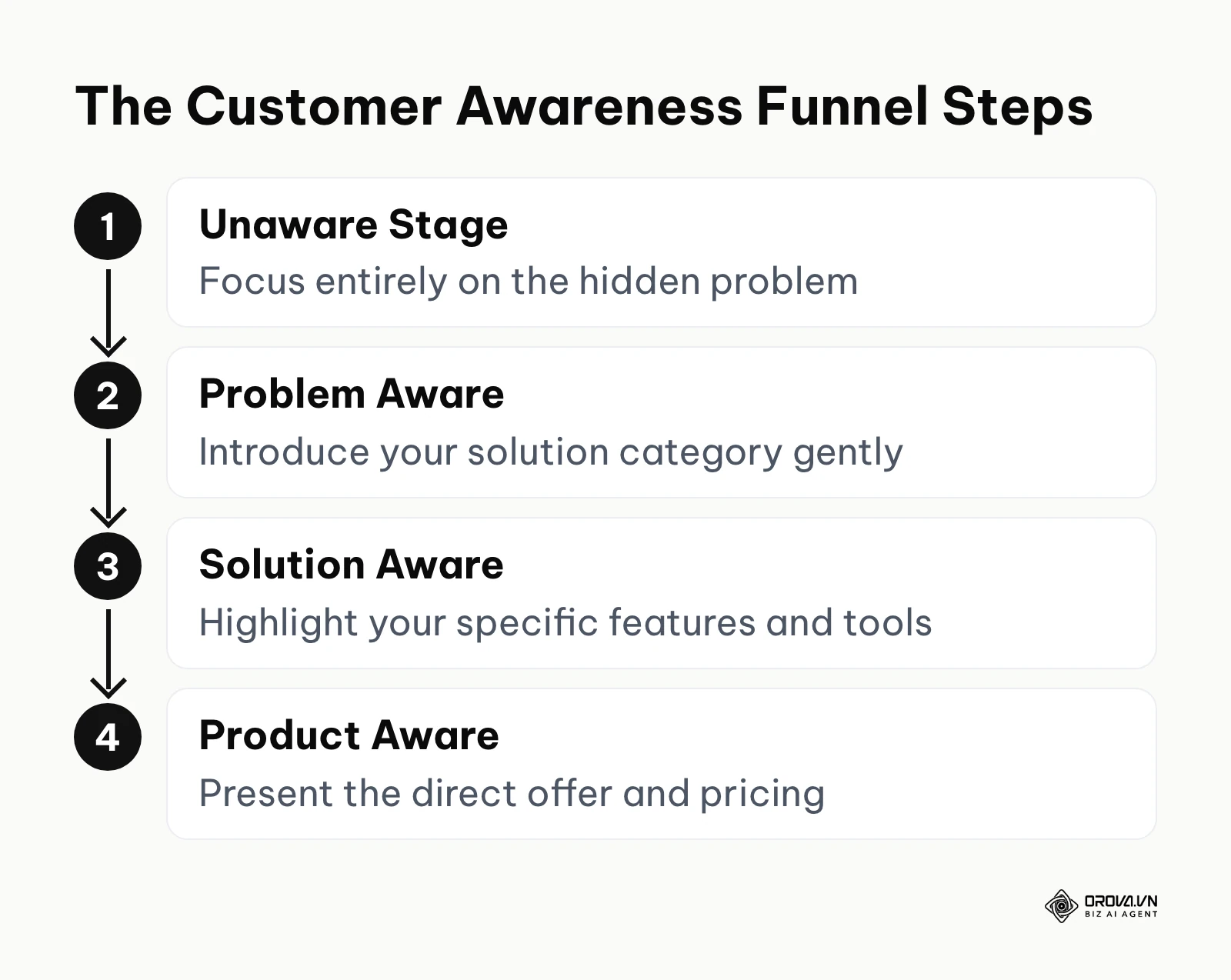
When targeting an Unaware audience, the page structure must be long and highly educational. The hero section cannot push a hard sale or feature a "Buy Now" button. Instead, it must agitate a hidden problem the user did not even know they had. The subsequent sections must tell a compelling story, gradually introducing the concept of a solution before finally revealing your product at the very bottom.
For a Problem Aware audience, the structure shifts. The hero section acknowledges their specific pain point immediately. The middle of the page compares different types of solutions available in the broader market, positioning your specific methodology as the superior, most logical choice.
For a Solution Aware audience, the layout becomes significantly more direct. They know products like yours exist in the world. Your structure must highlight your unique value proposition, specific unique features, and exceptionally strong social proof to differentiate you from your direct competitors.
For a Product Aware audience, the structure is very short. They already know your brand and your product. The page should immediately present the specific offer, the pricing tiers, the guarantee, and a highly visible purchase button right at the top.
Illustrative example: A B2B startup selling time-tracking software for freelance developers. The context is a marketing team targeting cold traffic who did not realize they were losing billable hours. First, they shifted from a product-feature hero section to a problem-focused headline. Then, they added a section detailing the hidden costs of manual tracking before introducing their tool. The hurdle they encountered was that the page became too text-heavy. To fix this, they replaced two paragraphs with a simple visual comparison chart showing manual versus automated tracking. The result was a noticeable improvement in scroll depth and a visible surge in users initiating the trial.
Applying behavioral psychology frameworks to your layout
A high converting landing page structure relies heavily on deep psychological principles. You are not just organizing digital boxes on a screen; you are guiding human behavior.
According to the Fogg Behavior Model published by the Persuasive Technology Lab at Stanford University in 2009, behavior occurs when motivation, ability, and a prompt converge at the same moment. Your layout must reflect this reality. The top of the page, including the headline and hero image, builds the user's Motivation. The form or the checkout process dictates their Ability; if the form is too complex, their ability drops, and the desired behavior fails to occur. Reducing the friction in your form fields therefore tends to lift the number of visitors who complete the main conversion. Finally, the CTA button serves as the Prompt. It must stand out visually and appear exactly when the user's motivation is at its highest point.
Another powerful framework for structuring your layout is PAS: Problem, Agitation, Solution. A PAS-driven structure dictates the flow of the entire page. It starts the page by naming the Problem clearly in the headline. The next section Agitates that problem, showing the severe negative consequences of leaving it unsolved, such as lost revenue or wasted time. Only in the lower half of the page does the layout finally present the Solution, which is your product. This specific structure works exceptionally well for lead generation in professional service industries.
The short-form vs long-form decision matrix
One of the most common and heated debates is whether a page should be short or long. The answer is never a guess; it depends on a decision matrix involving the price of the offer, the product complexity, and the user's perceived risk.
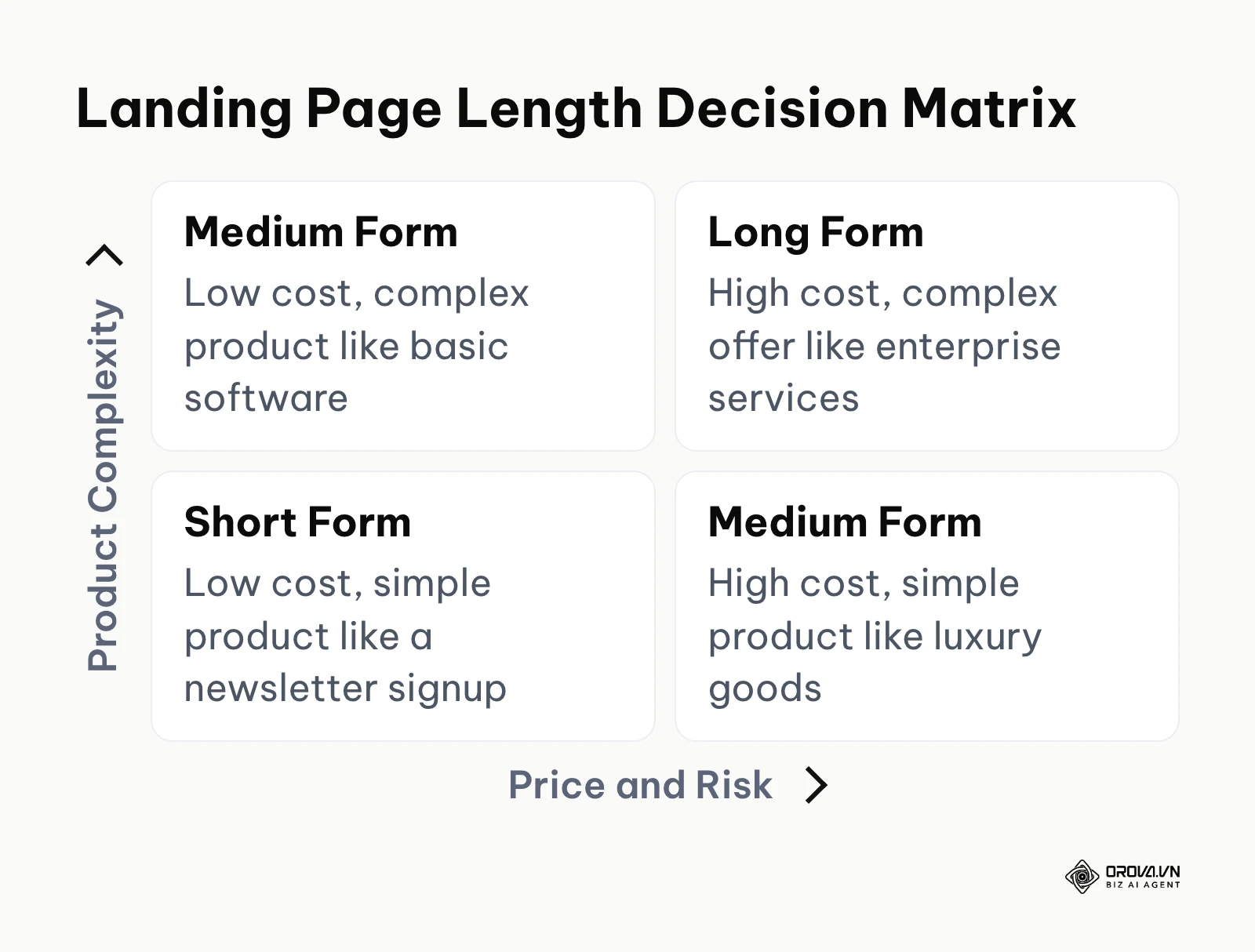
If your product is free or very low cost, such as a simple email newsletter signup, and the complexity is exceptionally low, you need a short-form structure. Everything must fit neatly above the fold without requiring a scroll. If your product is highly complex but low cost, such as a basic monthly software tool, you need a medium-form page to explain the features properly. If your product is simple to understand but highly expensive, like a luxury physical item, you need a medium-form page focused heavily on high-quality lifestyle imagery and trust signals rather than text. If your product is both highly complex and highly expensive, like an enterprise service package, you absolutely require a long-form structure to thoroughly educate the buyer and actively mitigate their perceived risk before asking for a massive commitment.
Wireframe templates for local services and SMBs
Small businesses cannot blindly copy the minimalist layouts of massive brands because they simply do not have the same established trust in the market. Here are specific structures designed for smaller, lesser-known entities.
Dental Clinic Layout: The hero section must have a localized headline stating the service and city clearly, along with a prominent "Book Appointment" button. Immediately below, feature a Google Maps screenshot and real local reviews. The next section should clearly list the insurance providers accepted, as this is a major trust factor. Finally, provide a short section detailing the specific procedure advertised, ending with a clickable phone number and a simple booking form.
B2B SaaS Startup Layout: The hero section needs a clear, high-resolution dashboard screenshot and a headline focusing on the exact time or money saved by using the software. Below the fold, feature integration logos to borrow trust from bigger platforms. The middle section should be a simple three-column layout highlighting the core features. The bottom must have a risk-free trial CTA with a subtext explicitly stating that no credit card is required.
Micro-course Creator Layout: The hero section absolutely requires a video introduction of the creator explaining exactly who the course is for. Below the video, list three bullet points of what the student will actually achieve. The next section must contain deep, undeniable social proof, such as screenshots of student messages or video testimonials. The layout then details the curriculum modules clearly. The final section is the pricing tier, an exceptionally strong money-back guarantee, and the buy button.
Handling objections without adding friction
Every visitor arrives with reasons not to buy. Your structure must aggressively address these objections without making the page feel heavy, defensive, or cluttered.
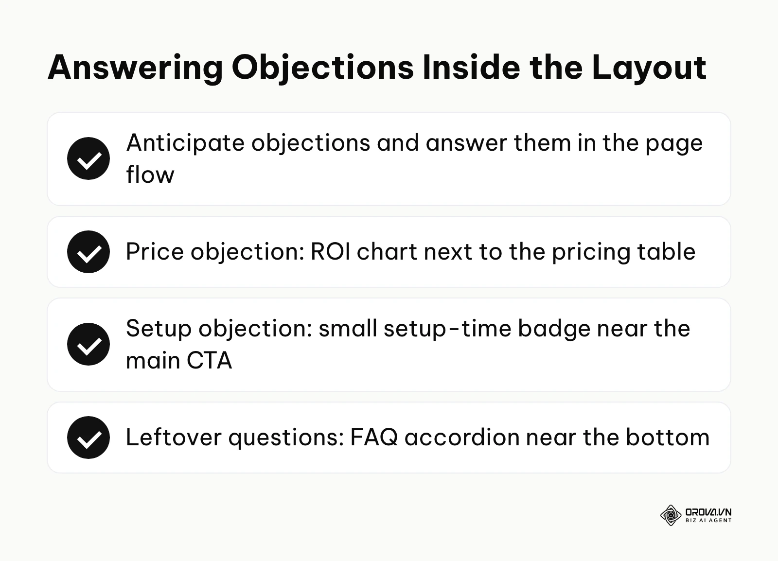
A reliable way to handle objections is to anticipate them and weave the answers directly into the natural flow of the page layout. If price is a major objection, place a clear return on investment calculation chart right next to the pricing table. If setup time is a massive objection, add a small, visually distinct badge stating "Setup takes less than 5 minutes" directly near the main CTA button.
Illustrative example: A boutique online agency selling expensive web design packages. The context features a team of five designers who saw high traffic but few discovery calls booked. First, they identified that the main objection was the project turnaround time. They inserted a clear project timeline just above the booking calendar. They also added a sticky frequently asked questions accordion at the bottom of the page. The hurdle was that the timeline pushed the calendar too far down on mobile screens. They resolved this by collapsing the timeline steps into a horizontal swipeable row. The result was a steady stream of calendar bookings with fewer basic questions asked during the discovery calls.
Placing SEO content without breaking the conversion flow
Many marketers struggle intensely to balance search engine optimization with conversion rate optimization. They dump massive blocks of text onto the page hoping to rank, which completely destroys the user experience and the conversion rate. Google's Search Quality Rater Guidelines stress that a page should have a clear, beneficial purpose for the people who visit it, and a wall of keyword text works against that.
To maintain a high converting landing page structure while still optimizing for search, you must use strategic placement. Keep the top half of the page entirely focused on conversion: punchy headlines, clear images, and tight copy. Move your heavier SEO content, such as detailed technical specifications, long-form explanations, and comprehensive keyword-rich paragraphs, strictly below the primary conversion sections. You can learn more about balancing these textual elements by reviewing a solid SEO content writing structure.
Use expandable accordions for highly detailed content. This allows search engine crawlers to read the text fully while keeping the visual layout exceptionally clean for the user. Ensure your headings are structured logically with H2 and H3 tags to provide context, which aligns perfectly with on page SEO fundamentals. If you are planning the page together with the rest of the site, a SEO website design workflow helps you decide which content lives on the landing page and which belongs elsewhere.
Adapting structure for cold traffic versus warm traffic
A page built strictly for cold traffic, meaning users who have never heard of your brand before, must focus heavily on establishing trust and deeply explaining the problem. The layout needs significantly more educational sections, more testimonials, and often a lower-friction call to action, such as downloading a helpful guide rather than buying a product immediately.
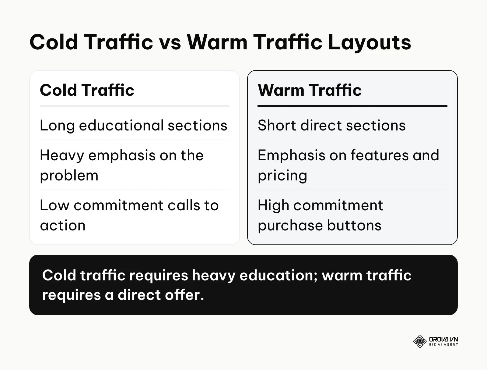
A page built for warm traffic, such as users returning from your email list or retargeting campaigns, can safely skip the heavy education. The layout should immediately present the specific offer, the pricing details, and the buy button. The structure is drastically shorter because the necessary trust is already established.
| Landing Page Type | Key Characteristic | Best Suited For |
|---|---|---|
| Click-Through Page | Warms up the visitor briefly before sending them to a complex checkout page. | E-commerce physical products. |
| Lead Generation Page | Contains a form directly on the page to capture contact information quickly. | B2B services and local businesses. |
| Sales Page | Very long, comprehensive page designed to close a high-ticket sale directly. | Expensive online courses or consulting. |
This leads to the ultimate Conversion-Readiness Checklist. Use these factors to audit your layout thoroughly before launching:
- Headline perfectly matches the preceding ad copy.
- Subheadline clarifies the headline's promise.
- Hero image or video demonstrates the product in use.
- Primary CTA is above the fold on desktop.
- CTA button color contrasts sharply with the background.
- CTA text uses action-oriented verbs.
- Social proof is visible immediately below the fold.
- Navigation menu is completely removed or heavily minimized.
- Outbound links to other websites are eliminated.
- The page focuses on only one primary conversion goal.
- Benefits are listed before technical features.
- Copy is broken into short, easily scannable paragraphs.
- Bullet points are used to highlight key takeaways.
- Trust badges are placed right near the CTA.
- The lead capture form asks only for absolutely essential information.
- Error messages on the form are clear and helpful.
- Mobile layout stacks elements logically without horizontal scrolling.
- Font sizes are highly legible on small mobile screens.
- Loading speed is optimized by compressing images (see what Core Web Vitals measure).
- Pricing, if applicable, is transparent and easy to understand.
- A frequently asked questions section addresses common objections.
- The page uses real customer testimonials with photos if possible.
- The final section repeats the core offer and the final CTA.
- Hover states on buttons indicate clear clickability.
- Privacy policy links are available securely in the footer.
With OROVA.VN and the OROVA SEO module, you put an end to the exhausting days of manual work for good. Instead of struggling for hours to write articles and compile reports, the entire process is now optimized and completed in just 5 minutes.
How to adapt your landing page structure for your business
The way you implement these structures depends heavily on your role and the specific resources at your disposal. You cannot approach this process exactly the same way a solo freelancer would if you manage a massive corporate marketing team.
Small business owner
If you run a small business, you must focus entirely on speed and clarity.
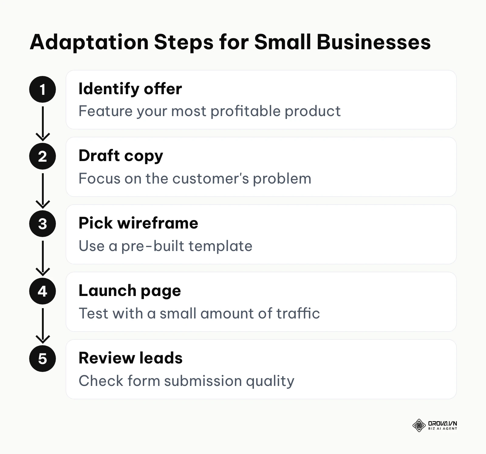
- Identify your most profitable service or product to feature first, ignoring the rest.
- Draft your copy focusing entirely on the customer's problem, not your business history.
- Select a pre-built wireframe template to save massive amounts of time on design.
- Launch the page quickly and drive a small amount of traffic to test it.
- Review the initial form submissions carefully to ensure the lead quality is actually high.
In-house marketer in a company
If you work inside a larger company, your focus shifts to team alignment and scaling efforts.
- Audit all existing advertising campaigns to see exactly where traffic is currently landing.
- Standardize a core wireframe structure for the entire design team to follow strictly.
- Implement A/B testing on the hero section headlines first, as they have the biggest impact.
- Ensure the lead capture form integrates flawlessly with the company CRM.
- Present the conversion rate improvements to stakeholders clearly to justify further optimization.
Agency or freelancer
If you build pages for external clients, your process must be highly structured and educational.
- Conduct a deep onboarding interview to understand the client's exact target audience.
- Present a wireframe structure to the client before designing any high-fidelity visuals.
- Explain the psychological reasoning behind the layout to get their early buy-in.
- Build the page focusing heavily on lowering the client's cost per acquisition.
- Provide a clear post-launch report detailing exactly how the structure performed.
| Common Mistake | Consequence | How to Avoid |
|---|---|---|
| Keeping the navigation bar | Visitors click away to read the "About Us" page and never return. | Hide the header menu entirely on dedicated campaign pages. |
| Asking for too much info | Form abandonment rates skyrocket immediately. | Only ask for the data absolutely necessary to contact the lead. |
| Weak, generic headlines | Immediate bounce as visitors fail to see relevance. | Ensure the headline specifically addresses the exact ad promise. |
Landing page structure design trends in the next few years: my perspective
The landscape of digital marketing changes rapidly, and the way we build pages must continuously adapt. Here is how I think user expectations will reshape page layouts, offered as my own view rather than a forecast with guaranteed timing.
The rise of AI-generated dynamic layouts
Currently, we manually build different pages for different traffic segments, which is highly time-consuming. I think static layouts will gradually lose ground in sophisticated marketing campaigns, as AI tools increasingly help assemble the landing page structure in real-time based on the user's specific search intent, location, and past behavior. A visitor who tends to read long-form technical content might see a text-heavier layout, while one who prefers quick visual summaries might see a version that rearranges the page to prioritize video and bullet points. You should start categorizing your assets—copy blocks, images, testimonials—into modular components now, so they are ready for dynamic assembly systems.
The decline of the traditional lead form
Forms have always been the primary source of friction on any layout. I believe traditional multi-field forms will become less common on pages, with more of them replaced by lower-friction options such as one-click social logins or biometric approvals directly from mobile devices. Users could simply tap a button to securely share their verified contact information without typing a single word. To prepare for this, you must begin prioritizing deep brand trust and credibility over aggressive data collection techniques.
Voice-optimized conversion pathways
As voice search and screenless interactions grow, visual layouts alone will not be enough. I expect landing page structures will increasingly need a machine-readable layer alongside the visual design. Users might ask their smart assistant to summarize the offer on your page and execute the purchase without ever looking at a physical screen. You must prepare by structuring your page content with pristine semantic HTML and clear, conversational data markup that AI assistants can easily interpret. These shifts could be slowed if major privacy regulations heavily restrict real-time personalization data usage.
Frequently asked questions about high converting landing page structures
Understanding the nuances of page layout often brings up highly specific, tactical questions from practitioners.
What is the ideal landing page structure for cold traffic?
Cold traffic requires a significantly longer, more educational structure. The page must start by agitating a specific problem the user faces, rather than immediately pitching a product. It needs extensive social proof and a low-commitment call to action, such as downloading a free resource, to build initial trust.
Where should I place the call to action?
The primary call to action should generally sit above the fold so users immediately understand what is explicitly expected of them. However, you must repeat the call to action strategically throughout the page, typically after a strong section of social proof and always at the very bottom of the page to catch users who finish reading.
How many form fields are optimal?
There is absolutely no universal optimal number, but the general rule is to ask only for what is strictly necessary to take the immediate next step. If you only need an email address to deliver a PDF, do not aggressively ask for a phone number. Removing unnecessary fields usually makes the form easier to complete.
Are landing pages still needed with AI?
Yes, absolutely. While AI can accurately answer questions and summarize information quickly, a dedicated landing page is still the most controlled environment for guiding a user toward a specific commercial action. AI will change how these pages are dynamically built and personalized, but the fundamental need for a focused conversion pathway remains essential. Understanding ChatGPT for SEO workflows can actually help you draft the persuasive copy for these pages much more efficiently.
Should a landing page have a navigation menu?
No. Including a standard website navigation menu is one of the most common and damaging mistakes marketers make. Navigation links act as immediate exit routes, distracting the user completely from the primary conversion goal. You must remove all unnecessary links to keep the visitor focused on the single call to action.
Where to begin with your page layout?
It is easy to feel completely overwhelmed by complex psychology frameworks, deep decision matrices, and long checklists. The absolute key to success is to start exactly where you are right now and make incremental improvements rather than attempting a massive, risky overhaul on day one. Your first move depends entirely on your current situation.
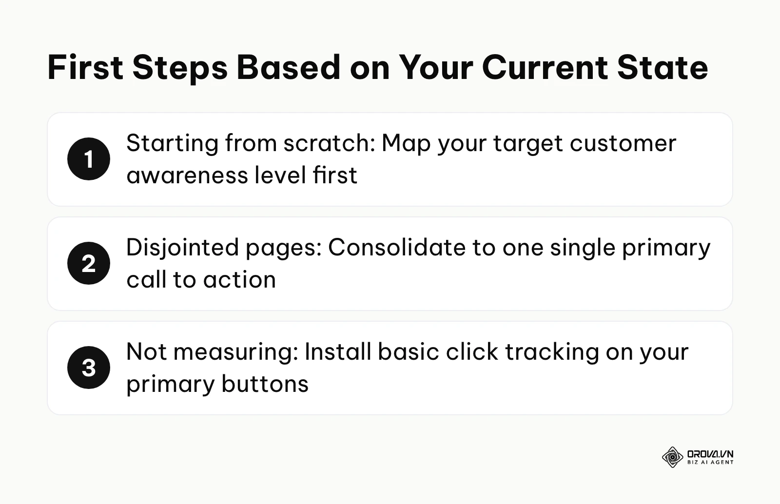
If you are starting from scratch and have absolutely no pages built, your very first step is to clearly map your target customer's awareness level. Do not open a design tool or start writing any copy yet. Sit down and write out exactly what your target customer already knows about their problem and your industry. This single, foundational decision will strictly dictate the entire length and flow of the page you eventually build.
If you already have disjointed pages scattered across different campaigns, your first step is to aggressively consolidate your focus by identifying the single primary call to action for your most important page. Audit that page and ruthlessly delete any secondary links, social media icons, or navigation elements that distract from that single goal. You can often see an immediate conversion lift simply by removing visual clutter. If you are struggling with poor ad performance despite having pages, reviewing a Google ads optimization blueprint can help precisely identify if the core issue is the ad targeting itself or the page layout.
If you have structured pages but are not formally measuring their performance, your immediate task is to install basic click tracking on your primary buttons. You cannot systematically improve what you do not accurately measure. Setting up simple event tracking will finally give you the baseline data needed to explicitly understand if your high converting landing page structure is actually working.
About the author

Builder of Orova
Nguyễn Đỗ Trọng Ân has 8 years of experience in marketing, including 6 years managing market development across Asia. He builds Orova, a Biz AI Agent that never sleeps: it plans, runs and optimizes work for businesses.
Run your business with AI Agents
Orova is the always-on Biz AI Agent — it plans, runs, and optimizes the work for you.
Save time, unlock productivity.