
SEO website design: The missing workflow between designers and SEOs

SEO website design is the practice of planning a site's architecture, layout, and code together so that search engines can crawl and understand every page while visitors find it fast and easy to use. Yet when launching a new digital presence, most teams treat it as two completely separate phases: web designers build a beautiful, visually engaging interface, and then SEO professionals are brought in at the very end to "optimize" or "fix" it for Google. This fragmented, waterfall approach almost always results in a bloated, technically slow website that looks stunning in an agency portfolio but completely fails to generate real organic traffic. You end up with gorgeous, heavy video headers that destroy your load speed, or modern JavaScript frameworks that render entirely blank pages to search engine crawlers. Attempting to bolt search optimization onto an existing, finalized design is an expensive recipe for disaster. This comprehensive guide will show you exactly how to bridge the critical gap between aesthetics and organic visibility. By integrating search optimization directly into your UI/UX workflow—from the very first site architecture map to the final developer handoff—you can successfully build a digital asset that pleases both human users and search engine algorithms from day one.
SEO website design: What is it and when should you care?
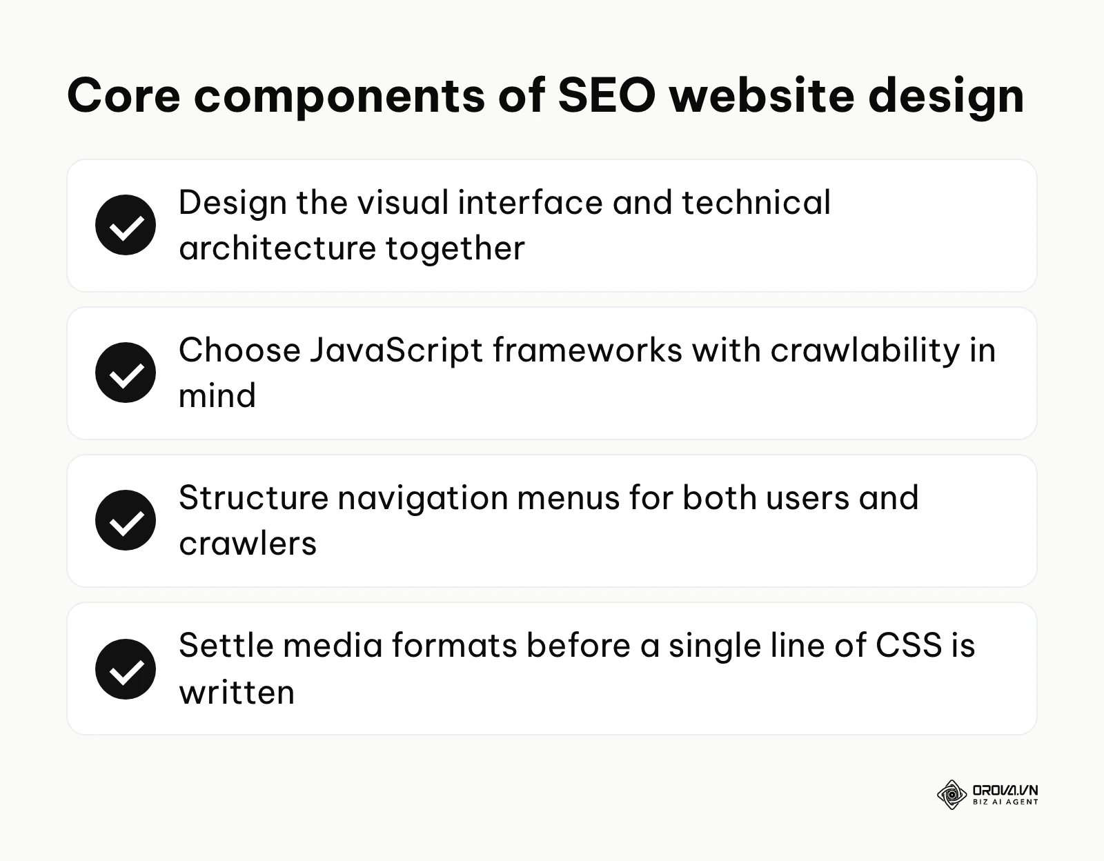
SEO website design is the strategic process of creating a website's visual interface and technical architecture simultaneously, ensuring that the site is both highly engaging for human users and perfectly accessible to search engine crawlers. It is not merely about adding keywords to a finalized layout; it is about making architectural decisions—such as choosing between JavaScript frameworks, structuring navigation menus, and optimizing media formats—before a single line of CSS is written.
This integrated approach is mandatory for any business that relies on organic search traffic to generate revenue, including e-commerce storefronts, SaaS platforms, and large-scale digital publishers. If you are building a small, private portal or a temporary landing page driven entirely by paid advertising, you might afford to ignore these principles. However, for long-term organic growth, separating design from search engine optimization will inevitably lead to costly structural rebuilds down the line.
What to prepare before starting your SEO-driven web design
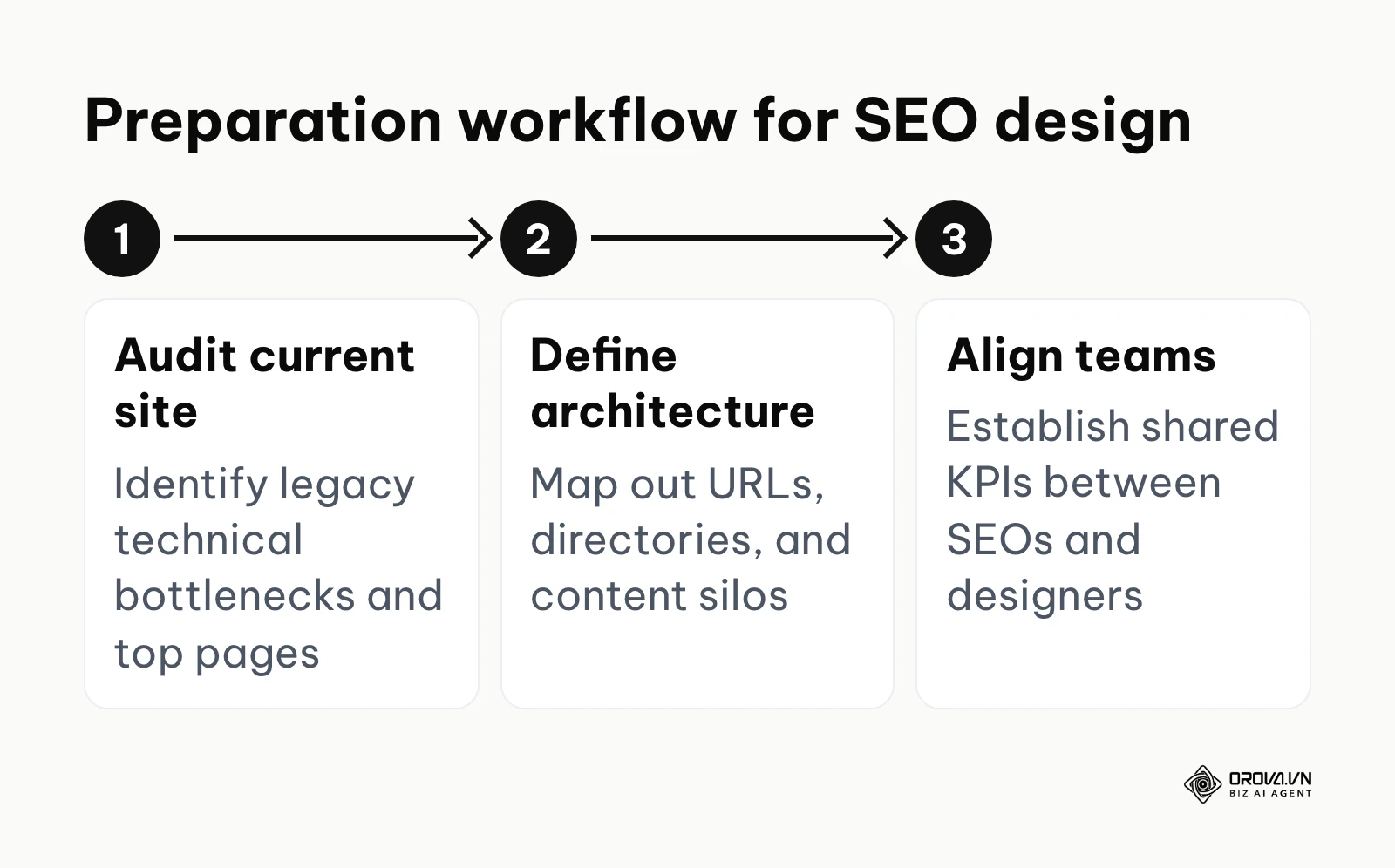
Before a designer even opens Figma or Sketch, a massive amount of preparatory work must occur. Skipping this phase is the primary reason website migrations result in disastrous traffic drops. You need to gather historical data, define the new structural boundaries, and align both teams on shared performance metrics.
| What to prepare | Where to source it | Estimated time |
|---|---|---|
| Legacy crawl data & top landing pages | Google Search Console & Google Analytics 4 | 2–3 days |
| Global keyword mapping document | SEO research tools (Ahrefs, Semrush, etc.) | 1–2 weeks |
| Competitor performance benchmarks | PageSpeed Insights & Lighthouse | 1–2 days |
| Preliminary URL redirect map | Current CMS export mapped to new architecture | 3–5 days |
| Target Core Web Vitals thresholds | Collaborative agreement between Dev and SEO | 1 day |
This preparation phase ensures that the design team understands the limitations they must work within. For example, if the SEO team identifies that the current site receives 60% of its traffic from deep sub-category pages, the design team must prioritize creating robust, easily navigable templates for those specific sub-categories rather than focusing all their creative energy solely on the homepage.
The step-by-step SEO website design workflow
Creating a website that dominates search results requires a tightly integrated workflow where SEO professionals and UI/UX designers act as equal partners. The following six steps outline exactly how these two disciplines should collaborate throughout the project lifecycle.
Step 1: Mapping the site architecture and URL structure
The foundation of any successful web project is its architecture. What are we building, how deep does it go, and how do the pieces connect? In an SEO-driven workflow, you must aim for a "flat" site architecture. This means that a user—and a search engine crawler—should be able to reach any critical page on your website within three clicks from the homepage.
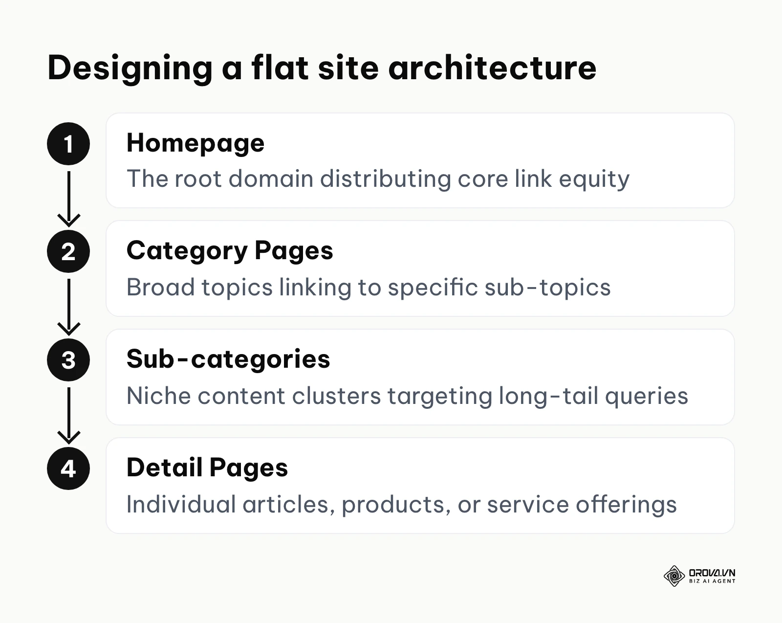
To do this, start by listing every major category and sub-category your business covers. The SEO team should dictate the naming conventions of these categories based on keyword research, while the design team figures out how to visually present them in the primary navigation menu. You must decide early on whether you will use subdirectories (e.g., website.com/blog/article) or subdomains (e.g., blog.website.com). Google says it can handle either, but many SEOs prefer subdirectories because they keep content and internal links under one host; what matters most is choosing once and not changing it later. Furthermore, you need to establish strict rules for URL parameter handling, especially for e-commerce sites with faceted navigation (filtering by size, color, price). If faceted URLs are not handled correctly from the start, search engines can end up crawling huge numbers of near-duplicate pages, wasting crawl budget that should go to your important pages.
Illustrative example (hypothetical numbers):
- Context: An SEO Manager at a large online retail company preparing for a complete platform redesign.
- Steps taken: They mapped out a new flat URL structure, ensuring all product pages were nested directly under their primary categories. They instructed the design team to create a visual mega-menu that naturally grouped these categories without relying on complex, un-crawlable JavaScript drop-downs.
- Friction and resolution: The design team wanted a minimalist "hamburger" menu even on the desktop version, which would hide the entire site structure. The SEO manager demonstrated that exposing the top-level categories improved internal link flow and user discovery, leading to a compromise where the primary categories were visible, while secondary filters were hidden.
- Results: Following the launch, the site experienced a 30% increase in crawl efficiency, and new product pages were indexed within hours instead of weeks.
Step 2: Wireframing for content hierarchy and internal linking
Once the architecture is mapped, the next phase is wireframing. This is where designers block out the layout of individual page templates. From an SEO perspective, this stage is entirely about securing real estate for text content and establishing a clear semantic structure.
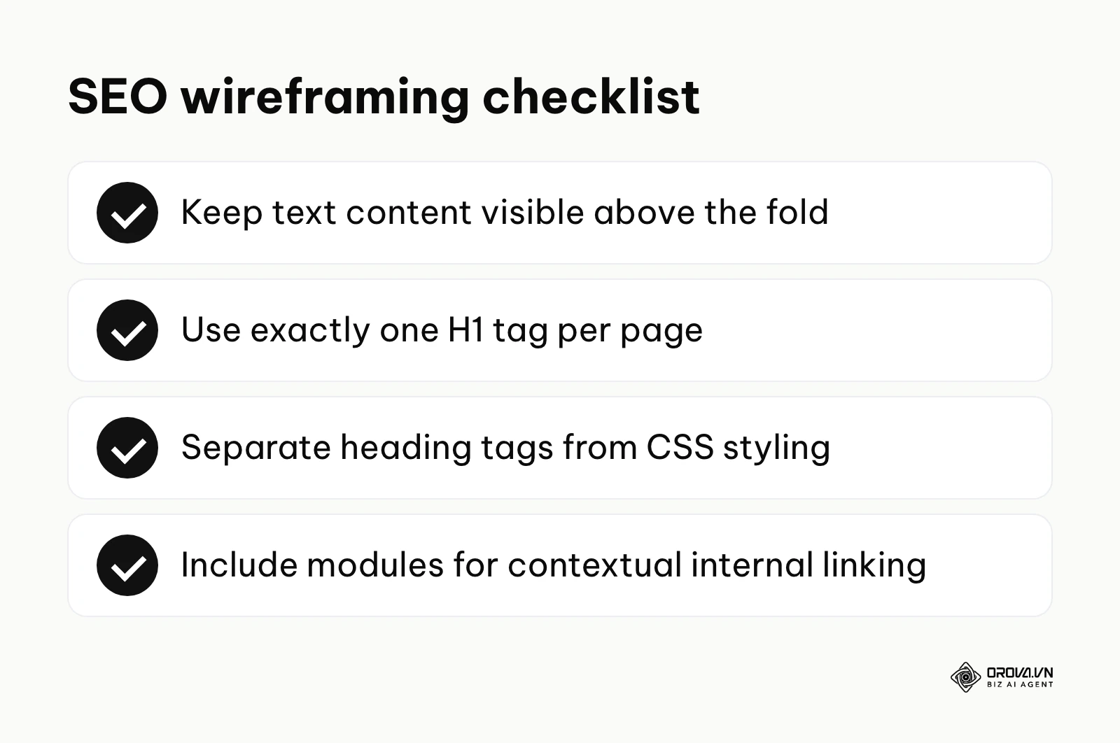
Designers often prioritize whitespace and imagery, pushing text to the bottom of the page or hiding it behind tabs. The SEO team must intervene here to ensure that primary target keywords and introductory text are visible above the fold. More importantly, wireframing is when you define the structural heading tags (H1, H2, H3). Designers frequently misuse heading tags simply to change font sizes—for example, using an H1 tag for a tiny footer link just because the CSS styling for H1 matches the desired look. You must separate visual styling from structural semantics. Ensure that every page template wireframe clearly designates exactly one H1 tag at the very top, followed by logical H2s and H3s. Additionally, wireframes must include dedicated modules for contextual internal linking—such as "Related Articles" or "People Also Bought" sections—to ensure link equity flows smoothly through the site. By adhering to rigorous on page SEO guidelines, you guarantee that the final interface communicates clearly with search algorithms.
Step 3: UI/UX design with accessibility and Core Web Vitals in mind
Moving from wireframes to high-fidelity UI design introduces colors, typography, and media. This is historically where websites become bloated and slow. In a modern workflow, every design decision must be evaluated against Google's Core Web Vitals: Largest Contentful Paint (LCP), Cumulative Layout Shift (CLS), and Interaction to Next Paint (INP).
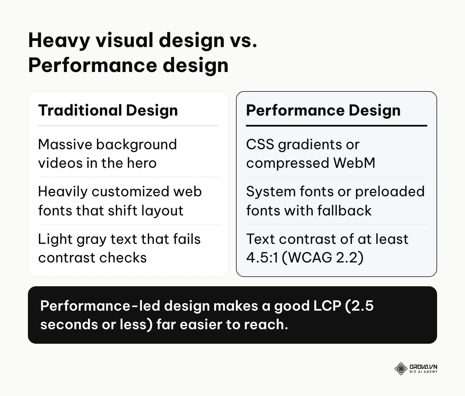
When choosing typography, heavily customized web fonts can cause severe CLS issues due to Flash of Unstyled Text (FOUT) or Flash of Invisible Text (FOIT). Designers should ideally rely on system fonts, or preload the few essential web fonts and set the font-display CSS property (for example swap) with a closely matched fallback font. When implementing large hero banners, avoid massive 10MB background videos; instead, use highly compressed WebM formats or lightweight CSS gradients to keep LCP at or below 2.5 seconds, the threshold Google publishes for a "good" score. Furthermore, accessibility is paramount. According to the Web Content Accessibility Guidelines (WCAG) 2.2 by W3C published in 2023, maintaining a minimum color contrast ratio of 4.5:1 for normal text is a mandatory requirement for baseline accessibility. Designing with these constraints forces teams to create cleaner, faster interfaces.
Illustrative example (hypothetical numbers):
- Context: A Product Owner at a regional healthcare portal aiming to ensure ADA compliance while improving overall organic visibility during a redesign.
- Steps taken: They audited the new proposed UI color palette, increased the base text size to 16px, added descriptive ARIA labels to all interactive UI elements, and enforced a strict semantic HTML heading structure for screen readers.
- Friction and resolution: The brand's primary corporate colors featured light gray text on a white background, which failed the WCAG AA contrast requirement of 4.5:1 for normal text. The Product Owner had to convince the branding department to darken the gray until it passed.
- Results: The accessibility audit score reached 100/100 in Lighthouse, and average engagement time rose by 15%, particularly among older visitors, alongside better visibility for local clinic searches.
Step 4: Prototyping and testing visual hierarchy for dwell time
Dwell time—the amount of time a user spends on your page before returning to the search results—is a useful behavioral proxy. Google has never confirmed it as a direct ranking factor, but if most visitors hit the "back" button within seconds (known as pogo-sticking), the page is clearly not satisfying the search, and that weakness tends to show up in engagement, conversions, and eventually visibility. Prototyping is the stage where you test whether the visual hierarchy successfully captures and retains user attention.
As detailed in the report F-Shaped Pattern of Reading on the Web: Misunderstood, But Still Relevant by the Nielsen Norman Group in 2017, users naturally scan text-heavy web pages in an F-shaped trajectory. Designers must arrange elements to cater to this behavior. Place the most critical value proposition and primary Call-To-Action (CTA) along the top horizontal axis, and use bullet points, bold text, and strategically placed images down the left vertical axis to pull the reader's eye downward. Break up massive walls of text with visually distinct pull quotes, interactive data visualizations, or embedded media to reset the user's attention span.
Illustrative example (hypothetical numbers):
- Context: A Lead Web Designer at a mid-sized B2B SaaS company tasked with redesigning the primary software feature pages to increase demo signups and reduce bounce rates.
- Steps taken: They mapped the visual hierarchy to strictly follow the F-shaped reading pattern, placed the primary CTA clearly above the fold, and replaced a heavy, distracting background video with lightweight CSS micro-animations that highlighted text benefits.
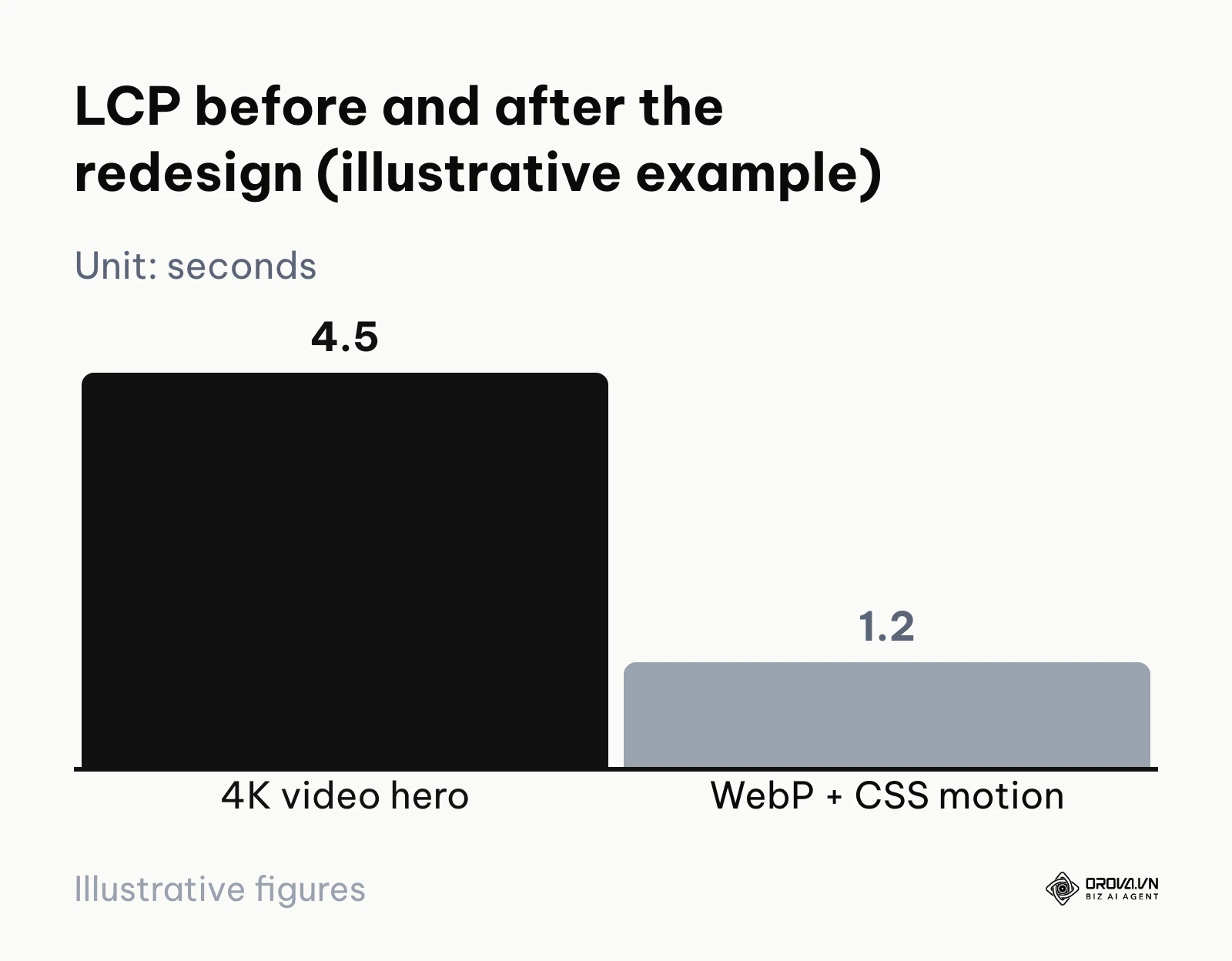
- Friction and resolution: Initially, the marketing team insisted on keeping a 15MB 4K cinematic video for "branding purposes." The designer resolved this by A/B testing a lightweight static WebP image accompanied by CSS animations against the heavy video, proving the animation loaded 3 seconds faster and held attention better.
- Results: The page's Largest Contentful Paint (LCP) dropped from 4.5s to 1.2s, reducing the bounce rate by an impressive 22% and securing a top-3 ranking for their core product keywords.
Step 5: The UI/UX acceptance checklist for SEO handoff
Before the finalized design files are handed over to the development team, the SEO specialist must perform a rigorous acceptance review. If designs are handed off with structural flaws, the developers will simply code those flaws into reality, making them incredibly expensive to fix later. Utilizing a comprehensive SEO checklist at this juncture is critical.
A professional handoff checklist must verify the following criteria:
- Mobile Parity: Does the mobile layout contain the same primary text, links, and navigational elements as the desktop layout? With mobile-first indexing, Google recommends that the mobile version carry the same primary content as desktop.
- Heading Semantics: Is there exactly one visually distinct element intended to be the H1 tag per page template? Are sub-headings visually tiered to match H2 and H3 structures?
- Image Specifications: Have exact aspect ratios and maximum file size constraints been documented for every image placeholder to prevent developers from serving unoptimized assets?
- Text Readability: Do all text elements pass the WCAG 4.5:1 color contrast ratio? Is the base font size legible on small mobile screens without requiring pinch-to-zoom?
- Hover States & Touch Targets: Are all clickable buttons and links at least 24 by 24 CSS pixels (the WCAG 2.2 level AA minimum for target size), with enough spacing to prevent accidental taps on mobile devices? Are essential links accessible without relying solely on mouse hover states?
Step 6: Monitoring the development phase for technical fidelity
The final step is arguably the most dangerous: translating the design into functional code. Designers and SEOs must remain heavily involved during the development sprints to ensure technical fidelity. Developers, aiming to launch features quickly, might take shortcuts that devastate search visibility.
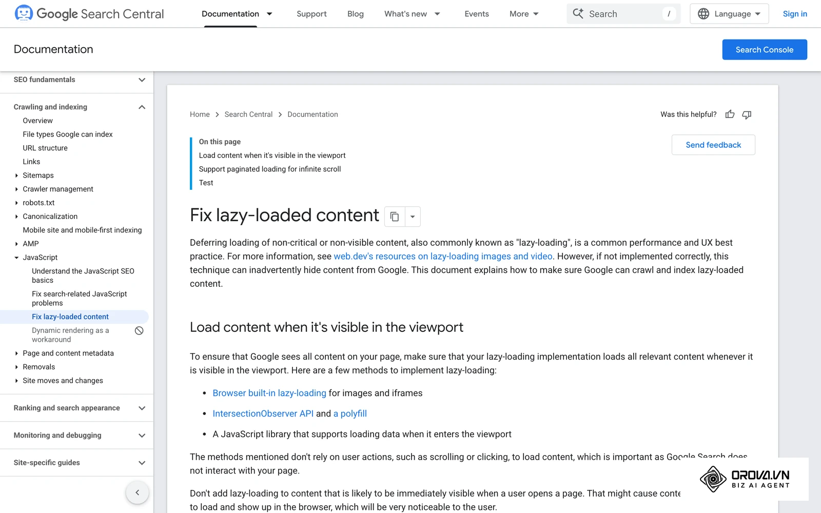
Common technical implementation errors include lazy loading images that appear above the fold (which destroys LCP), relying on JavaScript to inject critical internal links into the DOM (which delays crawling), or forgetting to include mandatory alt attribute fields in the content management system's image upload module. The SEO team must run staging environment crawls using tools like Screaming Frog or Sitebulb to catch these issues before they reach production. Following a robust technical SEO practices protocol during staging guarantees that the beautiful interface rendered by the developers remains fully accessible to Googlebot's rendering engine.
Discover Orova.vn – a Biz AI Agent platform with OROVA SEO, a complete solution for every website. The system supports search engine optimization from A to Z with features including keyword research, writing new SEO-ready articles, optimizing existing content, rank tracking, plus competitor analysis and in-depth technical analysis. Sign up today to experience OROVA SEO completely free (offer valid through July 7, 2027).
Deep dive: Balancing aesthetics, accessibility, and performance
The greatest friction in website creation arises when aesthetic desires clash with technical constraints. Understanding how to navigate these technical trade-offs is what separates amateur builds from enterprise-grade digital platforms.
The JavaScript framework dilemma: CSR vs. SSR
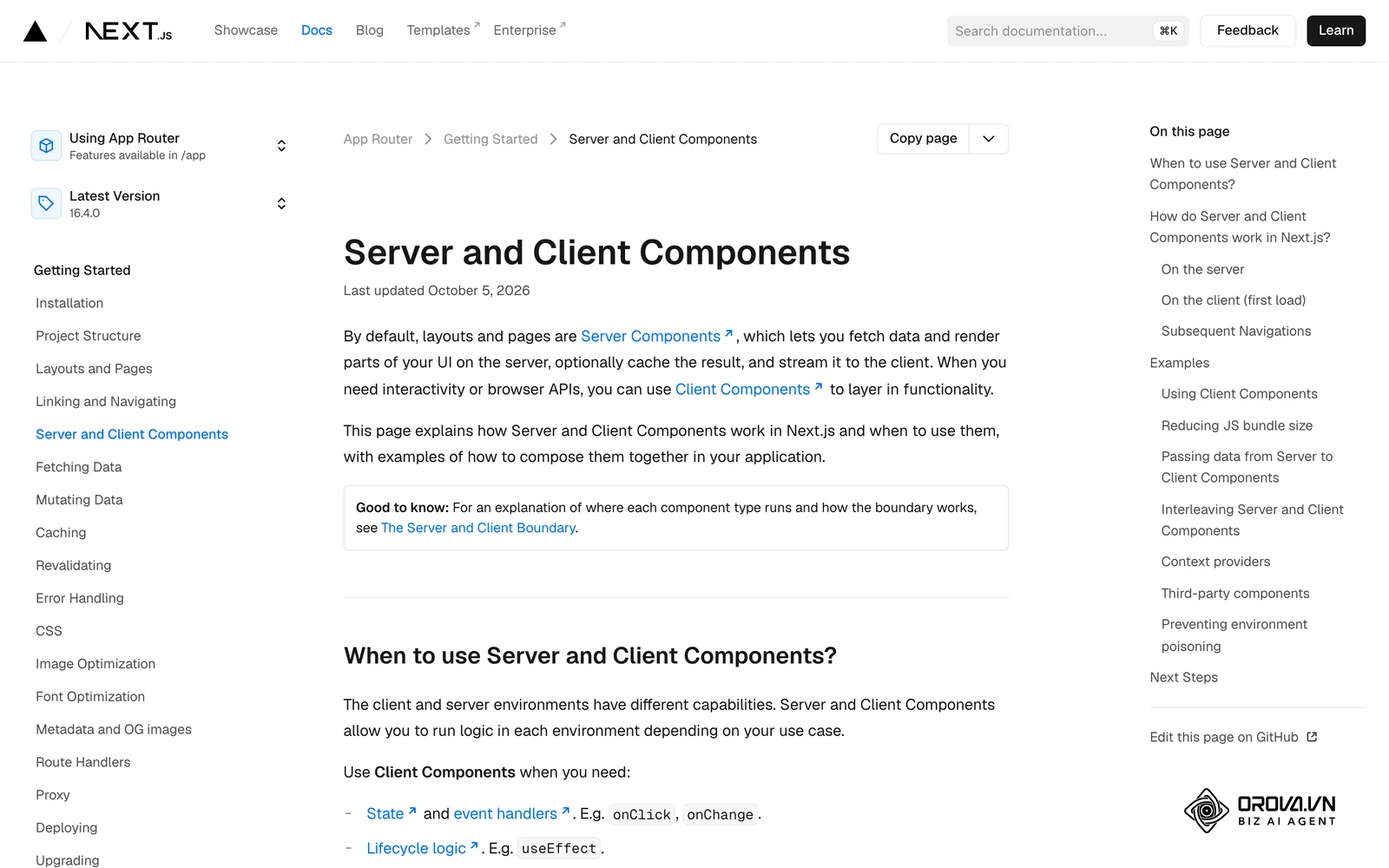
Modern web development relies heavily on JavaScript frameworks like React, Vue, and Angular to create highly interactive, app-like experiences. By default, these frameworks utilize Client-Side Rendering (CSR). In a CSR environment, the server sends an almost empty HTML document to the browser, alongside a massive bundle of JavaScript. The browser must download, parse, and execute this JavaScript before any visible content appears on the screen.
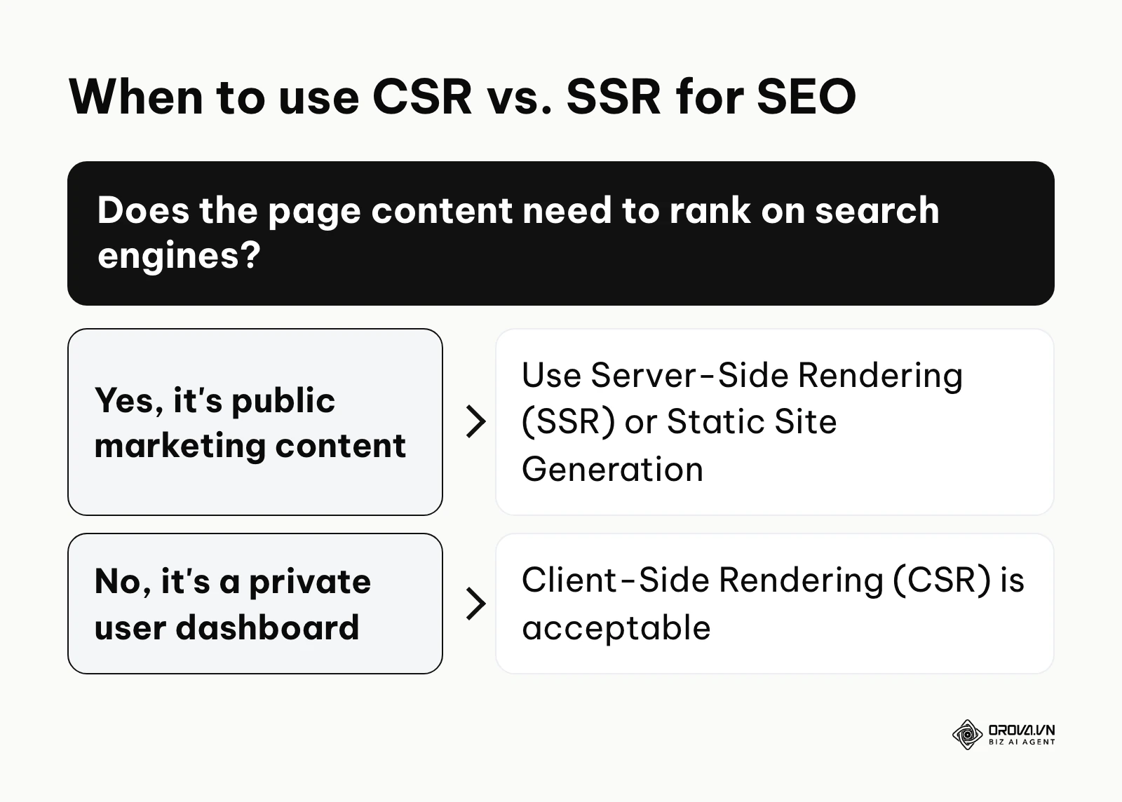
For search engines, CSR is a nightmare. Googlebot's Web Rendering Service (WRS) can execute JavaScript, but pages are queued for rendering, which is resource-intensive and can delay when your content is fully understood. Furthermore, if a script fails or a resource is blocked, the crawler may see little or no content at all. The solution is Server-Side Rendering (SSR) or Static Site Generation (SSG), often implemented via meta-frameworks like Next.js or Nuxt.js. SSR executes the JavaScript on the server before sending it to the user, delivering a fully populated HTML document immediately.
Illustrative example (hypothetical numbers):
- Context: An SEO Manager at an e-commerce agency handling a 50,000+ SKU website migration to a React-based frontend architecture.
- Steps taken: They audited the staging environment and realized the developers were utilizing standard Client-Side Rendering (CSR). When fetched by standard crawlers, the product pages were completely blank. They collaborated with the engineering lead to switch the architecture to Next.js for Server-Side Rendering (SSR).
- Friction and resolution: The development team pushed back fiercely due to increased server computing costs and slightly longer Time to First Byte (TTFB). The SEO Manager negotiated a compromise by implementing Incremental Static Regeneration (ISR) for the top 5,000 high-traffic products, and standard SSR for the long-tail inventory.
- Results: Organic traffic and revenue were fully maintained post-launch, avoiding the typical migration dip, and newly added products were indexed 40% faster than on the old PHP platform.
| Approach | Best used when | Weakness |
|---|---|---|
| Server-Side Rendering (SSR) | Content needs immediate indexability and social sharing previews | Higher server computing costs and potentially slower Time to First Byte (TTFB) |
| Client-Side Rendering (CSR) | Building private dashboards or web applications hidden entirely behind a login wall | Poor for initial SEO discovery; crawlers may see a near-empty page until scripts run |
| Static Site Generation (SSG) | Fast marketing sites or blogs with content that changes infrequently | Content updates usually require a rebuild and redeploy |
Accessibility (ADA/WCAG) as an indirect SEO ranking factor
Accessibility is no longer just a legal compliance issue or a moral obligation; it is deeply intertwined with search engine optimization. In some ways, search engine crawlers behave like the screen readers used by visually impaired users. They rely on semantic HTML structure to understand the context and priority of content.
When you design a site to be accessible, you inherently optimize it for search algorithms. For instance, providing descriptive alt text for images allows screen readers to describe the visual to a blind user, while simultaneously telling Google Image Search exactly what the picture contains. Utilizing proper ARIA roles (Accessible Rich Internet Applications) such as role="navigation" or aria-expanded="true" helps assistive technologies navigate complex dropdown menus, which in turn clarifies your site structure for bots. Google does not state that WCAG compliance is a direct ranking factor, but the cleaner code, clearer structure, and more inclusive experience that come with it tend to support SEO indirectly.
The decision matrix: Visual effects versus page speed
When designers propose complex visual effects—like parallax scrolling, 3D WebGL models, or heavy scroll-triggered animations—the SEO team must evaluate them based on their performance cost versus their visual impact. Not all animations are bad, but they must be chosen wisely.
To resolve conflicts over animations, use a decision matrix. Avoid effects that require JavaScript to constantly recalculate the layout on every scroll event, as this causes massive main-thread blocking. Instead, prioritize CSS-based transforms (transform: translate, opacity, scale), which are handled smoothly by the browser's GPU and do not trigger layout recalculations.
| Visual Effect Type | Performance Cost | Decision Rule | Example Execution |
|---|---|---|---|
| Heavy JavaScript DOM Manipulation | Extremely High | Avoid completely | jQuery-based content sliders |
| 3D WebGL / Canvas Rendering | Very High | Use sparingly | Dedicated hero section on a product launch page |
| CSS Layout Animations (Width/Height) | Medium | Standardize cautiously | Accordion menus expanding vertically |
| CSS Transform/Opacity Animations | Low | Prioritize | Button hover states fading in, items sliding in |
How to measure the success of an SEO-friendly design
Launching the website is merely the beginning; you must rigorously measure how the new design impacts both technical performance and user behavior to prove the ROI of your integrated workflow.
Tracking Core Web Vitals and user experience metrics
Your primary technical KPIs are the Core Web Vitals. You must differentiate between "Lab Data" (simulated tests) and "Field Data" (real-world user experiences). Tools like Lighthouse and PageSpeed Insights provide excellent Lab Data for developers to debug specific templates in a controlled environment. However, Google's Core Web Vitals assessment uses Field Data collected from the Chrome User Experience Report (CrUX), measured at the 75th percentile of page loads.
| Metric | Meaning | Good (Google threshold) | Poor |
|---|---|---|---|
| Largest Contentful Paint (LCP) | How fast the largest visual element on the screen fully renders | 2.5 seconds or less | More than 4 seconds |
| Cumulative Layout Shift (CLS) | How much the visual elements jump around as the page continues loading | 0.1 or less | More than 0.25 |
| Interaction to Next Paint (INP) | How quickly the page visually responds after a user clicks or taps | 200 milliseconds or less | More than 500 milliseconds |
You must establish automated monitoring for these metrics, as future content updates by the marketing team (like uploading an uncompressed 10MB image) can instantly ruin a perfectly designed page.
Monitoring behavioral signals and conversion rates
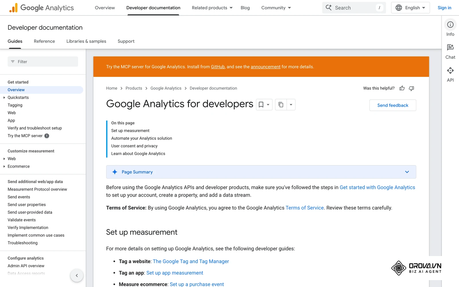
Beyond technical loading speed, you must track how real users interact with the design. Utilizing robust Google Search Console workflows in tandem with Google Analytics 4 allows you to measure behavioral signals.
Monitor the bounce rate and the engagement rate on your newly designed landing pages. If the engagement rate plummets after a redesign, your visual hierarchy might be confusing, or the primary content is buried too far down the page. Track scroll depth to see if users are actually reaching the bottom of your carefully crafted articles. Most importantly, tie these behavioral metrics directly to conversion events—whether that is a form submission, an email signup, or a product purchase. A design that achieves a perfect 100 on Lighthouse but fails to convert visitors is ultimately a failed business investment.
With OROVA.VN and the OROVA SEO module, you put an end to the exhausting days of manual work for good. Instead of struggling for hours to write articles and compile reports, the entire process is now optimized and completed in just 5 minutes.
Common mistakes when integrating SEO and web design
Even with a strong workflow, teams frequently stumble over legacy habits. Avoid these critical errors during your next redesign.
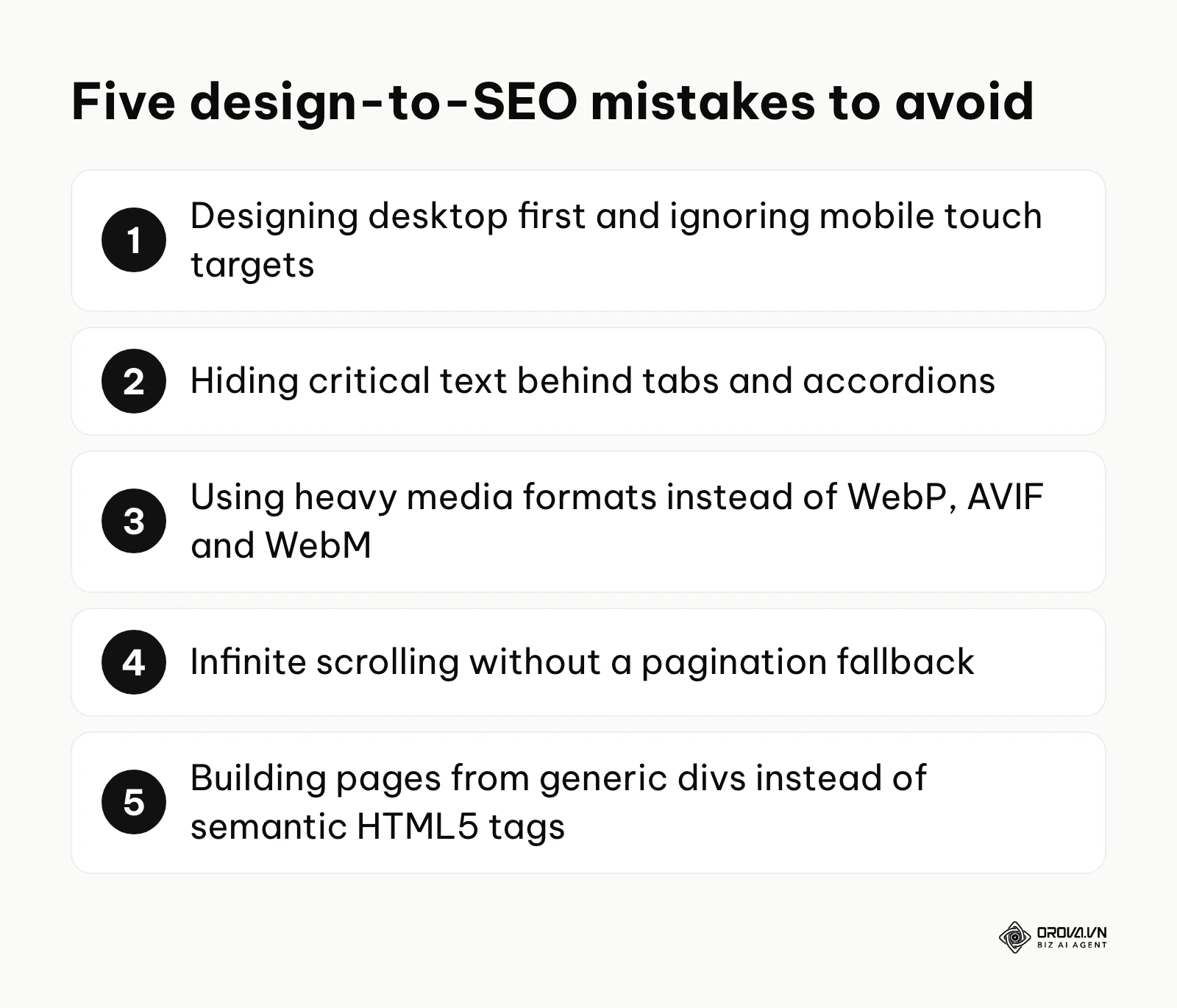
Mistake 1: Designing for desktop first, ignoring mobile touch targets
Many designers still conceptualize web layouts on massive 27-inch desktop monitors. However, Google uses mobile-first indexing, meaning it primarily uses the mobile version of your site for indexing and ranking. Designing intricate hover states or packing links tightly together ruins the mobile experience. Ensure all clickable touch targets are appropriately spaced, and prioritize the mobile viewport during the wireframing stage.
Mistake 2: Hiding critical text behind tabs and accordions
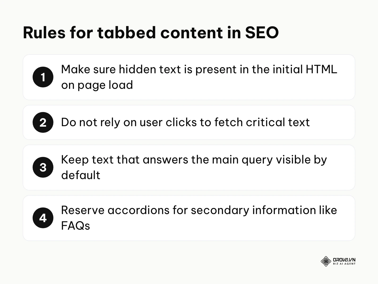
Clean minimalist designs often hide vast amounts of text behind "Read More" tabs or expanding accordions to save space. Google can index content inside tabs and accordions, but only if it is already present in the HTML when the page loads; text fetched only after a click may never be seen. Many readers also skip collapsed text, so if a passage answers the main query, keep it visible by default upon initial page load. Reserve accordions exclusively for secondary information like FAQs.
Mistake 3: Using heavy media formats instead of next-gen webp and WebM
Relying on traditional .jpg, .png, and .gif files is a guaranteed way to bloat your website. Modern SEO design demands the use of next-generation formats. Use .webp or .avif for static images to achieve massive compression without quality loss. For short looping animations, never use a massive .gif file; instead, encode it as a silent .mp4 or .webm video, which is vastly smaller and loads significantly faster.
Mistake 4: Infinite scrolling without pagination fallback
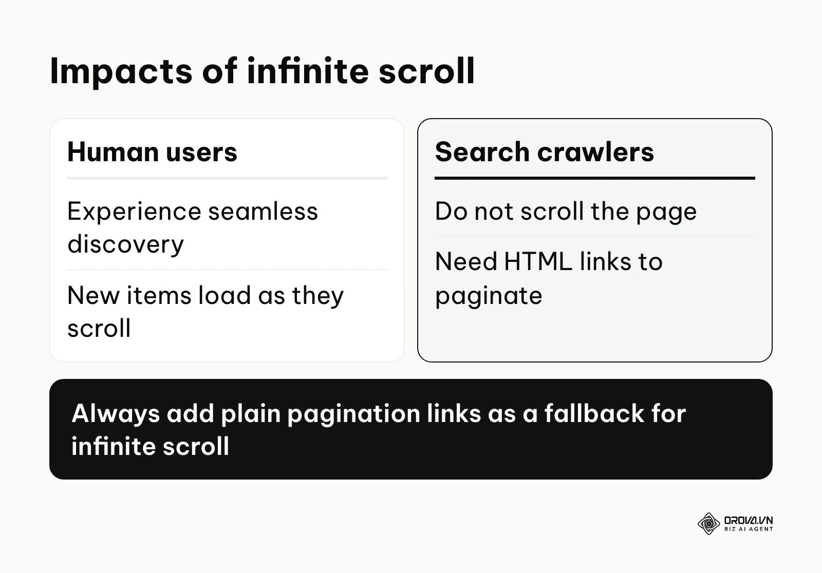
Infinite scroll offers a seamless user experience for content discovery, particularly on social media and e-commerce category pages. However, search engine crawlers do not scroll; they follow links. If you implement infinite scroll without providing a traditional pagination fallback in the HTML code (plain <a> links pointing to page 2, page 3, and so on), crawlers may only discover the first batch of items, leaving deeper pages hard for search engines to find.
Mistake 5: Neglecting structural semantic HTML5 tags
A common developmental flaw is building an entire webpage using only generic <div> and <span> tags. Search engines rely on semantic HTML5 tags to understand the purpose of different sections. Ensure your design translates into code that utilizes <header> for navigation, <main> for the core content, <article> for blog posts, <aside> for sidebars, and <footer> for bottom links. This structural clarity makes each section easier for crawlers to interpret. If your site runs on WordPress, many of these fixes live in theme templates and plugin settings, so it is worth reviewing them alongside a guide to optimizing WordPress SEO.
Web design trends in the next few years: The author's perspective
As we look toward the future of digital experiences, the intersection of visual design and search optimization is undergoing a radical transformation. Based on the technological shifts I am observing today, here are my three primary predictions for where SEO website design is heading.
AI-generated dynamic layouts will challenge static indexability
Currently, we design static page templates that look the same for every user, relying on search engines to index these rigid structures. However, I believe that in the coming years, more websites will leverage AI to dynamically generate unique layouts and content hierarchies in real-time based on the individual user's intent and browsing history. While this hyper-personalization may improve conversion rates, it could create real problems for traditional SEO crawlers that expect a single, canonical version of a page. You should prepare by ensuring your core technical architecture and content APIs are incredibly robust, providing a stable, fallback "bot-view" that remains highly optimized for search engines while the frontend UI shapeshifts for human users.
Voice and multimodal search will redefine the visual interface
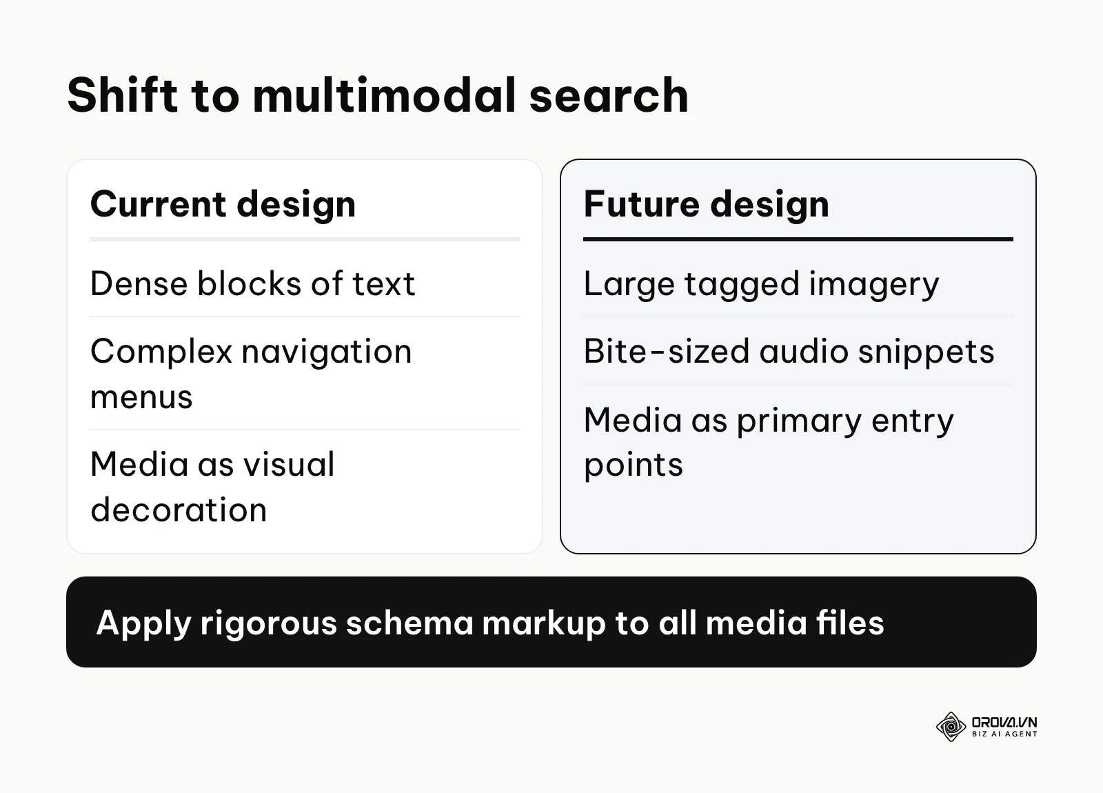
More users now combine typed queries with voice commands and visual search (like Google Lens). I anticipate that web design will adapt by becoming significantly less reliant on dense blocks of text and complex navigation menus. Instead, interfaces will pivot toward large, high-resolution, semantically tagged imagery and bite-sized, highly structured audio-ready snippets. To prepare for this, designers must start treating every image, video, and audio file as a primary entry point to the website, applying rigorous schema markup and metadata rather than treating media as mere aesthetic decoration.
Hyper-personalized accessibility will become the default
Today, web accessibility means passing a static WCAG compliance test. I believe accessibility will gradually evolve into dynamic interface adaptation. Operating systems and browsers will broadcast a user's specific accessibility needs (e.g., color blindness, motor impairments, cognitive preferences) directly to the website, and the site's CSS could adapt to accommodate them—adjusting contrast ratios, increasing touch targets, or simplifying animations on the fly. To get ahead of this curve, development teams must start adopting deeply modular design systems built on flexible CSS variables, moving away from rigid, hard-coded visual styles.
Frequently asked questions about SEO website design
How does AI change the way we design websites for SEO?
AI tools are radically accelerating the wireframing and prototyping phases, allowing teams to generate structurally sound, semantic layouts in minutes. Furthermore, AI-driven search engines prioritize answering user queries directly on the results page. This means web design must evolve to highlight highly structured data, clear concise answers, and proprietary data visualizations high up on the page to encourage users to click through for deeper context, rather than just burying answers in long-form text.
Can a website be beautiful and still rank well on Google?
Absolutely. The conflict between beauty and SEO only arises when "beauty" is equated with bloated, unoptimized code—like massive uncompressed videos, excessive JavaScript animations, and missing structural text. A beautiful website that utilizes clean CSS animations, optimized WebP imagery, elegant typography, and a fast, accessible layout will inherently rank better because search engines aim to reward helpful pages that offer a good user experience.
Should the SEO team or the design team lead a website redesign?
Neither team should operate in a vacuum or have absolute dictatorial control. A successful redesign requires a symbiotic partnership. The SEO team should lead the definition of the site architecture, URL structure, and content hierarchy based on data. The design team should take those constraints and lead the visual execution, user interface, and brand aesthetics. The project manager must ensure both teams compromise on performance metrics like Core Web Vitals.
How much does a bad design impact an existing SEO strategy?
A poorly executed design migration can seriously damage a thriving SEO strategy. If a new design alters URL structures without proper 301 redirects, relies heavily on client-side JavaScript that blocks rendering, or introduces massive layout shifts that ruin Core Web Vitals, organic traffic can drop sharply within a matter of weeks. The design is the vessel that delivers your content; if the vessel is broken, the content's quality becomes irrelevant to search engines.
Where should you start?
If you are looking at your current website and realizing it suffers from a disconnect between design and SEO, taking the first step can feel overwhelming. Depending on your current situation, here is the exact first action you should take tomorrow morning.
If your website looks great but generates zero organic traffic: Your primary issue is likely indexability or structural hierarchy. Your immediate first step is to run your homepage and top category pages through the URL Inspection tool in Google Search Console (live test) and the Rich Results Test. Analyze the rendered HTML output. If the text you see on your screen does not appear in the tool's rendered code, your JavaScript framework is blocking search engines. You must schedule an emergency meeting with your developers to discuss implementing Server-Side Rendering (SSR).
If you are planning a massive redesign project next quarter: Do not let anyone open a design tool yet. Your first step is to export all your historical performance data from Google Search Console and map out a strict URL redirect plan. Identify your top 50 traffic-driving pages and document their exact current structure, word count, and heading tags. Hand this document to your design team and mandate that the new templates for these specific pages must accommodate at least the same amount of content and internal links to prevent ranking drops.
If your site ranks well but has an extremely high bounce rate: Your technical SEO is likely fine, but your visual user experience is failing. Your first step is to implement a session recording tool (like Hotjar or Microsoft Clarity) on your top three landing pages. Watch exactly where users are scrolling, where they are rage-clicking, and where they abandon the page. You will likely discover that your primary Call-To-Action is buried, or a massive layout shift is frustrating users on mobile devices, giving you clear, actionable data to tweak the UI without rebuilding the whole site.
About the author

Builder of Orova
Nguyễn Đỗ Trọng Ân has 8 years of experience in marketing, including 6 years managing market development across Asia. He builds Orova, a Biz AI Agent that never sleeps: it plans, runs and optimizes work for businesses.
Run your business with AI Agents
Orova is the always-on Biz AI Agent — it plans, runs, and optimizes the work for you.
Save time, unlock productivity.