
What are data visualization charts? A practical guide to choosing them

You are staring at a massive spreadsheet containing thousands of rows, trying desperately to find a meaningful story. The old approach was to throw all those numbers into a pie chart, paste it into a presentation, and hope people somehow understood the point. This rarely works, leaving teams confused and campaigns mismanaged.
Data visualization charts are visual representations of data, such as lines, bars, dots, or slices, that reveal patterns a table hides. They are the essential bridge between raw mathematical data and human cognition. When you understand how to choose data visualization charts correctly, you stop guessing and start making confident decisions. This guide walks you through the main chart types, the rules for picking the right format, how to avoid deceptive designs, and how AI is changing reporting.
What Are Data Visualization Charts?
Data visualization charts are graphical representations of information and data sets, using visual elements like lines, bars, dots, or slices to highlight patterns, trends, and outliers. They serve to translate complex numerical datasets into accessible visual stories, differing from raw data tables by prioritizing immediate cognitive recognition over exact precision.
The concept is not a modern invention of the digital age. William Playfair, a Scottish engineer and political economist, published the first line and bar charts in 1786 and the pie chart in 1801 to make trade and economic figures easier to grasp. Today, we use the exact same principles to understand website traffic, sales funnels, and customer behavior.
People often confuse charts with other visual or data formats. The table below clarifies the distinctions.
| Concept | Difference from a Chart | Example |
|---|---|---|
| Data Table | Shows exact numbers in rows and columns, requiring reading rather than glancing. | An Excel sheet showing every single transaction amount for a month. |
| Infographic | A highly designed, static poster combining text, illustrations, and multiple small charts to tell a fixed story. | A long scrolling image explaining the history of the internet. |
| Dashboard | A collection of multiple interactive charts and widgets arranged on a single screen to monitor a process. | A screen showing live website visitors, revenue, and active ad campaigns together. |
Illustrative example:
- Context: You are driving a car on a highway.
- Steps: You look down at the dashboard to check your fuel level. You see a semi-circular gauge with a needle pointing near the red "E" line.
- Hiccup: If the car instead showed a text screen with the exact gallons remaining to three decimal places, you would have to calculate whether that is enough to reach the next town while steering. A visual gauge shows the proportion of fuel left without any math.
- Result: You decide right away to pull over at the next gas station, which shows how visual data drives faster action than raw numbers.
The Meaning Behind The Visuals
Data visualization charts exist to solve a fundamental biological problem: the human brain processes visual imagery much faster than it processes written text or sequential numbers. For business leaders, marketers, and analysts, time is a scarce resource. You cannot afford to spend hours mentally calculating percentage differences between columns in a database.
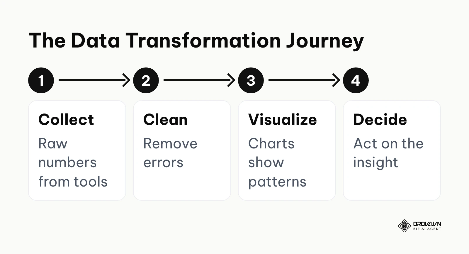
In the broader picture of business intelligence, charts sit right in the middle of the workflow. The journey begins with data collection from various platforms. Then comes data cleaning to remove errors. After that, data visualization charts step in to translate the clean data into a format human beings can actually debate and analyze. Finally, this leads to strategic decision making.
If you skip the visualization step, you lose alignment across your team. Different people will read the same raw table and come to completely different conclusions based on which numbers they happen to focus on. Without a shared visual reality, arguments replace analysis, and subtle but dangerous trends will go unnoticed until they become expensive crises.
The diagram below summarizes this data journey.
You do not need a data visualization chart when you only have one or two standalone numbers to report, such as a total revenue figure or a monthly target. In these cases, a simple text callout or a large KPI number is much more effective. Furthermore, you should avoid charts when your audience requires the exact, precise figures for strict accounting or compliance purposes down to the last decimal. In those rigid scenarios, a well-formatted data table is the correct tool, as visuals might obscure the specific values required for legal audits.
Core Value And Benefits
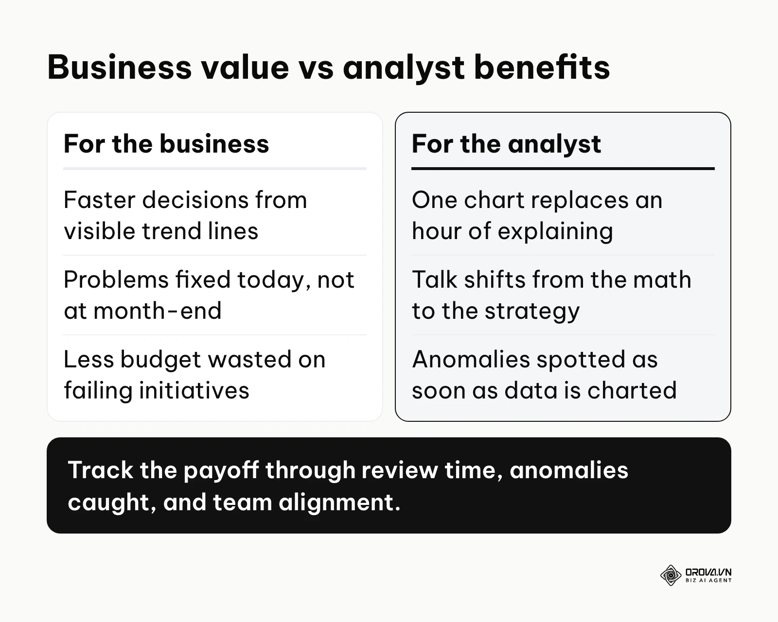
The impact of visual data can be split into high-level business value and practical, daily benefits for the people doing the work. Both layers are crucial for a data-driven culture.
Value for the Business: Speed and Risk Mitigation
For an enterprise, the primary value of charts is speed to insight. When executives can see a red trend line pointing downward, they can allocate resources to fix the problem today instead of waiting for an end-of-month written summary. This rapid response time directly mitigates financial risk and prevents budget waste on failing initiatives.
Benefits for the Analyst: Clarity and Persuasion
For the person actually building the reports, charts provide unparalleled persuasive power. Instead of spending an hour explaining a complex spreadsheet to a skeptical client, the analyst can present a single, well-designed bar chart that makes the argument undeniable. This shifts the conversation away from questioning the math and toward discussing the strategy.
Here is how these benefits are measured in the real world.
| Benefit | Metric to Measure | Time to See Results |
|---|---|---|
| Faster decision making | Average time spent in weekly review meetings | 1 to 2 weeks |
| Error detection | Number of data anomalies spotted before month-end | Immediately upon charting |
| Team alignment | Surveyed confidence in understanding company goals | 1 to 3 months |
Illustrative example:
- Context: An e-commerce manager ran separate campaigns on five different ad platforms with a limited budget and needed to track spend every week.
- Steps: They exported CSV files from each platform, merged them into a master sheet, and tried to read the raw numbers every Friday.
- Hiccup: The raw table made it hard to spot which platform had suddenly spiked in cost. They switched to a simple stacked area chart to view total spend and each channel's contribution on one screen.
- Result: At the next review, the chart made it obvious that one channel's daily spend had jumped mid-week. The manager paused that campaign the same day instead of finding the overrun weeks later in a table.
Turn multi-channel data into instant decisions. OROVA Insight seamlessly connects APIs from Online to Offline, helping you see the full picture of your business through a Real-time chart reporting system.
OROVA Insight: Integrate Online - Offline data, visualize reports in Real-time.
How Data Visualization Charts Work
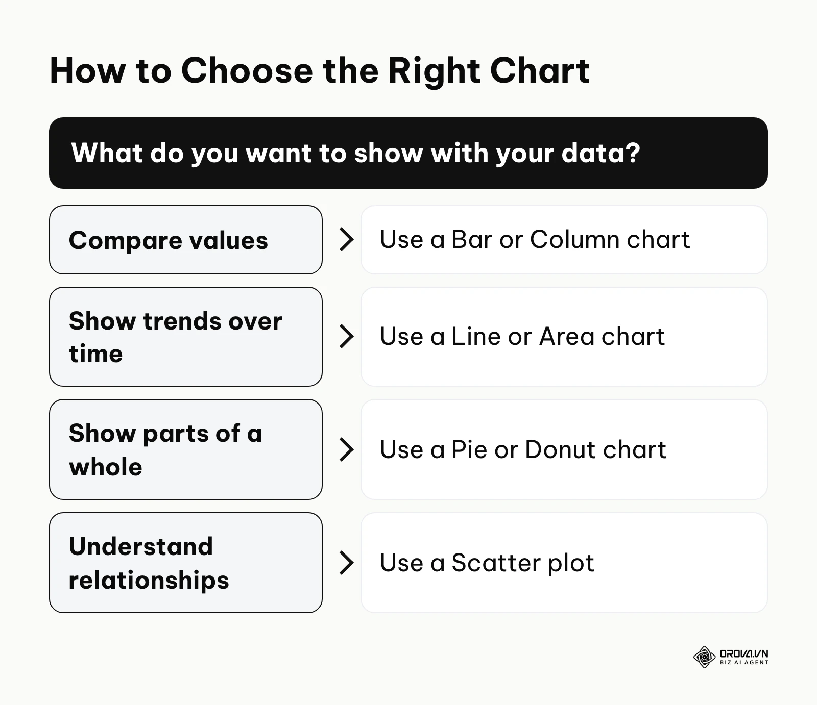
Understanding how charts work requires breaking them down into their component parts. Every effective chart is an assembly of specific anatomical elements that must work together. Before the anatomy, start with the decision: the tree below matches what you want to show with the chart family that shows it best.
The Data Input: Axes and Variables
This is the foundation of the chart. The X-axis generally represents the independent variable, such as time or distinct categories. The Y-axis represents the dependent variable, which is usually the numerical value you are measuring, like revenue or user count. The most common failure point here is starting the Y-axis of a bar or column chart at a number other than zero, which artificially exaggerates minor differences and misleads the viewer.
The Visual Encoding: Shapes, Colors, and Sizes
This step is where numbers become pictures. Data points are encoded into visual marks like the height of a bar, the angle of a pie slice, or the position of a dot on a grid. Colors and sizes are added to provide secondary layers of information. A frequent mistake is using a different color for every single bar in a chart, creating a distracting rainbow effect that confuses the eye rather than guiding it.
The Context: Labels, Legends, and Titles
A chart without context is just an abstract painting. Titles tell the viewer what they are looking at, labels identify the specific data points, and legends explain the color coding. Stephen Few argues in Information Dashboard Design (O'Reilly, 2006) that the most important information on a dashboard should fit on a single screen so it can be taken in at a glance. If your text is cluttered or requires viewers to constantly look back and forth, the chart fails.
Here are the main categories of charts you will encounter.
| Chart Category | Key Characteristic | Best Suited For |
|---|---|---|
| Comparison (bar, column) | Places values side-by-side | Evaluating performance between different products or teams |
| Trend (line, area) | Plots data points over a continuous timeline | Tracking revenue growth or website traffic over months |
| Composition (pie, donut) | Shows how a total is divided into parts | Displaying market share or budget allocation percentages |
| Distribution (histogram) | Maps the frequency of different values | Understanding customer age ranges or salary brackets |
| Relationship (scatter plot) | Plots two variables against each other | Checking whether ad spend and leads rise together |
Each branch of the decision tree at the start of this section points to one of these categories.
Comparing Values: Bar vs. Column Charts
People frequently struggle with deciding between horizontal bar charts and vertical column charts. A vertical column chart is excellent for showing data over a short period of chronological time, like sales over the last four quarters. However, it breaks down quickly when you have long category names.
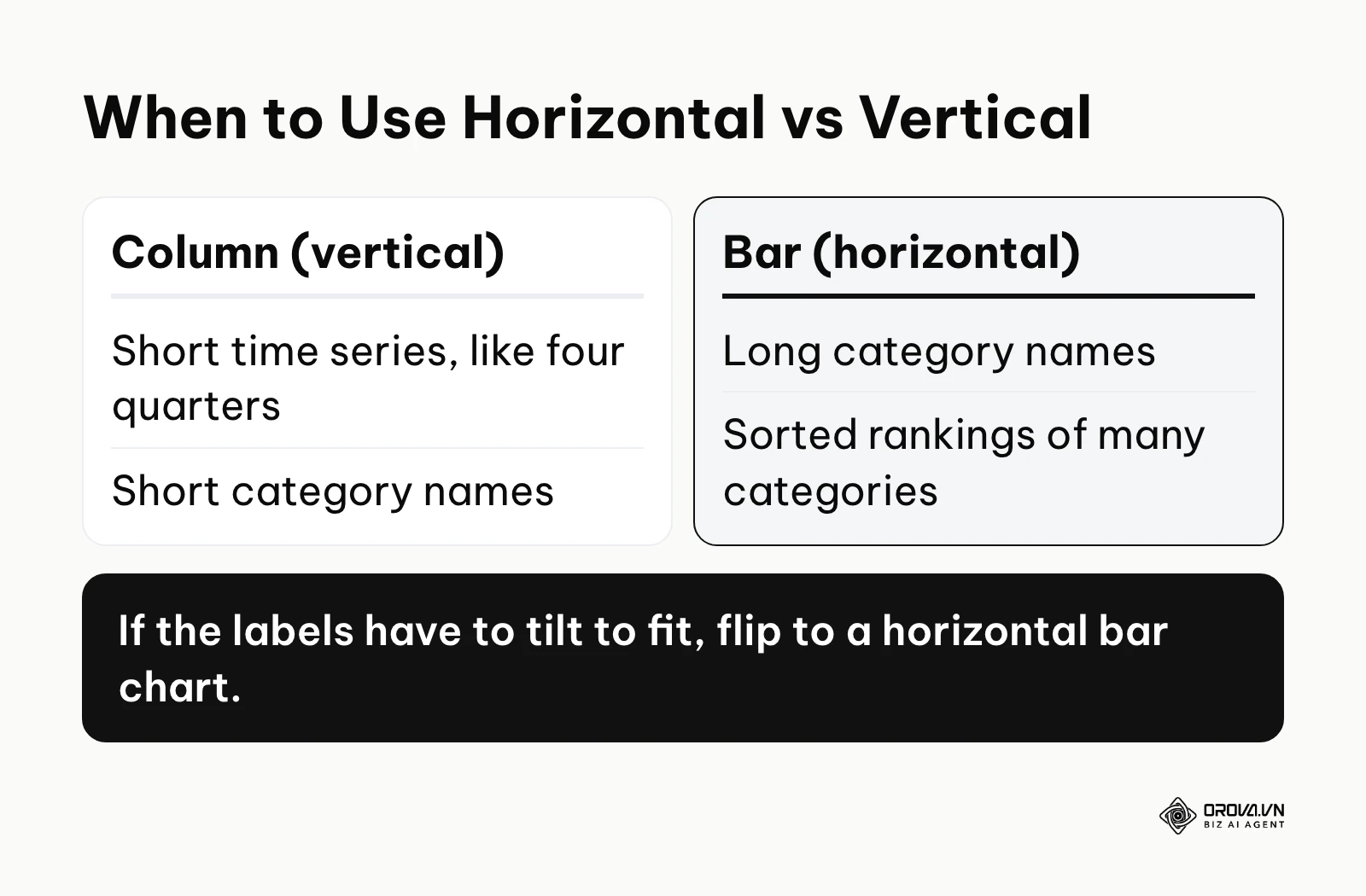
If you use a column chart for something like "Customer Acquisition Cost by Advertising Channel," the text labels on the bottom will overlap. The software will usually tilt the text at a 45-degree angle to make it fit. This forces the reader to tilt their head to read it, which is a terrible user experience. The simple solution is to flip the axes and use a horizontal bar chart, which allows long text to be read naturally from left to right.

Showing Composition: The Pie Chart Dilemma
Pie charts are the most overused and abused format in business reporting. They are meant to show parts of a whole, but the human eye is notoriously bad at comparing angles and area sizes. When you put more than five slices into a pie chart, it becomes an unreadable mess of tiny slivers.
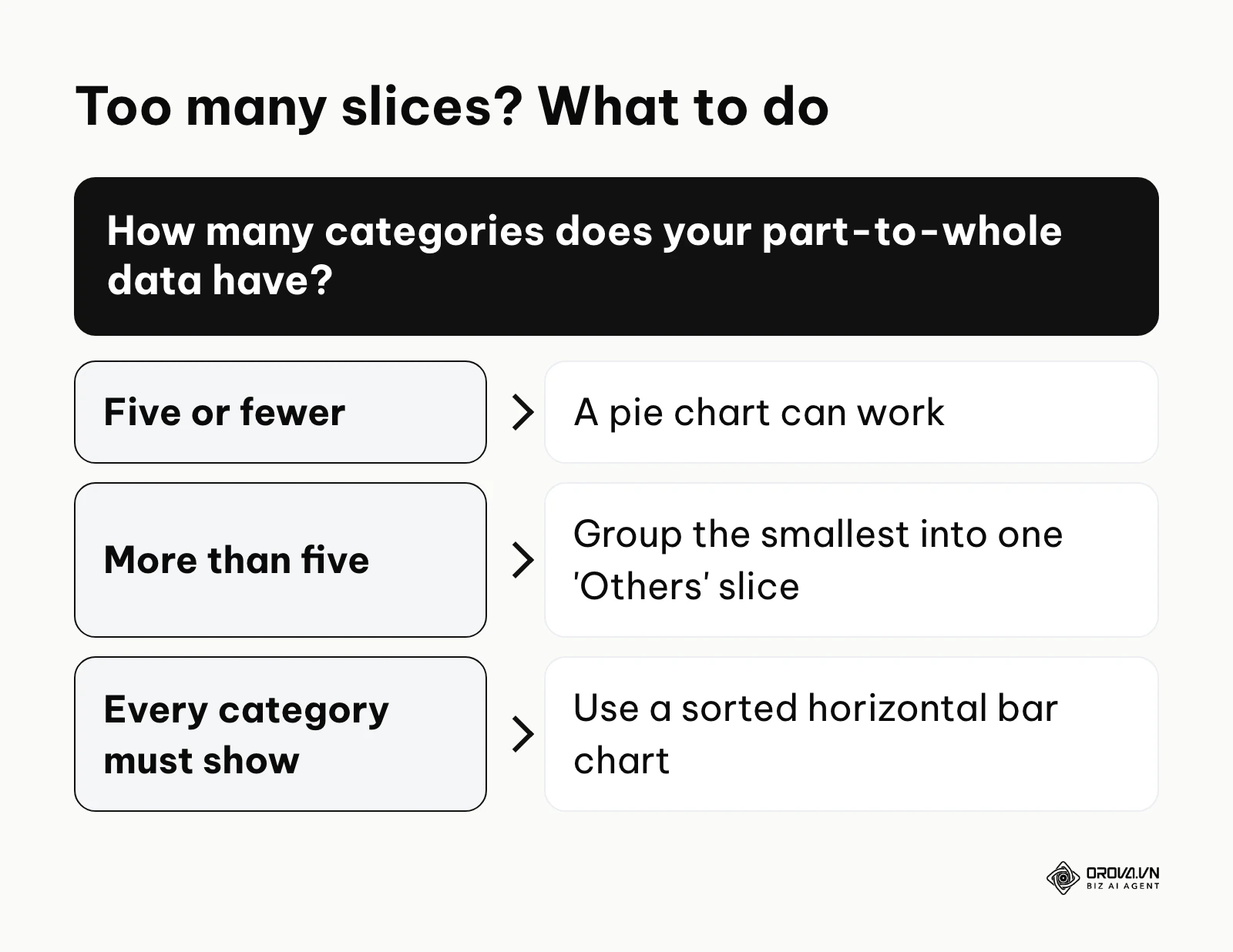
If you have a dataset with fifteen different categories, do not use a pie chart. The best practice is to group the smallest ten categories into a single slice labeled "Others." If you must show all fifteen distinctly, abandon the pie chart entirely and use a sorted horizontal bar chart instead. A bar chart allows people to easily compare the lengths of the bars, making the differences instantly recognizable.
Tracking Trends: Line Charts
Line charts are the standard for showing trends over time. However, a common mistake is putting too many lines on a single chart, creating what analysts call a "spaghetti chart." When ten lines cross over each other repeatedly, it is impossible to follow any single trend.
Edward Tufte, in The Visual Display of Quantitative Information (Graphics Press, 2001), uses the term chartjunk for unnecessary visual elements that distract from the core data. To fix a spaghetti chart, highlight the one specific line you want the audience to focus on with a bold color. Then, turn all the other comparative lines into a muted gray. This provides the necessary background context without overwhelming the viewer.
Practical Templates to Get Started
You do not need to build everything from scratch. Every professional should have three standard templates saved in their spreadsheet software. First, a simple line chart template with a clean white background for tracking weekly metrics. Second, a sorted horizontal bar chart template pre-formatted with your brand colors for comparing categories. Third, a clean dashboard layout that places four key charts on a single printable page.
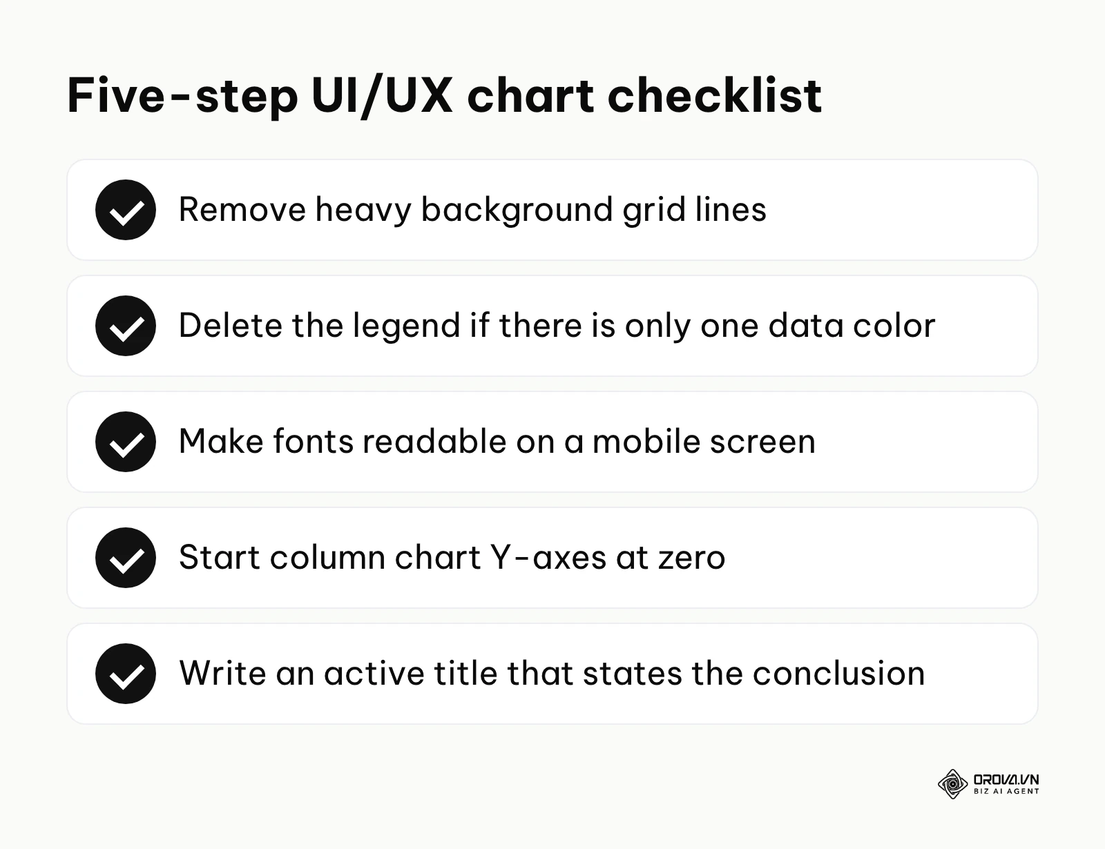
If you want to ensure your templates are effective, run them through this quick five-step UI/UX checklist. Remove all heavy grid lines in the background. Delete the legend if you only have one color of data. Ensure all fonts are large enough to read on a mobile screen. Start the Y-axis of every column chart at zero. Finally, write an active title that states the conclusion, like "Sales Dropped 15% in Q3," rather than a passive title like "Q3 Sales Data."
What To Do To Start Or Adapt
Implementing a visual data culture requires different steps depending on your role in the business. Here is how you can begin transforming your reporting practices immediately.
For Small Business Owners
As an owner, you cannot afford to get lost in the weeds of complex software. Your goal is to establish a basic baseline of visual truth.
- Pick one core metric that defines your weekly success, such as new leads or total sales.
- Choose a basic chart type, typically a line chart, to track this single number.
- Update and review this one chart every Friday morning without fail.
- Once this habit is solid, slowly add a second metric to your routine.
For Department Managers
Managers must ensure their entire team is speaking the same visual language. Consistency is more important than flashy design.
- Standardize a set of company colors for specific meanings, such as always using green for revenue and red for costs.
- Define a strict reporting frequency so the team knows exactly when to expect updated dashboards.
- Train your staff on the dangers of chart junk and deceptive axis scaling.
- Use one consistent notation for actuals, plans, and forecasts across every report so readers never have to relearn how a chart works.
- Audit existing reports and delete any charts that have not sparked a business decision in the last month.
For Marketing Agencies or Freelancers
Agencies live and die by how well they can prove their value to clients. Your charts must be persuasive and professional.
- Automate your client reporting with a dashboard tool such as Looker Studio to stop wasting billable hours copying and pasting data.
- Build standardized templates for different campaign types, ensuring consistency across your roster.
- Always include a brief text box next to every chart explaining the qualitative insight behind the numbers.
- Prepare alternative views of the data in case a client questions a specific trend during a presentation.
Even with good intentions, professionals often stumble. Review this table of common pitfalls.
| Common Mistake | Consequence | How to Avoid It |
|---|---|---|
| Using 3D chart effects | Distorts the actual size of the data segments, making smaller pieces look larger | Always stick to flat, 2D designs for accurate representation |
| Inconsistent color coding | Confuses readers who associate a color with a specific metric | Create a fixed brand color palette for all data |
| Overloading a dashboard | Causes viewers to ignore the report entirely due to overwhelm | Restrict each dashboard to a maximum of six charts |
Illustrative example:
- Context: A marketing agency sent a local retail client a dense PDF with dozens of charts every month.
- Steps: They reduced the report to a single, focused dashboard page and mapped the client's main business goal to three essential visuals: a line chart for overall website traffic, a bar chart for qualified leads, and a single large number for the cost per lead.
- Hiccup: The client first asked where the rest of the granular data had gone and felt uneasy about the missing pages. The agency explained that removing the clutter let everyone focus on the metrics that actually drove sales.
- Result: Monthly review meetings became much shorter and moved from nitpicking individual numbers to agreeing on concrete next steps.
If stitching exports together every week is eating your time, Orova Insight connects sources such as GA4, Search Console, Google Ads, Meta Ads, and Zalo OA to a drag-and-drop dashboard, lets you ask questions in plain language to get AI-built charts, and sends scheduled reports.
No more lag in data management. Unlock the power of the OROVA Insight system to sync O2O (Online-to-Offline) data flows and visualize every report in real time.
OROVA Insight: Integrate Online - Offline data, visualize reports in Real-time.
Trends In Data Visualization Charts In The Next Few Years: My Perspective
The landscape of reporting is shifting rapidly. As of 2026, the tools we use to understand numbers are becoming smarter, more intuitive, and increasingly integrated into our daily workflows. Here is how I see the industry evolving.
Generative AI Will Replace Manual Chart Building
I expect a steady shift away from manually highlighting spreadsheet cells to generate a visual. I believe the dominant way of creating a chart will become conversational. You will ask a system, "Show me a comparison of Q2 sales by region," and the AI will propose a suitable chart type. Well-built tools are likely to steer users away from bad practices like 3D pies or broken axes by default. I suggest you prepare for this by focusing on learning how to ask better analytical questions, rather than memorizing complex spreadsheet formulas.
Data Storytelling Will Trump Complex Dashboards
I think we will move away from the massive, wall-to-wall dashboards that look like an airplane cockpit. Many executives already feel dashboard fatigue. I lean towards a future where automated systems extract the single most important chart for the day and deliver it with a generated paragraph explaining why it matters. The focus will shift from exploring data to consuming curated insights. To adapt, you should start practicing how to write a clear, one-sentence takeaway for every chart you produce today.
Augmented Reality for Physical Data Mapping
My observation is that spatial computing will eventually bring data off the screen and into the physical world. While still in its early stages today, I can imagine supply chain managers and retail owners viewing live inventory charts overlaid onto their physical warehouses through augmented reality glasses. The limitation here, and what could prove this prediction wrong, is hardware adoption. If AR glasses remain a niche product, this trend will stall. However, if adoption grows, you will need to think about how your data looks in three-dimensional space, not just on a flat PDF.
Frequently Asked Questions About Data Visualization Charts
Do we still need data visualization charts when we have AI?
Yes, absolutely. While AI is excellent at reading raw data and generating summaries, humans still need visual evidence to trust the machine's conclusions. A chart provides an instant, verifiable snapshot that a dense paragraph of AI-generated text cannot match. You will use AI to build the charts faster, but the charts themselves remain essential for human communication.
How do I combine multiple charts into a dashboard without clutter?
The secret to a clean dashboard is ruthless prioritization and a strict grid system. Limit yourself to four to six charts per screen, placing the most critical, high-level summary metrics at the top left. Use consistent colors across all charts, and ensure there is plenty of white space between each visual element to let the eye rest.
What is the biggest mistake people make with line charts?
The most common error is manipulating the scale of the Y-axis to make a minor change look like a massive spike or crash. If revenue dips by two percent but the Y-axis starts just below the lowest value, the line will look like it fell off a cliff. Always provide proper context: label a truncated axis clearly, and start bar and column charts at zero.
Can I just use tables instead of charts?
You can, but you will sacrifice speed and engagement. Tables are necessary when exact precision is required, such as in accounting ledgers or legal compliance reports. However, if your goal is to spot trends, compare performance, or persuade an audience, tables force people to do mental math, which slows down the entire decision-making process.
How does visualization help with marketing strategy?
To successfully execute data driven marketing, you must have clear visual feedback on your experiments. Charts allow you to instantly see which channels are driving the lowest cost per acquisition, enabling you to shift budgets quickly. Without charts, you are essentially driving a car blindfolded.
Where To Start?
The most common reason companies fail at implementing reporting is that they try to build a complex, enterprise-grade system on day one. Your starting point depends entirely on the current state of your organization's data maturity. You need to take one practical step that matches your reality.
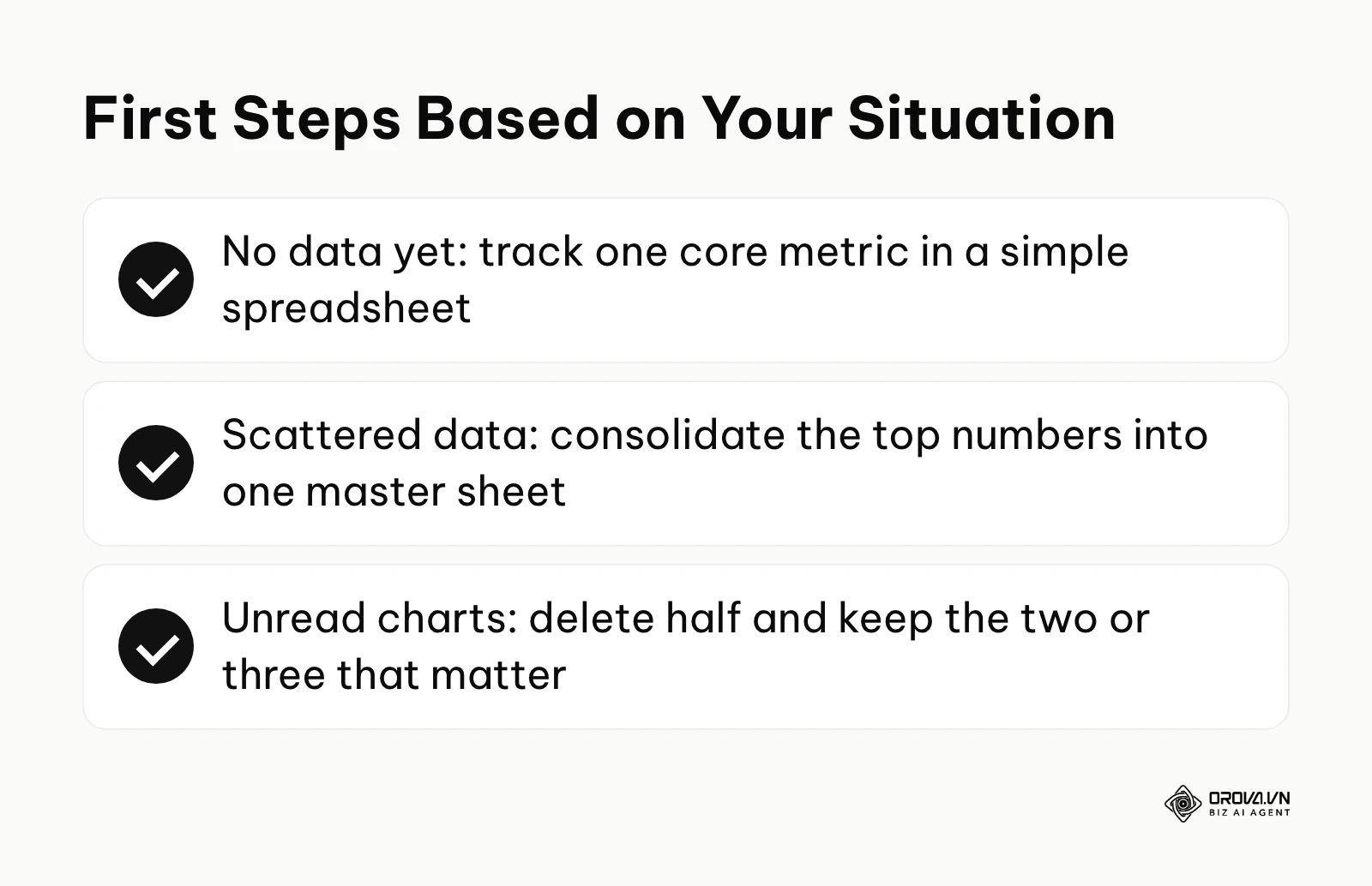
If you currently have no data tracking at all, your first step is not to buy visualization software. Your step is to pick one single metric—like daily website visitors—and track it manually in a simple spreadsheet for a month. Get used to the discipline of collecting the number before you worry about how to draw it.
If you have data, but it is scattered across ten different platforms, your priority is consolidation. When managing campaigns across various paid ad platforms, you need a unified view. Export the highest-level numbers into a single master sheet and build a basic column chart there.
If you are already making charts but nobody reads them, your step is deletion. To accurately measure marketing ROI, you do not need fifty metrics. Delete half of the charts in your next report and force a conversation around the two or three visuals that actually matter.
Illustrative example:
- Context: A regional team of field sales representatives tracked their daily outbound calls in their own separate, unshared spreadsheets.
- Steps: The team leader created a central Google Sheet template and asked everyone to log their numbers there, then connected the sheet to a basic visualization tool to show a leaderboard bar chart.
- Hiccup: At first the representatives often forgot to update the sheet at the end of the day, which left the chart stale. The leader set up a simple webhook to push updates from their calling app into the sheet, removing manual entry.
- Result: The chart on the office screen created visible, friendly competition, daily call volume became transparent to everyone, and overall activity rose within the first few weeks.
About the author

Builder of Orova
Nguyễn Đỗ Trọng Ân has 8 years of experience in marketing, including 6 years managing market development across Asia. He builds Orova, a Biz AI Agent that never sleeps: it plans, runs and optimizes work for businesses.
Run your business with AI Agents
Orova is the always-on Biz AI Agent — it plans, runs, and optimizes the work for you.
Save time, unlock productivity.