
Bubble chart: how to build and read one in 6 steps (2026)
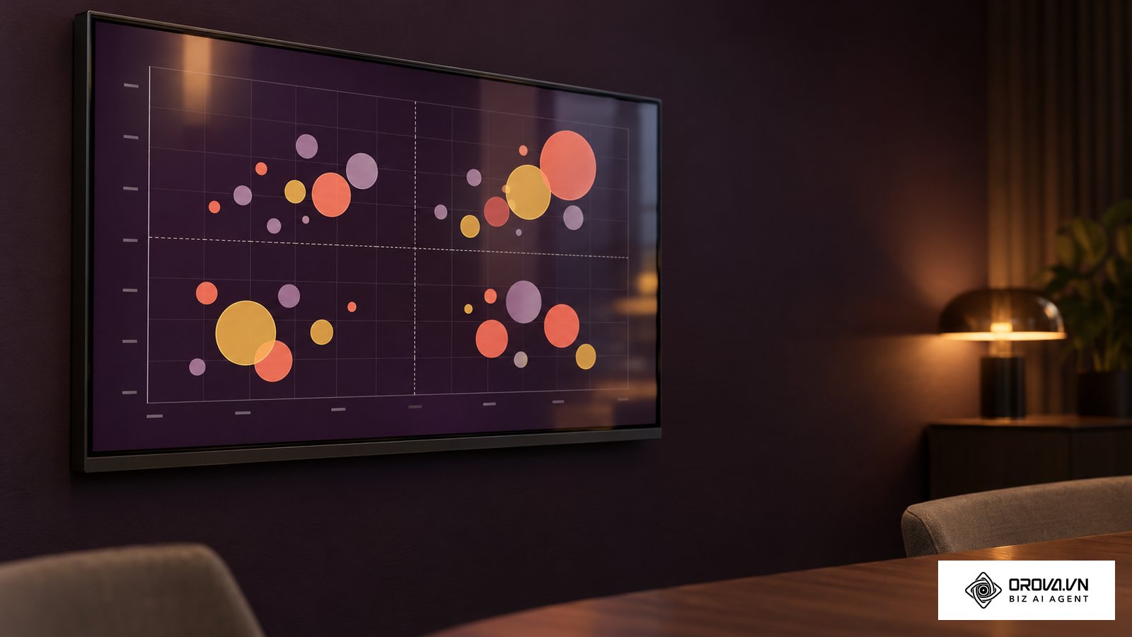
A bubble chart is a scatter chart in which every data point is drawn as a circle: its horizontal and vertical position show two metrics, and the size of the circle shows a third. In marketing reporting, that lets you compare cost, return and budget weight for many campaigns on a single canvas. By following this guide, you will produce an interactive dashboard that maps Cost Per Acquisition (CPA), Return on Ad Spend (ROAS), and total advertising expenditure into four clear decision quadrants. You need an active Google account with access to Looker Studio (Google's help pages now label the product Data Studio), view permissions on your advertising or web analytics properties, and approximately 30 minutes of setup time. If your team only tracks single-variable trends like total daily clicks or simple channel revenue totals, a basic bar chart or line graph will serve your needs better without the added configuration overhead.
What a bubble chart accomplishes in marketing reporting
A bubble chart plots three or four distinct metrics simultaneously across two spatial axes, circle area, and color grouping to reveal hidden performance trade-offs. Completing this end-to-end setup requires six practical steps and takes roughly 25 to 30 minutes from initial data connection to interactive quadrant calibration.
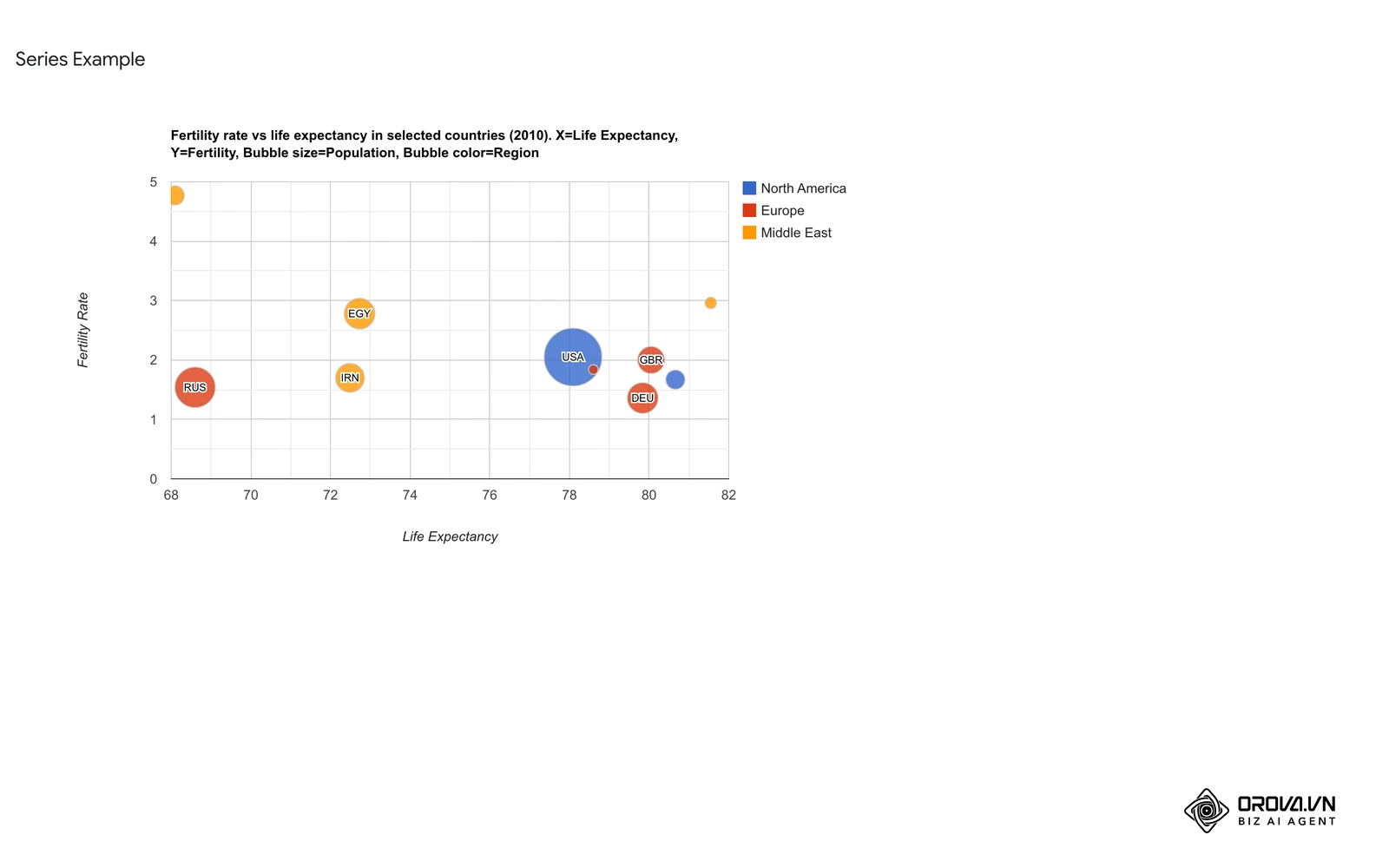
At its core, this visual format upgrades the traditional two-dimensional scatter plot by incorporating circle surface area as a third quantitative metric. Rather than forcing decision-makers to toggle between disconnected tables of acquisition costs and total revenue, the chart clusters every campaign according to its commercial efficiency and financial weight. High-spend campaigns immediately stand out by their physical presence, while their position along horizontal and vertical axes indicates whether that capital generated sustainable profits or wasteful acquisition costs.
Preparation before building your bubble chart
Before opening your reporting workspace, collect the necessary platform credentials and verify that your underlying metrics contain sufficient volume for statistical evaluation. The following table details the prerequisite assets required before launching the configuration workflow.
| Requirement | Source location | Setup time | Consequence if missing |
|---|---|---|---|
| Clean campaign dataset | Google Ads, Meta Ads Manager, or GA4 | 10 minutes | Chart displays empty canvas or broken metric calculations |
| Looker Studio account | lookerstudio.google.com | 2 minutes | Inability to create or host the visual dashboard |
| Defined KPI benchmarks | Marketing budget plan | 5 minutes | Inability to draw meaningful quadrant reference lines |
| Positive non-zero metrics | Ad account transaction records | 5 minutes | Bubbles with zero spend fail to render or distort circle scaling |
Ensure that your advertising accounts have recorded at least 30 distinct conversions across the selected reporting window. Sparse datasets with single-digit conversion numbers produce erratic ratio calculations that cluster all data points into extreme corners of the chart canvas.
Step 1: Audit and clean your three-variable marketing dataset
Audit your source data rows to ensure that every campaign record contains valid, positive numerical values for your primary horizontal, vertical, and sizing metrics.
Open your analytics property or export your campaign table into Google Sheets. Inspect the columns dedicated to your target dimensions: Campaign Name (text dimension), Cost Per Acquisition (currency metric), Return on Ad Spend (numerical ratio), and Cost (currency sizing metric). Verify that no rows contain blank values, text errors, or negative figures. If your campaign generated zero conversions, its CPA calculation will return a division-by-zero error, while an uncalculated return metric will output zero. Filter out inactive test campaigns that accumulated zero impressions or zero spend during the selected period.
Structuring multi-metric dimensions without data clipping
Ensure your dataset aggregates ratios properly rather than averaging pre-calculated percentages across varying spend volumes.
Visual verification at this stage is straightforward. Reviewing your spreadsheet or export table should display a uniform grid where every single row contains a campaign identifier alongside positive numerical entries across all three target metric columns.
A common pitfall occurs when newly launched campaigns register spend without recording a single conversion event. In standard reporting exports, this produces either an empty cell or an infinite CPA value, causing visualization engines to drop the entire campaign row silently. To fix this issue, apply a data filter in your source sheet that excludes campaigns with spend below your minimum testing threshold (such as 50 US dollars), or create a calculated column that sets unassigned CPA values to a default baseline flag.
Illustrative example:
- Context: An e-commerce brand spending 45,000 US dollars monthly across 35 Google Ads campaigns needed to evaluate multi-variable efficiency across search and shopping channels.
- Steps taken: Exported the monthly campaign performance report, removed 8 experimental ad groups with under 30 US dollars in ad spend, and established calculated columns for blended ROAS and acquisition costs.
- Hurdles and fixes: Several newly launched shopping campaigns registered zero conversions, producing division-by-zero errors that caused the visualization connector to crash; resolved by applying a filter that isolated zero-conversion campaigns into a separate diagnostic table rather than dropping them silently.
- Result: A clean, 27-row structured data table with validated positive metrics ready for coordinate mapping.
Step 2: Connect your data source to Looker Studio
Connect your audited advertising or web analytics account directly to Looker Studio using native, verified connectors.
Navigate to Looker Studio, click the Create button in the upper-left navigation bar, and select Report. In the data connector picker window, choose either the native Google Ads connector or the Google Analytics (GA4) connector, depending on your primary data repository. Select your target account and property, then click Add in the bottom-right corner. Confirm the dialogue prompt by clicking Add to Report.
Visual verification appears immediately on your blank canvas. Looker Studio inserts a default tabular chart, and the right-hand Data panel populates with your account fields, marked with green icons for text dimensions and blue icons for numerical metrics.
A frequent error involves currency metrics defaulting to generic numerical counts or text strings during connection. If your advertising spend metric displays a generic numerical symbol (#) rather than a currency format, calculated ratios will fail to display monetary symbols. To resolve this, open the data source schema by clicking the pencil icon next to your data source in the properties panel, locate the cost field, open its Type dropdown, and change it to a Currency type in US dollars (or your local operating currency).
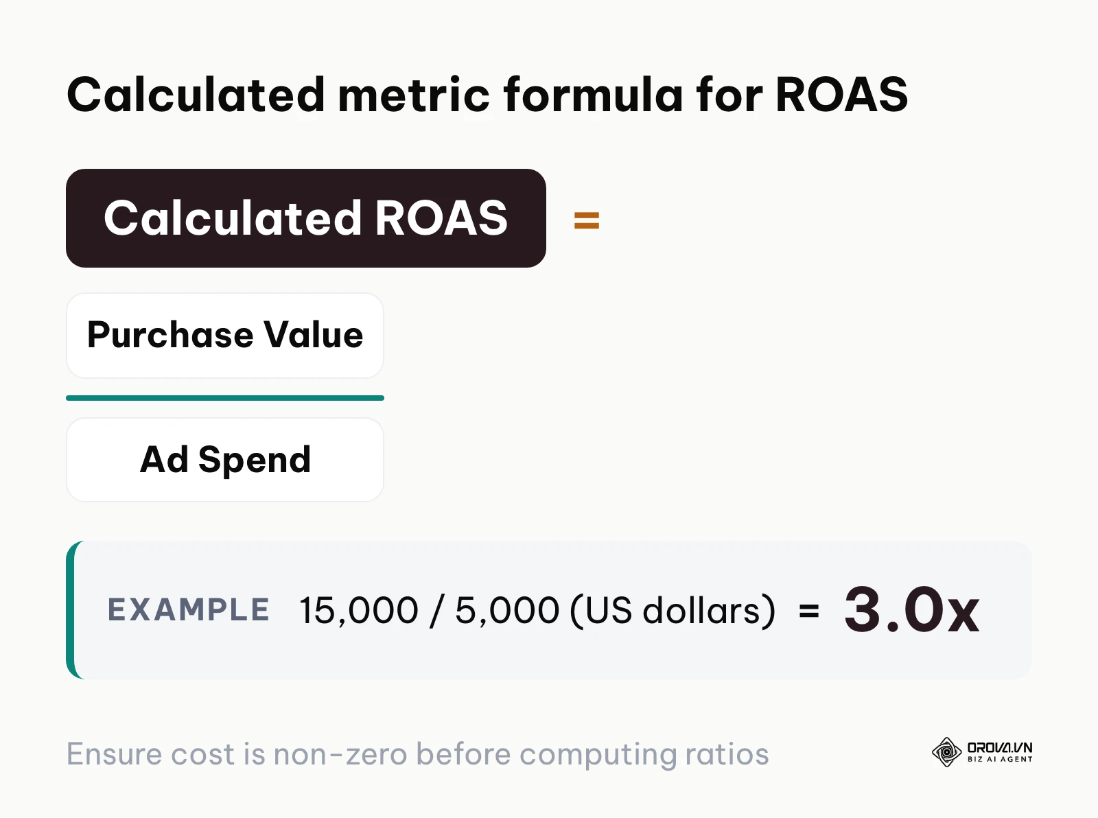
Build ROAS as a calculated field that divides total purchase value by total ad spend, rather than averaging row-level ratios. For example, 15,000 US dollars in purchase value on 5,000 US dollars in ad spend gives a ROAS of 15,000 / 5,000 = 3.0x. The diagram below summarizes this calculated metric formula.
Step 3: Insert and configure the core bubble chart properties
Insert a scatter chart component onto your blank report page and map your three core analytical metrics into their respective coordinate and sizing slots.
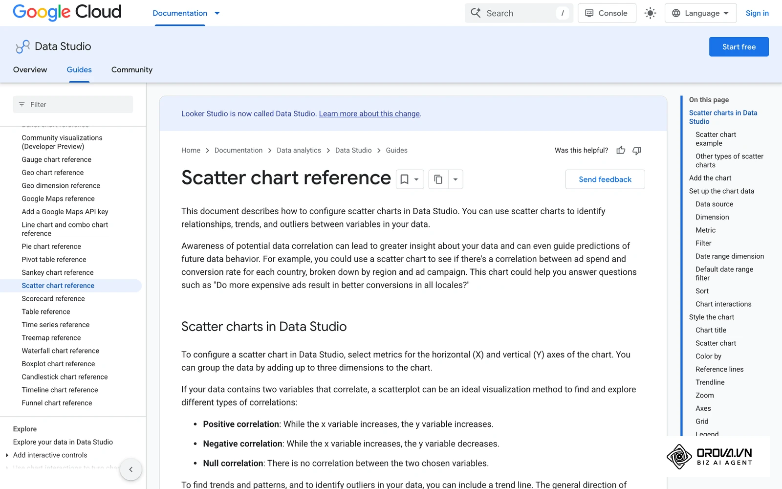
Click Add a chart in the top toolbar, scroll down to the Scatter category, and select the Bubble chart icon (the scatter chart subtype featuring varying circle sizes). Click on your report canvas to place the chart element. With the chart selected, turn your attention to the Setup panel on the right side of the screen. Drag and drop your fields into the exact configuration slots:
- Dimension: Drag Campaign Name into this field.
- Metric X: Drag your acquisition metric, such as Cost Per Acquisition (CPA), into the X-axis slot.
- Metric Y: Drag your commercial efficiency metric, such as Return on Ad Spend (ROAS), into the Y-axis slot.
- Bubble size metric: Drag your total volume metric, such as ad spend, into this slot. Setting a bubble size metric is what turns a scatter chart into a bubble chart.
- Bubble Color (optional): In the Style tab, set Bubble Color to Campaign Type or Channel to segment bubbles by marketing channel.
Visual verification is confirmed when the chart renders a collection of colored circular bubbles distributed across the coordinate field, where the physical diameter of each circle visibly varies according to the total capital invested in that campaign.
A common configuration mistake occurs when users invert the horizontal and vertical axes, placing ROAS along the horizontal axis and CPA along the vertical axis. While mathematically functional, this inversion contradicts standard financial visualization conventions where positive commercial return ascends vertically and cost efficiency moves horizontally. If your chart places higher returns toward the right rather than toward the top, swap the Metric X and Metric Y assignments in the properties panel.
Step 4: Calibrate bubble scale and prevent visual area distortion
Calibrate the minimum and maximum circle boundary parameters to ensure that visual volume corresponds truthfully to actual advertising spend.
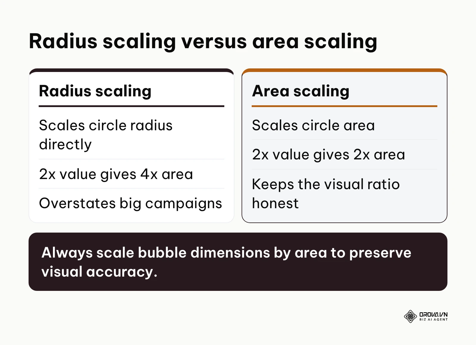
Select your chart and switch from the Setup tab to the Style tab in the right-hand properties panel. Set Bubble opacity to around 65% so overlapping circles stay visible, and use Number of bubbles to cap how many campaigns appear (when there are more dimension values than this number, only the top N are shown). Google's scatter chart reference notes that one chart can display up to 1,000 bubbles, far more than a readable marketing view needs.
Proportional symbols should be sized by circle area rather than radius, so that the eye compares the right quantity. When software scales circles by radius (r), doubling a metric value quadruples the circle area (πr²), which badly overstates the difference for anyone reading the chart.
The comparison table below details the mathematical distortion created when scaling by radius versus proper area scaling with concrete numerical values.
| Actual metric value | Scaling by radius (r) | Scaling by area (r²) | Perceptual visual distortion |
|---|---|---|---|
| Baseline campaign: 100 US dollars | Circle radius: 10px (area: 314 px²) | Circle radius: 10px (area: 314 px²) | Baseline reference (0%) |
| Scaled campaign: 200 US dollars | Circle radius: 20px (area: 1,257 px²) | Circle radius: 14.1px (area: 628 px²) | 100% visual overstatement (4x area for 2x data) |
| Scaled campaign: 400 US dollars | Circle radius: 40px (area: 5,027 px²) | Circle radius: 20px (area: 1,257 px²) | 300% visual overstatement (16x area for 4x data) |
Visual verification after this adjustment reveals a balanced canvas where high-spend campaigns appear distinctly larger without visually crushing or concealing mid-tier ad sets. Setting bubble opacity to 65% allows overlapping boundaries to remain distinctly visible.
A recurring problem at this stage is a single dominant campaign whose circle swallows adjacent data points. If one circle covers more than about 20% of the canvas, lower the bubble opacity further, reduce the number of bubbles, or move that campaign into its own scorecard so neighboring data points stay visible.
The diagram below contrasts the perceptual differences between flawed radial scaling and mathematically sound area scaling.
Illustrative example:
- Context: A B2B demand generation lead managing 80,000 US dollars across 22 search and display campaigns experienced stakeholder confusion during monthly budget reviews.
- Steps taken: Switched the reporting dashboard from a static table to Looker Studio, configured bubble sizes by spend, and manually adjusted the size scaling bounds.
- Hurdles and fixes: The core brand search campaign represented 45% of total budget, producing a massive circle that completely blocked six high-intent trial campaigns clustered behind it; resolved by moving brand search into a separate scorecard and reducing bubble opacity from 100% to 60%.
- Result: Every individual campaign became visually distinct and interactively selectable, maintaining clear spatial relationships across all spending tiers.
Turn multi-channel data into instant decisions. OROVA Insight seamlessly connects APIs from Online to Offline, helping you see the full picture of your business through a Real-time chart reporting system.
OROVA Insight: Integrate Online - Offline data, visualize reports in Real-time.
Step 5: Establish quadrant reference lines for campaign evaluation
Divide your chart canvas into four strategic action zones by plotting target threshold lines for acquisition cost and commercial return.
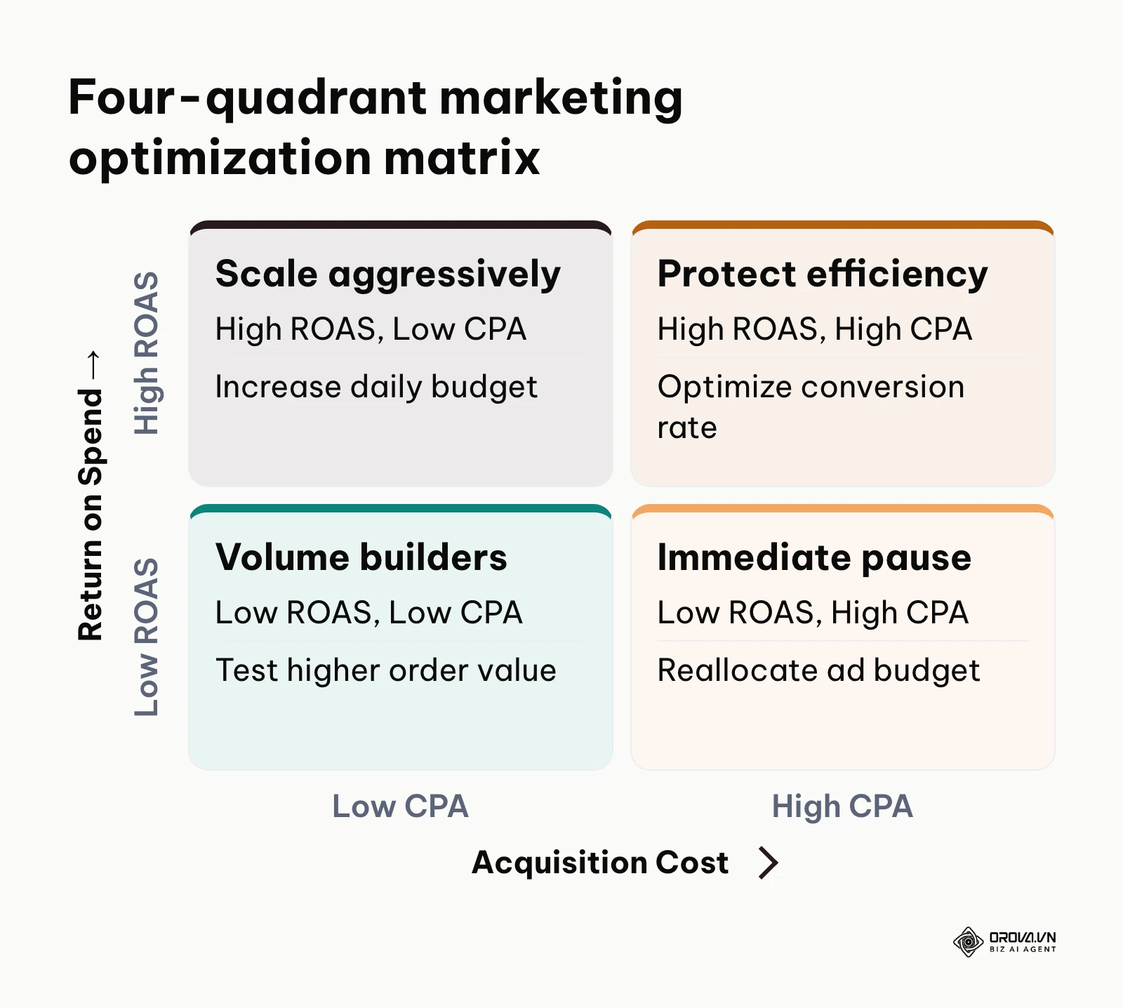
In the Style panel, scroll down to the Reference Lines section and click Add a reference line. Configure your horizontal threshold by selecting the Y-axis, choosing Constant value, and entering your organization's break-even return threshold (for instance, 2.5 for a 2.5x ROAS requirement). Next, click Add a reference line again, select the X-axis, and enter your maximum allowable acquisition cost (for instance, 40 for a target CPA of 40 US dollars). Customize line styles by selecting a dashed line pattern with a muted slate or dark gray color.
The 4-quadrant marketing optimization matrix
Once reference lines are drawn, your chart automatically segments campaigns into four distinct performance zones. Use the following structured matrix to dictate budget adjustments across each quadrant.
| Quadrant name | Metric conditions | Performance assessment | Strategic budget adjustment action | Simulated CPA / ROAS / Spend / Conversions (money in US dollars) |
|---|---|---|---|---|
| Top-Left: Scale Aggressively | ROAS ≥ 2.5x, CPA ≤ 40 | High revenue efficiency, low acquisition cost; primary profit driver | Increase daily ad budgets by 20% to 30% weekly until marginal CPA approaches threshold | CPA: 24.50 / ROAS: 4.2x / Spend: 12,400 / Conv: 506 |
| Top-Right: Protect Efficiency | ROAS ≥ 2.5x, CPA > 40 | High revenue per customer, but expensive acquisition; high average order value | Maintain ad spend; optimize landing page conversion rate and test cheaper audience segments | CPA: 58.20 / ROAS: 3.1x / Spend: 8,500 / Conv: 146 |
| Bottom-Left: Volume Builders | ROAS < 2.5x, CPA ≤ 40 | Affordable acquisition, but low basket size or low initial transaction value | Maintain spend while implementing post-purchase upsells and email retention sequences | CPA: 19.80 / ROAS: 1.8x / Spend: 6,200 / Conv: 313 |
| Bottom-Right: Immediate Pause | ROAS < 2.5x, CPA > 40 | High acquisition cost coupled with weak commercial returns; capital drain | Cut ad budget immediately; audit search queries, ad creatives, and audience targeting | CPA: 72.10 / ROAS: 1.1x / Spend: 7,900 / Conv: 110 |
These benchmark thresholds require exact alignment with your commercial unit economics. Cross-reference your product margins with an established break even ROAS calculator to avoid setting arbitrary horizontal baselines. Furthermore, verify that your tracking setup fires a validated conversion event so that recorded CPA figures represent actual customer acquisitions rather than preliminary landing page views.
Visual verification shows two intersecting dashed lines that cleanly divide your report into four rectangular spaces, with high-priority scaling candidates clustered neatly in the upper-left quadrant.
A common pitfall occurs when teams set hardcoded reference lines based on annual targets, ignoring seasonal shifts in customer behavior. When evaluating high-competition holiday periods where market-wide ad costs rise, static reference lines misclassify healthy seasonal campaigns as failures. To prevent this, consider basing the reference line on a Metric with an average calculation rather than a fixed constant value when auditing seasonal campaign sets.
The diagram below provides a visual map of the four-quadrant matrix and its associated operational directives.
Illustrative example:
- Context: A direct-to-consumer apparel brand auditing 40 Meta and Google campaign sets during a seasonal scaling window.
- Steps taken: Configured quadrant dividing lines at a CPA threshold of 35 US dollars and a ROAS benchmark of 2.8x in Looker Studio.
- Hurdles and fixes: The media buying team initially viewed two campaigns in the upper-right quadrant as clear scale candidates based solely on a 3.4x ROAS, missing that their CPA of 62 US dollars was draining working capital; resolved by locking the quadrant rules so that only campaigns satisfying both low CPA and high ROAS received budget increases.
- Result: Immediate visual clarity that redirected 4,200 US dollars in weekly spend from underperforming bottom-right campaigns into three upper-left scale leaders.
Step 6: Eliminate bubble overlap and configure dynamic interactive filters
Eliminate visual clustering and overlapping text labels by replacing static labels with interactive tooltips and configuring dynamic threshold filters.
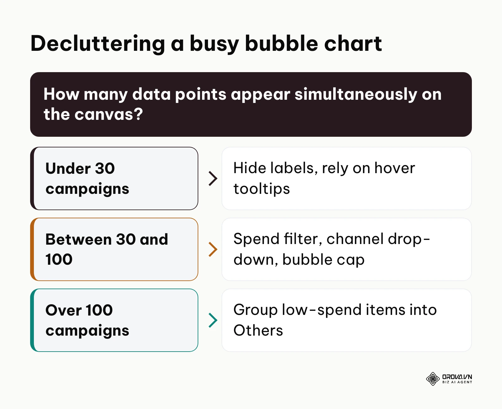
Select the chart, open the Style panel, navigate to the Labels section, and uncheck Show data labels; hovering over a bubble still shows its exact values. Next, return to the Setup panel, scroll down to the Filter section, and click Add a filter. Create a rule titled Minimum Spend Threshold that includes only records where Cost > 100. Finally, click Add a control from the top application toolbar, select Drop-down list, place it above your chart, and assign Channel or Campaign Type as its control field.
This combination of interactive filtering and dimensional control forms the bedrock of advanced performance marketing analytics. Marketers can isolate distinct acquisition funnels without losing the broader cross-channel perspective.
How far you declutter depends on volume. With fewer than 30 campaigns, hiding labels and relying on hover tooltips is usually enough. Between 30 and 100, add the spend filter, a channel drop-down and a Number of bubbles cap. Above 100, group low-spend campaigns into an "Others" row in your source data. The diagram below outlines this decluttering logic.
Visual verification confirms that all static text clashing across the circles disappears. Moving your mouse over any individual circle displays an interactive tooltip showing the precise campaign title, exact CPA, exact ROAS, and total spend.
A frequent pitfall at this stage involves setting the minimum spend filter too aggressively, which inadvertently hides emerging ad sets that have only been active for two or three days. To avoid missing early warning signs or breakout performers, combine your spend threshold with a date range control that defaults to the previous 14 or 30 days.
Overall checklist for bubble chart deployment
Review the following structured implementation checklist to verify every technical configuration before sharing your interactive report with executives or clients.
| Step | Core operational task | Verification indicator | Estimated completion time |
|---|---|---|---|
| Step 1 | Clean and audit three-variable dataset | Zero blank, null, or negative values in source records | 5 minutes |
| Step 2 | Connect data source to Looker Studio | Schema shows blue numeric and green text dimensions | 3 minutes |
| Step 3 | Map coordinates and sizing dimensions | Dimension, CPA (X), ROAS (Y), and Spend (Size) assigned | 5 minutes |
| Step 4 | Calibrate bubble area scale and opacity | Bubble opacity around 65%; number of bubbles capped | 4 minutes |
| Step 5 | Configure quadrant reference lines | Dashed threshold lines partition canvas into 4 zones | 5 minutes |
| Step 6 | Configure tooltips and drop-down filters | Static labels hidden; interactive hover tooltips active | 5 minutes |
Keep this table handy whenever deploying new visual reporting pages to guarantee consistent quality across client dashboards.
Common mistakes in bubble chart analysis and how to fix them
When building multi-variable charts under real-world conditions, several technical and perceptual errors frequently emerge. The following diagnostic guide identifies the most common issues and how to resolve them.
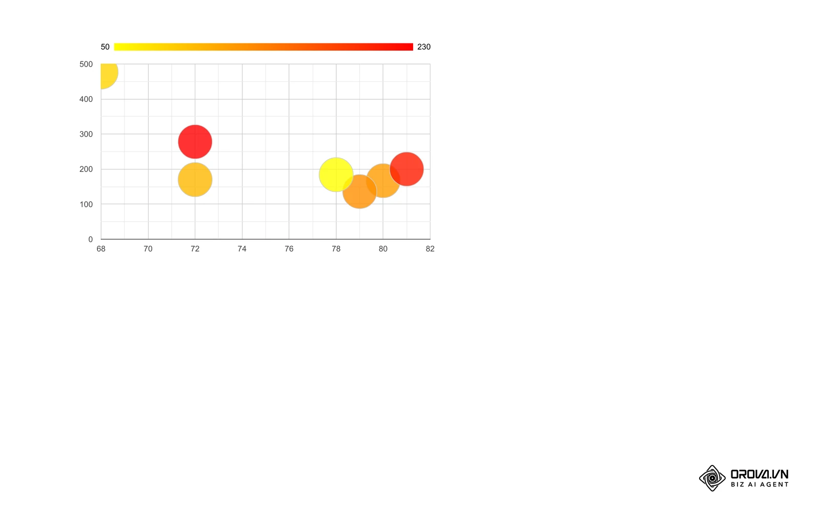
| Common mistake | Underlying cause | Practical remediation method |
|---|---|---|
| Sizing bubbles by signed metrics (Profit / ROI) | Software cannot calculate circle area for negative values | Keep sizing strictly assigned to positive absolute volume (Spend / Revenue); represent negative ROI using color grouping |
| Dense overlapping bubble clusters ("Bubble Soup") | Too many micro-campaigns plotted simultaneously | Apply a minimum spend filter (100 US dollars or more) and use drop-down controls to segment by channel |
| Overstated visual perception of top campaigns | Software scaling circle diameter rather than surface area | Check whether your tool scales by area; lower opacity and cap the number of bubbles |
| Unreadable text collisions | Enabling static text labels on dense coordinate spaces | Disable permanent labels; activate high-contrast hover tooltips displaying complete data |
| Inverted coordinate axes | Assigning cost metrics to vertical and return to horizontal | Reassign Return on Ad Spend to Y-axis and Cost Per Acquisition to X-axis |
| Misleading aggregate ratio calculations | Averaging individual campaign CPA or ROAS rows directly | Calculate ratios at the data source level dividing total sums rather than averaging pre-computed rates |
A critical analytical challenge involves handling campaigns that generated negative operating profits or negative net returns. Because circle area is mathematically incapable of rendering negative or imaginary values, attempting to map negative profit directly to bubble size causes reporting engines to either drop the row entirely or convert negative values to positive absolute numbers, fatally distorting reality. The correct protocol is to map total advertising spend to bubble size, while encoding profitability through color categories (such as green for profitable return thresholds and red for negative net outcomes).
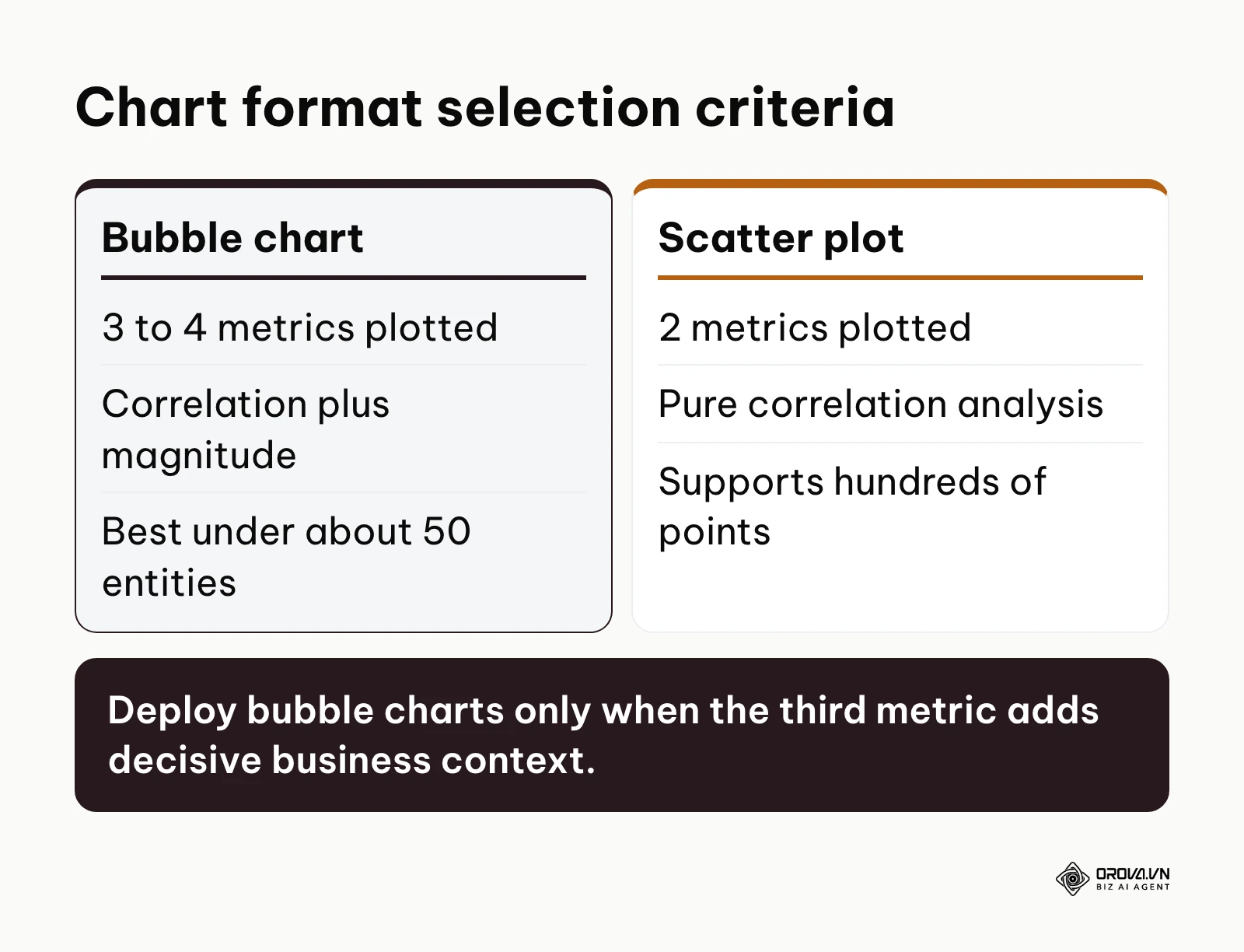
Choosing the correct visual format requires evaluating the nature of your underlying data dimensions. Use the decision framework below to confirm whether a bubble chart or an alternative structure best suits your reporting objective; for a wider overview of chart types, see this guide to data visualization charts.
| Visualization format | Required dimensions | Best analytical application | When to avoid this format |
|---|---|---|---|
| Bubble chart | 3 to 4 metrics (2 coordinates, 1 size, 1 color) | Evaluating multi-variable trade-offs (CPA vs ROAS vs Spend) | Tracking simple time-series trends or datasets with more than about 50 points |
| Scatter plot | 2 metrics (X and Y coordinates) | Identifying correlation between two continuous variables | Assessing financial volume or budget weight alongside efficiency |
| Treemap | 1 categorical dimension, 1 hierarchical size metric | Visualizing hierarchical market share or budget breakdowns | Plotting continuous correlations or performance ratios |
| Heatmap | 2 categorical dimensions, 1 continuous intensity metric | Pinpointing performance patterns across days of the week and hours | Analyzing continuous quantitative relationships between metrics |
When manual dashboard maintenance becomes a bottleneck, a reporting tool can carry part of the load. Orova Insight connects GA4, Search Console, Google Ads, Meta Ads, TikTok, YouTube and Google Sheets to a drag-and-drop dashboard in the style of Looker Studio, with custom metrics and scheduled report delivery.
No more lag in data management. Unlock the power of the OROVA Insight system to sync O2O (Online-to-Offline) data flows and visualize every report in real time.
OROVA Insight: Integrate Online - Offline data, visualize reports in Real-time.
Measuring reporting accuracy after your bubble chart goes live
After deploying your interactive report, verify that the visual presentation matches your source accounting data. Sum the total advertising expenditure represented by all visible bubbles across the canvas and reconcile that figure against your billing invoice in Google Ads or Meta Ads Manager. If the total spend displayed on your chart is lower than your official invoice, your spend filter threshold is set too high and is excluding active ad sets.
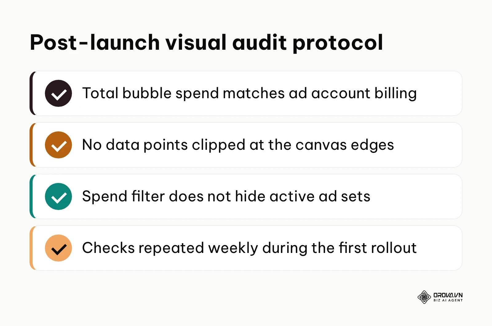
Check your coordinate boundary limits to confirm that no high-performing campaigns are clipped along the outer edges of the canvas. In Looker Studio, inspect the axis range settings under the Style tab and verify that horizontal and vertical minimums and maximums are set to Auto so that unusual performance spikes expand the canvas dynamically rather than disappearing beyond the chart borders. Reconcile these checks once weekly during initial deployment to guarantee data integrity across your stakeholder reports.
The diagram below outlines the final audit protocol to execute before publishing your dashboard.
Trends in bubble chart visualization over the coming years: author's perspective
Looking at analytics workflows as of 2026, I see marketing organizations shifting away from static PDF exports and moving to interactive visual canvases with dynamic filtering. Dashboards are increasingly viewed as working operational tools where media buyers make real-time budget decisions rather than retrospective monthly presentations.
In my view, the next two to three years will see bubble charts transition from descriptive visualizations into autonomous diagnostic workspaces powered by integrated artificial intelligence models. Rather than requiring analysts to visually scan quadrants to identify misallocated spend, embedded machine learning engines will automatically cluster bubbles based on statistical anomalies and suggest budget reallocations directly within the visual interface. I expect this shift because multi-channel ad delivery algorithms have become too fast and volatile for manual spreadsheet analysis to remain competitive.
To prepare for this transition, I would advise growth teams and analytics leads to start standardizing their cross-channel naming conventions and metric calculation layers now. A visual dashboard is only as reliable as the semantic consistency of the data feeding it. Teams that fail to align their conversion tracking definitions and attribution windows today will find themselves unable to leverage automated multi-variable visual tools tomorrow. This projection could prove incorrect if major advertising platforms restrict cross-network data portability or if chat-based natural language interfaces completely replace visual reporting canvases in executive workflows.
Frequently asked questions about bubble charts
What is the primary difference between a bubble chart and a scatter plot?
A scatter plot compares two continuous numerical metrics across horizontal and vertical coordinates to reveal mathematical correlation. A bubble chart introduces a third quantitative metric encoded as the surface area of each circular data point. This addition enables marketing analysts to assess the commercial volume or budget size of an entity alongside its coordinate efficiency ratios.
How do you represent negative ROI values on a bubble chart?
You cannot encode negative values directly into bubble size because physical area cannot be negative or zero without breaking visual scaling. To handle negative returns, assign positive total advertising spend or gross revenue to the bubble size metric, and use a categorical color dimension (such as red versus green) or split quadrant reference lines to represent negative profitability.
What is the ideal number of bubbles to display on a single dashboard?
An effective marketing bubble chart typically displays between 15 and 40 distinct data points. Displaying fewer than 10 points fails to justify the complexity of a multi-variable chart, while plotting more than 50 bubbles produces dense visual overlap that obscures smaller campaigns. When managing hundreds of ad sets, apply minimum spend filters or cluster smaller campaigns into an aggregate group.
Can a bubble chart display time-series trends effectively?
Standard bubble charts are static snapshots designed to evaluate performance across a fixed reporting window. While some advanced platforms support animated motion charts that show bubbles moving across coordinates over historical weeks, static reports should not use bubble charts for time-series analysis. Use standard multi-line charts to track performance changes over time.
How does artificial intelligence enhance bubble chart analysis?
Artificial intelligence models assist bubble chart analysis by automating outlier detection, clustering high-dimensional campaign variables, and generating natural-language performance summaries from the visual layout. Rather than manually inspecting coordinate quadrants, analysts can use machine learning algorithms to identify emerging creative fatigue and suggest budget reallocations based on multi-metric positioning.
Where should you start with your bubble chart?
If you are a solo marketer managing fewer than ten campaigns across a single advertising account, your immediate first step this afternoon is to open Google Sheets, export your last 30 days of campaign performance, and verify that your CPA and ROAS calculations contain positive values without division-by-zero errors.
If you are an agency media buyer managing multi-channel spend across Google, Meta, and TikTok, your initial action should be logging into Looker Studio, establishing a blended data source that maps cost and conversion metrics across your accounts, and building a basic prototype with your primary channel set as the color dimension.
If you are an analytics lead auditing an existing executive reporting suite, your priority today is reviewing the style settings on your current dashboards to verify that circle scaling uses proportional area formulas rather than radial dimensions, preventing misleading visual overstatements from reaching executive stakeholders.
Mastering multi-variable visual analysis transforms raw advertising tables into decisive commercial strategies. By structuring clean three-variable datasets, configuring accurate area-scaling parameters, and establishing transparent quadrant reference lines, your team can eliminate wasted ad spend and scale top-performing campaigns using an intuitive, reliable bubble chart.
About the author

Builder of Orova
Nguyễn Đỗ Trọng Ân has 8 years of experience in marketing, including 6 years managing market development across Asia. He builds Orova, a Biz AI Agent that never sleeps: it plans, runs and optimizes work for businesses.
Run your business with AI Agents
Orova is the always-on Biz AI Agent — it plans, runs, and optimizes the work for you.
Save time, unlock productivity.