
This page is written for people who have never opened Orova. You do not need to know anything about reporting software.
Each section starts with a few concepts, then walks you through where to click, what to fill in, and what you see afterwards.
One principle runs through everything: the data is yours, Orova only collects it and draws it. Orova only reads your data, it never posts on your behalf.
01 · Introduction
What Orova Insight is
Your business data is scattered across many places. Orova Insight brings it together into a single report.
Orova Insight
The place where you build data reports by dragging and dropping. Like arranging charts on a sheet of paper, except the numbers update themselves.
Workspace
Your company's private space inside Orova. Every report, data source and AI usage belongs to one workspace.
Report
A multi-page document. Each page is a landscape sheet where you place charts, tables and numbers.
Picture a coffee shop. Ad money is spent on Facebook, Google and TikTok. Orders live in the point-of-sale software. Website visits live in Google Analytics.
At the end of every month you open five places, copy the numbers into a spreadsheet and draw the charts yourself. Next month you start over.
Orova Insight removes that copying. You connect your data sources once, build the report once, and every time you open it the numbers are already fresh.
How it differs from Orova Ads and Orova SEO
Orova Ads runs your advertising. Orova SEO works on your search rankings. Those two modules do the work for you.
Orova Insight tells the story of the results. It does not run ads and it does not write articles. It reads numbers from many places and presents them to you and to your boss.
Who it is for
- Business owners who want one single page instead of opening five accounts.
- Marketers who have to report every week to a manager or a client.
- Agencies managing many clients, one report per client, shared with a single link.
- People with no ad account at all, just an Excel spreadsheet — it still works.
Note
What you need to prepare
02 · Report list
Opening the module for the first time
Unlike many tools, Orova Insight has no sidebar full of items. The whole module is just two screens: the report list and the report builder.
Trash
Where the reports you just deleted are kept. A report in there can still be restored, until you delete it permanently.
Template
A ready-made report with a good layout. You only point your own data at it instead of arranging charts from scratch.
This screen is where you land first. It lists every report in the workspace, split across the tabs on the top row.
Getting in
- 1
Open your workspace. Sign in to Orova and pick your workspace at the top of the page. If you belong to only one workspace, Orova takes you straight into it.
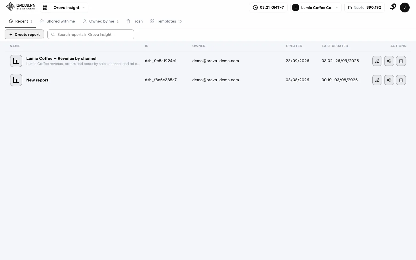
Where you land: every report in the workspace in one list. - 2
Pick Orova Insight in the module list. Click the
Insighttile. Orova takes you straight to the report list. There is no sub-item to choose after that.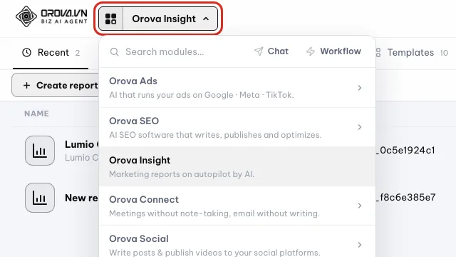
Open the module menu in the top bar and pick Orova Insight. - 3
Look at the tab row on top. There are five tabs:
Recent,Shared with me,Owned by me,Trash,Templates. Next to each tab is a counter showing how many reports that tab holds. - 4
Read the table columns. The table has four columns:
Name,Owner,Created,Last updated. TheOwnercolumn shows the creator's email, so you know exactly who built that report.
Each row shows the name, owner, created date and last update. - 5
Try the search box. Type part of a report name into the
Searchbox. The list narrows as you type, you do not have to press Enter.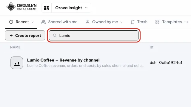
Type part of a report name to filter the list.
| Button / field | What it does | Notes |
|---|---|---|
Recent | Every report that is not deleted, most recently edited on top | The tab that is open when you arrive |
Shared with me | Reports created by others that you were given access to | Empty if nobody has shared anything with you yet |
Owned by me | Reports you created yourself | Use it to find your own work quickly |
Trash | Deleted reports that can still be restored | The last column changes to the deletion time |
Templates | A grid of ready-made landscape reports | Each template has a Use this template button |
Create report | Opens the dialog for creating a new report | Only shown if your role is allowed to edit |
Search | Filters the list by name | Filters in place, no page reload |
Note
No Create report button?
Tip
Times follow your own machine
Created and Last updated columns are converted to the time zone of the machine viewing them. A colleague in another time zone will see a different time than you, and that is correct.03 · Using a template
The fastest route: start from a ready-made template
If this is your first time, do not start from a blank page. Open a template first and you will immediately see what a good report looks like.
Report template
A report with charts and layout already arranged, but not yet attached to your data. Like a sheet of paper with the boxes already drawn, waiting for you to fill them in.
Orova ships a set of landscape templates. You can browse all of them for free, and it does not use any AI credits.
Use a template
- 1
Click the Templates tab. In the tab row at the top of the report list, click
Templates. The screen switches from a table to a grid of cards, each card a template with a preview image.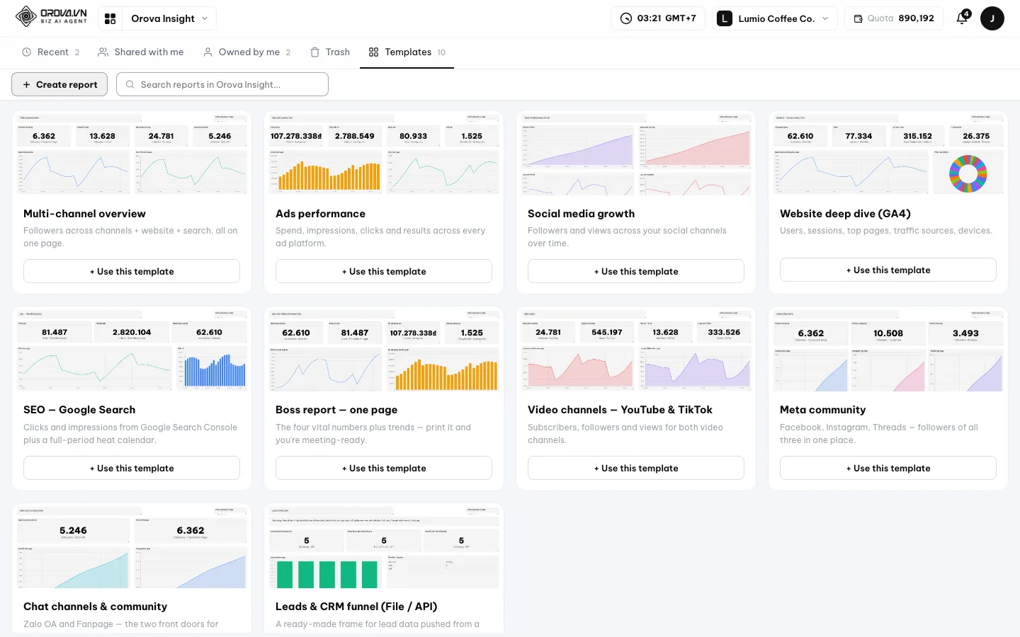
The Templates tab: browse every template for free. - 2
Look at each template's preview. Use the image to guess what that template is good for. Templates with many big numbers suit an overview report. Templates with many tables suit a detailed per-campaign report.
- 3
Click Use this template on the card you picked. Hover over the card and the
Use this templatebutton appears. Click it. Orova copies the whole layout into a new report of your own.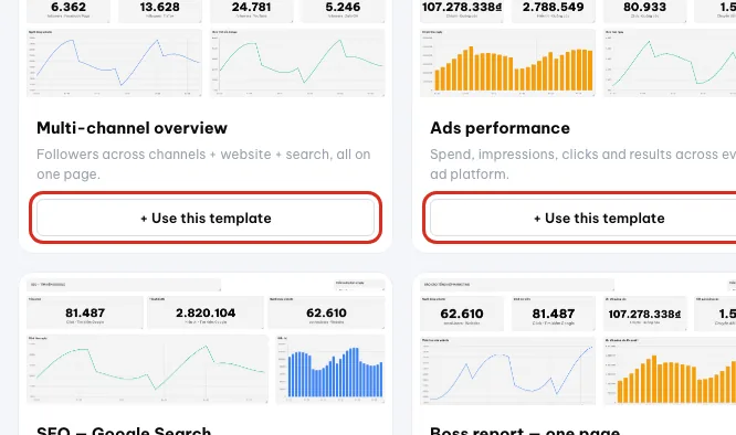
Click Use this template on the card you picked. - 4
See what just happened. Orova opens the report builder straight away. You see charts already laid out but without real numbers. That is because the template does not know where your data lives yet.
- 5
Point your own data source at it. Select each chart and change the
Data sourcefield in the properties panel on the right. How to bring data in is covered in the next section of this page.
Tip
A template gives you a copy, not the original
04 · Creating a report
Create a blank report from scratch
Once you are comfortable, you will want to build reports your own way. It starts with the create report dialog.
Report avatar
The small round image next to the report name. It exists only so you can spot a report faster in a long list.
Quota
The AI usage your workspace has left. Any action involving AI shows on screen how much will be deducted before you click.
This dialog is short, only four fields. You can leave them all empty; the name and image can be changed later at any time.
Six steps to create a report
- 1
Click Create report. The button sits in the top right corner of the list screen. A dialog slides into the middle of the screen.
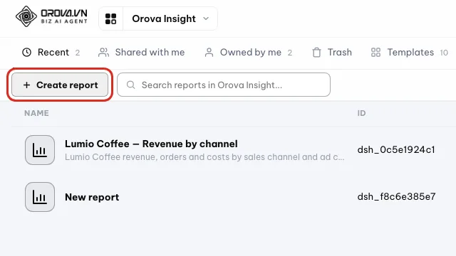
Click Create report to open the new report dialog. - 2
Fill in the Report name. The
Report namefield takes up to 80 characters and has a character counter next to it. Name it after the job, for example your company name plus Marketing report. Leave it blank and Orova names it New report.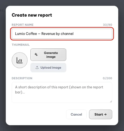
Type a clear name, for example Lumio Coffee — Revenue by channel. - 3
Pick an avatar — the free way. Click
Upload imageand pick a picture from your computer. It appears immediately in the round preview. This does not use any quota.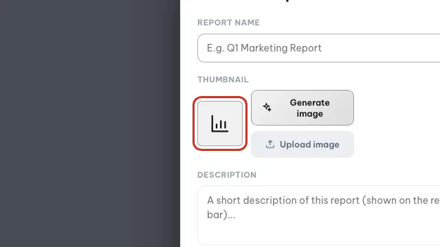
The free way: upload your own image as the report avatar. - 4
Or have AI draw the avatar. Click
Generate image. AI draws an avatar and places it in the round frame. This uses quota; the screen shows the amount before you click. A few seconds later the image is there.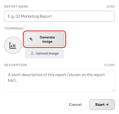
Generate image draws an avatar with AI and uses quota. - 5
Fill in a Description if you want. The
Descriptionfield takes up to 200 characters. That line appears on the report title bar and helps colleagues know what the report is for.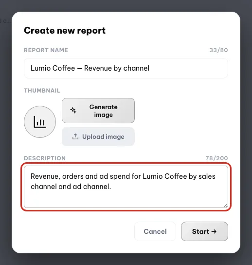
The description is optional; it helps teammates know what the report covers. - 6
Click Start. Orova creates the report with one blank page and opens the builder directly. You are now in front of a white canvas, ready to drop your first chart.
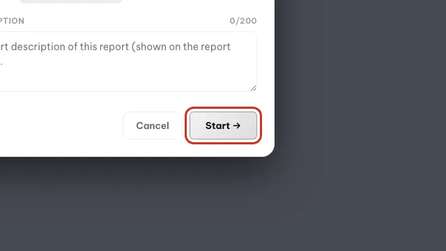
Click Start to create the report and open the builder.
Warning
Generate image uses quota on every click
Generate image costs one AI credit, even if you do not like the image that comes out. If the picture is just for fun, use Upload image instead.Note
Out of quota message
05 · Data sources
Bringing data in — pick the right kind of source
An empty report means there are no numbers yet. This section shows you three ways to bring data in, from the easiest to the one that needs an account login.
Data source
Where the numbers flow into the report from: an ad account, a social page, an Excel file you upload, or an API endpoint.
Connecting an account
The step where you sign in to Google or Facebook to give Orova permission to read your data. Orova only reads; it does not post and it does not spend money for you.
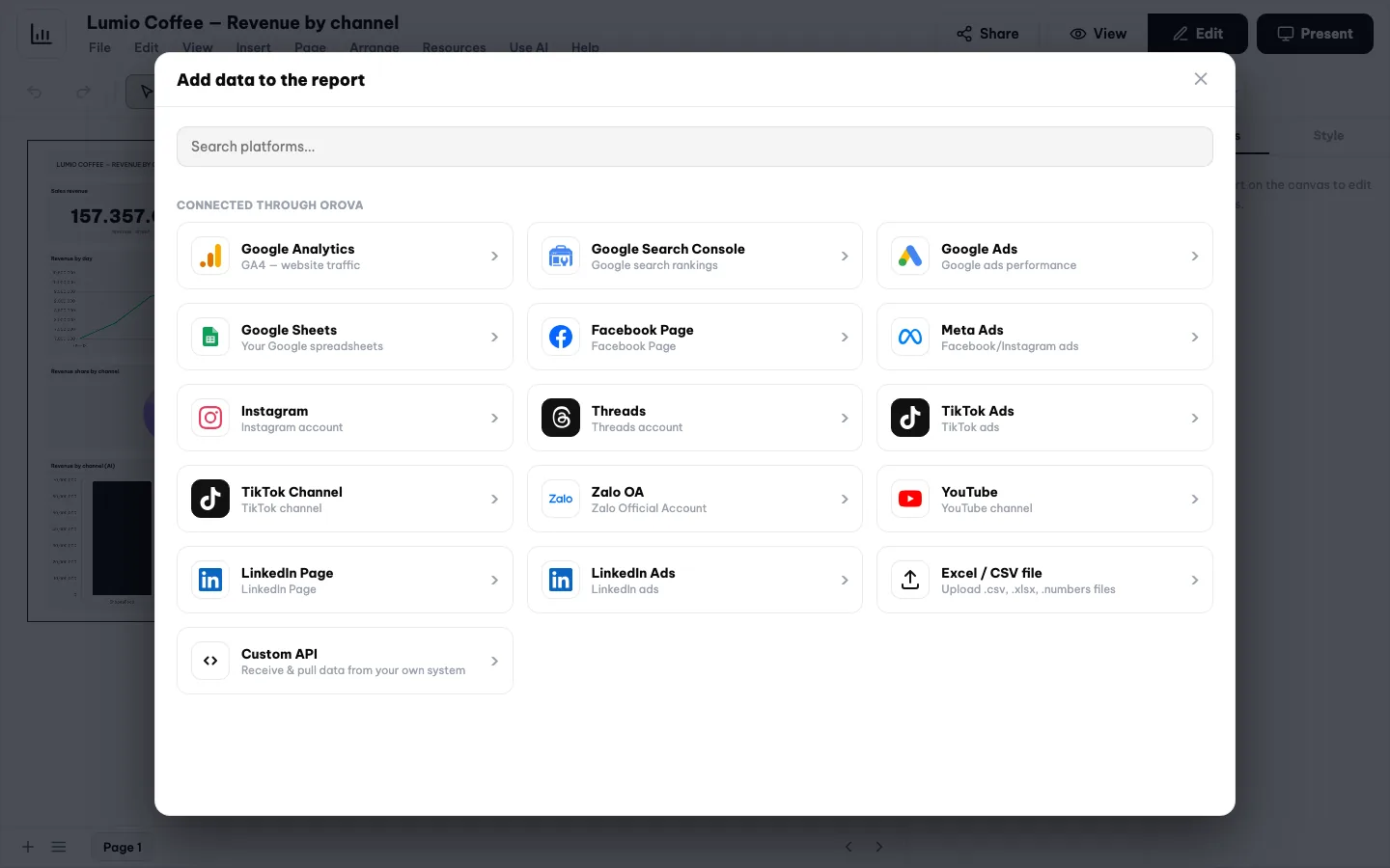
Inside the report builder, click the Add data button on the toolbar. A panel slides out listing every kind of source Orova supports, grouped by provider.
| Source | Group | Account connection needed? |
|---|---|---|
Google Analytics | Yes | |
Google Search Console | Yes | |
Google Ads | Yes | |
Google Sheets | Yes | |
Facebook Page | Meta | Yes |
Meta Ads | Meta | Yes |
Instagram | Meta | Yes |
Threads | Meta | Yes |
TikTok Ads | TikTok | Yes |
TikTok Channel | TikTok | Yes |
Zalo OA | Zalo | Yes |
YouTube | YouTube | Yes |
LinkedIn Page | Yes | |
LinkedIn Ads | Yes | |
Excel / CSV file | Other | No |
Custom API | Other | No |
Way 1 — Upload an Excel or CSV file (no account needed)
This is the easiest route and the one to try first. All you need is a spreadsheet with a date column and a few number columns.
Five steps to upload a file
- 1
Download Orova's sample spreadsheet. In the
Add datapanel, open theExcel / CSV filetile and click the sample spreadsheet download link. Your computer receives an.xlsxfile. Its content follows the language you are using. - 2
Fill in your own numbers using the same columns. Open the file in Excel or Numbers. The first tab holds sample data, the next one lists the filling rules. Delete the sample rows, enter your numbers, and keep the column names exactly as they are.
- 3
Name the source. Back in Orova, the
Namefield in the file source panel is required and takes up to 120 characters. Use something obvious like a campaign name or a store name. Leaving it blank returns the error Name the source first.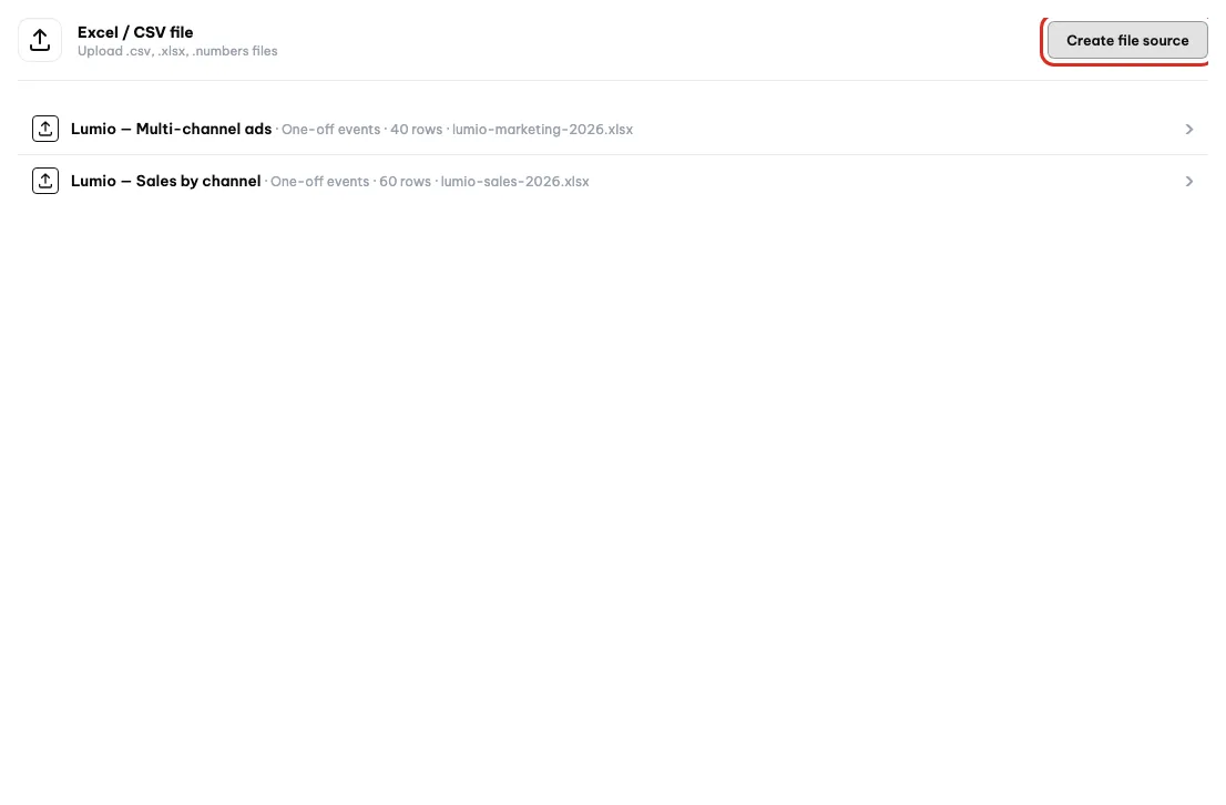
Create file source starts a new file source; loaded files are listed below. - 4
Upload the file. Pick the
.xlsxor.csvfile you just filled in and upload it. Orova reads the table structure in the background, which takes a few seconds to a few dozen seconds depending on the number of rows. Meanwhile the screen shows a loading state.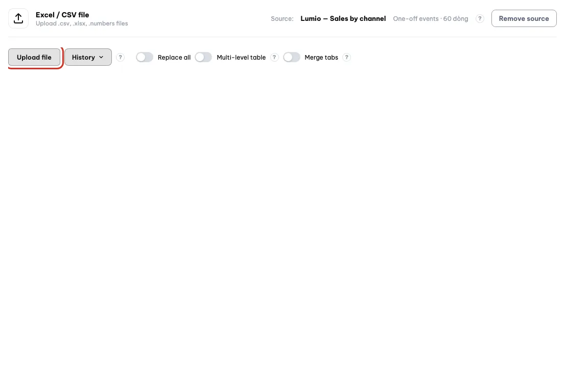
Open the source and click Upload file to load the spreadsheet. - 5
Wait for the load to finish, then check it. When it is done, the source tile shows the source name, the number of rows loaded, the last load time and the list of fields it detected. Seeing all the columns from your file means it worked.
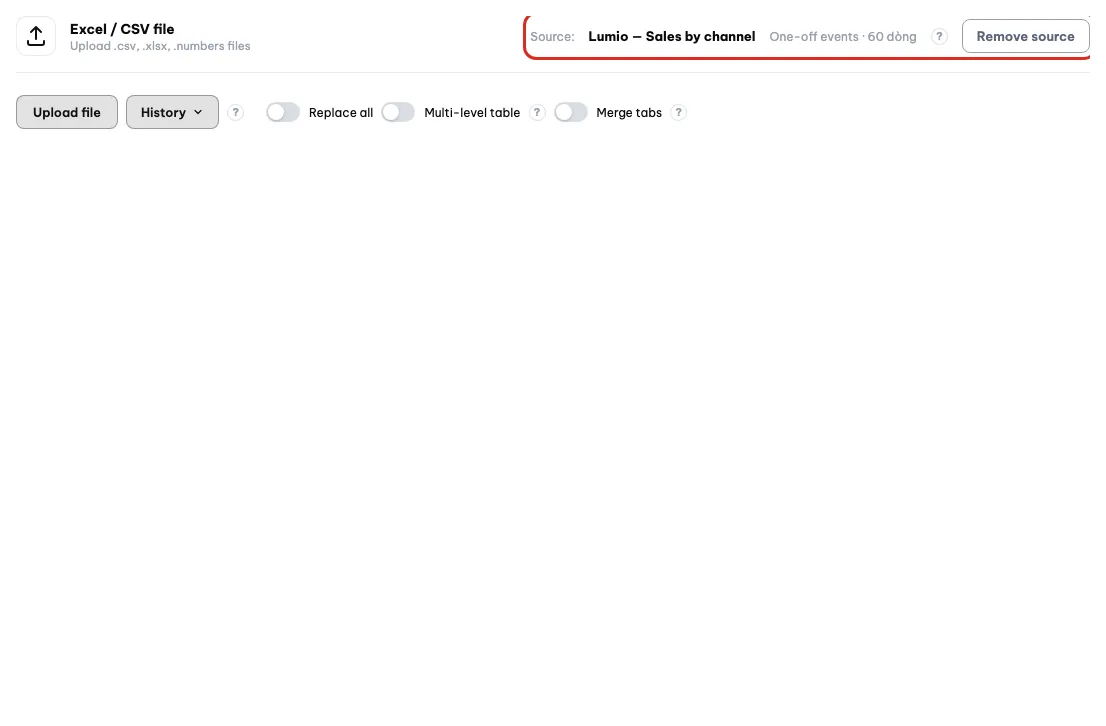
After the load finishes, check the source name and row count.
Warning
Let AI read the sheet uses quota per tab
Let AI read the sheet. That button uses quota for every tab in the file. Keeping the sample spreadsheet's column names costs nothing.Tip
Excel files with many tabs
Way 2 — Custom API (no account needed)
This route is for anyone with their own software, for example an ordering app or a warehouse system. The data flows into Orova by itself, so nobody has to upload a file by hand every week.
Create an API source
- 1
Open the Custom API tile. In the
Add datapanel, the last group contains theCustom APItile. Click it and the source creation panel appears.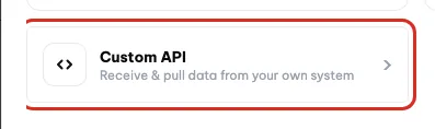
Custom API sends data from your own software into Orova. - 2
Name it and pick a mode. The
Namefield is required. Pick the write mode that fits your data; the default mode suits event-style data where each row is one occurrence.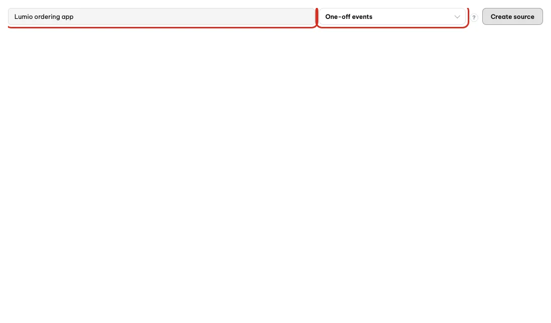
Name the source and pick a mode before clicking Create source. - 3
Grab the secret key and the send command. Once created, Orova generates a secret key and an intake endpoint. There is a button that copies the whole send command; hand that command to your technical person.
- 4
Choose which way the data flows. Both directions work. Your system pushes into Orova through the intake endpoint, or you declare a URL for Orova to pull from, optionally with an authentication header.
- 5
Check the latest record to confirm it works. The source panel has a place to view the most recent record received. Real data there means the pipe is live. You can also re-declare the field structure if Orova read it incorrectly.
Warning
Regenerating the key cuts the old pipe instantly
Warning
The clear received data button
Way 3 — Connect a real account (Google, Meta, TikTok, Zalo, YouTube, LinkedIn)
This is the route where the numbers refresh themselves without you doing anything. In return, you have to sign in once to grant read access.
How to connect an account
- 1
Pick the matching source tile. For example click the
Google Analyticstile in the Google group. The panel on the right explains what permissions Orova is asking for, with a connect button.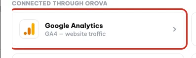
Pick the tile that matches your account, here Google Analytics. - 2
Click the connect button. A window from Google or Facebook opens, not an Orova screen. Sign in with the account that holds the data.
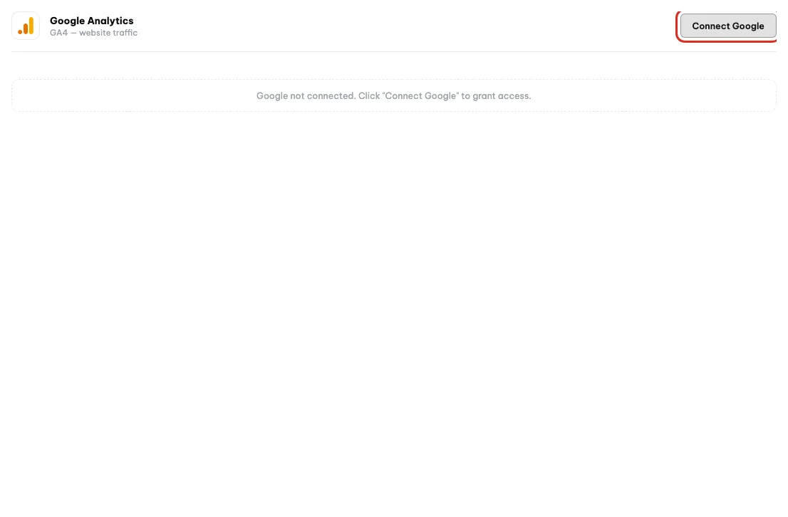
Click Connect Google, then sign in to grant read access. - 3
Approve the read permissions. The provider lists the permissions Orova is asking for. They are all read permissions. Click approve, the window closes and you come back to Orova.
- 4
Pick the right sub-account. One account usually manages several things: several Analytics properties, several Pages, several ad accounts. Orova asks you which one to use before pulling any numbers.
- 5
Wait for the first pull. The first pull takes longer than later ones because it fetches the whole history. Wait for the done message before you build charts, otherwise the charts show up empty.
Note
Google Sheets still needs a connected Google account
Tip
No ad account at all?
06 · Building the report
Build the report on the canvas
This is the main screen of the whole module. You drag and drop charts onto a landscape sheet, exactly like arranging a presentation slide.
Canvas
The white landscape area in the middle of the screen. Everything you place on it stays exactly where you put it when someone else opens the report.
Widget
One block on the canvas: a chart, a table, a big number, a text box or an image. A report is a set of widgets arranged next to each other.
Metric and dimension
A metric is a measurable number, like cost or revenue. A dimension is how you break that number down, like by day or by channel.
The screen is split into four bands from top to bottom: the title bar, the toolbar, the canvas, and the page bar at the bottom.
| Button | What it does | Notes |
|---|---|---|
Share | Opens the report sharing panel | See the sharing section at the end of this page |
View mode / Edit mode | Switches between viewing and editing | In view mode every editing button is hidden |
Undo / Redo | Steps back or repeats your last action | Use it when you drag something by accident |
Select | Returns the cursor to widget selection mode | Click it after you finish drawing a shape |
| zoom level | Zooms the canvas in or out | Type a number or pick a preset level |
Add page | Adds a new page to the report | The new page tab appears at the bottom |
Add data | Opens the data source picker | The first thing you should do |
Blend | Joins several sources into one shared source | Use it for cross-source comparisons |
Embedded content | Inserts content from an external page | Drop an embed box onto the canvas |
Image | Inserts an image, including a remove background option | Remove background uses quota |
Text | Inserts a text box | Use it for headings and notes |
Line | Draws a straight line | Separates blocks for readability |
Shape | Draws a rectangle or a circle | Makes a backdrop for a group of widgets |
Update | Pulls the latest numbers from the sources | Every widget reloads |
Drop your first widget
From blank canvas to a chart with numbers
- 1
Make sure you are in Edit mode. Look at the toggle on the toolbar. If it says
View mode, switch toEdit modeand the content buttons appear.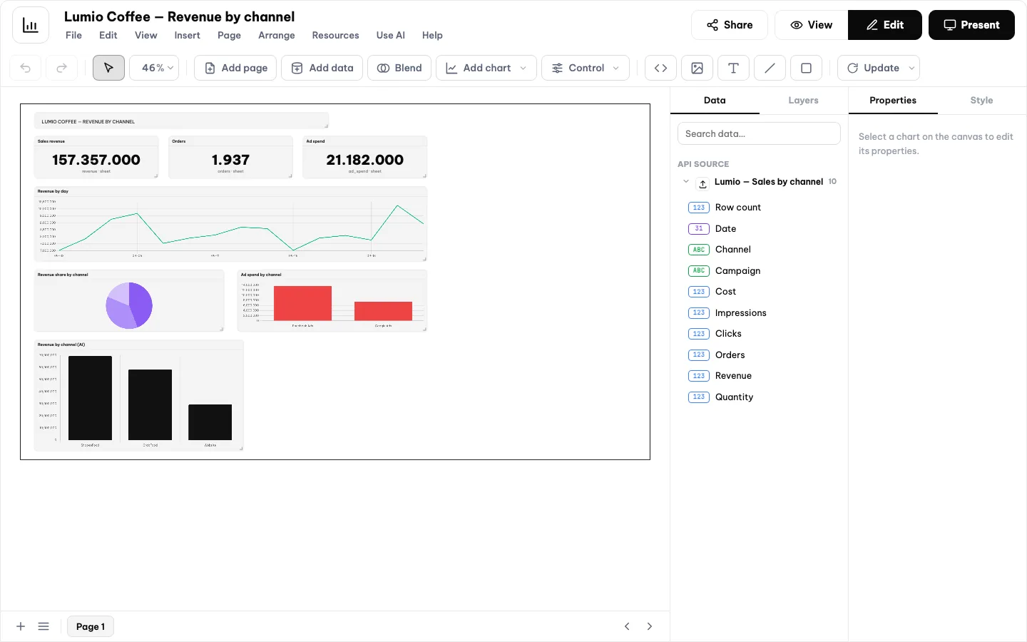
Edit mode is on when the Edit button at the top right is dark. - 2
Pick a content type and draw it on the canvas. Click the content type you want, for example a chart or
Text. Drag on the canvas to set the frame; release and the widget is there.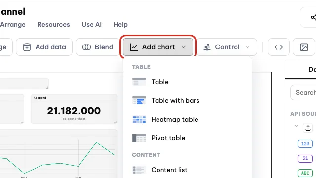
Pick a content type from Add chart, then draw it on the canvas. - 3
Open the properties panel. Click the widget you just created. The properties panel appears on the right of the screen. Every setting for that widget lives in this panel.
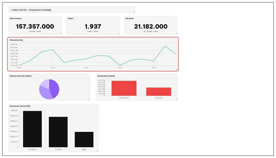
Click a chart on the canvas to select it. - 4
Pick a Data source. The
Data sourcefield lists the sources you have connected to this report. Only after you pick a source do the metric and dimension lists fill up.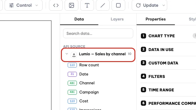
Pick the data source in the Data panel on the right. - 5
Pick a metric, then a dimension. For example the metric is revenue and the dimension is day. The widget redraws immediately, no save button needed. Switch the dimension to channel and the chart splits differently.
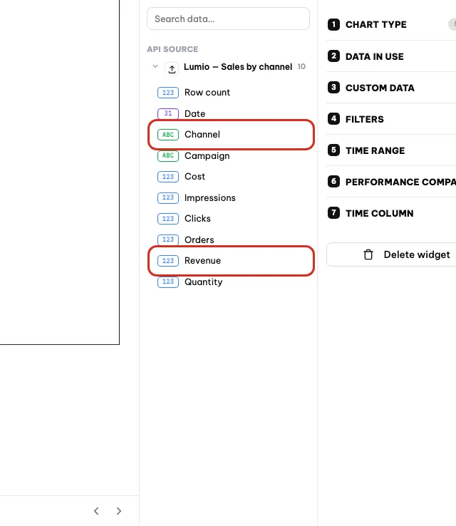
Pick a metric such as Revenue, then a dimension such as Channel. - 6
Set the date range. The
Date rangefield decides which period the chart pulls numbers from. If the chart is empty, the date range is very likely outside the period that has data. - 7
Pick a Chart type and colors. The chart type field opens a grid of types. Try a few to see which one reads best with your numbers. The color field changes the widget's palette.
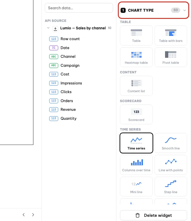
Open Chart type to switch the chart; the metric stays.
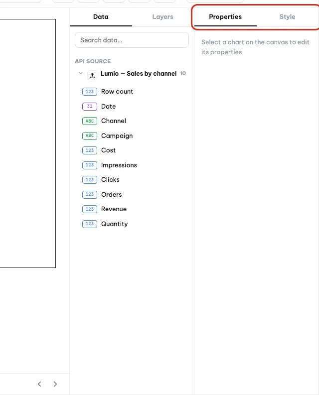
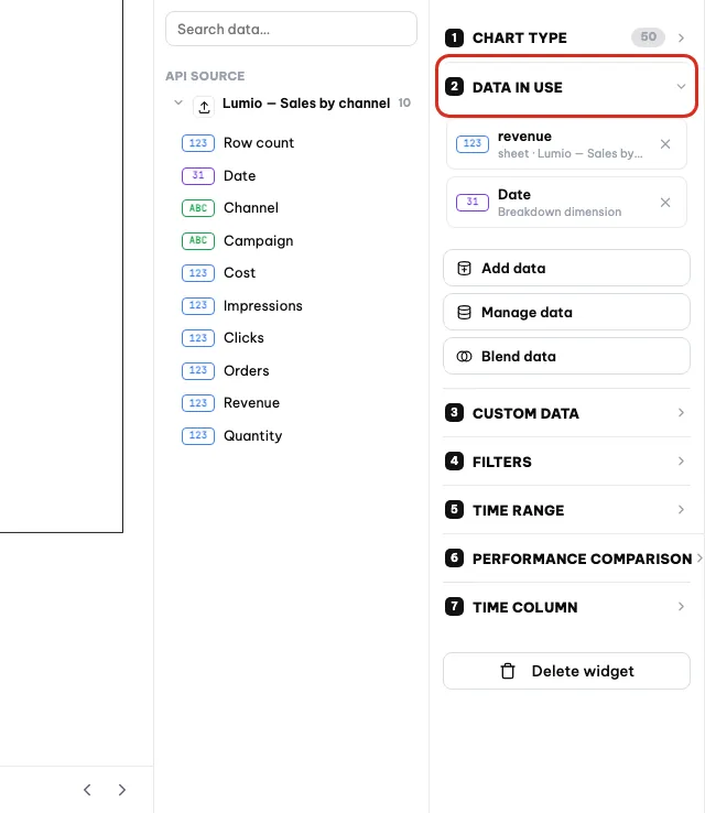
Which chart type to pick
Orova has a lot of chart types. You do not need to learn them all. The four groups below cover almost everything you do day to day.
- Big number — when you only need one single figure, for example total revenue this month.
- Time series line — when you want to see the trend going up and down across days.
- Column — when you want to compare channels or campaigns against each other.
- Pie — when you want to see what share each part holds of the total.
- Table — when the reader needs exact figures, not just a shape.
Tip
Do not cram too many widgets on one page
Text, images, lines, shapes and embedded content
Not every block needs data. These four types exist only to make the report easier to read.
Text— set a page heading, or note an explanation for an unusual figure.Image— insert a company logo or a product photo. There is a remove background option, and that option uses quota.LineandShape— draw dividers, or a backdrop for a group of charts.Embedded content— insert content from an external page into the middle of the report.
Multiple pages, zoom, undo
- 1
Add a new page. Click
Add pageon the toolbar, or the add button on the page bar at the bottom. A new page tab appears and you click to switch between them.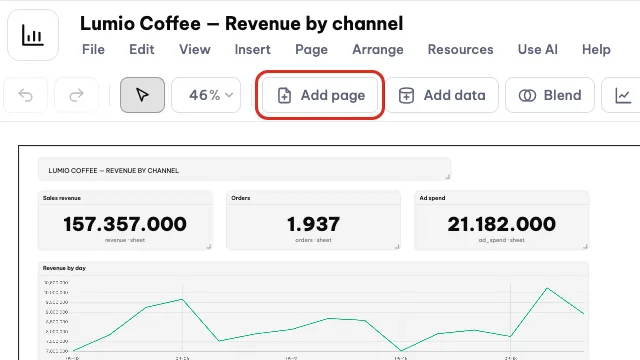
Add page creates a new blank page in the same report. - 2
View and arrange the pages. The bottom bar has an all pages button plus two arrows to scroll left and right when there are many pages. Each page is built independently from the others.

The page bar at the bottom lists and reorders the pages. - 3
Set the zoom to a comfortable level. The zoom field on the toolbar accepts a typed number or a preset level. On a small screen, reduce the zoom to see the whole canvas.
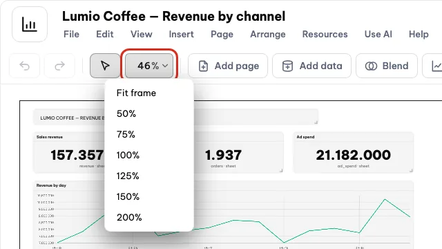
Set a zoom level that fits your screen. - 4
Made a mistake? Undo it. Click
Undoto step back,Redoto bring it back. The report saves continuously, so you never have to look for a save button.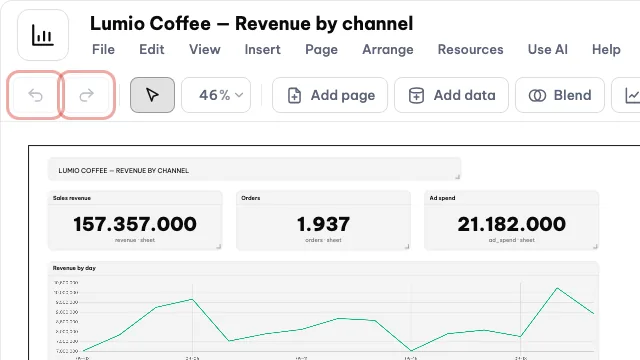
Undo reverses the last change; Redo brings it back.
Note
Reports save themselves
07 · Letting AI draw
Have AI draw the chart for you
If you are not comfortable picking metrics and dimensions yet, just describe what you want in plain language. AI picks for you and places the chart on the canvas.
Draw a chart with AI
You type one sentence describing what you want to see. AI reads the sources connected to the report and picks a suitable metric, dimension and chart type.
This is useful when you are just getting started, or when a source has so many columns that you do not know which one to use.
One AI request
- 1
Connect at least one source to the report first. AI only sees the sources connected to this very report. With no source on the report, AI has nothing to draw.
- 2
Click the draw a chart with AI button. The button is on the builder toolbar. An input box appears, with a line stating how much quota this costs.
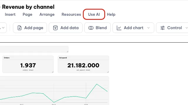
Click Use AI to open the draw a chart with AI box. - 3
Write the request as specifically as you can. Say clearly which figure, broken down by what, over what period. For example: draw revenue by day, split by channel, over the last thirty days.
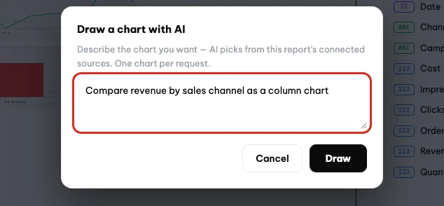
Describe the chart as specifically as you can. - 4
Send it and wait a few seconds. AI reads the source structure and returns one widget. Orova places it on the page you have open. Each request draws one widget.
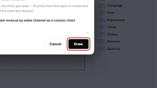
Click Draw to send; this uses quota. - 5
Adjust it if it is not quite right. Click the widget and open the properties panel on the right. Change the metric, dimension, date range or chart type as usual. Editing by hand uses no quota.
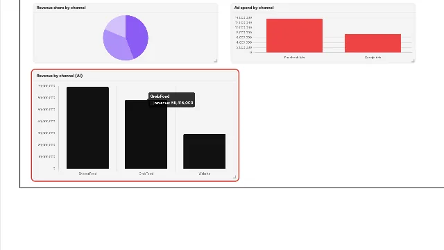
Select the AI chart to adjust it like any other chart.
Warning
Every AI request costs one quota credit
Tip
How to write a request AI understands
Note
What happens when quota runs out
08 · Custom metrics
Define your own metrics and formulas
Some numbers are not in your table already. You create them with a formula, then reuse them on every chart.
Custom metric
A number you define from columns you already have. For example, if your table only has Revenue and Cost, you can create a return on ad spend metric yourself.
Formula
A calculation written with column names, like a cell in Excel. You write it once and Orova recalculates it for every row of data.
ROAS
The common name for Revenue divided by Cost. It tells you how much revenue each unit of ad spend brings back.
You need this when your question cannot be answered by a single column. Custom metrics belong to the workspace, so the whole team shares them.
Create a custom metric
- 1
Open the metrics screen. Go to the
Metricssection of Orova Insight. The screen lists the metrics your team has created, each row showing a name and a formula. An empty list means nobody has created one yet.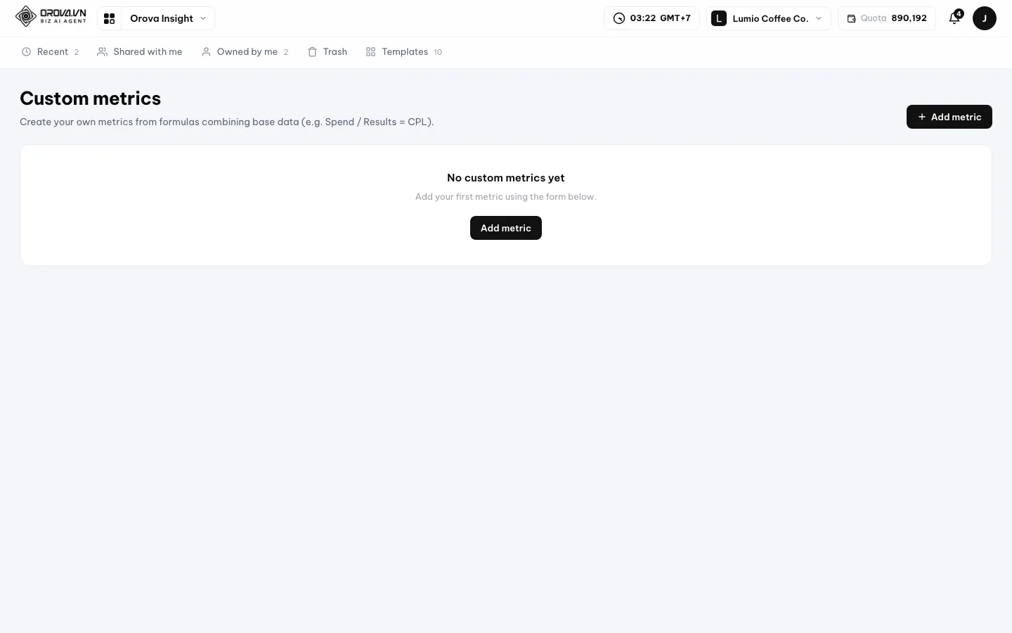
Custom metrics live on their own screen and are shared by the workspace. - 2
Name the metric. Type a short name the whole team understands. This name appears in the metric list while you build charts, so avoid abbreviations people have to guess.
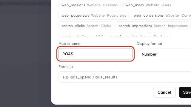
Give the metric a short name, for example ROAS. - 3
Write the formula. Use the exact column names in your source, for example
Revenuedivided byCost. A misspelled column name means the metric returns no value when you chart it.
Write the formula from the source's field names. - 4
Save it. Click save. The new metric appears in the list right away. It costs no quota, because this step is pure calculation — no AI call.
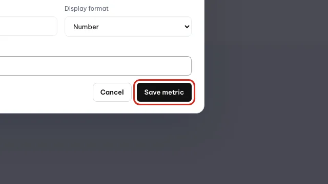
Click Save metric; the metric is shared with the whole workspace. - 5
Use the metric on a chart. Go back to the report, select a widget and open the
Metricbox in the properties panel on the right. The metric you just created sits in the same list as the original columns.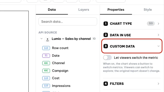
Use the metric on a chart from the Custom data section.
Note
A formula only runs when the source has every column
Revenue stays empty if you point it at a source without that column. Check the source field list first.Tip
Return on ad spend is clearer than Rev/Cost for someone new to the team.09 · Filters & date range
Filter your data and pick a date range
One source can show many different slices. The filter decides which rows to keep, the date range decides which period to read.
Filter
A condition that narrows the data down. For example, keep only rows where the channel is Facebook Ads and ignore every other channel.
Date range
The period a chart reads its numbers from. Changing the date range changes the question: the last seven days, or the whole quarter.
Previous period comparison
Turning on an extra period that sits right before the one you are viewing, so you can see whether the numbers are up or down.
You set both in the properties panel on the right after selecting a widget. Each widget keeps its own filter and date range.
Set a filter and a date range for one chart
- 1
Select the chart you want to change. Click a widget once on the canvas. The properties panel opens on the right with the
Data source,Metric,Dimension,FilterandDate rangeboxes. - 2
Open the date range box. Click
Date range. Pick the period for this widget. The chart redraws as soon as you choose — there is nothing to save.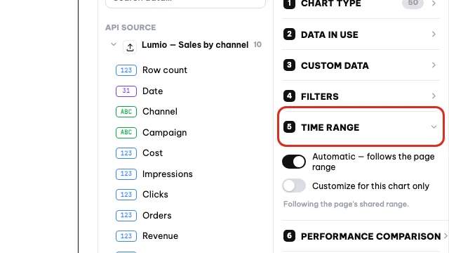
Open Time range and choose Customize for this chart only. - 3
Turn on the previous period comparison. In the same date range box, switch the comparison on. The chart adds the numbers from the period immediately before, so you can see the difference.
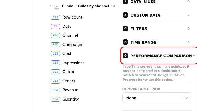
Performance comparison sets the previous period to compare against. - 4
Add a filter condition. Click
Filter, pick the column to filter on, then pick the values to keep. For example one channel, one campaign or one branch.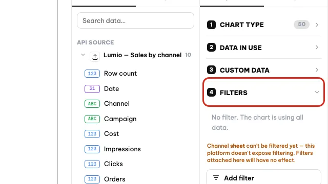
Open Filters and click Add filter to add a condition. - 5
Check the result. Look straight at the canvas. If the chart is empty after filtering, no row matches the condition any more — loosen it.
Note
Filtering one widget is not filtering the whole page
Tip
10 · Blending sources
Join two sources into one
When your numbers live in two different tables, you join them and chart them together.
Blended source
A new source created from two existing ones. Orova places the two tables side by side and treats the result as a single table.
Join column
A column that exists in both tables and acts as the joining point. Usually Date, Channel or Campaign.
You need a blend when you want ad cost next to sales revenue while those two numbers come from two separate tables.
Create a blended source
- 1
Open the blend tool. In the report builder, click
Blendon the toolbar. The blend tool opens and lets you pick from the sources already connected to this report.
Blend opens a dialog with Calculated field and Blend sources tabs. - 2
Pick the two sources. Choose the first source, then add the second. If the list is empty, go back and click
Add datato connect a source to the report first.
Switch to Blend sources to pick the two sources. - 3
Pick the column to join on. Point out the column the two tables share. Both columns must hold the same kind of value: dates join with dates, channel names join with channel names.
- 4
Save the blended source. Save it. The blended source appears in the
Data sourcelist of the properties panel and behaves like any other source.
Note
The two tables must share a column
Date column to both tables before uploading them.Tip
Facebook Ads and facebook ads count as two different values when joining.11 · Refreshing data
Refresh the data in a report
A report does not guess new numbers. You click update when you need to, or set a schedule and let Orova pull the data on a cycle.
Update
Pulling the latest data from the source back into the report. Like reloading the page, but only the numbers reload.
Auto-sync
Telling Orova to pull data on a cycle, so whenever you open the report the numbers are close to current.
For an Excel or CSV file source, the numbers are only new when you upload a new file. For a connected account, Orova pulls the data from the provider itself.
| Button / box | What it does | Notes |
|---|---|---|
| Update | Pull the data from the source again, right now | Every widget in the report reloads; no quota used |
| Auto-sync settings | Open the settings for the automatic pull cycle | Behind the small arrow right next to the Update button |
| Upload file (file source) | Bring the latest table into an existing source | Choose whether to append or replace all the old data |
Refresh your data
- 1
Click Update. On the builder toolbar, click
Update. The widgets switch to a loading state and redraw with the new numbers.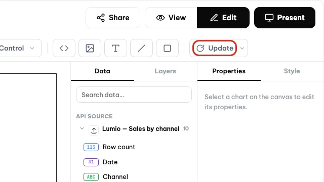
Click Update to pull fresh numbers into every chart. - 2
Open the auto-sync settings. Click the small arrow next to the
Updatebutton to openAuto-sync settings. Pick the cycle you want and save.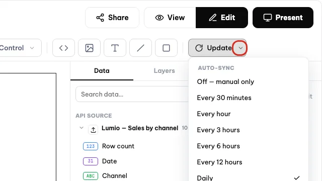
The arrow next to Update opens the auto-sync settings. - 3
File sources: upload the new table. Open that file source again and pick a new file from your computer. Choose append if the new table continues the old one, or replace if the new table is the complete set.
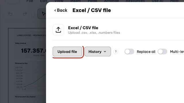
For a file source, upload the new table with Upload file. - 4
Wait for the load to finish before looking. Orova reads the file in the background. A large table leaves the source in a loading state for a few dozen seconds. Wait until the new row count appears before going back to the report.
Warning
Replacing deletes the old data in the source
Note
Connected accounts need a live connection
12 · Sharing & versions
Share a report and roll back to an older version
Once a report is built, you hand it to other people. Orova also keeps earlier checkpoints so you can go back after a slip.
View mode and edit mode
Edit mode lets you drag, drop and change everything. View mode is read-only and looks exactly like what the recipient will see.
Sharing permission
How much other people may do with the report: edit it, only view it, or not see it at all. Set it for the whole workspace or per person.
Version
A snapshot of the report at a point in time. Orova saves checkpoints so you can restore one when the current version breaks.
Preview before you send
- 1
Switch to view mode. On the title bar, flip the switch to
View mode. Every editing button disappears and you see exactly what the recipient will see.
Click View to see the report the way readers see it. - 2
Go back to editing. Flip the switch to
Edit mode. The toolbar and the properties panel come back. Nothing is lost when you switch back and forth.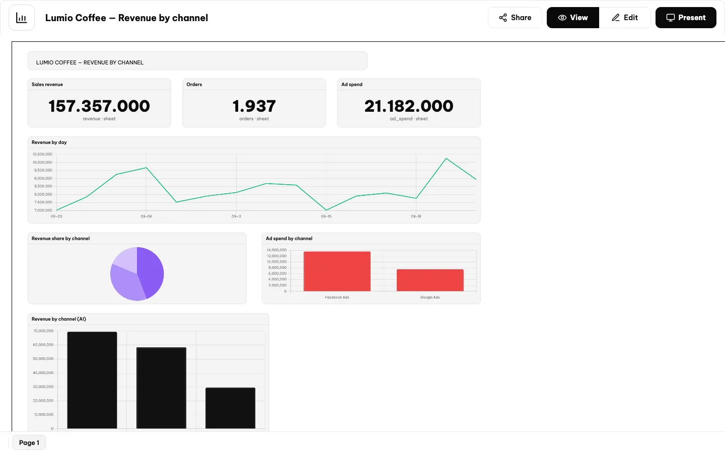
In view mode the toolbar is gone; switch back to Edit to change things.
Share a report
- 1
Open the sharing panel. Click
Shareon the title bar. The sharing panel opens in two parts: the general permission for the whole workspace, and per-person permissions.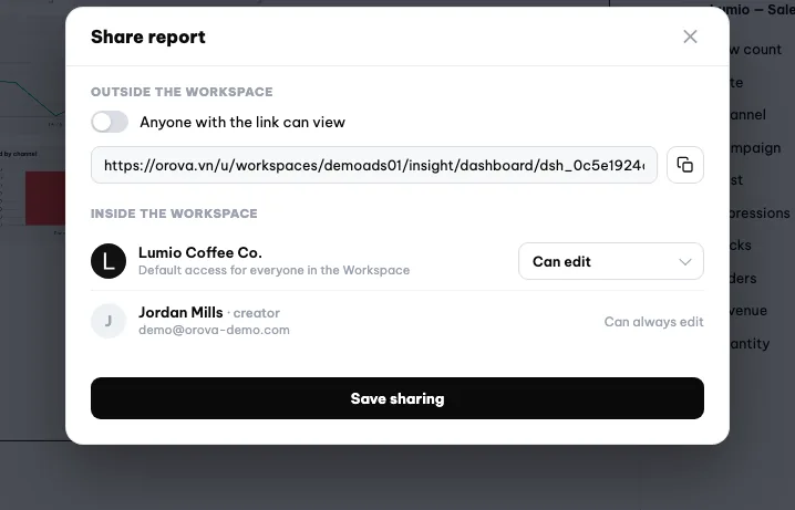
Share opens the permissions for the workspace, each person and the public link. - 2
Set the permission for the workspace. Pick one of three levels: can edit, can only view, or cannot see it. This level applies to every member of the workspace.
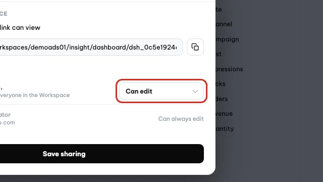
Set what everyone in the workspace may do with the report. - 3
Add a permission for one person. Add a person to the list and pick their own level. Use per-person permissions when someone needs a different level from the rest of the team.
- 4
Get the public view link. The sharing panel includes a public view link. Copy it and send it to people outside the workspace — they can view the report without an Orova account.
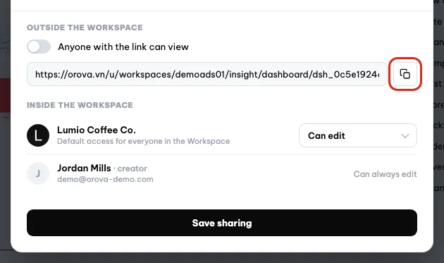
Copy the public view link from the top of the sharing dialog.
| Button / box | What it does | Notes |
|---|---|---|
| Share | Open the panel for view and edit permissions | Only people with edit rights can change it |
| View mode | See the report the way a recipient does | Nothing you are building is lost |
| Edit mode | Go back to building and dragging | Hidden when you only have view rights |
| Public view link | A link for people outside the workspace | Anyone with the link can view it, so think twice |
Warning
The public link asks for no password
Roll back, duplicate, delete
- 1
Open the version history. In the builder, open the version menu. The list shows the saved checkpoints with their timestamps, and each one has a restore button.
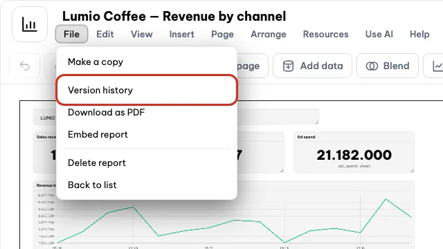
Open File, then Version history. - 2
Restore a checkpoint. Click restore on the checkpoint you want. The report returns to exactly that state. The open version is replaced by the older one, so check the timestamp carefully.
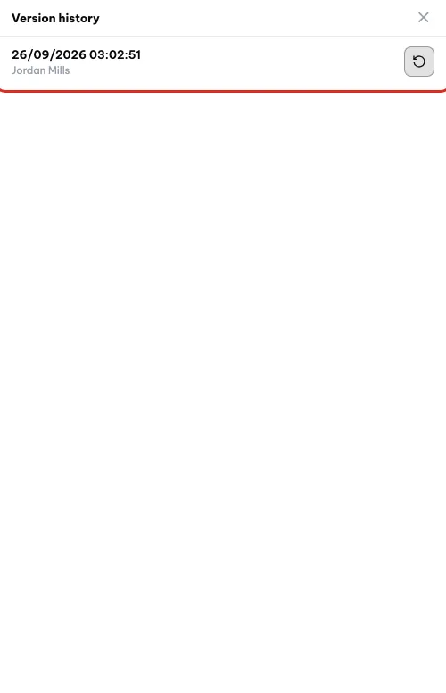
Pick a checkpoint in Version history to restore it. - 3
Duplicate it to experiment. Use duplicate to make a copy. You can change whatever you like on the copy without touching the original report the team is watching.
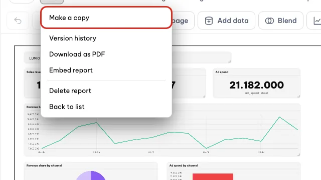
Make a copy duplicates the report so you can experiment safely. - 4
Delete a report. A deleted report does not vanish immediately — it lands in the
Trashtab of the report list. The last column of that tab shows when it was deleted.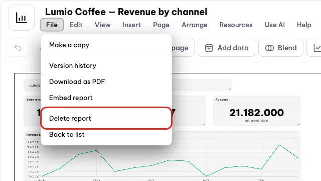
Delete report moves the report to Trash. - 5
Restore or delete permanently. From the
Trashtab you can restore a report back to its old list, or delete it permanently to remove it for good.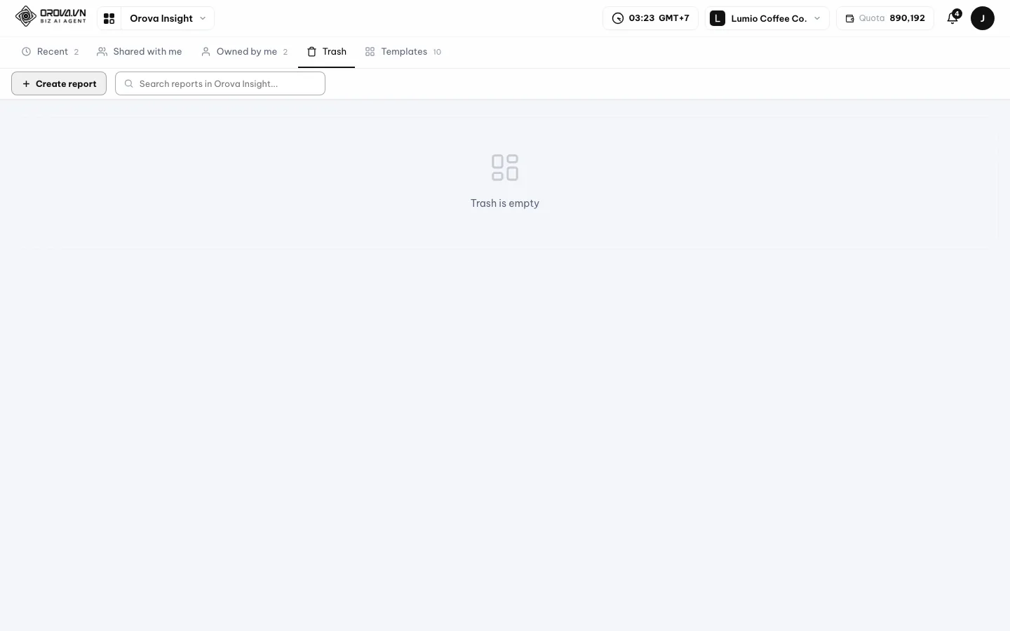
Deleted reports wait in the Trash tab.
Warning
Deleting permanently is final
Trash cannot be recovered, not even through the version history. Be sure before you click.13 · Scheduled sending
Email a report on a schedule
Instead of reminding each other to open a report, you set Orova to email it on a cycle to exactly the people who need to read it.
Schedule
A standing appointment: which report, to whom, on what cycle. Set it once and Orova does the rest.
Send now
Sending once outside the schedule, usually to check what the email looks like when it arrives.
This fits weekly or monthly reports for management. Recipients read the numbers without signing in to Orova.
Set up a schedule
- 1
Open the scheduled reports screen. Go to the scheduled reports section of Orova Insight. The screen lists the schedules already set, each row showing the report, the recipients and the cycle.
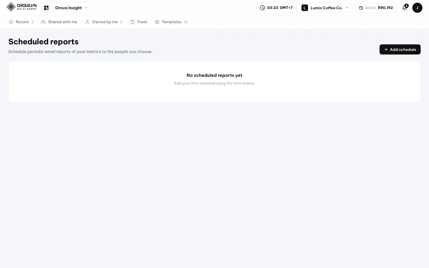
Scheduled reports: which report, to whom, on what cycle. - 2
Pick the report to send. Choose from your workspace report list. Only reports you have permission to view appear here.
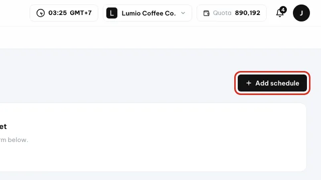
Click Add schedule to open the schedule form. - 3
Fill in the recipients. Enter each recipient's email address. Check the spelling carefully — a wrong address means the email goes astray with no clear error.

Type the recipients' emails, separated by commas. - 4
Pick the cycle. Set the sending cycle to suit you, for example once a week. Save it and the schedule starts running from the next cycle.
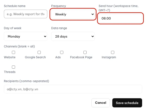
Pick the cycle and the time of day to send. - 5
Test it with send now. Use send now to receive a test copy. Open your own inbox and check that the layout and the numbers are right.
Warning
Send now sends a real email
Note
The entry point depends on your permissions
14 · FAQ & errors
Frequently asked questions and common errors
The messages you may run into while using Orova Insight, with the cause and the fix.
Error message
The red line Orova shows when a step does not go through. It always points at the exact thing that is stuck, so read it and you know what to fix.
I have no ad account at all. Can I still use Orova Insight?
Yes. Take the Excel / CSV file route: download the Orova sample spreadsheet, fill in your own numbers and upload it. This route needs no Google or Facebook account connection.
Why is my chart empty?
Three common causes. One, the widget has no Data source assigned. Two, the date range falls on a period where the source has no rows. Three, the filter is too tight and no row matches any more.
I see the message "That spreadsheet link isn't right. Copy the full URL from the Google Sheets address bar."
The link you pasted is not a spreadsheet link. Open the spreadsheet in your browser, copy the full URL from the address bar and paste it again.
I see the message "No Google account connected yet."
Orova has no permission to read your Google Sheets. You have to connect a Google account first. A public sharing link does not replace this connection step.
I see the message "This tab has no data table (only text or links). Please pick a different tab."
You picked a notes tab instead of the tab holding the data table. Go back and pick the tab with the data columns, for example the Data tab in the sample spreadsheet.
I see the message "Name the source first."
You created a file source or an API source with the name box left empty. Type a short, recognisable name and click again.
I see the message "Source not found."
That source has been deleted, or you are opening an old link. Go back to the Add data panel and pick a source from the current list.
I get a permission error when I open Orova Insight.
Your role in the workspace does not have Orova Insight enabled yet, or is not allowed to connect sources. Ask your workspace admin to grant it.
I am told I am out of quota.
The workspace has used up its AI credits. The jobs that call AI are asking AI to read a table, asking AI to build a chart, and generating a cover image. Everything else keeps working normally because it uses no quota.
How do I avoid spending quota when loading a file?
Keep the column names of the Orova sample spreadsheet you downloaded. When the column names follow a known pattern, Orova reads the table by rule instead of calling AI.
My report has disappeared from every tab.
Most likely your view permission on that report was changed. A report you have no permission for shows in no tab at all. Ask whoever created it to grant access again.
I just uploaded a file but the row count is still zero.
Orova reads the file in the background, and a large table takes a few dozen seconds. Wait until the source reports the load as finished before reopening the report.
Does Orova post to Facebook or Google on my behalf?
No. In Orova Insight, connecting an account is only for reading data to build reports. Orova posts nothing to your accounts.
I accidentally deleted a page in my report.
Click Undo on the toolbar if you just deleted it. If you already closed the report, open the version history and restore the most recent checkpoint from before the deletion.
/ Need help?
Can't find what you need? Open the Support section in your workspace, or send us a message.